
Search results for "Clean critical" in Home Design Ideas
 Rethink Design Studio
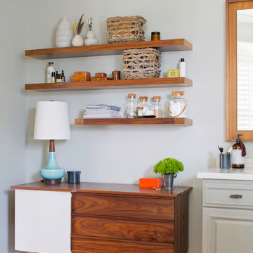
Sources:
Floating shelves: Custom design (Rethink Design Studio x AWD of Savannah)
Table lamp: Caravan Pacific
Credenza: Schoolhouse Electric Co.
Woven baskets: Target
Turkish towels: bathstyle (Etsy)
Glass decanters: Vintage
Wall color: BM Silver Song 1557
Vanity color: BM Arctic Shadows 1559
Vanity mirror: Custom teak mirror (Rethink Design Studio x AWD of Savannah)
Vanity hardware: Anthropologie
Flooring: Heart of Pine
Richard Leo Johnson
 Alecia Stevens, Inc.
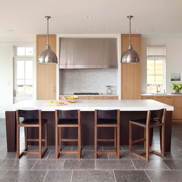
View into kitchen of Streeter home.
Steve Henke, Photo
Eat-in kitchen - transitional l-shaped eat-in kitchen idea in Minneapolis with an undermount sink, flat-panel cabinets, light wood cabinets, white backsplash, paneled appliances, white walls and an island
Eat-in kitchen - transitional l-shaped eat-in kitchen idea in Minneapolis with an undermount sink, flat-panel cabinets, light wood cabinets, white backsplash, paneled appliances, white walls and an island
 Advance Design Studio, Ltd.
Jackie and Sean loved the Algonquin neighborhood they lived in with the peaceful neighborhood and the close proximity to work and school. What they didn’t love was how outdated their home had become. With a cramped kitchen and an unused dining room, they decided a remodel was the perfect solution to their problem. They would be able to continue to live in the area they loved, while at the same time they could have the dream home they envisioned.
After a thorough search, Jackie came across Advance Design Studio. She was impressed by all of the positive reviews she saw on the internet and saw herself identifying with all of the project stories she saw on the website. Once they met with designer Scott Christensen and owner Todd Jurs, they knew Advance Design was the right company to make their dreams a reality.
The project consisted of four main areas: the kitchen/dining/powder room, the laundry room, the master bathroom, and the kid’s bathroom. They wanted to expand the kitchen into the seldom used dining room and add a large island for hosting parties and family gatherings. They also wanted new hardwood flooring throughout the first level. The laundry room needed to be more functional, and all three bathrooms were in dire need of updating.
The closed off kitchen was opened up to create a sweeping space between the new eating area and the much larger kitchen. A handsome dry bar complete with a beverage refrigerator and lighted glass door cabinetry makes an elegant transition across from a peninsula area filled with storage. An additional decorative cabinet lighting up elegant dishware through the mullioned glass sits directly across from the drybar.
An expansive island was critical to the kitchen plans. Jackie, Sean and Scott worked closely together to create just the right details for their design. They wanted the island to be functional in addition to being the centerpiece of the room. Added storage for the kid’s school supplies was hidden behind cabinet doors so the children could do their schoolwork right at the island, and a microwave drawer glides open with the touch of a finger hidden inconspicuously within the island space. The easy to care for Cambria Britannica Quartz island top with its sweeping grey and white marble look perched atop hand-carved Craftsman corbels was absolutely what they were hoping for, blending both beauty and function perfectly.
Adding a nice contrast to the brightness of the quartz and the white cabinetry, Kodiak - Leather granite countertops were used to balance the light and dark tones of the space. Dura Supreme Classic White painted cabinets grace the perimeter, while Maple Poppy Seed stained cabinets with a beautiful soft grey woodgrain were used in the beverage center and island. The two tones compliment the large space balancing it out nicely creating interest and elegance with the simple Craftsman style full overlay doors.
A deep warm Barnwood White Oak flooring was added throughout the lower level. The new floor brings additional contrast to the bright kitchen and provides unity with the now open floorplan as it rolls in to the foyer and family room. Final details like the show-stopping lunar like duo light fixtures complete the space and intermix expertly with crisscross details of the glass door mullions, the island bar seating and even accessories in the space.
The small cluttered laundry room needed more space and more storage. With a busy family it seemed to overflow daily and did not have anywhere to hide the families “in and out stuff.” Scott designed the new space with a stackable washer and dryer and much more efficiently organized cabinetry. Doing laundry is now (almost!) a pleasure and keeping everyone’s “stuff” hidden, but readily accessible is now a snap.
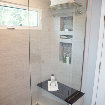
The master bath was not a place where the couple enjoyed spending time getting ready for their day. The tub almost never was used, so removing it made it possible to build an extra-large shower, replacing the small cramped cube of the previous shower they hated. Clean, horizontal lines softly draw your eye around the space with porcelain tile called Driftwood Sea spray. Full overlay cabinetry in a soft white vanity with double sinks makes getting ready for the day much more convenient for the busy couple.
Long floor planks made of porcelain tile mimic real hardwood floors in a soft grey to compliment the shower, but with the ease and care of a tile surface. Cambrian Black Granite counters with a matte finish and under mount porcelain sinks with handsome brushed chrome hardware complete the handsome space. A real bonus in any master bath; a custom built in storage nook was tucked in the corner of the space for linens and heavenly storage.
The kid’s bath was in sad shape because it was original to the house. To keep the budget in control, the tub which was in great condition was retained, but focus was on the new large brick style porcelain charcoal tile on the floor, crisp white new Craftsman style cabinetry with pretty furniture details on the corner base, a striking granite top with white under mount porcelain sinks and fresh hardware and faucets. Some beautiful soft grey wood mirrors to match mom and dads were custom sized and placed under new lighting, and 4 hooks were smartly arranged down the wall for kids’ towels.
This couple was determined not to move, and made their house their dream home. Not only does their home function greatly now, but Jackie says, “When the neighbors come to visit, they’re asking if they can “steal” the design”! The added functionality, elegance, and open floor plan were exactly what this family needed in order to stay.
Advance Design Studio, Joe Nowak
Find the right local pro for your project
 Wendy Glaister Interiors
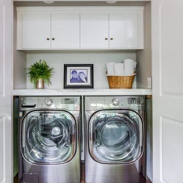
Once a guest bedroom, this space needed to house all sorts of critical activity for the household. It functions as an office, wine bar, coffee bar and laundry room. Office supplies, a shredder and printer are all concealed in the custom cabinetry. Le Grand outlets boast USB charging ports for convenience. The couple's Keurig pods are stowed in a drawer built for such a purpose. A Sub Zero wine refrigerator houses their extensive wine collection. And a laundry with chrome hanging bar and cleanser storage is tucked neatly behind a pair of doors.
 A036 Architecture, Design NYC and Chicago
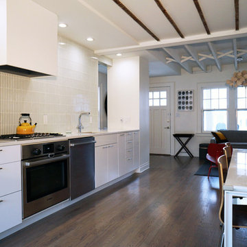
White Box – Kitchen and Living spaces
We were asked by our client to remove two walls in order to open the small space that measures 17’ wide by 31’ long. Two simple ideas drove the design; Light and duality of space. Guided by both we started with what we believe is critical to every project – process of discovery.
The proposed design uses white and dominating color for walls, cabinets and the built in bench. Light colored wood floor will add to the light appearance of space shell. As all dividing walls were removed, perimeter walls were charged with functions; linear kitchen, bench next to dining table, and pantry closet. Avoiding upper cabinets allow the design to be open and make use of the wall as a dynamic element –otherwise a monochromatic space. The newly created functional void connects both ends of space and creates what appears to be a larger and brighter spatial experience.
 Adaptiv DC
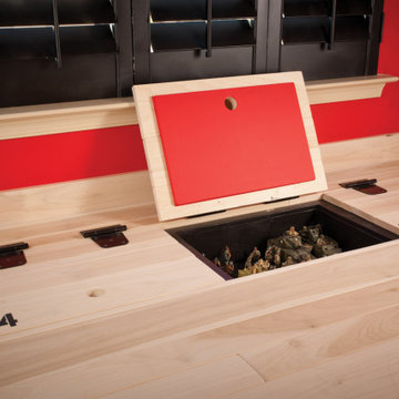
THEME The main theme for this room is an active, physical and personalized experience for a growing boy. This was achieved with the use of bold colors, creative inclusion of personal favorites and the use of industrial materials. FOCUS The main focus of the room is the 12 foot long x 4 foot high elevated bed. The bed is the focal point of the room and leaves ample space for activity within the room beneath. A secondary focus of the room is the desk, positioned in a private corner of the room outfitted with custom lighting and suspended desktop designed to support growing technical needs and school assignments. STORAGE A large floor armoire was built at the far die of the room between the bed and wall.. The armoire was built with 8 separate storage units that are approximately 12”x24” by 8” deep. These enclosed storage spaces are convenient for anything a growing boy may need to put away and convenient enough to make cleaning up easy for him. The floor is built to support the chair and desk built into the far corner of the room. GROWTH The room was designed for active ages 8 to 18. There are three ways to enter the bed, climb the knotted rope, custom rock wall, or pipe monkey bars up the wall and along the ceiling. The ladder was included only for parents. While these are the intended ways to enter the bed, they are also a convenient safety system to prevent younger siblings from getting into his private things. SAFETY This room was designed for an older child but safety is still a critical element and every detail in the room was reviewed for safety. The raised bed includes extra long and higher side boards ensuring that any rolling in bed is kept safe. The decking was sanded and edges cleaned to prevent any potential splintering. Power outlets are covered using exterior industrial outlets for the switches and plugs, which also looks really cool.
 Candace Nordquist Interiors
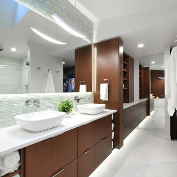
A personal retreat where the homeowners could escape and relax was desired. Large scale porcelain heated tile, sapele wood for a natural element and layering of lighting were critical to make each area relaxing and spa like. A wood wall and textured tile feature creates a custom backdrop for the soaking freestanding bath. Backlit led vanity mirrors highlight the soft green mosaic tile and the pretty vessel sinks and wall mounted faucets. A multi function shower adds to the options for a spa like experience with a seat to relax as needed. A towel warmer is a luxury feature for after a soothing shower or bath. The master closet connects so the homeowners have easy access to the dressing area, and custom cabinets continue into this space for a cohesive overall feel.


 Adaptiv DC
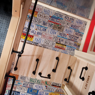
THEME The main theme for this room is an active, physical and personalized experience for a growing boy. This was achieved with the use of bold colors, creative inclusion of personal favorites and the use of industrial materials. FOCUS The main focus of the room is the 12 foot long x 4 foot high elevated bed. The bed is the focal point of the room and leaves ample space for activity within the room beneath. A secondary focus of the room is the desk, positioned in a private corner of the room outfitted with custom lighting and suspended desktop designed to support growing technical needs and school assignments. STORAGE A large floor armoire was built at the far die of the room between the bed and wall.. The armoire was built with 8 separate storage units that are approximately 12”x24” by 8” deep. These enclosed storage spaces are convenient for anything a growing boy may need to put away and convenient enough to make cleaning up easy for him. The floor is built to support the chair and desk built into the far corner of the room. GROWTH The room was designed for active ages 8 to 18. There are three ways to enter the bed, climb the knotted rope, custom rock wall, or pipe monkey bars up the wall and along the ceiling. The ladder was included only for parents. While these are the intended ways to enter the bed, they are also a convenient safety system to prevent younger siblings from getting into his private things. SAFETY This room was designed for an older child but safety is still a critical element and every detail in the room was reviewed for safety. The raised bed includes extra long and higher side boards ensuring that any rolling in bed is kept safe. The decking was sanded and edges cleaned to prevent any potential splintering. Power outlets are covered using exterior industrial outlets for the switches and plugs, which also looks really cool.
 Adaptiv DC
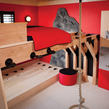
THEME The main theme for this room is an active, physical and personalized experience for a growing boy. This was achieved with the use of bold colors, creative inclusion of personal favorites and the use of industrial materials. FOCUS The main focus of the room is the 12 foot long x 4 foot high elevated bed. The bed is the focal point of the room and leaves ample space for activity within the room beneath. A secondary focus of the room is the desk, positioned in a private corner of the room outfitted with custom lighting and suspended desktop designed to support growing technical needs and school assignments. STORAGE A large floor armoire was built at the far die of the room between the bed and wall.. The armoire was built with 8 separate storage units that are approximately 12”x24” by 8” deep. These enclosed storage spaces are convenient for anything a growing boy may need to put away and convenient enough to make cleaning up easy for him. The floor is built to support the chair and desk built into the far corner of the room. GROWTH The room was designed for active ages 8 to 18. There are three ways to enter the bed, climb the knotted rope, custom rock wall, or pipe monkey bars up the wall and along the ceiling. The ladder was included only for parents. While these are the intended ways to enter the bed, they are also a convenient safety system to prevent younger siblings from getting into his private things. SAFETY This room was designed for an older child but safety is still a critical element and every detail in the room was reviewed for safety. The raised bed includes extra long and higher side boards ensuring that any rolling in bed is kept safe. The decking was sanded and edges cleaned to prevent any potential splintering. Power outlets are covered using exterior industrial outlets for the switches and plugs, which also looks really cool.
 Nautilus Architects
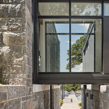
This waterfront home was conceived by the architects as a series of identically scaled, simply articulated gable-roofed elements linked by flat-roofed connectors. From the entrance driveway, the house appears almost as a village of individual granite residences. These two elements – gables and flat roofs – complement each other, establishing a dynamic of light and dark, smooth and rough, grounded and floating.
It was critical to the ultimate success of this building that it be well suited and connected to tits content so that it seems like it could not be anywhere else. The home was positioned to capture this view and, in a way, imbue it with power. We responded to this directive by incorporating large expanses of windows that allow one to literally look through the house from the front yard to the sailboats bobbing on the water at the rear.
A short bridge passes over an exterior passage connecting front and rear.
 ONE Design
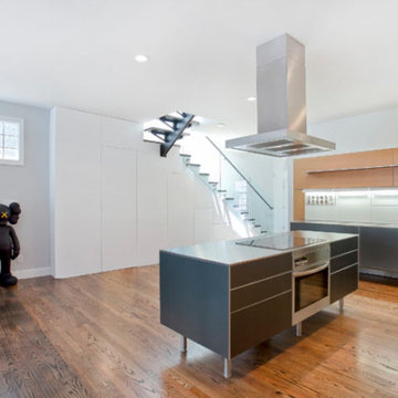
This project was an exercise in minimalism — how it can be embraced and incorporated at multiple levels. Typical of San Franciscan Victorians, the dark interior of this home was segregated and circulation spaces were narrow and dark. The stairs to the upper level was an afterthought and tucked away.
By removing the walls and rebuilding the stairs, we shifted the focus of this home’s interior and made the stairs the focal point. This project pays homage to the stairs, a critical element in the function and tone the home sets. As a transitional element, it carries the user from level to level, function to function, and mindset to mindset. The goal of this remodel was to invite the user upstairs and offer a more integrated transition to the upper level while at the same time using it to create a shaft of light into the inner recesses of the living space below.
As one ascends the stairs, the floor gradually disappears revealing a naked structural spine as the stairs reaches the upper level. The dormer addition offered ample headspace and invites columns of light to penetrate below. The cantilevered floor and shadow play this offers, dynamically marks its imprint on both levels.
Ancillary and storage spaces tucked away neatly and delicately – reminding us that expression should not be at the expense of function. Delicate and clean food preparation areas — now integrated with the rest of the home — invite us to celebrate this expression of unity.
 Kathy Kuo Designs Inc
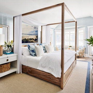
It’s lucky to have such a great space to work with when creating our coastal vision for the master bedroom. We centered this design around one of our favorite coastal style beds of all time, the solid oak Thomas Bina Otis Poster Bed. To soften the space, we wrapped the room in a textural wallpaper. Once again, we injected color and pattern into the design through the soft materials, like the bedding and the sophisticated koi fish print from Schumacher on our Ella rattan chair from Palecek. The master bedroom was our client’s whimsical getaway and the process from the floor planning and design schematics, to 3D renderings and then the final photography, it was just beautiful.
 Nautilus Architects
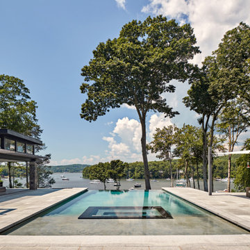
This waterfront home was conceived by the architects as a series of identically scaled, simply articulated gable-roofed elements linked by flat-roofed connectors. From the entrance driveway, the house appears almost as a village of individual granite residences. These two elements – gables and flat roofs – complement each other, establishing a dynamic of light and dark, smooth and rough, grounded and floating.
It was critical to the ultimate success of this building that it be well suited and connected to tits content so that it seems like it could not be anywhere else. The home was positioned to capture this view and, in a way, imbue it with power. We responded to this directive by incorporating large expanses of windows that allow one to literally look through the house from the front yard to the sailboats bobbing on the water at the rear.

 Nautilus Architects
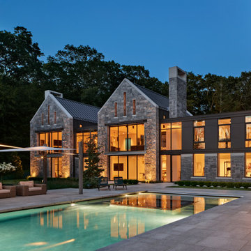
This waterfront home was conceived by the architects as a series of identically scaled, simply articulated gable-roofed elements linked by flat-roofed connectors. From the entrance driveway, the house appears almost as a village of individual granite residences. These two elements – gables and flat roofs – complement each other, establishing a dynamic of light and dark, smooth and rough, grounded and floating.
It was critical to the ultimate success of this building that it be well suited and connected to tits content so that it seems like it could not be anywhere else. The home was positioned to capture this view and, in a way, imbue it with power. We responded to this directive by incorporating large expanses of windows that allow one to literally look through the house from the front yard to the sailboats bobbing on the water at the rear. House and pool make a glowing pair at night.
 ONE Design
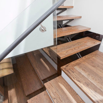
This project was an exercise in minimalism — how it can be embraced and incorporated at multiple levels. Typical of San Franciscan Victorians, the dark interior of this home was segregated and circulation spaces were narrow and dark. The stairs to the upper level was an afterthought and tucked away.
By removing the walls and rebuilding the stairs, we shifted the focus of this home’s interior and made the stairs the focal point. This project pays homage to the stairs, a critical element in the function and tone the home sets. As a transitional element, it carries the user from level to level, function to function, and mindset to mindset. The goal of this remodel was to invite the user upstairs and offer a more integrated transition to the upper level while at the same time using it to create a shaft of light into the inner recesses of the living space below.
As one ascends the stairs, the floor gradually disappears revealing a naked structural spine as the stairs reaches the upper level. The dormer addition offered ample headspace and invites columns of light to penetrate below. The cantilevered floor and shadow play this offers, dynamically marks its imprint on both levels.
Ancillary and storage spaces tucked away neatly and delicately – reminding us that expression should not be at the expense of function. Delicate and clean food preparation areas — now integrated with the rest of the home — invite us to celebrate this expression of unity.
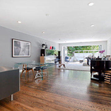 ONE Design
This project was an exercise in minimalism — how it can be embraced and incorporated at multiple levels. Typical of San Franciscan Victorians, the dark interior of this home was segregated and circulation spaces were narrow and dark. The stairs to the upper level was an afterthought and tucked away.
By removing the walls and rebuilding the stairs, we shifted the focus of this home’s interior and made the stairs the focal point. This project pays homage to the stairs, a critical element in the function and tone the home sets. As a transitional element, it carries the user from level to level, function to function, and mindset to mindset. The goal of this remodel was to invite the user upstairs and offer a more integrated transition to the upper level while at the same time using it to create a shaft of light into the inner recesses of the living space below.
As one ascends the stairs, the floor gradually disappears revealing a naked structural spine as the stairs reaches the upper level. The dormer addition offered ample headspace and invites columns of light to penetrate below. The cantilevered floor and shadow play this offers, dynamically marks its imprint on both levels.
Ancillary and storage spaces tucked away neatly and delicately – reminding us that expression should not be at the expense of function. Delicate and clean food preparation areas — now integrated with the rest of the home — invite us to celebrate this expression of unity.
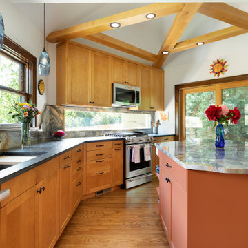
 Otogawa-Anschel Design-Build
What had been a dark, cramped, cluttered kitchen with an awkward adjacent space was transformed into this spacious, abundant, functional, light filled kitchen. Windows were added across much of the exterior wall. The window behind the range was added to bring light across the workspace without losing critical storage above. The jamb and sill are all wrapped in stone making this resilient and easy to clean.
The Island has a unique shape, allowing for both work prep space with traditional edges along two lines mirroring the work side of the kitchen. The opposite side is a free flowing organic shape that makes it easy to lean in to the counter top and engage in conversation.
One of the challenges presented by the space was the shape of a partially vaulted ceiling (from a previous remodel). We considered closing it off but felt losing the volume would be a shame. Instead we came up with an asymmetrical box beam that could serve as the task lighting for the room. Lights placed on the top side of the beam illuminate the elevated volume, creating the illusion of a sun filled space.
Finally, we brought organization and touch of color to the rear-entry / mudroom with some beautiful blue tile and a floating bench that serves double duty as storage for gloves and hats, and leaves space below for shoes.

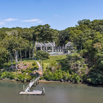 Nautilus Architects
This waterfront home was conceived by the architects as a series of identically scaled, simply articulated gable-roofed elements linked by flat-roofed connectors. From the entrance driveway, the house appears almost as a village of individual granite residences. These two elements – gables and flat roofs – complement each other, establishing a dynamic of light and dark, smooth and rough, grounded and floating.
It was critical to the ultimate success of this building that it be well suited and connected to tits content so that it seems like it could not be anywhere else. The home was positioned to capture this view and, in a way, imbue it with power. We responded to this directive by incorporating large expanses of windows that allow one to literally look through the house from the front yard to the sailboats bobbing on the water at the rear.
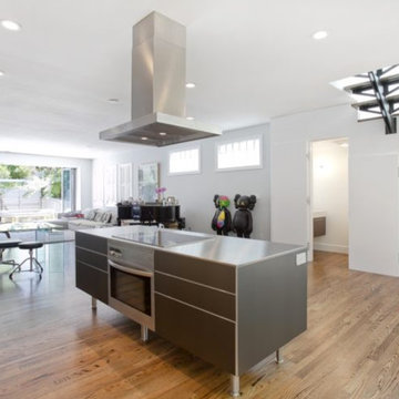 ONE Design
This project was an exercise in minimalism — how it can be embraced and incorporated at multiple levels. Typical of San Franciscan Victorians, the dark interior of this home was segregated and circulation spaces were narrow and dark. The stairs to the upper level was an afterthought and tucked away.
By removing the walls and rebuilding the stairs, we shifted the focus of this home’s interior and made the stairs the focal point. This project pays homage to the stairs, a critical element in the function and tone the home sets. As a transitional element, it carries the user from level to level, function to function, and mindset to mindset. The goal of this remodel was to invite the user upstairs and offer a more integrated transition to the upper level while at the same time using it to create a shaft of light into the inner recesses of the living space below.
As one ascends the stairs, the floor gradually disappears revealing a naked structural spine as the stairs reaches the upper level. The dormer addition offered ample headspace and invites columns of light to penetrate below. The cantilevered floor and shadow play this offers, dynamically marks its imprint on both levels.
Ancillary and storage spaces tucked away neatly and delicately – reminding us that expression should not be at the expense of function. Delicate and clean food preparation areas — now integrated with the rest of the home — invite us to celebrate this expression of unity.
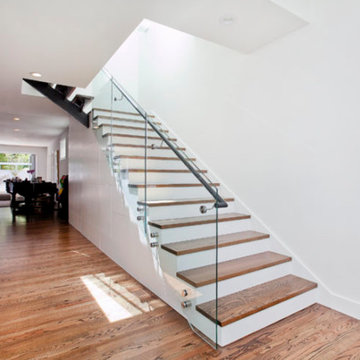 ONE Design
This project was an exercise in minimalism — how it can be embraced and incorporated at multiple levels. Typical of San Franciscan Victorians, the dark interior of this home was segregated and circulation spaces were narrow and dark. The stairs to the upper level was an afterthought and tucked away.
By removing the walls and rebuilding the stairs, we shifted the focus of this home’s interior and made the stairs the focal point. This project pays homage to the stairs, a critical element in the function and tone the home sets. As a transitional element, it carries the user from level to level, function to function, and mindset to mindset. The goal of this remodel was to invite the user upstairs and offer a more integrated transition to the upper level while at the same time using it to create a shaft of light into the inner recesses of the living space below.
As one ascends the stairs, the floor gradually disappears revealing a naked structural spine as the stairs reaches the upper level. The dormer addition offered ample headspace and invites columns of light to penetrate below. The cantilevered floor and shadow play this offers, dynamically marks its imprint on both levels.
Ancillary and storage spaces tucked away neatly and delicately – reminding us that expression should not be at the expense of function. Delicate and clean food preparation areas — now integrated with the rest of the home — invite us to celebrate this expression of unity.
13