
Search results for "Close properly" in Home Design Ideas
 TKS Design Group
Download our free ebook, Creating the Ideal Kitchen. DOWNLOAD NOW
Lakefront property in the northwest suburbs of Chicago is hard to come by, so when we were hired by this young family with exactly that, we were immediately inspired by not just the unusually large footprint of this 1950’s colonial revival but also the lovely views of the manmade lake it was sited on. The large 5-bedroom home was solidly stuck in the 1980’s, but we saw tons of potential. We started out by updating the existing staircase with a fresh coat of paint and adding new herringbone slate to the entry hall.
The powder room off the entryway also got a refresh - new flooring, new cabinets and fixtures. We ran the new slate right through into this space for some consistency. A fun wallpaper and shiplap trim add a welcoming feel and set the tone for the home.
Next, we tackled the kitchen. Located away from the rest of the first floor, the kitchen felt a little isolated, so we immediately began planning for how to better connect it to the rest of the first floor. We landed on removing the wall between the kitchen and dining room and designed a modified galley style space with separate cooking and clean up zones. The cooking zone consists of the refrigerator, prep sink and cooktop, along with a nice long run of prep space at the island. The cleanup side of the kitchen consists of the main sink and dishwasher. Both areas are situated so that the user can view the lake during prep work and cleanup!
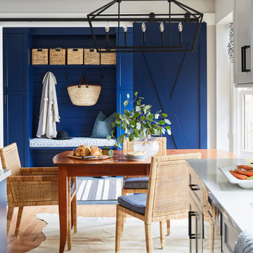
One of the home’s main puzzles was how to incorporate the mudroom and area in front of the patio doors at the back of the house. We already had a breakfast table area, so the space by the patio doors was a bit of a no man’s land. We decided to separate the kitchen proper from what became the new mudroom with a large set of barn doors. That way you can quickly hide any mudroom messes but have easy access to the light coming in through the patio doors as well as the outdoor grilling station. We also love the impact the barn doors add to the overall space.
The homeowners’ first words to us were “it’s time to ditch the brown,” so we did! We chose a lovely blue pallet that reflects the home’s location on the lake which is also vibrant yet easy on the eye. Countertops are white quartz, and the natural oak floor works well with the other honey accents. The breakfast table was given a refresh with new chairs, chandelier and window treatments that frame the gorgeous views of the lake out the back.
We coordinated the slate mudroom flooring with that used in the home’s main entrance for a consistent feel. The storage area consists of open and closed storage to allow for some clutter control as needed.
Next on our “to do” list was revamping the dated brown bar area in the neighboring dining room. We eliminated the clutter by adding some closed cabinets and did some easy updates to help the space feel more current. One snag we ran into here was the discovery of a beam above the existing open shelving that had to be modified with a smaller structural beam to allow for our new design to work. This was an unexpected surprise, but in the end we think it was well worth it!
We kept the colors here a bit more muted to blend with the homeowner’s existing furnishings. Open shelving and polished nickel hardware add some simple detail to the new entertainment zone which also looks out onto the lake!
Next we tackled the upstairs starting with the homeowner’s son’s bath. The bath originally had both a tub shower and a separate shower, so we decided to swap out the shower for a new laundry area. This freed up some space downstairs in what used to be the mudroom/laundry room and is much more convenient for daily laundry needs.
We continued the blue palette here with navy cabinetry and the navy tile in the shower. Porcelain floor tile and chrome fixtures keep maintenance to a minimum while matte black mirrors and lighting add some depth the design. A low maintenance runner adds some warmth underfoot and ties the whole space together.
We added a pocket door to the bathroom to minimize interference with the door swings. The left door of the laundry closet is on a 180 degree hinge to allow for easy full access to the machines. Next we tackled the master bath which is an en suite arrangement. The original was typical of the 1980’s with the vanity outside of the bathroom, situated near the master closet. And the brown theme continued here with multiple shades of brown.
Our first move was to segment off the bath and the closet from the master bedroom. We created a short hall from the bedroom to the bathroom with his and hers walk-in closets on the left and right as well as a separate toilet closet outside of the main bathroom for privacy and flexibility.
The original bathroom had a giant soaking tub with steps (dangerous!) as well as a small shower that did not work well for our homeowner who is 6’3”. With other bathtubs in the home, they decided to eliminate the tub and create an oversized shower which takes up the space where the old tub was located. The double vanity is on the opposite wall and a bench is located under the window for morning conversations and a place to set a couple of towels.
The pallet in here is light and airy with a mix of blond wood, creamy porcelain and marble tile, and brass accents. A simple roman shade adds some texture and it’s top-down mechanism allows for light and privacy.
This large whole house remodel gave our homeowners not only the ability to maximize the potential of their home but also created a lovely new frame from which to view their fabulous lake views.
Designed by: Susan Klimala, CKD, CBD
Photography by: Michael Kaskel
For more information on kitchen and bath design ideas go to: www.kitchenstudio-ge.com
 Westover Landscape Design
Not everyone would see the hidden beauty in the Yonkers property destined for the wrecking ball in 2000. But one family took the serious fixer-upper under their wing. Crumbling walls, overgrown maples (indeed, saplings were busting through the brick walls), and deer living in the basement was the state of affairs when Westover Landscape Design initially arrived on the scene. A year of intensive, meticulous, thoughtful renovation by the homeowner followed while the house was brought up to speed. When the last construction machine finally rumbled out, that’s when Robert Welsch and his crew began their odyssey.
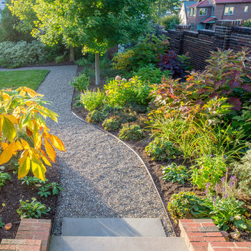
The goal was to honor the newly restored relic and deliver it into the future with fitting surroundings. “We wanted to bring that treasure back to life,” Robert Welsch explains. Working closely with the homeowner as well as the city of Yonkers to guide the restoration, their first feat was to install a proper drainage system with catchments capable of keeping storm water from the massive roof flowing away. Before anything was visible on the surface, extensive work was accomplished underground. Meanwhile, a plan was drafted to honor the era of the house. Westover chose bluestone as the primary path material for its easy maintenance and simplicity when laying the swank configuration of pathways around the house and outward to an entertaining pavilion. By cleverly hemming the bluestone with period brick that echoes the building material for the house for continuity, the result is a smart and sophisticated finish to a promenade that constantly draws the family and their pets outdoors. Brick was also used to rebuild the walled gardens for the much-needed privacy in a close-knit Yonkers community. And a graceful wrought iron gate enhances the arrival experience. But walls and gates were not the only element to screen and reveal views—plant selection was critical.
Few landscapers would go the extra mile to find period perfect plants for a 19th Century restoration, but Robert Welsch saw the importance of authenticity in creating the mood. He repeated large trees—such as an exquisite London plane tree in the front yard—to balance the expression in the back. Recognizing the need for immediate stature, he selected a weeping willow to gain instant volume, giving the landscape a sense of deep roots. A weeping Camperdown elm adds sophisticated drama to the walled stroll gardens. Hydrangeas were incorporated for their billowy stature, easy maintenance, and long blooming season. Similarly, all the plants in residence play their part in the display that goes beyond the usual spring fling to extend throughout the growing season—offering visual interest even when they are not performing. From spring bulbs to autumn perennials, there is never a dull moment. Meanwhile, every step along the way was a collaboration working hand-in-hand with the homeowner and the city to make certain that the historic landmark status of the property was upheld and honored.
The result goes beyond a landscape that is just old faithful. It adds life to the picture, creating a jewel-like setting for the newly proud house. In a word, it is sublime. By planting wisely and using sustainable elements, the restored house and its surroundings are ready for the next generation and beyond. This Yonkers gem remains meticulously groomed under the watchful eye and skill of Westover Landscape Design’s team of gardeners—It’s a keeper.
 TKS Design Group
Download our free ebook, Creating the Ideal Kitchen. DOWNLOAD NOW
Lakefront property in the northwest suburbs of Chicago is hard to come by, so when we were hired by this young family with exactly that, we were immediately inspired by not just the unusually large footprint of this 1950’s colonial revival but also the lovely views of the manmade lake it was sited on. The large 5-bedroom home was solidly stuck in the 1980’s, but we saw tons of potential. We started out by updating the existing staircase with a fresh coat of paint and adding new herringbone slate to the entry hall.
The powder room off the entryway also got a refresh - new flooring, new cabinets and fixtures. We ran the new slate right through into this space for some consistency. A fun wallpaper and shiplap trim add a welcoming feel and set the tone for the home.
Next, we tackled the kitchen. Located away from the rest of the first floor, the kitchen felt a little isolated, so we immediately began planning for how to better connect it to the rest of the first floor. We landed on removing the wall between the kitchen and dining room and designed a modified galley style space with separate cooking and clean up zones. The cooking zone consists of the refrigerator, prep sink and cooktop, along with a nice long run of prep space at the island. The cleanup side of the kitchen consists of the main sink and dishwasher. Both areas are situated so that the user can view the lake during prep work and cleanup!
One of the home’s main puzzles was how to incorporate the mudroom and area in front of the patio doors at the back of the house. We already had a breakfast table area, so the space by the patio doors was a bit of a no man’s land. We decided to separate the kitchen proper from what became the new mudroom with a large set of barn doors. That way you can quickly hide any mudroom messes but have easy access to the light coming in through the patio doors as well as the outdoor grilling station. We also love the impact the barn doors add to the overall space.
The homeowners’ first words to us were “it’s time to ditch the brown,” so we did! We chose a lovely blue pallet that reflects the home’s location on the lake which is also vibrant yet easy on the eye. Countertops are white quartz, and the natural oak floor works well with the other honey accents. The breakfast table was given a refresh with new chairs, chandelier and window treatments that frame the gorgeous views of the lake out the back.
We coordinated the slate mudroom flooring with that used in the home’s main entrance for a consistent feel. The storage area consists of open and closed storage to allow for some clutter control as needed.
Next on our “to do” list was revamping the dated brown bar area in the neighboring dining room. We eliminated the clutter by adding some closed cabinets and did some easy updates to help the space feel more current. One snag we ran into here was the discovery of a beam above the existing open shelving that had to be modified with a smaller structural beam to allow for our new design to work. This was an unexpected surprise, but in the end we think it was well worth it!
We kept the colors here a bit more muted to blend with the homeowner’s existing furnishings. Open shelving and polished nickel hardware add some simple detail to the new entertainment zone which also looks out onto the lake!
Next we tackled the upstairs starting with the homeowner’s son’s bath. The bath originally had both a tub shower and a separate shower, so we decided to swap out the shower for a new laundry area. This freed up some space downstairs in what used to be the mudroom/laundry room and is much more convenient for daily laundry needs.
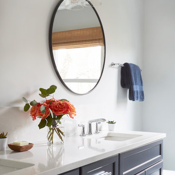
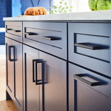
We continued the blue palette here with navy cabinetry and the navy tile in the shower. Porcelain floor tile and chrome fixtures keep maintenance to a minimum while matte black mirrors and lighting add some depth the design. A low maintenance runner adds some warmth underfoot and ties the whole space together.
We added a pocket door to the bathroom to minimize interference with the door swings. The left door of the laundry closet is on a 180 degree hinge to allow for easy full access to the machines. Next we tackled the master bath which is an en suite arrangement. The original was typical of the 1980’s with the vanity outside of the bathroom, situated near the master closet. And the brown theme continued here with multiple shades of brown.
Our first move was to segment off the bath and the closet from the master bedroom. We created a short hall from the bedroom to the bathroom with his and hers walk-in closets on the left and right as well as a separate toilet closet outside of the main bathroom for privacy and flexibility.
The original bathroom had a giant soaking tub with steps (dangerous!) as well as a small shower that did not work well for our homeowner who is 6’3”. With other bathtubs in the home, they decided to eliminate the tub and create an oversized shower which takes up the space where the old tub was located. The double vanity is on the opposite wall and a bench is located under the window for morning conversations and a place to set a couple of towels.
The pallet in here is light and airy with a mix of blond wood, creamy porcelain and marble tile, and brass accents. A simple roman shade adds some texture and it’s top-down mechanism allows for light and privacy.
This large whole house remodel gave our homeowners not only the ability to maximize the potential of their home but also created a lovely new frame from which to view their fabulous lake views.
Designed by: Susan Klimala, CKD, CBD
Photography by: Michael Kaskel
For more information on kitchen and bath design ideas go to: www.kitchenstudio-ge.com
Find the right local pro for your project
 Nar Design Group
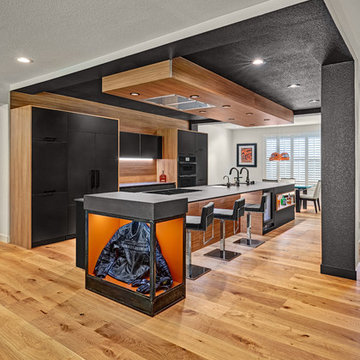
Part of an extensive home remodel, this kitchen design was born of one man’s love of all things Harley Davidson. Color inspiration came from the client’s own cherished bike which was a stunning combination of matte black and brushed steel. The client’s wish was to have a large open area in which he could “be one with his guests” when hosting large gatherings.
Cabinets, hardware and appliances all in black allow the focus to be on the beauty of the larger architectural elements as a whole. Included along the main storage wall is a hidden 42” refrigerator, dual pull-out pantries, and extra wide drawers below a pair of upper cabinets with matte black glass fold-up doors that open & close automatically via servo-drive technology.
The new island - which measures just shy of 16 ½ feet! - is a true central point around which all action revolves. Wide walkways on either side provide ease of flow for multiple sous chefs and guests alike. A textured cypress soffit above the island was designed to house the modern hood and also create a feeling of unity as it is the same size as the island below. Textured cypress wood also wraps matte black cabinetry and lines the main wall, changing grain direction to provide visual interest.
The 5’ Galley Workstation is a multi-functional marvel, easily transitioning from prep station to serving surface to clean-up with the addition of its built-in accessories. Placing an undercounter wine refrigerator on the back side of the island makes it easy for guests at the bar to help themselves. Close to the bar seating area, a 42” flat screen tv fits perfectly flush in the wall, practically disappearing when not in use.
Unique details include a large display cabinet with a metal framed front & side crafted out of steel by a local artisan. The glass is 2-way mirror so when the interior light is off, the treasure is concealed inside. The interior is painted in the trademark Harley orange.
Above a modern dining table, a one-of-a-kind chandelier was created from 3 bike helmets, painted in Harley orange by a local automobile detail shop. The interiors are finished in metallic silver for extra glow.
Adjacent to the Kitchen, and initially deceiving in its simplicity, the main tv wall was quite complex and challenging to realize. It has a convex curve from left to right and slopes back from floor to ceiling. The interior hollow space created room for a shallow tv niche on top and partially recessed deep media storage cabinets below. The planning and framing involved to create the proper compound miter connections required extra diligence from the designers and builder, but the finished product was worth the effort!
Photo credit: Fred Donham of Photographerlink
 BuildSense
Lissa Gotwals Photography
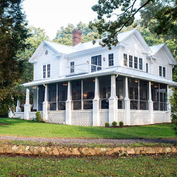
Example of a large classic white two-story wood exterior home design in Raleigh with a metal roof
Example of a large classic white two-story wood exterior home design in Raleigh with a metal roof
 TKS Design Group
Download our free ebook, Creating the Ideal Kitchen. DOWNLOAD NOW
Lakefront property in the northwest suburbs of Chicago is hard to come by, so when we were hired by this young family with exactly that, we were immediately inspired by not just the unusually large footprint of this 1950’s colonial revival but also the lovely views of the manmade lake it was sited on. The large 5-bedroom home was solidly stuck in the 1980’s, but we saw tons of potential. We started out by updating the existing staircase with a fresh coat of paint and adding new herringbone slate to the entry hall.
The powder room off the entryway also got a refresh - new flooring, new cabinets and fixtures. We ran the new slate right through into this space for some consistency. A fun wallpaper and shiplap trim add a welcoming feel and set the tone for the home.
Next, we tackled the kitchen. Located away from the rest of the first floor, the kitchen felt a little isolated, so we immediately began planning for how to better connect it to the rest of the first floor. We landed on removing the wall between the kitchen and dining room and designed a modified galley style space with separate cooking and clean up zones. The cooking zone consists of the refrigerator, prep sink and cooktop, along with a nice long run of prep space at the island. The cleanup side of the kitchen consists of the main sink and dishwasher. Both areas are situated so that the user can view the lake during prep work and cleanup!
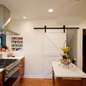
One of the home’s main puzzles was how to incorporate the mudroom and area in front of the patio doors at the back of the house. We already had a breakfast table area, so the space by the patio doors was a bit of a no man’s land. We decided to separate the kitchen proper from what became the new mudroom with a large set of barn doors. That way you can quickly hide any mudroom messes but have easy access to the light coming in through the patio doors as well as the outdoor grilling station. We also love the impact the barn doors add to the overall space.
The homeowners’ first words to us were “it’s time to ditch the brown,” so we did! We chose a lovely blue pallet that reflects the home’s location on the lake which is also vibrant yet easy on the eye. Countertops are white quartz, and the natural oak floor works well with the other honey accents. The breakfast table was given a refresh with new chairs, chandelier and window treatments that frame the gorgeous views of the lake out the back.
We coordinated the slate mudroom flooring with that used in the home’s main entrance for a consistent feel. The storage area consists of open and closed storage to allow for some clutter control as needed.
Next on our “to do” list was revamping the dated brown bar area in the neighboring dining room. We eliminated the clutter by adding some closed cabinets and did some easy updates to help the space feel more current. One snag we ran into here was the discovery of a beam above the existing open shelving that had to be modified with a smaller structural beam to allow for our new design to work. This was an unexpected surprise, but in the end we think it was well worth it!
We kept the colors here a bit more muted to blend with the homeowner’s existing furnishings. Open shelving and polished nickel hardware add some simple detail to the new entertainment zone which also looks out onto the lake!
Next we tackled the upstairs starting with the homeowner’s son’s bath. The bath originally had both a tub shower and a separate shower, so we decided to swap out the shower for a new laundry area. This freed up some space downstairs in what used to be the mudroom/laundry room and is much more convenient for daily laundry needs.
We continued the blue palette here with navy cabinetry and the navy tile in the shower. Porcelain floor tile and chrome fixtures keep maintenance to a minimum while matte black mirrors and lighting add some depth the design. A low maintenance runner adds some warmth underfoot and ties the whole space together.
We added a pocket door to the bathroom to minimize interference with the door swings. The left door of the laundry closet is on a 180 degree hinge to allow for easy full access to the machines. Next we tackled the master bath which is an en suite arrangement. The original was typical of the 1980’s with the vanity outside of the bathroom, situated near the master closet. And the brown theme continued here with multiple shades of brown.
Our first move was to segment off the bath and the closet from the master bedroom. We created a short hall from the bedroom to the bathroom with his and hers walk-in closets on the left and right as well as a separate toilet closet outside of the main bathroom for privacy and flexibility.
The original bathroom had a giant soaking tub with steps (dangerous!) as well as a small shower that did not work well for our homeowner who is 6’3”. With other bathtubs in the home, they decided to eliminate the tub and create an oversized shower which takes up the space where the old tub was located. The double vanity is on the opposite wall and a bench is located under the window for morning conversations and a place to set a couple of towels.
The pallet in here is light and airy with a mix of blond wood, creamy porcelain and marble tile, and brass accents. A simple roman shade adds some texture and it’s top-down mechanism allows for light and privacy.
This large whole house remodel gave our homeowners not only the ability to maximize the potential of their home but also created a lovely new frame from which to view their fabulous lake views.
Designed by: Susan Klimala, CKD, CBD
Photography by: Michael Kaskel
For more information on kitchen and bath design ideas go to: www.kitchenstudio-ge.com
 Charles Hilton Architects
Alice Washburn Award 2013 - Winner - Accessory Building
Charles Hilton Architects
Photography: Woodruff Brown
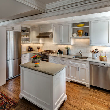
Inspiration for a small country u-shaped medium tone wood floor kitchen remodel in New York with an undermount sink, recessed-panel cabinets, white cabinets, white backsplash, subway tile backsplash, stainless steel appliances and an island
Inspiration for a small country u-shaped medium tone wood floor kitchen remodel in New York with an undermount sink, recessed-panel cabinets, white cabinets, white backsplash, subway tile backsplash, stainless steel appliances and an island
Sponsored
Plain City, OH

Kuhns Contracting, Inc.
Central Ohio's Trusted Home Remodeler Specializing in Kitchens & Baths
 Diskin Designs
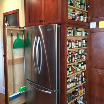
Encasing full depth fridge in paneling gives built-in appearance with greater storage. Hidden spice cabinets as side panel of refrigerator. Pull out broom storage.
 The Aldrich Group, LLC
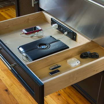
Convenient drawer for recharging electronics
Jeff Herr Photography
Home design - large cottage home design idea in Atlanta
Home design - large cottage home design idea in Atlanta
 ZeroEnergy Design
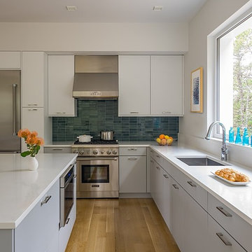
This modern green home offers both a vacation destination on Cape Cod near local family members and an opportunity for rental income.
FAMILY ROOTS. A West Coast couple living in the San Francisco Bay Area sought a permanent East Coast vacation home near family members living on Cape Cod. As academic professionals focused on sustainability, they sought a green, energy efficient home that was well-aligned with their values. With no green homes available for sale on Cape Cod, they decided to purchase land near their family and build their own.
SLOPED SITE. Comprised of a 3/4 acre lot nestled in the pines, the steeply sloping terrain called for a plan that embraced and took advantage of the slope. Of equal priority was optimizing solar exposure, preserving privacy from abutters, and creating outdoor living space. The design accomplished these goals with a simple, rectilinear form, offering living space on the both entry and lower/basement levels. The stepped foundation allows for a walk-out basement level with light-filled living space on the down-hill side of the home. The traditional basement on the eastern, up-hill side houses mechanical equipment and a home gym. The house welcomes natural light throughout, captures views of the forest, and delivers entertainment space that connects indoor living space to outdoor deck and dining patio.
MODERN VISION. The clean building form and uncomplicated finishes pay homage to the modern architectural legacy on the outer Cape. Durable and economical fiber cement panels, fixed with aluminum channels, clad the primary form. Cedar clapboards provide a visual accent at the south-facing living room, which extends a single roof plane to cover the entry porch.
SMART USE OF SPACE. On the entry level, the “L”-shaped living, dining, and kitchen space connects to the exterior living, dining, and grilling spaces to effectively double the home’s summertime entertainment area. Placed at the western end of the entry level (where it can retain privacy but still claim expansive downhill views) is the master suite with a built-in study. The lower level has two guest bedrooms, a second full bathroom, and laundry. The flexibility of the space—crucial in a house with a modest footprint—emerges in one of the guest bedrooms, which doubles as home office by opening the barn-style double doors to connect it to the bright, airy open stair leading up to the entry level. Thoughtful design, generous ceiling heights and large windows transform the modest 1,100 sf* footprint into a well-lit, spacious home. *(total finished space is 1800 sf)
RENTAL INCOME. The property works for its owners by netting rental income when the owners are home in San Francisco. The house especially caters to vacationers bound for nearby Mayo Beach and includes an outdoor shower adjacent to the lower level entry door. In contrast to the bare bones cottages that are typically available on the Cape, this home offers prospective tenants a modern aesthetic, paired with luxurious and green features. Durable finishes inside and out will ensure longevity with the heavier use that comes with a rental property.
COMFORT YEAR-ROUND. The home is super-insulated and air-tight, with mechanical ventilation to provide continuous fresh air from the outside. High performance triple-paned windows complement the building enclosure and maximize passive solar gain while ensuring a warm, draft-free winter, even when sitting close to the glass. A properly sized air source heat pump offers efficient heating & cooling, and includes a carefully designed the duct distribution system to provide even comfort throughout the house. The super-insulated envelope allows us to significantly reduce the equipment capacity, duct size, and airflow quantities, while maintaining unparalleled thermal comfort.
ENERGY EFFICIENT. The building’s shell and mechanical systems play instrumental roles in the home’s exceptional performance. The building enclosure reduces the most significant energy glutton: heating. Continuous super-insulation, thorough air sealing, triple-pane windows, and passive solar gain work together to yield a miniscule heating load. All active energy consumers are extremely efficient: an air source heat pump for heating and cooling, a heat pump hot water heater, LED lighting, energy recovery ventilation (ERV), and high efficiency appliances. The result is a home that uses 70% less energy than a similar new home built to code requirements.
OVERALL. The home embodies the owners’ goals and values while comprehensively enabling thermal comfort, energy efficiency, a vacation respite, and supplementary income.
PROJECT TEAM
ZeroEnergy Design - Architect & Mechanical Designer
A.F. Hultin & Co. - Contractor
Pamet Valley Landscape Design - Landscape & Masonry
Lisa Finch - Original Artwork
European Architectural Supply - Windows
Eric Roth Photography - Photography
 Kayron Brewer, CMKBD / Studio K B
Drew Rice, Red Pants Studio
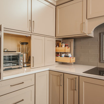
Example of a transitional l-shaped medium tone wood floor and brown floor open concept kitchen design in Seattle with an undermount sink, glass-front cabinets, beige cabinets, quartzite countertops, beige backsplash, subway tile backsplash, stainless steel appliances and an island
Example of a transitional l-shaped medium tone wood floor and brown floor open concept kitchen design in Seattle with an undermount sink, glass-front cabinets, beige cabinets, quartzite countertops, beige backsplash, subway tile backsplash, stainless steel appliances and an island

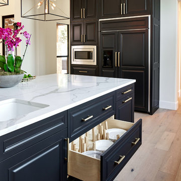
 Haven Design and Construction
Matthew Niemann Photography
Kitchen - transitional kitchen idea in Austin
Kitchen - transitional kitchen idea in Austin
Sponsored
Plain City, OH
Kuhns Contracting, Inc.
Central Ohio's Trusted Home Remodeler Specializing in Kitchens & Baths
 Nancy Finneson | DeMane Design
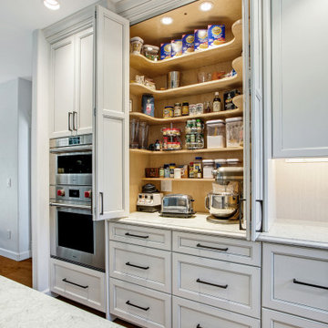
This kitchen has a new layout which resulted in more organized storage and work space. A flush mounted ceiling hood give it an open feel. A custom baking center keeps like items in their proper place and accessible. Off white glazed cabinets and ogee edged quartz countertops make an elegant statement. A raised live-edge bar and beverage cooler make entertaining a breeze.
 Steve
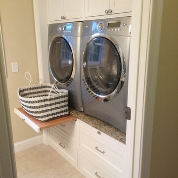
SteveLaundry Room with raised washer and dryer. The drawers eliminate the need to bend at the waist. The cabinets are made of maple and painted white with Benjamin Moore Satin Impervo. Feel free to ask any questions! Steve Obarowski

 MRF Construction, Inc.
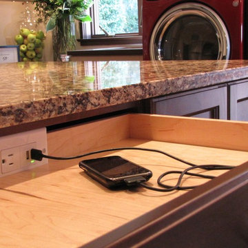
A central island has 4 stools to sit for homework, art or snacktime, and houses drawers for each of the kids to drop their keys, with a USB charger for phones and iPads.
Sponsored
Delaware, OH

Buckeye Basements, Inc.
Central Ohio's Basement Finishing ExpertsBest Of Houzz '13-'21
 Ke Design Collective Inc.
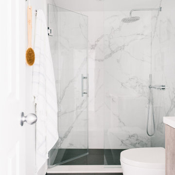
Alcove shower - small modern 3/4 multicolored tile and porcelain tile porcelain tile and gray floor alcove shower idea in Toronto with flat-panel cabinets, light wood cabinets, a one-piece toilet, white walls, an undermount sink, quartz countertops, a hinged shower door, white countertops and a built-in vanity

 PORTEUSA
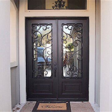
Wrought Iron Double Door - D'Vine by Porte, Color Dark Bronze, Clear Glass
Example of a small classic concrete floor entryway design in Austin with gray walls and a metal front door
Example of a small classic concrete floor entryway design in Austin with gray walls and a metal front door
11