
Search results for "Compensating" in Home Design Ideas
 ArchiCGI 3D Rendering
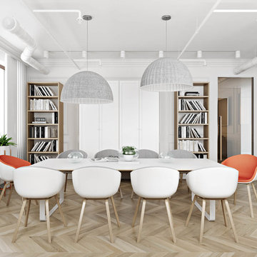
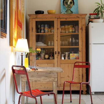
The deliberate roughness of the ceiling and raw-looking wood furniture is compensated with sophisticated shapes and colour accents of paintings, chairs and lamps. Pale gray with occasional red and pink splashes make the design project more refined and vivid.
 Jamaica Cottage Shop Inc
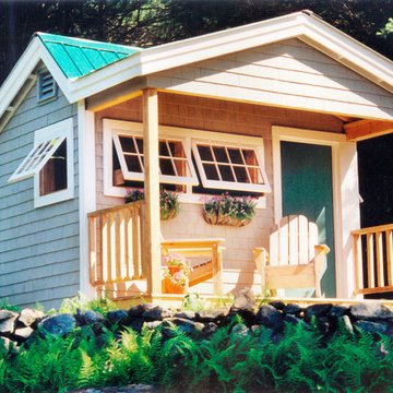
The building is essentially an 8×12 saltbox with an added four-foot porch. A dormer is attached to the front and extended out over the porch. Fabulous roofline. Four opening barn sash windows, a single 3’ door and a workbench give this cottage its uniqueness. The building in the picture has been finished off with special touches; including optional white cedar shingle siding and a set of stairs to compensate for the slope of the site.
 Metke Remodeling & Luxury Homes
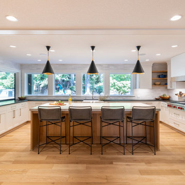
This spacious entertainer's kitchen is part of a whole house remodel and 2-story addition. Our clients' goal was to create a larger, more functional kitchen with a strong connection to the outdoors. The unique flip up window allows for a complete connection to the outdoor covered space.
No expense was spared in this design as the clients' desire for all natural materials drove the selections. The quartzite island in Opus White provides a textural and colorful element that grounds the space and complements the soapstone perimeter counters. The flip out window is a unique feature that bridges indoor and outdoor, and provides unique entertaining element. The focal point of the kitchen are the large windows looking into their greenspace, in order to preserve the view there were very few upper cabinets planned. To compensate with this direction, the lower cabinets were outfitted with top-of-the line interior accessories to provide the most functional and efficient storage. High-end, Wolf and Sub Zero appliance and the addition of a walk-in pantry completed the wish list!
Steel beams were the solution to creating the large open connection between existing structure and new kitchen addition. We had to incorporate a shallow steel beam spanning the whole width of the kitchen to not impede the existing 8' ceiling height, yet allow for the master bedroom addition directly above the new kitchen addition. In order to bridge interior and exterior spaces, a custom, flip-out window was selected. This sits on the finished counter slab, which extended into the adjacent covered entertaining patio. This allowed no room for error, all the components had to fit together exactly to insure the extended countertop would function as the sill.
The value provided our clients was in helping select high quality materials and install them with exceptional quality. Our team did an outstanding job of keeping our client on track and avoiding costly mistakes. This project was not delivered within the original budget due to several client driven change orders.
Find the right local pro for your project
 Bonnie McCarthy
Photo: Bonnie McCarthy © 2015 Houzz
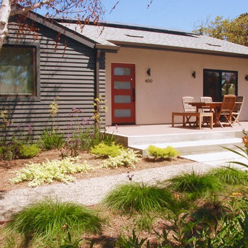
Inspiration for a contemporary exterior home remodel in Los Angeles
Inspiration for a contemporary exterior home remodel in Los Angeles
 Beroza Flooring
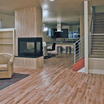
Modern basement is something especially convenient to have in order to compensate for lack of daylight that gets in there. Modern room style has minimalistic behavior to it when only major furniture and supplements are displayed making it look organized. At the same time asymmetry and sharp angles add playfulness typical for a room suitable to hang out with friends and spend your free time. In this case central element is corner fireplace that harmonically connect both room areas and can be enjoyed from both of them finishing the atmosphere created by rustic hardwood floors.
 Décor Aid
When a family living in Singapore decided to purchase a New York City pied-à-terre, they settled on the historic Langham Place, a 60-floor building along 5th Ave which features a mixture of permanent residencies and 5-star hotel suites. Immediately after purchasing the condo, they reached out to Decor Aid, and tasked us with designing a home that would reflect their jet-setting lifestyle and chic sensibility.
Book Your Free In-Home Consultation
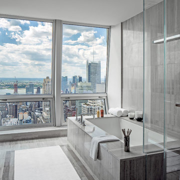
Connecting to the historic Tiffany Building at 404 5th Ave, the exterior of Langham Place is a combination of highly contemporary architecture and 1920’s art deco design. And with this highly unique architecture, came highly angular, outward leaning floor-to-ceiling windows, which would prove to be our biggest design challenge.
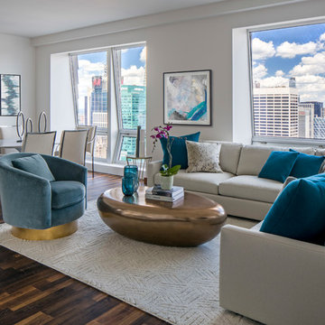
One of the apartment’s quirks was negotiating an uneven balance of natural light throughout the space. Parts of the apartment, such one of the kids’ bedrooms, feature floor-to-ceiling windows and an abundance of natural light, while other areas, such as one corner of the living room, receive little natural light.
By sourcing a combination of contemporary, low-profile furniture pieces and metallic accents, we were able to compensate for apartment’s pockets of darkness. A low-profile beige sectional from Room & Board was an obvious choice, which we complemented with a lucite console and a bronze Riverstone coffee table from Mitchell Gold+Bob Williams.
Circular tables were placed throughout the apartment in order to establish a design scheme that would be easy to walk through. A marble tulip table from Sit Down New York provides an opulent dining room space, without crowding the floor plan. The finishing touches include a sumptuous swivel chair from Safavieh, to create a sleek, welcoming vacation home for this international client.
 Décor Aid
When a family living in Singapore decided to purchase a New York City pied-à-terre, they settled on the historic Langham Place, a 60-floor building along 5th Ave which features a mixture of permanent residencies and 5-star hotel suites. Immediately after purchasing the condo, they reached out to Decor Aid, and tasked us with designing a home that would reflect their jet-setting lifestyle and chic sensibility.
Book Your Free In-Home Consultation
Connecting to the historic Tiffany Building at 404 5th Ave, the exterior of Langham Place is a combination of highly contemporary architecture and 1920’s art deco design. And with this highly unique architecture, came highly angular, outward leaning floor-to-ceiling windows, which would prove to be our biggest design challenge.
One of the apartment’s quirks was negotiating an uneven balance of natural light throughout the space. Parts of the apartment, such one of the kids’ bedrooms, feature floor-to-ceiling windows and an abundance of natural light, while other areas, such as one corner of the living room, receive little natural light.
By sourcing a combination of contemporary, low-profile furniture pieces and metallic accents, we were able to compensate for apartment’s pockets of darkness. A low-profile beige sectional from Room & Board was an obvious choice, which we complemented with a lucite console and a bronze Riverstone coffee table from Mitchell Gold+Bob Williams.
Circular tables were placed throughout the apartment in order to establish a design scheme that would be easy to walk through. A marble tulip table from Sit Down New York provides an opulent dining room space, without crowding the floor plan. The finishing touches include a sumptuous swivel chair from Safavieh, to create a sleek, welcoming vacation home for this international client.
 Décor Aid
When a family living in Singapore decided to purchase a New York City pied-à-terre, they settled on the historic Langham Place, a 60-floor building along 5th Ave which features a mixture of permanent residencies and 5-star hotel suites. Immediately after purchasing the condo, they reached out to Decor Aid, and tasked us with designing a home that would reflect their jet-setting lifestyle and chic sensibility.
Book Your Free In-Home Consultation
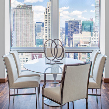
Connecting to the historic Tiffany Building at 404 5th Ave, the exterior of Langham Place is a combination of highly contemporary architecture and 1920’s art deco design. And with this highly unique architecture, came highly angular, outward leaning floor-to-ceiling windows, which would prove to be our biggest design challenge.
One of the apartment’s quirks was negotiating an uneven balance of natural light throughout the space. Parts of the apartment, such one of the kids’ bedrooms, feature floor-to-ceiling windows and an abundance of natural light, while other areas, such as one corner of the living room, receive little natural light.
By sourcing a combination of contemporary, low-profile furniture pieces and metallic accents, we were able to compensate for apartment’s pockets of darkness. A low-profile beige sectional from Room & Board was an obvious choice, which we complemented with a lucite console and a bronze Riverstone coffee table from Mitchell Gold+Bob Williams.
Circular tables were placed throughout the apartment in order to establish a design scheme that would be easy to walk through. A marble tulip table from Sit Down New York provides an opulent dining room space, without crowding the floor plan. The finishing touches include a sumptuous swivel chair from Safavieh, to create a sleek, welcoming vacation home for this international client.
 Jamaica Cottage Shop Inc
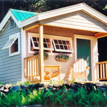
Excerpt via our website ` "This little cottage was designed and built for storage and gardening purposes. A sanctuary away from the main house, set among big white pines, close to the perennial gardens. Clients have reported spending evenings on the porch sipping red wine and watching wild turkeys forage in the fields. The building is essentially an 8×12 saltbox with an added four-foot porch. A dormer is attached to the front and extended out over the porch.
The additional gable detail enhances the design and adds character and charm by breaking up the rooflines. Four opening barn sash windows, a single 3’ door and a workbench give this cottage its uniqueness. The building in the picture has been finished off with special touches; including optional white cedar shingle siding and a set of stairs to compensate for the slope of the site. This cottage would make a great backyard retreat, bunkhouse, or special hide away."
Available as diy plans ($50), cabin kits, or fully assembled.
 Hyde Evans Design
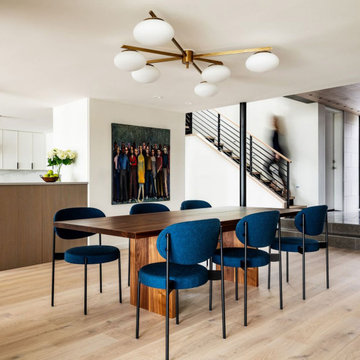
Open-concept dining room in a Lake Washington waterfront remodel by Hyde Evans Design, Seattle. A dramatic statement light fixture anchors the space above the dining table, compensating for the low ceilings with vertical presence. Deep blue upholstered chairs bring the clients' desired color into an otherwise neutral palette, and vintage mid-century end tables ground the room with warmth and character. The main level flows seamlessly between living, dining, and kitchen — a deliberate open-plan layout designed for both active family life and effortless entertaining. Photography: Andrew Giammarco. Architecture: CAST Architecture. Build: Align Builds. Interior Design: Hyde Evans Design, Seattle, WA.
 Grandeur Hills Group,Inc.
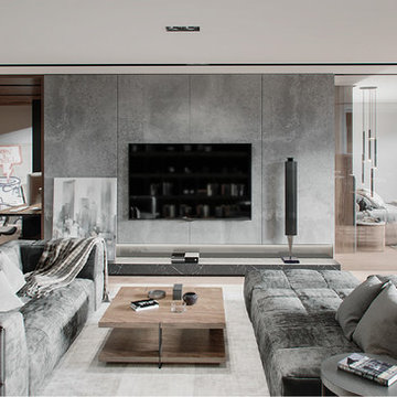
White, grey, and light-brown prevail in the interior design of this amazing living room. The room space is designed in a contemporary eclectic style that looks kind of dull at first sight.
To compensate for this disadvantage, our interior designers placed just a few of the most important pieces of furniture in the living room, thus making the room spacious. The large window also visually expands the living room, allowing plenty of sunlight to easily enter the room.
Don’t miss the great chance to radically change your living room interior design with the top Grandeur Hills Group interior designers!
 LBC Lighting
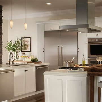
Melt Pendant
By Tech Lighting
Inverted teardrop shaped, richly colored frit glass accented with a clear glass draw at the bottom and three metal beads at the top.
 Drury Design
THE SETUP
Once these empty nest homeowners decided to stay put, they knew a new kitchen was in order. Passionate about cooking, entertaining, and hosting holiday gatherings, they found their existing kitchen inadequate. The space, with its traditional style and outdated layout, was far from ideal. They longed for an elegant, timeless kitchen that was not only show-stopping but also functional, seamlessly catering to both their daily routines and special occasions with friends and family. Another key factor was its future appeal to potential buyers, as they’re ready to enjoy their new kitchen while also considering downsizing in the future.
Design Objectives:
Create a more streamlined, open space
Eliminate traditional elements
Improve flow for entertaining and everyday use
Omit dated posts and soffits
Include storage for small appliances to keep counters clutter-free
Address mail organization and phone charging concerns
THE REMODEL
Design Challenges:
Compensate for lost storage from omitted wall cabinets
Revise floorplan to feature a single, spacious island
Enhance island seating proximity for a more engaging atmosphere
Address awkward space above existing built-ins
Improve natural light blocked by wall cabinet near the window
Create a highly functional space tailored for entertaining
Design Solutions:
Tall cabinetry and pull-outs maximize storage efficiency
A generous single island promotes seamless flow and ample prep space
Strategic island seating arrangement fosters easy conversation
New built-ins fill arched openings, ensuring a custom, clutter-free look
Replace wall cabinet with lighted open shelves for an airy feel
Galley Dresser and Workstation offer impeccable organization and versatility, creating the perfect setup for entertaining with everything easily accessible.
THE RENEWED SPACE
The new kitchen exceeded every expectation, thrilling the clients with its revitalized, expansive design and thoughtful functionality. The transformation brought to life an open space adorned with marble accents, a state-of-the-art steam oven, and the seamless integration of the Galley Dresser, crafting a kitchen not just to be used, but to be cherished. This is more than a culinary space; it’s a new heart of their home, ready to host countless memories and culinary adventures.
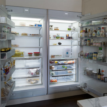
Sub-zero paneled fridge is show-stopping with immense storage and depth.

 land to living
Architect + Interior Design: Olson-Olson Architects,
Construction: Bruce Olson Construction,
Photography: Vance Fox
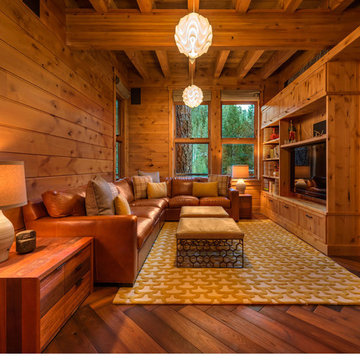
Example of a mid-sized minimalist medium tone wood floor family room design in Sacramento with brown walls, no fireplace and a media wall
Example of a mid-sized minimalist medium tone wood floor family room design in Sacramento with brown walls, no fireplace and a media wall
 TKS Design Group
Free ebook, Creating the Ideal Kitchen. DOWNLOAD NOW
This young family of four came in right after closing on their house and with a new baby on the way. Our goal was to complete the project prior to baby’s arrival so this project went on the expedite track. The beautiful 1920’s era brick home sits on a hill in a very picturesque neighborhood, so we were eager to give it the kitchen it deserves. The clients’ dream kitchen included pro-style appliances, a large island with seating for five and a kitchen that feels appropriate to the home’s era but that also is fresh and modern. They explicitly stated they did not want a “cookie cutter” design, so we took that to heart.
The key challenge was to fit in all of the items on their wish given the room’s constraints. We eliminated an existing breakfast area and bay window and incorporated that area into the kitchen. The bay window was bricked in, and to compensate for the loss of seating, we widened the opening between the kitchen and formal dining room for more of an open concept plan.
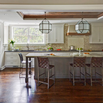
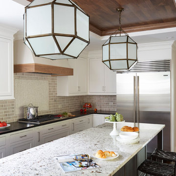
The ceiling in the original kitchen is about a foot lower than the rest of the house, and once it was determined that it was to hide pipes and other mechanicals, we reframed a large tray over the island and left the rest of the ceiling as is. Clad in walnut planks, the tray provides an interesting feature and ties in with the custom walnut and plaster hood.
The space feels modern yet appropriate to its Tudor roots. The room boasts large family friendly appliances, including a beverage center and cooktop/double oven combination. Soft white inset cabinets paired with a slate gray island provide a gentle backdrop to the multi-toned island top, a color echoed in the backsplash tile. The handmade subway tile has a textured pattern at the cooktop, and large pendant lights add more than a bit of drama to the room.
Designed by: Susan Klimala, CKD, CBD
Photography by: Mike Kaskel
For more information on kitchen and bath design ideas go to: www.kitchenstudio-ge.com
 OSMOND DESIGNS
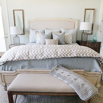
Master bedroom with blue bedding gray accents by Osmond Designs.
Bedroom - traditional bedroom idea in Salt Lake City
Bedroom - traditional bedroom idea in Salt Lake City


 TKS Design Group
Free ebook, Creating the Ideal Kitchen. DOWNLOAD NOW
This young family of four came in right after closing on their house and with a new baby on the way. Our goal was to complete the project prior to baby’s arrival so this project went on the expedite track. The beautiful 1920’s era brick home sits on a hill in a very picturesque neighborhood, so we were eager to give it the kitchen it deserves. The clients’ dream kitchen included pro-style appliances, a large island with seating for five and a kitchen that feels appropriate to the home’s era but that also is fresh and modern. They explicitly stated they did not want a “cookie cutter” design, so we took that to heart.
The key challenge was to fit in all of the items on their wish given the room’s constraints. We eliminated an existing breakfast area and bay window and incorporated that area into the kitchen. The bay window was bricked in, and to compensate for the loss of seating, we widened the opening between the kitchen and formal dining room for more of an open concept plan.
The ceiling in the original kitchen is about a foot lower than the rest of the house, and once it was determined that it was to hide pipes and other mechanicals, we reframed a large tray over the island and left the rest of the ceiling as is. Clad in walnut planks, the tray provides an interesting feature and ties in with the custom walnut and plaster hood.
The space feels modern yet appropriate to its Tudor roots. The room boasts large family friendly appliances, including a beverage center and cooktop/double oven combination. Soft white inset cabinets paired with a slate gray island provide a gentle backdrop to the multi-toned island top, a color echoed in the backsplash tile. The handmade subway tile has a textured pattern at the cooktop, and large pendant lights add more than a bit of drama to the room.
Designed by: Susan Klimala, CKD, CBD
Photography by: Mike Kaskel
For more information on kitchen and bath design ideas go to: www.kitchenstudio-ge.com
5