
Search results for "Compliments" in Home Design Ideas
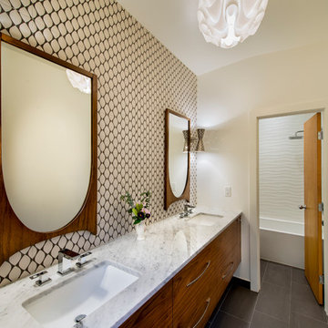
 Compliment Design
Inspiration for a mid-sized 1960s master brown tile, white tile and ceramic tile ceramic tile bathroom remodel in Denver with flat-panel cabinets, medium tone wood cabinets, beige walls, an undermount sink and marble countertops
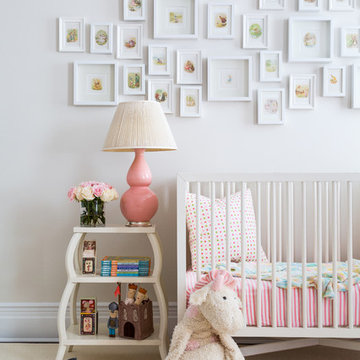
 Chango
Interior Design, Interior Architecture, Custom Millwork Design, Furniture Design, Art Curation, & Landscape Architecture by Chango & Co.
Photography by Ball & Albanese
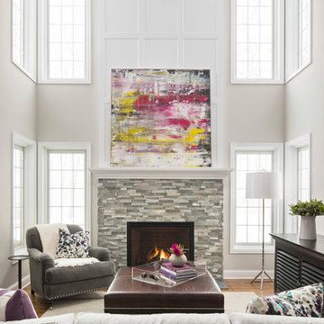
 O’Hara Interiors
Martha O'Hara Interiors, Interior Design & Photo Styling | Troy Thies, Photography | MDS Remodeling, Home Remodel | Please Note: All “related,” “similar,” and “sponsored” products tagged or listed by Houzz are not actual products pictured. They have not been approved by Martha O’Hara Interiors nor any of the professionals credited. For info about our work: design@oharainteriors.com
Find the right local pro for your project
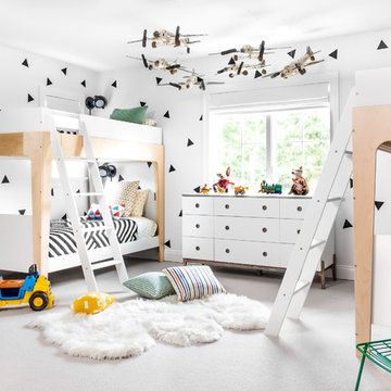 Chango
Interior Design, Interior Architecture, Custom Millwork Design, Furniture Design, Art Curation, & AV Design by Chango & Co.
Photography by Sean Litchfield
See the feature in Domino Magazine
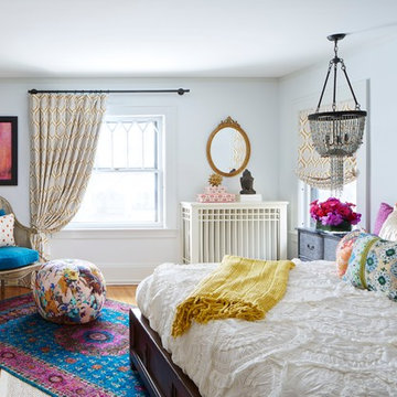 O’Hara Interiors
Martha O'Hara Interiors, Interior Design & Photo Styling | Corey Gaffer, Photography
Please Note: All “related,” “similar,” and “sponsored” products tagged or listed by Houzz are not actual products pictured. They have not been approved by Martha O’Hara Interiors nor any of the professionals credited. For information about our work, please contact design@oharainteriors.com.
 TKS Design Group
Download our free ebook, Creating the Ideal Kitchen. DOWNLOAD NOW
For many, extra time at home during COVID left them wanting more from their homes. Whether you realized the shortcomings of your space or simply wanted to combat boredom, a well-designed and functional home was no longer a want, it became a need. Tina found herself wanting more from her Old Irving Park home and reached out to The Kitchen Studio about adding function to her kitchen to make the most of the available real estate.
At the end of the day, there is nothing better than returning home to a bright and happy space you love. And this kitchen wasn’t that for Tina. Dark and dated, with a palette from the past and features that didn’t make the most of the available square footage, this remodel required vision and a fresh approach to the space. Lead designer, Stephanie Cole’s main design goal was better flow, while adding greater functionality with organized storage, accessible open shelving, and an overall sense of cohesion with the adjoining family room.
The original kitchen featured a large pizza oven, which was rarely used, yet its footprint limited storage space. The nearby pantry had become a catch-all, lacking the organization needed in the home. The initial plan was to keep the pizza oven, but eventually Tina realized she preferred the design possibilities that came from removing this cumbersome feature, with the goal of adding function throughout the upgraded and elevated space. Eliminating the pantry added square footage and length to the kitchen for greater function and more storage. This redesigned space reflects how she lives and uses her home, as well as her love for entertaining.
The kitchen features a classic, clean, and timeless palette. White cabinetry, with brass and bronze finishes, contrasts with rich wood flooring, and lets the large, deep blue island in Woodland’s custom color Harbor – a neutral, yet statement color – draw your eye.
The kitchen was the main priority. In addition to updating and elevating this space, Tina wanted to maximize what her home had to offer. From moving the location of the patio door and eliminating a window to removing an existing closet in the mudroom and the cluttered pantry, the kitchen footprint grew. Once the floorplan was set, it was time to bring cohesion to her home, creating connection between the kitchen and surrounding spaces.
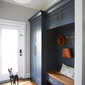
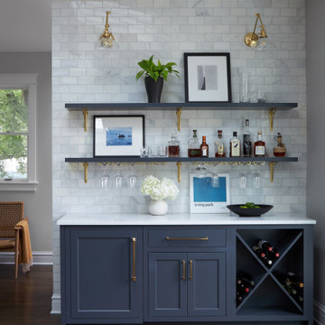
The color palette carries into the mudroom, where we added beautiful new cabinetry, practical bench seating, and accessible hooks, perfect for guests and everyday living. The nearby bar continues the aesthetic, with stunning Carrara marble subway tile, hints of brass and bronze, and a design that further captures the vibe of the kitchen.
Every home has its unique design challenges. But with a fresh perspective and a bit of creativity, there is always a way to give the client exactly what they want [and need]. In this particular kitchen, the existing soffits and high slanted ceilings added a layer of complexity to the lighting layout and upper perimeter cabinets.
While a space needs to look good, it also needs to function well. This meant making the most of the height of the room and accounting for the varied ceiling features, while also giving Tina everything she wanted and more. Pendants and task lighting paired with an abundance of natural light amplify the bright aesthetic. The cabinetry layout and design compliments the soffits with subtle profile details that bring everything together. The tile selections add visual interest, drawing the eye to the focal area above the range. Glass-doored cabinets further customize the space and give the illusion of even more height within the room.
While her family may be grown and out of the house, Tina was focused on adding function without sacrificing a stunning aesthetic and dreamy finishes that make the kitchen the gathering place of any home. It was time to love her kitchen again, and if you’re wondering what she loves most, it’s the niche with glass door cabinetry and open shelving for display paired with the marble mosaic backsplash over the range and complimenting hood. Each of these features is a stunning point of interest within the kitchen – both brag-worthy additions to a perimeter layout that previously felt limited and lacking.
Whether your remodel is the result of special needs in your home or simply the excitement of focusing your energy on creating a fun new aesthetic, we are here for it. We love a good challenge because there is always a way to make a space better – adding function and beauty simultaneously.
 Compliment Design
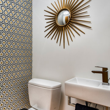
Inspiration for a small 1950s powder room remodel in Denver with a two-piece toilet, white walls and a wall-mount sink
 House of L
A traditional Georgian home receives an incredible transformation with an addition to expand the originally compact kitchen and create a pathway into the family room and dining area, opening the flow of the spaces that allow for fluid movement from each living space for the young family of four. Taking the lead from the client's desire to have a contemporary and edgier feel to their home's very classic facade, House of L worked with the architect's addition to the existing kitchen to design a kitchen that was incredibly functional and gorgeously dramatic, beckoning people to grab a barstool and hang out. Glossy macassar ebony wood is complimented with lacquered white cabinets for an amazing study in contrast. An oversized brushed nickel hood with polished nickel banding makes a presence on the feature wall of the kitchen. Brushed and polished nickel details are peppered in the landscape of this room, including the cabinets in the second island, a storage cabinet and automated hopper doors by Hafele on the refrigeration wall and all of the cabinet hardware, supplied and custom sized by Rajack. White quartz countertops by Hanstone in the Bianco Canvas colorway float on all the perimeter cabinets and the secondary island and creates a floating frame for the Palomino Quartzite that is a highlight in the kitchen and lends an organic feel to the clean lines of the millwork. The backsplash area behind the rangetop is a brick patterned mosaic blend of stone and glass, while surrounding walls have a layered sandstone tile that lend an incredible texture to the room. The light fixture hanging above the second island is by Wells Long and features faceted metal polygons with an amber gold interior. Woven linen drapes at window winks at the warmer tones in the room with a lustrous sheen that catches the natural light filtering in. The rift and sawn cut white oak floors are 8" planks that were fitted and finished on site to match the existing floor in the family and dining rooms. The clients were very clear on the appliances they needed the kitchen to accommodate. In addition to the vast expanses of wall space that were gained with the kitchen addition the larger footprint allowed for two sizeable islands and a host of cooking amenities, including a 48" rangetop, two double ovens, a warming drawer, and a built-in coffee maker by Miele and a 36" Refrigerator and Freezer and a beverage drawer by Subzero. A fabulous stainless steel Kallista sink by Mick De Giulio's series for the company is fitted in the first island which serves as a prep area, flanked by an Asko dishwasher to the right. A Dorenbracht faucet is a strong compliment to the scale of the sink. A smaller Kallista stainless sink is centered in the second island which has a secondary burner by Miele for overflow cooking.
Jason Miller, Pixelate
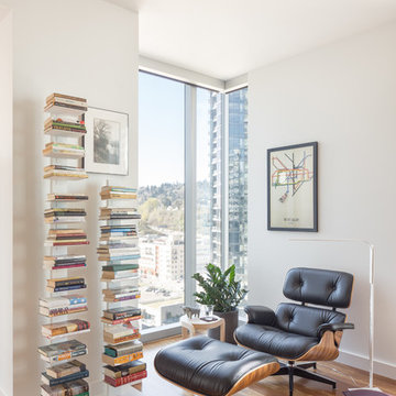
 Guggenheim Architecture + Design Studio
With sweeping views of the Willamette river and Mt. Hood, this Atwater Place condo was designed with a balance of minimalism and livability in mind. A complete kitchen remodel brought a dark interior kitchen to the light and a full furnishings package welcomed Los Angeles transplants home to their new modern and bright residence. Our clients, a retired camera operator for both feature films and television and a producer/production manager on numerous television series including Weeds and The Middle, relocated from their traditionally-styled LA bungalow to Portland in the Summer of 2014. The couple sought a design departure from their long-term California residence and a fresh start for their new life in the South Waterfront.
With only two pieces of sentimental furniture and a handful of artwork included in the plan, we set out to create a comfortable and clean-lined furnishings package complimenting the broad southeast views. Organically shaped upholstery pieces juxtaposed with angular steel and wood tables create a soft balance in the open floor plan. Several custom pieces, including a dining table designed by our studio and a custom hand-blown glass chandelier crafted by Scott Schiesel with Lightlite compliment timeless pieces from Knoll, Herman Miller, and B&B Italia.
The kitchen is designed to reflect light and create brilliance in a space that is otherwise naturally dark. A material balance of stainless steel, back painted glass, quartz composite, lacquer, and mirror all play their part in creating a vibrant cooking environment. We collectively decided to forgo the traditional island pendant for a linear commercial fixture that provides tremendous light to the prep surface and creates an unexpected architectural element. The mirrored prep island creates the illusion of open space while concealing casework and wine storage on the working side of the kitchen.
It is worth noting that this project was designed and installed almost entirely while our clients were still living in LA and wrapping up professional obligations and selling their home. This afforded us the tremendous opportunity to send our clients to showrooms not available in Portland to view key pieces before final specification. Textiles and finish samples were approved via mail and communication took place over e-mail, telephone, and an occasional office visit. This unique process lead to a successful result and a beautifully balanced living environment.
Josh Partee Photography
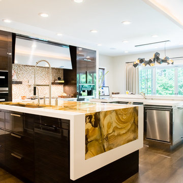 House of L
A traditional Georgian home receives an incredible transformation with an addition to expand the originally compact kitchen and create a pathway into the family room and dining area, opening the flow of the spaces that allow for fluid movement from each living space for the young family of four. Taking the lead from the client's desire to have a contemporary and edgier feel to their home's very classic facade, House of L worked with the architect's addition to the existing kitchen to design a kitchen that was incredibly functional and gorgeously dramatic, beckoning people to grab a barstool and hang out. Glossy macassar ebony wood is complimented with lacquered white cabinets for an amazing study in contrast. An oversized brushed nickel hood with polished nickel banding makes a presence on the feature wall of the kitchen. Brushed and polished nickel details are peppered in the landscape of this room, including the cabinets in the second island, a storage cabinet and automated hopper doors by Hafele on the refrigeration wall and all of the cabinet hardware, supplied and custom sized by Rajack. White quartz countertops by Hanstone in the Bianco Canvas colorway float on all the perimeter cabinets and the secondary island and creates a floating frame for the Palomino Quartzite that is a highlight in the kitchen and lends an organic feel to the clean lines of the millwork. The backsplash area behind the rangetop is a brick patterned mosaic blend of stone and glass, while surrounding walls have a layered sandstone tile that lend an incredible texture to the room. The light fixture hanging above the second island is by Wells Long and features faceted metal polygons with an amber gold interior. Woven linen drapes at window winks at the warmer tones in the room with a lustrous sheen that catches the natural light filtering in. The rift and sawn cut white oak floors are 8" planks that were fitted and finished on site to match the existing floor in the family and dining rooms. The clients were very clear on the appliances they needed the kitchen to accommodate. In addition to the vast expanses of wall space that were gained with the kitchen addition the larger footprint allowed for two sizeable islands and a host of cooking amenities, including a 48" rangetop, two double ovens, a warming drawer, and a built-in coffee maker by Miele and a 36" Refrigerator and Freezer and a beverage drawer by Subzero. A fabulous stainless steel Kallista sink by Mick De Giulio's series for the company is fitted in the first island which serves as a prep area, flanked by an Asko dishwasher to the right. A Dorenbracht faucet is a strong compliment to the scale of the sink. A smaller Kallista stainless sink is centered in the second island which has a secondary burner by Miele for overflow cooking.
Jason Miller, Pixelate
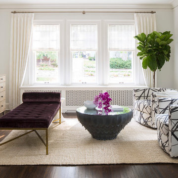 O’Hara Interiors
Martha O'Hara Interiors, Interior Design & Photo Styling | John Kraemer & Sons, Remodel | Troy Thies, Photography
Please Note: All “related,” “similar,” and “sponsored” products tagged or listed by Houzz are not actual products pictured. They have not been approved by Martha O’Hara Interiors nor any of the professionals credited. For information about our work, please contact design@oharainteriors.com.
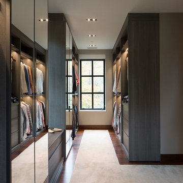
 Sagart Studio
poliformdc.com
Inspiration for a huge contemporary men's carpeted and beige floor walk-in closet remodel in DC Metro with flat-panel cabinets and gray cabinets
Inspiration for a huge contemporary men's carpeted and beige floor walk-in closet remodel in DC Metro with flat-panel cabinets and gray cabinets
 Drury Design
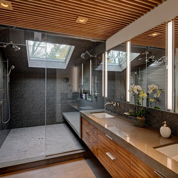
The homeowners were seeking a major renovation from their original master bath. The young family had completed several remodeling projects on the first floor of their 1980’s era home and the time had finally come where they wanted to focus on the second floor, particularly their master bath which was cramped and overpowered by a Jacuzzi-style tub.
After multiple design meetings spent choosing the right hardware and materials, everything was set, and the transformation began! Drury designer, Diana Burton, began by borrowing some space from the bedroom this way they were able to reconfigure the whole layout, which made a big difference to the homeowner. The floating vanity cabinets paired with quartz counters, wall-mounted fixtures, and mirrors featuring built-in lighting enhance the room’s sleek, clean look.
 O’Hara Interiors
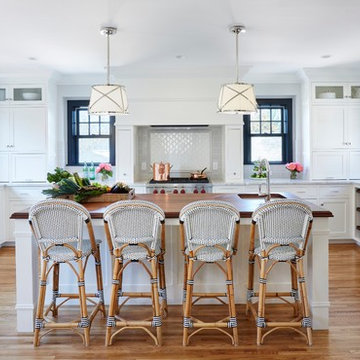
Martha O'Hara Interiors, Interior Design & Photo Styling | Corey Gaffer, Photography | Fred Nordahl Construction
Please Note: All “related,” “similar,” and “sponsored” products tagged or listed by Houzz are not actual products pictured. They have not been approved by Martha O’Hara Interiors nor any of the professionals credited. For information about our work, please contact design@oharainteriors.com.
 AV Architects + Builders
Location: McLean, VA, USA
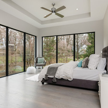
Our newest custom modern home, located in the heart of McLean, Virginia measures just over 8,700 square feet.
Situated on a beautiful lot on Old Chesterbrook Road, the modern home design takes advantage of the lot’s natural contours and sight-lines. Spread throughout three levels, the home contains five bedrooms, six full bathrooms, one half-bath, and a three-car garage.
The main level of our modern home design features an open-floor plan designed to entertain family and friends. The entry flows into both the grand dining room and the central area, dedicated to the kitchen, breakfast and a double height great room that opens to a large outdoor deck with picturesque views of the expansive backyard. Located just off the garage is a functional mudroom that features plenty of storage space. In addition to a large home office and powder room, the entire left wing is dedicated to a private master suite with an expansive custom his/her walk-in closet, a master bath with a rainfall shower and a free-standing soaking tub with his/her vanities.
The upper level of our modern home design features three generously sized en-suite bedrooms with full baths and closets with a full-size laundry room with plenty of storage space.
The lower level of our modern home design also features an en-suite guest bedroom with full bath and walk-in closets amenities. It also includes an expansive recreational room with a glass enclosed wine cellar to house your prized wine collection. To finish out the lower level, we added a full exercise room paired with a full bath with direct access to the outdoor terrace and complimented the house with plenty of storage space.
The materials we used for our modern home design are of the highest quality brands. We wanted to hand-select materials that would last for years to come, require little to no maintenance, and compliment the modern aesthetic of the home. The home features aluminum-clad oversized windows, Nichiha rectangular siding, and brick with a pastel finish; all brought together under a vacation style hip roof.
Overall, we wanted to create a modern home design that feels like a retreat but still offers all the required amenities a family needs to keep up with the fast pace of Northern Virginia.
 TKS Design Group
Free ebook, Creating the Ideal Kitchen. DOWNLOAD NOW
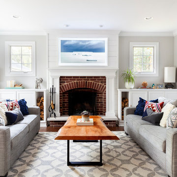
We went with a minimalist, clean, industrial look that feels light, bright and airy. The island is a dark charcoal with cool undertones that coordinates with the cabinetry and transom work in both the neighboring mudroom and breakfast area. White subway tile, quartz countertops, white enamel pendants and gold fixtures complete the update. The ends of the island are shiplap material that is also used on the fireplace in the next room.
In the new mudroom, we used a fun porcelain tile on the floor to get a pop of pattern, and walnut accents add some warmth. Each child has their own cubby, and there is a spot for shoes below a long bench. Open shelving with spots for baskets provides additional storage for the room.
Designed by: Susan Klimala, CKBD
Photography by: LOMA Studios
For more information on kitchen and bath design ideas go to: www.kitchenstudio-ge.com
 TKS Design Group
Download our free ebook, Creating the Ideal Kitchen. DOWNLOAD NOW
For many, extra time at home during COVID left them wanting more from their homes. Whether you realized the shortcomings of your space or simply wanted to combat boredom, a well-designed and functional home was no longer a want, it became a need. Tina found herself wanting more from her Old Irving Park home and reached out to The Kitchen Studio about adding function to her kitchen to make the most of the available real estate.
At the end of the day, there is nothing better than returning home to a bright and happy space you love. And this kitchen wasn’t that for Tina. Dark and dated, with a palette from the past and features that didn’t make the most of the available square footage, this remodel required vision and a fresh approach to the space. Lead designer, Stephanie Cole’s main design goal was better flow, while adding greater functionality with organized storage, accessible open shelving, and an overall sense of cohesion with the adjoining family room.
The original kitchen featured a large pizza oven, which was rarely used, yet its footprint limited storage space. The nearby pantry had become a catch-all, lacking the organization needed in the home. The initial plan was to keep the pizza oven, but eventually Tina realized she preferred the design possibilities that came from removing this cumbersome feature, with the goal of adding function throughout the upgraded and elevated space. Eliminating the pantry added square footage and length to the kitchen for greater function and more storage. This redesigned space reflects how she lives and uses her home, as well as her love for entertaining.
The kitchen features a classic, clean, and timeless palette. White cabinetry, with brass and bronze finishes, contrasts with rich wood flooring, and lets the large, deep blue island in Woodland’s custom color Harbor – a neutral, yet statement color – draw your eye.
The kitchen was the main priority. In addition to updating and elevating this space, Tina wanted to maximize what her home had to offer. From moving the location of the patio door and eliminating a window to removing an existing closet in the mudroom and the cluttered pantry, the kitchen footprint grew. Once the floorplan was set, it was time to bring cohesion to her home, creating connection between the kitchen and surrounding spaces.
The color palette carries into the mudroom, where we added beautiful new cabinetry, practical bench seating, and accessible hooks, perfect for guests and everyday living. The nearby bar continues the aesthetic, with stunning Carrara marble subway tile, hints of brass and bronze, and a design that further captures the vibe of the kitchen.
Every home has its unique design challenges. But with a fresh perspective and a bit of creativity, there is always a way to give the client exactly what they want [and need]. In this particular kitchen, the existing soffits and high slanted ceilings added a layer of complexity to the lighting layout and upper perimeter cabinets.
While a space needs to look good, it also needs to function well. This meant making the most of the height of the room and accounting for the varied ceiling features, while also giving Tina everything she wanted and more. Pendants and task lighting paired with an abundance of natural light amplify the bright aesthetic. The cabinetry layout and design compliments the soffits with subtle profile details that bring everything together. The tile selections add visual interest, drawing the eye to the focal area above the range. Glass-doored cabinets further customize the space and give the illusion of even more height within the room.
While her family may be grown and out of the house, Tina was focused on adding function without sacrificing a stunning aesthetic and dreamy finishes that make the kitchen the gathering place of any home. It was time to love her kitchen again, and if you’re wondering what she loves most, it’s the niche with glass door cabinetry and open shelving for display paired with the marble mosaic backsplash over the range and complimenting hood. Each of these features is a stunning point of interest within the kitchen – both brag-worthy additions to a perimeter layout that previously felt limited and lacking.
Whether your remodel is the result of special needs in your home or simply the excitement of focusing your energy on creating a fun new aesthetic, we are here for it. We love a good challenge because there is always a way to make a space better – adding function and beauty simultaneously.
 Princeton Design Collaborative
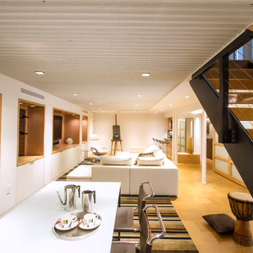
Lower Level family room with Acoustic ceiling and built in storage
Photo by:Jeffrey Edward Tryon
Inspiration for a mid-sized contemporary look-out carpeted basement remodel in Philadelphia with white walls
Inspiration for a mid-sized contemporary look-out carpeted basement remodel in Philadelphia with white walls
 O’Hara Interiors
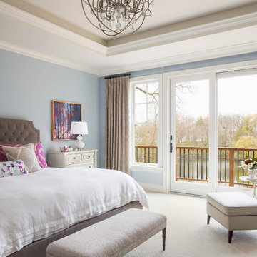
Martha O'Hara Interiors, Interior Design & Photo Styling | Troy Thies, Photography | Stonewood Builders LLC
Please Note: All “related,” “similar,” and “sponsored” products tagged or listed by Houzz are not actual products pictured. They have not been approved by Martha O’Hara Interiors nor any of the professionals credited. For information about our work, please contact design@oharainteriors.com.
 Guggenheim Architecture + Design Studio
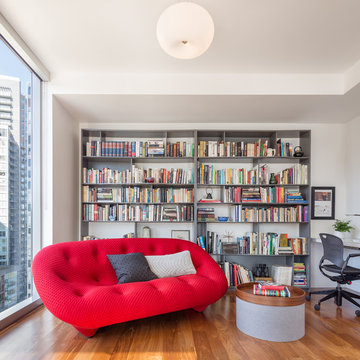
With sweeping views of the Willamette river and Mt. Hood, this Atwater Place condo was designed with a balance of minimalism and livability in mind. A complete kitchen remodel brought a dark interior kitchen to the light and a full furnishings package welcomed Los Angeles transplants home to their new modern and bright residence. Our clients, a retired camera operator for both feature films and television and a producer/production manager on numerous television series including Weeds and The Middle, relocated from their traditionally-styled LA bungalow to Portland in the Summer of 2014. The couple sought a design departure from their long-term California residence and a fresh start for their new life in the South Waterfront.
With only two pieces of sentimental furniture and a handful of artwork included in the plan, we set out to create a comfortable and clean-lined furnishings package complimenting the broad southeast views. Organically shaped upholstery pieces juxtaposed with angular steel and wood tables create a soft balance in the open floor plan. Several custom pieces, including a dining table designed by our studio and a custom hand-blown glass chandelier crafted by Scott Schiesel with Lightlite compliment timeless pieces from Knoll, Herman Miller, and B&B Italia.
The kitchen is designed to reflect light and create brilliance in a space that is otherwise naturally dark. A material balance of stainless steel, back painted glass, quartz composite, lacquer, and mirror all play their part in creating a vibrant cooking environment. We collectively decided to forgo the traditional island pendant for a linear commercial fixture that provides tremendous light to the prep surface and creates an unexpected architectural element. The mirrored prep island creates the illusion of open space while concealing casework and wine storage on the working side of the kitchen.
It is worth noting that this project was designed and installed almost entirely while our clients were still living in LA and wrapping up professional obligations and selling their home. This afforded us the tremendous opportunity to send our clients to showrooms not available in Portland to view key pieces before final specification. Textiles and finish samples were approved via mail and communication took place over e-mail, telephone, and an occasional office visit. This unique process lead to a successful result and a beautifully balanced living environment.
Josh Partee Photography
5