
Search results for "Confuse" in Home Design Ideas

 Robert Miller FAIA Architects
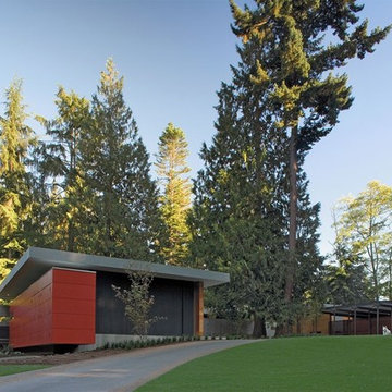
Located on a wooded site, a single-story 1950s house with an awkward floor plan was strategically remodeled to provide living spaces that connect to the outdoors and respond to the needs of a young family.
This home had undergone successive alterations over the years, resulting in a fragmented, confusing layout. With only minor changes to the footprint, the architects redesigned this midcentury home to blur the boundary between indoor living and the landscape beyond. The new design effects a dramatic change by reorganizing the space into linear zones, raising the roof in key places, and making two small additions.
A concrete wall links a new music studio and detached garage to the main house, forming an entry court that welcomes visitors and screens the private bedroom spaces nearby. The entry is marked by a series of round skylights, while the living room has been opened up with taller ceilings, a new fireplace and walls of glass. A series of long colored boxes provides storage and utility spaces, while planar elements draw the eye through the house to the landscape beyond. Teak cabinets, blackened steel and Douglas fir contrast with more modest materials such as painted MDF panels, fiber-cement siding and painted gypsum wallboard. These spaces are designed to accommodate both intimate family gatherings and large parties.
Select Furnishings provided by INForm
Images by Nic LeHoux Photography
 Siobhan's Outdoor Transformations
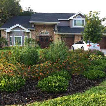
Sustainable landscaping featuring low maintenance plants. The orange blooming plants are Dwarf Firebush shrubs. I paired them with Dwarf Natal Plum and Paspalum Ornamental grass. Dwarf Firebush shrubs sport orange flowers tipped with gold, which set off their beauty. A great nectar source for butterflies and hummingbirds adds to it's appeal.
They are really tough, so tough they are used in commercial locations and on some roadways. This delightful shrub blooms on and off all year - more during warmer weather - and attracts butterflies and hummingbirds to its brightly-colored, tubular flowers.
It has a light and airy charm and looks best when it's hand-trimmed to form a natural mounded shape, rather than trying to keep it manicured with hedge trimmers.
Now this is not the native variety, for all you native plant purists out there, though many nurseries sell the dwarf as just "firebush," which can get confusing.
Here's how to tell the difference:
The native grows larger and has slightly "hairy" leaves and deep red to red-orange flowers. It's dwarf "cousin" can be kept smaller and more compact, though with a similar informal look.
The smaller variety has smoother leaves and a touch of yellow to the blossoms...and requires a bit more care.
This shrub is a fast grower that can be kept 3 feet tall and wide, though you can let it grow larger if you prefer.
Though considered evergreen, the plant can lose leaves during a cold winter, though with proper pruning in spring it should sprout new growth and flush out again. A location sheltered from winter winds will help protect it.
These plants prefer full to partial sun, though they'll grow in part shade, where they'll flower less with more open growth.
Landscape uses for dwarf fire bush:
• accent for a mixed bed
• informal hedge
• butterfly garden plant
• lining a walkway or garden path
• along a medium-height or tall fence
• around a poolcage, patio, porch or deck
• understory planting for tall palms
• backdrop planting for smaller plants
Find the right local pro for your project
 TKSL Construction
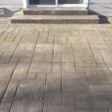
Patio - small traditional backyard stamped concrete patio idea in Denver with no cover
 Robert Miller FAIA Architects
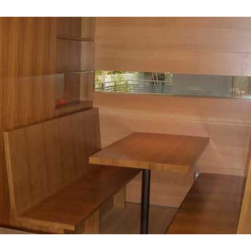
Located on a wooded site, a single-story 1950s house with an awkward floor plan was strategically remodeled to provide living spaces that connect to the outdoors and respond to the needs of a young family.
This home had undergone successive alterations over the years, resulting in a fragmented, confusing layout. With only minor changes to the footprint, the architects redesigned this midcentury home to blur the boundary between indoor living and the landscape beyond. The new design effects a dramatic change by reorganizing the space into linear zones, raising the roof in key places, and making two small additions.
A concrete wall links a new music studio and detached garage to the main house, forming an entry court that welcomes visitors and screens the private bedroom spaces nearby. The entry is marked by a series of round skylights, while the living room has been opened up with taller ceilings, a new fireplace and walls of glass. A series of long colored boxes provides storage and utility spaces, while planar elements draw the eye through the house to the landscape beyond. Teak cabinets, blackened steel and Douglas fir contrast with more modest materials such as painted MDF panels, fiber-cement siding and painted gypsum wallboard. These spaces are designed to accommodate both intimate family gatherings and large parties.
Select Furnishings provided by INForm
Image by Bellan Construcution
 Hoskins Interior Design
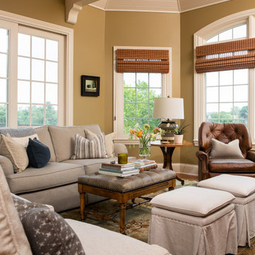
Example of a mid-sized classic formal and open concept medium tone wood floor, beige floor and vaulted ceiling living room design in Indianapolis with beige walls, a standard fireplace, a brick fireplace and a wall-mounted tv
 Revealing Redesign
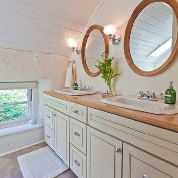
This farmhouse, with it's original foundation dating back to 1778, had a lot of charm--but with its bad carpeting, dark paint colors, and confusing layout, it was hard to see at first just how welcoming, charming, and cozy it could be.
The first focus of our renovation was creating a master bedroom suite--since there wasn't one, and one was needed for the modern family that was living here day-in and day-out.
To do this, a collection of small rooms (some of them previously without heat or electrical outlets) were combined to create a gorgeous, serene space in the eaves of the oldest part of the house, complete with master bath containing a double vanity, and spacious shower. Even though these rooms are new, it is hard to see that they weren't original to the farmhouse from day one.
In the rest of the house we removed walls that were added in the 1970's that made spaces seem smaller and more choppy, added a second upstairs bathroom for the family's two children, reconfigured the kitchen using existing cabinets to cut costs ( & making sure to keep the old sink with all of its character & charm) and create a more workable layout with dedicated eating area.
Also added was an outdoor living space with a deck sheltered by a pergola--a spot that the family spends tons of time enjoying during the warmer months.
A family room addition had been added to the house by the previous owner in the 80's, so to make this space feel less like it was tacked on, we installed historically accurate new windows to tie it in visually with the original house, and replaced carpeting with hardwood floors to make a more seamless transition from the historic to the new.
To complete the project, we refinished the original hardwoods throughout the rest of the house, and brightened the outlook of the whole home with a fresh, bright, updated color scheme.
Photos by Laura Kicey
 Marblex Design International, Inc.
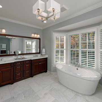
Stunning traditional house we worked on in cooperation with our long-time clients - Great Falls Construction and Christina Simon (C|S Design Studio). Has Super White Quartzite on kitchen countertops and Calacata Gold on the master vanity in the bathroom.
Photos by the amazing Bob Narod.
 Thaddeus Drew Remodeling
Simple yet beautiful master bathroom.
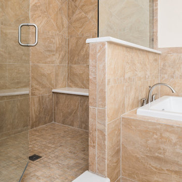
Inspiration for a mid-sized contemporary master white tile porcelain tile and beige floor alcove bathtub remodel in Dallas with shaker cabinets, brown cabinets, a one-piece toilet, blue walls, an undermount sink, marble countertops and a hinged shower door
Inspiration for a mid-sized contemporary master white tile porcelain tile and beige floor alcove bathtub remodel in Dallas with shaker cabinets, brown cabinets, a one-piece toilet, blue walls, an undermount sink, marble countertops and a hinged shower door
 Susan Berry Design, Inc.
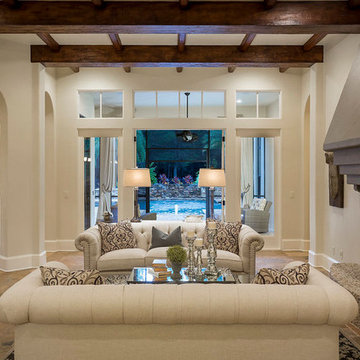
Croatian inspired fireplace design. Custom faux wood ceiling details. Furnishings by homeowner. Interior architecture by Susan Berry Design, Inc. R.l.Vogel Home Builder. HighResMedia photo
 Robert Miller FAIA Architects
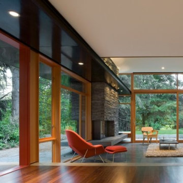
Located on a wooded site, a single-story 1950s house with an awkward floor plan was strategically remodeled to provide living spaces that connect to the outdoors and respond to the needs of a young family.
This home had undergone successive alterations over the years, resulting in a fragmented, confusing layout. With only minor changes to the footprint, the architects redesigned this midcentury home to blur the boundary between indoor living and the landscape beyond. The new design effects a dramatic change by reorganizing the space into linear zones, raising the roof in key places, and making two small additions.
A concrete wall links a new music studio and detached garage to the main house, forming an entry court that welcomes visitors and screens the private bedroom spaces nearby. The entry is marked by a series of round skylights, while the living room has been opened up with taller ceilings, a new fireplace and walls of glass. A series of long colored boxes provides storage and utility spaces, while planar elements draw the eye through the house to the landscape beyond. Teak cabinets, blackened steel and Douglas fir contrast with more modest materials such as painted MDF panels, fiber-cement siding and painted gypsum wallboard. These spaces are designed to accommodate both intimate family gatherings and large parties.
Select Furnishings provided by INForm
Image by Nic LeHoux
 Revealing Redesign
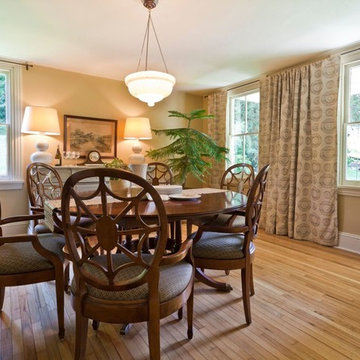
This farmhouse, with it's original foundation dating back to 1778, had a lot of charm--but with its bad carpeting, dark paint colors, and confusing layout, it was hard to see at first just how welcoming, charming, and cozy it could be.
The first focus of our renovation was creating a master bedroom suite--since there wasn't one, and one was needed for the modern family that was living here day-in and day-out.
To do this, a collection of small rooms (some of them previously without heat or electrical outlets) were combined to create a gorgeous, serene space in the eaves of the oldest part of the house, complete with master bath containing a double vanity, and spacious shower. Even though these rooms are new, it is hard to see that they weren't original to the farmhouse from day one.
In the rest of the house we removed walls that were added in the 1970's that made spaces seem smaller and more choppy, added a second upstairs bathroom for the family's two children, reconfigured the kitchen using existing cabinets to cut costs ( & making sure to keep the old sink with all of its character & charm) and create a more workable layout with dedicated eating area.
Also added was an outdoor living space with a deck sheltered by a pergola--a spot that the family spends tons of time enjoying during the warmer months.
A family room addition had been added to the house by the previous owner in the 80's, so to make this space feel less like it was tacked on, we installed historically accurate new windows to tie it in visually with the original house, and replaced carpeting with hardwood floors to make a more seamless transition from the historic to the new.
To complete the project, we refinished the original hardwoods throughout the rest of the house, and brightened the outlook of the whole home with a fresh, bright, updated color scheme.
Photos by Laura Kicey
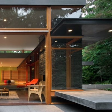 Robert Miller FAIA Architects
Located on a wooded site, a single-story 1950s house with an awkward floor plan was strategically remodeled to provide living spaces that connect to the outdoors and respond to the needs of a young family.
This home had undergone successive alterations over the years, resulting in a fragmented, confusing layout. With only minor changes to the footprint, the architects redesigned this midcentury home to blur the boundary between indoor living and the landscape beyond. The new design effects a dramatic change by reorganizing the space into linear zones, raising the roof in key places, and making two small additions.
A concrete wall links a new music studio and detached garage to the main house, forming an entry court that welcomes visitors and screens the private bedroom spaces nearby. The entry is marked by a series of round skylights, while the living room has been opened up with taller ceilings, a new fireplace and walls of glass. A series of long colored boxes provides storage and utility spaces, while planar elements draw the eye through the house to the landscape beyond. Teak cabinets, blackened steel and Douglas fir contrast with more modest materials such as painted MDF panels, fiber-cement siding and painted gypsum wallboard. These spaces are designed to accommodate both intimate family gatherings and large parties.
Select Furnishings provided by INForm
Images by Nic LeHoux Photography
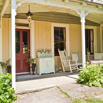 Revealing Redesign
This farmhouse, with it's original foundation dating back to 1778, had a lot of charm--but with its bad carpeting, dark paint colors, and confusing layout, it was hard to see at first just how welcoming, charming, and cozy it could be.
The first focus of our renovation was creating a master bedroom suite--since there wasn't one, and one was needed for the modern family that was living here day-in and day-out.
To do this, a collection of small rooms (some of them previously without heat or electrical outlets) were combined to create a gorgeous, serene space in the eaves of the oldest part of the house, complete with master bath containing a double vanity, and spacious shower. Even though these rooms are new, it is hard to see that they weren't original to the farmhouse from day one.
In the rest of the house we removed walls that were added in the 1970's that made spaces seem smaller and more choppy, added a second upstairs bathroom for the family's two children, reconfigured the kitchen using existing cabinets to cut costs ( & making sure to keep the old sink with all of its character & charm) and create a more workable layout with dedicated eating area.
Also added was an outdoor living space with a deck sheltered by a pergola--a spot that the family spends tons of time enjoying during the warmer months.
A family room addition had been added to the house by the previous owner in the 80's, so to make this space feel less like it was tacked on, we installed historically accurate new windows to tie it in visually with the original house, and replaced carpeting with hardwood floors to make a more seamless transition from the historic to the new.
To complete the project, we refinished the original hardwoods throughout the rest of the house, and brightened the outlook of the whole home with a fresh, bright, updated color scheme.
Photos by Laura Kicey
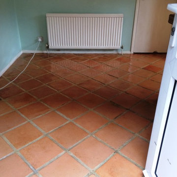
 Tile Doctor Ltd
This was a rather dirty Terracotta kitchen floor located at a house in Winchmore Hill in Buckinghamshire, not to be confused with the Winchmore Hill in London. The sealer on the tiles had worn off some time ago and now the dirt was becoming trapped in the pores of the Terracotta making it impossible to clean.
Deep Cleaning Terracotta Tile
To deep clean into the pores of the Terracotta a diluted solution of Tile Doctor Pro Clean, which is a strong tile cleaner sage to use on tiled floors, was applied to kitchen floor and left to soak in for around ten minutes. Then with the aid of a commercial rotary machine the solution was scrubbed into the tiles to release the many years of accumulated ingrained soiling which was removed from the floor using a wet vacuum.
Although this deep cleaned the tile the grout lines needed further attention and were treated with Tile Doctor Grout Clean-up solution and then washed down with fresh water which was removed with a wet vacuum.
There was still evidence of sealer remaining on the floor in some areas so the next step in the process was to apply Tile Doctor Remove and Go again working it into the tile using a scrubbing pad fitted to a rotary machine. Remove and Go as its name suggests is used to remove waxes and sealants from tile and stone. It certainly did the job and once the resultant slurry was vacuumed up and the floor given a final rinse to remove any chemicals used in the process the floor was looking much cleaner and left to dry overnight ready for our return
Sealing Terracotta Tile
The next day came back to do the sealing and checked the floor first for any spots we might had missed and also to ensure it had dried sufficiently. Tile Doctor Seal and Go was then applied in coats to fully seal the floor. As well as adding protection Seal and Go adds a nice subtle satin finish to Terracotta and being water based it doesn’t give off an odour when it’s drying.
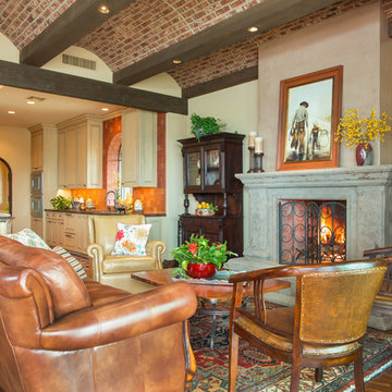
 Sunset Interiors
Mid-sized southwest open concept dark wood floor and brown floor living room photo in Phoenix with beige walls, a standard fireplace, a concrete fireplace and a wall-mounted tv

 BBQGuys
The long-lasting, hand woven Avery Island Collection from Lakeview Outdoor Designs offers an upscale look with multiple configuration options.
UltimatePatio.com
 Alair Homes Plano
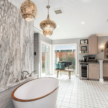
This once dated master suite is now a bright and eclectic space with influence from the homeowners travels abroad. We transformed their overly large bathroom with dysfunctional square footage into cohesive space meant for luxury. We created a large open, walk in shower adorned by a leathered stone slab. The new master closet is adorned with warmth from bird wallpaper and a robin's egg blue chest. We were able to create another bedroom from the excess space in the redesign. The frosted glass french doors, blue walls and special wall paper tie into the feel of the home. In the bathroom, the Bain Ultra freestanding tub below is the focal point of this new space. We mixed metals throughout the space that just work to add detail and unique touches throughout. Design by Hatfield Builders & Remodelers | Photography by Versatile Imaging

 Le jardinet
Gorgeous blue-green foliage on this prostrate conifer; Feelin' Blue deodar cedar
Le jardinet
Photo of a traditional landscaping in Seattle.
Photo of a traditional landscaping in Seattle.
 Revealing Redesign
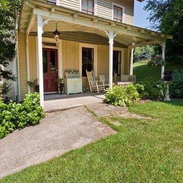
This farmhouse, with it's original foundation dating back to 1778, had a lot of charm--but with its bad carpeting, dark paint colors, and confusing layout, it was hard to see at first just how welcoming, charming, and cozy it could be.
The first focus of our renovation was creating a master bedroom suite--since there wasn't one, and one was needed for the modern family that was living here day-in and day-out.
To do this, a collection of small rooms (some of them previously without heat or electrical outlets) were combined to create a gorgeous, serene space in the eaves of the oldest part of the house, complete with master bath containing a double vanity, and spacious shower. Even though these rooms are new, it is hard to see that they weren't original to the farmhouse from day one.
In the rest of the house we removed walls that were added in the 1970's that made spaces seem smaller and more choppy, added a second upstairs bathroom for the family's two children, reconfigured the kitchen using existing cabinets to cut costs ( & making sure to keep the old sink with all of its character & charm) and create a more workable layout with dedicated eating area.
Also added was an outdoor living space with a deck sheltered by a pergola--a spot that the family spends tons of time enjoying during the warmer months.
A family room addition had been added to the house by the previous owner in the 80's, so to make this space feel less like it was tacked on, we installed historically accurate new windows to tie it in visually with the original house, and replaced carpeting with hardwood floors to make a more seamless transition from the historic to the new.
To complete the project, we refinished the original hardwoods throughout the rest of the house, and brightened the outlook of the whole home with a fresh, bright, updated color scheme.
Photos by Laura Kicey
32