
Search results for "Confuse" in Home Design Ideas
 Dietsche + Dietsche Architects PC
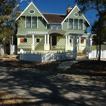
The cozy Victorian be cottage welcomes guests with white-columns and a trellis topped porch. Traditional Victorian shingle patterns frame oval windows in the matching green dormers with beautiful traditional architectural detail.

 Robert Miller FAIA Architects
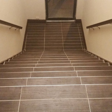
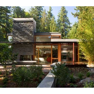
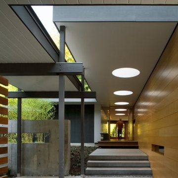
Located on a wooded site, a single-story 1950s house with an awkward floor plan was strategically remodeled to provide living spaces that connect to the outdoors and respond to the needs of a young family.
This home had undergone successive alterations over the years, resulting in a fragmented, confusing layout. With only minor changes to the footprint, the architects redesigned this midcentury home to blur the boundary between indoor living and the landscape beyond. The new design effects a dramatic change by reorganizing the space into linear zones, raising the roof in key places, and making two small additions.
A concrete wall links a new music studio and detached garage to the main house, forming an entry court that welcomes visitors and screens the private bedroom spaces nearby. The entry is marked by a series of round skylights, while the living room has been opened up with taller ceilings, a new fireplace and walls of glass. A series of long colored boxes provides storage and utility spaces, while planar elements draw the eye through the house to the landscape beyond. Teak cabinets, blackened steel and Douglas fir contrast with more modest materials such as painted MDF panels, fiber-cement siding and painted gypsum wallboard. These spaces are designed to accommodate both intimate family gatherings and large parties.
Select Furnishings provided by INForm
Images by Nic LeHoux Photography
Find the right local pro for your project
 Davey McEathron Architecture
Leonid Furmansky
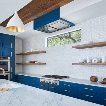
Large minimalist dark wood floor open concept kitchen photo in Austin with an undermount sink, flat-panel cabinets, blue cabinets, marble countertops, cement tile backsplash, stainless steel appliances, an island and white countertops
Large minimalist dark wood floor open concept kitchen photo in Austin with an undermount sink, flat-panel cabinets, blue cabinets, marble countertops, cement tile backsplash, stainless steel appliances, an island and white countertops
 Paragon Construction Company LLC
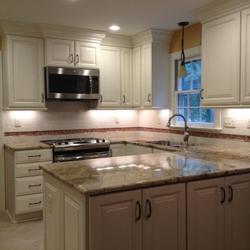
The Cooking & Kitchen work area.
Designed by Paragon's Kitchen & Bath Designer and Customer Advisor, this kitchen project consisted of new tile floors, Wellborn Premier Cabinents, Granite Counter Tops, Subway tile back splash with glass mosaic accent with stainless accents.
 Vogl Architects
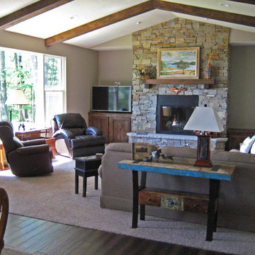
House on the Bluff - Gladstone, Michigan
Living room - mid-sized craftsman open concept carpeted living room idea in Grand Rapids with gray walls, a ribbon fireplace, a stone fireplace and a tv stand
Living room - mid-sized craftsman open concept carpeted living room idea in Grand Rapids with gray walls, a ribbon fireplace, a stone fireplace and a tv stand
 Revealing Redesign
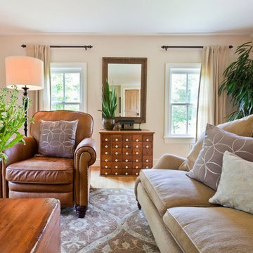
This farmhouse, with it's original foundation dating back to 1778, had a lot of charm--but with its bad carpeting, dark paint colors, and confusing layout, it was hard to see at first just how welcoming, charming, and cozy it could be.
The first focus of our renovation was creating a master bedroom suite--since there wasn't one, and one was needed for the modern family that was living here day-in and day-out.
To do this, a collection of small rooms (some of them previously without heat or electrical outlets) were combined to create a gorgeous, serene space in the eaves of the oldest part of the house, complete with master bath containing a double vanity, and spacious shower. Even though these rooms are new, it is hard to see that they weren't original to the farmhouse from day one.
In the rest of the house we removed walls that were added in the 1970's that made spaces seem smaller and more choppy, added a second upstairs bathroom for the family's two children, reconfigured the kitchen using existing cabinets to cut costs ( & making sure to keep the old sink with all of its character & charm) and create a more workable layout with dedicated eating area.
Also added was an outdoor living space with a deck sheltered by a pergola--a spot that the family spends tons of time enjoying during the warmer months.
A family room addition had been added to the house by the previous owner in the 80's, so to make this space feel less like it was tacked on, we installed historically accurate new windows to tie it in visually with the original house, and replaced carpeting with hardwood floors to make a more seamless transition from the historic to the new.
To complete the project, we refinished the original hardwoods throughout the rest of the house, and brightened the outlook of the whole home with a fresh, bright, updated color scheme.
Photos by Laura Kicey
 Kitchen Design Concepts
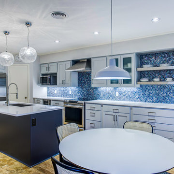
We must admit, we’ve got yet another show-stopping transformation! With keeping the cabinetry boxes (though few had to be replaced), swapping out drawer and drawer fronts with new ones, and updating all the finishes – we managed to give this space a renovation that could be confused for a full remodel! The combination of a vibrant new backsplash, a light painted cabinetry finish, and new fixtures, these cosmetic changes really made the kitchen become “brand new”. Want to learn more about this space and see how we went from “drab” to “fab” then keep reading!
Cabinetry
The cabinets boxes that needed to be replaced are from WW Woods Shiloh, Homestead door style, in maple wood. These cabinets were unfinished, as we finished the entire kitchen on-site with the rest of the new drawer and drawer fronts for a seamless look. The cabinet fronts that were replaced were from Woodmont cabinetry, in a paint grade maple, and a recessed panel profile door-style. As a result, the perimeter cabinets were painted in Sherwin Williams Tinsmith, the island in Sherwin Williams Sea Serpent, and a few interiors of the cabinets were painted in a Sherwin Williams Tinsmith.
Countertop
The countertops feature a 3 cm Caesarstone Vivid White quartz
Backsplash
The backsplash installed from countertops to the bottom of the furrdown are from Glazzio in the Oceania Herringbone Series, in Cobalt Sea, and are a 1×2 size. We love how vibrant it is!
Fixtures and Fittings
From Blanco, we have a Meridian semi-professional faucet in Satin Nickel, and a granite composite Precis 1-3/4 bowl sink in a finish of Cinder. The floating shelves are from Danver and are a stainless steel finish.
Flooring
The flooring is a cork material from Harris Cork in the Napa Collection, in a Fawn finish.
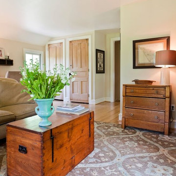 Revealing Redesign
This farmhouse, with it's original foundation dating back to 1778, had a lot of charm--but with its bad carpeting, dark paint colors, and confusing layout, it was hard to see at first just how welcoming, charming, and cozy it could be.
The first focus of our renovation was creating a master bedroom suite--since there wasn't one, and one was needed for the modern family that was living here day-in and day-out.
To do this, a collection of small rooms (some of them previously without heat or electrical outlets) were combined to create a gorgeous, serene space in the eaves of the oldest part of the house, complete with master bath containing a double vanity, and spacious shower. Even though these rooms are new, it is hard to see that they weren't original to the farmhouse from day one.
In the rest of the house we removed walls that were added in the 1970's that made spaces seem smaller and more choppy, added a second upstairs bathroom for the family's two children, reconfigured the kitchen using existing cabinets to cut costs ( & making sure to keep the old sink with all of its character & charm) and create a more workable layout with dedicated eating area.
Also added was an outdoor living space with a deck sheltered by a pergola--a spot that the family spends tons of time enjoying during the warmer months.
A family room addition had been added to the house by the previous owner in the 80's, so to make this space feel less like it was tacked on, we installed historically accurate new windows to tie it in visually with the original house, and replaced carpeting with hardwood floors to make a more seamless transition from the historic to the new.
To complete the project, we refinished the original hardwoods throughout the rest of the house, and brightened the outlook of the whole home with a fresh, bright, updated color scheme.
Photos by Laura Kicey

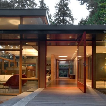 Robert Miller FAIA Architects
Located on a wooded site, a single-story 1950s house with an awkward floor plan was strategically remodeled to provide living spaces that connect to the outdoors and respond to the needs of a young family.
This home had undergone successive alterations over the years, resulting in a fragmented, confusing layout. With only minor changes to the footprint, the architects redesigned this midcentury home to blur the boundary between indoor living and the landscape beyond. The new design effects a dramatic change by reorganizing the space into linear zones, raising the roof in key places, and making two small additions.
A concrete wall links a new music studio and detached garage to the main house, forming an entry court that welcomes visitors and screens the private bedroom spaces nearby. The entry is marked by a series of round skylights, while the living room has been opened up with taller ceilings, a new fireplace and walls of glass. A series of long colored boxes provides storage and utility spaces, while planar elements draw the eye through the house to the landscape beyond. Teak cabinets, blackened steel and Douglas fir contrast with more modest materials such as painted MDF panels, fiber-cement siding and painted gypsum wallboard. These spaces are designed to accommodate both intimate family gatherings and large parties.
Select Furnishings provided by INForm
Images by Nic LeHoux Photography
 Marie Hebson's interiorsBYDESIGN Inc.
Marie Hebson, Designer Natasha Dixon, Photographer
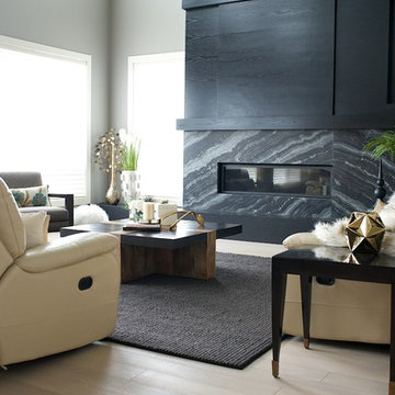
Example of a large transitional loft-style light wood floor living room design in Edmonton with gray walls, a standard fireplace, a stone fireplace and a media wall
Example of a large transitional loft-style light wood floor living room design in Edmonton with gray walls, a standard fireplace, a stone fireplace and a media wall
 Darcy Bean Custom Construction Inc.
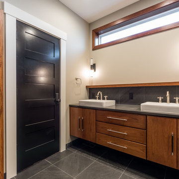
Industrial inspired design utilizing modern conveniences. Deck mounted cross handled faucet with Satin Nickel finish set adorns the Semi recessed sinks. Quartz counter top enhances the rich color of the Hickory cabinetry. Heated tile flooring throughout bath. Custom wood trim transom is a simply but elegant detail.
Buras Photography
 L/L Design - Build - Furnish
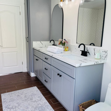
Sometimes the cost of painting an existing vanity vs. a new vanity isn't only the cost of the labor, fixing the old doors, the inside shelves were in poor condition, and the overall space the vanity provided was sub par...so we did replace the vanity and they have so much more functioning space. We did however paint the linen cabinet and the adjoining wall, and it really makes it look built it. I think this transformation is a home run!!!

 Le jardinet
feathery foliage of bronze fennel
Le jardinet
This is an example of a traditional landscaping in Seattle.
This is an example of a traditional landscaping in Seattle.
 Tolleson Architects
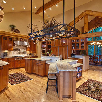
Large trendy u-shaped light wood floor eat-in kitchen photo in Denver with an undermount sink, flat-panel cabinets, medium tone wood cabinets, granite countertops, beige backsplash, porcelain backsplash, stainless steel appliances and two islands
 Robert Miller FAIA Architects
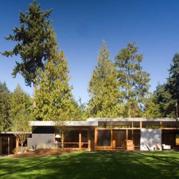
Located on a wooded site, a single-story 1950s house with an awkward floor plan was strategically remodeled to provide living spaces that connect to the outdoors and respond to the needs of a young family.
This home had undergone successive alterations over the years, resulting in a fragmented, confusing layout. With only minor changes to the footprint, the architects redesigned this midcentury home to blur the boundary between indoor living and the landscape beyond. The new design effects a dramatic change by reorganizing the space into linear zones, raising the roof in key places, and making two small additions.
A concrete wall links a new music studio and detached garage to the main house, forming an entry court that welcomes visitors and screens the private bedroom spaces nearby. The entry is marked by a series of round skylights, while the living room has been opened up with taller ceilings, a new fireplace and walls of glass. A series of long colored boxes provides storage and utility spaces, while planar elements draw the eye through the house to the landscape beyond. Teak cabinets, blackened steel and Douglas fir contrast with more modest materials such as painted MDF panels, fiber-cement siding and painted gypsum wallboard. These spaces are designed to accommodate both intimate family gatherings and large parties.
Select Furnishings provided by INForm
Images by Nic LeHoux Photography
 Robert Miller FAIA Architects
Located on a wooded site, a single-story 1950s house with an awkward floor plan was strategically remodeled to provide living spaces that connect to the outdoors and respond to the needs of a young family.
This home had undergone successive alterations over the years, resulting in a fragmented, confusing layout. With only minor changes to the footprint, the architects redesigned this midcentury home to blur the boundary between indoor living and the landscape beyond. The new design effects a dramatic change by reorganizing the space into linear zones, raising the roof in key places, and making two small additions.
A concrete wall links a new music studio and detached garage to the main house, forming an entry court that welcomes visitors and screens the private bedroom spaces nearby. The entry is marked by a series of round skylights, while the living room has been opened up with taller ceilings, a new fireplace and walls of glass. A series of long colored boxes provides storage and utility spaces, while planar elements draw the eye through the house to the landscape beyond. Teak cabinets, blackened steel and Douglas fir contrast with more modest materials such as painted MDF panels, fiber-cement siding and painted gypsum wallboard. These spaces are designed to accommodate both intimate family gatherings and large parties.
Select Furnishings provided by INForm
Images by Nic LeHoux Photography
 Katherine Stern Design
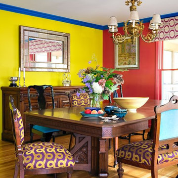
Dining room - eclectic light wood floor and beige floor dining room idea with multicolored walls
 Keystone Custom Decks
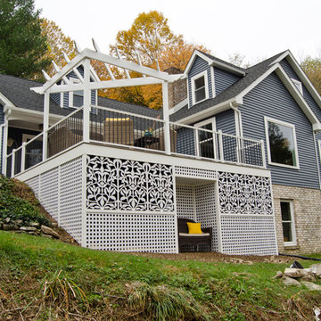
Completely custom outdoor living space built using TimberTech Ashwood Decking. The space features Custom Laser Cut lattice. This project also showcases a custom white vinyl corner pergola.
Photography by Keystone Custom Decks
30