
Search results for "Considerable possibilities" in Home Design Ideas
 Alair Homes Nanaimo
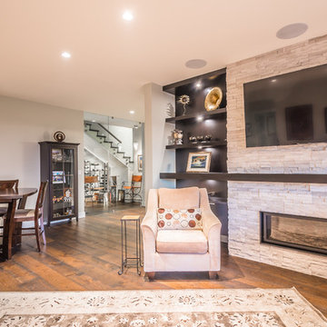
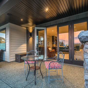
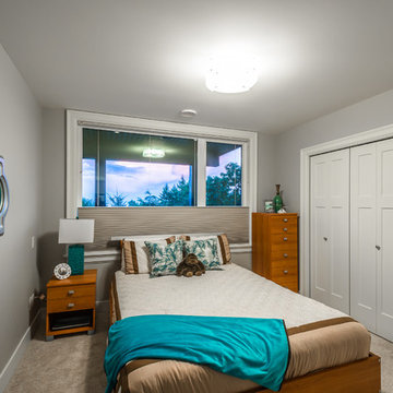
This modern-style executive home takes full advantage of the views and rocky terrain. The homeowners are retirees whose goal was to build a home that they could age in place in. Taking their needs into consideration, we created a large open concept design that takes advantage of the natural light and scenery while enabling the owners full accessibility throughout. All the primary rooms are located on the main floor with guest and additional spaces on lower floors. All door widths were increased and a roll thru shower was installed to allow for wheelchair accessibility if required in the future. The entire house is controlled by a state of the art iPad home automation system controlling media, mechanical systems, lighting & security.
"Light & Bright" are the items our client wanted us to focus on, with "Light" we wanted to capture as much as natural light from the large windows as possible. As for "Bright" we kept most of the finishes grey and white and clean. Pops of colour and warm hardwood flooring tie the entire space together.
 Interior Design Imports
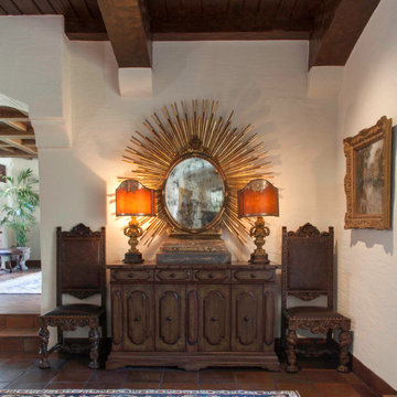
An historic Spanish Colonial residence built in 1925 being redesigned and furnished for a modern-day Southern California family was the challenge. The interiors of the main house needed the backgrounds set and then a timeless collection created for its furnishings. Lifestyle was always a consideration as well as the interiors relating to the strong architecture of the residence. Natural colors such as terra cotta, tans, blues, greens, old red and soft vintage shades were incorporated throughout. Our goal was to maintain the historic character of the residence combining design elements and materials considered classic in Southern California Spanish Colonial architecture. Natural fiber textiles, leathers and woven linens were the predominated upholstery choices. A 7000 square foot basement was added and furnished to provide a gym, Star Wars theater, game areas, spa area and a simulator for indoor golf and other sports.
Antiques were selected throughout the world, fine art from major galleries, custom reproductions fabricated in the old-world style. Collectible carpets were selected for the reclaimed hardwood flooring in all the areas. An estancia and garden over the basement were created and furnished with old world designs and materials as reclaimed woods, terra cotta and French limestone flooring.
 Home Advertising
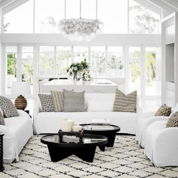
A Hampton style sofa has become a necessity in home decor as people become more familiar with the Hampton interior style. Hampton style sofas are a good choice for timeless design if you are replacing or buying a new one. When you are uncertain of what you want, buying a sofa can seem challenging. If you're trying to select La maison hampton furniture for one of your home's most important rooms, you have a lot to take into account. It maust suit your taste and function.
Couches require thought and consideration. It is important that you choose a style and a color that goes well with your living area, along with a durable material that meets your needs. The front door must also be able to accommodate the rug. So, don't forget to familiarize yourself with the different sizes, fillings, and textures before creating your budget. You don't have to spend a lot of money on a new sofa, but while there are some places where you can save money, there are others where you should invest.
First, Let's Talk about the Vibe of sofa style
First and foremost, you should consider the style of your sofa. Choose a sofa whose style fits the current theme of your home. It may seem very obvious, but many people simply buy whatever suits their fancy, and unfortunately, the style of the room is a lot of the time different from what suits their fancy.
If the rug or the art above the sofa don't go together, it might not work in the room. It's imperative to get the look right before adding the rest of these elements. Make sure you consider how you wish the room to feel when you're in it. If you're looking for something more colorful, or you have a particular style in mind, such as mid-century (then googling 'Hampton style sofas' will prove valuable). A sofa that looks great but is super-comfy might end up looking completely out of place if you skip this step.
Next, We will Discuss Functionality of sofas
It is important to consider what you will be doing with the sofa. Although I am convinced that the answer is "to sit on", we need to dig deeper. Can you, for instance, sit down for drinks in this formal sitting room when company comes over? Do you watch television in this room every day? There is a rumpus room upstairs for the kids to interact with their friends and eat and drink on it? There might be Hampton style sofas in the guest room.
For your convenience, I have compiled a full list of Hampton style sofas here. Depending on the situation, each sofa style needs to be different. Typically, formal couches tend to be less comfortable. They're usually more rigid and upright. Couches for watching TV should be cushier; they should be comfortable. We know that many teens are not concerned about Hampton style sofas maintenance, so kids zones need sofas that are able to withstand more wear and tear. This is something high schools should teach.
This story shows you the importance of not skipping this important ‘how will it be used? At this point, you should have an idea of how you'll use the Hampton style sofas. Consider, for instance, a sofa with a bold color and a formal feel for your living room. If you want a couch with a relaxed feel, choose a neutral shade with a cushy feel.
Dimensions of an ideal hamptons style sofa
Before you buy a Hampton style sofa, you must measure the size of your current living room. You will probably not fit it if you don't do this. A large one will either overwhelm the room and leave no room for a coffee table, or a small one will look dwarfed in comparison. When a pandemic strikes, scale is everything.
You should be able to fit the sofa into the room comfortably without it feeling too large or small. Measure the width of your La maison hampton furniture style sofas first with a tape measure. Consider if you'd like side tables beside your sofa. In that case, you would need to measure the width of either side of your sofa and add around 50cm to either side (most decent side tables have a width of about 50cm).
In addition to measuring Hampton style sofas depth, you should also measure the width. There are some sofas that can be as deep as a metre (from the front of the sofa cushion to its back). Since your sofa will need an allowance of 50cm from the edge of the coffee table to the front of the sofa, and a minimum of 50cm on the other side of the coffee table, you might want to measure your current coffee table to ensure it matches.
Another Important Factor is Height
In an open-plan living room, this element is particularly important if your sofa crosses the space. When you have a sectional sofa, for example, one of the ends will likely cut across the room, so the back should be low so your eye can still pass over the back.
One of the top 10 living room design mistakes I make is to place tall-backed Hampton style sofas across the room, a mistake that really cramps the style of the whole space. It happens way too often.
Although the height won't be a major issue if the sofa is backed up against a wall, it is still worth considering the size of the art you want to hang above it. If you want neck support whilst watching TV, a low-back sofa might not be for you. My neck tends to become less and less flexible as I get older. It's a sad fact, but true nonetheless. If you find yourself in the same situation, you should consider high-back Hampton style sofas.
Sofa Cushions: How Low are They?
Many people don't think about this dimension when purchasing a sofa online, especially if they're doing so for the first time. If you're road-testing the sofa in-store, you'll know if it's too low for you right away, but an online purchase is something else. Low-profile sofas have a seat height of 40 cm or less. The sofa's 60cm seat height will make it much more difficult to get up and out of it. The importance of this factor increases as we age or if we have mobility problems.
The seat you're sitting in should allow you to stand up comfortably, without feeling like you need assistance. Additionally, the height of your coffee table should not be higher than the seat cushions on the sofa, because the table should never be higher than the seat cushions on the sofa. They should never be higher than each other. Make sure you take notes!
What Else is There in the Room?
A good idea when choosing a sofa is to consider what other elements will be in the room. For a well-designed, elegantly-resolved living room, you'll need a sofa, rug, coffee table, side table/s, lamp, TV unit, and wall art. The room will not feel right if you buy a massive sectional sofa that takes up the entire room and leaves no space for a coffee table or side tables.
You should measure out your sofa, keeping in mind that the other pieces La maison hampton furniture and decor will also need to fit into the space. All pieces of furniture need to have enough space to breathe. It's best not to have all the furniture crammed into the point where sitting down means hitting your legs or feet against pieces. You probably now understand that choosing a couch is more about the couch itself than with how to choose it. So think of the big picture whenever you choose something.
Two Two-Seaters, or a Sectional Sofa?
People often have to wrestle with the question of whether they should buy two sofas or one sectional when figuring out how to choose a sofa. Sectionals are usually preferable to two separate two-seater sofas. However, the corner piece is rarely occupied anyway. Often, the corner piece of a sectional is so tiny that it is impossible for a person to sit there comfortably. Therefore, think about whether you actually need this over getting two x two-seater sofas and arranging them into an L-shape.
If you don't have a large living room, you might prefer 2 x two-seater sofas instead. Sectional sofas are best for larger rooms. With the visual break of all that fabric dominating the corner, it will do the room a world of good. Furthermore, you can use the space between your sofas to put a side table so you can place drinks, or a table lamp, there.
You may want to consider getting 1 x two-seater sofa and an armchair instead, if you have a really small living room. Even though you want to seat as many people as possible, you should let the room determine how many people the sofa can accommodate.
A Guide to Picking the Right Material
The material of the sofa is obviously very important when it comes to picking out the right one. The best advice I can offer is to consider who will use the sofa and how that will impact maintenance.
Leather sofas are easier to clean than fabric ones when kids or pets are present. Leather has the disadvantage of retaining heat in the winter and being cold in the summer. Cushions work well with leather sofas, but velvet ones work better with leather sofas. Leather will show up claw marks more easily on some pets (like my cats).
It is true that fabric sofas are softer and cozier, but they can also be more difficult to clean. Having a slipcover sofa is a godsend if you have pets or toddlers, but they're not too easy to maintain.
You should consider how much patience you have to keep the sofa clean and who uses it. That will make it easier to decide what material to use. I work with a sofa supplier who has bomb-proof fabric that is so easy to clean that you can literally serve dinner right onto the cushions without making an utter mess.
Find the right local pro for your project
 Huggins Wood Floor Specialist
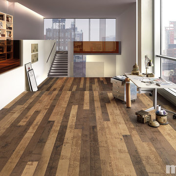
Carving Grunge I Oak plank (1/2 OAK Country Vulcano, 1/2 OAK Country) in 3-layer construction, bevelled on the long side and with approx. 4 mm top layer, with approx. 4 mm backing in the same wood and middle layer conifer. Tongue and groove on all sides for easy installation. Cracks, branch knots and splay knots are highlighted with black putty. Colour variations and some sapwood are possible. Small open cracks and unsealed spots in the millimetre range are allowed. The graphic design is laid out across approx. 15 m². In order to get the most natural image, it should be taken into consideration that any repeat planks should not be laid out close to each other.
 Gallery KBNY
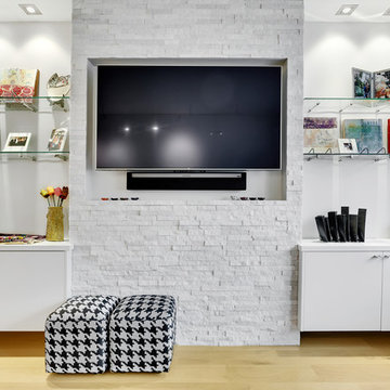
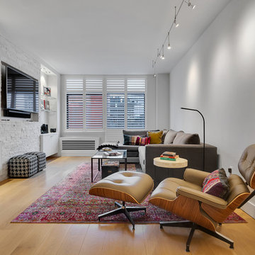
In this Manhattan pied-à-terre renovation, Gallery tackled the entire apartment. A true full renovation, we updated the kitchen, master bathroom, and powder room, installed new flooring throughout the entire space, and built the entertainment center in the living room.
DESIGN DETAILS
The clients wanted their pied-à-terre to have some modern touches, but not too sleek or contemporary. Since it combines a number of styles and elements, transitional turned out to be their ideal aesthetic. Whites, grays, and earthy tones carried this color theme throughout the apartment.
One of the clients is an artist and wanted wall space to display their original work, visible in the dining area and powder room in the photos below. The entertainment center is another highlight, with its white mosaic brick tile accent wall and glass open shelves to display family photos on both sides.
Instead of tiles, the new powder room walls received a textured concrete application, resulting in an almost industrial vibe. In the master bathroom renovation, glass mosaic tile accent walls bring a touch of personality to both the shower and a storage nook opposite the vanity.
UNIQUELY-SHAPED ROOMS
We specialize in adapting to every potential challenge, including uniquely-shaped rooms like the nearly-triangular kitchen in this Manhattan pied-à-terre renovation.
It’s important to design an uncommonly-shaped space as practically as possible, including specs seemingly as small as sink positioning. Every little detail counts tenfold in a room that’s not rectangular!
Other design details in the kitchen renovation include the classic combination of Shaker-style cabinets and quartz countertops, with a glass mosaic backsplash that matches the one used in the bathroom.
VISIBILITY = TRUST
Communication is always a core value at Gallery, but it’s even more vital when working with bi-coastal clients who were in another state throughout almost the entire process. We met with them once; everything else was done virtually thanks to JobTracker, our project management system.
The client had complete visibility into the renovation, including all design renderings, scheduled installations, and daily progress videos and photos. Even though they were 3000 miles away, they had a direct line to everyone on the team at all times.
SOME HIGHLIGHTS
- Entertainment center designed and built to serve as focal point, with white brick mosaic accent wall and open shelves made of glass
- Track lighting for ease of displaying art and to preserve ceiling height instead of the dropped ceiling that recessed lighting would necessitate
- Deliberate consideration of space in the unusually-shaped, nearly triangular kitchen
- Glass mosaic tile accent walls in the master bathroom with matching tile for the backsplash in the kitchen
Thinking about renovating your bathroom? Contact us today to find out how you can benefit from our expertise in remodeling New York City bathrooms. As a design-and-build firm with a full-scale approach, we handle every single aspect of your home renovation from start to finish.


 Betz Pools Limited
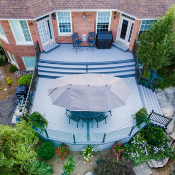
The attractive composite wood deck built by the owner’s contractor shows the considerable drop in elevation from the main floor walkouts down to ground level. The pool equipment, seen to left of the deck, is noticeable from this high vantage point, but is largely out of view from the deck or ground level.
Sponsored
Columbus, OH

Snider & Metcalf Interior Design, LTD
Leading Interior Designers in Columbus, Ohio & Ponte Vedra, Florida
 Lenore Weiss Studios, LLC
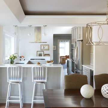
The wall between the dining room and kitchen was removed to create bright open living spaces.
Inspiration for a 1950s kitchen remodel in Chicago
Inspiration for a 1950s kitchen remodel in Chicago
 Alair Homes Plano
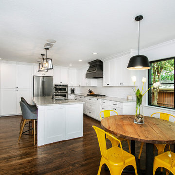
Our clients came to us after recently purchasing this 1967 home in the lovely Spring Creek neighborhood. They originally considered adding on to the master bedroom or possibly putting an addition above the garage. After all considerations, they decided to work within the existing sq. ft. of the home. They wanted to update their kitchen, they needed to add an office, as she works from home and they wanted consistent flooring throughout the front of the house. They had a small galley kitchen that you could enter from the front formal living/dining room or from the other end but it was completely closed off to the main living area, other than a small window. They really wanted to open it up but worried it might be too opened up. In addition to adding new ceiling height cabinets, they wanted to completely gut this outdated kitchen and start over with a cleaner, simpler looking kitchen. They had trouble envisioning what their space would look like opened up, so using our technology and being able to show them a rendering and being able to do a virtual walk-through, really helped them see their future.
We demoed the entire kitchen and all of the flooring throughout the kitchen, family room, living room and formal living room. We removed most of the wall that closed off the kitchen to the living room, with the exception of the half wall that became part of the new island. The doorway that used to go between the formal dining and kitchen was closed off, creating more kitchen wall space and allowing an office to be added at the back of the formal dining that could be closed off, when needed.
White Chandler cabinets were installed with beautiful Macaubus Giotto Quartzite countertops. Our clients chose to install a spice pull out and utensil caddy pull out on either side of the oven and a tray pull out for cookie sheets, as well. A wooden vent-hood was also built by Chandler, creating a nice contrast to the white cabinets. Matte black Stanton pulls and Elara knobs were installed coordinating with the Forge Industrial Pendant Island lights and the Doster Dome kitchen table pendant. A Kohler vault Smart Divide®top-/under-mount double-equal bowl kitchen sink was installed in the island with a Kohler Simplice kitchen faucet, also in matte black. Detailed posts were added to each corner on the back side of the island, giving it a more custom finished look. In the formal dining room, a 4-light Forge Industrial Island Light was installed, which coordinated with the two pendant lights above the island. Adjacent to the living room was an office/wet bar area, leading to the back porch. We replaced the existing wet bar with a new cabinet and countertop and faucet, matching the kitchen and installed a wine refrigerator, too. Hardwood floors were installed throughout the entire front of the house, tying it all together. Recessed lighting was installed throughout the dining room, living room and kitchen, really giving the space some much needed light. A fresh coat of paint to top it all off really brightened up the space and gave our clients exactly what they were wanting.
 Tile Doctor Ltd
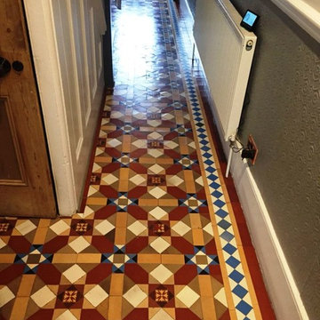
This detailed Victorian tiled hallway at a property in Camden was overdue some much-needed repair and maintenance. The owners of the property appreciated that original period features like this add a lot of value to a property and asked me to visit the property to quote for renovating it. The property was in a terrace of similar properties most of which appeared to have retained their Victorian character.
I inspected the floor and found there were a couple of loose, cracked, worn and broken tiles that needed to be replaced. In addition, the floor tiles needed a deep clean and then seal to bring back the wow factor. I was confident we could renovate the floor but at that point unsure if we would be able to find exact match replacements for the damaged tiles. Fortunately, Victorian tiles are still in demand and I knew of several companies I could check with so I was confident they could be found.
We discussed how long the work would take and assuming I could source the replacements agreed a price for the full restoration of the floor. After doing some research I managed to find suitable replacements with a company called Original Style and the work was scheduled for the following month.
Firstly, we prepared all areas with protective tapes to threshold edges and skirting.
This was followed by spaying the tiles with a strong dilution of Tile Doctor Remove & Go which is product designed to remove old sealers and coatings. After about ten minutes the tiles were scrubbed with black scrubbing pads and scrubbing brushes. Fresh water was used to rinse the floor and the slurry was extracted using a wet vacuum.
The floor was inspected and then a second clean carried out, this time using Tile Doctor Pro-Clean which is a Tile and Grout cleaning agent. The same process of application was used and after rinsing and extracting the dirt the tiles were given a steam clean. This ensured all the dirt was lifted out of the pores of the tile and the floor was now as clean as it possible could be.
The next step was the remove the loose and cracked tiles using the reclaimed tiles we had sourced earlier. Some cuts were necessary to get the replacements to match the originals but overall the plan worked. A quick drying adhesive was used to secure the tiles so we could apply the grout shortly after. The whole floor was then re-grouted and cleaned off to ensure a good match. The floor was left to dry off overnight, and you could already see it was now looking considerably improved.
Returning the next morning we checked the floor was dry using a moisture meter, this is important as to apply a sealer to damp tiles will lead to a patchy experience. All was well so we were ready to apply the sealer.
To start a single base coat of Tile Doctor Colour Grow sealer was applied to the floor and left to dry. This sealer is an impregnator that protects from within by occupying the pores in the clay tile improving colour in the process. This sealer does leave a matt finish however and the client wanted a subtle shine so one dry it was followed by four coats of Tile Doctor Seal & Go. The combination of the two sealers works really well to add long lasting protection to the tiles and provide the desired finish to the floor.
The floor was much improved, and the client was delighted. The detailed pattern and colours were now much more prominent, and the hallway looked much more inviting for both the owner and their guests. For the aftercare of Victorian tiles, I recommended the use of Tile Doctor Neutral Cleaner which is pH neutral and won’t prematurely erode the life of the sealer.
Nigel Voyce
North London Tile Doctor
 L & L Home Restoration, LLC
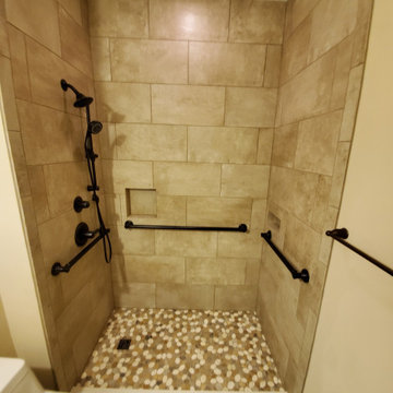
People with accessibility issues have special considerations and it is not one size fits all. This Client had a bathtub in this space that they could no longer use. We took out the tub and installed a low threshold shower. The curb we custom built to be a low as possible (this house is built on slab and the client did not wan to disturb that). Lots of grab bars for stability at every step of the shower. The wall head and hand shower allow for easier cleaning of both persons and the shower itself.
 Amity Worrel & Co.
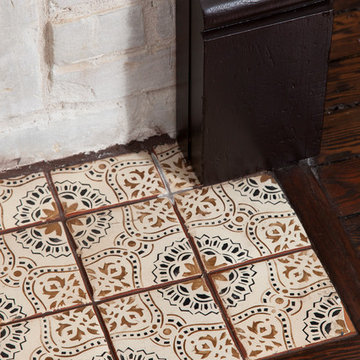
This was a dream project! The clients purchased this 1880s home and wanted to renovate it for their family to live in. It was a true labor of love, and their commitment to getting the details right was admirable. We rehabilitated doors and windows and flooring wherever we could, we milled trim work to match existing and carved our own door rosettes to ensure the historic details were beautifully carried through.
Every finish was made with consideration of wanting a home that would feel historic with integrity, yet would also function for the family and extend into the future as long possible. We were not interested in what is popular or trendy but rather wanted to honor what was right for the home.
 Bilotta Kitchen & Home
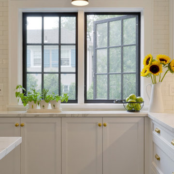
For this kitchen, designed by Peter Bittner, the client had a very clear idea of what she wanted right from the start. She did her research. The mother of a fast growing, young family, she wanted something as efficient as it was beautiful – on the simple, yet elegant side. Her requests were straightforward: white and light grey Bilotta cabinetry in a transitional style so as not to compete with the detailing inside her 1950s Tudor-style home; a heated tile floor (By Rye Ridge Tile); stainless appliances; white subway tile backsplash by Walker Zanger (again to keep it clean and not compete with its surroundings); and seating at the island for snacks and homework. The “pop” suggested by Peter was done through the satin brass hardware and lighting fixtures. The real challenge with this space was to fit as much as possible into the existing footprint which was overall on the smaller side. The solution was eliminating a doorway (with a swinging door that opened into the kitchen) and stairs from the kitchen to the basement. By moving the stairs and doorway, the usable space increased considerably. The typical working triangle became the focus for one side of the kitchen and the island overhang and seating became available on the other side. To make up for the limited amount of wall cabinets Peter designed shallow pantry-style cabinets along the back wall. Quartz Countertops by Rom Stone Fabrication. Designer: Peter Bittner Photographer: Peter Krupenye

Sponsored
Columbus, OH

Hope Restoration & General Contracting
Columbus Design-Build, Kitchen & Bath Remodeling, Historic Renovations
 Alair Homes Nanaimo
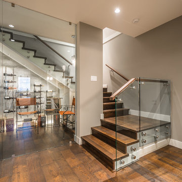
This modern-style executive home takes full advantage of the views and rocky terrain. The homeowners are retirees whose goal was to build a home that they could age in place in. Taking their needs into consideration, we created a large open concept design that takes advantage of the natural light and scenery while enabling the owners full accessibility throughout. All the primary rooms are located on the main floor with guest and additional spaces on lower floors. All door widths were increased and a roll thru shower was installed to allow for wheelchair accessibility if required in the future. The entire house is controlled by a state of the art iPad home automation system controlling media, mechanical systems, lighting & security.
"Light & Bright" are the items our client wanted us to focus on, with "Light" we wanted to capture as much as natural light from the large windows as possible. As for "Bright" we kept most of the finishes grey and white and clean. Pops of colour and warm hardwood flooring tie the entire space together.
 User
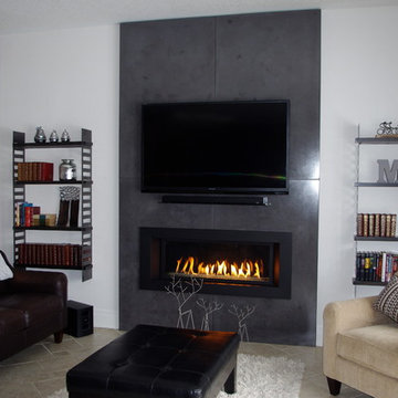
UserThis fireplace surround is comprised of four equal sections. After careful consideration the clients whited to have this piece look as symmetrical as possible. The overall height of this piece is 10' and the width is 6', making GFRC a prime candidate for its construction.
 Brooks + Scarpa Architects
Description: In early 1994, the architects began work on the project and while in construction (demolition, grading and foundations) the owner, due to circumstances beyond his control, halted all construction of the project. Seven years later the owner returned to the architects and asked them to complete the partially constructed house. Due to code changes, city ordinances and a wide variety of obstacles it was determined that the house was unable to be completed as originally designed.
After much consideration the client asked the architect if it were possible to alter/remodel the partially constructed house, which was a remodel/addition to a 1970’s ranch style house, into a project that fit into current zoning and structural codes. The owner also requested that the house’s footprint and partially constructed foundations remain to avoid the need for further entitlements and delays on an already long overdue and difficult hillside site.
The architects’ main challenge was how to alter the design that reflected an outdated philosophical approach to architecture that was nearly a decade old. How could the house be re-conceived reflecting the architect and client’s maturity on a ten-year-old footprint?
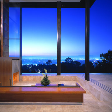
The answer was to remove almost all of the previously proposed existing interior walls and transform the existing footprint into a pavilion-like structure that allows the site to in a sense “pass through the house”. This allowed the client to take better advantage of a limited and restricted building area while capturing extraordinary panoramic views of the San Fernando Valley and Hollywood Hills. Large 22-foot high custom sliding glass doors allow the interior and exterior to become one. Even the studio is separated from the house and connected only by an exterior bridge. Private spaces are treated as loft-like spaces capturing volume and views while maintaining privacy.
Limestone floors extend from inside to outside and into the lap pool that runs the entire length of the house creating a horizon line at the edge of the view. Other natural materials such as board formed concrete, copper, steel and cherry provides softness to the objects that seem to float within the interior volume. By placing objects and materials "outside the frame," a new frame of reference deepens our sense of perception. Art does not reproduce what we see; rather it makes us see.
 Alair Homes Nanaimo
This modern-style executive home takes full advantage of the views and rocky terrain. The homeowners are retirees whose goal was to build a home that they could age in place in. Taking their needs into consideration, we created a large open concept design that takes advantage of the natural light and scenery while enabling the owners full accessibility throughout. All the primary rooms are located on the main floor with guest and additional spaces on lower floors. All door widths were increased and a roll thru shower was installed to allow for wheelchair accessibility if required in the future. The entire house is controlled by a state of the art iPad home automation system controlling media, mechanical systems, lighting & security.
"Light & Bright" are the items our client wanted us to focus on, with "Light" we wanted to capture as much as natural light from the large windows as possible. As for "Bright" we kept most of the finishes grey and white and clean. Pops of colour and warm hardwood flooring tie the entire space together.


 Alair Homes Nanaimo
This modern-style executive home takes full advantage of the views and rocky terrain. The homeowners are retirees whose goal was to build a home that they could age in place in. Taking their needs into consideration, we created a large open concept design that takes advantage of the natural light and scenery while enabling the owners full accessibility throughout. All the primary rooms are located on the main floor with guest and additional spaces on lower floors. All door widths were increased and a roll thru shower was installed to allow for wheelchair accessibility if required in the future. The entire house is controlled by a state of the art iPad home automation system controlling media, mechanical systems, lighting & security.
"Light & Bright" are the items our client wanted us to focus on, with "Light" we wanted to capture as much as natural light from the large windows as possible. As for "Bright" we kept most of the finishes grey and white and clean. Pops of colour and warm hardwood flooring tie the entire space together.
 Gallery KBNY
In this Manhattan pied-à-terre renovation, Gallery tackled the entire apartment. A true full renovation, we updated the kitchen, master bathroom, and powder room, installed new flooring throughout the entire space, and built the entertainment center in the living room.
DESIGN DETAILS
The clients wanted their pied-à-terre to have some modern touches, but not too sleek or contemporary. Since it combines a number of styles and elements, transitional turned out to be their ideal aesthetic. Whites, grays, and earthy tones carried this color theme throughout the apartment.
One of the clients is an artist and wanted wall space to display their original work, visible in the dining area and powder room in the photos below. The entertainment center is another highlight, with its white mosaic brick tile accent wall and glass open shelves to display family photos on both sides.
Instead of tiles, the new powder room walls received a textured concrete application, resulting in an almost industrial vibe. In the master bathroom renovation, glass mosaic tile accent walls bring a touch of personality to both the shower and a storage nook opposite the vanity.
UNIQUELY-SHAPED ROOMS
We specialize in adapting to every potential challenge, including uniquely-shaped rooms like the nearly-triangular kitchen in this Manhattan pied-à-terre renovation.
It’s important to design an uncommonly-shaped space as practically as possible, including specs seemingly as small as sink positioning. Every little detail counts tenfold in a room that’s not rectangular!
Other design details in the kitchen renovation include the classic combination of Shaker-style cabinets and quartz countertops, with a glass mosaic backsplash that matches the one used in the bathroom.
VISIBILITY = TRUST
Communication is always a core value at Gallery, but it’s even more vital when working with bi-coastal clients who were in another state throughout almost the entire process. We met with them once; everything else was done virtually thanks to JobTracker, our project management system.
The client had complete visibility into the renovation, including all design renderings, scheduled installations, and daily progress videos and photos. Even though they were 3000 miles away, they had a direct line to everyone on the team at all times.
SOME HIGHLIGHTS
- Entertainment center designed and built to serve as focal point, with white brick mosaic accent wall and open shelves made of glass
- Track lighting for ease of displaying art and to preserve ceiling height instead of the dropped ceiling that recessed lighting would necessitate
- Deliberate consideration of space in the unusually-shaped, nearly triangular kitchen
- Glass mosaic tile accent walls in the master bathroom with matching tile for the backsplash in the kitchen
Thinking about renovating your bathroom? Contact us today to find out how you can benefit from our expertise in remodeling New York City bathrooms. As a design-and-build firm with a full-scale approach, we handle every single aspect of your home renovation from start to finish.
 Seed
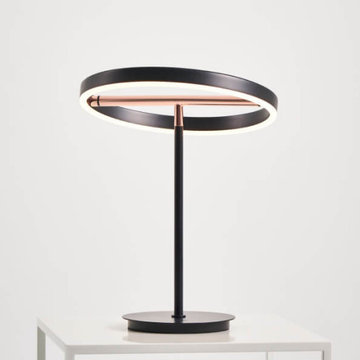
SeedSOL collection is low-key design with elaborate consideration, consists of pendant, table lamp and even bow lamp type. SOL Table Lamp ’s ring-like lampshade is finely affixed to a metallic luster balance bar, demonstrating the definition of understated luxury. The adjustable ring tilt allows the pendant to function almost like a planet floating on a track of stars. Invisible LED strip makes the light source impeccable, with a gradual dimming capability, rendering it possible for you to re-create your own personal sunrise and sunset.
18