
Search results for "Consistency" in Home Design Ideas
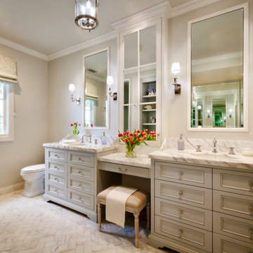
 Melanie Giolitti Interior Design
Remodel of Primary Bathroom consisting of new space plan to accommodate modern life.
Inspiration for a coastal marble floor, white floor and double-sink bathroom remodel in Los Angeles with gray cabinets, a two-piece toilet, an undermount sink, marble countertops, white countertops, a built-in vanity, recessed-panel cabinets and beige walls
Inspiration for a coastal marble floor, white floor and double-sink bathroom remodel in Los Angeles with gray cabinets, a two-piece toilet, an undermount sink, marble countertops, white countertops, a built-in vanity, recessed-panel cabinets and beige walls
 S.Flynn Design + Build
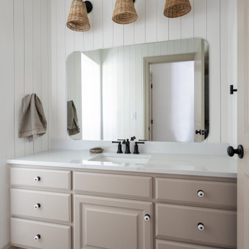
The guest bath perfectly complements the mudroom next door. We continued the slat wall treatment behind the mirror and put the same trim color on the cabinetry for consistency. For a fun flare, we installed 3 rattan sconces above the modern, frameless mirror with rounded edges that soften its look.
 Breathe Design Studio: San Francisco
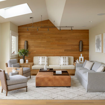
Completed in 2015, this project incorporates a Scandinavian vibe to enhance the modern architecture and farmhouse details. The vision was to create a balanced and consistent design to reflect clean lines and subtle rustic details, which creates a calm sanctuary.
Find the right local pro for your project
 Matarozzi Pelsinger Builders
In the process of renovating this house for a multi-generational family, we restored the original Shingle Style façade with a flared lower edge that covers window bays and added a brick cladding to the lower story. On the interior, we introduced a continuous stairway that runs from the first to the fourth floors. The stairs surround a steel and glass elevator that is centered below a skylight and invites natural light down to each level. The home’s traditionally proportioned formal rooms flow naturally into more contemporary adjacent spaces that are unified through consistency of materials and trim details.
 Kohn Shnier architects
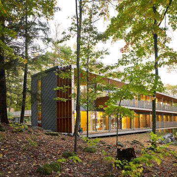
This year round two-family cottage is comprised of seven modules which required just 25 days to construct in an off-site facility. When assembled, these prefabricated units form a building that is 38 metres long but less than 5 metres wide. The length offers a variety of living spaces while the constricted width maintains a level of intimacy and affords views of the lake from every room.
Sited along a north-south axis, the cottage sits obliquely on a ridge. Each of the three levels has a point of access at grade. The shared living spaces are entered from the top of the ridge with the sleeping spaces a level below. Facing the lake, the east elevation consists entirely of sliding glass doors and provides every room with access to the forest or balconies.
Materials fall into two categories: reflective surfaces – glazing and mirror, and those with a muted colouration – unfinished cedar, zinc cladding, and galvanized steel. The objective is to visually push the structure into the background. Photos by Tom Arban
 Distinctive Interior Designs
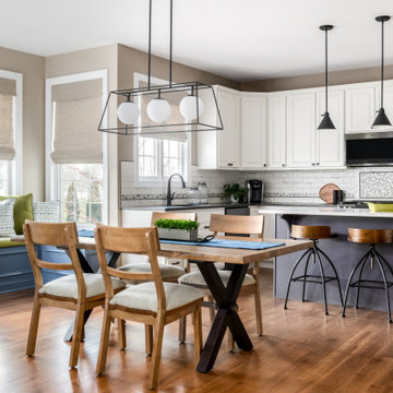
Check out this newly refreshed kitchen and custom reading nook! Every element, surface, accessory, corner, and window treatment in this entire kitchen is completely new, EXCEPT the cabinets & appliances.
We are known for our ability to create massive transformations without necessarily breaking the bank. DiD consistently presents our clients with multiple options as to how their home can be redone and always takes into account the ‘comfort zone’ of our clients.
The new end result is a happy, bright space that feels softly flooded with sunshine! Take a look at more details in the newly redone family room here.
 Evolve Co. Architectural Builders
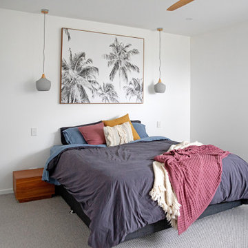
This stunning property won 1st place Custom Build of the Year 600-700K in the 2019 HIA CSR Hunter Housing and Kitchen & Bathroom Awards.
The design takes advantage of the northern views overlooking Lake Macquarie, NSW. The upper level consists of the main bedroom and an open floor plan, allowing all living and entertaining spaces to maximise the views. An additional living space and undercover deck is positioned downstairs, offering a perfect retreat for the children.
 Anima Architects
This project was designed, and developed by Rhodes Architecture + Light while Josh Meharry was a team member.
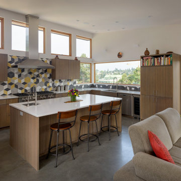
After seeing this roof design the clients dubbed their new house “Garuda” after the Hindu Demi-God with wings so large they darkened the sky, and the name stuck. These clients were a couple who were wanting a house for them and their dogs that could also house each of their parents who came often to visit them from India for prolonged stays. They wanted to have plenty of common space for everyone to spend time together as well as a sense of privacy between each of the three bedroom suites.
The resulting design consists of two lower “plinths”, each one housing one of the parent’s ensuite bedrooms which open onto private exterior patios in the rear yard. The upper level that bridges over and cantilevers beyond the lower plinths contains the communal living spaces and the couple’s bedroom suite, while the tops of the lower plinths then become roof decks for the spaces above. The void between the lower plinths serves as the primary entrance, and this space opens into a double height space with skylights that draw you up and make you feel connected to the upper living spaces despite the level change. Other unique spaces and elements were integrated into the design at the client’s request such as a Puja (prayer) room that opened into a screened exterior landscape area with a small fountain, as well as a rock climbing wall in the interior entrance atrium. The garage was tucked below and accessed from the side to keep the doors largely out of view, and a large movie room was also integrated on the lowest level.
The clients requested natural and warm materials, which lead to exposing the concrete floors throughout the interior and the use of corten rusting steel panels on the exterior of the lower plinths and wood soffits at the roof and underside of the upper floor.
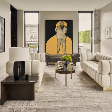 Matarozzi Pelsinger Builders
Once a traditional home built in the 1940’s, the new design transformed this space into a modern masterpiece with flush detailing, custom woodwork, and consistent reveals making seamless transitions between like and unlike materials. The home takes advantage of the space by incorporating two roof decks, penthouse views of the Golden Gate Bridge, and natural light throughout, including a 20’+ window that spans from the main floor to the second floor. The envelope was also transformed to make a statement with an arrangement of blocklike volumes centered around a patinated bronze-clad front door. Exposed concrete and Accoya siding flank the exterior which creates an intriguing chiaroscuro effect – accenting light and darkness. To accomplish the new layout and size, the existing structure was hydraulically shored for hard rock excavation adding a new basement below. The space is filled with custom cabinetry and doors that carry a beautifully crafted ceruse finish. The stone door portals compliment the natural color palette as a rich textured material. The remodel includes a water feature with stone-clad walls, an elevator, PV solar panels, an integrated lighting system, and a 1,200-bottle wine room.
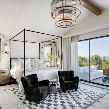
 Jess Diab Studio
Define spaces through furniture groupings, rugs, and subtle architectural transitions. Natural light and consistent materials help maintain harmony throughout the home. Focus on simplifying architectural details while introducing natural materials. Linen drapery, stone surfaces, and warm wood elements create balance between modernity and comfort.
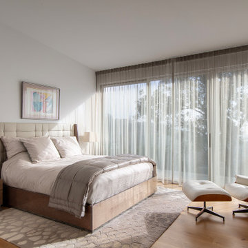
 Studio Couture
The primary bedroom was redesigned to feel calm, open, and directly connected to the landscape. Full-height glazing introduces consistent natural light while maintaining privacy through sheer drapery. Warm wood flooring and restrained detailing create a quiet backdrop, allowing the garden and filtered Bay light to define the atmosphere. The space reflects the broader intent of the remodel—clarity, simplicity, and alignment with site.
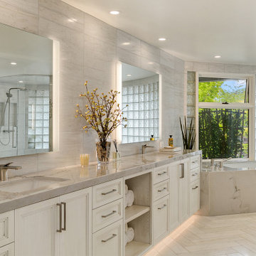
 Anne Grice Interiors
Example of a beach style gray tile gray floor and double-sink bathroom design in Denver with recessed-panel cabinets, white cabinets, an undermount tub, gray walls, an undermount sink, gray countertops and a built-in vanity
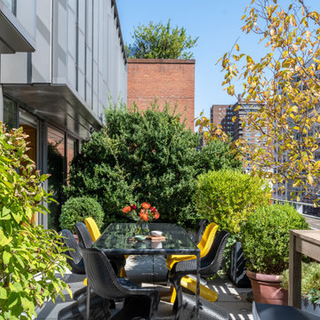

 Power Luxury Residence Group
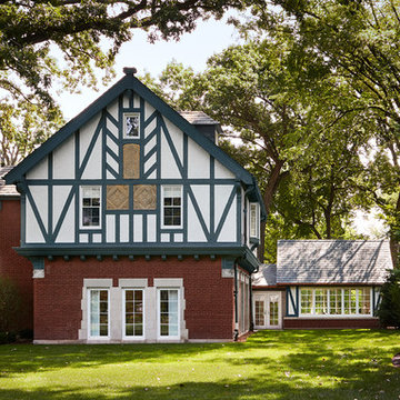
Once the carriage house to the neighboring Weibolt mansion (Northwestern University President's Home), Robbins Architecture designed a drastic interior reconfiguration and renovation that restored the building to its early 1900s glory. This exciting project for Northwestern University consists of a 3,400 square foot renovation and 1,000 square foot addition that will transform and modernize the existing structure while preserving the integrity of the original architecture and includes a new kitchen, living room, and family room on the first floor. Two new staircases connect to the second floor which is being reconfigured from four bedrooms into a grand master bedroom suite, additional bedroom and bathroom, study, and library tower.
Architect:Robbins Architecture
Designer: Thea Home, Inc.
Lighting Designer: Anne Kustner Lighting Design
Photography: Kendall McCaugherty @ Hall+Merrick
 Newschool Builders LLC
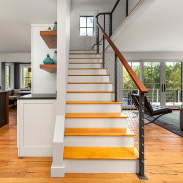
Nestled against the backdrop of the Worcester Mountain Range lies this timeless Modern Farmhouse. This project consisted of a full gut to most of the interior as well as new windows, doors, siding, decks, and trim. Part of the project involved building an addition to join the detached garage to the main house as well as redefining the entry with a beautiful and functional mudroom and powder room. We also built out a new dining room with a ton of glass which helped to connect the interior with the lush gardens outside.
Custom cabinetry, millwork, and builtins throughout. Doug Fir Timbers were used to support the load above while also providing a warm and handsome ascetic value throughout the downstairs as we opened the floorpan up. It is always refreshing to breath new life into an outdated structure.
 Erika Bruder Interior Design LLC
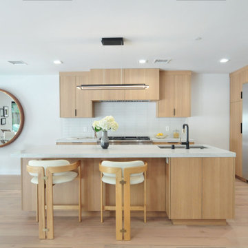
Remodeled home with contemporary, clean lines. Italian laminate cabinetry, high-end finishes.
Inspiration for a contemporary l-shaped light wood floor and beige floor eat-in kitchen remodel in Los Angeles with an undermount sink, flat-panel cabinets, light wood cabinets, white backsplash, stainless steel appliances, an island and white countertops
Inspiration for a contemporary l-shaped light wood floor and beige floor eat-in kitchen remodel in Los Angeles with an undermount sink, flat-panel cabinets, light wood cabinets, white backsplash, stainless steel appliances, an island and white countertops
 Klopf Architecture
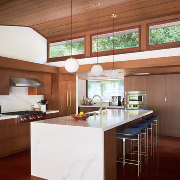
Nestled in the hills of Orinda, California, this 1951 residence is one of only seven extant homes, now known as “The Magnificent Seven”, designed by architect Olof Dahlstrand, a protégé of Frank Lloyd Wright. With its low-slung rooflines, natural materials, and deep integration with the sloping landscape, the home is a pristine example of mid-century modern design inspired by Wright’s organic principles. Over the years, prior homeowners have emphasized preservation, ensuring that the house remained relatively untouched. Each owner has respected the original architecture and stayed true to Dahlstrand’s intent. When a family of five—two college-aged sons and a middle school-aged daughter—acquired the property, they were captivated by its history, legacy of care, and architectural significance. While they appreciated Dahlstrand’s original vision, they also recognized the need to adapt the home for contemporary living while preserving its design integrity.
The remodel was conceived as a thoughtful response to the past—an effort to bring the house into the 21st century without compromising its soul. The primary mandate was to maintain architectural continuity while improving the functionality, comfort, and livability for a modern family. The design team—architects and contractor alike—worked with a shared reverence for the original architecture, allowing that mindset to guide even the most technical or pragmatic decisions.
A key objective was to increase natural light in the kitchen—a departure from Wrightian principles of enclosed, intimate cooking spaces—while maintaining the home’s architectural language. The kitchen was reconfigured to foster a stronger connection to adjacent living spaces while retaining the underlying concept of spatial separation. One of the most transformative architectural changes was the removal of a ridge beam that was originally planned to remain visible through the kitchen. During construction, the team collaborated on a better solution: a wide-flanged steel beam concealed within the roof envelope. This subtle move preserved the clean lines and ceiling continuity, a modern update carried out with utmost respect for the existing framework.
The home’s original powder room, previously accessible only through the kitchen, was relocated for better flow and privacy. A new powder room was carved out of former kitchen cabinetry—a narrow, interior space that could have felt dark and enclosed. To avoid this, the design extended the line of original transom windows into the new powder room and added a skylight above the vanity. The result is a bright and airy space that feels consistent with the rest of the home. Other updates included the installation of new solid-core interior doors with veneers carefully matched to the original mahogany, enhancing the continuity of the interiors. Even smaller decisions, such as placing the door knobs at 42 inches high, mirrored the original proportions. Every choice reflected a shared belief between the architect, contractor, and client: that new work should serve the integrity of the old.
The home’s extensive interior redwood millwork and paneling was meticulously restored. Where new materials were introduced—such as the replacement redwood soffit paneling—the contractor took pains to find finish nails that matched the original, rather than using modern equivalents. This level of craftsmanship and collaboration defined the project. It extended even to the detailing of a blind door to the new powder room, which had to disappear into the existing redwood board-and-batten wall. It was a team effort: the owner found a suitable handle, the architects devised the custom in-swing mechanism, and the contractor executed it so the door aligned precisely with the battens. Throughout, the homeowners were deeply engaged in the design process. One, a meticulous design enthusiast, focused on aesthetic integrity and historic detail. The other brought a practical and function-driven perspective, ensuring that new fixtures and materials would be durable and require minimal maintenance.
While the home’s location posed no major site challenges, sustainability was a key concern. The team upgraded the roof insulation, installed solar panels with battery storage, and added ductless mini-split cooling systems. Lighting was another area where modern technology was woven into a historic framework: new square LED fixtures echo the original custom perimeter soffit lights, maintaining the design language while offering advanced performance.
A planned expansion of a bedroom into suite with a bathroom had to be shelved due to budget constraints and the high cost of below-grade foundation work. Still, the team focused their efforts on making the most of the existing footprint, resolving constraints through design ingenuity rather than adding square footage. This renovation represents a collaborative achievement in preserving and evolving a historically significant home. Every decision was shaped by a shared ethos among clients, architects, and contractor: to maintain the home’s architectural soul while updating it for contemporary life. The result is a timeless modernist residence that continues Olof Dahlstrand’s legacy, remaining grounded in nature, craftsmanship, and human-scale design.
Klopf Architecture Team: John Klopf, AIA, Klara Kevane, Fernanda Bernardes
Interior Architectural Design: Klopf Architecture
Structural Engineer: Daniel Bastiao
Contractor: Don Larwood, Larwood Construction
Photography: Mariko Reed
Year Completed: 2022
 Schulte Design Build
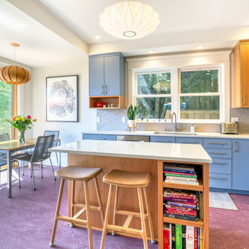
In this Ballard kitchen project, we worked with our clients to upgrade their 1905 Craftsman home. The goal was to create a space that was light, bright, and vibrant while staying true to the character of the home. We used plum marmoleum, an eco-friendly choice, for the flooring, complemented by lavender-gray cabinets and white Carrara polished quartz countertops. To maintain consistency and warmth, we incorporated natural wood elements from the kitchen into the custom cabinets along the kitchen entry way.
Additionally, we relocated the fireplace to create an open living room, further enhancing the flow and functionality of the home. This project is a reflection of our clients' aesthetic preferences and highlights the importance of working with clients directly to realize their vision.
 Peacock Pavers
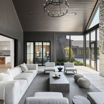
A cohesive interior begins with the surface. Rice White pavers support daily living while maintaining a refined, consistent finish.
Trendy screened-in porch photo in Miami with a fireplace and a roof extension
Trendy screened-in porch photo in Miami with a fireplace and a roof extension
 SoNo architects
Architects: SoNo Arhitekti
www.sono.si
www.facebook.com/SonoArhitekti
Location: Slovenia
Architects in Charge: Edvard Blažko, Marko Volk, Nina Tešanović, Samo Radinja
Area: 230 sqm
Year: 2015
Photographs: Aljoša Videtič
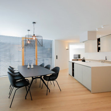
This family home is an example of a modern design filled with natural light and building blocks comprised of sustainable material – in this case wood, one of the if not the most strategic material of Slovenia . It's definitely not a typical prefabricated house out of catalogue as we tried to develop a residence that meets the needs of modern users while having functional floor plans and contemporary elegant exterior all appropriately settled into its landscape.
Main concept presents three volumes that are placed in a triangular composition partially overlayed with a rectangular form of the upper floor. While the dynamic shape of the groundfloor is covered with a flat roof, the 1st floor is completed with a gable –like roof, echoing the traditional architecture of the house's surroundings.
While we enter into an open spacious and dynamically shaped groundfloor we discover a pleasant intimate ambience. The living room and dining area offer a lot of natural light through the large glazed window surfaces. A prominent staircase leads us to the upper sleeping area that consists of the main bedroom with its own dressing room and a bathroom and children's rooms with a smaller bathroom.
Despite groundfloor's dynamic shape, its façade is monochrome - predominately a clean white surface in combination with bigger windows. On the contrary the simple form of the upper floor has a boldly designed façade - a combination of dark colour shades and natural larch wood’s textures.
Wood is the basic structural element and at the same time complements the facades, window frames, while also dominating the interiors.
116