
Search results for "Consistency" in Home Design Ideas
 Valentini Kids Furniture Brooklyn NY
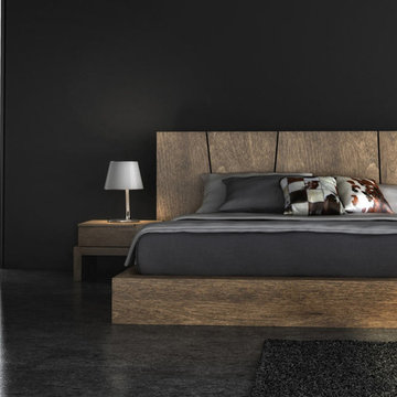
Modern Bedroom Set Silk by Huppe
Made in Canada
The Silk Bedroom by Huppe is manufactured in birch veneer specially selected, which is timeless and sophisticated. The case goods repeat the lines of the bed, giving a sense of balance to the collection. The headboard consists of 5 distinct sections with architectural details that let daylight or optional led lighting pass through. The Silk bed is available with wooden slats platform or a wooden panels platform on which a mattress can be used without a box spring. Optionally, the set also offers a dresser, chest and nightstands to give the bed a comfortable storage system. The drawer interiors are hand stained with a silky finish that protects the contents. The drawers close softly and quietly thanks to hidden self-closing slow motion slides. Customers are ensured that this product, designed by Joel Dupras and manufactured in Canada by a passionate team, is unique, authentic and of top quality. The Silk bed can be ordered with an optional Storage Platform.
Dimensions:
Queen Size Bed: W79" x D88.7" x H37"
King Size Bed: W97" x D88.7" x H37"
Queen Size Storage Bed: W79" x D88.7" x H37"
King Size Storage Bed: W97" x D88.7" x H37"
1-Drawer Nightstand: W21.7" x D20" x H13.5"
2-Drawer Nightstand: W22" x D19" x H16"
6-Drawer Dresser: W66" x D19" x H29"
5-Drawer Chest: W30" x D19" x H50"
Horizontal Mirror: W46" x D2.3" x H26"
Floor Mirror: W23" x D2.3" x H75"
 CORE Remodeling Services, Inc.
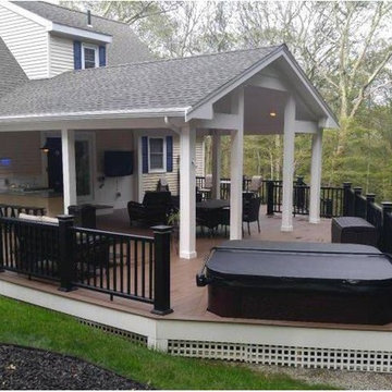
Deck and deck design in Douglas MA. with outdoor kitchen. CORE designed and completed this project. The project consists of Timbertech Antique Palm decking and Radiance railings with light post caps around the entire deck and finished with installing a hot tub.

Find the right local pro for your project
 ADŌR Homes
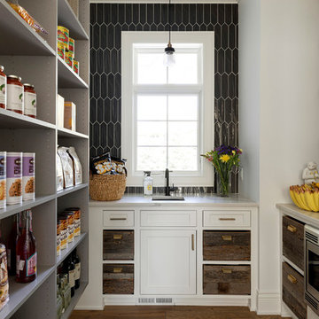
reclaimed wood drawers
Benjamin moore super white cabinets
quartz countertops
closet organizer in gray
Smoke Gray tile with white grout
Sub Zero glass front fridge
Microwave with Trim Kit
Image by @Spacecrafting
 CairnsCraft Design & Remodel
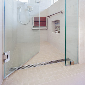
Our client requested a design that reflected their need to renovate their dated bathroom into a transitional floor plan that would provide accessibility and function. The new shower design consists of a pony wall with a glass enclosure that has beautiful details of brushed nickel square glass clamps.
The interior shower fittings entail geometric lines that lend a contemporary finish. A curbless shower and linear drain added an extra dimension of accessibility to the plan. In addition, a balance bar above the accessory niche was affixed to the wall for extra stability.
The shower area also includes a folding teak wood bench seat that also adds to the comfort of the bathroom as well as to the accessibility factors. Improved lighting was created with LED Damp-location rated recessed lighting. LED sconces were also used to flank the Robern medicine cabinet which created realistic and flattering light. Designer: Marie cairns
Contractor: Charles Cairns
Photographer: Michael Andrew
 Pineapple House Interior Design
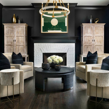
Pineapple House creates style and drama using contrasting bold colors -- primarily midnight black with snow white, set upon dark hardwood floors. Upon entry, an inviting conversation area consisting of four over-sized swivel chairs upholstered in taupe mohair surround the parlor's white painted brick fireplace. Their electronics and entertainment center are hidden in two washed oak cabinets.
 Breathe Design Studio
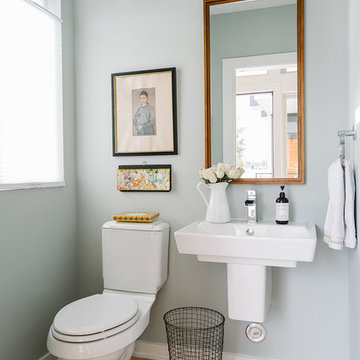
Completed in 2015, this project incorporates a Scandinavian vibe to enhance the modern architecture and farmhouse details. The vision was to create a balanced and consistent design to reflect clean lines and subtle rustic details, which creates a calm sanctuary. The whole home is not based on a design aesthetic, but rather how someone wants to feel in a space, specifically the feeling of being cozy, calm, and clean. This home is an interpretation of modern design without focusing on one specific genre; it boasts a midcentury master bedroom, stark and minimal bathrooms, an office that doubles as a music den, and modern open concept on the first floor. It’s the winner of the 2017 design award from the Austin Chapter of the American Institute of Architects and has been on the Tribeza Home Tour; in addition to being published in numerous magazines such as on the cover of Austin Home as well as Dwell Magazine, the cover of Seasonal Living Magazine, Tribeza, Rue Daily, HGTV, Hunker Home, and other international publications.
Featured on Dwell!
https://www.dwell.com/article/sustainability-is-the-centerpiece-of-this-new-austin-development-071e1a55

 TVL Creative Ltd.
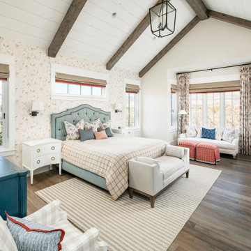
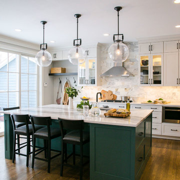
Our clients had just recently closed on their new house in Stapleton and were excited to transform it into their perfect forever home. They wanted to remodel the entire first floor to create a more open floor plan and develop a smoother flow through the house that better fit the needs of their family. The original layout consisted of several small rooms that just weren’t very functional, so we decided to remove the walls that were breaking up the space and restructure the first floor to create a wonderfully open feel.
After removing the existing walls, we rearranged their spaces to give them an office at the front of the house, a large living room, and a large dining room that connects seamlessly with the kitchen. We also wanted to center the foyer in the home and allow more light to travel through the first floor, so we replaced their existing doors with beautiful custom sliding doors to the back yard and a gorgeous walnut door with side lights to greet guests at the front of their home.
Living Room
Our clients wanted a living room that could accommodate an inviting sectional, a baby grand piano, and plenty of space for family game nights. So, we transformed what had been a small office and sitting room into a large open living room with custom wood columns. We wanted to avoid making the home feel too vast and monumental, so we designed custom beams and columns to define spaces and to make the house feel like a home. Aesthetically we wanted their home to be soft and inviting, so we utilized a neutral color palette with occasional accents of muted blues and greens.
Dining Room
Our clients were also looking for a large dining room that was open to the rest of the home and perfect for big family gatherings. So, we removed what had been a small family room and eat-in dining area to create a spacious dining room with a fireplace and bar. We added custom cabinetry to the bar area with open shelving for displaying and designed a custom surround for their fireplace that ties in with the wood work we designed for their living room. We brought in the tones and materiality from the kitchen to unite the spaces and added a mixed metal light fixture to bring the space together
Kitchen
We wanted the kitchen to be a real show stopper and carry through the calm muted tones we were utilizing throughout their home. We reoriented the kitchen to allow for a big beautiful custom island and to give us the opportunity for a focal wall with cooktop and range hood. Their custom island was perfectly complimented with a dramatic quartz counter top and oversized pendants making it the real center of their home. Since they enter the kitchen first when coming from their detached garage, we included a small mud-room area right by the back door to catch everyone’s coats and shoes as they come in. We also created a new walk-in pantry with plenty of open storage and a fun chalkboard door for writing notes, recipes, and grocery lists.
Office
We transformed the original dining room into a handsome office at the front of the house. We designed custom walnut built-ins to house all of their books, and added glass french doors to give them a bit of privacy without making the space too closed off. We painted the room a deep muted blue to create a glimpse of rich color through the french doors
Powder Room
The powder room is a wonderful play on textures. We used a neutral palette with contrasting tones to create dramatic moments in this little space with accents of brushed gold.
Master Bathroom
The existing master bathroom had an awkward layout and outdated finishes, so we redesigned the space to create a clean layout with a dream worthy shower. We continued to use neutral tones that tie in with the rest of the home, but had fun playing with tile textures and patterns to create an eye-catching vanity. The wood-look tile planks along the floor provide a soft backdrop for their new free-standing bathtub and contrast beautifully with the deep ash finish on the cabinetry.
 Drake Construction, Inc.
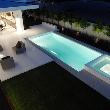
Pool and spa. Photo by Michael McCreary.
Minimalist backyard pool photo in Los Angeles
Minimalist backyard pool photo in Los Angeles
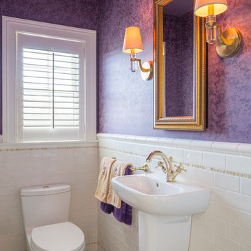
Example of a small minimalist white tile and subway tile marble floor powder room design in Boston with a wall-mount sink and purple walls
 Nouvel Kitchen and Bath
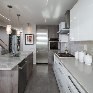
In this middle size town house the kitchen is a very important, central place and it had undergone a full structural remodel. The client had requested a neutral color palette with subdued natural tones. The designer had used two level counter tops to give a hint of separation between kitchen and dining areas but consistency in material gave it a united look.
 Cabinet-S-Top
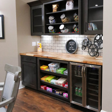
This basement remodeling project consisted of creating a kitchen which has Waypoint 650F door style cabinets in Painted Harbor on the perimeter and 650F door style cabinets in Cherry Slate on the island with Cambria Skara Brae quartz on the countertop.
A bathroom was created and installed a Waypoint DT24F door style vanity cabinet in Duraform Drift with Carrara Black quartz countertops. In the shower, Wow Liso Ice subway tile was installed with custom shower door. On the floor is Elode grey deco tile.
A movie room and popcorn/snack area was created using Waypoint 650F door style in Cherry Slate with Madera wood countertops.
 Mark Brand Architecture
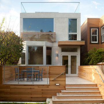
Rear Facade Photo.
"Business in the Front, Party in the Back."
This project provided Mark with the opportunity to revisit a project from the first year of his practice. Our clients were the third owners since Mark first worked on this house in 1987. The original project had consisted of a small addition to the rear of an existing single-story (over garage) house. The new owners wanted to completely remodel the house and add two floors. In addition they wanted it to be MODERN. This was a perfect fit for where the firm had evolved to over the years, but the neighbors weren't having it. The neighbors were very organized and didn’t like the idea of a large modern structure in what was a mostly traditional block. We were able to work with the neighbors to agree to a design that was Craftsman on the front and modern on the interior and rear. Because of this dichotomy, we sometimes refer to this as the "Mullet House". We were able to minimize the apparent height of the facade by hiding the top floor behind a dormered roof. Unique features of this house include a stunning roof deck with glass guardrails, a custom stair with a zigzag edge and a guardrail composed of vertical stainless steel tubes and an asymmetrical fireplace composition.
Rear Facade Photo by Thomas Kuoh
 Allen Kitchen & Bath
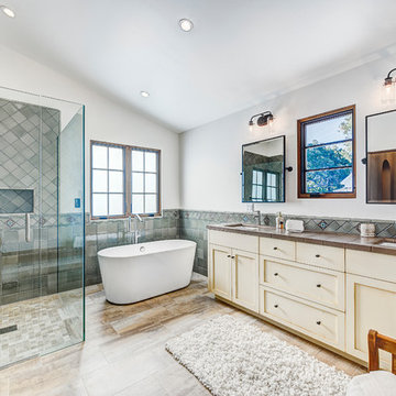
Architect: RRM Design | Photo by: Jim Bartsch | Built by Allen
This Houzz project features the wide array of bathroom projects that Allen Construction has built and, where noted, designed over the years.
Allen Kitchen & Bath - the company's design-build division - works with clients to design the kitchen of their dreams within a tightly controlled budget. We’re there for you every step of the way, from initial sketches through welcoming you into your newly upgraded space. Combining both design and construction experts on one team helps us to minimize both budget and timelines for our clients. And our six phase design process is just one part of why we consistently earn rave reviews year after year.
Learn more about our process and design team at: http://design.buildallen.com
 Haven Design and Construction
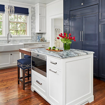
This 1902 San Antonio home was beautiful both inside and out, except for the kitchen, which was dark and dated. The original kitchen layout consisted of a breakfast room and a small kitchen separated by a wall. There was also a very small screened in porch off of the kitchen. The homeowners dreamed of a light and bright new kitchen and that would accommodate a 48" gas range, built in refrigerator, an island and a walk in pantry. At first, it seemed almost impossible, but with a little imagination, we were able to give them every item on their wish list. We took down the wall separating the breakfast and kitchen areas, recessed the new Subzero refrigerator under the stairs, and turned the tiny screened porch into a walk in pantry with a gorgeous blue and white tile floor. The french doors in the breakfast area were replaced with a single transom door to mirror the door to the pantry. The new transoms make quite a statement on either side of the 48" Wolf range set against a marble tile wall. A lovely banquette area was created where the old breakfast table once was and is now graced by a lovely beaded chandelier. Pillows in shades of blue and white and a custom walnut table complete the cozy nook. The soapstone island with a walnut butcher block seating area adds warmth and character to the space. The navy barstools with chrome nailhead trim echo the design of the transoms and repeat the navy and chrome detailing on the custom range hood. A 42" Shaws farmhouse sink completes the kitchen work triangle. Off of the kitchen, the small hallway to the dining room got a facelift, as well. We added a decorative china cabinet and mirrored doors to the homeowner's storage closet to provide light and character to the passageway. After the project was completed, the homeowners told us that "this kitchen was the one that our historic house was always meant to have." There is no greater reward for what we do than that.
 Stuga
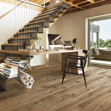
StugaThe idea for Scandinavian Hardwoods came after years of countless conversations with homeowners, designers, architects, and builders. The consistent theme: they wanted more than just a beautiful floor. They wanted insight into manufacturing locations (not just the seller or importer) and what materials are used and why. They wanted to understand the product’s environmental impact and it’s effect on indoor air quality and human health. They wanted a compelling story to tell guests about the beautiful floor they’ve chosen. At Scandinavian Hardwoods, we bring all of these elements together while making luxury more accessible.
 Schuler Cabinetry
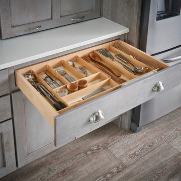
Grays add a softness to the design, whether as a primary color, shown in the kitchen here, or as a secondary color, often on an island.
Gray is the perfect fit for the growing trend of Transitional design. The washed look and character of Peppercorn cherry paired with our Boardwalk door style creates a naturally calm and simple space. Designing with consistent horizontal sight lines, linear crown and a blended color palette are a few of the key elements to create a Transitional haven.
Pairing gray toned finishes, such as stain and paint, allows you to showcase multiple textures and values for creating depth through a layered approach.
 Klopf Architecture
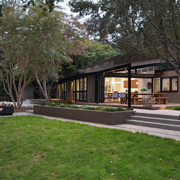
The owners of this property had been away from the Bay Area for many years, and looked forward to returning to an elegant mid-century modern house. The one they bought was anything but that. Faced with a “remuddled” kitchen from one decade, a haphazard bedroom / family room addition from another, and an otherwise disjointed and generally run-down mid-century modern house, the owners asked Klopf Architecture and Envision Landscape Studio to re-imagine this house and property as a unified, flowing, sophisticated, warm, modern indoor / outdoor living space for a family of five.
Opening up the spaces internally and from inside to out was the first order of business. The formerly disjointed eat-in kitchen with 7 foot high ceilings were opened up to the living room, re-oriented, and replaced with a spacious cook's kitchen complete with a row of skylights bringing light into the space. Adjacent the living room wall was completely opened up with La Cantina folding door system, connecting the interior living space to a new wood deck that acts as a continuation of the wood floor. People can flow from kitchen to the living / dining room and the deck seamlessly, making the main entertainment space feel at once unified and complete, and at the same time open and limitless.
Klopf opened up the bedroom with a large sliding panel, and turned what was once a large walk-in closet into an office area, again with a large sliding panel. The master bathroom has high windows all along one wall to bring in light, and a large wet room area for the shower and tub. The dark, solid roof structure over the patio was replaced with an open trellis that allows plenty of light, brightening the new deck area as well as the interior of the house.
All the materials of the house were replaced, apart from the framing and the ceiling boards. This allowed Klopf to unify the materials from space to space, running the same wood flooring throughout, using the same paint colors, and generally creating a consistent look from room to room. Located in Lafayette, CA this remodeled single-family house is 3,363 square foot, 4 bedroom, and 3.5 bathroom.
Klopf Architecture Project Team: John Klopf, AIA, Jackie Detamore, and Jeffrey Prose
Landscape Design: Envision Landscape Studio
Structural Engineer: Brian Dotson Consulting Engineers
Contractor: Kasten Builders
Photography ©2015 Mariko Reed
Staging: The Design Shop
Location: Lafayette, CA
Year completed: 2014
 Liv Companies LLC Design + Build
Photography by Willie Chandler
Design and Construction by Liv Companies LLC, David Pollard AIA
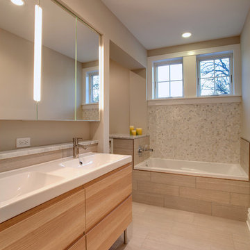
Bathroom - mid-sized contemporary master gray tile and porcelain tile porcelain tile bathroom idea in Chicago with an integrated sink, furniture-like cabinets, light wood cabinets, solid surface countertops, a two-piece toilet and gray walls
Bathroom - mid-sized contemporary master gray tile and porcelain tile porcelain tile bathroom idea in Chicago with an integrated sink, furniture-like cabinets, light wood cabinets, solid surface countertops, a two-piece toilet and gray walls
135