
Search results for "Consistency" in Home Design Ideas
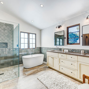
 Allen Kitchen & Bath
Architect: RRM Design | Photo by: Jim Bartsch | Built by Allen
This Houzz project features the wide array of bathroom projects that Allen Construction has built and, where noted, designed over the years.
Allen Kitchen & Bath - the company's design-build division - works with clients to design the kitchen of their dreams within a tightly controlled budget. We’re there for you every step of the way, from initial sketches through welcoming you into your newly upgraded space. Combining both design and construction experts on one team helps us to minimize both budget and timelines for our clients. And our six phase design process is just one part of why we consistently earn rave reviews year after year.
Learn more about our process and design team at: http://design.buildallen.com
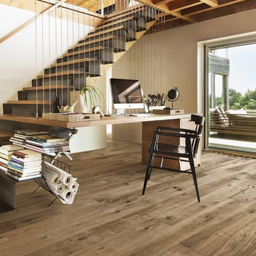
 Stuga
StugaThe idea for Scandinavian Hardwoods came after years of countless conversations with homeowners, designers, architects, and builders. The consistent theme: they wanted more than just a beautiful floor. They wanted insight into manufacturing locations (not just the seller or importer) and what materials are used and why. They wanted to understand the product’s environmental impact and it’s effect on indoor air quality and human health. They wanted a compelling story to tell guests about the beautiful floor they’ve chosen. At Scandinavian Hardwoods, we bring all of these elements together while making luxury more accessible.
 Haven Design and Construction
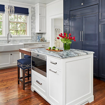
This 1902 San Antonio home was beautiful both inside and out, except for the kitchen, which was dark and dated. The original kitchen layout consisted of a breakfast room and a small kitchen separated by a wall. There was also a very small screened in porch off of the kitchen. The homeowners dreamed of a light and bright new kitchen and that would accommodate a 48" gas range, built in refrigerator, an island and a walk in pantry. At first, it seemed almost impossible, but with a little imagination, we were able to give them every item on their wish list. We took down the wall separating the breakfast and kitchen areas, recessed the new Subzero refrigerator under the stairs, and turned the tiny screened porch into a walk in pantry with a gorgeous blue and white tile floor. The french doors in the breakfast area were replaced with a single transom door to mirror the door to the pantry. The new transoms make quite a statement on either side of the 48" Wolf range set against a marble tile wall. A lovely banquette area was created where the old breakfast table once was and is now graced by a lovely beaded chandelier. Pillows in shades of blue and white and a custom walnut table complete the cozy nook. The soapstone island with a walnut butcher block seating area adds warmth and character to the space. The navy barstools with chrome nailhead trim echo the design of the transoms and repeat the navy and chrome detailing on the custom range hood. A 42" Shaws farmhouse sink completes the kitchen work triangle. Off of the kitchen, the small hallway to the dining room got a facelift, as well. We added a decorative china cabinet and mirrored doors to the homeowner's storage closet to provide light and character to the passageway. After the project was completed, the homeowners told us that "this kitchen was the one that our historic house was always meant to have." There is no greater reward for what we do than that.
Find the right local pro for your project
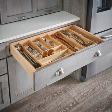
 Schuler Cabinetry
Grays add a softness to the design, whether as a primary color, shown in the kitchen here, or as a secondary color, often on an island.
Gray is the perfect fit for the growing trend of Transitional design. The washed look and character of Peppercorn cherry paired with our Boardwalk door style creates a naturally calm and simple space. Designing with consistent horizontal sight lines, linear crown and a blended color palette are a few of the key elements to create a Transitional haven.
Pairing gray toned finishes, such as stain and paint, allows you to showcase multiple textures and values for creating depth through a layered approach.
 Liv Companies LLC Design + Build
Photography by Willie Chandler
Design and Construction by Liv Companies LLC, David Pollard AIA
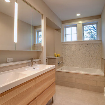
Bathroom - mid-sized contemporary master gray tile and porcelain tile porcelain tile bathroom idea in Chicago with an integrated sink, furniture-like cabinets, light wood cabinets, solid surface countertops, a two-piece toilet and gray walls
Bathroom - mid-sized contemporary master gray tile and porcelain tile porcelain tile bathroom idea in Chicago with an integrated sink, furniture-like cabinets, light wood cabinets, solid surface countertops, a two-piece toilet and gray walls
 Studio Industrielle
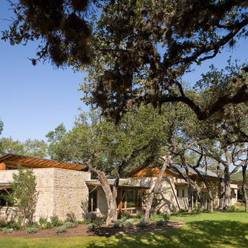
The program consists of a detached Guest House with full Kitchen, Living and Dining amenities, Carport and Office Building with attached Main house and Master Bedroom wing. The arrangement of buildings was dictated by the numerous majestic oaks and organized as a procession of spaces leading from the Entry arbor up to the front door. Large covered terraces and arbors were used to extend the interior living spaces out onto the site.
All the buildings are clad in Texas limestone with accent bands of Leuders limestone to mimic the local limestone cliffs in the area. Steel was used on the arbors and fences and left to rust. Vertical grain Douglas fir was used on the interior while flagstone and stained concrete floors were used throughout. The flagstone floors extend from the exterior entry arbors into the interior of the Main Living space and out onto the Main house terraces.
 Klopf Architecture
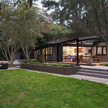
The owners of this property had been away from the Bay Area for many years, and looked forward to returning to an elegant mid-century modern house. The one they bought was anything but that. Faced with a “remuddled” kitchen from one decade, a haphazard bedroom / family room addition from another, and an otherwise disjointed and generally run-down mid-century modern house, the owners asked Klopf Architecture and Envision Landscape Studio to re-imagine this house and property as a unified, flowing, sophisticated, warm, modern indoor / outdoor living space for a family of five.
Opening up the spaces internally and from inside to out was the first order of business. The formerly disjointed eat-in kitchen with 7 foot high ceilings were opened up to the living room, re-oriented, and replaced with a spacious cook's kitchen complete with a row of skylights bringing light into the space. Adjacent the living room wall was completely opened up with La Cantina folding door system, connecting the interior living space to a new wood deck that acts as a continuation of the wood floor. People can flow from kitchen to the living / dining room and the deck seamlessly, making the main entertainment space feel at once unified and complete, and at the same time open and limitless.
Klopf opened up the bedroom with a large sliding panel, and turned what was once a large walk-in closet into an office area, again with a large sliding panel. The master bathroom has high windows all along one wall to bring in light, and a large wet room area for the shower and tub. The dark, solid roof structure over the patio was replaced with an open trellis that allows plenty of light, brightening the new deck area as well as the interior of the house.
All the materials of the house were replaced, apart from the framing and the ceiling boards. This allowed Klopf to unify the materials from space to space, running the same wood flooring throughout, using the same paint colors, and generally creating a consistent look from room to room. Located in Lafayette, CA this remodeled single-family house is 3,363 square foot, 4 bedroom, and 3.5 bathroom.
Klopf Architecture Project Team: John Klopf, AIA, Jackie Detamore, and Jeffrey Prose
Landscape Design: Envision Landscape Studio
Structural Engineer: Brian Dotson Consulting Engineers
Contractor: Kasten Builders
Photography ©2015 Mariko Reed
Staging: The Design Shop
Location: Lafayette, CA
Year completed: 2014
 Moen
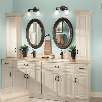
MoenWith intricate architectural features that transcend time, Brantford faucets and accessories give any bath a polished, traditional look. Classic lever handles, a tapered spout and globe finial give this collection universal appeal.
 Durham Designs & Consulting, LLC
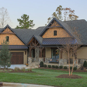
The exterior of this beautiful Lake Wylie lake house consists of stucco, stone and cedar shake. The bronze windows, cedar headers and beams, metal porch roof, and stained garage doors all add to the rustic feel of the home.
Designed by Melodie Durham of Durham Designs & Consulting, LLC.
Photo by Livengood Photographs [www.livengoodphotographs.com/design].
 SDH Studio Architecture and Interior Design
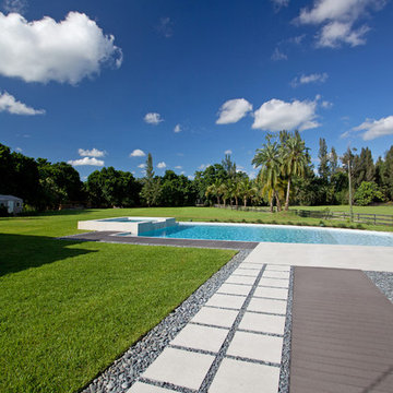
SDH Studio - Architecture and Design
Location: Southwest Ranches, Florida, Florida, USA
Set on a expansive two-acre lot in horse country, Southwest Ranches, Florida.
This project consists on the transformation of a 3700 Sq. Ft. Mediterranean structure to a 6500 Sq. Ft. Contemporary Home.
 building Lab, inc.
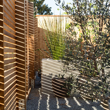
Eichler in Marinwood - At the larger scale of the property existed a desire to soften and deepen the engagement between the house and the street frontage. As such, the landscaping palette consists of textures chosen for subtlety and granularity. Spaces are layered by way of planting, diaphanous fencing and lighting. The interior engages the front of the house by the insertion of a floor to ceiling glazing at the dining room.
Jog-in path from street to house maintains a sense of privacy and sequential unveiling of interior/private spaces. This non-atrium model is invested with the best aspects of the iconic eichler configuration without compromise to the sense of order and orientation.
photo: scott hargis


 Tom Meaney Architect, AIA
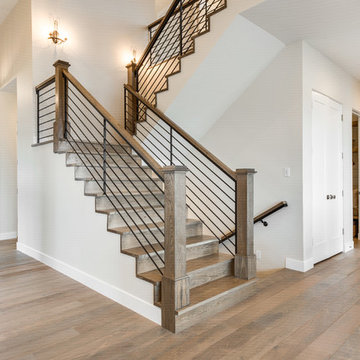
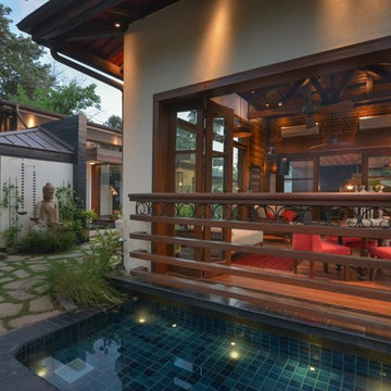
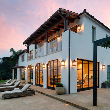
Six thousand square foot home on an ocean view acre. The project consisted of a major remodel and addition. The original home had the master bedroom in the rear of the lot, away from the ocean view. The kitchen, family, and dining rooms were on the upper floor, disconnected from the pool area and outdoor living terraces. I moved the kitchen and family rooms to the lower level connecting to the pool terrace and views to the south. I added an intimate morning terrace off the kitchen and dining room to the east.
Finally, the master bedroom and bath moved to the second floor with a balcony and dramatic ocean views.
 andisonresidentialdesign
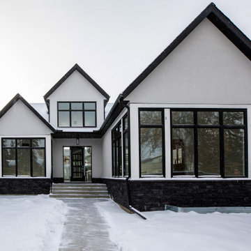
This is not your traditional bungalow! While it shares some of the hallmarks of this historic home style, this bungalow brings the classic single-story design into the twenty-first century.
The black-and-white facade shows a simple, but incredibly well thought out design consisting of mostly straight lines and glass. Modern architecture is all about simple designs where less is more. Clean and uncluttered home exterior trends have gained popularity over the years, as many homeowners are yearning to live peacefully without excess.
Clean lines, basic forms, single-use of colour, repetition of structures and strategic use of metal, stone, stucco and glass materials are defining characteristics of this custom home in the upper-scale, inner-city community of North Glenmore Park in Calgary, Alberta.
 TVL Creative Ltd.
Our clients had just recently closed on their new house in Stapleton and were excited to transform it into their perfect forever home. They wanted to remodel the entire first floor to create a more open floor plan and develop a smoother flow through the house that better fit the needs of their family. The original layout consisted of several small rooms that just weren’t very functional, so we decided to remove the walls that were breaking up the space and restructure the first floor to create a wonderfully open feel.
After removing the existing walls, we rearranged their spaces to give them an office at the front of the house, a large living room, and a large dining room that connects seamlessly with the kitchen. We also wanted to center the foyer in the home and allow more light to travel through the first floor, so we replaced their existing doors with beautiful custom sliding doors to the back yard and a gorgeous walnut door with side lights to greet guests at the front of their home.
Living Room
Our clients wanted a living room that could accommodate an inviting sectional, a baby grand piano, and plenty of space for family game nights. So, we transformed what had been a small office and sitting room into a large open living room with custom wood columns. We wanted to avoid making the home feel too vast and monumental, so we designed custom beams and columns to define spaces and to make the house feel like a home. Aesthetically we wanted their home to be soft and inviting, so we utilized a neutral color palette with occasional accents of muted blues and greens.
Dining Room
Our clients were also looking for a large dining room that was open to the rest of the home and perfect for big family gatherings. So, we removed what had been a small family room and eat-in dining area to create a spacious dining room with a fireplace and bar. We added custom cabinetry to the bar area with open shelving for displaying and designed a custom surround for their fireplace that ties in with the wood work we designed for their living room. We brought in the tones and materiality from the kitchen to unite the spaces and added a mixed metal light fixture to bring the space together
Kitchen
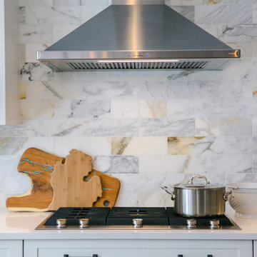
We wanted the kitchen to be a real show stopper and carry through the calm muted tones we were utilizing throughout their home. We reoriented the kitchen to allow for a big beautiful custom island and to give us the opportunity for a focal wall with cooktop and range hood. Their custom island was perfectly complimented with a dramatic quartz counter top and oversized pendants making it the real center of their home. Since they enter the kitchen first when coming from their detached garage, we included a small mud-room area right by the back door to catch everyone’s coats and shoes as they come in. We also created a new walk-in pantry with plenty of open storage and a fun chalkboard door for writing notes, recipes, and grocery lists.
Office
We transformed the original dining room into a handsome office at the front of the house. We designed custom walnut built-ins to house all of their books, and added glass french doors to give them a bit of privacy without making the space too closed off. We painted the room a deep muted blue to create a glimpse of rich color through the french doors
Powder Room
The powder room is a wonderful play on textures. We used a neutral palette with contrasting tones to create dramatic moments in this little space with accents of brushed gold.
Master Bathroom
The existing master bathroom had an awkward layout and outdated finishes, so we redesigned the space to create a clean layout with a dream worthy shower. We continued to use neutral tones that tie in with the rest of the home, but had fun playing with tile textures and patterns to create an eye-catching vanity. The wood-look tile planks along the floor provide a soft backdrop for their new free-standing bathtub and contrast beautifully with the deep ash finish on the cabinetry.
 TKS Design Group
WATCH the time lapse video of this kitchen remodel: https://youtu.be/caemXXlauLU
Free ebook, Creating the Ideal Kitchen. DOWNLOAD NOW
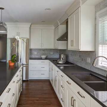
This Glen Ellyn homeowner came to us, frustrated with the layout and size of their current kitchen, looking for help generating ideas for how to maximize functionality within the constraints of the space. After visiting with them and seeing the home’s layout, I realized that looking at the bigger picture of how they used the entire first floor might bring us some dramatic solutions. We ended up flipping the kitchen and family room and taking down the wall separating the two creating one big open floor plan for the family to enjoy. There is still a visual separation between the rooms because of their different lengths and the overall space now relates nicely to the dining room which was also opened up to both rooms.
The new kitchen is an L-shaped space that is no longer cramped and small and is truly a cook’s dream. The fridge is on one end, a large cooktop and sink are located along the main perimeter and double ovens located at the end of the “L” complete the layout. Ample work surface along the perimeter and on the large island makes entertaining a breeze. An existing door to the patio remains, floods the room with light and provides easy access to the existing outdoor deck for entertaining and grilling.
White cabinetry with quartz countertops, Carrera marble backsplash tile and a contrasting gray island give the space a clean and modern feel. The gray pendant lights and stainless appliances bring a slight industrial feel to the space letting you know that some serious cooking will take place here.
Once we had their Dream Kitchen design completed, the homeowners decided to tackle another project at the same time. We made plans to create a master suite upstairs by combining two existing bedrooms into a larger bedroom, bathroom and walk-in closet. The existing spaces were not overly large so getting everything on the wish list into the design was a challenge. In the end, we came up with a design that works. The two bedrooms were adjoined, one wall moved back slightly to make for a slightly larger bedroom, and the remaining space was allotted to the new bathroom and a walk in closet.
The bathroom consists of a double vanity and a large shower with a barn door shower door. A skylight brings light into the space and helps make it feel larger and more open. The new walk-in closet is accessible through the bathroom, and we even managed to fit in a small entry vestibule that houses some additional storage and makes a nice transition from the hallway. A white vanity, Carrera tops and gray floor tile make for a serene space that feels just right for this home.
Designed by: Susan Klimala, CKD, CBD
Photography by: Mike Kaskel
For more information on kitchen and bath design ideas go to: www.kitchenstudio-ge.com
 Titan Homes
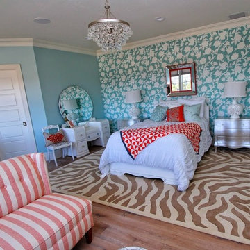
Cute girls room done is coral and blue. Fun blue with white flower wallpaper accent wall. Zebra print floor area rug. Uses furniture to create separate areas in the room. TV area with coral couch and window seat with tons of pillows. Recovered antique chairs and fresh painted silver piano. Fun functional roman shades for privacy. Framed artwork consists of favorite song quotes on sheet music.
 Clawson Architects, LLC
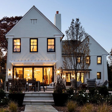
Rear elevation of new home construction. On the main street heading into Maplewood Village sat a home that was completely out of scale and did not exhibit the grandeur of the other homes surrounding it. When the home became available, our client seized the opportunity to create a home that is more in scale and character with the neighborhood. By creating a home with period details and traditional materials, this new home dovetails seamlessly into the the rhythm of the street while providing all the modern conveniences today's busy life demands.
Clawson Architects was pleased to work in collaboration with the owners to create a new home design that takes into account the context, period and scale of the adjacent homes without being a "replica". It recalls details from the English Arts and Crafts style. The stucco finish on the exterior is consistent with the stucco finish on one of the adjacent homes as well as others on the block.

136