
Search results for "Consists" in Home Design Ideas


 Daryl Toby - AguaFina Gardens International
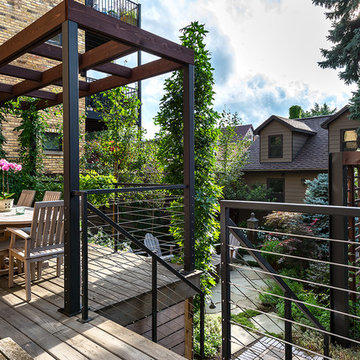
This small space was once the main parking area for this cottage lakeside home and was radically transformed into an intimate and inviting courtyard. Defined by a hand stacked fieldstone wall, granite stepping stones lead from the entrance of the garden and gradually wind their way over a stream bed and lead to the porch that borders the garden. Although set in a cold weather climate, the client requested that the garden be developed to have a lush tropical feeling yet remain consistent with the general surroundings. This was achieved by using a mixture of large leafed perennials such as Ligularia, Hosta and Petasites (Butterbur) ,along with various groundcovers and other perennials including Ferns, Iris and Japanese Forest Grass. The central feature of the garden is a naturalized meandering stream and pond filled with Koi. The use of water in the garden thematically ties the house and courtyard to the homes’ surrounding, an adjacent lake, and adds movement and tranquil sound to the space. Stepping stones appear to float across the surface of the water allowing the visitor another way to enjoy the space. Scale is essential with even the smallest detail needing to be well executed within such limited space.
Photos by: George Dzahristos
 Wellborn Cabinet, Inc.
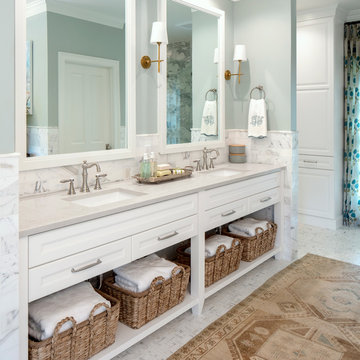
In this master bathroom by Wellborn Cabinet, the Premier Series was used and displayed in the Glacier finish. The door style used is the Davenport Square on Maple. In this relaxing, crisp bathroom shaker legs were used to give this space just the right finishing touch.
Find the right local pro for your project
 McClean Design
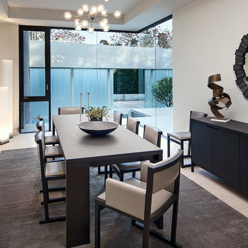
Designer: Paul McClean
Project Type: New Single Family Residence
Location: Los Angeles, CA
Approximate Size: 11,000 sf
Project Completed: June 2013
Photographer: Jim Bartsch
 Dwell Interiors, LLC
Starr Homes
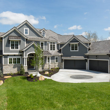
Inspiration for a timeless gray two-story mixed siding house exterior remodel in Dallas with a hip roof and a shingle roof
Inspiration for a timeless gray two-story mixed siding house exterior remodel in Dallas with a hip roof and a shingle roof
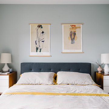
 Breathe Design Studio
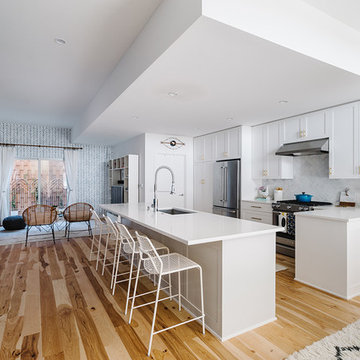
Completed in 2015, this project incorporates a Scandinavian vibe to enhance the modern architecture and farmhouse details. The vision was to create a balanced and consistent design to reflect clean lines and subtle rustic details, which creates a calm sanctuary. The whole home is not based on a design aesthetic, but rather how someone wants to feel in a space, specifically the feeling of being cozy, calm, and clean. This home is an interpretation of modern design without focusing on one specific genre; it boasts a midcentury master bedroom, stark and minimal bathrooms, an office that doubles as a music den, and modern open concept on the first floor. It’s the winner of the 2017 design award from the Austin Chapter of the American Institute of Architects and has been on the Tribeza Home Tour; in addition to being published in numerous magazines such as on the cover of Austin Home as well as Dwell Magazine, the cover of Seasonal Living Magazine, Tribeza, Rue Daily, HGTV, Hunker Home, and other international publications.
----
Featured on Dwell!
https://www.dwell.com/article/sustainability-is-the-centerpiece-of-this-new-austin-development-071e1a55
 Clearcut & Co
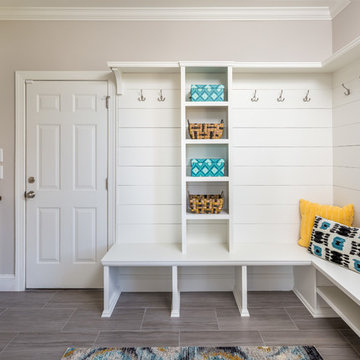
This project consisted of stripping everything to the studs and removing walls on half of the first floor and replacing with custom finishes creating an open concept with zoned living areas.
 Cheban Interiors
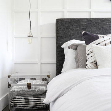
Trendy medium tone wood floor and gray floor bedroom photo in New York with white walls
 PS & Daughters
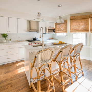
Clean, white and simple the kitchen is a smaller profile space. We made the counter work perfectly for an easy breakfast, and the custom kitchen table cosy for dinner at the banquette.
 Prideaux Design
Matt Vacca
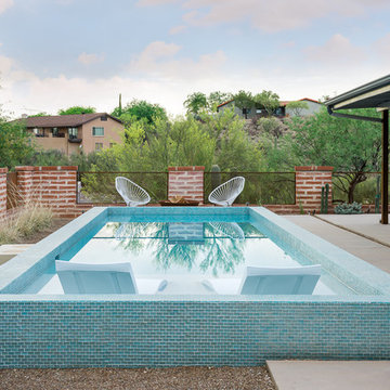
Pool - small southwestern backyard concrete and rectangular pool idea in Phoenix
Pool - small southwestern backyard concrete and rectangular pool idea in Phoenix
 American Pro Exteriors, Inc.
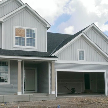
This new construction home's exterior consists of LP SmartSide trim, vinyl siding, and vinyl board and batten.
Trendy gray two-story vinyl exterior home photo in Minneapolis
Trendy gray two-story vinyl exterior home photo in Minneapolis
 Home Design & Decor Magazine
Photography: Dustin Peck http://www.dustinpeckphoto.com/ http://www.houzz.com/pro/dpphoto/dustinpeckphotographyinc
Designer: Susan Tollefsen http://www.susantinteriors.com/ http://www.houzz.com/pro/susu5/susan-tollefsen-interiors
June/July 2016
 Breathe Design Studio
Completed in 2015, this project incorporates a Scandinavian vibe to enhance the modern architecture and farmhouse details. The vision was to create a balanced and consistent design to reflect clean lines and subtle rustic details, which creates a calm sanctuary. The whole home is not based on a design aesthetic, but rather how someone wants to feel in a space, specifically the feeling of being cozy, calm, and clean. This home is an interpretation of modern design without focusing on one specific genre; it boasts a midcentury master bedroom, stark and minimal bathrooms, an office that doubles as a music den, and modern open concept on the first floor. It’s the winner of the 2017 design award from the Austin Chapter of the American Institute of Architects and has been on the Tribeza Home Tour; in addition to being published in numerous magazines such as on the cover of Austin Home as well as Dwell Magazine, the cover of Seasonal Living Magazine, Tribeza, Rue Daily, HGTV, Hunker Home, and other international publications.
Featured on Dwell!
https://www.dwell.com/article/sustainability-is-the-centerpiece-of-this-new-austin-development-071e1a55

 L. Hamilton & Co.
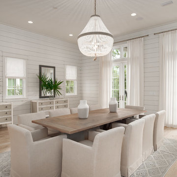
A coastal dining space with an elegant chandelier and upholstered dining chairs. The wall consists of shiplap, mirrors, with light and airy drapes.
Beach style light wood floor and beige floor dining room photo with white walls and no fireplace
Beach style light wood floor and beige floor dining room photo with white walls and no fireplace
 CAPITOL HARDSCAPES
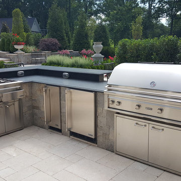
Custom Outdoor Kitchen with High end Lynx Grill,
Granite Countertop, Outdoor Refrigerator, Warming Drawer
Outoor sink. The floor is Travertine installed to a French pattern
 Studio Industrielle
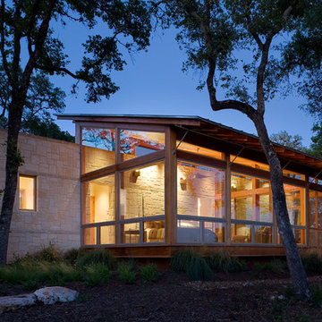
The program consists of a detached Guest House with full Kitchen, Living and Dining amenities, Carport and Office Building with attached Main house and Master Bedroom wing. The arrangement of buildings was dictated by the numerous majestic oaks and organized as a procession of spaces leading from the Entry arbor up to the front door. Large covered terraces and arbors were used to extend the interior living spaces out onto the site.
All the buildings are clad in Texas limestone with accent bands of Leuders limestone to mimic the local limestone cliffs in the area. Steel was used on the arbors and fences and left to rust. Vertical grain Douglas fir was used on the interior while flagstone and stained concrete floors were used throughout. The flagstone floors extend from the exterior entry arbors into the interior of the Main Living space and out onto the Main house terraces.
 Eden LA Furniture and Interiors
Kim Pritchard
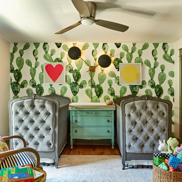
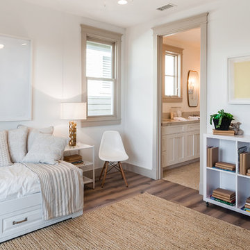
Inspiration for a bedroom transitional brown floor kids' bedroom remodel in Los Angeles with white walls
Inspiration for a bedroom transitional brown floor kids' bedroom remodel in Los Angeles with white walls
 Gordon Tobey Developments
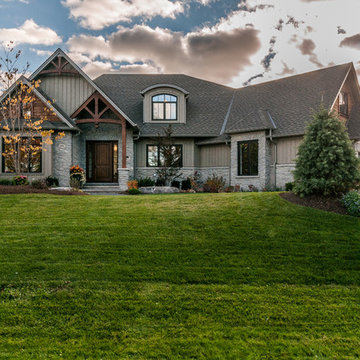
This beautiful, Mountain-Craftsman style home consists of natural stone, cedar shake, board & batten, and wood beam accents.
Large transitional two-story mixed siding gray home design photo in Toronto with a hip roof
Large transitional two-story mixed siding gray home design photo in Toronto with a hip roof

 TKS Design Group
Download our free ebook, Creating the Ideal Kitchen. DOWNLOAD NOW
Lakefront property in the northwest suburbs of Chicago is hard to come by, so when we were hired by this young family with exactly that, we were immediately inspired by not just the unusually large footprint of this 1950’s colonial revival but also the lovely views of the manmade lake it was sited on. The large 5-bedroom home was solidly stuck in the 1980’s, but we saw tons of potential. We started out by updating the existing staircase with a fresh coat of paint and adding new herringbone slate to the entry hall.
The powder room off the entryway also got a refresh - new flooring, new cabinets and fixtures. We ran the new slate right through into this space for some consistency. A fun wallpaper and shiplap trim add a welcoming feel and set the tone for the home.
Next, we tackled the kitchen. Located away from the rest of the first floor, the kitchen felt a little isolated, so we immediately began planning for how to better connect it to the rest of the first floor. We landed on removing the wall between the kitchen and dining room and designed a modified galley style space with separate cooking and clean up zones. The cooking zone consists of the refrigerator, prep sink and cooktop, along with a nice long run of prep space at the island. The cleanup side of the kitchen consists of the main sink and dishwasher. Both areas are situated so that the user can view the lake during prep work and cleanup!
One of the home’s main puzzles was how to incorporate the mudroom and area in front of the patio doors at the back of the house. We already had a breakfast table area, so the space by the patio doors was a bit of a no man’s land. We decided to separate the kitchen proper from what became the new mudroom with a large set of barn doors. That way you can quickly hide any mudroom messes but have easy access to the light coming in through the patio doors as well as the outdoor grilling station. We also love the impact the barn doors add to the overall space.
The homeowners’ first words to us were “it’s time to ditch the brown,” so we did! We chose a lovely blue pallet that reflects the home’s location on the lake which is also vibrant yet easy on the eye. Countertops are white quartz, and the natural oak floor works well with the other honey accents. The breakfast table was given a refresh with new chairs, chandelier and window treatments that frame the gorgeous views of the lake out the back.
We coordinated the slate mudroom flooring with that used in the home’s main entrance for a consistent feel. The storage area consists of open and closed storage to allow for some clutter control as needed.
Next on our “to do” list was revamping the dated brown bar area in the neighboring dining room. We eliminated the clutter by adding some closed cabinets and did some easy updates to help the space feel more current. One snag we ran into here was the discovery of a beam above the existing open shelving that had to be modified with a smaller structural beam to allow for our new design to work. This was an unexpected surprise, but in the end we think it was well worth it!
We kept the colors here a bit more muted to blend with the homeowner’s existing furnishings. Open shelving and polished nickel hardware add some simple detail to the new entertainment zone which also looks out onto the lake!
Next we tackled the upstairs starting with the homeowner’s son’s bath. The bath originally had both a tub shower and a separate shower, so we decided to swap out the shower for a new laundry area. This freed up some space downstairs in what used to be the mudroom/laundry room and is much more convenient for daily laundry needs.
We continued the blue palette here with navy cabinetry and the navy tile in the shower. Porcelain floor tile and chrome fixtures keep maintenance to a minimum while matte black mirrors and lighting add some depth the design. A low maintenance runner adds some warmth underfoot and ties the whole space together.
We added a pocket door to the bathroom to minimize interference with the door swings. The left door of the laundry closet is on a 180 degree hinge to allow for easy full access to the machines. Next we tackled the master bath which is an en suite arrangement. The original was typical of the 1980’s with the vanity outside of the bathroom, situated near the master closet. And the brown theme continued here with multiple shades of brown.
Our first move was to segment off the bath and the closet from the master bedroom. We created a short hall from the bedroom to the bathroom with his and hers walk-in closets on the left and right as well as a separate toilet closet outside of the main bathroom for privacy and flexibility.
The original bathroom had a giant soaking tub with steps (dangerous!) as well as a small shower that did not work well for our homeowner who is 6’3”. With other bathtubs in the home, they decided to eliminate the tub and create an oversized shower which takes up the space where the old tub was located. The double vanity is on the opposite wall and a bench is located under the window for morning conversations and a place to set a couple of towels.
The pallet in here is light and airy with a mix of blond wood, creamy porcelain and marble tile, and brass accents. A simple roman shade adds some texture and it’s top-down mechanism allows for light and privacy.
This large whole house remodel gave our homeowners not only the ability to maximize the potential of their home but also created a lovely new frame from which to view their fabulous lake views.
Designed by: Susan Klimala, CKD, CBD
Photography by: Michael Kaskel
For more information on kitchen and bath design ideas go to: www.kitchenstudio-ge.com
52