Search results for "Context" in Home Design Ideas

The renovation of this classic Muskoka cottage, focused around re-designing the living space to make the most of the incredible lake views. This update completely changed the flow of space, aligning the living areas with a more modern & luxurious living context.
In collaboration with the client, we envisioned a home in which clean lines, neutral tones, a variety of textures and patterns, and small yet luxurious details created a fresh, engaging space while seamlessly blending into the natural environment.
The main floor of this home was completely gutted to reveal the true beauty of the space. Main floor walls were re-engineered with custom windows to expand the client’s majestic view of the lake.
The dining area was highlighted with features including ceilings finished with Shadowline MDF, and enhanced with a custom coffered ceiling bringing dimension to the space.
Unobtrusive details and contrasting textures add richness and intrigue to the space, creating an energizing yet soothing interior with tactile depth.

Gillian Jackson
Inspiration for a small eclectic galley light wood floor kitchen remodel in Toronto with an undermount sink, shaker cabinets, white cabinets, marble countertops, gray backsplash, stone slab backsplash, stainless steel appliances and an island

A carefully positioned skylight pulls sunlight down into the shower. The reflectance off of the glazed handmade tiles suggests water pouring down the stone walls of a cave.
Find the right local pro for your project

Peter Peirce
Example of a mid-sized cottage green two-story wood house exterior design in Bridgeport with a hip roof and a shingle roof

This project was completed for clients who wanted a comfortable, accessible 1ST floor bathroom for their grown daughter to use during visits to their home as well as a nicely-appointed space for any guest. Their daughter has some accessibility challenges so the bathroom was also designed with that in mind.
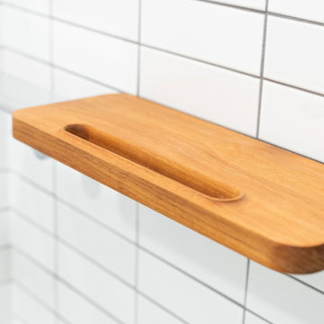
The original space worked fairly well in some ways, but we were able to tweak a few features to make the space even easier to maneuver through. We started by making the entry to the shower flush so that there is no curb to step over. In addition, although there was an existing oversized seat in the shower, it was way too deep and not comfortable to sit on and just wasted space. We made the shower a little smaller and then provided a fold down teak seat that is slip resistant, warm and comfortable to sit on and can flip down only when needed. Thus we were able to create some additional storage by way of open shelving to the left of the shower area. The open shelving matches the wood vanity and allows a spot for the homeowners to display heirlooms as well as practical storage for things like towels and other bath necessities.
We carefully measured all the existing heights and locations of countertops, toilet seat, and grab bars to make sure that we did not undo the things that were already working well. We added some additional hidden grab bars or “grabcessories” at the toilet paper holder and shower shelf for an extra layer of assurance. Large format, slip-resistant floor tile was added eliminating as many grout lines as possible making the surface less prone to tripping. We used a wood look tile as an accent on the walls, and open storage in the vanity allowing for easy access for clean towels. Bronze fixtures and frameless glass shower doors add an elegant yet homey feel that was important for the homeowner. A pivot mirror allows adjustability for different users.
If you are interested in designing a bathroom featuring “Living In Place” or accessibility features, give us a call to find out more. Susan Klimala, CKBD, is a Certified Aging In Place Specialist (CAPS) and particularly enjoys helping her clients with unique needs in the context of beautifully designed spaces.
Designed by: Susan Klimala, CKD, CBD
Photography by: Michael Alan Kaskel

Lariat Pull by Rocky Mountain Hardware on Elegant modern kitchen created by combining custom cabinets, ceasar stone counter tops, Artistic Tile backsplash and Gregorious Pineo LIght Fixture. Custom cabinets all finished by hand with custom color and glaze by Fabian Fine furniture. Photos by Christopher Stark

This project was completed for clients who wanted a comfortable, accessible 1ST floor bathroom for their grown daughter to use during visits to their home as well as a nicely-appointed space for any guest. Their daughter has some accessibility challenges so the bathroom was also designed with that in mind.
The original space worked fairly well in some ways, but we were able to tweak a few features to make the space even easier to maneuver through. We started by making the entry to the shower flush so that there is no curb to step over. In addition, although there was an existing oversized seat in the shower, it was way too deep and not comfortable to sit on and just wasted space. We made the shower a little smaller and then provided a fold down teak seat that is slip resistant, warm and comfortable to sit on and can flip down only when needed. Thus we were able to create some additional storage by way of open shelving to the left of the shower area. The open shelving matches the wood vanity and allows a spot for the homeowners to display heirlooms as well as practical storage for things like towels and other bath necessities.
We carefully measured all the existing heights and locations of countertops, toilet seat, and grab bars to make sure that we did not undo the things that were already working well. We added some additional hidden grab bars or “grabcessories” at the toilet paper holder and shower shelf for an extra layer of assurance. Large format, slip-resistant floor tile was added eliminating as many grout lines as possible making the surface less prone to tripping. We used a wood look tile as an accent on the walls, and open storage in the vanity allowing for easy access for clean towels. Bronze fixtures and frameless glass shower doors add an elegant yet homey feel that was important for the homeowner. A pivot mirror allows adjustability for different users.
If you are interested in designing a bathroom featuring “Living In Place” or accessibility features, give us a call to find out more. Susan Klimala, CKBD, is a Certified Aging In Place Specialist (CAPS) and particularly enjoys helping her clients with unique needs in the context of beautifully designed spaces.
Designed by: Susan Klimala, CKD, CBD
Photography by: Michael Alan Kaskel

Photo: Carolyn Reyes © 2016 Houzz
Master Bedroom Suite
Transitional bedroom photo in Los Angeles

Mathew and his team at Cummings Architects have a knack for being able to see the perfect vision for a property. They specialize in identifying a building’s missing elements and crafting designs that simultaneously encompass the large scale, master plan and the myriad details that make a home special. For this Winchester home, the vision included a variety of complementary projects that all came together into a single architectural composition.
Starting with the exterior, the single-lane driveway was extended and a new carriage garage that was designed to blend with the overall context of the existing home. In addition to covered parking, this building also provides valuable new storage areas accessible via large, double doors that lead into a connected work area.
For the interior of the house, new moldings on bay windows, window seats, and two paneled fireplaces with mantles dress up previously nondescript rooms. The family room was extended to the rear of the house and opened up with the addition of generously sized, wall-to-wall windows that served to brighten the space and blur the boundary between interior and exterior.
The family room, with its intimate sitting area, cozy fireplace, and charming breakfast table (the best spot to enjoy a sunlit start to the day) has become one of the family’s favorite rooms, offering comfort and light throughout the day. In the kitchen, the layout was simplified and changes were made to allow more light into the rear of the home via a connected deck with elongated steps that lead to the yard and a blue-stone patio that’s perfect for entertaining smaller, more intimate groups.
From driveway to family room and back out into the yard, each detail in this beautiful design complements all the other concepts and details so that the entire plan comes together into a unified vision for a spectacular home.
Photos By: Eric Roth

Our client was drawn to the property in Wesley Heights as it was in an established neighborhood of stately homes, on a quiet street with views of park. They wanted a traditional home for their young family with great entertaining spaces that took full advantage of the site.
The site was the challenge. The natural grade of the site was far from traditional. The natural grade at the rear of the property was about thirty feet above the street level. Large mature trees provided shade and needed to be preserved.
The solution was sectional. The first floor level was elevated from the street by 12 feet, with French doors facing the park. We created a courtyard at the first floor level that provide an outdoor entertaining space, with French doors that open the home to the courtyard.. By elevating the first floor level, we were able to allow on-grade parking and a private direct entrance to the lower level pub "Mulligans". An arched passage affords access to the courtyard from a shared driveway with the neighboring homes, while the stone fountain provides a focus.
A sweeping stone stair anchors one of the existing mature trees that was preserved and leads to the elevated rear garden. The second floor master suite opens to a sitting porch at the level of the upper garden, providing the third level of outdoor space that can be used for the children to play.
The home's traditional language is in context with its neighbors, while the design allows each of the three primary levels of the home to relate directly to the outside.
Builder: Peterson & Collins, Inc
Photos © Anice Hoachlander

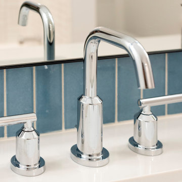
• American Olean “Color Appeal” 4” x 12” glass tile in “Fountain Blue” • Interceramic 10” x 24” “Spa” white glazed tile • Daltile “Color Wave” mosaic tile “Ice White Block Random Mosaic” • Stonepeak 12” x 24 “Infinite Brown” ceramic tile, Land series • glass by Anchor Ventana at shower • Slik Mode acrylic freestanding tub • Grohe Concetto tub spout • photography by Paul Finkel

Here is a far shot of the beam screens and context photo for them. The various levels are more evident as you walk through the garden and pan through these garden photos. One difficult spot was keeping the back hot tub walls from getting too tall but being able to form a vault for the hot tub beneath the deck. I was excited about my design for the floating steps up from the hot tub, to serve as lounge bench seating with the back of the BBQ plinth acting as privacy as well as the back of the bench and steps. The planters add green and another seating perch and deal with the grading levels I mentioned in other photos.

this master suite renovation represents the completion of a whole house remodel initiated several years ago. the space had been intended as a master suite but left incomplete for budgetary reasons. the pending arrival of the family’s second child prompted the move to complete. Schwartz and Architecture’s master plan had organized a strong spatial arrangement, packed with program. building Lab, along with the client, developed all of the materials and detailing. we also, of course, built it.
bL picked up on prominent themes from the earlier project, developed and re-worked them with materials specific to the context. from a geometric standpoint, cleanness, simplicity and continuity drove decisions. headers were eliminated from doors allowing continuous ceiling planes interrupted only by slots for sliding doors. flush detailing of tile and sheetrock and sliding glass doors that converge to form an inside corner are but a couple examples of many challenging details dedicated to precise alignments and reveals. from a material standpoint the wood provides tactile softness, frosted glass and lighting maximize depth, while tile and Caesarstone maintain solidity and groundedness. details such as the Caesarstone wrap of the vanity and medicine cabinets offer surprise and engagement through unlikely material application.
projects of such density and richness in materials and detail are somewhat rare. we are grateful to our clients for the opportunity and challenge.
see rutledge st. residence for photos of entire house.
master plan: schwartz & architecture
photo by scott hargis

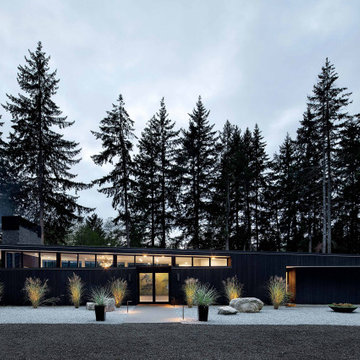
The project’s goal is to introduce more affordable contemporary homes for Triangle Area housing. This 1,800 SF modern ranch-style residence takes its shape from the archetypal gable form and helps to integrate itself into the neighborhood. Although the house presents a modern intervention, the project’s scale and proportional parameters integrate into its context.
Natural light and ventilation are passive goals for the project. A strong indoor-outdoor connection was sought by establishing views toward the wooded landscape and having a deck structure weave into the public area. North Carolina’s natural textures are represented in the simple black and tan palette of the facade.

This project was completed for clients who wanted a comfortable, accessible 1ST floor bathroom for their grown daughter to use during visits to their home as well as a nicely-appointed space for any guest. Their daughter has some accessibility challenges so the bathroom was also designed with that in mind.
The original space worked fairly well in some ways, but we were able to tweak a few features to make the space even easier to maneuver through. We started by making the entry to the shower flush so that there is no curb to step over. In addition, although there was an existing oversized seat in the shower, it was way too deep and not comfortable to sit on and just wasted space. We made the shower a little smaller and then provided a fold down teak seat that is slip resistant, warm and comfortable to sit on and can flip down only when needed. Thus we were able to create some additional storage by way of open shelving to the left of the shower area. The open shelving matches the wood vanity and allows a spot for the homeowners to display heirlooms as well as practical storage for things like towels and other bath necessities.
We carefully measured all the existing heights and locations of countertops, toilet seat, and grab bars to make sure that we did not undo the things that were already working well. We added some additional hidden grab bars or “grabcessories” at the toilet paper holder and shower shelf for an extra layer of assurance. Large format, slip-resistant floor tile was added eliminating as many grout lines as possible making the surface less prone to tripping. We used a wood look tile as an accent on the walls, and open storage in the vanity allowing for easy access for clean towels. Bronze fixtures and frameless glass shower doors add an elegant yet homey feel that was important for the homeowner. A pivot mirror allows adjustability for different users.
If you are interested in designing a bathroom featuring “Living In Place” or accessibility features, give us a call to find out more. Susan Klimala, CKBD, is a Certified Aging In Place Specialist (CAPS) and particularly enjoys helping her clients with unique needs in the context of beautifully designed spaces.
Designed by: Susan Klimala, CKD, CBD
Photography by: Michael Alan Kaskel

Modern Front Porch: covered terrace with hanging swing chairs, handcrafted sculptural furniture, and a floor of Black Locust wood pavers set in gravel.
building Lab is a design build firm specialized in modern architecture.

Here is a far shot of the beam screens from the dining area and context photo for them. The various levels are more evident as you walk through the garden and pan through these garden photos. The dining area comes level off the house and the screens and diagonal decking detail help the deck not feel too long and act as a visual queue to denote the next space. When designing diagonal decking, one has to be mindful of the deck framing to accommodate so it is something consider early in the design process.

Michael Merrill Design Studio designed this 110 square foot guest bedroom in the quietest, simplest, most unobtrusive way possible. Diagonal sightlines, open back chairs, furniture that does not extend to the floor, open weave fabrics at the windows all contribute to a sense of spaciousness.
Photos © Mark Darley Interior And Architectural Photography
27