
Search results for "Continually enhancing" in Home Design Ideas

 Greathouse
 is keeping you warm this season with fire tables by Oriflamme - exclusively in San Diego & Carlsbad. Enjoy the ambiance, warmth and style of your customizable fire table. Choose table top, burner design and artistic glass to match your own personal style.
Created by an artisan who sought to capture and share the “essence” of fire, the unique and innovative Oriflamme Fire Table offers the original designed fire. The Oriflamme Fire Table will be a centerpiece for conversation or contemplation and enhance your outdoor environment and experience.
Listing Includes:
48" Round Granite Top
Table Top
Burner
Fire Glass
20# Propane Tank
Protective Lid
Burner Puller
Also available in: 42" Round, 40" square and 45" Octagon
Also Available in 4 different Granite Finishes: Tropical Brown, Giallo Fiorito, Absolute Black & Giallo Santo
Features:
• Heat source up to 65,000 BTU’s
• Burn time lasts on average of 18-22 hours. Continuous burn times last 10-22 hours depending on outside temperature and flame height
• Adjustable flame height for warmth or ambiance
• Natural gas component kit available
• Portable
• Easy assembly (no tools required)
• All table components are interchangeable
• Hoses available for larger remote propane tanks

 Ernesto Santalla PLLC
Ernesto Santalla was approached to create a new home for two Washington, DC lawyers wishing to downsize their living space. The move took them from a row house in Washington's historic Dupont Circle neighborhood to a two bedroom apartment in the vibrant, up-and-coming U Street Corridor. Our task was to transform a rather plain and generic apartment into a custom, sophisticated space in a few strategic moves. Ceiling details serve to define functional areas of the living space without creating divisions. Changing some doors from wood to frosted glass, creates a sense of continuity between spaces, and allows light to travel between spaces. Lighting was inserted strategically, to enhance certain functions of the home. The kitchen was partially enclosed with a plane of frosted glass to create visual separation from the main living space while still allowing natural light to filter in from the expansive wall of floor-to-ceiling windows. Color was used to reinforce the architectural intent and simplify spaces, such as the entry, which as many doors and frames. Furniture was selected to blend with the client's collection of heirloom pieces, creating a sophisticated juxtaposition. Statement pieces like a ceiling light from Viabizzuno create impact while maintaining the visual simplicity of our minimal approach.
This project was featured in DC Modern Luxury. https://www.modernluxury.com/washington-dc/story/grand-nest
Photography by Geoffrey Hodgdon

 User
Morningside Architects, LLP
Structural Engineers: Structural Consulting Co., Inc.
Interior Designer: Lisa McCollam Designs LLC.
Contractor: Gilbert Godbold
Photography: Rick Gardner dbold, Contractor
Rick Gardner, Photography
Find the right local pro for your project

 nC2 architecture llc
Full gut renovation and facade restoration of an historic 1850s wood-frame townhouse. The current owners found the building as a decaying, vacant SRO (single room occupancy) dwelling with approximately 9 rooming units. The building has been converted to a two-family house with an owner’s triplex over a garden-level rental.
Due to the fact that the very little of the existing structure was serviceable and the change of occupancy necessitated major layout changes, nC2 was able to propose an especially creative and unconventional design for the triplex. This design centers around a continuous 2-run stair which connects the main living space on the parlor level to a family room on the second floor and, finally, to a studio space on the third, thus linking all of the public and semi-public spaces with a single architectural element. This scheme is further enhanced through the use of a wood-slat screen wall which functions as a guardrail for the stair as well as a light-filtering element tying all of the floors together, as well its culmination in a 5’ x 25’ skylight.

 Spaces Renewed
This kitchen has soaring cathedral ceilings, and the cabinets not only bring attention to the height, but accentuate it with their glass fronts and clean lines. The window is framed with a balanced cabinet design and the decorative valance detail below the sink cabinet adds charm and stylistically enhances the traditional and craftsman feel of the space. The dark cherry island is a great way to break away from all of the white without clashing or compromising continuity. The wine area and open shelving on the exposed end are a great way to add character and detail to cabinets, while not compromising on storage or function. The dark chair rail framing the dining room is personal and dramatic against the more neutral walls. The pendant lights are in an antique smoke glass, further enhancing the custom details of this kitchen.

 Hallmark Floors
Mink Silverado Hardwood Flooring
Silverado Hardwood Floors features stunning Birch Timber hand crafted and factory finished to create rustic texturing. Bold grain visuals and colors add to this unique species appeal. This product offers a dramatic appeal at exceptional value.
This uniquely styled, wide plank floor features a beautiful, rotary peeled, deeply hand scraped surface that dazzles the eye. The six inch width and pillowed edge of Silverado plank gives it a bold western look that is unique in the marketplace.
The warm and rich stains give Silverado its distinctive color and greatly enhance the rustic, truly heavily hand scraped plank. The continuously varied grains of this hardwood surface combined with the long length of 6 feet, a length that our competitor’s can only envy(most rotary floors are 4 feet long) and UV cured aluminum oxide coatings makes Silverado Plank stand out on the floor and captures the attention of anyone walking on it.
These features make Silverado Plank an exceptional value with maximum design impact.
Simply Better…Discover Why.
www.hallmarkfloors.com

 Concept Renovations, Inc.
The Impressive Studio City Mid-Century Exterior Masterpiece was a comprehensive interior and exterior remodel, revitalizing a dated property into a stunning modern sanctuary. The homeowners sought to blend mid-century design with a contemporary twist, emphasizing clean lines, natural materials, and expansive views. We transformed the exterior with a sleek wood-paneled entrance, smooth stucco walls, and minimalist landscaping, creating an inviting curb appeal that reflects the home's architectural roots. Large, custom glass doors seamlessly connect the indoors with the outdoors, bathing the interior in natural light and offering breathtaking views of the surrounding Studio City landscape.
Inside, we continued the mid-century theme by selecting warm wood flooring, an open-concept layout, and modern fixtures that merge style with comfort. The homeowners wanted a space that felt sophisticated yet warm, and our team worked closely with them throughout the project to ensure every detail met their vision. As a Studio City-based company, we took pride in sourcing local materials and embracing the area's aesthetic. This remodel has resulted in a mid-century masterpiece that not only enhances the home’s functionality but also stands as a true statement piece in the neighborhood.

 CoverMyPatio.com
The Arcadia Louvered Roof enhances the beauty of any style home and provides the flexibility of having an open roof when the weather is good or a solid roof to keep the rain off your patio when the weather turns bad.
Eco-friendly Construction
The Arcadia system is made up of recycled aluminum making it an extremely Green product. It is also eco-friendly, helping consumers save on passive solar heating and cooling.
We Think Green
Arcadia is proud to continue the company's tradition with its approach to Environmental Innovation. From the choice of lightweight materials and lean production methods to the efficiency of its drive system and designs, Arcadia is committed to operating as a more sustainable business and reducing its overall environmental impact.
High-quality Building Materials
Each Arcadia system is a work of art, constructed with care and attention to every little detail.
Our system is powered coated, extruded aluminum with stainless steel components giving us the most durable louvered roof on the market today. From our superior drive system, which is UL & CE certified, down to the stainless steel tex screws that secures the system together. Nothing but the best!
Our low-maintenance components eliminate painting, staining, and waterproofing of traditional shading structures. Using powder-coated aluminum construction prevents warping, cracking, and corrosion.
 Ernesto Santalla PLLC
Ernesto Santalla was approached to create a new home for two Washington, DC lawyers wishing to downsize their living space. The move took them from a row house in Washington's historic Dupont Circle neighborhood to a two bedroom apartment in the vibrant, up-and-coming U Street Corridor. Our task was to transform a rather plain and generic apartment into a custom, sophisticated space in a few strategic moves. Ceiling details serve to define functional areas of the living space without creating divisions. Changing some doors from wood to frosted glass, creates a sense of continuity between spaces, and allows light to travel between spaces. Lighting was inserted strategically, to enhance certain functions of the home. The kitchen was partially enclosed with a plane of frosted glass to create visual separation from the main living space while still allowing natural light to filter in from the expansive wall of floor-to-ceiling windows. Color was used to reinforce the architectural intent and simplify spaces, such as the entry, which as many doors and frames. Furniture was selected to blend with the client's collection of heirloom pieces, creating a sophisticated juxtaposition. Statement pieces like a ceiling light from Viabizzuno create impact while maintaining the visual simplicity of our minimal approach.
This project was featured in DC Modern Luxury. https://www.modernluxury.com/washington-dc/story/grand-nest
Photography by Geoffrey Hodgdon
 nC2 architecture llc
Full gut renovation and facade restoration of an historic 1850s wood-frame townhouse. The current owners found the building as a decaying, vacant SRO (single room occupancy) dwelling with approximately 9 rooming units. The building has been converted to a two-family house with an owner’s triplex over a garden-level rental.
Due to the fact that the very little of the existing structure was serviceable and the change of occupancy necessitated major layout changes, nC2 was able to propose an especially creative and unconventional design for the triplex. This design centers around a continuous 2-run stair which connects the main living space on the parlor level to a family room on the second floor and, finally, to a studio space on the third, thus linking all of the public and semi-public spaces with a single architectural element. This scheme is further enhanced through the use of a wood-slat screen wall which functions as a guardrail for the stair as well as a light-filtering element tying all of the floors together, as well its culmination in a 5’ x 25’ skylight.

 Klopf Architecture
, Outer Space Landscape Architects, Sezen & Moon Structural Engineer and Flegels Construction updated a classic Eichler open, indoor-outdoor home.
Everyone loved the classic, original bones of this house, but it was in need of a major facelift both inside and out. The owners also wanted to remove the barriers between the kitchen and great room, and increase the size of the master bathroom as well as make other layout changes. No addition to the house was contemplated.
The owners worked with Klopf Architecture in part because of Klopf’s extensive mid-century modern / Eichler design portfolio, and in part because one of their neighbors who had worked with Klopf on their Eichler home remodel referred them. The Klopf team knew how to update the worn finishes to make a more sophisticated, higher quality home that both looks better and functions better.
In conjunction with the atrium and the landscaped rear yard / patio, the glassy living room feels open on both sides and allows an indoor / outdoor flow throughout. The new, natural wood exterior siding runs through the house from inside to outside to inside again, updating one of the classic design features of the Eichler homes.
Picking up on the wood siding, walnut vanities and cabinets offset the white walls. Gray porcelain tiles evoke the concrete slab floors and flow from interior to exterior to make the spaces appear to flow together. Similarly the ceiling decking has the same white-washed finish from inside to out. The continuity of materials and space enhances the sense of flow.
The large kitchen, perfect for entertaining, has a wall of built-ins and an oversized island. There’s plenty of storage and space for the whole group to prep and cook together.
One unique approach to the master bedroom is the bed wall. The head of the bed is tucked within a line of built-in wardrobes with a high window above. Replacing the master closet with this wall of wardrobes allowed for both a larger bathroom and a larger bedroom.
This 1,953 square foot, 4 bedroom, 2 bathroom Double Gable Eichler remodeled single-family house is located in Mountain View in the heart of the Silicon Valley.
Klopf Architecture Project Team: John Klopf, AIA, Klara Kevane, and Yegvenia Torres-Zavala
Landscape Architect: Outer Space Landscape Architects
Structural Engineer: Sezen & Moon
Contractor: Flegels Construction
Landscape Contractor: Roco's Gardening & Arroyo Vista Landscaping, Inc.
Photography ©2016 Mariko Reed
Location: Mountain View, CA
Year completed: 2015

 Housetrends Magazine
Since moving into her Dublin home two and a half years ago, Nancy Sanford has been peeling off the decades—quite literally. Built in the 1980s, the home was “very well-maintained, but very little had been done to it” in terms of updating the finishes or style, Sanford says. Plush white carpet ran from wall-to-wall-to-wall, almond-colored laminate coated the kitchen cabinets and wallpaper ran rampant—even covering some ceilings.
Despite her efforts, Sanford knew it was going to take more than cosmetic editing to shake the ‘80s and make the home her own. Although she lives in the traditional-leaning Muirfield community, Sanford adores a minimalist, contemporary style—and admits to devouring design magazines “ad nauseam.”
To implement her thoroughly modern vision, Sanford turned to Brigid Norton, an interior designer and family friend, and Kristi Youles, a kitchen designer with The JAE Company. Working together, the trio created a carefully considered contemporary design that’s easy on the eyes, and the body.
In addition to improving the flow of the kitchen—by removing a V-shaped peninsula that angled out into the room—and adding appliances like a stainless steel refrigerator, Sanford’s short list of must-haves included clean, uncluttered lines and no wall cabinets over the countertops. “I’ve found as I’ve aged, I’ve gotten shorter and just don’t use the upper cabinets,” Sanford explains.
Easy-access, smooth-slide drawers with clean slab fronts were the answer—resulting in strong visual lines, an open, airy feel and enhanced ergonomics. Starting with a “needs assessment,” Youles and Norton designed the space quite literally around Nancy. By looking at factors such as her height and which items she uses most frequently, they were able to determine the optimum placement for everything from canned goods in the pantry to cutlery, pans and plates in the customized drawers, all of which helped to achieve the ultimate kitchen organization.
But there’s more to the kitchen cabinets smooth façade than clean-lined storage. Walnut drawer fronts—found on the oven and the base of the island—are book-matched, allowing the grain to continue from drawer to drawer. And even in spaces where drawers weren’t feasible, beneath the sink and in a desk area, the designers continued the look with cabinet doors crafted to resemble drawers.
The visual continuity of these lines might not be as impactful if it weren’t for the careful selection of contrasting finishes. The designers filled the space with pure, glossy white—using a specific type of quartz, White Cliff by Cambria, to accent the bold rectangular design of the island. Then, to break up the expanse of accompanying white painted drawers, walnut was selected to bring the contrasting warmth and grain of wood without red undertones. It is commonly found in modern furniture design, as well as current productions of mid-century designs like the iconic Eames Lounge Chair from Herman Miller, Youles says.
 Shepel Homes - Kitchen and Bath
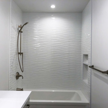
This sleek and neutral style bathroom gives you cleaner showering and tubbing while probing to eliminate that last little space at the back of the tub where mold and mildew can grow. The shower enclosure attaches directly to the tub, so you no longer have a gap between the wall and the tub, where grimy soap scum can build up.
The master bathroom remodels a seamless wall tile matched nicely with dark wood tone cabinets. An undermount sink is combined with an undermount tub, creating continuity in the design of this spa-like retreat, and it is cost-effective too. Overall, the space looks shiny because of chrome hardware fixtures, making the retreat seem endlessly modern.
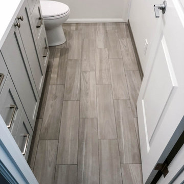
The guest bathroom uses brushed nickel hardware and fixtures that give the space a subtler-softer look with white wave wall tiles which are elegant and graceful additions that enhance the natural light that differs from the masters' bathroom. And the cabinets in the guest bathroom are clean and simple with shaker finishes-edges.
 Ernesto Santalla PLLC
Ernesto Santalla was approached to create a new home for two Washington, DC lawyers wishing to downsize their living space. The move took them from a row house in Washington's historic Dupont Circle neighborhood to a two bedroom apartment in the vibrant, up-and-coming U Street Corridor. Our task was to transform a rather plain and generic apartment into a custom, sophisticated space in a few strategic moves. Ceiling details serve to define functional areas of the living space without creating divisions. Changing some doors from wood to frosted glass, creates a sense of continuity between spaces, and allows light to travel between spaces. Lighting was inserted strategically, to enhance certain functions of the home. The kitchen was partially enclosed with a plane of frosted glass to create visual separation from the main living space while still allowing natural light to filter in from the expansive wall of floor-to-ceiling windows. Color was used to reinforce the architectural intent and simplify spaces, such as the entry, which as many doors and frames. Furniture was selected to blend with the client's collection of heirloom pieces, creating a sophisticated juxtaposition. Statement pieces like a ceiling light from Viabizzuno create impact while maintaining the visual simplicity of our minimal approach.
This project was featured in DC Modern Luxury. https://www.modernluxury.com/washington-dc/story/grand-nest
Photography by Geoffrey Hodgdon
 Hallmark Floors
Tobacco Birch, Silverado Hardwood Flooring.
Silverado Hardwood Floors features stunning Birch Timber hand crafted and factory finished to create rustic texturing. Bold grain visuals and colors add to this unique species appeal. This product offers a dramatic appeal at exceptional value.
This uniquely styled, wide plank floor features a beautiful, rotary peeled, deeply hand scraped surface that dazzles the eye. The six inch width and pillowed edge of Silverado plank gives it a bold western look that is unique in the marketplace.
The warm and rich stains give Silverado its distinctive color and greatly enhance the rustic, truly heavily hand scraped plank. The continuously varied grains of this hardwood surface combined with the long length of 6 feet, a length that our competitor’s can only envy(most rotary floors are 4 feet long) and UV cured aluminum oxide coatings makes Silverado Plank stand out on the floor and captures the attention of anyone walking on it.
These features make Silverado Plank an exceptional value with maximum design impact.
Simply Better…Discover Why.
www.hallmarkfloors.com

 Matt Fajkus Architecture
The site descends from the street and is privileged with dynamic natural views toward a creek below and beyond. To incorporate the existing landscape into the daily life of the residents, the house steps down to the natural topography. A continuous and jogging retaining wall from outside to inside embeds the structure below natural grade at the front with flush transitions at its rear facade. All indoor spaces open up to a central courtyard which terraces down to the tree canopy, creating a readily visible and occupiable transitional space between man-made and nature.
The courtyard scheme is simplified by two wings representing common and private zones - connected by a glass dining “bridge." This transparent volume also visually connects the front yard to the courtyard, clearing for the prospect view, while maintaining a subdued street presence. The staircase acts as a vertical “knuckle,” mediating shifting wing angles while contrasting the predominant horizontality of the house.
Crips materiality and detailing, deep roof overhangs, and the one-and-half story wall at the rear further enhance the connection between outdoors and indoors, providing nuanced natural lighting throughout and a meaningful framed procession through the property.
Photography
Charles Davis Smith
 Klopf Architecture
, Outer Space Landscape Architects, Sezen & Moon Structural Engineer and Flegels Construction updated a classic Eichler open, indoor-outdoor home.
Everyone loved the classic, original bones of this house, but it was in need of a major facelift both inside and out. The owners also wanted to remove the barriers between the kitchen and great room, and increase the size of the master bathroom as well as make other layout changes. No addition to the house was contemplated.
The owners worked with Klopf Architecture in part because of Klopf’s extensive mid-century modern / Eichler design portfolio, and in part because one of their neighbors who had worked with Klopf on their Eichler home remodel referred them. The Klopf team knew how to update the worn finishes to make a more sophisticated, higher quality home that both looks better and functions better.
In conjunction with the atrium and the landscaped rear yard / patio, the glassy living room feels open on both sides and allows an indoor / outdoor flow throughout. The new, natural wood exterior siding runs through the house from inside to outside to inside again, updating one of the classic design features of the Eichler homes.
Picking up on the wood siding, walnut vanities and cabinets offset the white walls. Gray porcelain tiles evoke the concrete slab floors and flow from interior to exterior to make the spaces appear to flow together. Similarly the ceiling decking has the same white-washed finish from inside to out. The continuity of materials and space enhances the sense of flow.
The large kitchen, perfect for entertaining, has a wall of built-ins and an oversized island. There’s plenty of storage and space for the whole group to prep and cook together.
One unique approach to the master bedroom is the bed wall. The head of the bed is tucked within a line of built-in wardrobes with a high window above. Replacing the master closet with this wall of wardrobes allowed for both a larger bathroom and a larger bedroom.
This 1,953 square foot, 4 bedroom, 2 bathroom Double Gable Eichler remodeled single-family house is located in Mountain View in the heart of the Silicon Valley.
Klopf Architecture Project Team: John Klopf, AIA, Klara Kevane, and Yegvenia Torres-Zavala
Landscape Architect: Outer Space Landscape Architects
Structural Engineer: Sezen & Moon
Contractor: Flegels Construction
Landscape Contractor: Roco's Gardening & Arroyo Vista Landscaping, Inc.
Photography ©2016 Mariko Reed
Location: Mountain View, CA
Year completed: 2015
 Shepel Homes - Kitchen and Bath
This sleek and neutral style bathroom gives you cleaner showering and tubbing while probing to eliminate that last little space at the back of the tub where mold and mildew can grow. The shower enclosure attaches directly to the tub, so you no longer have a gap between the wall and the tub, where grimy soap scum can build up.
The master bathroom remodels a seamless wall tile matched nicely with dark wood tone cabinets. An undermount sink is combined with an undermount tub, creating continuity in the design of this spa-like retreat, and it is cost-effective too. Overall, the space looks shiny because of chrome hardware fixtures, making the retreat seem endlessly modern.
The guest bathroom uses brushed nickel hardware and fixtures that give the space a subtler-softer look with white wave wall tiles which are elegant and graceful additions that enhance the natural light that differs from the masters' bathroom. And the cabinets in the guest bathroom are clean and simple with shaker finishes-edges.

 Tradition Outdoor Living
In Katy, Texas, Tradition Outdoor Living designed an outdoor living space, transforming the average backyard into a Texas Ranch-style retreat.
Entering this outdoor addition, the scene boasts Texan Ranch with custom made cedar Barn-style doors creatively encasing the recessed TV above the fireplace. Maintaining the appeal of the doors, the fireplace cedar mantel is adorned with accent rustic hardware. The 60” electric fireplace, remote controlled with LED lights, flickers warm colors for a serene evening on the patio. An extended hearth continues along the perimeter of living room, creating bench seating for all.
This combination of Rustic Taloka stack stone, from the fireplace and columns, and the polished Verano stone, capping the hearth and columns, perfectly pairs together enhancing the feel of this outdoor living room. The cedar-trimmed coffered beams in the tongue and groove ceiling and the wood planked stamped concrete make this space even more unique!
In the large Outdoor Kitchen, beautifully polished New Venetian Gold granite countertops allow the chef plenty of space for serving food and chatting with guests at the bar. The stainless steel appliances sparkle in the evening while the custom, color-changing LED lighting glows underneath the kitchen granite.
In the cooler months, this outdoor space is wired for electric radiant heat. And if anyone is up for a night of camping at the ranch, this outdoor living space is ready and complete with an outdoor bathroom addition!
Photo Credit: Jennifer Sue Photography

 Axis Mundi Design
When marrying two Upper West Side apartments to accommodate a growing family’s needs, the team at Axis Mundi was faced with a conundrum: how to distinctly delineate public and private spaces without sacrificing the greater openness conferred by the expansion. So they limned that line with a six-foot square sliding glass door, which enables parents to block out the sounds of rambunctious youth emanating from private quarters, while also shielding sleeping children from the later night activities of their parents—all of it without obscuring light or affecting the impression of open-plan living. Continuity of materials—hand-scraped walnut plank floors, a custom bamboo veneer kitchen and living room shelving—enhances the sense of sweeping, loft-like spaces. Materials also create intriguing textural contrasts, as in a powder room where a high-tech glass sink and black stainless steel penny tile is softened by a leather door with contrast stitching one must open to enter the space.
Highlights: A pair of Gio Ponti lounge chairs, black glass rock tables and a William Yeoward area rug from the Rug Company (living room), sliding glass shower door from Magnum in the master bath.
Total Area: 1950 sf
Design Team: John Beckmann, Richard Rosenbloom and Nick Messerlian
Photography: Mikiko Kikuyama
© Axis Mundi Design LLC
112