
Search results for "Continually updating" in Home Design Ideas
 User
UserAfter Photo:
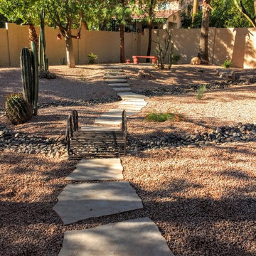
-We installed this flagstone walk way to lead to my client's meditation area. We needed to be sure he could walk this path with a cane.
-We placed the bridge over the river run drainage area for a continuous path
-We lowered all river run drainage areas to aid in proper drainage from back to front yard
-We installed all new irrigation to be more water efficient
Please see review from my client Mr. Huntsinger.
Client Deana M. Chiavola
 Update My Stairs
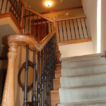
Venetian Series - continuous acanthus leaf pattern
Inspiration for a timeless wooden l-shaped staircase remodel in Chicago with wooden risers
Inspiration for a timeless wooden l-shaped staircase remodel in Chicago with wooden risers
 Drury Design
This update involved keeping the existing floorplan while using new materials to bring the space up to date.
Design objectives
-Modernize the space
-Use eye-catching tile
-Vanity with more storage
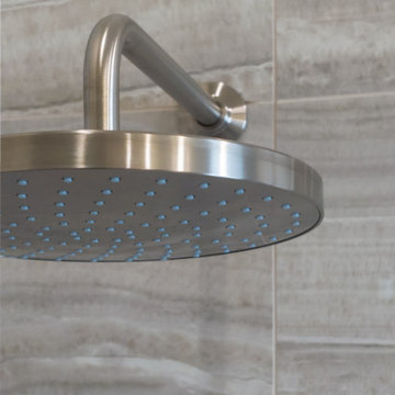
-Brighter finish on plumbing fixtures
Design challenges:
-Get more storage/functionality out of the same vanity space
-Tile selection – finding the right combination for the large the space
-Material selection – getting that wow-factor effect without being able to move walls or plumbing. This refresh was all about choosing materials with impact.
-Bringing in more light in a space somewhat defined by an existing vaulted ceiling.
Design solutions:
-Removed the old built-in tub look and replaced it with a sleek freestanding tub
-Continued the same tile from the shower walls behind the freestanding tub for a beautiful look on the back wall when you walk into the space
-Created a vanity with undermount sinks, all at one level to gain more countertop space
-Added floating shelves by the vanity – this added more options for decor and easy access to everyday items
-Large-format tile = less visible grout
Find the right local pro for your project
 Worthington Design & Remodeling
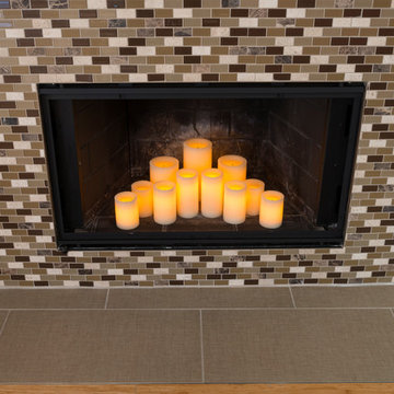
To complete the continuous aesthetic flow of the entire open space, the fireplace was updated with the same tile used as the kitchen accent backsplash tile.
Photo Credit: Whonsetler Photography
 The Interior Collection
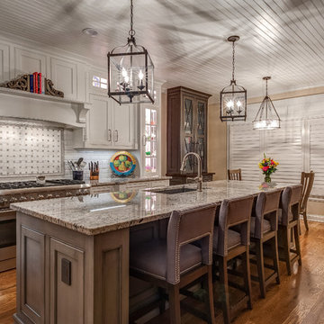
The owner is a cabinet maker and he and his wife remodeled this home. Their desire was to continue to use some of their existing furnishings but also give the home a newer look with updated colors and finishes.
 Update My Stairs
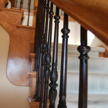
Venetian Series - continuous acanthus leaf pattern
Example of a classic wooden l-shaped staircase design in Chicago with wooden risers
Example of a classic wooden l-shaped staircase design in Chicago with wooden risers
 Worthington Design & Remodeling
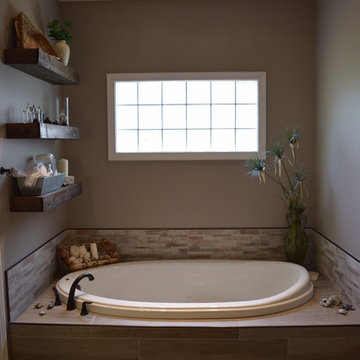
While the existing jetted tub functioned well, the tub deck needed a cosmetic update. The beautiful new wood-look floor tile was continued up the side and top of the tub deck, and a beautiful accent tile surround replaced the former outdated white tile.
Photo Credit: Whonsetler Photography
Sponsored
Columbus, OH

HomeCraft Remodeling
Custom Craftsmanship & Build Solutions in Franklin County, Ohio
 MDB Design Group
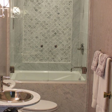
A home owner asked me to help her update her guest bath in an older ranch style house. Looking around her the house, I saw she had decorated in a more traditional style. She asked for the new design to be more contemporary, but classic and timeless.
The long, narrow space, 4 feet by 10 feet, was a challenge. We removed the old tile shower and wing wall, and replaced it with a soaking tub and shower. The frameless shower doors allow the feature fan tile on the back wall to draw your eye into the depth of the room. A small, wall hung sink keeps the space open. We had a custom marble top and splash fabricated. The wall sconces and mirror complete this vignette. The clean lines of the toilet continue this minimalist design.
Mary Broerman, CCIDC

 Milgard Windows & Doors
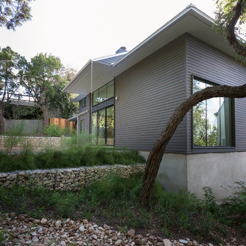
The Kiguchi family moved into their Austin, Texas home in 1994. Built in the 1980’s as part of a neighborhood development, they happily raised their family here but longed for something more contemporary. Once they became empty nesters, they decided it was time for a major remodel. After spending many years visiting Austin AIA Home Tours that highlight contemporary residential architecture, they had a lot of ideas and in 2013 were ready to interview architects and get their renovation underway.
The project turned into a major remodel due to an unstable foundation. Architects Ben Arbib and Ed Hughey, of Arbib Hughey Design were hired to solve the structural issue and look for inspiration in the bones of the house, which sat on top of a hillside and was surrounded by great views.
Unfortunately, with the old floor plan, the beautiful views were hidden by small windows that were poorly placed. In order to bring more natural light into the house the window sizes and configurations had to be addressed, all while keeping in mind the homeowners desire for a modern look and feel.
To achieve a more contemporary and sophisticated front of house, a new entry was designed that included removing a two-story bay window and porch. The entrance of the home also became more integrated with the landscape creating a template for new foliage to be planted. Older exterior materials were updated to incorporate a more muted palette of colors with a metal roof, dark grey siding in the back and white stucco in the front. Deep eaves were added over many of the new large windows for clean lines and sun protection.
“Inside it was about opening up the floor plan, expanding the views throughout the house, and updating the material palette to get a modern look that was also warm and inviting,” said Ben from Arbib Hughey Design. “Prior to the remodel, the house had the typical separation of rooms. We removed the walls between them and changed all of the windows to Milgard Thermally Improved Aluminum to connect the inside with the outside. No matter where you are you get nice views and natural light.”
The architects wanted to create some drama, which they accomplished with the window placement and opening up the interior floor plan to an open concept approach. Cabinetry was used to help delineate intimate spaces. To add warmth to an all-white living room, white-washed oak wood floors were installed and pine planks were used around the fireplace. The large windows served as artwork bringing the color of nature into the space.
An octagon shaped, elevated dining room, (named “the turret”), had a big impact on the design of the house. They architects rounded the corners and added larger window openings overlooking a new sunken garden. The great room was also softened by rounding out the corners and that circular theme continued throughout the house, being picked up in skylight wells and kitchen cabinetry. A staircase leading to a catwalk was added and the result was a two-story window wall that flooded the home with natural light.
When asked why Milgard® Thermally Improved Aluminum windows were selected, the architectural team listed many reasons:
1) Aesthetics: “We liked the slim profiles and narrow sightlines. The window frames never get in the way of the view and that was important to us. They also have a very contemporary look that went well with our design.”
2) Options: “We liked that we could get large sliding doors that matched the windows, giving us a very cohesive look and feel throughout the project.”
3) Cost Effective: “Milgard windows are affordable. You get a good product at a good price.”
4) Custom Sizes: “Milgard windows are customizable, which allowed us to get the right window for each location.”
Ready to take on your own traditional to modern home remodeling project? Arbib Hughey Design advises, “Work with a good architect. That means picking a team that is creative, communicative, listens well and is responsive. We think it’s important for an architect to listen to their clients and give them something they want, not something the architect thinks they should have. At the same time you want an architect who is willing and able to think outside the box and offer up design options that you may not have considered. Design is about a lot of back and forth, trying out ideas, getting feedback and trying again.”
The home was completely transformed into a unique, contemporary house perfectly integrated with its site. Internally the home has a natural flow for the occupants and externally it is integrated with the surroundings taking advantage of great natural light. As a side note, it was highly praised as part of the Austin AIA homes tour.
 Braswell Design+Build
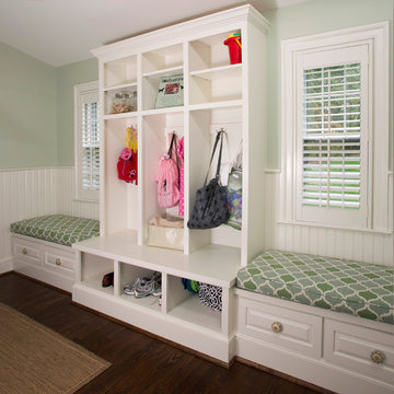
This client sought to update their recently purchased home in Alexandria. A gourmet kitchen that complemented the size of the home and property was a top priority. They wanted more light-filled and connected living spaces for their growing family. Updating the finishes throughout the home was also a necessity.
Design challenges included an existing utility space that occupied a large portion of the kitchen footprint, making the kitchen cramped and narrow. In addition, the foyer was dark, confined and uninviting as a result of its organization and enclosed nature of the main stair.
To overcome the challenges, we relocated the utilities, creating a more usable footprint for the kitchen. The aging furnace was replaced with a high efficiency furnace located in a newly insulated and conditioned crawl space. A new hot water heater was placed in the finished attic, and the electrical panel was also relocated. Then, we designed a portion of the kitchen to mask the need for dropped structural headers: the refrigerator, freezer and pantry were placed under the area that necessitated a drop bulkhead, creating a sleek built-in area for the appliances.
Once the utilities were moved, the kitchen could be opened up to a large family room and designed with a much-improved layout. Two new four-panel exterior doors replaced small doors at the family room to connect the main living space with the beautiful yard. In addition, white bead board was added to the family room ceiling, creating more visual continuity with the adjacent white kitchen.
To transform the foyer into a grand and welcoming entry, a small amount of space was taken from a large second floor bedroom, and the entire second floor structure was supported with a series of flush beams to allow the stair to be opened and expose the rail. New glass doors to the den, relocated at an angle from the main stair provide the foyer with more natural light and a wider, more inviting path to the kitchen.
In the master suite, the bedroom and bathroom entry doors were relocated to improve the room’s layout and offer more bathroom privacy and space for a walk-in closet. A room forgotten by the previous owner was turned into a family mudroom with built-ins and wainscoting to keep the family organized in style.
Photography by Greg Hadley
 Moore Design Group
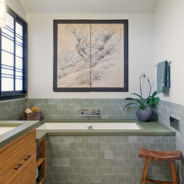
Commissioned to shed new light on a dark and dated master bath suite, we banished the cultured marble, raised the ceiling, and installed bright clerestory windows. We crowned custom bamboo cabinets with poured concrete counters, extended them to the Jacuzzi tub surrounds, and finished the space with gleaming nickel hardware, a recycled glass shower enclosure, and tumbled marble floors with radiant heating, for year-round warmth.
Our clients were so pleased with the results they asked us to continue the same sense of elegance and serenity we had started in the master bath and extend it towards a full remodel of their family room and kitchen. We installed new hardwood floors to emphasize the comfortable, quiet spaciousness of a newly arranged layout. Quartzite counters, quarter-sawn white oak cabinetry, and a recycled glass tile backsplash were combined to produce a sophisticated kitchen, gleaming surfaces and clean lines, while rough split-faced travertine brick enriched an updated fireplace, bookended by built-in shelves and cabinetry, to make a strong, practical center in the family room.
 McGuire + Co. Kitchen & Bath
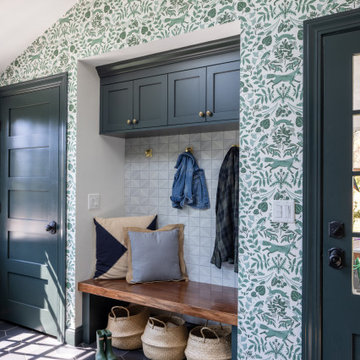
Design-build remodel in Wakefield, MA, featuring a kitchen with a bar area and mudroom space. (#ProjectEclecticEnvy) This remodel showcases painted frameless cabinetry in Rookwood Green, with a white textured subway tile backsplash, seamlessly integrated into a U-shaped layout with a peninsula for seating. The appliance suite in matte black adds contrast, accented with brass and German bronze hardware. A Silgranit apron sink with a fabric skirt and a brass bridge faucet introduce traditional charm. The bar area features a medium gray quartz countertop that mimics concrete, a highly textured geometric backsplash, and a concealed framed television. The mudroom space includes custom built-in storage with a stained bench top and continues the bar area’s backsplash tile. An 8” charcoal hexagon floor tile and Hygge & West Piedmont Wallpaper in Pine - a large-scale patterned wallpaper featuring foxes, birds, and florals - tie the space together with bold character.
Sponsored
Columbus, OH

Snider & Metcalf Interior Design, LTD
Leading Interior Designers in Columbus, Ohio & Ponte Vedra, Florida
 Tracy Berman Interiors
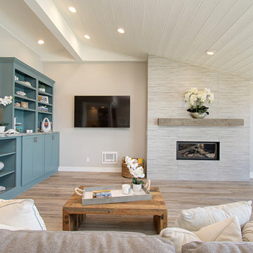
This gorgeous beach condo sits on the banks of the Pacific ocean in Solana Beach, CA. The previous design was dark, heavy and out of scale for the square footage of the space. We removed an outdated bulit in, a column that was not supporting and all the detailed trim work. We replaced it with white kitchen cabinets, continuous vinyl plank flooring and clean lines throughout. The entry was created by pulling the lower portion of the bookcases out past the wall to create a foyer. The shelves are open to both sides so the immediate view of the ocean is not obstructed. New patio sliders now open in the center to continue the view. The shiplap ceiling was updated with a fresh coat of paint and smaller LED can lights. The bookcases are the inspiration color for the entire design. Sea glass green, the color of the ocean, is sprinkled throughout the home. The fireplace is now a sleek contemporary feel with a tile surround. The mantel is made from old barn wood. A very special slab of quartzite was used for the bookcase counter, dining room serving ledge and a shelf in the laundry room. The kitchen is now white and bright with glass tile that reflects the colors of the water. The hood and floating shelves have a weathered finish to reflect drift wood. The laundry room received a face lift starting with new moldings on the door, fresh paint, a rustic cabinet and a stone shelf. The guest bathroom has new white tile with a beachy mosaic design and a fresh coat of paint on the vanity. New hardware, sinks, faucets, mirrors and lights finish off the design. The master bathroom used to be open to the bedroom. We added a wall with a barn door for privacy. The shower has been opened up with a beautiful pebble tile water fall. The pebbles are repeated on the vanity with a natural edge finish. The vanity received a fresh paint job, new hardware, faucets, sinks, mirrors and lights. The guest bedroom has a custom double bunk with reading lamps for the kiddos. This space now reflects the community it is in, and we have brought the beach inside.

 Stock & Associates, Inc.
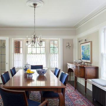
Sitting in one of Capital Hill’s beautiful neighborhoods, the exterior of this residence portrays a
bungalow style home as from the Arts and Craft era. By adding a large dormer to east side of the house,
the street appeal was maintained which allowed for a large master suite to be added to the second
floor. As a result, the two guest bedrooms and bathroom were relocated to give to master suite the
space it needs. Although much renovation was done to the Federalist interior, the original charm was
kept by continuing the formal molding and other architectural details throughout the house. In addition
to opening up the stair to the entry and floor above, the sense of gained space was furthered by opening
up the kitchen to the dining room and remodeling the space to provide updated finishes and appliances
as well as custom cabinetry and a hutch. The main level also features an added powder room with a
beautiful black walnut vanity.
 RoomService 360
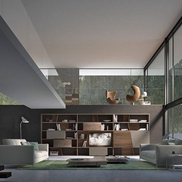
With over 60 years of excellence in manufacturing and design, Presotto Italia continues to reinvent the relationships between form and function by interpreting the evolving consumer lifestyles, tastes and trends. Today, Presotto is one of Italy’s leading manufacturers of top notch, ultra-modern bedrooms and extraordinary, exclusively-designed living room solutions. Best known for its one-of-a-kind Aqua Bed and Zero Round Bed, Presotto Italia is also the source for innovation and edgy product design which includes countless wall unit collections, wardrobes, walk-in closets, dining rooms and bedrooms.
Sponsored
Columbus, OH
HomeCraft Remodeling
Custom Craftsmanship & Build Solutions in Franklin County, Ohio
 Kitchen Magic
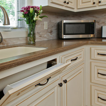
This refaced kitchen is now bright and cheery, reflecting the homeowners personal style. While the home is modest in the range of color choices, it's got lots of style. A sophisticated motif without a lot of clutter.
Cabinet refacing saved a lot of their budget allowing them to upgrade change the countertops and backsplash too. When you remodel the kitchen, the more elements you can change the bigger the transformation. Many times when you try to leave in and work off an existing element of the room, it holds you back in terms of design.
The countertop color highlights the beautiful walnut glazing on the the cabinet doors. Enriching the space with a subtle undertone of warmth.
The Sonora Corian countertops are a warm cocoa color with sublte swirls of gray and brown, contrasting and blancing the rich antique white cabinetry. Corian is a solid surface material that will last for decades. Corian is strong and durable material that is bacteria resistant and doesn't scratch or stain.
We continued with the Corian for the backsplash picking up the colors of the cabinets and the countertops with Sandlewood. The swirls of coco, off white and gray, continue with the muted palette.
They chose Corian for the backsplash because they didn't want to deal with grout and tile as they did in the past. The Corian backsplash will never need sealing or regrouting, creating another maintenance free component to this updated kitchen remodel.
This monochromatic color palette is now rich and inviting.The homeowners love of entertaining are now back and they love showing off their new kitchen!
Photographer: David Glasofer
 River Valley Landscapes
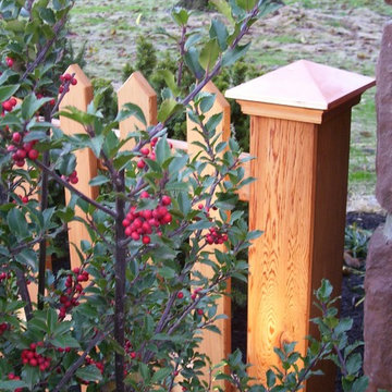
 This project presented unique opportunities that are not often found in residential landscaping. The homeowners were not only restoring their 1840's era farmhouse, a piece of their family’s history, but also enlarging and updating the home for modern living. The landscape designers continued this idea by creating a space that is a modern day interpretation of an 1840s era farm rather then a strict recreation. The resulting design combines elements of farm living from that time, as well as acknowledging the property’s history as a horse farm, with staples of 21st century landscapes such as space for outdoor living, lighting, and newer plant varieties.
Guests approach from the main driveway which winds through the property and ends at the main barn. There is secondary gated driveway just for the homeowners. Connected to this main driveway is a narrower gravel lane which leads directly to the residence. The lane passes near fruit trees planted in broken rows to give the illusion that they are the remains of an orchard that once existed on the site. The lane widens at the entrance to the gardens where there is a hitching post built into the fence that surrounds the gardens and a watering trough. The widened section is intended as a place to park a golf cart or, in a nod to the home’s past, tie up horses before entering. The gravel lane passes between two stone pillars and then ends at a square gravel court edged in cobblestones. The gravel court transitions into a wide flagstone walk bordered with yew hedges and lavender leading to the front door.
Directly to the right, upon entering the gravel court, is located a gravel and cobblestone edged walk leading to a secondary entrance into the residence. The walk is gated where it connects with the gravel court to close it off so as not to confuse visitors and guests to the main residence and to emphasize the primary entrance. An area for a bench is provided along this walk to encourage stopping to view and enjoy the gardens.
On either side of the front door, gravel and cobblestone walks branch off into the garden spaces. The one on the right leads to a flagstone with cobblestone border patio space. Since the home has no designated backyard like most modern suburban homes the outdoor living space had to be placed in what would traditionally be thought of as the front of the house. The patio is separated from the entrance walk by the yew hedge and further enclosed by three Amelanchiers and a variety of plantings including modern cultivars of old fashioned plants such as Itea and Hydrangea. A third entrance, the original front door to the 1840’s era section, connects to the patio from the home’s kitchen, making the space ideal for outdoor dining.
The gravel and cobblestone walk branching off to the left of the front door leads to the vegetable and perennial gardens. The idea for the vegetable garden was to recreate the tradition of a kitchen garden which would have been planted close to the residence for easy access. The vegetable garden is surrounded by mixed perennial beds along the inside of the wood picket fence which surrounds the entire garden space. Another area designated for a bench is provided here to encourage stopping and viewing. The home’s original smokehouse, completely restored and used as a garden shed, provides a strong architectural focal point to the vegetable garden. Behind the smokehouse is planted lilacs and other plants to give mass and balance to the corner and help screen the garden from the neighboring subdivision. At the rear corner of the garden a wood arbor was constructed to provide a structure on which to grow grapes or other vines should the homeowners choose to.
The landscape and gardens for this restored farmhouse and property are a thoughtfully designed and planned recreation of a historic landscape reinterpreted for modern living. The idea was to give a sense of timelessness when walking through the gardens as if they had been there for years but had possibly been updated and rejuvenated as lifestyles changed. The attention to materials and craftsmanship blend seamlessly with the residence and insure the gardens and landscape remain an integral part of the property. The farm has been in the homeowner’s family for many years and they are thrilled at the results and happy to see respect given to the home’s history and to its meticulous restoration.
 Tracy Berman Interiors
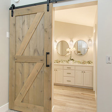
This gorgeous beach condo sits on the banks of the Pacific ocean in Solana Beach, CA. The previous design was dark, heavy and out of scale for the square footage of the space. We removed an outdated bulit in, a column that was not supporting and all the detailed trim work. We replaced it with white kitchen cabinets, continuous vinyl plank flooring and clean lines throughout. The entry was created by pulling the lower portion of the bookcases out past the wall to create a foyer. The shelves are open to both sides so the immediate view of the ocean is not obstructed. New patio sliders now open in the center to continue the view. The shiplap ceiling was updated with a fresh coat of paint and smaller LED can lights. The bookcases are the inspiration color for the entire design. Sea glass green, the color of the ocean, is sprinkled throughout the home. The fireplace is now a sleek contemporary feel with a tile surround. The mantel is made from old barn wood. A very special slab of quartzite was used for the bookcase counter, dining room serving ledge and a shelf in the laundry room. The kitchen is now white and bright with glass tile that reflects the colors of the water. The hood and floating shelves have a weathered finish to reflect drift wood. The laundry room received a face lift starting with new moldings on the door, fresh paint, a rustic cabinet and a stone shelf. The guest bathroom has new white tile with a beachy mosaic design and a fresh coat of paint on the vanity. New hardware, sinks, faucets, mirrors and lights finish off the design. The master bathroom used to be open to the bedroom. We added a wall with a barn door for privacy. The shower has been opened up with a beautiful pebble tile water fall. The pebbles are repeated on the vanity with a natural edge finish. The vanity received a fresh paint job, new hardware, faucets, sinks, mirrors and lights. The guest bedroom has a custom double bunk with reading lamps for the kiddos. This space now reflects the community it is in, and we have brought the beach inside.
31