
Search results for "Continually updating" in Home Design Ideas
 Drury Design
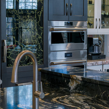
The existing kitchen wasn’t cutting it anymore. The homeowners designed and built this home about 20 years ago, but since then, their taste and needs changed. The outdated finishes felt outdated. There weren’t enough work areas. Some counterspace stations were just awkward due to the layout. Adjoining spaces around the kitchen were also in need of an update, but it was decided that the kitchen would undergo a transformation first.
Design Objectives
-Rework the overall layout (kitchen, laundry and butler’s pantry) to have a better flow and utilize the space better
-Incorporate materials with wow and pizzazz to reflect the homeowner’s style
-Design large work areas for cooking with two or more people at a time
-Provide seating at an island in addition to table seating
-Update surrounding spaces since the kitchen is open to the rest of the home
Design Challenges:
-Include a vast array of cooking appliances while having enough of cabinet storage
-Adjacent rooms need to feel updated and flow with new Kitchen
-Having multiple focal points with different materials but not have the space feel like a hodge podge
-Provide different task, accent and overall lighting to brighten up space
Design Solutions:
-The homeowner loves to cook and wanted to maximize her abilities. We incorporated a 48” rangetop with a griddle, a single oven, steam oven, microwave drawer and 15” induction cooktop next to a 48” Galley Ideal Workstation with two faucets. In order to have room for all of these appliances, the floor plan needed to accommodate more cabinetry. Both dining room entrances were closed off and the laundry room entrance were moved to the opposite end of the wall to allow two long walls for additional cabinets.
-The existing round columns throughout the first floor were outdated. To keep the architectural element of the columns, we wrapped the new columns to have a square shape with a flat panel on all four sides. Then, we painted them black (to tie in with the kitchen tops and curved hood surround) and added simple crown molding. For the flow of the space, closing up the odd corner that connected the laundry and dining room and relocating both room entrances allowed the space to actually feel larger and more continuous. --Adding the same square columns to the main dining room entrance, by the front door, also tied in the front of the house with the kitchen.
-The homeowner loves unique and bold materials. The main focal point of the kitchen is definitely the custom metal hood that incorporates two finishes and is set on a Lumix quartzite full-high back and side splashes. To make this area even more pronounced, a hearth-like drywall arch encloses the space. Once your eye moves off the hood, you start to notice the mirrored refrigerator panels, high gloss island cabinets, mirrored metal backsplash tile, delicate pendant island lights and the stunning island countertop material! There is a good mix of materials that make every space shine. The blacks, golds and pewter finishes help tie everything together.
-Lighting in a large kitchen is important. This space, besides getting a lot of natural light, needed lots of additional lighting due to the dark finishes. For overall lighting we have plenty of can lights in addition to lighting at the tops of the wall cabinets (that shine on the ceiling), undercabinet task lighting to make the tops sparkle and provide abundant lighting while prepping, pendant accent lighting over the island and a fandolier to add a little sparkle over the pub table. Voila!
 Tri-Town Woodworking LLC
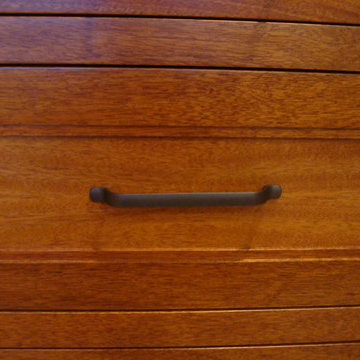
The same clean lines of the kithen cabinatry is continued. in the peninsular. Photo by Tri-Town Woodworking
Kitchen - cottage kitchen idea in Providence
Kitchen - cottage kitchen idea in Providence
 Kitchens by Good Guys
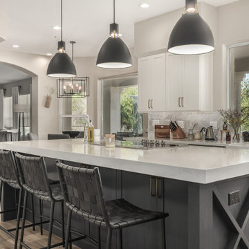
Our Gold Dust project is what we would call a rip out and replace, but with more effort. The kitchen before was decent, however it had an angle that protruded in the kitchen that only allowed for a small island. With keeping the floor, we knew that this was going to be a unique challenge. We also remodeled the bar and updated the laundry room as well.
For the kitchen, our clients wanted more function and cohesive movement throughout the space. In the beginning, if you were standing at the sink, and turn, you would get hip checked by the island. So, we pushed back the angled walls that cut into the kitchen, then turned and extended the island to host more seats. We kept the rest of the kitchen with the same layout and updated the cabinetry. Our clients went with a classic white shaker for the perimeter and for the island they chose a dark blue stain on a poplar wood species. For the countertops, they went with a beautiful white quartz everywhere and a three inch mitered edge for the island. Marble backsplash was put in to continue that classic timeless style. For the hardware, a gold finish was chosen to add warmth and to compliment the black plumbing fixtures. In the bar, there were two massive columns that were taking up too much real estate. By removing them, we were able to add in a full-size wine refrigerator and open the space for a more functional entertaining bar. We kept the laundry with the same layout, but just updated the cabinets and added the same marble backsplash from the kitchen. By keeping the bar and the laundry room the same cabinets as in the kitchen, this house now feels timeless, classic, and cozy.
We had such a joyful time working with our clients on this home.
Find the right local pro for your project
 Burrow & Nest
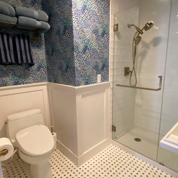
The bathroom was completely redone, with a new walk-in shower replacing an old tub and tile. The room is now open and airy, with a full glass enclosed shower.
Popping blues and teals in the wallpaper continue the color scheme throughout the house, a more subtle floor with azure celeste and tazzo marble tie in blues and white.
Wainscoting was added for a clean and classic look. A tailored pedestal sink is simple and chic, and highlights the champagne finish fixtures. A mod custom colored sconce adds whimsy to the space.
 Dixie Belle Paint Company
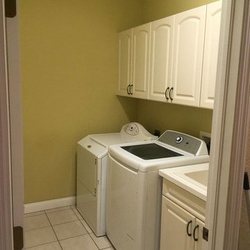
Continue to keep your brush damp throughout the project but not dripping wet. By the time your first coat is finished you can start on your second coat.
 WhyteHouse Staging & Re-Design LLC
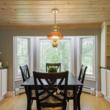
The cozy eating area sits right off the kitchen. We continued the granite counter tops and the painting of the walls and cabinet the same to create a very cohesive large kitchen.
 Align Design LLC
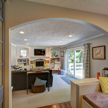
A new mantle and built ins around the fireplace continue with the arches.
Example of a transitional family room design in Other
Example of a transitional family room design in Other
Sponsored
Columbus, OH

HomeCraft Remodeling
Custom Craftsmanship & Build Solutions in Franklin County, Ohio
 Drury Design
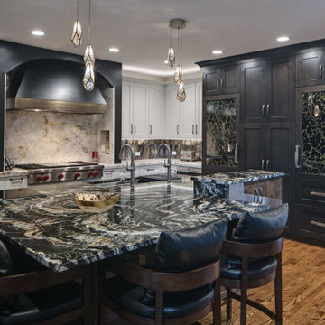
The existing kitchen wasn’t cutting it anymore. The homeowners designed and built this home about 20 years ago, but since then, their taste and needs changed. The outdated finishes felt outdated. There weren’t enough work areas. Some counterspace stations were just awkward due to the layout. Adjoining spaces around the kitchen were also in need of an update, but it was decided that the kitchen would undergo a transformation first.
Design Objectives
-Rework the overall layout (kitchen, laundry and butler’s pantry) to have a better flow and utilize the space better
-Incorporate materials with wow and pizzazz to reflect the homeowner’s style
-Design large work areas for cooking with two or more people at a time
-Provide seating at an island in addition to table seating
-Update surrounding spaces since the kitchen is open to the rest of the home
Design Challenges:
-Include a vast array of cooking appliances while having enough of cabinet storage
-Adjacent rooms need to feel updated and flow with new Kitchen
-Having multiple focal points with different materials but not have the space feel like a hodge podge
-Provide different task, accent and overall lighting to brighten up space
Design Solutions:
-The homeowner loves to cook and wanted to maximize her abilities. We incorporated a 48” rangetop with a griddle, a single oven, steam oven, microwave drawer and 15” induction cooktop next to a 48” Galley Ideal Workstation with two faucets. In order to have room for all of these appliances, the floor plan needed to accommodate more cabinetry. Both dining room entrances were closed off and the laundry room entrance were moved to the opposite end of the wall to allow two long walls for additional cabinets.
-The existing round columns throughout the first floor were outdated. To keep the architectural element of the columns, we wrapped the new columns to have a square shape with a flat panel on all four sides. Then, we painted them black (to tie in with the kitchen tops and curved hood surround) and added simple crown molding. For the flow of the space, closing up the odd corner that connected the laundry and dining room and relocating both room entrances allowed the space to actually feel larger and more continuous. --Adding the same square columns to the main dining room entrance, by the front door, also tied in the front of the house with the kitchen.
-The homeowner loves unique and bold materials. The main focal point of the kitchen is definitely the custom metal hood that incorporates two finishes and is set on a Lumix quartzite full-high back and side splashes. To make this area even more pronounced, a hearth-like drywall arch encloses the space. Once your eye moves off the hood, you start to notice the mirrored refrigerator panels, high gloss island cabinets, mirrored metal backsplash tile, delicate pendant island lights and the stunning island countertop material! There is a good mix of materials that make every space shine. The blacks, golds and pewter finishes help tie everything together.
-Lighting in a large kitchen is important. This space, besides getting a lot of natural light, needed lots of additional lighting due to the dark finishes. For overall lighting we have plenty of can lights in addition to lighting at the tops of the wall cabinets (that shine on the ceiling), undercabinet task lighting to make the tops sparkle and provide abundant lighting while prepping, pendant accent lighting over the island and a fandolier to add a little sparkle over the pub table. Voila!
 Phoenix Home Remodeling
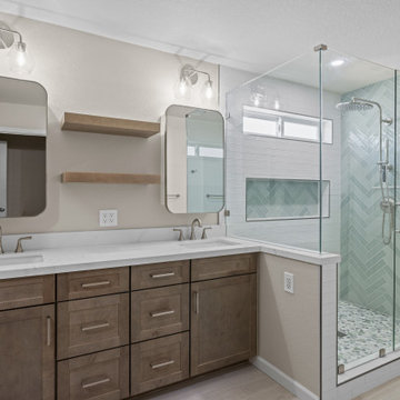
Garth & Stephanie wanted their primary bathroom to feel brighter, more functional, and designed for daily comfort. Their vision was to remove the dated tub and shower setup and create a clean, inviting retreat with updated finishes.
The shower was rebuilt from the ground up, beginning with new drain plumbing and waterproofing. The floor was finished with Coastal Marble Pebble Mosaic from Floor & Decor, bringing in a new texture and natural tones.
For the walls, Bedrosians Marin Pearl White tile was used in a brick lay pattern, complemented by a striking accent wall of Bedrosians Marin Aloe Green tile set in a herringbone design.
An oversized recessed wall niche and shaving foot niche were added, tiled in the same Aloe Green for continuity. Fixtures included a Delta Kayra trim kit, a Delta Emerge shower, and both a rain shower head and hand shower in Lumicoat Stainless.
Frameless tempered glass enclosed the shower with brushed nickel clips for a clean finish.
Waypoint maple almond cabinets with a 410F door profile provided ample new storage, paired with floating shelves between the mirrors for balance. The vanity was topped with Della Terra Quartz in Calacatta Bellatrix.
The floor was updated with Shibusa Bianco 12x24’ porcelain tile, installed in a ⅓ offset pattern for a subtle flow. The room also received a new American Standard Cadet 3 toilet, along with updated towel bars and robe hooks.
 Klopf Architecture
Klopf Architecture, Outer Space Landscape Architects, Sezen & Moon Structural Engineer and Flegels Construction updated a classic Eichler open, indoor-outdoor home.
Everyone loved the classic, original bones of this house, but it was in need of a major facelift both inside and out. The owners also wanted to remove the barriers between the kitchen and great room, and increase the size of the master bathroom as well as make other layout changes. No addition to the house was contemplated.
The owners worked with Klopf Architecture in part because of Klopf’s extensive mid-century modern / Eichler design portfolio, and in part because one of their neighbors who had worked with Klopf on their Eichler home remodel referred them. The Klopf team knew how to update the worn finishes to make a more sophisticated, higher quality home that both looks better and functions better.
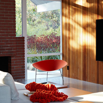
In conjunction with the atrium and the landscaped rear yard / patio, the glassy living room feels open on both sides and allows an indoor / outdoor flow throughout. The new, natural wood exterior siding runs through the house from inside to outside to inside again, updating one of the classic design features of the Eichler homes.
Picking up on the wood siding, walnut vanities and cabinets offset the white walls. Gray porcelain tiles evoke the concrete slab floors and flow from interior to exterior to make the spaces appear to flow together. Similarly the ceiling decking has the same white-washed finish from inside to out. The continuity of materials and space enhances the sense of flow.
The large kitchen, perfect for entertaining, has a wall of built-ins and an oversized island. There’s plenty of storage and space for the whole group to prep and cook together.
One unique approach to the master bedroom is the bed wall. The head of the bed is tucked within a line of built-in wardrobes with a high window above. Replacing the master closet with this wall of wardrobes allowed for both a larger bathroom and a larger bedroom.
This 1,953 square foot, 4 bedroom, 2 bathroom Double Gable Eichler remodeled single-family house is located in Mountain View in the heart of the Silicon Valley.
Klopf Architecture Project Team: John Klopf, AIA, Klara Kevane, and Yegvenia Torres-Zavala
Landscape Architect: Outer Space Landscape Architects
Structural Engineer: Sezen & Moon
Contractor: Flegels Construction
Landscape Contractor: Roco's Gardening & Arroyo Vista Landscaping, Inc.
Photography ©2016 Mariko Reed
Location: Mountain View, CA
Year completed: 2015
 Kitchens by Good Guys
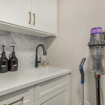
Our Gold Dust project is what we would call a rip out and replace, but with more effort. The kitchen before was decent, however it had an angle that protruded in the kitchen that only allowed for a small island. With keeping the floor, we knew that this was going to be a unique challenge. We also remodeled the bar and updated the laundry room as well.
For the kitchen, our clients wanted more function and cohesive movement throughout the space. In the beginning, if you were standing at the sink, and turn, you would get hip checked by the island. So, we pushed back the angled walls that cut into the kitchen, then turned and extended the island to host more seats. We kept the rest of the kitchen with the same layout and updated the cabinetry. Our clients went with a classic white shaker for the perimeter and for the island they chose a dark blue stain on a poplar wood species. For the countertops, they went with a beautiful white quartz everywhere and a three inch mitered edge for the island. Marble backsplash was put in to continue that classic timeless style. For the hardware, a gold finish was chosen to add warmth and to compliment the black plumbing fixtures. In the bar, there were two massive columns that were taking up too much real estate. By removing them, we were able to add in a full-size wine refrigerator and open the space for a more functional entertaining bar. We kept the laundry with the same layout, but just updated the cabinets and added the same marble backsplash from the kitchen. By keeping the bar and the laundry room the same cabinets as in the kitchen, this house now feels timeless, classic, and cozy.
We had such a joyful time working with our clients on this home.
 Worthington Design & Remodeling
This home was built in 1955 and is located in the Meridian-Kessler neighborhood of Indianapolis. The homeowners were able to see the potential of this bungalow through its very dated charm.
First order of business? Opening up the wall between the kitchen/living/dining areas to create a stunning open concept format.
Floors were beautifully refinished, timeless materials were selected, and the original charm of the home, including the windows and continuation of the trim molding from the dining room onto the remaining support beam...every detail was thoroughly addressed by our team.
Photography by The Home Aesthetic
 Worthington Design & Remodeling
This home was built in 1955 and is located in the Meridian-Kessler neighborhood of Indianapolis. The homeowners were able to see the potential of this bungalow through its very dated charm.
First order of business? Opening up the wall between the kitchen/living/dining areas to create a stunning open concept format.
Floors were beautifully refinished, timeless materials were selected, and the original charm of the home, including the windows and continuation of the trim molding from the dining room onto the remaining support beam...every detail was thoroughly addressed by our team.
Photography by The Home Aesthetic
Sponsored
Columbus, OH
HomeCraft Remodeling
Custom Craftsmanship & Build Solutions in Franklin County, Ohio
 Kitchen Design Concepts
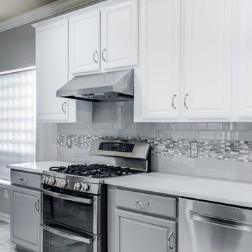
When we initially met with our clients, they expressed the need for modernization and updating. The original kitchen had good quality cabinetry but had standard finishes and lacked a little bit of design. With utilizing this kitchen already good bones, and a “few” updates, it’s almost as if it’s a brand new kitchen! This included a fresh new finish for the cabinetry, new countertops, backsplash, and fixtures. Want to learn more about how we transformed this kitchen? Continue reading below!
Cabinetry
As mentioned above, the kitchen already had great bones. Refinishing cabinetry is not only a great way to save money but a wonderful way to recycle and revamping what you already have. All, we needed to do was remove the door and drawer fronts, paint the cabinet boxes and paint the fronts. Voila! We have a two-tone white and grey kitchen! Already the space was looking fresh and brand new. However, no stopping there. While we were at it, we updated some other stuff as well. Keep reading below!
Countertops
Having lived with laminate tops for a while, our clients were starting to notice the wear and tear from its daily use. So, they wanted something that would not only last but also is easy to maintain. There’s no better choice than quartz! They decided on a 3cm Caesarstone in Nougat – a great pairing with newly finished cabinetry!
Backsplash
Having had 12×12 standard tiles as the backsplash, there were lots left to be desired. With tons of options of tile out there, we decided on utilizing two different tile styles as the backsplash. For the main field tile, we have a 3×6 H-line in Pumice, and an accent tile in Daltile Frost Snow marble. Simple, classic, and clean!
Fixtures
Lastly, the finishing touches of the kitchen, are not just finishing touches. They provide functionality to the space! The sink and faucet are not only beautiful pieces but something you use every single day, so they must be something that works for our client’s space. Our clients decided on a Blanco Quattrus super single bowl in stainless steel, and a Blanco faucet and soap dispenser.
 Corinthian Fine Homes
This homeowner came to us with her basic design ready for us to execute for her kitchen, but also asked us to design and update her entry, sunroom and fireplace. Her kitchen was 80’s standard builder grade cabinetry and laminate countertops and she had a knee wall separating her kitchen from the family room. We removed that wall and installed a custom cabinetry buffet to complement the cabinetry of the kitchen, allowing for access from all sides. We removed a desk area in the kitchen and converted it to a closed organization station complete with a charging station for phones and computers. Calcutta Quartzite countertops were used throughout and continued seamlessly up the walls as a backsplash to create a wow factor. We converted a closet into a pantry cabinet, and new stainless appliances, including a microwave drawer completed this renovation.
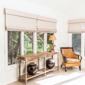
Additionally, we updated her sunroom by removing the “popcorn” textured ceiling and gave it a fresh updated coat of paint. We installed 12x24 tile floor giving the room a simple classic transformation. Finally, we renewed the fireplace area, by building a custom mantle and adding wood paneling and trim to soften the marble fireplace face and a simple coat of paint in the entry and a new chandelier brought a lighter and fresher impact upon entering the home.
 T7 Architecture, Inc.
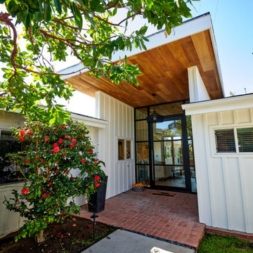
Design on the Via de Vista Residence began before the family moved into the home with the goals of modernizing the design and capturing the ocean views. The design focused on the exterior finishes, entryway, rear deck, newly added roof deck, and an entire interior update while adding no square footage. The exterior shifted from an Avocado Green siding to a combination of crisp white stucco and whiteboard and batten finish with updated black light fixtures for contrast. Entering the home, views to the ocean are created through a large 9'-0" by 4'-0" black metal frame and glass pivot door surrounded by large thin-framed sidelights and transom windows. Across from the entryway, beyond the living room is a new 14'-0" by 9'-0" La Cantina door that continues the unobstructed views out to the larger deck and water beyond, connecting the deck and living room, seamlessly. The newly added rooftop deck sits above the living room down below, mirroring its proportions, and is accessed by a black metal spiral staircase. All interior spaces have been updated with wide plank white oak floors and a variety of upscale but low maintenance finishes throughout the kitchen, bathrooms and bedrooms.
 Kitchen & Floor Decor
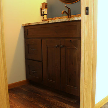
The Vesuvio granite from the kitchen and the Character Alder cabinets in Caraway are also showcased in this bathroom. Karndean extends from the kitchen to this bathroom with their Davinci line in Beach Driftwood.
The Moen Wynford Faucets in Oil Rubbed Bronze continue in this space with the vanity faucet.
Sponsored
Columbus, OH

Snider & Metcalf Interior Design, LTD
Leading Interior Designers in Columbus, Ohio & Ponte Vedra, Florida
 KJ Design Collective
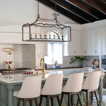
This Mediterranean modern kitchen renovation seamlessly blends old-world charm with contemporary elegance. By repainting and rephasing the existing doors with updated hardware, we refreshed the space while preserving its character. The transformation continues with a newly designed wet bar, featuring custom shelving that adds both function and style—perfect for entertaining. Warm wood tones, textural accents, and modern fixtures enhance the kitchen’s inviting atmosphere, creating a space that feels both timeless and elevated. With thoughtful updates and refined details, this kitchen now serves as a stunning centerpiece of the home.
 Carol's Interior Fashions
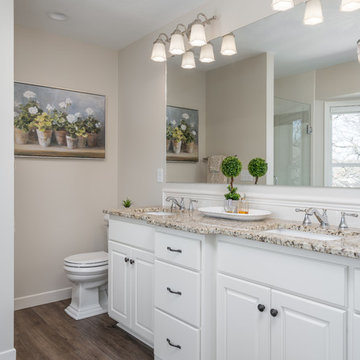
Instead of having a long "runway" vanity, we designed a detailed center base cabinet, that broke up the "long, continuous" look of the bathroom.
Bathroom - mid-sized transitional master beige tile and ceramic tile vinyl floor and brown floor bathroom idea in Minneapolis with raised-panel cabinets, white cabinets, a two-piece toilet, beige walls, an undermount sink, granite countertops, a hinged shower door and beige countertops
Bathroom - mid-sized transitional master beige tile and ceramic tile vinyl floor and brown floor bathroom idea in Minneapolis with raised-panel cabinets, white cabinets, a two-piece toilet, beige walls, an undermount sink, granite countertops, a hinged shower door and beige countertops
 Aiden Fabrics
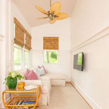
This space felt eclectic as we continued into the den/playroom designed with their toddler daughter in mind. Mixing in purple-toned fuchsias, periwinkles and powder blues, the neutral colored Crypton we used on the Robin Bruce Laney Slipcovered Sectional got just the pop it needed with a variety of custom throw pillows. And the nearby play table, which was painted orchid pink on top by our very creative client! The jungle print on the floor cushions kept it whimsical and tied in beautifully with the natural, beachy textures of the window treatments, ceiling fan, and “Inverted Leaf” wool rug from Colorfields.
34