
Search results for "Copy paste from product description" in Home Design Ideas

 Windhill+Co.
The Johnson-Thompson House, built c. 1750, has the distinct title as being the oldest structure in Winchester. Many alterations were made over the years to keep up with the times, but most recently it had the great fortune to get just the right family who appreciated and capitalized on its legacy. From the newly installed pine floors with cut, hand driven nails to the authentic rustic plaster walls, to the original timber frame, this 300 year old Georgian farmhouse is a masterpiece of old and new. Together with the homeowners and Cummings Architects, Windhill Builders embarked on a journey to salvage all of the best from this home and recreate what had been lost over time. To celebrate its history and the stories within, rooms and details were preserved where possible, woodwork and paint colors painstakingly matched and blended; the hall and parlor refurbished; the three run open string staircase lovingly restored; and details like an authentic front door with period hinges masterfully created. To accommodate its modern day family an addition was constructed to house a brand new, farmhouse style kitchen with an oversized island topped with reclaimed oak and a unique backsplash fashioned out of brick that was sourced from the home itself. Bathrooms were added and upgraded, including a spa-like retreat in the master bath, but include features like a claw foot tub, a niche with exposed brick and a magnificent barn door, as nods to the past. This renovation is one for the history books!
Eric Roth
 Leib Designs
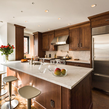
The kitchen was created in collaboration with Smallbone of Devizes. The electronic stove from Wolf has a stainless steel finish and allows residents to choose from ten different cooking modes with even temperatures and airflow throughout. The available dual fuel ranges are natural or LP gas. The refrigerator is a product of Sub-Zero and is built into the surrounding cabinetry. To ensure freshness of food and water, the refrigerator features an air purification system, that reduces stench, odors, bacteria and viruses. The residents will be accustom to cleaning without error, with the help of their fully integrated dishwasher from Miele.
 The Brooklyn Studio
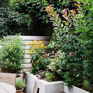
This residence was a complete gut renovation of a 4-story row house in Park Slope, and included a new rear extension and penthouse addition. The owners wished to create a warm, family home using a modern language that would act as a clean canvas to feature rich textiles and items from their world travels. As with most Brooklyn row houses, the existing house suffered from a lack of natural light and connection to exterior spaces, an issue that Principal Brendan Coburn is acutely aware of from his experience re-imagining historic structures in the New York area. The resulting architecture is designed around moments featuring natural light and views to the exterior, of both the private garden and the sky, throughout the house, and a stripped-down language of detailing and finishes allows for the concept of the modern-natural to shine.
Upon entering the home, the kitchen and dining space draw you in with views beyond through the large glazed opening at the rear of the house. An extension was built to allow for a large sunken living room that provides a family gathering space connected to the kitchen and dining room, but remains distinctly separate, with a strong visual connection to the rear garden. The open sculptural stair tower was designed to function like that of a traditional row house stair, but with a smaller footprint. By extending it up past the original roof level into the new penthouse, the stair becomes an atmospheric shaft for the spaces surrounding the core. All types of weather – sunshine, rain, lightning, can be sensed throughout the home through this unifying vertical environment. The stair space also strives to foster family communication, making open living spaces visible between floors. At the upper-most level, a free-form bench sits suspended over the stair, just by the new roof deck, which provides at-ease entertaining. Oak was used throughout the home as a unifying material element. As one travels upwards within the house, the oak finishes are bleached to further degrees as a nod to how light enters the home.
The owners worked with CWB to add their own personality to the project. The meter of a white oak and blackened steel stair screen was designed by the family to read “I love you” in Morse Code, and tile was selected throughout to reference places that hold special significance to the family. To support the owners’ comfort, the architectural design engages passive house technologies to reduce energy use, while increasing air quality within the home – a strategy which aims to respect the environment while providing a refuge from the harsh elements of urban living.
This project was published by Wendy Goodman as her Space of the Week, part of New York Magazine’s Design Hunting on The Cut.
Photography by Kevin Kunstadt
Find the right local pro for your project
 Fiorella Design, LLC
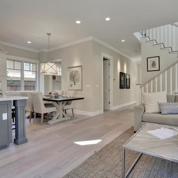
island Paint Benj Moore Kendall Charcoal
Floors- DuChateau Chateau Antique White
Living room - mid-sized transitional open concept light wood floor and gray floor living room idea in San Francisco with gray walls and no tv
Living room - mid-sized transitional open concept light wood floor and gray floor living room idea in San Francisco with gray walls and no tv
 Guy Ayers, Architect
Reverse Shed Eichler
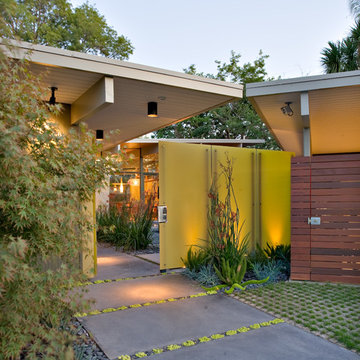
This project is part tear-down, part remodel. The original L-shaped plan allowed the living/ dining/ kitchen wing to be completely re-built while retaining the shell of the bedroom wing virtually intact. The rebuilt entertainment wing was enlarged 50% and covered with a low-slope reverse-shed roof sloping from eleven to thirteen feet. The shed roof floats on a continuous glass clerestory with eight foot transom. Cantilevered steel frames support wood roof beams with eaves of up to ten feet. An interior glass clerestory separates the kitchen and livingroom for sound control. A wall-to-wall skylight illuminates the north wall of the kitchen/family room. New additions at the back of the house add several “sliding” wall planes, where interior walls continue past full-height windows to the exterior, complimenting the typical Eichler indoor-outdoor ceiling and floor planes. The existing bedroom wing has been re-configured on the interior, changing three small bedrooms into two larger ones, and adding a guest suite in part of the original garage. A previous den addition provided the perfect spot for a large master ensuite bath and walk-in closet. Natural materials predominate, with fir ceilings, limestone veneer fireplace walls, anigre veneer cabinets, fir sliding windows and interior doors, bamboo floors, and concrete patios and walks. Landscape design by Bernard Trainor: www.bernardtrainor.com (see “Concrete Jungle” in April 2014 edition of Dwell magazine). Microsoft Media Center installation of the Year, 2008: www.cybermanor.com/ultimate_install.html (automated shades, radiant heating system, and lights, as well as security & sound).
 Blue Heron
Trent Bell Photography
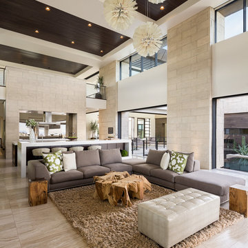
Huge trendy open concept living room photo in Las Vegas with white walls
Huge trendy open concept living room photo in Las Vegas with white walls
 Duet Design Group
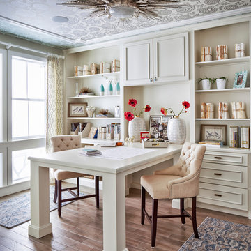
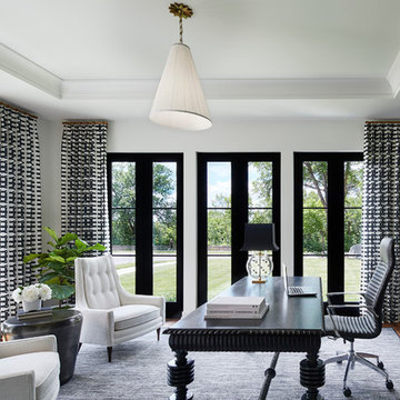
Example of a classic built-in desk medium tone wood floor home office design in Denver
 Ancient Surfaces
Image by 'Ancient Surfaces'
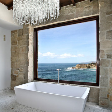
Product name: Antique Stone and Marble Bathroom Elements.
Contacts: (212) 461-0245
Email: Sales@ancientsurfaces.com
Website: www.AncientSurfaces.com
Those antique stone elements used in creating the crème de la crème of award winning bathrooms could be used today in rendering your humble bathroom into a magical indoor dreamscape equivalent to having your own exotic travel destination just a few step away from bed.
Allow yourself a full body and mind therapy that will let you unwind and escape from life's constraints and worries for an ephemeral period that will feel like an eternity...
From our antique marble and stone sinks, specialty reclaimed shower stones, floors and counter vanities, all our stone creations are guaranteed to give your bathroom a unique composition and arcane feel.
Our stone elements are considered by many high profile designers and architects a badge of honor that helps them achieve an overall creative design vision for your house.
 TKS Design Group
Free ebook, Creating the Ideal Kitchen. DOWNLOAD NOW
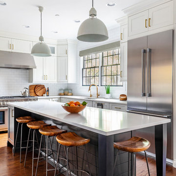
We went with a minimalist, clean, industrial look that feels light, bright and airy. The island is a dark charcoal with cool undertones that coordinates with the cabinetry and transom work in both the neighboring mudroom and breakfast area. White subway tile, quartz countertops, white enamel pendants and gold fixtures complete the update. The ends of the island are shiplap material that is also used on the fireplace in the next room.
In the new mudroom, we used a fun porcelain tile on the floor to get a pop of pattern, and walnut accents add some warmth. Each child has their own cubby, and there is a spot for shoes below a long bench. Open shelving with spots for baskets provides additional storage for the room.
Designed by: Susan Klimala, CKBD
Photography by: LOMA Studios
For more information on kitchen and bath design ideas go to: www.kitchenstudio-ge.com
 Thyme & Place Design LLC
The client requested a kitchen that would not only provide a great space to cook and enjoy family meals but one that would fit in with her unique design sense. An avid collector of contemporary art, she wanted something unexpected in her 100-year-old home in both color and finishes but still providing a great layout with improved lighting, storage, and superior cooking abilities. The existing kitchen was in a closed off space trapped between the family room and the living. If you were in the kitchen, you were isolated from the rest of the house. Making the kitchen an integrated part of the home was a paramount request.
Step one, remove the wall separating the kitchen from the other rooms in the home which allowed the new kitchen to become an integrated space instead of an isolation room for the cook. Next, we relocated the pantry access which was in the family room to the kitchen integrating a poorly used recess which had become a catch all area which did not provide any usable space for storage or working area. To add valuable function in the kitchen we began by capturing unused "cubbies", adding a walk-in pantry from the kitchen, increasing the storage lost to un-needed drop ceilings and bring light and design to the space with a new large awning window, improved lighting, and combining interesting finishes and colors to reflect the artistic attitude of the client.
A bathroom located above the kitchen had been leaking into the plaster ceiling for several years. That along with knob and tube wiring, rotted beams and a brick wall from the back of the fireplace in the adjacent living room all needed to be brought to code. The walls, ceiling and floors in this 100+ year old home were completely out of level and the room’s foot print could not be increased.
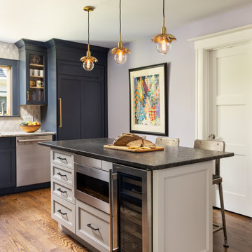
The choice of a Sub-Zero wolf product is a standard in my kitchen designs. The quality of the product, its manufacturing and commitment to food preservation is the reason I specify Sub Zero Wolf. For the cook top, the integrated line of the contemporary cooktop and the signature red knobs against the navy blue of the cabinets added to the design vibe of the kitchen. The cooking performance and the large continuous grate on the cooktop makes it an obvious choice for a cook looking for a great cook top with professional results in a more streamlined profile. We selected a Sharp microwave drawer for the island, an XO wine refrigerator, Bosch dishwasher and Kitchen Aid double convection wall ovens to round out the appliance package.
A recess created by the fireplace was outfitted with a cabinet which now holds small appliances within easy reach of my very petite client. Natural maple accents were used inside all the wall cabinets and repeated on the front of the hood and for the sliding door appliance cabinet and the floating shelves. This allows a brighter interior for the painted cabinets instead of the traditional same interior as exterior finish choice. The was an amazing transformation from the old to the new.
The final touches are the honey bronze hardware from Top Knobs, Mitzi pendants from Hudson Valley Lighting group,
a fabulous faucet from Brizo. To eliminate the old freestanding bottled water cooler, we specified a matching water filter faucet.
 Dura Supreme Cabinetry
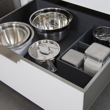
This contemporary kitchen features the NEW Stainless Steel Drawers and Roll-Out Shelves from Dura Supreme Cabinetry. The Bria (frameless) cabinets in Dura Supreme's "White" and Wired-Foil cabinets in Dura Supreme's "Wired-Mercury" are a great combination of cabinetry for creating the clean sleek look of this modern two-tone kitchen design.
Dura Supreme Cabinetry is excited to introduce NEW Stainless Steel Drawers and Roll-Out Shelves for their Bria Cabinetry (Frameless / Full-Access product line). For a limited time, this new metal drawer system is available exclusively from Dura Supreme as they partnered with Blum to be the first American manufacturer to bring it to market.
Dura Supreme’s Stainless Steel Drawers and Roll-Out Shelves are an attractive option for any kitchen design. Sleek, double-wall, stainless steel sides are only ½” thick and work with many of Dura Supreme’s wood drawer accessories, as well as the coordinating gray metal accessories designed specifically for Stainless Steel drawers. Concealed, undermount glides are integrated into the sides and are self-closing with a soft-close feature.
Our new Stainless Steel drawer option provides a contemporary alternative to our classic Maple dovetailed drawer. For homeowners that favor Transitional or Contemporary styling, this sleek, high-performance drawer system will be ideal!
Request a FREE Dura Supreme Brochure:
http://www.durasupreme.com/request-brochure
Find a Dura Supreme Showroom in your area:
http://www.durasupreme.com/dealer-locator
Want to become a Dura Supreme Dealer? Go to:
http://www.durasupreme.com/new-dealer-inquiry
To view a video and more info about this product go to: http://www.durasupreme.com/storage-solutions/stainless-steel-drawers-roll-outs
 The Brooklyn Studio
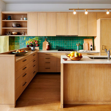
This residence was a complete gut renovation of a 4-story row house in Park Slope, and included a new rear extension and penthouse addition. The owners wished to create a warm, family home using a modern language that would act as a clean canvas to feature rich textiles and items from their world travels. As with most Brooklyn row houses, the existing house suffered from a lack of natural light and connection to exterior spaces, an issue that Principal Brendan Coburn is acutely aware of from his experience re-imagining historic structures in the New York area. The resulting architecture is designed around moments featuring natural light and views to the exterior, of both the private garden and the sky, throughout the house, and a stripped-down language of detailing and finishes allows for the concept of the modern-natural to shine.
Upon entering the home, the kitchen and dining space draw you in with views beyond through the large glazed opening at the rear of the house. An extension was built to allow for a large sunken living room that provides a family gathering space connected to the kitchen and dining room, but remains distinctly separate, with a strong visual connection to the rear garden. The open sculptural stair tower was designed to function like that of a traditional row house stair, but with a smaller footprint. By extending it up past the original roof level into the new penthouse, the stair becomes an atmospheric shaft for the spaces surrounding the core. All types of weather – sunshine, rain, lightning, can be sensed throughout the home through this unifying vertical environment. The stair space also strives to foster family communication, making open living spaces visible between floors. At the upper-most level, a free-form bench sits suspended over the stair, just by the new roof deck, which provides at-ease entertaining. Oak was used throughout the home as a unifying material element. As one travels upwards within the house, the oak finishes are bleached to further degrees as a nod to how light enters the home.
The owners worked with CWB to add their own personality to the project. The meter of a white oak and blackened steel stair screen was designed by the family to read “I love you” in Morse Code, and tile was selected throughout to reference places that hold special significance to the family. To support the owners’ comfort, the architectural design engages passive house technologies to reduce energy use, while increasing air quality within the home – a strategy which aims to respect the environment while providing a refuge from the harsh elements of urban living.
This project was published by Wendy Goodman as her Space of the Week, part of New York Magazine’s Design Hunting on The Cut.
Photography by Kevin Kunstadt
 OLSON LEWIS + Architects
This New England home has the essence of a traditional home, yet offers a modern appeal. The home renovation and addition involved moving the kitchen to the addition, leaving the resulting space to become a formal dining and living area.
The extension over the garage created an expansive open space on the first floor. The large, cleverly designed space seamlessly integrates the kitchen, a family room, and an eating area.
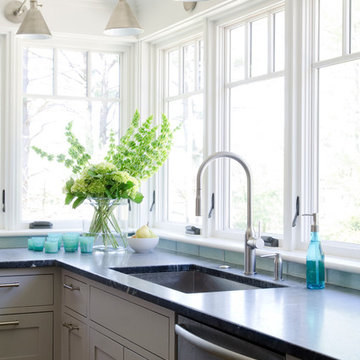
A substantial center island made of soapstone slabs has ample space to accommodate prepping for dinner on one side, and the kids doing their homework on the other. The pull-out drawers at the end contain extra refrigerator and freezer space. Additionally, the glass backsplash tile offers a refreshing luminescence to the area. A custom designed informal dining table fills the space adjacent to the center island.
Paint colors in keeping with the overall color scheme were given to the children. Their resulting artwork sits above the family computers. Chalkboard paint covers the wall opposite the kitchen area creating a drawing wall for the kids. Around the corner from this, a reclaimed door from the grandmother's home hangs in the opening to the pantry. Details such as these provide a sense of family and history to the central hub of the home.
Builder: Anderson Contracting Service
Interior Designer: Kristina Crestin
Photographer: Jamie Salomon
 Eldorado Stone
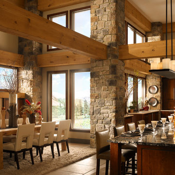
Stone: Autumn Leaf - RoughCut
RoughCut mimics limestone with its embedded, fossilized artifacts and roughly cleaved, pronounced face. Shaped for bold, traditional statements with clean contemporary lines, RoughCut ranges in heights from 2″ to 11″ and lengths from 2″ to over 18″. The color palettes contain blonds, russet, and cool grays.
Get a Sample of RoughCut:
http://shop.eldoradostone.com/products/rough-cut-sample
 Dura Supreme Cabinetry
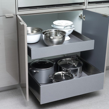
This contemporary kitchen features the NEW Stainless Steel Drawers and Roll-Out Shelves from Dura Supreme Cabinetry. The Bria (frameless) cabinets in Dura Supreme's "White" and Wired-Foil cabinets in Dura Supreme's "Wired-Mercury" are a great combination of cabinetry for creating the clean sleek look of this modern two-tone kitchen design.
Dura Supreme Cabinetry is excited to introduce NEW Stainless Steel Drawers and Roll-Out Shelves for their Bria Cabinetry (Frameless / Full-Access product line). For a limited time, this new metal drawer system is available exclusively from Dura Supreme as they partnered with Blum to be the first American manufacturer to bring it to market.
Dura Supreme’s Stainless Steel Drawers and Roll-Out Shelves are an attractive option for any kitchen design. Sleek, double-wall, stainless steel sides are only ½” thick and work with many of Dura Supreme’s wood drawer accessories, as well as the coordinating gray metal accessories designed specifically for Stainless Steel drawers. Concealed, undermount glides are integrated into the sides and are self-closing with a soft-close feature.
Our new Stainless Steel drawer option provides a contemporary alternative to our classic Maple dovetailed drawer. For homeowners that favor Transitional or Contemporary styling, this sleek, high-performance drawer system will be ideal!
Request a FREE Dura Supreme Brochure:
http://www.durasupreme.com/request-brochure
Find a Dura Supreme Showroom in your area:
http://www.durasupreme.com/dealer-locator
Want to become a Dura Supreme Dealer? Go to:
http://www.durasupreme.com/new-dealer-inquiry
To view a video and more info about this product go to: http://www.durasupreme.com/storage-solutions/stainless-steel-drawers-roll-outs
 JWT Associates
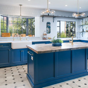
A small kitchen and breakfast room were combined to create this large open space. The floor is antique cement tile from France. The island top is reclaimed wood with a wax finish. Countertops are Carrera marble. All photos by Lee Manning Photography
 Advance Design Studio, Ltd.
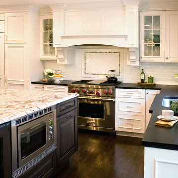
Crisp white cabinetry was accented by a dark patina-ed cherry with heavy distressing. The rich island color is mimicked by original hardwood oak floors stained a darker shade than the original honey oak of the past. Two tone counter tops compliment one another with a rich Leathered Black and the dramatic patterned granite of the island. The fresh white ceramic backsplash shines with mitred bricks from an era past, and herringbone detail hemmed by elegant gray marble accents.
The built in refrigerator is flanked by matching pantry pairs on each side, handily equipped with plenty of functional pull out drawers to store every cook’s required ingredients. The island seats the entire family, but also houses handsomely a glass front beverage center, a microwave oven, a trash pull out, and a warming drawer; all hidden behind customized matching panel doors.
Just across from the island a custom matching cook book cabinet fits in nicely holding all of the cook’s favorite recipes just a few steps from this cook’s new dream kitchen.
 O’Hara Interiors
Martha O'Hara Interiors, Furnishings & Photo Styling | Detail Design + Build, Builder | Charlie & Co. Design, Architect | Corey Gaffer, Photography | Please Note: All “related,” “similar,” and “sponsored” products tagged or listed by Houzz are not actual products pictured. They have not been approved by Martha O’Hara Interiors nor any of the professionals credited. For information about our work, please contact design@oharainteriors.com.
 SabaRehman Abdulrehman
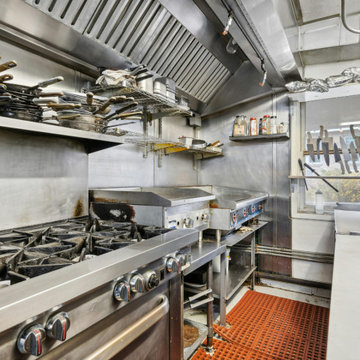
Phoenix's food scene is vibrant and thriving, but also one of the most closely watched in the country. Health inspectors in Maricopa County are strict, and customers expect spotless dining spaces.
To stay competitive, restaurant owners and food vendors must stay on top of evolving health codes, sanitation protocols, and food safety benchmarks. That starts with a firm grip on restaurant cleaning safety standards. Ignoring sanitation rules risks more than bad reviews. It invites citations, customer complaints, and operational shutdowns.
Whether you're operating a food truck or a restaurant, following these Phoenix cleaning standards helps you stay compliant, pass health inspections, and build customer trust.
Importance of a Clean Phoenix Restaurant that Follows Food Health and Safety Standards
The restaurant industry in Phoenix operates under strict oversight. The Maricopa County Environmental Services Department conducts regular inspections, and violations can result in fines or closures. In this climate, restaurant cleaning is not just a hygiene standard. It is a business-critical measure.
Proper food handling and establishment cleaning protocols reduce the risk of foodborne illnesses, control pests, protect equipment, and keep your staff safe. Inconsistent practices, on the other hand, can quickly become liabilities.
Start With the Food Code
Phoenix food vendors must comply with the 2017 FDA Food Code as adopted by Maricopa County. This includes rules on:
- Sanitizing food-contact surfaces after each use
- Maintaining proper water temperatures for dishwashing
- Cleaning restrooms frequently and keeping them stocked
- Storing cleaning chemicals away from prep areas
- Daily: Wipe prep tables, mop floors, clean grills, sanitize cutting boards
- Weekly: Deep clean kitchen hoods, polish cooking equipment, disinfect drains
- Monthly: Check pest control measures, clean freezer coils, and inspect HVAC filters
- Using the right sanitizers and PPE
- Logging cleaning times and who performed the task
- Identifying signs of mold, grease buildup, or rodent activity
- Conducting thorough surface cleaning to ensure all food-contact surfaces are sanitized regularly
- Food-safe and non-corrosive
- Effective against norovirus, salmonella, and E. coli
- Clearly labeled and stored in original containers
- Seal gaps around doors and pipes
- Store dry goods in sealed, elevated containers
- Keep outdoor waste bins locked and distanced from entry points
- Record cleaning completion in real time
- Alert managers when tasks are missed
- Keep a historical record for inspections
- Is certified and understands the Arizona food codes
- Provides documented service reports
- Offers customized cleaning plans
- Offers flexible scheduling around your operating hours
- Cross-contamination prevention: Regularly clean food prep surfaces and tools, and use separate equipment for raw meats, vegetables, and ready-to-eat foods. Proper cleaning prevents any contact with food that could lead to cross-contamination and affects food quality.
- Temperature monitoring: While not directly related to cleaning, maintaining proper food temperature is essential. Hot foods should be stored above 140°F, and cold foods below 40°F. Regularly monitor temperatures and clean temperature gauges to ensure accuracy.
- Proper storage: Use clean storage containers and shelving for food storage, keeping items off the floor. Ensure all food is sealed and labeled to avoid contamination risks and comply with food safety standards.
 Leclair Decor
When we found out we were expecting in June, we had already put a plan in motion to merge our home offices to eventually make way for a nursery. After the excitement of the big news we kicked it into high gear!
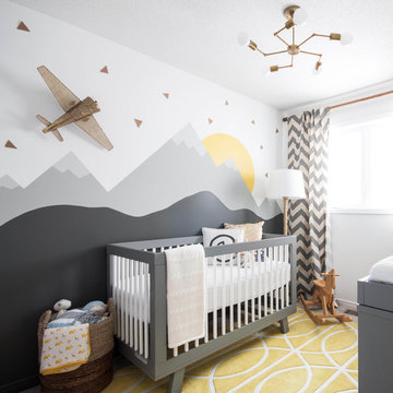
First off we painted the room a crisp white to contrast from the past 2 tone dark office colours. Our amazing painter Carolyn from Roll Her Sleeves then traced out and painted our vision for the mural. At first we wanted to go very minimal but after looking at it for a few weeks, we asked her to come back and add a forefront layer of grey mountains, details in the peaks and the yellow sun.
During that time the search for the perfect modern crib was on. We found the Hudson model from Babyletto which we loved from one of our suppliers in the states but after duties and shipping it ended up being more practical to buy it here in town.
At the Artemano opening we hosted in November, we connected with Jonathan from Obasan mattresses. He graciously offered to supply us with one of their locally made high quality mattresses. We can’t wait for our baby boy to sleep on it!
Our rocking chair has quite the story behind it. We originally found it for $8 ( yes eight ) dollars last spring. We weren’t sure at the time where and how we were going to use it so we had stored it in one of the garages where we were keeping furniture for an ongoing model home project. One morning we arrived and noticed the chair was missing. We made a call to our construction contact and he relayed the message. Next thing we know a worker was jumping in the garbage bins across the street. They had believed the chair was to be thrown away. Although a bit dusty it was recovered in decent shape. A few months passed and we started entertaining the idea of using it as our rocker. We asked Melissa’s dad if he would be interested in converting it to a rocker for us, and always up for a challenge he accepted and came through big time! At least was the task of reupholstering. We kind of liked the fun bright orange it was but decided to keep it safe with a nice grey material.
After trying numerous curtains ( we lost count ) we finally settled on a old fav, the west elm chevrons. As well, 3 or 4 rugs were attempted until we tried the yellow rug from Urban Barn and instantly knew that was the one.
We slid a couple small Ikea hacks in there. We wrapped an inexpensive floor lamp with rope to give it a different look ( and hide the silver since everything is brass ) and spray painted the shelf hinges to match the rest of the finishes.
Photo: Sacha Leclair
12