
Search results for "Cost effective storage" in Home Design Ideas
 NB Construction
Our bathroom renovation services range from makeovers to full reconstructions. The bathroom is a great place to green your home by upgrading to new eco-conscious systems. It’s also very cost effective to replace the surfaces and hardware to update or upgrade your bathroom.
Taken by: Rick Rodney

 Change Your Bathroom©
The goal of this project was to upgrade the builder grade finishes and create an ergonomic space that had a contemporary feel. This bathroom transformed from a standard, builder grade bathroom to a contemporary urban oasis. This was one of my favorite projects, I know I say that about most of my projects but this one really took an amazing transformation. By removing the walls surrounding the shower and relocating the toilet it visually opened up the space. Creating a deeper shower allowed for the tub to be incorporated into the wet area. Adding a LED panel in the back of the shower gave the illusion of a depth and created a unique storage ledge. A custom vanity keeps a clean front with different storage options and linear limestone draws the eye towards the stacked stone accent wall.
Houzz Write Up: https://www.houzz.com/magazine/inside-houzz-a-chopped-up-bathroom-goes-streamlined-and-swank-stsetivw-vs~27263720
The layout of this bathroom was opened up to get rid of the hallway effect, being only 7 foot wide, this bathroom needed all the width it could muster. Using light flooring in the form of natural lime stone 12x24 tiles with a linear pattern, it really draws the eye down the length of the room which is what we needed. Then, breaking up the space a little with the stone pebble flooring in the shower, this client enjoyed his time living in Japan and wanted to incorporate some of the elements that he appreciated while living there. The dark stacked stone feature wall behind the tub is the perfect backdrop for the LED panel, giving the illusion of a window and also creates a cool storage shelf for the tub. A narrow, but tasteful, oval freestanding tub fit effortlessly in the back of the shower. With a sloped floor, ensuring no standing water either in the shower floor or behind the tub, every thought went into engineering this Atlanta bathroom to last the test of time. With now adequate space in the shower, there was space for adjacent shower heads controlled by Kohler digital valves. A hand wand was added for use and convenience of cleaning as well. On the vanity are semi-vessel sinks which give the appearance of vessel sinks, but with the added benefit of a deeper, rounded basin to avoid splashing. Wall mounted faucets add sophistication as well as less cleaning maintenance over time. The custom vanity is streamlined with drawers, doors and a pull out for a can or hamper.
A wonderful project and equally wonderful client. I really enjoyed working with this client and the creative direction of this project.
Brushed nickel shower head with digital shower valve, freestanding bathtub, curbless shower with hidden shower drain, flat pebble shower floor, shelf over tub with LED lighting, gray vanity with drawer fronts, white square ceramic sinks, wall mount faucets and lighting under vanity. Hidden Drain shower system. Atlanta Bathroom.
 User
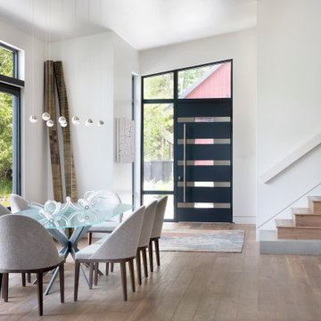
UserWindows reaching a grand 12’ in height fully capture the allurement of the area, bringing the outdoors into each space. Furthermore, the large 16’ multi-paneled doors provide the constant awareness of forest life just beyond. The unique roof lines are mimicked throughout the home with trapezoid transom windows, ensuring optimal daylighting and design interest. A standing-seam metal, clads the multi-tiered shed-roof line. The dark aesthetic of the roof anchors the home and brings a cohesion to the exterior design. The contemporary exterior is comprised of cedar shake, horizontal and vertical wood siding, and aluminum clad panels creating dimension while remaining true to the natural environment.
The Glo A5 double pane windows and doors were utilized for their cost-effective durability and efficiency. The A5 Series provides a thermally-broken aluminum frame with multiple air seals, low iron glass, argon filled glazing, and low-e coating. These features create an unparalleled double-pane product equipped for the variant northern temperatures of the region. With u-values as low as 0.280, these windows ensure year-round comfort.
Find the right local pro for your project
 SafeRacks
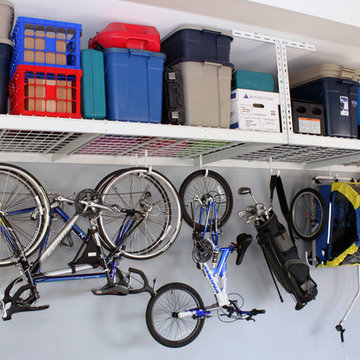
- Two 4x8 racks side by side
- 4 sets of Deck Hooks used
- Industrial Grade Steel
- Adjustable Height
- Store: decorations, coolers, tools, pet carriers, files, tents, sports gear, bikes, gear bags, strollers, golf clubs
 Wauwatosa By Design
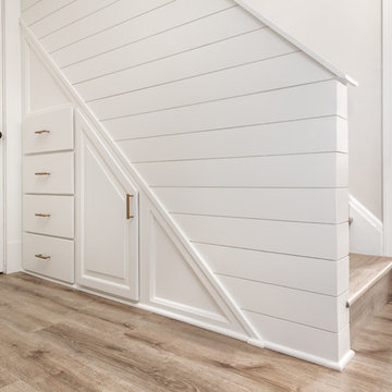
Custom designed and built understair storage cabinets with drawers and door.
White Shiplap paneling.
Inspiration for a mid-sized country wooden staircase remodel in Milwaukee with wooden risers
Inspiration for a mid-sized country wooden staircase remodel in Milwaukee with wooden risers
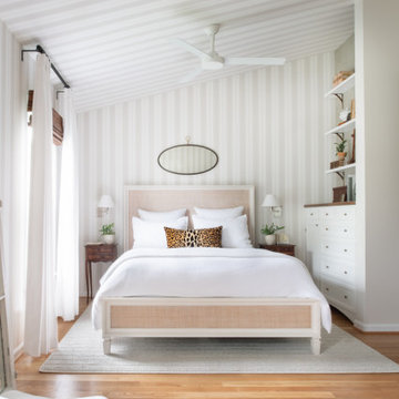
 Alison Giese Interiors
A reworking of a bedroom space to create a master oasis. A tented effect was achieved with a striped wallpaper applied to walls and ceiling. Wood floors replaced carpet, and built-ins were tucked into niches for storage.
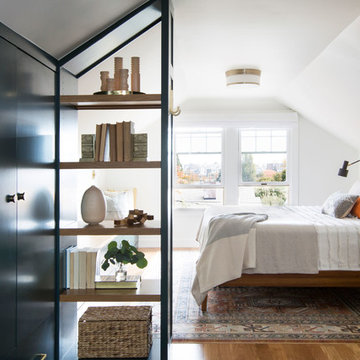
 Casework Inter Design
When Casework first met this 550 square foot attic space in a 1912 Seattle Craftsman home, it was dated and not functional. The homeowners wanted to transform their existing master bedroom and bathroom to include more practical closet and storage space as well as add a nursery. The renovation created a purposeful division of space for a growing family, including a cozy master with built-in bench storage, a spacious his and hers dressing room, open and bright master bath with brass and black details, and a nursery perfect for a growing child. Through clever built-ins and a minimal but effective color palette, Casework was able to turn this wasted attic space into a comfortable, inviting and purposeful sanctuary.

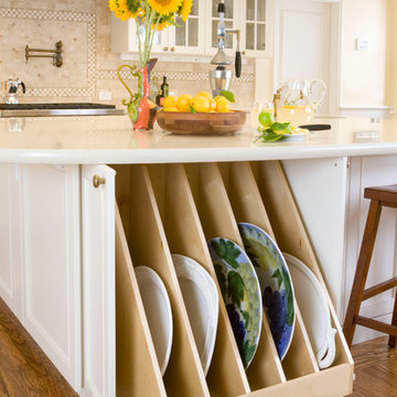
 Construction by Meyer
To accommodate the client's request for a designated storage space for her large dinner plates, we installed a custom roll-out storage solution. This unique feature was thoughtfully designed to be both practical and aesthetically pleasing, providing an elegant means to showcase her exquisite collection.
 Gallery KBNY
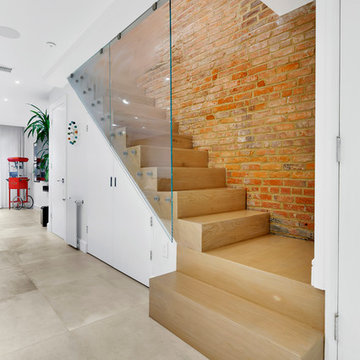
The owner of this historic and landmarked town-home renovation in Hudson Square, originally built in 1826, hired Gallery Kitchen and Bath to fully gut-renovate this 3-unit row-home. The scope of work included a full-scale renovation of the owners unit, including the renovation of the kitchen, one 4-piece master ensuite bathroom, one 3-piece bathroom with a walk-in steam shower, and a beautiful powder room. Additional work in the owners unit also included flooring, electrical upgrade, major plumbing work, new HVAC system, restoration of a fireplace, installation of a fully integrated smart home system and landmarked approved windows.
CELLAR RENOVATION IN NYC LANDMARKED TOWN-HOME
Rounding out the owners unit we renovated the cellar, which was converted into an entertainment space and featured a custom glass curtain wall, along with a custom staircase with an exposed brick wall. During the demolition phase of the cellar, our team discovered 56 wine jugs filled with wine from the prohibition era, leading us to name this project the prohibition house. For the two tenant units, Gallery Kitchen and Bath undertook the renovation of 2 kitchens, 4 bathrooms, new hardwood flooring throughout, along with detailed carpentry work in the entire home.
WHY GALLERY KITCHEN AND BATH
After interviewing multiple contractors, our client decided on Gallery Kitchen and Bath primarily because of our turnkey design, selection, and build process. In a renovation of this magnitude it is crucial to have a centralized full service contractor under one roof to handle all of the aspects and simultaneous moving parts of the project. Decentralizing the entire process by having multiple unaffiliated vendors handle various parts of the process can easily become chaotic, time consuming, and costly.
Because Gallery Kitchen and Bath undertook the entire process, from the design of the entire space to the selection and procurement of all finishes and fixtures, down to the procurement of all permits and LPC filings, it made a seemingly chaotic project a’lot more manageable.
PHASE 1: DESIGN, SELECTION, PROCUREMENT
Our client wanted the renovation to incorporate a fully modern design into his Hudson Square town-house. Being that this is a landmarked property, the exterior facade had to be restored and kept with the original aesthetic, the interior of the home however was a whole different story.
In keeping up with the modern aesthetic, our designers went to work to design a custom kitchen that included fully custom flat panel base cabinets in a white high gloss finish and an absolute matte black appliance/pantry wall. The kitchen design also included a white quartz countertop and backsplash with a waterfall edge island. To bring warmth to the modern kitchen, our designers incorporated a rifted and quartered select oak wood floor in a herringbone pattern, and custom blended stain with matte polyurethane finish. For continuity, the wood floor was also extended throughout the entire owners unit.
In the ensuite bathroom we created a “wet area” which houses a standalone soaking tub as well as a beautiful rainfall shower, completely leveled with the rest of the floor in the bathroom. Some highlights within this space include a tiled square drain, large niche cutouts with a carrera marble accents. Once again, to bring warmth to this modern bathroom, our designers incorporated a floating rustic oak vanity and carrera marble mosaic floor tile.
Last on the list on the owners unit floor was the cellar, which our client wanted to utilize as an entertainment space for his friends and family. During the design phase, we incorporated an open concept layout, wedding the indoor and outdoor space with a custom glass curtain wall. The design also included custom walnut built-ins that serve as a custom wet bar and storage piece.
With the design approved and selections made our office liaisons moved to procure all of the material selections and finishes.
PHASE 2: DEMO
Because this home is almost two centuries old, we had to take extra precaution during the interior demolition phase of the project. One specific area that we had to pay special attention to was the existing brick. Over time the mortar in old brick homes deteriorates and turns into dust – for this reason it was extremely important that a thorough and ongoing inspection of the exteriors and interior walls took place during the demolition of the space.
After 14 30-yard debris containers and 56 wine filled jugs from the prohibition era later , the demolition of this historic Hudson Square town-home came to an end. If you are wondering whether we tried the wine? After notifying the owner we agreed to open one of the jugs and try them together – nothing but vinegar.
PHASE 3: BUILD
One of the challenges in a renovation project of this scope is nailing down the logistics and delivery of fixtures and finish material. Adding to this challenge was a narrow entry door that required us to use a boom truck in order to deliver some of the larger materials on site. To ensure a succinct time schedule, we boomed all of the materials through the 3rd floor for the entire project and worked our renovation work from top floor to cellar. This technique also insured that any unexpected water issues during the renovation process would not damage a finished floor.
With all roughing and framing complete, the Gallery KBNY team proceeded to execute on the design plan.
THE REVEAL
From what was once a dilapidated town-home with nothing but potential, to a glamorous and luxurious modern interior space – the prohibition house was complete. Ready to speak with us about your renovation project? Contact us to schedule your free consultation and let Gallery KBNY show you why our all-inclusive approach to your renovation is the smartest way to renovating in NYC.
 Palindrome Design, LLC
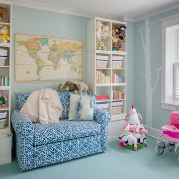
Both pretty and practical, this play space has a few hidden secrets. The FLOR carpet tiles are a soft surface for baby to crawl on and can be removed and washed in case of mishaps. The loveseat, upholstered in a wipe-able, stain-resistant outdoor fabric, hides a twin bed for guests or sleepovers.
Photograph © John Cole Photography
 The Artisans Group, Inc.
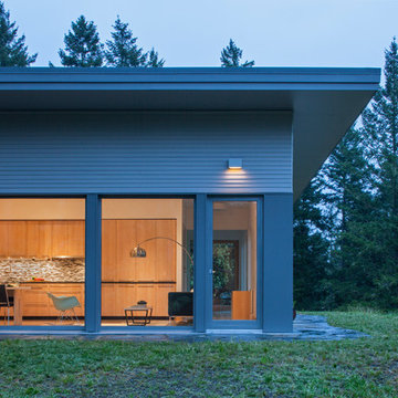
This prefabricated 1,800 square foot Certified Passive House is designed and built by The Artisans Group, located in the rugged central highlands of Shaw Island, in the San Juan Islands. It is the first Certified Passive House in the San Juans, and the fourth in Washington State. The home was built for $330 per square foot, while construction costs for residential projects in the San Juan market often exceed $600 per square foot. Passive House measures did not increase this projects’ cost of construction.
The clients are retired teachers, and desired a low-maintenance, cost-effective, energy-efficient house in which they could age in place; a restful shelter from clutter, stress and over-stimulation. The circular floor plan centers on the prefabricated pod. Radiating from the pod, cabinetry and a minimum of walls defines functions, with a series of sliding and concealable doors providing flexible privacy to the peripheral spaces. The interior palette consists of wind fallen light maple floors, locally made FSC certified cabinets, stainless steel hardware and neutral tiles in black, gray and white. The exterior materials are painted concrete fiberboard lap siding, Ipe wood slats and galvanized metal. The home sits in stunning contrast to its natural environment with no formal landscaping.
Photo Credit: Art Gray
 Breathe Design Studio
Our Austin studio decided to go bold with this project by ensuring that each space had a unique identity in the Mid-Century Modern style bathroom, butler's pantry, and mudroom. We covered the bathroom walls and flooring with stylish beige and yellow tile that was cleverly installed to look like two different patterns. The mint cabinet and pink vanity reflect the mid-century color palette. The stylish knobs and fittings add an extra splash of fun to the bathroom.
The butler's pantry is located right behind the kitchen and serves multiple functions like storage, a study area, and a bar. We went with a moody blue color for the cabinets and included a raw wood open shelf to give depth and warmth to the space. We went with some gorgeous artistic tiles that create a bold, intriguing look in the space.
In the mudroom, we used siding materials to create a shiplap effect to create warmth and texture – a homage to the classic Mid-Century Modern design. We used the same blue from the butler's pantry to create a cohesive effect. The large mint cabinets add a lighter touch to the space.
 Breathe Design Studio
Our Austin studio decided to go bold with this project by ensuring that each space had a unique identity in the Mid-Century Modern style bathroom, butler's pantry, and mudroom. We covered the bathroom walls and flooring with stylish beige and yellow tile that was cleverly installed to look like two different patterns. The mint cabinet and pink vanity reflect the mid-century color palette. The stylish knobs and fittings add an extra splash of fun to the bathroom.
The butler's pantry is located right behind the kitchen and serves multiple functions like storage, a study area, and a bar. We went with a moody blue color for the cabinets and included a raw wood open shelf to give depth and warmth to the space. We went with some gorgeous artistic tiles that create a bold, intriguing look in the space.
In the mudroom, we used siding materials to create a shiplap effect to create warmth and texture – a homage to the classic Mid-Century Modern design. We used the same blue from the butler's pantry to create a cohesive effect. The large mint cabinets add a lighter touch to the space.
 KURV Architecture DPC (Alex Hughes Architects)
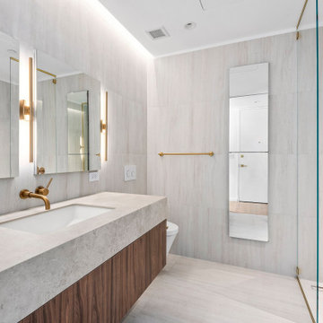
Located in the heart of Manhattan’s Lower East Side, the building was erected on a shallow commercial lot between two 120 year old masonry buildings and a new residential rental building. 330 Grand Street is a mix of 725 SF 1BRs and 1050 SF 2BR apartments. It also contains a 1100 SF two story duplex as well as private and public rooftop space, large private balconies for most units and two large private terraces for the ground floor units.
330 Grand Street was originally designed and approved at the NYC DOB as a prefabricated modular building. During the pandemic, as shipping costs skyrocketed putting the project at risk, we suggested redesigning the building as a reinforced cast-in-place concrete structure. Concrete was readily available and prices had not been affected by the demand increase that many other materials suffered in the pandemic. We took this opportunity to raise floor to ceiling heights, enlarge high performance windows and redistribute the buildings MEPFS and Structural Systems to create very open floor plans.
The challenge was to create a luxurious sensorial living experience with very limited means. In a city with very high construction costs, low cost residential buildings in the area are usually devoid of good quality, design and character. Our approach was to aim high for the end user, prioritizing natural light, open space with long visual perspectives, high ceilings and as always, rejecting the use of predefined building templates.
Our biggest challenge was to ensure that the small spaces feel as clean cut, large and bright as possible. Several unique design decisions were made to ensure low cost and high quality;
Floor plans were laid out so that spaces were wide open and free of clutter from mechanical or structural interruptions. Therefore all infrastructure was placed in lateral demising walls, which in turn act as the unit’s storage and kitchen. The apartments feel wide open, are super quiet and have more storage space than any other comparable apartment in the city.
To solve the problem of the site’s shallow commercial lot which is typically prone to dark interior spaces we focused our attention on the building’s envelope. Instead of the usual small punched window openings, oversized high performance windows were designed to ensure that light penetrated as far as possible into the units. In the smaller 1BR units, the full 50’ depth of the lot is perceived by partitioning spaces with sliding pocket doors that can be retracted to allow deep visual perspectives, making the sight lines in the space feel longer, larger, more ample than normal. In addition to the full height glazing, each unit above the 2nd floor receives a 7 foot covered balcony, adding 120 to 240 sf to each apartment, something unusual in New York City buildings. The space is large enough for a full size dining table, when the weather permits being outside.
We also worked hard to ensure modularity. For example, all kitchen units are all identical throughout the building. The idea of modularity and the economy of the repetitive unit is exercised to the maximum through the building.
Hardware, appliances, flooring, wall coverings and material finishes are all carefully selected to feel bespoke, high quality and unique.
It was important to KURV that the result of this work manifest into something that would deeply connect with the end user and sustain relationships with the consumers of this space.
All images by KURV Architecture ©
 Bradford Smith - High Rock Real Estate
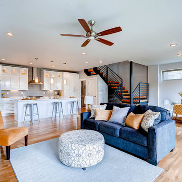
$8,000 Builder credit paid to you towards window coverings, closing costs or interest buy-down! Magazine quality kitchen w/ expensive high gloss white finish, frosted glass showcase and soft close / pull-out cabinetry * Upgraded touch faucet * Upgraded composite granite sink for durability * Upgraded GE Cafe SS appliances * Upgraded 4" solid hardwood flooring * Upgraded slimline fireplace * Upgraded tankless water heater for high efficiency* Upgraded solid core doors throughout (twice the price of standard hollow core) * Upgraded custom handmade wrought-iron rail / with butcher block wood stairsystem * Rec/Media Room w/ upgraded roll-up garage door double pane & insulated for energy efficiency * Expansive patio with panoramic unobstructed city skyline AND mountain views perfect for entertaining* Full wet bar w/ wine refrigerator, sink and storage * 4 bedroom potential (call broker for specs) * 2 car detached garage * Ample storage space in 14' garage and temp controlled 3' crawl space.
 Saikley Architects
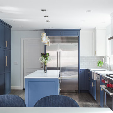
Our busy Silicon Valley clients asked us to convert their tight-quartered 1960’s ranch house to a gracious family home that would meet their long term needs. Ease of living was paramount, both in functionality and in ordered design.
The project was completed on a moderate budget.While retaining most of the structure of the existing house to avoid costly structural changes, we opened walls to improve the sight lines and flow of the house and bring in more light. We made small additions at the front and back bedrooms to gain space for the family and relatives. An existing underused patio area was improved with a simple outdoor kitchen and overhang to extend the living space to the outside. Costs were kept down with choices of modest materials.
Everything was made to be functional. Ample storage has been built into the right places. The details of the kitchen were carefully worked out to accommodate all the wishes of the various cooks in the family. The house is set up to be easy to keep clean. Acoustic walls separate living from bedroom spaces so adults can enjoy time together while children sleep. The outdoor kitchen has easy access to the indoor kitchen and the garage, and its setup promotes socializing while cooking outdoors.
A large part of the narrow back yard was previously unusable space due to a steep slope up to a neighbor’s higher fence. With a new retaining wall and some re-grading we took back more of the yard for the patio and play space on a new lawn.
The remodeled house is a mix of contemporary and traditional elements. Cool colors have a calming effect. Traditional items such as prairie style windows, trellis, mosaic tiles, and Shaker style cabinets, break down the scale in an otherwise streamlined, contemporary design. A new gabled roof with a broad arch at the front of the house marks the entry and resolves a challenging form where the central entry is set back from walls on both sides.
Photography: Kurt Manley
https://saikleyarchitects.com/portfolio/modern-ranch/
 Signature Design & Cabinetry LLC
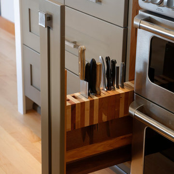
Pull out knife block makes use of a small space while keep essential cooking tools close at hand. ~
Brian DalBalcon Photography
Kitchen - mid-sized transitional kitchen idea in Seattle
Kitchen - mid-sized transitional kitchen idea in Seattle
 White Sands Coastal Development
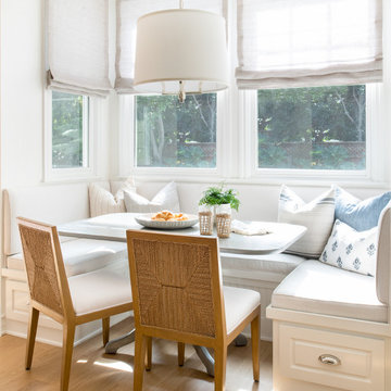
Our clients built their Manhattan dream house years ago, but a couple of decades in, the yellow and green palette seemed stale. We brightened the home with new paint and countertops, white oak flooring and updated carpet, custom fixtures and furniture, and new finishes, window treatments, and accessories.
For enhanced functionality, we added built-in storage throughout, reupholstered existing furniture and the breakfast nook in performance fabric, and created a custom dining table that seats a dozen. To keep the dining room coastal and informal, we paired plush head chairs with rattan-backed side chairs and accented with sea-foam and sandy-hued floor and window coverings.
The addition of a murphy bed, as well as shelving and file storage, made the office more suited to their growing family’s needs. In the second office, a standing desk, as well as a customized craft desk with built-ins for specific supplies, transformed the area into a completely personalized and effective space.
New furniture and a ceiling-length fireplace facade of soft ivory and gray stone transformed the family room into a cozy and welcoming retreat.
The overall effect is a home that feels spacious, beachy, and comfortable.
 Closet Factory
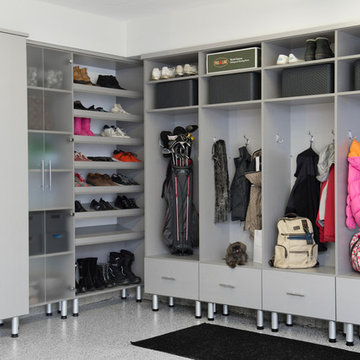
Embarking on a garage remodeling project is a transformative endeavor that can significantly enhance both the functionality and aesthetics of the space.
By investing in tailored storage solutions such as cabinets, wall-mounted organizers, and overhead racks, one can efficiently declutter the area and create a more organized storage system. Flooring upgrades, such as epoxy coatings or durable tiles, not only improve the garage's appearance but also provide a resilient surface.
Adding custom workbenches or tool storage solutions contributes to a more efficient and user-friendly workspace. Additionally, incorporating proper lighting and ventilation ensures a well-lit and comfortable environment.
A remodeled garage not only increases property value but also opens up possibilities for alternative uses, such as a home gym, workshop, or hobby space, making it a worthwhile investment for both practicality and lifestyle improvement.
 Breathe Design Studio
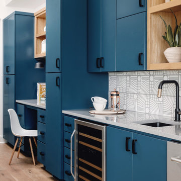
Our Austin studio decided to go bold with this project by ensuring that each space had a unique identity in the Mid-Century Modern style bathroom, butler's pantry, and mudroom. We covered the bathroom walls and flooring with stylish beige and yellow tile that was cleverly installed to look like two different patterns. The mint cabinet and pink vanity reflect the mid-century color palette. The stylish knobs and fittings add an extra splash of fun to the bathroom.
The butler's pantry is located right behind the kitchen and serves multiple functions like storage, a study area, and a bar. We went with a moody blue color for the cabinets and included a raw wood open shelf to give depth and warmth to the space. We went with some gorgeous artistic tiles that create a bold, intriguing look in the space.
In the mudroom, we used siding materials to create a shiplap effect to create warmth and texture – a homage to the classic Mid-Century Modern design. We used the same blue from the butler's pantry to create a cohesive effect. The large mint cabinets add a lighter touch to the space.
5