
Search results for "Cost effective storage" in Home Design Ideas
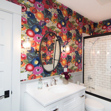
 Kraft Custom Construction
This 1914 family farmhouse was passed down from the original owners to their grandson and his young family. The original goal was to restore the old home to its former glory. However, when we started planning the remodel, we discovered the foundation needed to be replaced, the roof framing didn’t meet code, all the electrical, plumbing and mechanical would have to be removed, siding replaced, and much more. We quickly realized that instead of restoring the home, it would be more cost effective to deconstruct the home, recycle the materials, and build a replica of the old house using as much of the salvaged materials as we could.
The design of the new construction is greatly influenced by the old home with traditional craftsman design interiors. We worked with a deconstruction specialist to salvage the old-growth timber and reused or re-purposed many of the original materials. We moved the house back on the property, connecting it to the existing garage, and lowered the elevation of the home which made it more accessible to the existing grades. The new home includes 5-panel doors, columned archways, tall baseboards, reused wood for architectural highlights in the kitchen, a food-preservation room, exercise room, playful wallpaper in the guest bath and fun era-specific fixtures throughout.
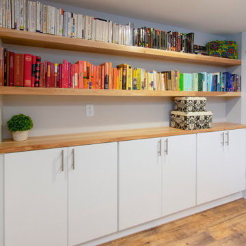
 Kowalske Kitchen & Bath
This 1933 Wauwatosa basement was dark, dingy and lacked functionality. The basement was unfinished with concrete walls and floors. A small office was enclosed but the rest of the space was open and cluttered.
The homeowners wanted a warm, organized space for their family. A recent job change meant they needed a dedicated home office. They also wanted a place where their kids could hang out with friends.
Their wish list for this basement remodel included: a home office where the couple could both work, a full bathroom, a cozy living room and a dedicated storage room.
This basement renovation resulted in a warm and bright space that is used by the whole family.
Highlights of this basement:
- Home Office: A new office gives the couple a dedicated space for work. There’s plenty of desk space, storage cabinets, under-shelf lighting and storage for their home library.
- Living Room: An old office area was expanded into a cozy living room. It’s the perfect place for their kids to hang out when they host friends and family.
- Laundry Room: The new laundry room is a total upgrade. It now includes fun laminate flooring, storage cabinets and counter space for folding laundry.
- Full Bathroom: A new bathroom gives the family an additional shower in the home. Highlights of the bathroom include a navy vanity, quartz counters, brass finishes, a Dreamline shower door and Kohler Choreograph wall panels.
- Staircase: We spruced up the staircase leading down to the lower level with patterned vinyl flooring and a matching trim color.
- Storage: We gave them a separate storage space, with custom shelving for organizing their camping gear, sports equipment and holiday decorations.
CUSTOMER REVIEW
“We had been talking about remodeling our basement for a long time, but decided to make it happen when my husband was offered a job working remotely. It felt like the right time for us to have a real home office where we could separate our work lives from our home lives.
We wanted the area to feel open, light-filled, and modern – not an easy task for a previously dark and cold basement! One of our favorite parts was when our designer took us on a 3D computer design tour of our basement. I remember thinking, ‘Oh my gosh, this could be our basement!?!’ It was so fun to see how our designer was able to take our wish list and ideas from my Pinterest board, and turn it into a practical design.
We were sold after seeing the design, and were pleasantly surprised to see that Kowalske was less costly than another estimate.” – Stephanie, homeowner

 Kessick Wine Storage Systems
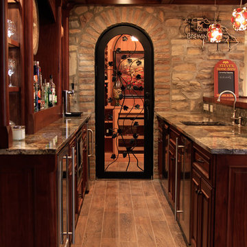
Elevate wine storage system by Kessick combines neck out and label forward wine storage in a stunning format. Stainless steel rods support clear acrylic bottle cradles to create a floating effect. The rods span floor to ceiling allowing the LED lighting to shine through the wine as it reflects off the textured stone wall.
Find the right local pro for your project
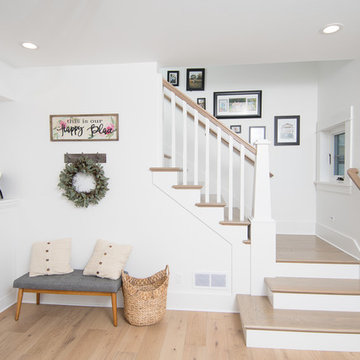 Kraft Custom Construction
This 1914 family farmhouse was passed down from the original owners to their grandson and his young family. The original goal was to restore the old home to its former glory. However, when we started planning the remodel, we discovered the foundation needed to be replaced, the roof framing didn’t meet code, all the electrical, plumbing and mechanical would have to be removed, siding replaced, and much more. We quickly realized that instead of restoring the home, it would be more cost effective to deconstruct the home, recycle the materials, and build a replica of the old house using as much of the salvaged materials as we could.
The design of the new construction is greatly influenced by the old home with traditional craftsman design interiors. We worked with a deconstruction specialist to salvage the old-growth timber and reused or re-purposed many of the original materials. We moved the house back on the property, connecting it to the existing garage, and lowered the elevation of the home which made it more accessible to the existing grades. The new home includes 5-panel doors, columned archways, tall baseboards, reused wood for architectural highlights in the kitchen, a food-preservation room, exercise room, playful wallpaper in the guest bath and fun era-specific fixtures throughout.
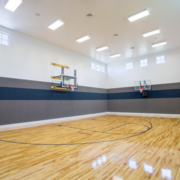
 Carrick Custom Home Design
Highland Custom Homes
Elegant medium tone wood floor indoor basketball/tennis/multi-game court photo in Salt Lake City
Elegant medium tone wood floor indoor basketball/tennis/multi-game court photo in Salt Lake City
 Breathe Design Studio
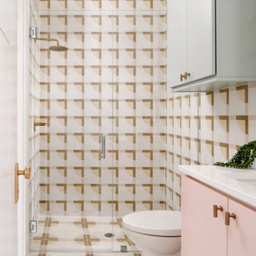
Our Austin studio decided to go bold with this project by ensuring that each space had a unique identity in the Mid-Century Modern style bathroom, butler's pantry, and mudroom. We covered the bathroom walls and flooring with stylish beige and yellow tile that was cleverly installed to look like two different patterns. The mint cabinet and pink vanity reflect the mid-century color palette. The stylish knobs and fittings add an extra splash of fun to the bathroom.
The butler's pantry is located right behind the kitchen and serves multiple functions like storage, a study area, and a bar. We went with a moody blue color for the cabinets and included a raw wood open shelf to give depth and warmth to the space. We went with some gorgeous artistic tiles that create a bold, intriguing look in the space.
In the mudroom, we used siding materials to create a shiplap effect to create warmth and texture – a homage to the classic Mid-Century Modern design. We used the same blue from the butler's pantry to create a cohesive effect. The large mint cabinets add a lighter touch to the space.
 KURV Architecture DPC (Alex Hughes Architects)
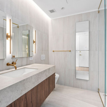
Located in the heart of Manhattan’s Lower East Side, the building was erected on a shallow commercial lot between two 120 year old masonry buildings and a new residential rental building. 330 Grand Street is a mix of 725 SF 1BRs and 1050 SF 2BR apartments. It also contains a 1100 SF two story duplex as well as private and public rooftop space, large private balconies for most units and two large private terraces for the ground floor units.
330 Grand Street was originally designed and approved at the NYC DOB as a prefabricated modular building. During the pandemic, as shipping costs skyrocketed putting the project at risk, we suggested redesigning the building as a reinforced cast-in-place concrete structure. Concrete was readily available and prices had not been affected by the demand increase that many other materials suffered in the pandemic. We took this opportunity to raise floor to ceiling heights, enlarge high performance windows and redistribute the buildings MEPFS and Structural Systems to create very open floor plans.
The challenge was to create a luxurious sensorial living experience with very limited means. In a city with very high construction costs, low cost residential buildings in the area are usually devoid of good quality, design and character. Our approach was to aim high for the end user, prioritizing natural light, open space with long visual perspectives, high ceilings and as always, rejecting the use of predefined building templates.
Our biggest challenge was to ensure that the small spaces feel as clean cut, large and bright as possible. Several unique design decisions were made to ensure low cost and high quality;
Floor plans were laid out so that spaces were wide open and free of clutter from mechanical or structural interruptions. Therefore all infrastructure was placed in lateral demising walls, which in turn act as the unit’s storage and kitchen. The apartments feel wide open, are super quiet and have more storage space than any other comparable apartment in the city.
To solve the problem of the site’s shallow commercial lot which is typically prone to dark interior spaces we focused our attention on the building’s envelope. Instead of the usual small punched window openings, oversized high performance windows were designed to ensure that light penetrated as far as possible into the units. In the smaller 1BR units, the full 50’ depth of the lot is perceived by partitioning spaces with sliding pocket doors that can be retracted to allow deep visual perspectives, making the sight lines in the space feel longer, larger, more ample than normal. In addition to the full height glazing, each unit above the 2nd floor receives a 7 foot covered balcony, adding 120 to 240 sf to each apartment, something unusual in New York City buildings. The space is large enough for a full size dining table, when the weather permits being outside.
We also worked hard to ensure modularity. For example, all kitchen units are all identical throughout the building. The idea of modularity and the economy of the repetitive unit is exercised to the maximum through the building.
Hardware, appliances, flooring, wall coverings and material finishes are all carefully selected to feel bespoke, high quality and unique.
It was important to KURV that the result of this work manifest into something that would deeply connect with the end user and sustain relationships with the consumers of this space.
All images by KURV Architecture ©

Sponsored
Sunbury, OH

J.Holderby - Renovations
Franklin County's Leading General Contractors - 2X Best of Houzz!
 Breathe Design Studio
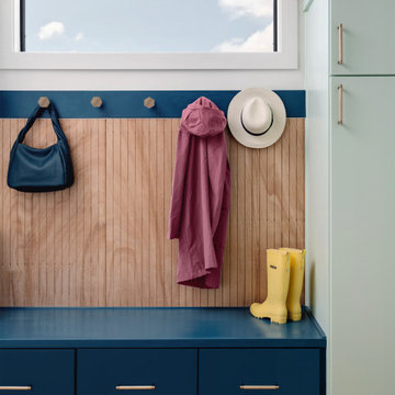
Our Austin studio decided to go bold with this project by ensuring that each space had a unique identity in the Mid-Century Modern style bathroom, butler's pantry, and mudroom. We covered the bathroom walls and flooring with stylish beige and yellow tile that was cleverly installed to look like two different patterns. The mint cabinet and pink vanity reflect the mid-century color palette. The stylish knobs and fittings add an extra splash of fun to the bathroom.
The butler's pantry is located right behind the kitchen and serves multiple functions like storage, a study area, and a bar. We went with a moody blue color for the cabinets and included a raw wood open shelf to give depth and warmth to the space. We went with some gorgeous artistic tiles that create a bold, intriguing look in the space.
In the mudroom, we used siding materials to create a shiplap effect to create warmth and texture – a homage to the classic Mid-Century Modern design. We used the same blue from the butler's pantry to create a cohesive effect. The large mint cabinets add a lighter touch to the space.
 Casework Inter Design
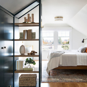
When Casework first met this 550 square foot attic space in a 1912 Seattle Craftsman home, it was dated and not functional. The homeowners wanted to transform their existing master bedroom and bathroom to include more practical closet and storage space as well as add a nursery. The renovation created a purposeful division of space for a growing family, including a cozy master with built-in bench storage, a spacious his and hers dressing room, open and bright master bath with brass and black details, and a nursery perfect for a growing child. Through clever built-ins and a minimal but effective color palette, Casework was able to turn this wasted attic space into a comfortable, inviting and purposeful sanctuary.
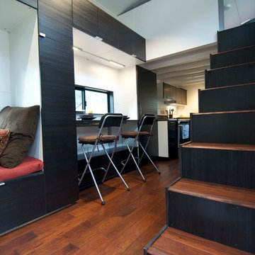
 The Morrison hOMe Tiny House
The comfortable stairs go up to the master loft in hOMe, our modern tiny house on wheels. The tall IKEA cabinets serve as our office storage. In the top cabinets is our printer, paper supplies, and books. The white wall paneling is simply Iron Ply (a 1/4" lightweight vinyl subflooring material) spaced apart with tyco nails during installation and painted white. The effect is a modern, high end wall paneling system but at a fraction of the cost.
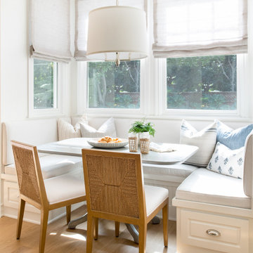
 White Sands Coastal Development
Our clients built their Manhattan dream house years ago, but a couple of decades in, the yellow and green palette seemed stale. We brightened the home with new paint and countertops, white oak flooring and updated carpet, custom fixtures and furniture, and new finishes, window treatments, and accessories.
For enhanced functionality, we added built-in storage throughout, reupholstered existing furniture and the breakfast nook in performance fabric, and created a custom dining table that seats a dozen. To keep the dining room coastal and informal, we paired plush head chairs with rattan-backed side chairs and accented with sea-foam and sandy-hued floor and window coverings.
The addition of a murphy bed, as well as shelving and file storage, made the office more suited to their growing family’s needs. In the second office, a standing desk, as well as a customized craft desk with built-ins for specific supplies, transformed the area into a completely personalized and effective space.
New furniture and a ceiling-length fireplace facade of soft ivory and gray stone transformed the family room into a cozy and welcoming retreat.
The overall effect is a home that feels spacious, beachy, and comfortable.
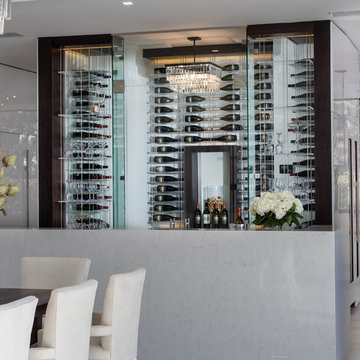 Kessick Wine Storage Systems
Design and Manufacturer: Kessick Wine Storage Systems, Sales and Installation: Cru Wine Cellars, Architect and Builder: Phil Kean Designs, Photography: Uneek Luxury Tours
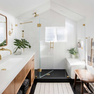 Casework Inter Design
When Casework first met this 550 square foot attic space in a 1912 Seattle Craftsman home, it was dated and not functional. The homeowners wanted to transform their existing master bedroom and bathroom to include more practical closet and storage space as well as add a nursery. The renovation created a purposeful division of space for a growing family, including a cozy master with built-in bench storage, a spacious his and hers dressing room, open and bright master bath with brass and black details, and a nursery perfect for a growing child. Through clever built-ins and a minimal but effective color palette, Casework was able to turn this wasted attic space into a comfortable, inviting and purposeful sanctuary.
Sponsored
Columbus, OH

Hope Restoration & General Contracting
Columbus Design-Build, Kitchen & Bath Remodeling, Historic Renovations
 Breathe Design Studio
Our Austin studio decided to go bold with this project by ensuring that each space had a unique identity in the Mid-Century Modern style bathroom, butler's pantry, and mudroom. We covered the bathroom walls and flooring with stylish beige and yellow tile that was cleverly installed to look like two different patterns. The mint cabinet and pink vanity reflect the mid-century color palette. The stylish knobs and fittings add an extra splash of fun to the bathroom.
The butler's pantry is located right behind the kitchen and serves multiple functions like storage, a study area, and a bar. We went with a moody blue color for the cabinets and included a raw wood open shelf to give depth and warmth to the space. We went with some gorgeous artistic tiles that create a bold, intriguing look in the space.
In the mudroom, we used siding materials to create a shiplap effect to create warmth and texture – a homage to the classic Mid-Century Modern design. We used the same blue from the butler's pantry to create a cohesive effect. The large mint cabinets add a lighter touch to the space.
 Adrienne DeRosa
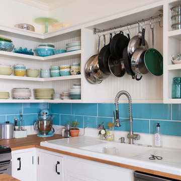
Kiel's woodworking talents are in full effect in the kitchen. Rather than incorporate pre-fabricated cabinets into the newly rebuilt space, he decided to build them himself, affording the home the custom work that it so deserves. "It didn't make sense to put in the same fiberboard cabinetry that was there before", he confesses. Part of the plan called for open shelving up top to show off Chelsea's colorful plate collection. "One of the perks of being married to a wood worker", Chelsea jokes, "is having an entire kitchen worth of cabinets for the cost of wood and paint!"
The couple outfitted the antique sink with a modern spray fixture from IKEA. The enameled cast iron sink was not only a steal at $25, but it is certainly made to last. "Often we buy older pieces which have been around for 50+ years because we know that if they have survived this long they will likely survive another 50", she says.
Backsplash Tile, Hamilton Parker
Photo: Adrienne DeRosa Photography © 2014 Houzz
 The Artisans Group, Inc.
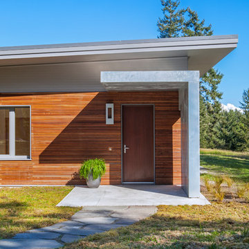
This prefabricated 1,800 square foot Certified Passive House is designed and built by The Artisans Group, located in the rugged central highlands of Shaw Island, in the San Juan Islands. It is the first Certified Passive House in the San Juans, and the fourth in Washington State. The home was built for $330 per square foot, while construction costs for residential projects in the San Juan market often exceed $600 per square foot. Passive House measures did not increase this projects’ cost of construction.
The clients are retired teachers, and desired a low-maintenance, cost-effective, energy-efficient house in which they could age in place; a restful shelter from clutter, stress and over-stimulation. The circular floor plan centers on the prefabricated pod. Radiating from the pod, cabinetry and a minimum of walls defines functions, with a series of sliding and concealable doors providing flexible privacy to the peripheral spaces. The interior palette consists of wind fallen light maple floors, locally made FSC certified cabinets, stainless steel hardware and neutral tiles in black, gray and white. The exterior materials are painted concrete fiberboard lap siding, Ipe wood slats and galvanized metal. The home sits in stunning contrast to its natural environment with no formal landscaping.
Photo Credit: Art Gray
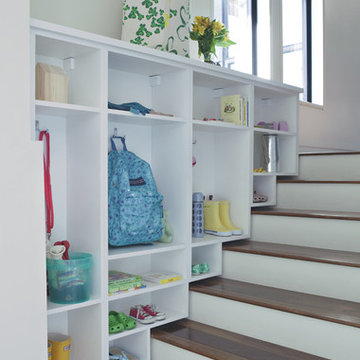
 California Closets of Tennessee
Creative shelving above the stairs adds entryway storage in a fresh way.
Example of a small trendy staircase design in Nashville
Example of a small trendy staircase design in Nashville
Sponsored
Delaware, OH

Buckeye Basements, Inc.
Central Ohio's Basement Finishing ExpertsBest Of Houzz '13-'21

 Bilotta Kitchen & Home
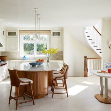
Your smile is not the only curve in the room when you enter this room. This open and airy traditional Atlantic Beach kitchen flaunts a beautiful curved island in natural cherry which is the focal point of the space. There are occasional times when a homeowner comes to the table with a vision from which the designer can draw his inspiration. Such was the case when Bilotta designer Goran Savic and Interior designer, Catherine Ebert’s mutual client announced that design and an expansive feeling should be prioritized over the prevailing “more storage” maxim. Although the kitchen was opened up to afford a view of the beautiful sculptural staircase, cabinetry was limited to a modest “L”-shaped footprint with an island. But not just any island: curved cabinetry in cherry that references the curves of the staircase and its cherry newel post and railing. While the rounded shape doesn’t contribute much to storage, it provides plenty of room for seating and definitely makes a strong design statement. More seating can be found in the comfy cushioned banquette (with storage drawers below). That’s a perfect spot to grab breakfast or even read a book. The unique piece here is the custom table at the banquette. Its beveled oval cherry base and double stainless-steel column supports are evocative of a luxury Art Deco yacht and echo the curved island. Goran utilized a number of space-enlarging visual devices as part of his design arsenal. Open shelving and glass upper sections on the wall cabinets prevent the frequent claustrophobic effect of all solid doors. Installing the wall cabinets higher than usual created a larger backsplash that helps offset the normal feeling of countertop clutter. Of course, nothing opens up a room like the inclusion of abundant natural light, but choice of materials also plays a huge role. Here we have a bleached stain on the wood floor, white cabinets, pale-colored countertops and backsplash tiles, and clear glass pendants, all of which enhance the airiness of this stunning new room.
 Guggenheim Architecture + Design Studio
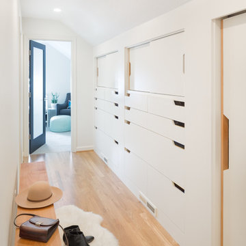
This hallway was part of a larger remodel of an attic space which included the hall, master bedroom, bathroom and nursery. Painted a brilliant white and borrowing light from the frosted, glass inset nursery and bedroom doors, this light hardwood space is lined on one side with custom, built-in storage. Making the most of the sloping eave space and pony wall, there is room for stacking, hanging and multiple drawer depths, very versatile storage. The cut-out pulls and toe-kick registers keep the floor and walkway clear of any extrusions. The hall acts as an extension of the bedrooms, with the narrow bench providing a resting place while getting ready in the morning.
All photos: Josh Partee Photography
6