
Search results for "Cost effective storage" in Home Design Ideas
 Breathe Design Studio
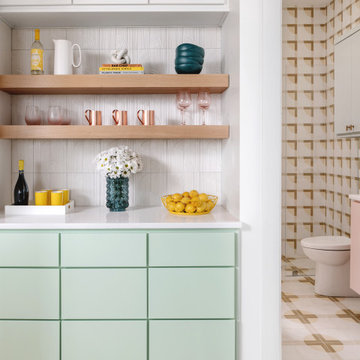
Our Austin studio decided to go bold with this project by ensuring that each space had a unique identity in the Mid-Century Modern style bathroom, butler's pantry, and mudroom. We covered the bathroom walls and flooring with stylish beige and yellow tile that was cleverly installed to look like two different patterns. The mint cabinet and pink vanity reflect the mid-century color palette. The stylish knobs and fittings add an extra splash of fun to the bathroom.
The butler's pantry is located right behind the kitchen and serves multiple functions like storage, a study area, and a bar. We went with a moody blue color for the cabinets and included a raw wood open shelf to give depth and warmth to the space. We went with some gorgeous artistic tiles that create a bold, intriguing look in the space.
In the mudroom, we used siding materials to create a shiplap effect to create warmth and texture – a homage to the classic Mid-Century Modern design. We used the same blue from the butler's pantry to create a cohesive effect. The large mint cabinets add a lighter touch to the space.
 Cedar Hill Cabinets
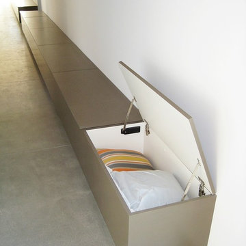
This family has a lot children. This long hallway filled with bench seats that lift up to allow storage of any item they may need. Photography by Greg Hoppe
 Bradford Smith - High Rock Real Estate
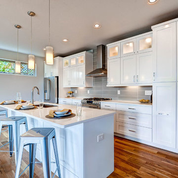
$8,000 Builder credit paid to you towards window coverings, closing costs or interest buy-down! Magazine quality kitchen w/ expensive high gloss white finish, frosted glass showcase and soft close / pull-out cabinetry * Upgraded touch faucet * Upgraded composite granite sink for durability * Upgraded GE Cafe SS appliances * Upgraded 4" solid hardwood flooring * Upgraded slimline fireplace * Upgraded tankless water heater for high efficiency* Upgraded solid core doors throughout (twice the price of standard hollow core) * Upgraded custom handmade wrought-iron rail / with butcher block wood stairsystem * Rec/Media Room w/ upgraded roll-up garage door double pane & insulated for energy efficiency * Expansive patio with panoramic unobstructed city skyline AND mountain views perfect for entertaining* Full wet bar w/ wine refrigerator, sink and storage * 4 bedroom potential (call broker for specs) * 2 car detached garage * Ample storage space in 14' garage and temp controlled 3' crawl space.
Find the right local pro for your project
 Closet Factory
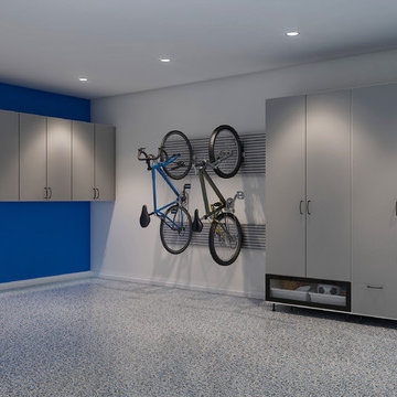
Embarking on a garage remodeling project is a transformative endeavor that can significantly enhance both the functionality and aesthetics of the space.
By investing in tailored storage solutions such as cabinets, wall-mounted organizers, and overhead racks, one can efficiently declutter the area and create a more organized storage system. Flooring upgrades, such as epoxy coatings or durable tiles, not only improve the garage's appearance but also provide a resilient surface.
Adding custom workbenches or tool storage solutions contributes to a more efficient and user-friendly workspace. Additionally, incorporating proper lighting and ventilation ensures a well-lit and comfortable environment.
A remodeled garage not only increases property value but also opens up possibilities for alternative uses, such as a home gym, workshop, or hobby space, making it a worthwhile investment for both practicality and lifestyle improvement.
 M.J. Whelan Construction
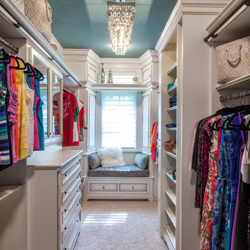
This incredible closet is custom in every way. It was designed to meet the specific needs and desires of our client. The cabinetry was slightly distressed, glazed and load with extensive detail. The rolling ladder moves around entire closet for upper storage. Several pull out and slide out shelves, scarf racks, hanger racks and custom storage accessories were included in the design. A custom dresser with upper glass cabinets along with built-in hamper are also included. It wouldn't be complete without a vertical, tilted shoe rack. Ceiling painted in a rich robin’s egg blue with sparkle additive sets this closet apart from any other. The custom upholstered storage bench with pillows at the end of the room and crystal chandelier finishes this room beautifully. Photo Credit - Hall Of Portraits
 Breathe Design Studio
Our Austin studio decided to go bold with this project by ensuring that each space had a unique identity in the Mid-Century Modern style bathroom, butler's pantry, and mudroom. We covered the bathroom walls and flooring with stylish beige and yellow tile that was cleverly installed to look like two different patterns. The mint cabinet and pink vanity reflect the mid-century color palette. The stylish knobs and fittings add an extra splash of fun to the bathroom.
The butler's pantry is located right behind the kitchen and serves multiple functions like storage, a study area, and a bar. We went with a moody blue color for the cabinets and included a raw wood open shelf to give depth and warmth to the space. We went with some gorgeous artistic tiles that create a bold, intriguing look in the space.
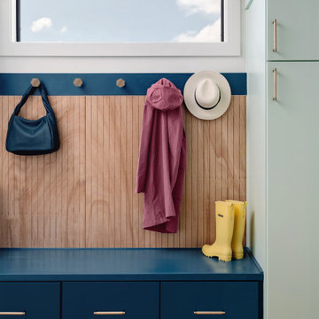
In the mudroom, we used siding materials to create a shiplap effect to create warmth and texture – a homage to the classic Mid-Century Modern design. We used the same blue from the butler's pantry to create a cohesive effect. The large mint cabinets add a lighter touch to the space.
 Drury Design
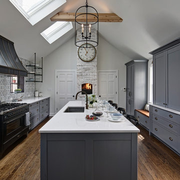
This remodel was designed to celebrate the original use of the structure, focusing on a 1930’s automobile theme. The design features ample storage without overbearing wall cabinets and also, vintage looking appliances. The homeowner wanted to remove the soffit and rework the supply and return air to better balance the temperature in the space. To do so, the entire space was reinsulated with closed cell insulation to provide the best insulation for our cold winters and hot summers.
The homeowner opted for a custom artisan hood paired with metal open shelves to tie into the industrial era of the original space from the 1930s. The Matte Black with Bronze accents paired with vintage hardware on the range also picks up on the details of the Classic cars once parked in this coach house. The silkscreen marble tiles appear to be wallpaper yet is both heat resistant and effective for these aspiring chefs
The enlarged island now can seat four and houses a larger sink with trash bins that open with a tap of the knee. As per the client’s request, the refrigerator now blends into the cabinetry appearing more like the tall cabinets on the south wall than an appliance.
The new kitchen is not only stunning but practical as it has double the storage or the old kitchen without lining the room with cabinetry.


 Kessick Wine Storage Systems
Elevate wine storage system by Kessick combines neck out and label forward wine storage in a stunning format. Stainless steel rods support clear acrylic bottle cradles to create a floating effect. The rods span floor to ceiling allowing the LED lighting to shine through the wine as it reflects off the textured stone wall.
 Chris Rossetti at Main Line Kitchen Design
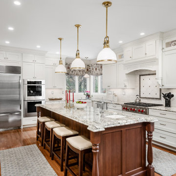
Main Line Kitchen Design's unique business model allows our customers to work with the most experienced designers and get the most competitive kitchen cabinet pricing.
How does Main Line Kitchen Design offer the best designs along with the most competitive kitchen cabinet pricing? We are a more modern and cost effective business model. We are a kitchen cabinet dealer and design team that carries the highest quality kitchen cabinetry, is experienced, convenient, and reasonable priced. Our five award winning designers work by appointment only, with pre-qualified customers, and only on complete kitchen renovations.
Our designers are some of the most experienced and award winning kitchen designers in the Delaware Valley. We design with and sell 8 nationally distributed cabinet lines. Cabinet pricing is slightly less than major home centers for semi-custom cabinet lines, and significantly less than traditional showrooms for custom cabinet lines.
After discussing your kitchen on the phone, first appointments always take place in your home, where we discuss and measure your kitchen. Subsequent appointments usually take place in one of our offices and selection centers where our customers consider and modify 3D designs on flat screen TV's. We can also bring sample doors and finishes to your home and make design changes on our laptops in 20-20 CAD with you, in your own kitchen.
Call today! We can estimate your kitchen project from soup to nuts in a 15 minute phone call and you can find out why we get the best reviews on the internet. We look forward to working with you.
As our company tag line says:
"The world of kitchen design is changing..."
 Drury Design
The Setup:
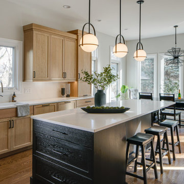
After purchasing this home, the homeowners faced a unique opportunity to reimagine their kitchen and nearby spaces. Water damage from a burst pipe had left much of the home’s interior in need of repair, and while the existing kitchen was functional and in relatively good shape, it didn’t align with the family’s vision for their new home. The layout included a peninsula that wasn’t ideal, and there were some druthers with the nearby pantry.
Since the space needed to be rebuilt anyway, the homeowners saw this as a chance to create a kitchen that was both highly functional for their four young children and timeless in its design. The project also included a refresh of the adjacent message center and dining room — spaces that play key roles in the family’s daily life. The goal was to create a cohesive flow between these areas, balancing modern functionality with the craftsman-inspired character of the rest of the home.
Design Objectives:
- Replace the outdated peninsula with a large island to maximize counter space and create new seating options.
- Open up the space visually by removing soffits and rethinking the cabinetry layout.
Incorporate concealed refrigeration and freezer units to provide significant storage for the family while maintaining a streamlined aesthetic.
- Integrate black cabinetry into the design without making the space feel harsh or heavy.
- Ensure the lighting plan balances functional task lighting with ambient accent lighting.
- Avoid visual clutter in the cabinetry design while still giving a nod to the craftsman aesthetic.
- Incorporate a slab backsplash as a key design feature.
Design Challenges:
- The outdated peninsula left dead space in the kitchen and lacked sufficient seating for the family.
- The cooktop wall was cramped, with small cabinets flanking the hood, limited storage, and soffits that made the space feel closed-in.
- The family needed significant refrigeration space (two refrigerators and a freezer) but wanted to avoid a cluttered look with visible stainless steel appliances.
- Adding black cabinetry risked making the space feel too dark or heavy.
- The original lighting plan was insufficient, particularly over the dining table where a decorative fixture proved too dim.
- The family wanted shaker-style drawer fronts to match the home’s arts-and-crafts design but worried that too much shaker cabinetry might look overly busy.
- Prioritizing a slab backsplash in the wish list priority planning.
The Renewed Space
Design Solutions:
- A functional island: The peninsula was replaced with a large island that provides continuous countertop space for prepping and serving. The island also features seating for four people, creating a central hub for informal meals and activities.
- Streamlined cooktop wall: The soffits were removed, and the upper cabinets on the cooktop wall were eliminated to create a more open, streamlined design. A custom oversized hood became the focal point of the wall, with the blower unit offset inside it to align with the cooktop while maintaining exterior visual symmetry.
- Concealed refrigeration: Two column refrigerators and one freezer were integrated into the cabinetry, concealing them behind wood paneling that blends seamlessly with the overall design.
- Warm black cabinetry: The black cabinetry was crafted from hickory with a visible grain, softening its appearance and adding warmth. The grain detail gives the cabinetry a rich, textured look that avoids feeling stark or overpowering.
- Additional lighting: In the dining area, recessed can lights were added during an additional installation phase to supplement the gorgeous decorative fixture’s dim output. The new lighting plan creates a layered effect, combining functional task lighting with softer ambient lighting.
- Simplified cabinetry details: Slab drawer fronts were used on the upper drawers, while five-piece shaker fronts (with slightly less prominent rail and stile pieces) were reserved for the middle and lower drawers. This approach simplified the overall look while maintaining the craftsman-inspired aesthetic.
- Slab backsplash priority: The slab backsplash was prioritized by making thoughtful adjustments elsewhere, like opting not to extend cabinetry to the ceiling, which also helped visually prioritize the gorgeous slab backsplash. This decision also enhanced the kitchen’s furniture-like feel, aligning with the home’s craftsman character.
- This kitchen perfectly balances practicality with timeless style. By addressing the family’s functional needs — ample seating, smart storage, and effective lighting — while incorporating thoughtful design elements like warm black cabinetry and a striking slab backsplash, Alicia created a space that works beautifully for a busy household. The result is a cohesive, inviting kitchen that honors the home’s craftsman roots and will serve the family well for years to come.
 Summit Remodeling Group
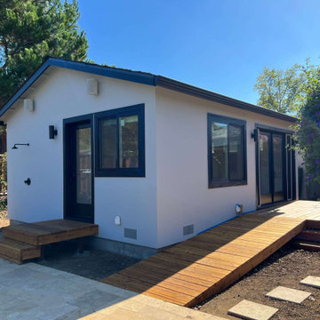
A garage conversion ADU (Accessory Dwelling Unit) is the process of transforming an existing garage space into a fully functional living unit. This conversion typically involves adding basic amenities such as a kitchen, bathroom, and living area, to create a comfortable, independent living space. It is a cost-effective way to add additional living space to a property, often used for rental income, guest housing, or as a private living area for family members.
 Breathe Design Studio
Our Austin studio decided to go bold with this project by ensuring that each space had a unique identity in the Mid-Century Modern style bathroom, butler's pantry, and mudroom. We covered the bathroom walls and flooring with stylish beige and yellow tile that was cleverly installed to look like two different patterns. The mint cabinet and pink vanity reflect the mid-century color palette. The stylish knobs and fittings add an extra splash of fun to the bathroom.
The butler's pantry is located right behind the kitchen and serves multiple functions like storage, a study area, and a bar. We went with a moody blue color for the cabinets and included a raw wood open shelf to give depth and warmth to the space. We went with some gorgeous artistic tiles that create a bold, intriguing look in the space.
In the mudroom, we used siding materials to create a shiplap effect to create warmth and texture – a homage to the classic Mid-Century Modern design. We used the same blue from the butler's pantry to create a cohesive effect. The large mint cabinets add a lighter touch to the space.
 Breathe Design Studio
Our Austin studio decided to go bold with this project by ensuring that each space had a unique identity in the Mid-Century Modern style bathroom, butler's pantry, and mudroom. We covered the bathroom walls and flooring with stylish beige and yellow tile that was cleverly installed to look like two different patterns. The mint cabinet and pink vanity reflect the mid-century color palette. The stylish knobs and fittings add an extra splash of fun to the bathroom.
The butler's pantry is located right behind the kitchen and serves multiple functions like storage, a study area, and a bar. We went with a moody blue color for the cabinets and included a raw wood open shelf to give depth and warmth to the space. We went with some gorgeous artistic tiles that create a bold, intriguing look in the space.
In the mudroom, we used siding materials to create a shiplap effect to create warmth and texture – a homage to the classic Mid-Century Modern design. We used the same blue from the butler's pantry to create a cohesive effect. The large mint cabinets add a lighter touch to the space.

Sponsored
Columbus, OH

Hope Restoration & General Contracting
Columbus Design-Build, Kitchen & Bath Remodeling, Historic Renovations
 Change Your Bathroom©
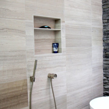
The goal of this project was to upgrade the builder grade finishes and create an ergonomic space that had a contemporary feel. This bathroom transformed from a standard, builder grade bathroom to a contemporary urban oasis. This was one of my favorite projects, I know I say that about most of my projects but this one really took an amazing transformation. By removing the walls surrounding the shower and relocating the toilet it visually opened up the space. Creating a deeper shower allowed for the tub to be incorporated into the wet area. Adding a LED panel in the back of the shower gave the illusion of a depth and created a unique storage ledge. A custom vanity keeps a clean front with different storage options and linear limestone draws the eye towards the stacked stone accent wall.
Houzz Write Up: https://www.houzz.com/magazine/inside-houzz-a-chopped-up-bathroom-goes-streamlined-and-swank-stsetivw-vs~27263720
The layout of this bathroom was opened up to get rid of the hallway effect, being only 7 foot wide, this bathroom needed all the width it could muster. Using light flooring in the form of natural lime stone 12x24 tiles with a linear pattern, it really draws the eye down the length of the room which is what we needed. Then, breaking up the space a little with the stone pebble flooring in the shower, this client enjoyed his time living in Japan and wanted to incorporate some of the elements that he appreciated while living there. The dark stacked stone feature wall behind the tub is the perfect backdrop for the LED panel, giving the illusion of a window and also creates a cool storage shelf for the tub. A narrow, but tasteful, oval freestanding tub fit effortlessly in the back of the shower. With a sloped floor, ensuring no standing water either in the shower floor or behind the tub, every thought went into engineering this Atlanta bathroom to last the test of time. With now adequate space in the shower, there was space for adjacent shower heads controlled by Kohler digital valves. A hand wand was added for use and convenience of cleaning as well. On the vanity are semi-vessel sinks which give the appearance of vessel sinks, but with the added benefit of a deeper, rounded basin to avoid splashing. Wall mounted faucets add sophistication as well as less cleaning maintenance over time. The custom vanity is streamlined with drawers, doors and a pull out for a can or hamper.
A wonderful project and equally wonderful client. I really enjoyed working with this client and the creative direction of this project.
Brushed nickel shower head with digital shower valve, freestanding bathtub, curbless shower with hidden shower drain, flat pebble shower floor, shelf over tub with LED lighting, gray vanity with drawer fronts, white square ceramic sinks, wall mount faucets and lighting under vanity. Hidden Drain shower system. Atlanta Bathroom.
 Francesca Owings Interior Design
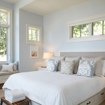
Bedroom - coastal master bedroom idea in Grand Rapids with blue walls and no fireplace
 Change Your Bathroom©
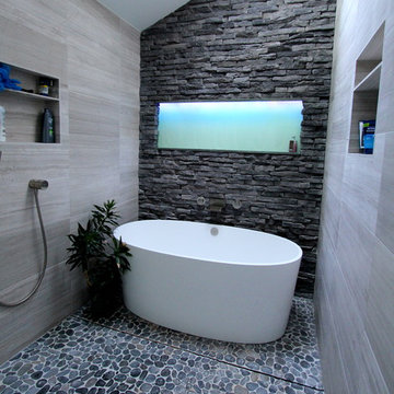
The goal of this project was to upgrade the builder grade finishes and create an ergonomic space that had a contemporary feel. This bathroom transformed from a standard, builder grade bathroom to a contemporary urban oasis. This was one of my favorite projects, I know I say that about most of my projects but this one really took an amazing transformation. By removing the walls surrounding the shower and relocating the toilet it visually opened up the space. Creating a deeper shower allowed for the tub to be incorporated into the wet area. Adding a LED panel in the back of the shower gave the illusion of a depth and created a unique storage ledge. A custom vanity keeps a clean front with different storage options and linear limestone draws the eye towards the stacked stone accent wall.
Houzz Write Up: https://www.houzz.com/magazine/inside-houzz-a-chopped-up-bathroom-goes-streamlined-and-swank-stsetivw-vs~27263720
The layout of this bathroom was opened up to get rid of the hallway effect, being only 7 foot wide, this bathroom needed all the width it could muster. Using light flooring in the form of natural lime stone 12x24 tiles with a linear pattern, it really draws the eye down the length of the room which is what we needed. Then, breaking up the space a little with the stone pebble flooring in the shower, this client enjoyed his time living in Japan and wanted to incorporate some of the elements that he appreciated while living there. The dark stacked stone feature wall behind the tub is the perfect backdrop for the LED panel, giving the illusion of a window and also creates a cool storage shelf for the tub. A narrow, but tasteful, oval freestanding tub fit effortlessly in the back of the shower. With a sloped floor, ensuring no standing water either in the shower floor or behind the tub, every thought went into engineering this Atlanta bathroom to last the test of time. With now adequate space in the shower, there was space for adjacent shower heads controlled by Kohler digital valves. A hand wand was added for use and convenience of cleaning as well. On the vanity are semi-vessel sinks which give the appearance of vessel sinks, but with the added benefit of a deeper, rounded basin to avoid splashing. Wall mounted faucets add sophistication as well as less cleaning maintenance over time. The custom vanity is streamlined with drawers, doors and a pull out for a can or hamper.
A wonderful project and equally wonderful client. I really enjoyed working with this client and the creative direction of this project.
Brushed nickel shower head with digital shower valve, freestanding bathtub, curbless shower with hidden shower drain, flat pebble shower floor, shelf over tub with LED lighting, gray vanity with drawer fronts, white square ceramic sinks, wall mount faucets and lighting under vanity. Hidden Drain shower system. Atlanta Bathroom.
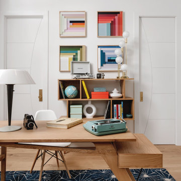 Breathe Design Studio
Our Austin studio decided to go bold with this project by ensuring that each space had a unique identity in the Mid-Century Modern style bathroom, butler's pantry, and mudroom. We covered the bathroom walls and flooring with stylish beige and yellow tile that was cleverly installed to look like two different patterns. The mint cabinet and pink vanity reflect the mid-century color palette. The stylish knobs and fittings add an extra splash of fun to the bathroom.
The butler's pantry is located right behind the kitchen and serves multiple functions like storage, a study area, and a bar. We went with a moody blue color for the cabinets and included a raw wood open shelf to give depth and warmth to the space. We went with some gorgeous artistic tiles that create a bold, intriguing look in the space.
In the mudroom, we used siding materials to create a shiplap effect to create warmth and texture – a homage to the classic Mid-Century Modern design. We used the same blue from the butler's pantry to create a cohesive effect. The large mint cabinets add a lighter touch to the space.
 Michael Nash Design, Build & Homes
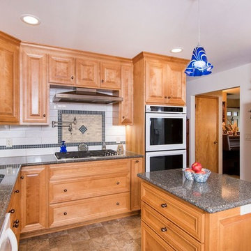
This growing family of six was struggling with a dysfunctional kitchen design. The center island had been installed at an odd angle that limited accessibility and traffic flow. Additionally, storage space was limited by poor cabinet design. Finally, doorways in and out of the kitchen were narrow and poorly located, especially for children dashing in and out.
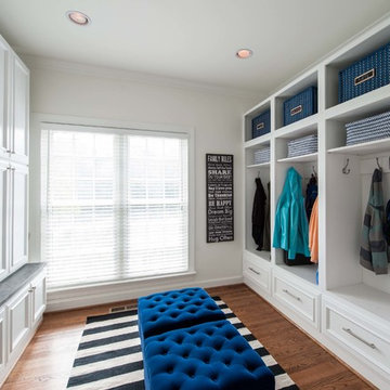
Other design challenges included how to better use a 10’ x 12’ room for children’s jackets and toys and how to add a professional-quality gas range in a neighborhood were natural gas wasn’t available. The new design would address all of these issues.
DESIGN SOLUTIONS
The new kitchen design revolves around a more proportional island. Carefully placed in the center of the new space with seating for four, it includes a prep sink, a second dishwasher and a beverage center.
The distressed ebony-stained island and hutch provides a brilliant contrast between the white color cabinetry. White Carrera marble countertops and backsplash top both island and perimeter cabinets.
Tall, double stacked cabinetry lines two walls to maximize storage space. Across the room there was an unused wall that now contains a 36” tower fridge and freezer, both covered with matching panels, and a tall cabinet that contains a microwave, steam unit and warming drawer.
A propane tank was buried in the back yard to provide gas to a new 60” professional range and cooktop. A custom-made wood mantel hood blends perfectly with the cabinet style.
The old laundry room was reconfigured to have lots of locker space for all kids and added cabinetry for storage. A double entry door separated the new mudroom from the rest of the back hall. In the back hall the back windows were replaced with a set of French door and added decking to create a direct access to deck and backyard.
The end result is an open floor plan, high-end appliances, great traffic flow and pleasing colors. The homeowner calls it the “kitchen of her dreams.”
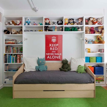
 Casa Kids
photography by Juan Lopez Gil
Example of a trendy boy medium tone wood floor kids' bedroom design in New York with white walls
Example of a trendy boy medium tone wood floor kids' bedroom design in New York with white walls

 Kraft Custom Construction
This 1914 family farmhouse was passed down from the original owners to their grandson and his young family. The original goal was to restore the old home to its former glory. However, when we started planning the remodel, we discovered the foundation needed to be replaced, the roof framing didn’t meet code, all the electrical, plumbing and mechanical would have to be removed, siding replaced, and much more. We quickly realized that instead of restoring the home, it would be more cost effective to deconstruct the home, recycle the materials, and build a replica of the old house using as much of the salvaged materials as we could.
The design of the new construction is greatly influenced by the old home with traditional craftsman design interiors. We worked with a deconstruction specialist to salvage the old-growth timber and reused or re-purposed many of the original materials. We moved the house back on the property, connecting it to the existing garage, and lowered the elevation of the home which made it more accessible to the existing grades. The new home includes 5-panel doors, columned archways, tall baseboards, reused wood for architectural highlights in the kitchen, a food-preservation room, exercise room, playful wallpaper in the guest bath and fun era-specific fixtures throughout.
7