
Search results for "Crammed" in Home Design Ideas

 Design Vision Studio
James Latta of Rancho Images -
MOVIE COLONY
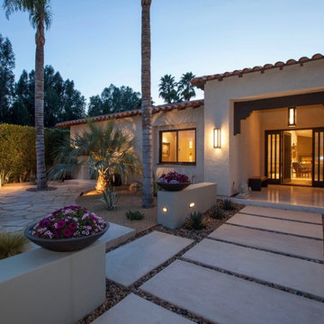
When we met these wonderful Palm Springs clients, they were overwhelmed with the task of downsizing their vast collection of fine art, antiques, and sculptures. The problem was it was an amazing collection so the task was not easy. What do we keep? What do we let go? Design Vision Studio to the rescue! We realized that to really showcase these beautiful pieces, we needed to pick and choose the right ones and ensure they were showcased properly.
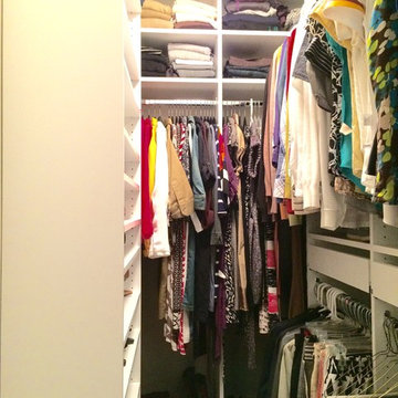
Lighting was improved throughout the home. We installed and updated recessed lights and cabinet lighting. Outdated ceiling fans and chandeliers were replaced. The walls were painted with a warm, soft ivory color and the moldings, door and windows also were given a complimentary fresh coat of paint. The overall impact was a clean bright room.
We replaced the outdated oak front doors with modern glass doors. The fireplace received a facelift with new tile, a custom mantle and crushed glass to replace the old fake logs. Custom draperies frame the views. The dining room was brought to life with recycled magazine grass cloth wallpaper on the ceiling, new red leather upholstery on the chairs, and a custom red paint treatment on the new chandelier to tie it all together. (The chandelier was actually powder-coated at an auto paint shop!)
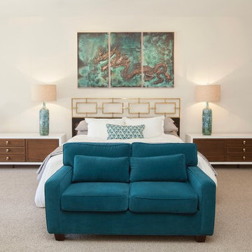
Once crammed with too much, too little and no style, the Asian Modern Bedroom Suite is now a DREAM COME TRUE. We even incorporated their much loved (yet horribly out-of-date) small sofa by recovering it with teal velvet to give it new life.
Underutilized hall coat closets were removed and transformed with custom cabinetry to create art niches. We also designed a custom built-in media cabinet with "breathing room" to display more of their treasures. The new furniture was intentionally selected with modern lines to give the rooms layers and texture.
When we suggested a crystal ship chandelier to our clients, they wanted US to walk the plank. Luckily, after months of consideration, the tides turned and they gained the confidence to follow our suggestion. Now their powder room is one of their favorite spaces in their home.
Our clients (and all of their friends) are amazed at the total transformation of this home and with how well it "fits" them. We love the results too. This home now tells a story through their beautiful life-long collections. The design may have a gallery look but the feeling is all comfort and style.
 My Landscape Guide
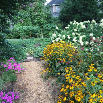
Design ideas for a large traditional partial sun backyard stone formal garden in Nashville for spring.
Find the right local pro for your project
 Buckingham Drive Interior Designs
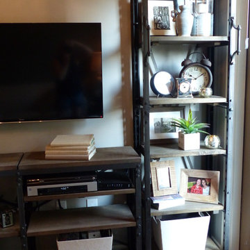
Hunter Douglas Solera Shades, down. Panels in Duralee fabric. Leather sectional by Flexsteel. Shelves and lighting by Restoration Hardware. Vintage combined with new pieces. (Which is which?)
 Aquatica Plumbing Group
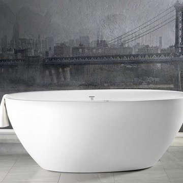
The Sensuality Mini White Freestanding Bathtub boasts all of the perks of the full-size Sensuality, but in a small, space-conscious design. With natural, earthy forms true to its Scandinavian origins, this one-piece AquateX™ matte tub presents both efficient heat retention and lasting durability.
Its variable-width rim and smooth texture complete this ideal bathtub, and much like its larger counterpart, the Sensuality Mini is extra deep to allow a full-body soak.
This tub is also cUPC certified in both the USA and Canada.
All the features of Sensuality's Scandinavian-inspired bigger sister have been re-engineered with care to deliver a very generous interior – 43.75” (111 cm) flaring out to a giant top rim length of 64.25” (163 cm), and an equally large 20.5” internal depth. Definitely room for two, both enjoying a deep soak without feeling crammed.
The Sensuality Mini features roomy interior with a sculptured built-in headrest made of our signature silky-smooth and warm AquateX™ solid surface. Aquatica continues to invest substantial amounts in R&D, especially in material science, ergonomics research and design.
 Pfuner Design - Miami Interior Designers
Pfuner Design
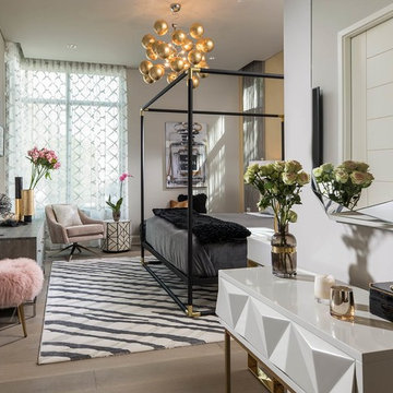
Example of a mid-sized trendy light wood floor and beige floor bedroom design in Miami with beige walls
Example of a mid-sized trendy light wood floor and beige floor bedroom design in Miami with beige walls
 Art and Cement Construction LLC
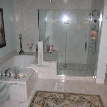
Mid-sized elegant master white tile and stone tile marble floor drop-in bathtub photo in DC Metro with an undermount sink, furniture-like cabinets, dark wood cabinets, quartz countertops, a two-piece toilet and green walls
 User
UserBlu Fish Photography
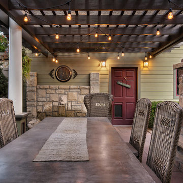
Inspiration for a mid-sized victorian backyard stone patio fountain remodel in Boise with a pergola
Inspiration for a mid-sized victorian backyard stone patio fountain remodel in Boise with a pergola

 Meyer Design
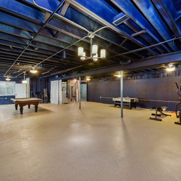
Not planning to finish your basement just yet. How about creating a moody game/exercise room by painting the exposed walls and ceiling a deep color?
Basement game room - large transitional underground concrete floor, beige floor and exposed beam basement game room idea in Chicago with purple walls
Basement game room - large transitional underground concrete floor, beige floor and exposed beam basement game room idea in Chicago with purple walls
 ShelfGenie National
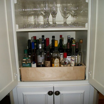
Upgrade a fixed shelf to a custom pull out shelf designed to fit your existing cabinet and create ease of access to your liquor cabinet. Each full extension pull out shelf holds 100 pounds, even when fully extended.
 Phinney Design Group
Elizabeth Pedinotti Haynes
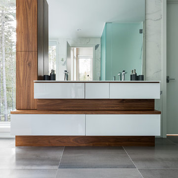
Inspiration for a mid-sized modern master white tile and marble tile ceramic tile and gray floor freestanding bathtub remodel in Burlington with flat-panel cabinets, brown cabinets, white walls, a drop-in sink, granite countertops, a hinged shower door and white countertops
Inspiration for a mid-sized modern master white tile and marble tile ceramic tile and gray floor freestanding bathtub remodel in Burlington with flat-panel cabinets, brown cabinets, white walls, a drop-in sink, granite countertops, a hinged shower door and white countertops
 BeeTree Homes
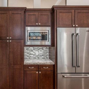
Open concept kitchen - mid-sized transitional l-shaped medium tone wood floor open concept kitchen idea in Jacksonville with an undermount sink, shaker cabinets, dark wood cabinets, granite countertops, gray backsplash, glass tile backsplash, stainless steel appliances and an island
 Design Vision Studio
James Latta of Rancho Images -
MOVIE COLONY
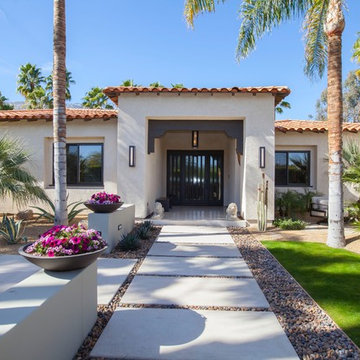
When we met these wonderful Palm Springs clients, they were overwhelmed with the task of downsizing their vast collection of fine art, antiques, and sculptures. The problem was it was an amazing collection so the task was not easy. What do we keep? What do we let go? Design Vision Studio to the rescue! We realized that to really showcase these beautiful pieces, we needed to pick and choose the right ones and ensure they were showcased properly.
Lighting was improved throughout the home. We installed and updated recessed lights and cabinet lighting. Outdated ceiling fans and chandeliers were replaced. The walls were painted with a warm, soft ivory color and the moldings, door and windows also were given a complimentary fresh coat of paint. The overall impact was a clean bright room.
We replaced the outdated oak front doors with modern glass doors. The fireplace received a facelift with new tile, a custom mantle and crushed glass to replace the old fake logs. Custom draperies frame the views. The dining room was brought to life with recycled magazine grass cloth wallpaper on the ceiling, new red leather upholstery on the chairs, and a custom red paint treatment on the new chandelier to tie it all together. (The chandelier was actually powder-coated at an auto paint shop!)
Once crammed with too much, too little and no style, the Asian Modern Bedroom Suite is now a DREAM COME TRUE. We even incorporated their much loved (yet horribly out-of-date) small sofa by recovering it with teal velvet to give it new life.
Underutilized hall coat closets were removed and transformed with custom cabinetry to create art niches. We also designed a custom built-in media cabinet with "breathing room" to display more of their treasures. The new furniture was intentionally selected with modern lines to give the rooms layers and texture.
When we suggested a crystal ship chandelier to our clients, they wanted US to walk the plank. Luckily, after months of consideration, the tides turned and they gained the confidence to follow our suggestion. Now their powder room is one of their favorite spaces in their home.
Our clients (and all of their friends) are amazed at the total transformation of this home and with how well it "fits" them. We love the results too. This home now tells a story through their beautiful life-long collections. The design may have a gallery look but the feeling is all comfort and style.
 Susan Yeley Homes
Nearly two decades ago now, Susan and her husband put a letter in the mailbox of this eastside home: "If you have any interest in selling, please reach out." But really, who would give up a Flansburgh House?
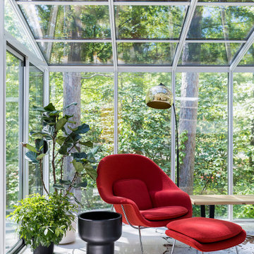
Fast forward to 2020, when the house went on the market! By then it was clear that three children and a busy home design studio couldn't be crammed into this efficient footprint. But what's second best to moving into your dream home? Being asked to redesign the functional core for the family that was.
In this classic Flansburgh layout, all the rooms align tidily in a square around a central hall and open air atrium. As such, all the spaces are both connected to one another and also private; and all allow for visual access to the outdoors in two directions—toward the atrium and toward the exterior. All except, in this case, the utilitarian galley kitchen. That space, oft-relegated to second class in midcentury architecture, got the shaft, with narrow doorways on two ends and no good visual access to the atrium or the outside. Who spends time in the kitchen anyway?
As is often the case with even the very best midcentury architecture, the kitchen at the Flansburgh House needed to be modernized; appliances and cabinetry have come a long way since 1970, but our culture has evolved too, becoming more casual and open in ways we at SYH believe are here to stay. People (gasp!) do spend time—lots of time!—in their kitchens! Nonetheless, our goal was to make this kitchen look as if it had been designed this way by Earl Flansburgh himself.
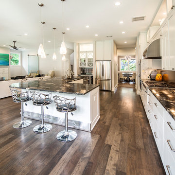
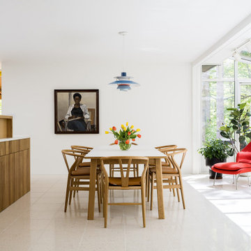
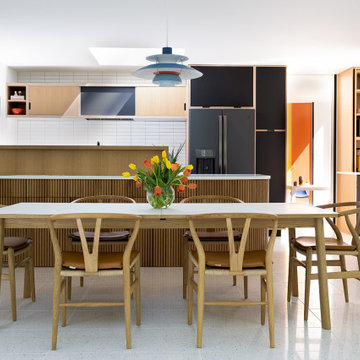
The house came to us full of bold, bright color. We edited out some of it (along with the walls it was on) but kept and built upon the stunning red, orange and yellow closet doors in the family room adjacent to the kitchen. That pop was balanced by a few colorful midcentury pieces that our clients already owned, and the stunning light and verdant green coming in from both the atrium and the perimeter of the house, not to mention the many skylights. Thus, the rest of the space just needed to quiet down and be a beautiful, if neutral, foil. White terrazzo tile grounds custom plywood and black cabinetry, offset by a half wall that offers both camouflage for the cooking mess and also storage below, hidden behind seamless oak tambour.
Contractor: Rusty Peterson
Cabinetry: Stoll's Woodworking
Photographer: Sarah Shields

 Susan Yeley Homes
Nearly two decades ago now, Susan and her husband put a letter in the mailbox of this eastside home: "If you have any interest in selling, please reach out." But really, who would give up a Flansburgh House?
Fast forward to 2020, when the house went on the market! By then it was clear that three children and a busy home design studio couldn't be crammed into this efficient footprint. But what's second best to moving into your dream home? Being asked to redesign the functional core for the family that was.
In this classic Flansburgh layout, all the rooms align tidily in a square around a central hall and open air atrium. As such, all the spaces are both connected to one another and also private; and all allow for visual access to the outdoors in two directions—toward the atrium and toward the exterior. All except, in this case, the utilitarian galley kitchen. That space, oft-relegated to second class in midcentury architecture, got the shaft, with narrow doorways on two ends and no good visual access to the atrium or the outside. Who spends time in the kitchen anyway?
As is often the case with even the very best midcentury architecture, the kitchen at the Flansburgh House needed to be modernized; appliances and cabinetry have come a long way since 1970, but our culture has evolved too, becoming more casual and open in ways we at SYH believe are here to stay. People (gasp!) do spend time—lots of time!—in their kitchens! Nonetheless, our goal was to make this kitchen look as if it had been designed this way by Earl Flansburgh himself.
The house came to us full of bold, bright color. We edited out some of it (along with the walls it was on) but kept and built upon the stunning red, orange and yellow closet doors in the family room adjacent to the kitchen. That pop was balanced by a few colorful midcentury pieces that our clients already owned, and the stunning light and verdant green coming in from both the atrium and the perimeter of the house, not to mention the many skylights. Thus, the rest of the space just needed to quiet down and be a beautiful, if neutral, foil. White terrazzo tile grounds custom plywood and black cabinetry, offset by a half wall that offers both camouflage for the cooking mess and also storage below, hidden behind seamless oak tambour.
Contractor: Rusty Peterson
Cabinetry: Stoll's Woodworking
Photographer: Sarah Shields
 Design Vision Studio
James Latta of Rancho Images -
MOVIE COLONY
When we met these wonderful Palm Springs clients, they were overwhelmed with the task of downsizing their vast collection of fine art, antiques, and sculptures. The problem was it was an amazing collection so the task was not easy. What do we keep? What do we let go? Design Vision Studio to the rescue! We realized that to really showcase these beautiful pieces, we needed to pick and choose the right ones and ensure they were showcased properly.
Lighting was improved throughout the home. We installed and updated recessed lights and cabinet lighting. Outdated ceiling fans and chandeliers were replaced. The walls were painted with a warm, soft ivory color and the moldings, door and windows also were given a complimentary fresh coat of paint. The overall impact was a clean bright room.
We replaced the outdated oak front doors with modern glass doors. The fireplace received a facelift with new tile, a custom mantle and crushed glass to replace the old fake logs. Custom draperies frame the views. The dining room was brought to life with recycled magazine grass cloth wallpaper on the ceiling, new red leather upholstery on the chairs, and a custom red paint treatment on the new chandelier to tie it all together. (The chandelier was actually powder-coated at an auto paint shop!)
Once crammed with too much, too little and no style, the Asian Modern Bedroom Suite is now a DREAM COME TRUE. We even incorporated their much loved (yet horribly out-of-date) small sofa by recovering it with teal velvet to give it new life.
Underutilized hall coat closets were removed and transformed with custom cabinetry to create art niches. We also designed a custom built-in media cabinet with "breathing room" to display more of their treasures. The new furniture was intentionally selected with modern lines to give the rooms layers and texture.
When we suggested a crystal ship chandelier to our clients, they wanted US to walk the plank. Luckily, after months of consideration, the tides turned and they gained the confidence to follow our suggestion. Now their powder room is one of their favorite spaces in their home.
Our clients (and all of their friends) are amazed at the total transformation of this home and with how well it "fits" them. We love the results too. This home now tells a story through their beautiful life-long collections. The design may have a gallery look but the feeling is all comfort and style.
 Susan Yeley Homes
Nearly two decades ago now, Susan and her husband put a letter in the mailbox of this eastside home: "If you have any interest in selling, please reach out." But really, who would give up a Flansburgh House?
Fast forward to 2020, when the house went on the market! By then it was clear that three children and a busy home design studio couldn't be crammed into this efficient footprint. But what's second best to moving into your dream home? Being asked to redesign the functional core for the family that was.
In this classic Flansburgh layout, all the rooms align tidily in a square around a central hall and open air atrium. As such, all the spaces are both connected to one another and also private; and all allow for visual access to the outdoors in two directions—toward the atrium and toward the exterior. All except, in this case, the utilitarian galley kitchen. That space, oft-relegated to second class in midcentury architecture, got the shaft, with narrow doorways on two ends and no good visual access to the atrium or the outside. Who spends time in the kitchen anyway?
As is often the case with even the very best midcentury architecture, the kitchen at the Flansburgh House needed to be modernized; appliances and cabinetry have come a long way since 1970, but our culture has evolved too, becoming more casual and open in ways we at SYH believe are here to stay. People (gasp!) do spend time—lots of time!—in their kitchens! Nonetheless, our goal was to make this kitchen look as if it had been designed this way by Earl Flansburgh himself.
The house came to us full of bold, bright color. We edited out some of it (along with the walls it was on) but kept and built upon the stunning red, orange and yellow closet doors in the family room adjacent to the kitchen. That pop was balanced by a few colorful midcentury pieces that our clients already owned, and the stunning light and verdant green coming in from both the atrium and the perimeter of the house, not to mention the many skylights. Thus, the rest of the space just needed to quiet down and be a beautiful, if neutral, foil. White terrazzo tile grounds custom plywood and black cabinetry, offset by a half wall that offers both camouflage for the cooking mess and also storage below, hidden behind seamless oak tambour.
Contractor: Rusty Peterson
Cabinetry: Stoll's Woodworking
Photographer: Sarah Shields
40