
Search results for "Creating strong" in Home Design Ideas
 SM Design
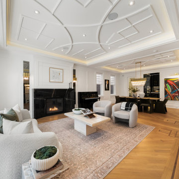
York Mills Residence | Layered Contemporary Elegance
This York Mills residence was designed around the idea of quiet luxury expressed through architectural detail rather than excess. The interior combines classical residential proportions with contemporary forms, creating a sophisticated environment that feels highly curated while remaining comfortable and inviting for everyday living.
A key design strategy was to establish a continuous architectural language across the connected living, dining, and circulation spaces. Rather than designing each zone independently, the spaces are visually tied together through consistent wall paneling, warm oak flooring, carefully controlled neutral tones, and a coordinated lighting strategy. This creates a strong sense of continuity and allows the eye to move naturally through the home.
The ceiling design plays an important role in defining the character of the interior. Elaborate geometric and curved coffering introduces a sculptural element overhead, transforming the ceiling into a fifth architectural surface. The integrated perimeter illumination emphasizes these forms after dark, while recessed lighting provides functional illumination without competing with the decorative architecture.
The black stone fireplace provides a deliberate counterpoint to the predominantly light interior. Its strong visual weight anchors the living area and establishes a dramatic focal point, while the softer curved seating and neutral upholstery balance its intensity. This contrast between monumental architectural elements and tactile, rounded furnishings gives the room a contemporary character without losing its residential warmth.
Furniture planning was approached as an exercise in conversation, proportion, and movement. The seating arrangement creates an intimate conversational zone while maintaining a clear visual and physical connection to the dining area. The curved forms soften the geometry of the architecture and introduce a more relaxed human scale within the larger room.
The dining area extends the social function of the space and is visually framed by the architectural detailing and artwork. A sculptural chandelier establishes a focal point above the dining table, while the large-scale artwork introduces color, energy, and individuality into the otherwise restrained palette. This balance between a controlled architectural background and expressive art allows the homeowner's personality to become part of the design.
The flooring contributes another layer of craftsmanship. The warm wood surface establishes continuity throughout the open interior, while geometric floor detailing and directional patterns subtly define zones without relying on physical partitions. This allows the architecture to remain open while still providing a sense of hierarchy and spatial organization.
Artwork, decorative objects, greenery, and furnishings were intentionally selected to introduce moments of color, texture, softness, and visual contrast. The result is not a purely minimalist interior; instead, it is a layered composition in which restraint provides the foundation for carefully selected moments of expression.
Overall, the project reflects a contemporary approach to traditional luxury, architectural, highly detailed, and timeless, but never overly formal. The design prioritizes proportion, craftsmanship, material relationships, natural light, and the experience of moving through the home, creating an interior that functions as both an elegant entertaining environment and a comfortable everyday living space.
 SM Design
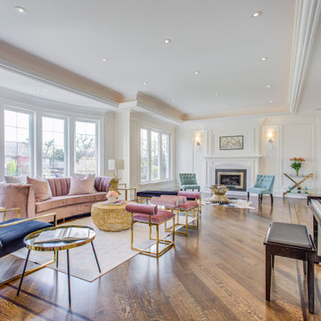
Bridle Path Residence — Formal Living & Music Room
This Bridle Path Residence living room is conceived as an elegant, light-filled entertaining space where classical architectural structure meets contemporary glamour and collected residential comfort. Rather than relying on ornament alone, the design uses proportion, symmetry, material contrast, and carefully selected furniture to create a room that feels sophisticated yet genuinely livable.
The architecture establishes a strong sense of permanence. Extensive wall panelling, substantial crown moulding, layered ceiling details, and classical fireplace architecture give the room an established character reminiscent of a refined estate interior. At the same time, the clean white envelope keeps the architecture fresh and allows the furnishings and artwork to provide the personality.
The expansive bay windows are one of the defining features of the room. Their repeated vertical proportions bring abundant natural light deep into the space while creating a strong relationship with the surrounding landscape. The windows also soften the formal architecture, giving the room an open, airy quality rather than the heaviness often associated with traditional interiors.
The furniture introduces a deliberately more contemporary language. A blush-toned sofa and upholstered accent chairs bring softness and warmth, while deep navy seating adds contrast and visual depth. Slim brass frames on the chairs and occasional tables introduce a subtle metallic thread throughout the room, connecting the individual seating pieces into a cohesive composition.
The central seating arrangement is intentionally conversational. Rather than orienting every piece toward the fireplace, the furniture creates an intimate social zone within the much larger room. The mix of rounded forms, sculptural silhouettes, and geometric metal bases prevents the formal architecture from feeling rigid.
A sculptural gold-toned coffee table becomes an important visual anchor. Its organic texture contrasts with the linear architectural detailing and polished hardwood floor, adding a layer of tactile richness. Smaller glass and metal tables maintain visual openness and allow the expansive room to remain uncluttered.
The fireplace provides a secondary focal point at the far end of the room, framed by symmetrical architectural detailing and flanking sconces. Its position establishes a visual axis through the space, while the artwork above introduces a curated, contemporary note within the traditional setting.
The piano adds an important dimension to the room's identity. Rather than being treated as a separate musical installation, it is integrated naturally into the overall composition, reinforcing the idea of the room as a space for music, entertaining, conversation, and everyday enjoyment. It also adds a rich dark element that balances the lighter furnishings and architectural envelope.
The warm hardwood flooring provides continuity and grounds the predominantly white palette. Against it, the combination of blush, navy, muted green, brass, glass, and natural textures creates a sophisticated but approachable colour story.
Overall, the room demonstrates a modern interpretation of classic luxury. Traditional architectural detailing provides the foundation, while contemporary furniture, sculptural lighting, metallic accents, art, and layered upholstery bring freshness and personality. The result is an elegant Bridle Path living space that feels tailored, highly finished, and timeless without becoming overly formal.
 RWH Architect PLLC
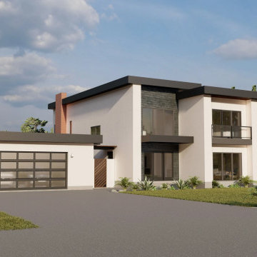
RWH Architect presents the Whistle Hill Lot 8 Residence, a statement home that reflects a bold shift toward modern, refined design. This contemporary residence is defined by its clean lines, dramatic vertical expressions, and a sophisticated mix of architectural forms that culminate in a truly forward-thinking home. From the moment visitors step into the central courtyard that connects the detached garage to the main house, the project introduces a new level of architectural intention rarely seen in the region.
The detached garage, featuring an expansive 18' x 8' door, creates a strong street presence and anchors the courtyard entry sequence. Passing through the courtyard leads to a welcoming entry foyer designed with built-in hooks and a bench, creating a comfortable—and functional—moment of arrival. Just beyond the entry is a private study with custom built-in bookshelves, a space tailored for work, reading, or quiet focus. The main floor unfolds into a sophisticated open-concept layout where the kitchen, great room, and dining areas flow effortlessly together. The kitchen includes a walk-in pantry, a pot filler for convenience, and a dedicated dog-feeding station that integrates seamlessly into the cabinetry. The great room stands as the heart of the home, featuring a built-in wood-burning fireplace and oversized sliding doors that extend the living space out to a covered patio. A centrally located half bath near the kitchen completes the first-floor program.
All bedrooms are located on the second floor to preserve privacy and capitalize on natural light. The master suite is designed as a luxurious retreat, offering a screened-in porch, a spacious walk-in closet, and a unique bathroom where the walk-in shower wraps around a freestanding tub, creating a spa-like environment that blends innovation with comfort. The laundry room is conveniently positioned on the same floor. Two additional bedrooms share a well-appointed bathroom, completing the second-floor layout.
Several design challenges shaped the evolution of this project and ultimately elevated its architectural clarity. One of the primary challenges was organizing the home around a detached garage while maintaining a cohesive architectural experience. RWH resolved this by creating a courtyard that acts as a transitional outdoor room, visually linking the structures and providing a dramatic yet functional entry sequence. Another challenge involved balancing large modern window systems with the bold vertical elements that define the façade. By carefully proportioning the glazing and framing it within thoughtful material changes, RWH maintained a strong contemporary identity while ensuring visual harmony. Integrating the built-in fireplace, open-concept layout, and large patio openings required complex structural solutions; RWH overcame this by using discreetly integrated structural steel that allowed for wide spans without compromising the home’s clean, minimalist interior aesthetic. Designing the master bathroom’s combined shower-and-tub layout also presented a unique challenge, requiring careful grading, waterproofing, and spatial planning. Through strategic detailing and 3D modeling, RWH delivered a seamless spa-like experience that feels both inventive and intuitively functional.
The Whistle Hill Lot 8 Residence stands as a testament to a new architectural direction in the area—one that embraces innovative forms, curated materials, and a lifestyle-driven floor plan. With its modern massing, intentional interior flow, and elevated details, this home reflects RWH Architect’s commitment to pushing residential design into its next era.
Find the right local pro for your project

 STUDIO KONDE | Konrad Idaszewski Architect
Komfoo house interior designed by STUDIO KONDE Konrad Idaszewski Architekt, an interior architect from Poznań creating contemporary residential spaces that combine comfort, refined materials and a strong architectural character. Visit the full project: https://conde.pl/portfolio/gotowy-projekt-wnetrz-domu-komfoo/ Komfoo is part of the Modelowedomy collection of three individually configurable houses, conceived for different ways of living and distinct spatial arrangements. This comfortable house features a high living room with a mezzanine, while the kitchen and dining area are separated from the living space by a functional furniture wall.
Contemporary living room designed as part of a modern house interior project in Poland, combining warm natural wood, soft beige upholstery, dark accents and carefully selected architectural details. Generous glazing brings greenery and daylight into the interior, while the high ceiling and elevated opening visible above the living zone emphasize the spacious character of the Komfoo house.
The living area is centred around a large modular sectional sofa in a warm cream-beige fabric, composed of generously padded seats and broad chaise elements. Its soft, rounded profile creates a relaxed and comfortable seating arrangement, while several large cushions add to the informal character of the lounge. A textured light throw lies across the chaise, introducing another layer of softness and reinforcing the tactile quality of the neutral interior.
Two overlapping round coffee tables form the centre of the seating arrangement, both finished in a deep black tone with vertically ribbed cylindrical bases. Their dark colour creates a strong contrast against the pale sofa and textured rug, while the different diameters give the composition a more dynamic, layered appearance. A small stack of books provides a discreet everyday detail on the smaller table.
One of the strongest elements of this living room is the large feature wall finished with irregular natural timber panels. The individual pieces vary subtly in shape and orientation, creating a three-dimensional, textured surface that extends across the entire media wall. Set against this warm wood background, the large flat-screen television becomes a clearly defined focal point. Rather than being mounted directly to the wall, it stands on a slim black floor-supported structure, giving the media zone a lighter and more contemporary appearance.
Natural timber flooring continues throughout the room, complementing the warm tones of the feature wall while contrasting with the pale woven rug beneath the seating area. The rug introduces a pronounced looped texture and visually gathers the sofa and coffee tables into one coherent lounge zone. Above, a large white cylindrical pendant suspended from a curved floor-to-ceiling arc provides a sculptural lighting element and adds a distinctive vertical accent to the otherwise restrained composition.
Behind the seating area, a tall opening reveals the greenery outside and allows the garden to become part of the interior setting. The combination of the high living room, textured timber media wall, generous modular sofa, sculptural lighting and carefully balanced neutral palette gives the Komfoo interior a warm and sophisticated character. This approach reflects the work of STUDIO KONDE, an interior architect in Poznań developing contemporary, comfortable interiors as part of the Modelowedomy collection.
 RWH Architect PLLC
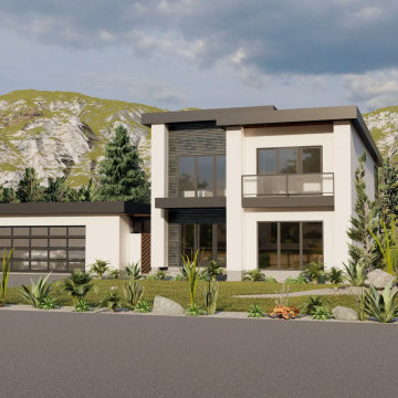
RWH Architect presents the Whistle Hill Lot 8 Residence, a statement home that reflects a bold shift toward modern, refined design. This contemporary residence is defined by its clean lines, dramatic vertical expressions, and a sophisticated mix of architectural forms that culminate in a truly forward-thinking home. From the moment visitors step into the central courtyard that connects the detached garage to the main house, the project introduces a new level of architectural intention rarely seen in the region.
The detached garage, featuring an expansive 18' x 8' door, creates a strong street presence and anchors the courtyard entry sequence. Passing through the courtyard leads to a welcoming entry foyer designed with built-in hooks and a bench, creating a comfortable—and functional—moment of arrival. Just beyond the entry is a private study with custom built-in bookshelves, a space tailored for work, reading, or quiet focus. The main floor unfolds into a sophisticated open-concept layout where the kitchen, great room, and dining areas flow effortlessly together. The kitchen includes a walk-in pantry, a pot filler for convenience, and a dedicated dog-feeding station that integrates seamlessly into the cabinetry. The great room stands as the heart of the home, featuring a built-in wood-burning fireplace and oversized sliding doors that extend the living space out to a covered patio. A centrally located half bath near the kitchen completes the first-floor program.
All bedrooms are located on the second floor to preserve privacy and capitalize on natural light. The master suite is designed as a luxurious retreat, offering a screened-in porch, a spacious walk-in closet, and a unique bathroom where the walk-in shower wraps around a freestanding tub, creating a spa-like environment that blends innovation with comfort. The laundry room is conveniently positioned on the same floor. Two additional bedrooms share a well-appointed bathroom, completing the second-floor layout.
Several design challenges shaped the evolution of this project and ultimately elevated its architectural clarity. One of the primary challenges was organizing the home around a detached garage while maintaining a cohesive architectural experience. RWH resolved this by creating a courtyard that acts as a transitional outdoor room, visually linking the structures and providing a dramatic yet functional entry sequence. Another challenge involved balancing large modern window systems with the bold vertical elements that define the façade. By carefully proportioning the glazing and framing it within thoughtful material changes, RWH maintained a strong contemporary identity while ensuring visual harmony. Integrating the built-in fireplace, open-concept layout, and large patio openings required complex structural solutions; RWH overcame this by using discreetly integrated structural steel that allowed for wide spans without compromising the home’s clean, minimalist interior aesthetic. Designing the master bathroom’s combined shower-and-tub layout also presented a unique challenge, requiring careful grading, waterproofing, and spatial planning. Through strategic detailing and 3D modeling, RWH delivered a seamless spa-like experience that feels both inventive and intuitively functional.
The Whistle Hill Lot 8 Residence stands as a testament to a new architectural direction in the area—one that embraces innovative forms, curated materials, and a lifestyle-driven floor plan. With its modern massing, intentional interior flow, and elevated details, this home reflects RWH Architect’s commitment to pushing residential design into its next era.
 STUDIO KONDE | Konrad Idaszewski Architect
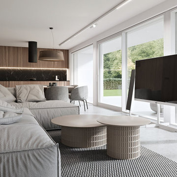
Techplan house interior designed by STUDIO KONDE Konrad Idaszewski Architekt, combining contemporary architecture with a warm, carefully balanced interior. Project details: https://conde.pl/portfolio/gotowy-projekt-wnetrz-domu-techplan/ . The Techplan concept belongs to the Modelowedomy collection of three individually configurable houses and is defined by a modern flat roof and an open living space connecting the lounge, dining area and kitchen. For clients looking for an interior architect in Poznań, the project demonstrates how a generous open-plan layout can remain comfortable and clearly organized.
Warm oak cabinetry, soft grey upholstery, dark accents and extensive glazing create a calm and sophisticated living environment. The restrained palette gives the interior a timeless quality. Carefully placed furniture and lighting define the individual functions without closing the space into separate rooms.
A large sectional sofa in light grey-beige fabric occupies the foreground. Deep seats, broad cushions and generous proportions create a relaxed lounge arrangement. Several loosely positioned cushions add texture and a casual residential feel. In front of the sofa, two round coffee tables introduce a sculptural accent. Both have smooth light-coloured tops and cylindrical bases formed from a fine vertical lattice. Their different sizes create a layered composition over the dark textured rug.
Facing the seating area, a large flat-screen television stands freely in front of the glazed façade. Two tall, narrow speakers flank the screen on minimalist white bases. This freestanding arrangement keeps the media zone visually light. It also leaves the garden visible through the windows behind it.
Further inside, the kitchen is integrated into a wall of warm oak-toned cabinetry. Full-height timber fronts create a strong architectural backdrop. A dark stone backsplash with expressive light veining introduces a contrasting horizontal band. Concealed LED lighting runs along its upper edge and softly illuminates the work surface. Black pendant lighting adds another dark accent above the kitchen and dining zones.
The dining area sits naturally between the kitchen and living room. A rounded table and softly upholstered chairs continue the neutral palette. Their curved silhouettes contrast with the linear cabinetry. Warm timber surfaces provide visual continuity between the two functional zones.
Large glazed openings extend across the side of the living area. Mature trees, lawn and a white vertical fence are visible outside. Natural daylight emphasizes the grain of the oak cabinetry and the textures of the upholstery, rug and coffee-table bases. The resulting Techplan interior combines open-plan functionality with a refined material palette and a strong connection to the garden, reflecting the residential interior design work of STUDIO KONDE in Poznań.



Sponsored
Delaware, OH

Buckeye Basements, Inc.
Central Ohio's Basement Finishing ExpertsBest Of Houzz '13-'21

 J. Stephens Interiors
Hamptons-Inspired Kitchen
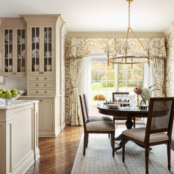
One cannot help but feel a distinct sense of serenity and timeless beauty when entering this Hamptons-style kitchen. Bathed in natural light and shimmering with inspired accents and details, this complete kitchen transformation is at once elegant and inviting. Plans and elevations were conceived to create balance and function without sacrificing harmony and visual intrigue.
A metal custom hood, with an eye-catching brass band and impeccably balanced cabinets on either side, provides a strong focal point for the kitchen, which can be viewed from the adjacent living room. Brass faucets, hardware and light fixtures complement and draw further attention to this anchoring element. A wall of glass cabinetry enhances the existing windows and pleasantly expands the sense of openness in the space.
Taj Mahal quartzite blends gracefully with the cabinet finishes. Cream-tone, herringbone tiles are custom-cut into different patterns to create a sense of visual movement as the eyes move across the room. An elegant, marble-top island paired with sumptuous, leather-covered stools, not only offers extra counterspace, but also an ideal gathering place for loved ones to enjoy.
This unforgettable kitchen gem shines even brighter with the addition of glass cabinets, designed to display the client’s collection of Portmeirion china. Careful consideration was given to the selection of stone for the countertops, as well as the color of paint for the cabinets, to highlight this inspiring collection.
Breakfast room
A thoughtfully blended mix of furniture styles introduces a splash of European charm to this Hamptons-style kitchen, with French, cane-back chairs providing a sense of airy elegance and delight.
A performance velvet adorns the banquette, which is piled high with lush cushions for optimal comfort while lounging in the room. Another layer of texture is achieved with a wool area rug that defines and accentuates this gorgeous breakfast nook with sprawling views of the outdoors.
Finishing features include drapery fabric and Brunschwig and Fils Bird and Thistle paper, whose natural, botanic pattern combines with the beautiful vistas of the backyard to inspire a sense of being in a botanical, outdoor wonderland.
 S. B. Long Interiors
photographed by Keith Scott Morton
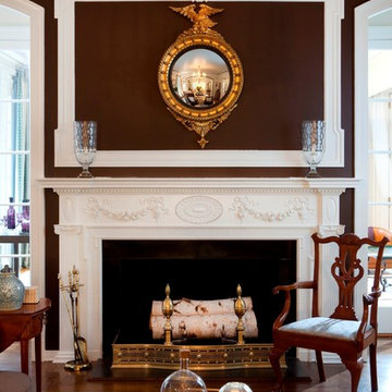
Example of a classic dark wood floor living room design in New York with brown walls, a standard fireplace and no tv
Example of a classic dark wood floor living room design in New York with brown walls, a standard fireplace and no tv
 House of L
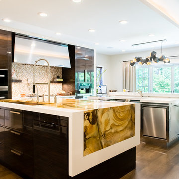
A traditional Georgian home receives an incredible transformation with an addition to expand the originally compact kitchen and create a pathway into the family room and dining area, opening the flow of the spaces that allow for fluid movement from each living space for the young family of four. Taking the lead from the client's desire to have a contemporary and edgier feel to their home's very classic facade, House of L worked with the architect's addition to the existing kitchen to design a kitchen that was incredibly functional and gorgeously dramatic, beckoning people to grab a barstool and hang out. Glossy macassar ebony wood is complimented with lacquered white cabinets for an amazing study in contrast. An oversized brushed nickel hood with polished nickel banding makes a presence on the feature wall of the kitchen. Brushed and polished nickel details are peppered in the landscape of this room, including the cabinets in the second island, a storage cabinet and automated hopper doors by Hafele on the refrigeration wall and all of the cabinet hardware, supplied and custom sized by Rajack. White quartz countertops by Hanstone in the Bianco Canvas colorway float on all the perimeter cabinets and the secondary island and creates a floating frame for the Palomino Quartzite that is a highlight in the kitchen and lends an organic feel to the clean lines of the millwork. The backsplash area behind the rangetop is a brick patterned mosaic blend of stone and glass, while surrounding walls have a layered sandstone tile that lend an incredible texture to the room. The light fixture hanging above the second island is by Wells Long and features faceted metal polygons with an amber gold interior. Woven linen drapes at window winks at the warmer tones in the room with a lustrous sheen that catches the natural light filtering in. The rift and sawn cut white oak floors are 8" planks that were fitted and finished on site to match the existing floor in the family and dining rooms. The clients were very clear on the appliances they needed the kitchen to accommodate. In addition to the vast expanses of wall space that were gained with the kitchen addition the larger footprint allowed for two sizeable islands and a host of cooking amenities, including a 48" rangetop, two double ovens, a warming drawer, and a built-in coffee maker by Miele and a 36" Refrigerator and Freezer and a beverage drawer by Subzero. A fabulous stainless steel Kallista sink by Mick De Giulio's series for the company is fitted in the first island which serves as a prep area, flanked by an Asko dishwasher to the right. A Dorenbracht faucet is a strong compliment to the scale of the sink. A smaller Kallista stainless sink is centered in the second island which has a secondary burner by Miele for overflow cooking.
Jason Miller, Pixelate

 TVL Creative Ltd.
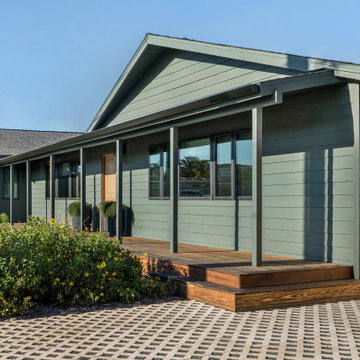
This 1910 West Highlands home was so compartmentalized that you couldn't help to notice you were constantly entering a new room every 8-10 feet. There was also a 500 SF addition put on the back of the home to accommodate a living room, 3/4 bath, laundry room and back foyer - 350 SF of that was for the living room. Needless to say, the house needed to be gutted and replanned.
Kitchen+Dining+Laundry-Like most of these early 1900's homes, the kitchen was not the heartbeat of the home like they are today. This kitchen was tucked away in the back and smaller than any other social rooms in the house. We knocked out the walls of the dining room to expand and created an open floor plan suitable for any type of gathering. As a nod to the history of the home, we used butcherblock for all the countertops and shelving which was accented by tones of brass, dusty blues and light-warm greys. This room had no storage before so creating ample storage and a variety of storage types was a critical ask for the client. One of my favorite details is the blue crown that draws from one end of the space to the other, accenting a ceiling that was otherwise forgotten.
Primary Bath-This did not exist prior to the remodel and the client wanted a more neutral space with strong visual details. We split the walls in half with a datum line that transitions from penny gap molding to the tile in the shower. To provide some more visual drama, we did a chevron tile arrangement on the floor, gridded the shower enclosure for some deep contrast an array of brass and quartz to elevate the finishes.
Powder Bath-This is always a fun place to let your vision get out of the box a bit. All the elements were familiar to the space but modernized and more playful. The floor has a wood look tile in a herringbone arrangement, a navy vanity, gold fixtures that are all servants to the star of the room - the blue and white deco wall tile behind the vanity.
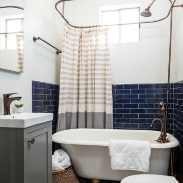
Full Bath-This was a quirky little bathroom that you'd always keep the door closed when guests are over. Now we have brought the blue tones into the space and accented it with bronze fixtures and a playful southwestern floor tile.
Living Room & Office-This room was too big for its own good and now serves multiple purposes. We condensed the space to provide a living area for the whole family plus other guests and left enough room to explain the space with floor cushions. The office was a bonus to the project as it provided privacy to a room that otherwise had none before.
Sponsored
Delaware, OH
Buckeye Basements, Inc.
Central Ohio's Basement Finishing ExpertsBest Of Houzz '13-'21
 Amy Martin Landscape Design
Location: Cohasset, MA, US
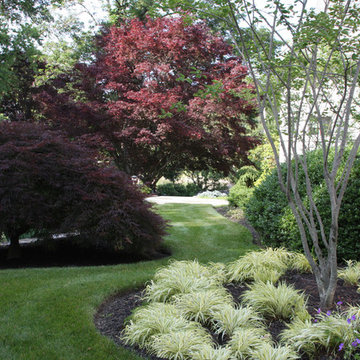
These clients wanted a landscape that had a sense of flow, of unfolding, of mysteries revealed. They love art and were open to ideas beyond the traditional themes, and so the swirls and circles of artist Sonia Delaunay, became the inspiration for this gorgeous coastal property in Cohasset, MA.
This garden was inspired by the art of Sonia Delaunay. Along the entire length of the house we made a sweeping serpentine stone wall that swerves around like a great dragon tail. In front of it are deep beds filled with Euphorbia, Lavender, Geranium, Coreopsis, Salvia, and Hakonechloa grass. They sing with blues, purples and yellows, the homeowners’ favorite colors.
This composition creates a strong flow, leading the eye down the path. Notice how the size, shape and color of the two Japanese Maples create a rich backdrop to the dazzling Hakonechloa grass and Geranium Roxanne. The slender branches of the Amelanchier tree give the composition just what it needs, a vertical line leading upward in the foreground.
 Catherine Rose Design & CO.
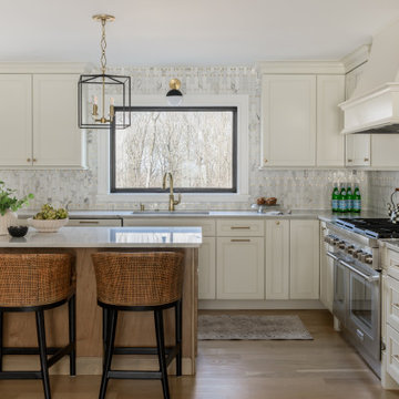
The kitchen at The Peacock Project was designed around a family with strong roots to their heritage with a need for cooking, entertaining, and the everyday life.
We also incorporated a lot of personal details into this home with custom artwork and pottery by our client's children.
 Amazing Spaces
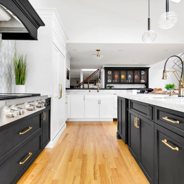
The existing U-shaped kitchen was tucked away in a small corner while the dining table was swimming in a room much too large for its size. The client’s needs and the architecture of the home made it apparent that the perfect design solution for the home was to swap the spaces.
The homeowners entertain frequently and wanted the new layout to accommodate a lot of counter seating, a bar/buffet for serving hors d’oeuvres, an island with prep sink, and all new appliances. They had a strong preference that the hood be a focal point and wanted to go beyond a typical white color scheme even though they wanted white cabinets.
While moving the kitchen to the dining space gave us a generous amount of real estate to work with, two of the exterior walls are occupied with full-height glass creating a challenge how best to fulfill their wish list. We used one available wall for the needed tall appliances, taking advantage of its height to create the hood as a focal point. We opted for both a peninsula and island instead of one large island in order to maximize the seating requirements and create a barrier when entertaining so guests do not flow directly into the work area of the kitchen. This also made it possible to add a second sink as requested. Lastly, the peninsula sets up a well-defined path to the new dining room without feeling like you are walking through the kitchen. We used the remaining fourth wall for the bar/buffet.
Black cabinetry adds strong contrast in several areas of the new kitchen. Wire mesh wall cabinet doors at the bar and gold accents on the hardware, light fixtures, faucets and furniture add further drama to the concept. The focal point is definitely the black hood, looking both dramatic and cohesive at the same time.
 Amazing Spaces
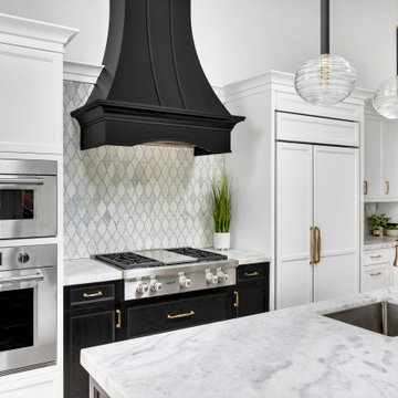
The existing U-shaped kitchen was tucked away in a small corner while the dining table was swimming in a room much too large for its size. The client’s needs and the architecture of the home made it apparent that the perfect design solution for the home was to swap the spaces.
The homeowners entertain frequently and wanted the new layout to accommodate a lot of counter seating, a bar/buffet for serving hors d’oeuvres, an island with prep sink, and all new appliances. They had a strong preference that the hood be a focal point and wanted to go beyond a typical white color scheme even though they wanted white cabinets.
While moving the kitchen to the dining space gave us a generous amount of real estate to work with, two of the exterior walls are occupied with full-height glass creating a challenge how best to fulfill their wish list. We used one available wall for the needed tall appliances, taking advantage of its height to create the hood as a focal point. We opted for both a peninsula and island instead of one large island in order to maximize the seating requirements and create a barrier when entertaining so guests do not flow directly into the work area of the kitchen. This also made it possible to add a second sink as requested. Lastly, the peninsula sets up a well-defined path to the new dining room without feeling like you are walking through the kitchen. We used the remaining fourth wall for the bar/buffet.
Black cabinetry adds strong contrast in several areas of the new kitchen. Wire mesh wall cabinet doors at the bar and gold accents on the hardware, light fixtures, faucets and furniture add further drama to the concept. The focal point is definitely the black hood, looking both dramatic and cohesive at the same time.

Sponsored
Delaware, OH
Buckeye Basements, Inc.
Central Ohio's Basement Finishing ExpertsBest Of Houzz '13-'21

 Bickford Construction Corporation
This lakeside home is a Modern Prairie Style inspired design, with strong horizontal lines, gently sloping roofs, and large overhangs. The natural cedar front porch creates a strong entrance with protection from the elements in Vermont.
 Gary Keith Jackson Design Inc.
Bruce Glass Photography
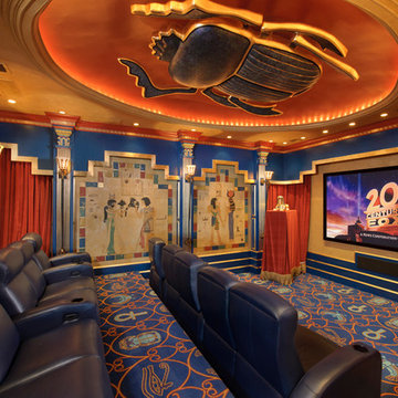
Inspiration for a mediterranean home theater remodel in Houston with a projector screen
Inspiration for a mediterranean home theater remodel in Houston with a projector screen
 Amazing Spaces
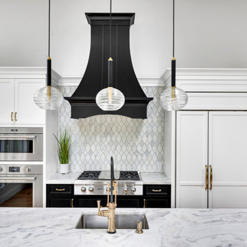
The existing U-shaped kitchen was tucked away in a small corner while the dining table was swimming in a room much too large for its size. The client’s needs and the architecture of the home made it apparent that the perfect design solution for the home was to swap the spaces.
The homeowners entertain frequently and wanted the new layout to accommodate a lot of counter seating, a bar/buffet for serving hors d’oeuvres, an island with prep sink, and all new appliances. They had a strong preference that the hood be a focal point and wanted to go beyond a typical white color scheme even though they wanted white cabinets.
While moving the kitchen to the dining space gave us a generous amount of real estate to work with, two of the exterior walls are occupied with full-height glass creating a challenge how best to fulfill their wish list. We used one available wall for the needed tall appliances, taking advantage of its height to create the hood as a focal point. We opted for both a peninsula and island instead of one large island in order to maximize the seating requirements and create a barrier when entertaining so guests do not flow directly into the work area of the kitchen. This also made it possible to add a second sink as requested. Lastly, the peninsula sets up a well-defined path to the new dining room without feeling like you are walking through the kitchen. We used the remaining fourth wall for the bar/buffet.
Black cabinetry adds strong contrast in several areas of the new kitchen. Wire mesh wall cabinet doors at the bar and gold accents on the hardware, light fixtures, faucets and furniture add further drama to the concept. The focal point is definitely the black hood, looking both dramatic and cohesive at the same time.
15