
Search results for "Creating strong" in Home Design Ideas
 Alair Homes Hickory
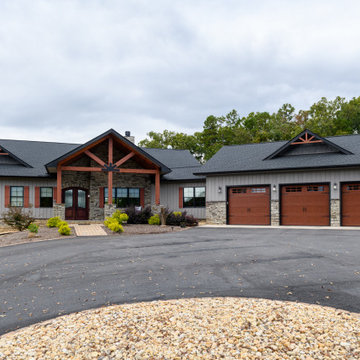
This custom ranch estate blends mountain-inspired architecture with refined craftsmanship and modern comfort. Stone, timber, and board-and-batten siding create a strong yet welcoming exterior, while expansive windows and covered outdoor living spaces capture the surrounding views.
 Designs by KS
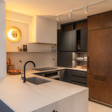
The open-concept condo could use some visual interest. The goal was to create a moody, modern yet cozy space. Inspired by our travels to Europe, we often referred to this style as Moody Mediterranean. We used warm wood tones, sand-colored tiles, and Dekton countertops, a strong man-made solid surface material that mimics travertine.

 Mike Farley Pool Designer, SWD, ASLA
Strong geometric lines divided by grass inserts create the ultimate pool jigsaw puzzle. View from the back of a Geometric Spanish Style in ground pool in Southlake, TX . Features include: fountain/spa, fire bar, vanishing edge pool, elevation changes & beautifully landscaped added touches. Designed by Mike Farley and constructed by Claffey Pools. Check out Mike's Reference Site at FarleyDesigns.net Photos taken by Mike Farley
Find the right local pro for your project

 Granit Architects + Interiors
We are delighted to have completed the radical transformation of a tired detached property in South Croydon.
When they appointed Granit, our clients were living in the property which had previously been divided into a number of flats.
The historic sub-division had resulted in an extremely poor use of space with redundant staircases, kitchens and bathrooms throughout.
Our clients sought to reconfigure the property back into a single dwelling for his growing family.
Our client had an eye for design and was keen to balance contemporary design whilst maintaining as much of the character of the original house.
Maximising natural light, space and establishing a visual and physical connection were also key drivers for the design. Owing to the size of the property, it became apparent that reconfiguration rather than extension provided the solution to meet the brief.
A metal clad ‘intervention’ was introduced to the rear facade. This created a strong horizontal element creating a visual balance with the vertical nature of the three storey gable.
The metal cladding specified echoed the colour of the red brick string courses tying old with new. Slender frame sliding doors provide access and views of the large garden.
The central circulation space was transformed by the introduction of a double height glazed slot wrapping up the rear facade and onto the roof. This allows daylight to permeate into the heart of the otherwise dark deep floor plan. The staircase was reconfigured into a series of landings looking down over the main void space below and out towards the tree canopies at the rear of the garden.
The introduction of double pocket doors throughout the ground floor creates a series of interconnected spaces and the whitewashed Larch flooring flows seamlessly from room to room. A bold palette of colours and materials lends character and texture throughout the property.
The end result is a spacious yet cosy environment for the family to inhabit for years to come.
 Do Arch LLC
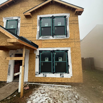
This exterior siding project features a modern combination of wood composite siding, white board-and-batten siding, and white colonial 4.5-inch Dutch lap vinyl siding on a renovated residential home in the Philadelphia area.
The design combines warm wood-look composite siding with clean white horizontal Dutch lap siding and board-and-batten gable accents, creating a high-contrast exterior with a modern farmhouse style. Black window trim adds definition and gives the home a sharp, updated appearance.
The scope of work included exterior preparation, wood composite siding installation, white colonial Dutch lap siding installation, board-and-batten siding details, soffit and fascia finishing, trim work, and clean alignment around windows, corners, roof lines, and entry areas.
Wood composite siding provides a durable, low-maintenance exterior finish with the natural look of wood, while white colonial Dutch lap siding keeps the home bright, classic, and timeless. Together, these materials create a strong curb appeal upgrade for homeowners, investors, rental properties, and house flips.
This project is a strong example of a complete exterior siding renovation designed to improve curb appeal, protect the structure, and increase long-term property value.
Serving Philadelphia, Montgomery County, Norristown, Plymouth Meeting, King of Prussia, Conshohocken, Blue Bell, and surrounding Pennsylvania areas.
 Do Arch LLC
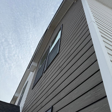
This exterior siding project features a modern combination of wood composite siding, white board-and-batten siding, and white colonial 4.5-inch Dutch lap vinyl siding on a renovated residential home in the Philadelphia area.
The design combines warm wood-look composite siding with clean white horizontal Dutch lap siding and board-and-batten gable accents, creating a high-contrast exterior with a modern farmhouse style. Black window trim adds definition and gives the home a sharp, updated appearance.
The scope of work included exterior preparation, wood composite siding installation, white colonial Dutch lap siding installation, board-and-batten siding details, soffit and fascia finishing, trim work, and clean alignment around windows, corners, roof lines, and entry areas.
Wood composite siding provides a durable, low-maintenance exterior finish with the natural look of wood, while white colonial Dutch lap siding keeps the home bright, classic, and timeless. Together, these materials create a strong curb appeal upgrade for homeowners, investors, rental properties, and house flips.
This project is a strong example of a complete exterior siding renovation designed to improve curb appeal, protect the structure, and increase long-term property value.
Serving Philadelphia, Montgomery County, Norristown, Plymouth Meeting, King of Prussia, Conshohocken, Blue Bell, and surrounding Pennsylvania areas.
 Interior Design Imports
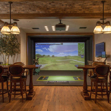
An historic Spanish Colonial residence built in 1925 being redesigned and furnished for a modern-day Southern California family was the challenge. The interiors of the main house needed the backgrounds set and then a timeless collection created for its furnishings. Lifestyle was always a consideration as well as the interiors relating to the strong architecture of the residence. Natural colors such as terra cotta, tans, blues, greens, old red and soft vintage shades were incorporated throughout. Our goal was to maintain the historic character of the residence combining design elements and materials considered classic in Southern California Spanish Colonial architecture. Natural fiber textiles, leathers and woven linens were the predominated upholstery choices. A 7000 square foot basement was added and furnished to provide a gym, Star Wars theater, game areas, spa area and a simulator for indoor golf and other sports.
Antiques were selected throughout the world, fine art from major galleries, custom reproductions fabricated in the old-world style. Collectible carpets were selected for the reclaimed hardwood flooring in all the areas. An estancia and garden over the basement were created and furnished with old world designs and materials as reclaimed woods, terra cotta and French limestone flooring.
Sponsored
Delaware, OH

Buckeye Basements, Inc.
Central Ohio's Basement Finishing ExpertsBest Of Houzz '13-'21
 Storie Collective
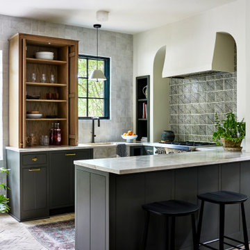
Boho meets Portuguese design in a stunning transformation of this Van Ness tudor in the upper northwest neighborhood of Washington, DC. Our team’s primary objectives were to fill space with natural light, period architectural details, and cohesive selections throughout the main level and primary suite. At the entry, new archways are created to maximize light and flow throughout the main level while ensuring the space feels intimate. A new kitchen layout along with a peninsula grounds the chef’s kitchen while securing its part in the everyday living space. Well-appointed dining and living rooms infuse dimension and texture into the home, and a pop of personality in the powder room round out the main level. Strong raw wood elements, rich tones, hand-formed elements, and contemporary nods make an appearance throughout the newly renovated main level and primary suite of the home.
 TVL Creative Ltd.
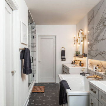
This project was not only full of many bathrooms but also many different aesthetics. The goals were fourfold, create a new master suite, update the basement bath, add a new powder bath and my favorite, make them all completely different aesthetics.
Primary Bath-This was originally a small 60SF full bath sandwiched in between closets and walls of built-in cabinetry that blossomed into a 130SF, five-piece primary suite. This room was to be focused on a transitional aesthetic that would be adorned with Calcutta gold marble, gold fixtures and matte black geometric tile arrangements.
Powder Bath-A new addition to the home leans more on the traditional side of the transitional movement using moody blues and greens accented with brass. A fun play was the asymmetry of the 3-light sconce brings the aesthetic more to the modern side of transitional. My favorite element in the space, however, is the green, pink black and white deco tile on the floor whose colors are reflected in the details of the Australian wallpaper.
Hall Bath-Looking to touch on the home's 70's roots, we went for a mid-mod fresh update. Black Calcutta floors, linear-stacked porcelain tile, mixed woods and strong black and white accents. The green tile may be the star but the matte white ribbed tiles in the shower and behind the vanity are the true unsung heroes.

 Gail Green
A 1920's Modernist black and white bath enlivens this upper east side apartment. The stark white tiles on all the walls except for the back wall and floor create a strong and dramatic contrast to the black and white marble zig-zag tiles. An oval mirror and satelllite make-up side element add to the fun.
 TVL Creative Ltd.
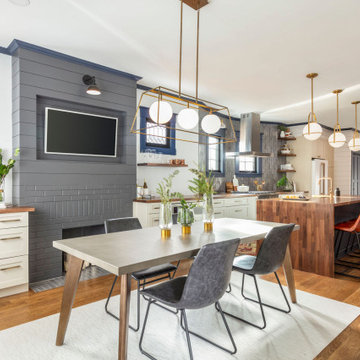
This 1910 West Highlands home was so compartmentalized that you couldn't help to notice you were constantly entering a new room every 8-10 feet. There was also a 500 SF addition put on the back of the home to accommodate a living room, 3/4 bath, laundry room and back foyer - 350 SF of that was for the living room. Needless to say, the house needed to be gutted and replanned.
Kitchen+Dining+Laundry-Like most of these early 1900's homes, the kitchen was not the heartbeat of the home like they are today. This kitchen was tucked away in the back and smaller than any other social rooms in the house. We knocked out the walls of the dining room to expand and created an open floor plan suitable for any type of gathering. As a nod to the history of the home, we used butcherblock for all the countertops and shelving which was accented by tones of brass, dusty blues and light-warm greys. This room had no storage before so creating ample storage and a variety of storage types was a critical ask for the client. One of my favorite details is the blue crown that draws from one end of the space to the other, accenting a ceiling that was otherwise forgotten.
Primary Bath-This did not exist prior to the remodel and the client wanted a more neutral space with strong visual details. We split the walls in half with a datum line that transitions from penny gap molding to the tile in the shower. To provide some more visual drama, we did a chevron tile arrangement on the floor, gridded the shower enclosure for some deep contrast an array of brass and quartz to elevate the finishes.
Powder Bath-This is always a fun place to let your vision get out of the box a bit. All the elements were familiar to the space but modernized and more playful. The floor has a wood look tile in a herringbone arrangement, a navy vanity, gold fixtures that are all servants to the star of the room - the blue and white deco wall tile behind the vanity.
Full Bath-This was a quirky little bathroom that you'd always keep the door closed when guests are over. Now we have brought the blue tones into the space and accented it with bronze fixtures and a playful southwestern floor tile.
Living Room & Office-This room was too big for its own good and now serves multiple purposes. We condensed the space to provide a living area for the whole family plus other guests and left enough room to explain the space with floor cushions. The office was a bonus to the project as it provided privacy to a room that otherwise had none before.

 Western DuPage Landscaping, Inc.
After years of enjoying their backyard, the clients of this property enlisted our firm to improve the original landscape we had completed over ten years ago. Our goal was to update the patio and further develop their backyard by creating a garden with a variety of color and texture.
Over time the existing patio had settled, plantings grew, and an existing Oak thrived. During the initial home and landscape construction our clients were particularly concerned about the health of the mature Oak located just off the home. Special care was given when the patio was first built. Precautions were again taken in working around the Oak as the existing patio was removed and replaced. Surrounding trees and shrubs had grown and enclosed the backyard limiting access. This required almost all work and transport of material to be done by hand.
The old concrete paver patio was replaced with bluestone. Existing mortared limestone around the edges of the patio levels were cleaned and tuck-pointed. A new stoop was constructed with mortared limestone risers and bluestone treads. A built-in grill and fireplace further updated the backyard space. The fireplace was designed to follow the organic curve of the patio. Mortared limestone and bluestone material were repeated on all elements, tying them together.
Along with the updated patio, many additions were made in transforming the modest backyard into a lush garden. Masses of annuals, ornamental grasses, and perennials along with mixed shrubs created sweeps of color and texture in front of a new arborvitae hedge and other existing trees and shrubs.
After careful planning and execution the completed landscape gave our clients the updated landscape they desired. The completion of the project was a rewarding and fulfilling experience as we transformed a good past project into a fantastic new project.

 Arimar International
This beautiful Wide Plank European White Oak is one of our best sellers from the Floor Art Collection.
This floor was installed by All American Floors.
DESCRIPTION
Smoked-Brushed Rustic European White Oak 9/16 x 9 ½ x 96”
Smoked Brushed Rustic Oak This beautiful wide plank floor creates a balance between modern and traditional look. Its 9 ½” x 96” with the smoked, light brushed finish makes it special.
Specie: Rustic European White Oak
Appearance:
Color: Light Chocolate
Variation: Moderate
Properties:
Durability: Dense, strong, excellent resistance.
Construction: T&G, 3 Ply Engineered floor. The use of Heveas or Rubber core makes this floor environmentally friendly.
Finish: 8% UV acrylic urethane with scratch resistant.
Sizes: 9/16 x 9 ½ x 96”, (85% of its board), with a 3.2mm wear layer.
Sponsored
Columbus, OH

Hope Restoration & General Contracting
Columbus Design-Build, Kitchen & Bath Remodeling, Historic Renovations


 Grandin Road
Hang your coat on a coat tree. Literally! Each limb of our beautiful Oversize Tree Hook cleverly serves as a coat hanger. But you're not done there. Our 100% cast aluminum hooks are strong and durable enough to use as pulls on larger doors. Talk about making a statement right at the front entrance. Do you have a home with tall ceilings and windows? Then use our Tree Hook as stunning curtain pulls sure to highlight both the windows and the curtains. Lastly, our Oversize Tree Hooks looks absolutely beautiful as a stand-alone wall accent, too. The glowing beauty of its cast aluminum along with its whimsical tree design create a sophisticated look however you choose to use them.

 RoomService 360
Giotto Modern Bookcase is a furniture piece that has the ability to create an artistic atmosphere with its mix of strong geometry and eclectic aesthetics. Designed by Andrea Lucatello for Cattelan Italia and manufactured in Italy, Giotto Bookcase is made of solid Canaletto walnut with four shelves in matte graphite or matte beaver (light warm grey) lacquered wood.
 Lincoln Lighthill Architect
 employed several discrete updates that collectively transform this existing row house.
At the heart of the home, a section of floor was removed at the top level to open up the existing stair and allow light from a new skylight to penetrate deep into the home. The stair itself received a new maple guardrail and planter, with a Fiddle-leaf fig tree growing up through the opening towards the skylight.
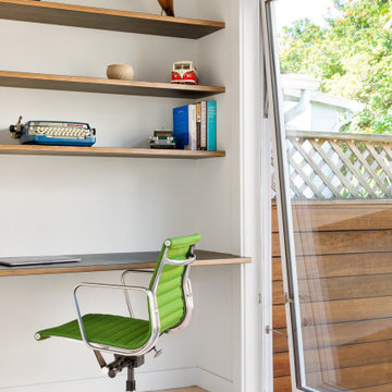
On the top living level, an awkwardly located entrance to a full bathroom directly off the main stair was moved around the corner and out of the way by removing a little used tub from the bathroom, as well as an outdated heater in the back corner. This created a more discrete entrance to the existing, now half-bath, and opened up a space for a wall of pantry cabinets with built-in refrigerator, and an office nook at the rear of the house with a huge new awning window to let in light and air.
Downstairs, the two existing bathrooms were reconfigured and recreated as dedicated master and kids baths. The kids bath uses yellow and white hexagonal Heath tile to create a pixelated celebration of color. The master bath, hidden behind a flush wall of walnut cabinetry, utilizes another Heath tile color to create a calming retreat.
Throughout the home, walnut thin-ply cabinetry creates a strong contrast to the existing maple flooring, while the exposed blond edges of the material tie the two together. Rounded edges on integral pulls and door edges create pinstripe detailing that adds richness and a sense of playfulness to the design.
This project was featured by Houzz: https://tinyurl.com/stn2hcze
Sponsored
Plain City, OH

The Creative Kitchen Company
Columbus Area Kitchen Remodeling and Refacing Professional

 Organized Living
 freedomRail in Driftwood Live. An adjustable storage solution for mudrooms and entry ways. When you organize an entryway, it keeps clutter like school bags, books, umbrellas and accessories from entering the rest of the home. Easy to install and incredibly strong. Discover more ways to organize your space in our image gallery here: http://www.organizedliving.com/home/get-inspired/areas-of-the-home/mudroom

 Christopher Simmonds Architect
The extreme change in grade across a shallow lot presented challenges for the design of this contemporary home. The solution was found in an unconventional way, by locating the front door on the lower level of the home. This would normally be a problem, but here the floating staircase and interconnected floor levels allow people on main floor to see who is coming to the front door below. The roof shape is a modern approach to the mansard roof, in order to moderate the height and mass of the four-storey elevation. The exterior material palette of synthetic stone, cement panel, and wood creates contrast, and their congenial composition strongly defines the south facade.

 Matt Fajkus Architecture
The Main Stay House exists as a straightforward proposal on an urban infill lot, paring down the components of a house to a minimal amount of planes and openings. The scheme is anchored by a modern entry sequence and a staircase volume, both clad in iron spot masonry externally and internally, creating thresholds between the respective realms of public, common and private, by minimal means. The masonry contrasts with an otherwise muted interior atmosphere of smooth, desaturated surfaces.
The entry sequence is a twist upon the conventional domestic front door, front facade, and fence. The front masonry wall replaces the typical residential fence and frames an indirect access to the front door, functioning as a privacy barrier while revealing slices of the interior to the public street.
The staircase bifurcates the layout to provide a clear division between the common and private zones of the house, while clearly reading as a mass from all outside view. Brick and glass become portals between common and private zones.
The design consolidates the service core along the west façade, allowing the structure to fully open the living zone to the pool court and existing trees. This directly connects interior and exterior, as well as human and nature. Freedom to vary the program or functional use of the area is enabled and strongly encouraged.
Photography: Charles Davis Smith
153