Search results for "Creating" in Home Design Ideas
Our clients wanted to make a statement and add an element of lux to their bathroom. Our designer created a sense of luxury and drama by mixing dark moody surface textures. Black feature tiles have different textured surfaces and create an eye catching finish as soon as you enter the bathroom. Black tiles are complemented by the walnut finish on the sleek vanity with an edgy Luxecrete benchtop in charcoal. The basin is moulded into the benchtop giving the vanity its clean minimalist look. The vanity, the shaving cabinet and the cupboard provide plenty of storage for the busy family of four. Matt black wall-mounted taps suit the dark colour scheme and give the bathroom its polished look. The black wall hung toilet is both practical and aesthetically pleasing, and it’s a sophisticated choice for a contemporary concealed toilet solution. The built-in shower bench enhances the look and functionality of the walk-in shower and provides its user with many practical solutions - from storing the toiletries to creating a perch to sit on.

Inspiration for a mid-sized contemporary carpeted bedroom remodel in Boston with multicolored walls and no fireplace

This client came to us with a very clear vision of what she wanted, but she needed help to refine and execute the design. At our first meeting she described her style as somewhere between modern rustic and ‘granny chic’ – she likes cozy spaces with nods to the past, but also wanted to blend that with the more contemporary tastes of her husband and children. Functionally, the old layout was less than ideal with an oddly placed 3-sided fireplace and angled island creating traffic jams in and around the kitchen. By creating a U-shaped layout, we clearly defined the chef’s domain and created a circulation path that limits disruptions in the heart of the kitchen. While still an open concept, the black cabinets, bar height counter and change in flooring all add definition to the space. The vintage inspired black and white tile is a nod to the past while the black stainless range and matte black faucet are unmistakably modern.
High on our client’s wish list was eliminating upper cabinets and keeping the countertops clear. In order to achieve this, we needed to ensure there was ample room in the base cabinets and reconfigured pantry for items typically stored above. The full height tile backsplash evokes exposed brick and serves as the backdrop for the custom wood-clad hood and decorative brass sconces – a perfect blend of rustic, modern and chic. Black and brass elements are repeated throughout the main floor in new hardware, lighting, and open shelves as well as the owners’ curated collection of family heirlooms and furnishings. In addition to renovating the kitchen, we updated the entire first floor with refinished hardwoods, new paint, wainscoting, wallcovering and beautiful new stained wood doors. Our client had been dreaming and planning this kitchen for 17 years and we’re thrilled we were able to bring it to life.
Find the right local pro for your project
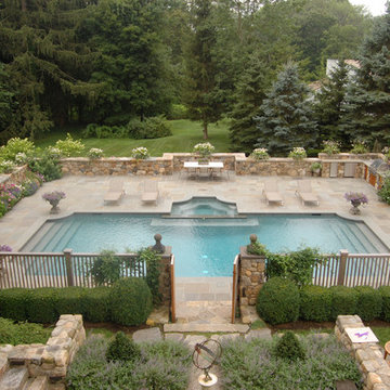
Our clients had just recently closed on their new house in Stapleton and were excited to transform it into their perfect forever home. They wanted to remodel the entire first floor to create a more open floor plan and develop a smoother flow through the house that better fit the needs of their family. The original layout consisted of several small rooms that just weren’t very functional, so we decided to remove the walls that were breaking up the space and restructure the first floor to create a wonderfully open feel.
After removing the existing walls, we rearranged their spaces to give them an office at the front of the house, a large living room, and a large dining room that connects seamlessly with the kitchen. We also wanted to center the foyer in the home and allow more light to travel through the first floor, so we replaced their existing doors with beautiful custom sliding doors to the back yard and a gorgeous walnut door with side lights to greet guests at the front of their home.
Living Room
Our clients wanted a living room that could accommodate an inviting sectional, a baby grand piano, and plenty of space for family game nights. So, we transformed what had been a small office and sitting room into a large open living room with custom wood columns. We wanted to avoid making the home feel too vast and monumental, so we designed custom beams and columns to define spaces and to make the house feel like a home. Aesthetically we wanted their home to be soft and inviting, so we utilized a neutral color palette with occasional accents of muted blues and greens.
Dining Room
Our clients were also looking for a large dining room that was open to the rest of the home and perfect for big family gatherings. So, we removed what had been a small family room and eat-in dining area to create a spacious dining room with a fireplace and bar. We added custom cabinetry to the bar area with open shelving for displaying and designed a custom surround for their fireplace that ties in with the wood work we designed for their living room. We brought in the tones and materiality from the kitchen to unite the spaces and added a mixed metal light fixture to bring the space together
Kitchen
We wanted the kitchen to be a real show stopper and carry through the calm muted tones we were utilizing throughout their home. We reoriented the kitchen to allow for a big beautiful custom island and to give us the opportunity for a focal wall with cooktop and range hood. Their custom island was perfectly complimented with a dramatic quartz counter top and oversized pendants making it the real center of their home. Since they enter the kitchen first when coming from their detached garage, we included a small mud-room area right by the back door to catch everyone’s coats and shoes as they come in. We also created a new walk-in pantry with plenty of open storage and a fun chalkboard door for writing notes, recipes, and grocery lists.
Office
We transformed the original dining room into a handsome office at the front of the house. We designed custom walnut built-ins to house all of their books, and added glass french doors to give them a bit of privacy without making the space too closed off. We painted the room a deep muted blue to create a glimpse of rich color through the french doors
Powder Room
The powder room is a wonderful play on textures. We used a neutral palette with contrasting tones to create dramatic moments in this little space with accents of brushed gold.
Master Bathroom
The existing master bathroom had an awkward layout and outdated finishes, so we redesigned the space to create a clean layout with a dream worthy shower. We continued to use neutral tones that tie in with the rest of the home, but had fun playing with tile textures and patterns to create an eye-catching vanity. The wood-look tile planks along the floor provide a soft backdrop for their new free-standing bathtub and contrast beautifully with the deep ash finish on the cabinetry.

This project was such an incredible design opportunity, and instilled inspiration and excitement at every turn! Our amazing clients came to us with the challenge of converting their beloved family home into a welcoming haven for all members of the family. At the time that we met our clients, they were struggling with the difficult personal decision of the fate of the home. Their father/father-in-law had passed away and their mother/mother-in-law had recently been admitted into a nursing facility and was fighting Alzheimer’s. Resistant to loss of the home now that both parents were out of it, our clients purchased the home to keep in in the family. Despite their permanent home currently being in New Jersey, these clients dedicated themselves to keeping and revitalizing the house. We were moved by the story and became immediately passionate about bringing this dream to life.
The home was built by the parents of our clients and was only ever owned by them, making this a truly special space to the family. Our goal was to revitalize the home and to bring new energy into every room without losing the special characteristics that were original to the home when it was built. In this way, we were able to develop a house that maintains its own unique personality while offering a space of welcoming neutrality for all members of the family to enjoy over time.
The renovation touched every part of the home: the exterior, foyer, kitchen, living room, sun room, garage, six bedrooms, three bathrooms, the laundry room, and everything in between. The focus was to develop a style that carried consistently from space to space, but allowed for unique expression in the small details in every room.
Starting at the entry, we renovated the front door and entry point to offer more presence and to bring more of the mid-century vibe to the home’s exterior. We integrated a new modern front door, cedar shingle accents, new exterior paint, and gorgeous contemporary house numbers that really allow the home to stand out. Just inside the entry, we renovated the foyer to create a playful entry point worthy of attention. Cement look tile adorns the foyer floor, and we’ve added new lighting and upgraded the entry coat storage.
Upon entering the home, one will immediately be captivated by the stunning kitchen just off the entry. We transformed this space in just about every way. While the footprint of the home ultimately remained almost identical, the aesthetics were completely turned on their head. We re-worked the kitchen to maximize storage and to create an informal dining area that is great for casual hosting or morning coffee.
We removed the entry to the garage that was once in the informal dining, and created a peninsula in its place that offers a unique division between the kitchen/informal dining and the formal dining and living areas. The simple light warm light gray cabinetry offers a bit of traditional elegance, along with the marble backsplash and quartz countertops. We extended the original wood flooring into the kitchen and stained all floors to match for a warmth that truly resonates through all spaces. We upgraded appliances, added lighting everywhere, and finished the space with some gorgeous mid century furniture pieces.
In the formal dining and living room, we really focused on maintaining the original marble fireplace as a focal point. We cleaned the marble, repaired the mortar, and refinished the original fireplace screen to give a new sleek look in black. We then integrated a new gas insert for modern heating and painted the upper portion in a rich navy blue; an accent that is carried through the home consistently as a nod to our client’s love of the color.
The former entry into the old covered porch is now an elegant glass door leading to a stunning finished sunroom. This room was completely upgraded as well. We wrapped the entire space in cozy white shiplap to keep a casual feel with brightness. We tiled the floor with large format concrete look tile, and painted the old brick fireplace a bright white. We installed a new gas burning unit, and integrated transitional style lighting to bring warmth and elegance into the space. The new black-frame windows are adorned with decorative shades that feature hand-sketched bird prints, and we’ve created a dedicated garden-ware “nook” for our client who loves to work in the yard. The far end of this space is completed with two oversized chaise loungers and overhead lights…the most perfect little reading nook!
Just off the dining room, we created an entirely new space to the home: a mudroom. The clients lacked this space and desperately needed a landing spot upon entering the home from the garage. We uniquely planned existing space in the garage to utilize for this purpose, and were able to create a small but functional entry point without losing the ability to park cars in the garage. This new space features cement-look tile, gorgeous deep brown cabinetry, and plenty of storage for all the small items one might need to store while moving in and out of the home.
The remainder of the upstairs level includes massive renovations to the guest hall bathroom and guest bedroom, upstairs master bed/bath suite, and a third bedroom that we converted into a home office for the client.
Some of the largest transformations were made in the basement, where unfinished space and lack of light were converted into gloriously lit, cozy, finished spaces. Our first task was to convert the massive basement living room into the new master bedroom for our clients. We removed existing built-ins, created an entirely new walk-in closet, painted the old brick fireplace, installed a new gas unit, added carpet, introduced new lighting, replaced windows, and upgraded every part of the aesthetic appearance. One of the most incredible features of this space is the custom double sliding barn door made by a Denver artisan. This space is truly a retreat for our clients!
We also completely transformed the laundry room, back storage room, basement master bathroom, and two bedrooms.
This home’s massive scope and ever-evolving challenges were thrilling and exciting to work with, and the result is absolutely amazing. At the end of the day, this home offers a look and feel that the clients love. Above all, though, the clients feel the spirit of their family home and have a welcoming environment for all members of the family to enjoy for years to come.

Belle Imaging
Inspiration for a mid-sized eclectic gender-neutral gray floor kids' room remodel in London with blue walls

The Design Styles Architecture team beautifully remodeled the exterior and interior of this Carolina Circle home. The home was originally built in 1973 and was 5,860 SF; the remodel added 1,000 SF to the total under air square-footage. The exterior of the home was revamped to take your typical Mediterranean house with yellow exterior paint and red Spanish style roof and update it to a sleek exterior with gray roof, dark brown trim, and light cream walls. Additions were done to the home to provide more square footage under roof and more room for entertaining. The master bathroom was pushed out several feet to create a spacious marbled master en-suite with walk in shower, standing tub, walk in closets, and vanity spaces. A balcony was created to extend off of the second story of the home, creating a covered lanai and outdoor kitchen on the first floor. Ornamental columns and wrought iron details inside the home were removed or updated to create a clean and sophisticated interior. The master bedroom took the existing beam support for the ceiling and reworked it to create a visually stunning ceiling feature complete with up-lighting and hanging chandelier creating a warm glow and ambiance to the space. An existing second story outdoor balcony was converted and tied in to the under air square footage of the home, and is now used as a workout room that overlooks the ocean. The existing pool and outdoor area completely updated and now features a dock, a boat lift, fire features and outdoor dining/ kitchen.
Photo by: Design Styles Architecture

Sponsored
Columbus, OH
Hope Restoration & General Contracting
Columbus Design-Build, Kitchen & Bath Remodeling, Historic Renovations

www.gianaallendesign.com
Giana Allen Design
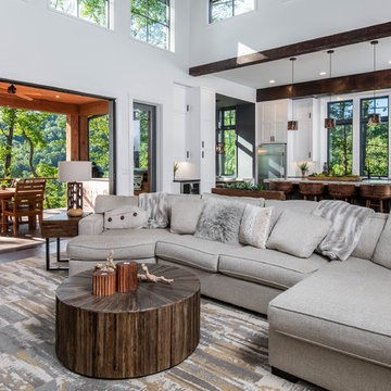
Created a cabin and furnished the interiors to create a feeling of openness and intimacy for a cabin that was located in a warm climate. The airy space and light colors contrasting with the warmth of the wood creates a feeling of intimacy within the large room.
For more pics and furniture for sale=
www.gianaallendesign.com

Front foyer and living room space separated by vintage red Naugahyde sofa. Featured in 'My Houzz'. photo: Rikki Snyder
Small eclectic formal and open concept medium tone wood floor and brown floor living room photo in New York with white walls, no fireplace and a tv stand

Living room - mediterranean formal dark wood floor and brown floor living room idea in Las Vegas with white walls

Design ideas for a large traditional drought-tolerant and full sun backyard stone garden path in San Diego.

This kitchen area is set up in a 90° angle, dividing the room into a cooking area and a dining area with seats at the kitchen counter. High cabinets are set apart and contain an integrated refrigerator and plenty of room for groceries.
To light up the overall room we chose Flos downlights coupled with a focused light above the kitchen counter in the form of a beautiful brass LED-lamp from Anour.

Sponsored
Delaware, OH
Buckeye Basements, Inc.
Central Ohio's Basement Finishing ExpertsBest Of Houzz '13-'21
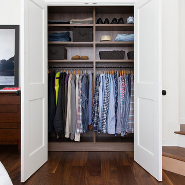
Example of a trendy orange tile and white tile gray floor and double-sink alcove shower design in Salt Lake City with shaker cabinets, medium tone wood cabinets, white walls, an undermount sink, a hinged shower door, white countertops and a floating vanity

Hillside Modernism In Context.
The owners of this modern hillside home sought to have a home in a nice Los Angeles neighborhood wherein they could raise their burgeoning family. The owners purchased a 1948 2000sf, single story, 2 bedroom English Cottage styled home (believed to have been originally owned by Yul Brynner) on a ½ acre hillside site in the exclusive Brentwood area of Los Angeles. The property slopes downward away from the street and overlooks a mini eucalyptus arroyo. The owners love their new location but are now faced-with having to raise their new and growing family on a hillside with extremely limited yard spaces for children to play and in a location where nature is very close – deer as well as coyotes wander the arroyo.
In 2000 the owners commissioned architect Richard Best to add 2500sf to the cottage and transform it into a home more fitting to their growing family’s needs. Subsequently, in 2014/15, the owners again commissioned Richard to create a 2-story master suite addition. Living in or visiting the completed project - the original 1948 home remodeled + the 2000 addition + the 2014/15 addition, one goes through an unexpected and delightful experience as the spaces of the home “unfold” to reveal intimacy and environmental immersion.
It was important to Richard and to the owners that their remodels and additions be appropriately designed to fit into the neighborhood and have the feel, scale, and soul of the original cottage. With this in-mind, Richard has interpreted the design intentions of the original cottage - “modernizing” the architectural vocabulary and creating open-plan, 2-story additions which promote site “engagement” at various floor levels and openness to the outdoors in a manner clearly inspired by the original cottage, yet modern.
At the front door of the original (still remains as it was) 1948 structure, one is presented with a quaint a low-slung entry which establishes a very comfortable sense of scale. Inside, the remodeled spaces of the original cottage exude comfort and a cozy sensibility evoked by the reuse of the original home’s exposed timber framing structure, open-plan circulation, and an inventive two-sided steel fireplace which acts as a room divider between the living room and a home office. Accordion wood doors connect these rooms to a newly formed outdoor rear patio. At this point one also gets ones first hint that something very interesting is happening just beyond – a glimpse of the 2000 & 2014/15 additions.
Moving from the original 1948 structure into the 2-story 2000 addition, one is greeted by a modern and open linear floor plan arrangement – a kitchen, casual dining and family room extend perpendicularly from the 1948 structure into the rear yard and down the hillside. The open framed cathedral ceiling and wood roof trusses establish a lofty feeling and a rhythm discretely separating the open rooms one from the other. Extensive use of windows and French doors connect the indoors to the outdoors and provide abundant natural lighting. This new appendage ends with a symmetrical family room which has no corners – it is a geometry composed of two overlapped squares - one rotated 45 degrees atop the other to create double opportunities for bay windows. The design not only connects the home to the desired exterior flat yards spaces, but it also takes full advantage of the sloping terrain by adding a floor below the original level so as to maintain a scale appropriate to the neighborhood. The exterior materials were chosen taking “hints” from the original 1948 structure – natural redwood siding, reused brick veneer and wood doors/windows all serving to aesthetically connect the addition back-to the spirit of the original structure.
By 2014/15 the owners’ family has fully blossomed - the children are now teenagers and there is a need for additional space. However, the owners are very content with their remodeled cottage and Richard’s 2000 addition – unsure how to add to a home which they feel is quite perfect as it is … wanting whatever changes are to be made to be sympathetic to it. They are also concerned about potential additions blocking-out their views of the eucalyptus arroyo. The owners approached Richard with trepidation – we love our perfect house but we need it to be a bit bigger and we don’t want to block-out the arroyo views or create a hemmed-in feeling – how can we add but still see the arroyo.
In response Richard created a private yet connected 2-story master suite, which by its positioning, dynamic geometries and extensive glazing create the fourth side of the former rear patio, making it into exterior courtyard with views around and through the new addition into the arroyo. A dynamic angularity in the new master addition (inspired by the 2000 addition) simultaneously reduces the apparent size/presence of the master suite addition on the edge of the eucalyptus arroyo while creating framed views into the arroyo from the newly formed courtyard. The new master suite - a master bathroom, master closet and a master sleeping loft each having exterior decks and/or patios, is connected back to the 2000 addition via a glazed hallway which provides a sense of connectedness and privacy. A modern rustic aesthetic of exposed board-formed concrete, natural finished Corten steel exterior cladding, frameless metal windows, and clear finished Douglas Fir planks serve to “extend” the soul of the original cottage into the master suite.
The project is a highly sustainable design as well. Energy use is reduced by employing a high efficiency heat pump heating and cooling system, dual paned/gasketed metal window/door systems, natural lighting through a Kalwall skylight and generous exterior glazing with extensive eaves for shading, rigid roof insulation, and earthen backing – the lower floor is up-against the hillside which tends to even-out the day/night temperature differential.
Credits:
Architecture & Interior Design: Richard Best Architect Inc.
Structural Engineering: Dan Echeto & David Choi Associates
Interior Decor: Noelle Schoop
Landscape: Connie Heitzman
Photos: Carmel McFayden and Adriano Sarmento / James Porschen

The owners of this kitchen had spent the money to upgrade the finishes in their kitchen upon building the home 12 years ago, but after living in the space for several years they realized how nonfunctional the layout really was. The (then) two preschool aged children had grown into busy, hungry teenagers with many friends who also liked to hang out at the house. So the family needed a more functional kitchen with better traffic flow, space for daily activities revolving around the kitchen at different times of day, and a kitchen that could accommodate cooking for and serving large groups. Furthermore, the dark, traditional finishes no longer reflected the homeowners’ style. They requested a brighter, more relaxed, coastal style that reflected their love of the seaside cities they like to visit.
Originally, the kitchen was U-shaped with a narrow island in the middle. The island created narrow aisles that bottle-necked at the dishwasher, refrigerator, and cooktop areas. There was a pass-through from the foyer into the kitchen, but the owners never liked that the pass-through was also located so close to the powder room. The awkward proximity was unappealing and made guests feel uncomfortable.
The kitchen’s storage was made up of lots of narrow cabinets, apothecary drawers, clipped corner units, and very few drawers. It lacked useful storage for the larger items the family used on a daily basis. And the kitchen’s only pantry was small closet that had only builder-grade, narrow shelving with no illumination to be able to see the contents inside.
Overall, the kitchen’s lighting plan was poorly executed. Only six recessed cans illuminated the entire kitchen and nook areas. The under cabinet lighting was not evenly distributed either. In fact, the builder had mis-placed the under cabinet lighting around the decorative pilasters which made for choppy, dark cubbies. Further, the builder didn’t include any lighting over the sink or the bar area, which meant whoever was doing the dishes was always in their own shadow. That, coupled with the steep overhang of the game room above made the bar area feel like a dim, cavernous space that wasn’t inviting or task oriented. The kitchen looked out into the main living space, but the raised bar and a narrow wall (which held the only large cabinet in the kitchen) created more of a barrier than a relationship to the living room or breakfast nook. In fact, one couldn’t even see the breakfast nook from the cooktop or sink areas due to its orientation. The raised bar top was too narrow to comfortably sit to either dine at or chat from due to the lack of knee space. The the homeowners confided that the kitchen felt more like a dark, dirty prison than place where the family, or their guests, wanted to gather and commune.
The clients' needs and desires were:
➢ to create a kitchen that would be a space the family loved to be in; to relate to the adjacent spaces all around, and to have better flow for entertaining large groups
➢ to remove the walls between the breakfast nook and living area and to be able to utilize the natural light from the windows in both those areas
➢ to incorporate a functional chopping block for prepping fresh food for home cooked meals, an island with a large sink and drain board, 2 pull out trash cans, and seating for at least the 2 teens to eat or do homework
➢ to design a kitchen and breakfast nook with an airy, coastal, relaxed vibe that blended with the rest of the house's coastal theme
➢ to integrate a layered lighting plan which would include ample general illumination, specific task lighting, decorative lighting, and lots of illuminated storage
➢ to design a kitchen with not only more storage for all the husband’s kitchen gadgets and collection of oils and spices, but smart storage, including a coffee/breakfast bar and a place to store and conceal the toaster oven and microwave
➢ to find a way to utilize the large open space between the kitchen, pantry area, and breakfast nook
Twelve Stones Designs achieved the owner's goals by:
➢ removing the walls between the kitchen and living room to allow the natural light to filter in from the adjacent rooms and to create a connection between the kitchen, nook, and living spaces for a sense of unity and communion
➢ removing the existing pantry and designing 3 large pantry style cabinets with LED tape lights and rollout drawers to house lots of kitchen appliances, gadgets, and tons of groceries. We also took the cabinets all the way up to the 9’ ceiling for additional storage for seasonal items and bulk storage.
➢ designing 2 islands - 1 with a gorgeous black walnut chopping block that houses a drawer for chopping and carving knives and a custom double pull out trash unit for point of use utilization - and 1 that houses the dishwasher, a large Blanco Gourmet sink with integrated drain board, woven baskets for fresh root vegetables and kitchen towels, plenty of drawer storage for kitchen items, and bar seating for up to 4 diners.
➢ closing off the space between the kitchen and the powder room to create a beautiful new private alcove for the powder room as well as adding some decorative storage. This also gave us space to include more tall storage near the new range for precision placement of the husband’s extensive oil and spice collection as well as a location for a combo-steam oven the wife wanted for baking and cooking healthy meals.
The project is enhanced functionally by:
➢ incorporated USB and standard receptacles for the kids’ laptops and phone charging in the large island
➢ designing the small island to include additional open shelving for items used on a daily basis such as a variety of bowls, plates, and colanders. This set up also works well for the husband who prefers to “plate” his dinners in restaurant-style fashion before presenting them to the table.
➢ the integration of specific storage units, such as double stacked cutlery drawers, a custom spice pull-out, a Kuerig coffee and tea pod drawer, and custom double stacked utensil drawers
➢ moving the refrigerator to the old oven location - this eliminated the bottle neck as well as created a better relationship to the eating table. It also utilizes the floor space between the pantry, nook, and kitchen
➢ creating a banquet style breakfast nook - this banquette seating not only doubles the amount of seating for large gatherings but it better utilizes the odd space between the kitchen and the previous nook area. It also helps to create a distinct pathway from the mudroom room through the pantry area, kitchen, nook, and living room.
➢ the coffee/breakfast bar area which includes the perfect location for the concealed microwave and toaster oven, convenient storage for the coffee pods and tea accoutrements. Roll-out drawers below also house the smoothie maker, hot water kettle, and a plethora of smoothie-making ingredients such as protein powders, smoothie additives, etc. Furthermore, the drawers below the Keurig house measuring utensil, cutlery, baking supplies and tupperware storage.
➢ incorporating lots of wide drawers and pullouts to accommodate large cookware.
➢ utilizing as much vertical space as possible by building storage to the ceiling which accommodates the family’s abundant amount of serving platters, baking sheets, bakeware, casserole dishes, and additional cutting boards.
The project is enhanced aesthetically by:
➢ new 5-piece Versailles pattern porcelain tile that now seamlessly joins the entire down stairs area together creating a bright, cohesiveness feeling instead of choppy separated spaces - it also adds a coastal feeling
➢ designing a cabinet to conceal the microwave and toaster oven
➢ the coastal influenced light fixtures over the nook table and island
➢ the sandy colors of the Langdon Cambria countertops. The swirling pattern and sparkling quartz pieces remind the homeowner of black-and-tan sandy beaches
➢ the striped banquet seating whose creamy white background and blue-green stripes were the inspiration for the cabinet and wall colors.
➢ All the interior doors were painted black to coordinate with the blacks and grays in the backsplash tile and countertop. This also adds a hint of tailored formality to an otherwise casual space.
➢ the use of WAC's Oculux small aperture LED units for the overhead lighting complimented with Diode LED strips for task lighting under the cabinets and inside the pantry and glass wall cabinets. All of the lighting applications are on separate dimmer switches.
Innovative uses of materials or construction methods by Realty Restoration LLC:
➢ Each 1-1/2” x 3” block of reclaimed end-grain black walnut that makes up the center island chopping block was hand milled and built in the shop. It was designed to look substantial and proportional to the surrounding elements, executed by creating the 4 inch tall top with a solid wood chamfered edge band.
➢ The metal doors on either side of the vent hood were also custom designed for this project and built in the Realty Restoration LLC shop. They are made 1x2, 11-gauge mild steel with ribbed glass. Weighing 60 lbs a piece, heavy duty cabinet hinges were added to support the weight of the door and keep them from sagging.
➢ Under-cabinet receptacles were added along the range wall in order to have a clean, uninterrupted backsplash.
Design obstacles to overcome:
➢ Because we were removing the demising walls between the kitchen and living room, we had to find a way to plumb and vent the new island. We did this by tunneling through the slab (the slab had post tension cables which prevented us from just trenching) to run a new wet vent through a nearby structural wall. We pulled the existing hot and cold lines between upper floor joists and ran them down the structural wall as well and up through a conduit in the tunnel.
➢ Since we were converting from wall overs to a gas range it allowed us to utilize the 220 feed for the wall ovens to provide a new sub panel for all the new kitchen circuits
➢ Due to framing deficiencies inherited from the original build there was a 1-1/2” differential in the floor-to-ceiling height over a 20 foot span; by utilizing the process of cutting and furring coupled with the crown moulding details on the cabinet elevations we were able to mask the problem and provide seamless transitions between the cabinet components.
Evidence of superior craftsmanship:
➢ uniquely designed, one-of-a-kind metal “X” end panels on the large island. The end panels were custom made in the Realty Restoration LLC shop and fitted to the exact dimensions of the island. The welding seams are completely indistinguishable - the posts look like they are cut from a single sheet of metal
➢ square metal posts on the small island were also custom made and designed to compliment and carry through the metal element s throughout the kitchen
➢ the beautiful, oversized end panels on the pantry cabinets which give the breakfast nook a tailored look
➢ integrating a large format 5 piece Versailles tile pattern to seamlessly flow from the existing spaces into the new kitchen space
➢ By constructing a custom cabinet that jogged around a corner we could not remodel (housing the entry way coat closet) we were able to camouflage the adjacent wall offset within the upper and lower cabinets. By designing around the existing jog in the structural walls we accomplished a few things: we were able to find the space to house, and hide, the microwave and toaster oven yet still have a clean cohesive appearance from the kitchen side. Additionally, the owners were able to keep their much needed coat closet and we didn’t have to increase the budget with unnecessary structural work.

Sponsored
Delaware, OH
Buckeye Basements, Inc.
Central Ohio's Basement Finishing ExpertsBest Of Houzz '13-'21

The goal of the project was to create a more functional kitchen, but to remodel with an eco-friendly approach. To minimize the waste going into the landfill, all the old cabinetry and appliances were donated, and the kitchen floor was kept intact because it was in great condition. The challenge was to design the kitchen around the existing floor and the natural soapstone the client fell in love with. The clients continued with the sustainable theme throughout the room with the new materials chosen: The back splash tiles are eco-friendly and hand-made in the USA.. The custom range hood was a beautiful addition to the kitchen. We maximized the counter space around the custom sink by extending the integral drain board above the dishwasher to create more prep space. In the adjacent laundry room, we continued the same color scheme to create a custom wall of cabinets to incorporate a hidden laundry shoot, and dog area. We also added storage around the washer and dryer including two different types of hanging for drying purposes.

For our client, who had previous experience working with architects, we enlarged, completely gutted and remodeled this Twin Peaks diamond in the rough. The top floor had a rear-sloping ceiling that cut off the amazing view, so our first task was to raise the roof so the great room had a uniformly high ceiling. Clerestory windows bring in light from all directions. In addition, we removed walls, combined rooms, and installed floor-to-ceiling, wall-to-wall sliding doors in sleek black aluminum at each floor to create generous rooms with expansive views. At the basement, we created a full-floor art studio flooded with light and with an en-suite bathroom for the artist-owner. New exterior decks, stairs and glass railings create outdoor living opportunities at three of the four levels. We designed modern open-riser stairs with glass railings to replace the existing cramped interior stairs. The kitchen features a 16 foot long island which also functions as a dining table. We designed a custom wall-to-wall bookcase in the family room as well as three sleek tiled fireplaces with integrated bookcases. The bathrooms are entirely new and feature floating vanities and a modern freestanding tub in the master. Clean detailing and luxurious, contemporary finishes complete the look.

alex lukey photography
Example of a small trendy black tile powder room design in Toronto with black walls, white countertops and an integrated sink
55