
Search results for "Criticisms" in Home Design Ideas
 David Charlez Designs
Landmark Photography
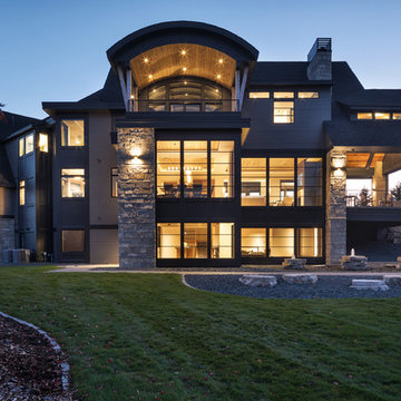
Huge transitional gray three-story mixed siding exterior home photo in Other with a mixed material roof
Huge transitional gray three-story mixed siding exterior home photo in Other with a mixed material roof
 OMNIA Group Architects
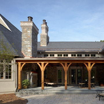
The comfortable elegance of this French-Country inspired home belies the challenges faced during its conception. The beautiful, wooded site was steeply sloped requiring study of the location, grading, approach, yard and views from and to the rolling Pennsylvania countryside. The client desired an old world look and feel, requiring a sensitive approach to the extensive program. Large, modern spaces could not add bulk to the interior or exterior. Furthermore, it was critical to balance voluminous spaces designed for entertainment with more intimate settings for daily living while maintaining harmonic flow throughout.
The result home is wide, approached by a winding drive terminating at a prominent facade embracing the motor court. Stone walls feather grade to the front façade, beginning the masonry theme dressing the structure. A second theme of true Pennsylvania timber-framing is also introduced on the exterior and is subsequently revealed in the formal Great and Dining rooms. Timber-framing adds drama, scales down volume, and adds the warmth of natural hand-wrought materials. The Great Room is literal and figurative center of this master down home, separating casual living areas from the elaborate master suite. The lower level accommodates casual entertaining and an office suite with compelling views. The rear yard, cut from the hillside, is a composition of natural and architectural elements with timber framed porches and terraces accessed from nearly every interior space flowing to a hillside of boulders and waterfalls.
The result is a naturally set, livable, truly harmonious, new home radiating old world elegance. This home is powered by a geothermal heating and cooling system and state of the art electronic controls and monitoring systems.
 MainStreet Design Build
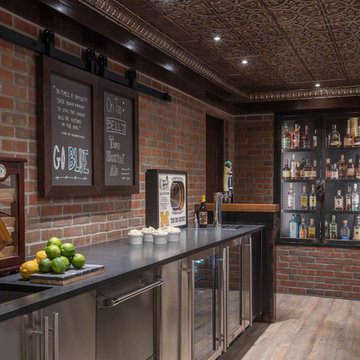
We were lucky to work with a blank slate in this nearly new home. Keeping the bar as the main focus was critical. With elements like the gorgeous tin ceiling, custom finished distressed black wainscot and handmade wood bar top were the perfect compliment to the reclaimed brick walls and beautiful beam work. With connections to a local artist who handcrafted and welded the steel doors to the built-in liquor cabinet, our clients were ecstatic with the results. Other amenities in the bar include the rear wall of stainless built-ins, including individual refrigeration, freezer, ice maker, a 2-tap beer unit, dishwasher drawers and matching Stainless Steel sink base cabinet.
Find the right local pro for your project
 NEAT Method Santa Barbara
Michelle Drewes Photography
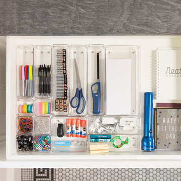
Inspiration for a transitional home office remodel in Santa Barbara
Inspiration for a transitional home office remodel in Santa Barbara
 Nathan Taylor for Obelisk Home
Historical Renovation
Objective: The homeowners asked us to join the project after partial demo and construction was in full
swing. Their desire was to significantly enlarge and update the charming mid-century modern home to
meet the needs of their joined families and frequent social gatherings. It was critical though that the
expansion be seamless between old and new, where one feels as if the home “has always been this
way”.
Solution: We created spaces within rooms that allowed family to gather and socialize freely or allow for
private conversations. As constant entertainers, the couple wanted easier access to their favorite wines
than having to go to the basement cellar. A custom glass and stainless steel wine cellar was created
where bottles seem to float in the space between the dining room and kitchen area.
A nineteen foot long island dominates the great room as well as any social gathering where it is
generally spread from end to end with food and surrounded by friends and family.
Aside of the master suite, three oversized bedrooms each with a large en suite bath provide plenty of
space for kids returning from college and frequent visits from friends and family.
A neutral color palette was chosen throughout to bring warmth into the space but not fight with the
clients’ collections of art, antique rugs and furnishings. Soaring ceiling, windows and huge sliding doors
bring the naturalness of the large wooded lot inside while lots of natural wood and stone was used to
further complement the outdoors and their love of nature.
Outside, a large ground level fire-pit surrounded by comfortable chairs is another favorite gathering
spot.
 Leslie Goodwin Photography
Design by Barbara Magnoni of South Hill Interiors | https://www.southhillinteriors.com
© Leslie Goodwin Photography
 Smith & Ragsdale Interior Design
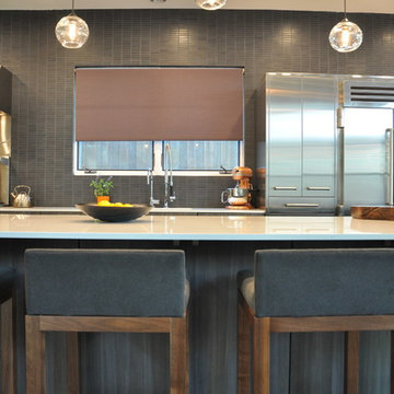
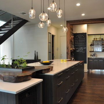
While this new home had an architecturally striking exterior, the home’s interior fell short in terms of true functionality and overall style. The most critical element in this renovation was the kitchen and dining area, which needed careful attention to bring it to the level that suited the home and the homeowners.
As a graduate of Culinary Institute of America, our client wanted a kitchen that “feels like a restaurant, with the warmth of a home kitchen,” where guests can gather over great food, great wine, and truly feel comfortable in the open concept home. Although it follows a typical chef’s galley layout, the unique design solutions and unusual materials set it apart from the typical kitchen design.
Polished countertops, laminated and stainless cabinets fronts, and professional appliances are complemented by the introduction of wood, glass, and blackened metal – materials introduced in the overall design of the house. Unique features include a wall clad in walnut for dangling heavy pots and utensils; a floating, sculptural walnut countertop piece housing an herb garden; an open pantry that serves as a coffee bar and wine station; and a hanging chalkboard that hides a water heater closet and features different coffee offerings available to guests.
The dining area addition, enclosed by windows, continues to vivify the organic elements and brings in ample natural light, enhancing the darker finishes and creating additional warmth.
Photography by Ira Montgomery
 TVL Creative Ltd.
This 1910 West Highlands home was so compartmentalized that you couldn't help to notice you were constantly entering a new room every 8-10 feet. There was also a 500 SF addition put on the back of the home to accommodate a living room, 3/4 bath, laundry room and back foyer - 350 SF of that was for the living room. Needless to say, the house needed to be gutted and replanned.
Kitchen+Dining+Laundry-Like most of these early 1900's homes, the kitchen was not the heartbeat of the home like they are today. This kitchen was tucked away in the back and smaller than any other social rooms in the house. We knocked out the walls of the dining room to expand and created an open floor plan suitable for any type of gathering. As a nod to the history of the home, we used butcherblock for all the countertops and shelving which was accented by tones of brass, dusty blues and light-warm greys. This room had no storage before so creating ample storage and a variety of storage types was a critical ask for the client. One of my favorite details is the blue crown that draws from one end of the space to the other, accenting a ceiling that was otherwise forgotten.
Primary Bath-This did not exist prior to the remodel and the client wanted a more neutral space with strong visual details. We split the walls in half with a datum line that transitions from penny gap molding to the tile in the shower. To provide some more visual drama, we did a chevron tile arrangement on the floor, gridded the shower enclosure for some deep contrast an array of brass and quartz to elevate the finishes.
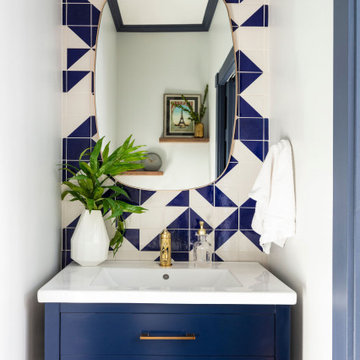
Powder Bath-This is always a fun place to let your vision get out of the box a bit. All the elements were familiar to the space but modernized and more playful. The floor has a wood look tile in a herringbone arrangement, a navy vanity, gold fixtures that are all servants to the star of the room - the blue and white deco wall tile behind the vanity.
Full Bath-This was a quirky little bathroom that you'd always keep the door closed when guests are over. Now we have brought the blue tones into the space and accented it with bronze fixtures and a playful southwestern floor tile.
Living Room & Office-This room was too big for its own good and now serves multiple purposes. We condensed the space to provide a living area for the whole family plus other guests and left enough room to explain the space with floor cushions. The office was a bonus to the project as it provided privacy to a room that otherwise had none before.
 WINN Design+Build
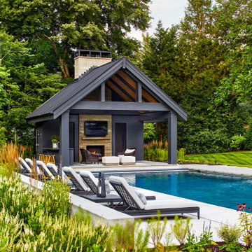
Example of a large backyard concrete paver and rectangular pool house design in DC Metro
 MainStreet Design Build
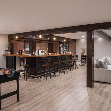
We were lucky to work with a blank slate in this nearly new home. Keeping the bar as the main focus was critical. With elements like the gorgeous tin ceiling, custom finished distressed black wainscot and handmade wood bar top were the perfect compliment to the reclaimed brick walls and beautiful beam work. With connections to a local artist who handcrafted and welded the steel doors to the built-in liquor cabinet, our clients were ecstatic with the results. Other amenities in the bar include the rear wall of stainless built-ins, including individual refrigeration, freezer, ice maker, a 2-tap beer unit, dishwasher drawers and matching Stainless Steel sink base cabinet.
 Smith & Ragsdale Interior Design
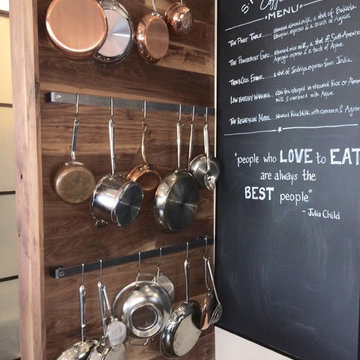
While this new home had an architecturally striking exterior, the home’s interior fell short in terms of true functionality and overall style. The most critical element in this renovation was the kitchen and dining area, which needed careful attention to bring it to the level that suited the home and the homeowners.
As a graduate of Culinary Institute of America, our client wanted a kitchen that “feels like a restaurant, with the warmth of a home kitchen,” where guests can gather over great food, great wine, and truly feel comfortable in the open concept home. Although it follows a typical chef’s galley layout, the unique design solutions and unusual materials set it apart from the typical kitchen design.
Polished countertops, laminated and stainless cabinets fronts, and professional appliances are complemented by the introduction of wood, glass, and blackened metal – materials introduced in the overall design of the house. Unique features include a wall clad in walnut for dangling heavy pots and utensils; a floating, sculptural walnut countertop piece housing an herb garden; an open pantry that serves as a coffee bar and wine station; and a hanging chalkboard that hides a water heater closet and features different coffee offerings available to guests.
The dining area addition, enclosed by windows, continues to vivify the organic elements and brings in ample natural light, enhancing the darker finishes and creating additional warmth.
Photography by Ira Montgomery

 Thinkterior LLC
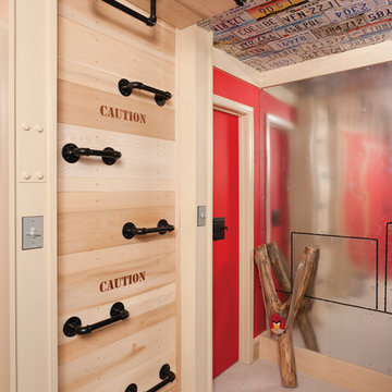
THEME The main theme for this room
is an active, physical and personalized
experience for a growing boy. This was
achieved with the use of bold colors,
creative inclusion of personal favorites
and the use of industrial materials.
FOCUS The main focus of the room is
the 12 foot long x 4 foot high elevated
bed. The bed is the focal point of the
room and leaves ample space for
activity within the room beneath. A
secondary focus of the room is the
desk, positioned in a private corner of
the room outfitted with custom lighting
and suspended desktop designed to
support growing technical needs and
school assignments.
STORAGE A large floor armoire was
built at the far die of the room between
the bed and wall.. The armoire was
built with 8 separate storage units that
are approximately 12”x24” by 8” deep.
These enclosed storage spaces are
convenient for anything a growing boy
may need to put away and convenient
enough to make cleaning up easy for
him. The floor is built to support the
chair and desk built into the far corner
of the room.
GROWTH The room was designed
for active ages 8 to 18. There are
three ways to enter the bed, climb the
knotted rope, custom rock wall, or pipe
monkey bars up the wall and along
the ceiling. The ladder was included
only for parents. While these are the
intended ways to enter the bed, they
are also a convenient safety system to
prevent younger siblings from getting
into his private things.
SAFETY This room was designed for an
older child but safety is still a critical
element and every detail in the room
was reviewed for safety. The raised bed
includes extra long and higher side
boards ensuring that any rolling in bed
is kept safe. The decking was sanded
and edges cleaned to prevent any
potential splintering. Power outlets are
covered using exterior industrial outlets
for the switches and plugs, which also
looks really cool.
 JWH Design and Cabinetry LLC
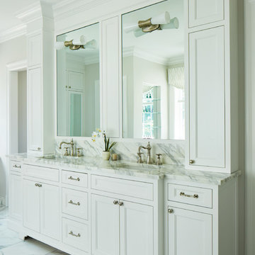
The architectural changes by the JWH Team set the stage for a custom dressing area with mirrored storage, a double vanity with separate storage for him/her, and the critical essentials of a private toilet room, focal point tub, and amazing shower.
Space planning and cabinetry: Jennifer Howard, JWH
Cabinet Installation: JWH Construction Management
Photography: Tim Lenz.

 Laney LA, Inc.
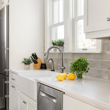
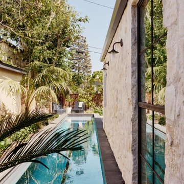
Rather than starting with an outcome in mind, this 1,400 square foot residence began from a polemic place - exploring shared conviction regarding the concentrated power of living with a smaller footprint. From the gabled silhouette to passive ventilation, the home captures the nostalgia for the past with the sustainable practices of the future.
While the exterior materials contrast a calm, minimal palette with the sleek lines of the gabled silhouette, the interior spaces embody a playful, artistic spirit. From the hand painted De Gournay wallpaper in the master bath to the rugged texture of the over-grouted limestone and Portuguese cobblestones, the home is an experience that encapsulates the unexpected and the timeless.
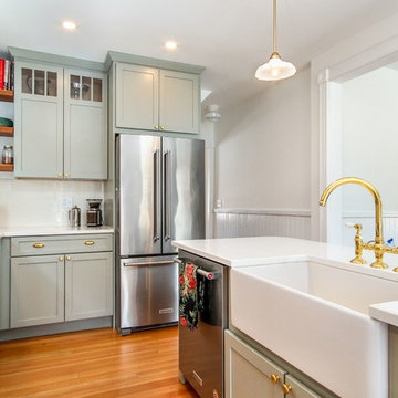
 Bouchard-Pierce
Designer: Brittny Mee
Of Vermont Kitchen Design
Transitional kitchen photo in Burlington
Transitional kitchen photo in Burlington
 The Kitchen Source
While this new home had an architecturally striking exterior, the home’s interior fell short in terms of true functionality and overall style. The most critical element in the home’s renovation was the kitchen and dining area, which needed careful attention to bring it to the level that suited the home and the homeowners. The concept and vision of Abby Smith, Abby Smith Design, was brought to life by collaboration with The Kitchen Source to elicit thoughtful space-planning and great attention to the necessary details.
Having trained in the culinary arts, the homeowner wanted a kitchen that “feels like a restaurant,” where guests can gather over great food, great wine, and truly feel comfortable in the open concept home. The use of natural materials, textures, and finishes beautifully contrasts the professional appliances and industrial elements sought after by the homeowners. The dining area addition, enclosed by windows, continues to vivify the organic elements and brings in ample natural light, enhancing the darker finishes.
This collaborative effort proved to be successful in producing a truly custom and elegant space that finally gave life to this modern home.
Photography - Lemuel Walsh
 M.T.N Design
Produced By: PrecisionCraft Log & Timber Homes
Heidi Long, Longview Studios
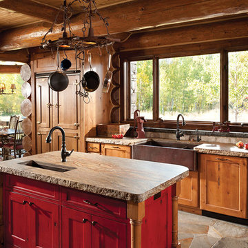
Eat-in kitchen - rustic u-shaped eat-in kitchen idea in Boise with a double-bowl sink
Eat-in kitchen - rustic u-shaped eat-in kitchen idea in Boise with a double-bowl sink
26