
Search results for "Criticisms" in Home Design Ideas
 Zola European Windows
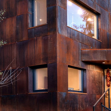
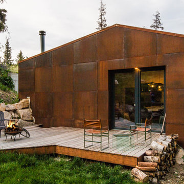
Located in, Summit Park, Park City UT lies one of the most efficient houses in the country. The Summit Haus – designed and built by Chris Price of PCD+B, is an exploration in design and construction of advanced high performance housing. Seeing a rising demand for sustainable housing along with rising Carbon emissions leading to global warming, this house strives to show that sensible, good design can create spaces adequate for today’s housing demands while adhering to strict standards. The house was designed to meet the very rigid Passiv House rating system – 90% more efficient than a typical home in the area.
The house itself was intended to nestle neatly into the 45 degree sloped site and to take full advantage of the limited solar access and views. The views range from short, highly wooded views to a long corridor out towards the Uinta Mountain range towards the east. The house was designed and built based off Passiv Haus standards, and the framing and ventilation became critical elements to maintain such minimal energy requirements.
Zola triple-pane, tilt-and-turn Thermo uPVC windows contribute substantially to the home’s energy efficiency, and takes advantage of the beautiful surrounding of the location, including forrest views from the deck off of the kitchen.
Photographer: Douglas Burke
 JA Design
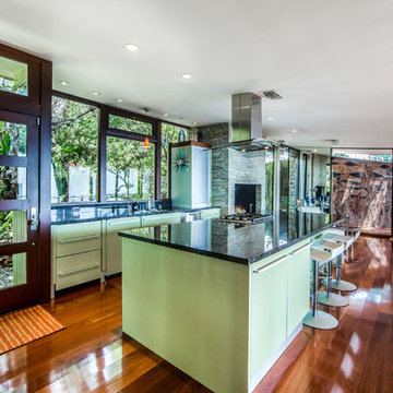
We expanded the kitchen and opened up the room using lots of glass windows, note the kitchen corner window; and used mirrors to expand the size and show off the amazing expansive ocean view.
 Advance Design Studio, Ltd.
Jackie and Sean loved the Algonquin neighborhood they lived in with the peaceful neighborhood and the close proximity to work and school. What they didn’t love was how outdated their home had become. With a cramped kitchen and an unused dining room, they decided a remodel was the perfect solution to their problem. They would be able to continue to live in the area they loved, while at the same time they could have the dream home they envisioned.
After a thorough search, Jackie came across Advance Design Studio. She was impressed by all of the positive reviews she saw on the internet and saw herself identifying with all of the project stories she saw on the website. Once they met with designer Scott Christensen and owner Todd Jurs, they knew Advance Design was the right company to make their dreams a reality.
The project consisted of four main areas: the kitchen/dining/powder room, the laundry room, the master bathroom, and the kid’s bathroom. They wanted to expand the kitchen into the seldom used dining room and add a large island for hosting parties and family gatherings. They also wanted new hardwood flooring throughout the first level. The laundry room needed to be more functional, and all three bathrooms were in dire need of updating.
The closed off kitchen was opened up to create a sweeping space between the new eating area and the much larger kitchen. A handsome dry bar complete with a beverage refrigerator and lighted glass door cabinetry makes an elegant transition across from a peninsula area filled with storage. An additional decorative cabinet lighting up elegant dishware through the mullioned glass sits directly across from the drybar.
An expansive island was critical to the kitchen plans. Jackie, Sean and Scott worked closely together to create just the right details for their design. They wanted the island to be functional in addition to being the centerpiece of the room. Added storage for the kid’s school supplies was hidden behind cabinet doors so the children could do their schoolwork right at the island, and a microwave drawer glides open with the touch of a finger hidden inconspicuously within the island space. The easy to care for Cambria Britannica Quartz island top with its sweeping grey and white marble look perched atop hand-carved Craftsman corbels was absolutely what they were hoping for, blending both beauty and function perfectly.
Adding a nice contrast to the brightness of the quartz and the white cabinetry, Kodiak - Leather granite countertops were used to balance the light and dark tones of the space. Dura Supreme Classic White painted cabinets grace the perimeter, while Maple Poppy Seed stained cabinets with a beautiful soft grey woodgrain were used in the beverage center and island. The two tones compliment the large space balancing it out nicely creating interest and elegance with the simple Craftsman style full overlay doors.
A deep warm Barnwood White Oak flooring was added throughout the lower level. The new floor brings additional contrast to the bright kitchen and provides unity with the now open floorplan as it rolls in to the foyer and family room. Final details like the show-stopping lunar like duo light fixtures complete the space and intermix expertly with crisscross details of the glass door mullions, the island bar seating and even accessories in the space.
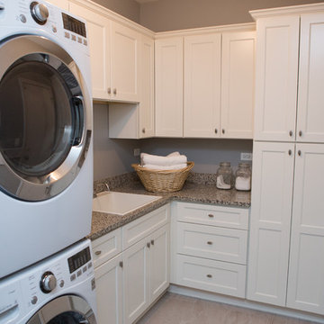
The small cluttered laundry room needed more space and more storage. With a busy family it seemed to overflow daily and did not have anywhere to hide the families “in and out stuff.” Scott designed the new space with a stackable washer and dryer and much more efficiently organized cabinetry. Doing laundry is now (almost!) a pleasure and keeping everyone’s “stuff” hidden, but readily accessible is now a snap.
The master bath was not a place where the couple enjoyed spending time getting ready for their day. The tub almost never was used, so removing it made it possible to build an extra-large shower, replacing the small cramped cube of the previous shower they hated. Clean, horizontal lines softly draw your eye around the space with porcelain tile called Driftwood Sea spray. Full overlay cabinetry in a soft white vanity with double sinks makes getting ready for the day much more convenient for the busy couple.
Long floor planks made of porcelain tile mimic real hardwood floors in a soft grey to compliment the shower, but with the ease and care of a tile surface. Cambrian Black Granite counters with a matte finish and under mount porcelain sinks with handsome brushed chrome hardware complete the handsome space. A real bonus in any master bath; a custom built in storage nook was tucked in the corner of the space for linens and heavenly storage.
The kid’s bath was in sad shape because it was original to the house. To keep the budget in control, the tub which was in great condition was retained, but focus was on the new large brick style porcelain charcoal tile on the floor, crisp white new Craftsman style cabinetry with pretty furniture details on the corner base, a striking granite top with white under mount porcelain sinks and fresh hardware and faucets. Some beautiful soft grey wood mirrors to match mom and dads were custom sized and placed under new lighting, and 4 hooks were smartly arranged down the wall for kids’ towels.
This couple was determined not to move, and made their house their dream home. Not only does their home function greatly now, but Jackie says, “When the neighbors come to visit, they’re asking if they can “steal” the design”! The added functionality, elegance, and open floor plan were exactly what this family needed in order to stay.
Advance Design Studio, Joe Nowak
Find the right local pro for your project
 Deck Remodelers.com
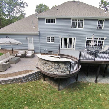
The client wanted a deck to be connected to the rest of the yard and transition to the upper deck 10ft of grade to the patio on grade. The centrally located circular kitchen area services both the patio and the upper deck and gives lots of options whether it’s just the family or a party for 50. Minimizing rails and stairs during the transition from the upper deck to the lower deck on grade was critical to the clients. Adding the kitchen to the project without obstructing the view out the rear patio doors was also an important request from the client. The WOLF PVC Black Walnut accents and fascia really sets off the Driftwood field. Dutch Quality weathered ledge stone was used in the kitchen with a granite counter. Custom welded aluminum rails and EP Henry Bristol pavers are also featured. The built in flower beds extend the feel of the patio area and allow for plantings to be added. This project turned an unusable back yard and disconnected elevated deck into cohesive multi-level living space.
 Renovisions
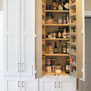
These South Shore of Boston homeowners desired a larger kitchen as their existing had limited space to host family events and entertain guests – they turned to Renovisions to help transform their small, outdated kitchen with separate walk-in pantry into a beautiful, open and spacious inspirational room.
Choosing the right cabinetry for the room and how to meet the needs of the client was critical to the overall success of this design. A traditional style was the framework of the home and the flat paneled doors on the white painted cabinetry support this aspect. Going vertical as possible with cabinets is a trend here to stay; keeping with that idea, we recommended the graceful tall pantry cabinet that flanks one side of the kitchen. This not only lends to an eye-appealing furniture-look, but adds significant storage space, allowing the cabinets to store items they may not use on a regular basis. In this case, the clients are amazed with the amount of storage they’ve gained and one that provides easy access to all interior items. Every inch of space was key to create this optimally functional kitchen. Must-haves such as tray dividers above the refrigerator are handy and the double pull-out trash/recycling bins on the right side of the sink were a simple and clean way to gain floor space and conceal unsightly trash.
The focal point of this kitchen is the expansive, soft-grey colored contrasting island with larger, deeper drawers for pots, pans and platters. The client was excited to switch to an induction chef-series range that featured a divided oven that can accommodate two different temperatures.
Fit and finish is important in any renovation and this certainly holds true in this kitchen project to personalize their space. The custom recessed panel columns with wainscot details add an architectural element that ties into the kitchen cabinet design and Carrera-look quartz countertops which provide a stunning classical look that ties nicely with the overall traditional style. These homeowners are excited to show off their open and spacious Renovision!
“We really enjoyed our new kitchen and it’s amazing improvement over the holidays. We got rave reviews from all of our guests!”
Steve & Mary S. (Duxbury)
 STRATTON DESIGN GROUP
photo: GIL STOSE
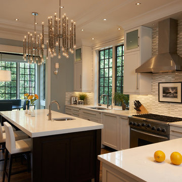
Example of a large transitional l-shaped medium tone wood floor eat-in kitchen design in Charlotte with an undermount sink, recessed-panel cabinets, white cabinets, white backsplash, stainless steel appliances and an island
Example of a large transitional l-shaped medium tone wood floor eat-in kitchen design in Charlotte with an undermount sink, recessed-panel cabinets, white cabinets, white backsplash, stainless steel appliances and an island
 Growsgreen Landscape Design
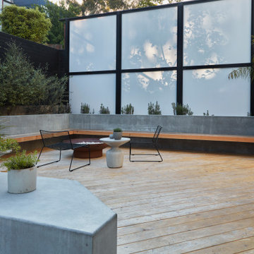
A few into the fire pit and long beam benches off the planting bed concrete retaining walls. The Paloform BOL fire pit is a favorite of mine. The translucent feeling of the space was a requirement of the client and I love how the modern Shoji screen look allows for the play of shadow and light in the mornings.
 MainStreet Design Build
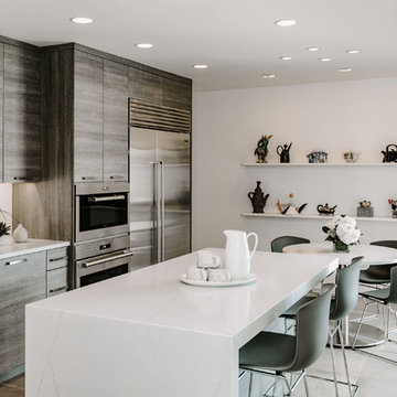
This lovely couple are in their 70's and previously remodeled their kitchen over 25 years ago. With that in mind, the homeowners had three specific design goals for their new kitchen renovation - age, height, and ease of use, as well as keeping the new look in line with the unique modern design of their gorgeous home. Neither owner is tall, (husband 5'6" and wife under 5'); therefore, a kitchen with easy reach appliances and fixtures was critical. The island design incorporated an extra thick quartz top but needed to be no higher than 35". The ovens were lowered for safety and ease of use, and a pull-out stool was incorporated into the toe kick. The in-drawer downdraft control along with the wide rail stainless steel apron sink was incorporated for complete ease of use. The couple was not looking for a major change in layout but wanted to incorporate a 48" wide Subzero refrigerator into the "smallish" kitchen without creating an overwhelming feeling. Moving all the tall units to one end of the kitchen (near the nook) gave the space an open feel while offering more substantial refrigeration.
 L A Custom Pools and Spas, Inc.
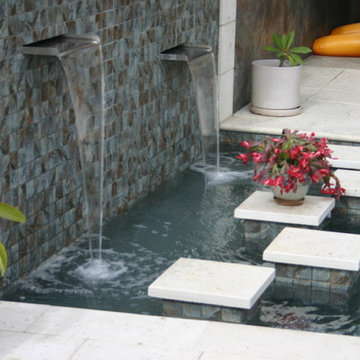
Creating space is critical in small areas. Here we used the pool structure to hold back the hillside. The addition of multi level water scuppers adds elegance.
 Metropolis Drafting and Construction Inc
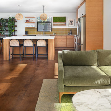
A Modern home that wished for more warmth...
An addition and reconstruction of approx. 750sq. area.
That included new kitchen, office, family room and back patio cover area.
The custom-made kitchen cabinets are semi-inset / semi-frameless combination.
The door style was custom build with a minor bevel at the edge of each door.
White oak was used for the frame, drawers and most of the cabinet doors with some doors paint white for accent effect.
The island "legs" or water fall sides if you wish and the hood enclosure are Tambour wood paneling.
These are 3/4" half round wood profile connected together for a continues pattern.
These Tambour panels, the wicker pendant lights and the green live walls inject a bit of an Asian fusion into the design mix.
The floors are polished concrete in a dark brown finish to inject additional warmth vs. the standard concrete gray most of us familiar with.
A huge 16' multi sliding door by La Cantina was installed, this door is aluminum clad (wood finish on the interior of the door).

 JWH Design and Cabinetry LLC
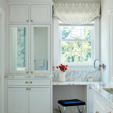
The architectural changes by the JWH Team set the stage for a custom dressing area with mirrored storage, a double vanity with separate storage for him/her, and the critical essentials of a private toilet room, focal point tub, and amazing shower.
Space planning and cabinetry: Jennifer Howard, JWH
Cabinet Installation: JWH Construction Management
Photography: Tim Lenz.
 Zola European Windows
Located in, Summit Park, Park City UT lies one of the most efficient houses in the country. The Summit Haus – designed and built by Chris Price of PCD+B, is an exploration in design and construction of advanced high performance housing. Seeing a rising demand for sustainable housing along with rising Carbon emissions leading to global warming, this house strives to show that sensible, good design can create spaces adequate for today’s housing demands while adhering to strict standards. The house was designed to meet the very rigid Passiv House rating system – 90% more efficient than a typical home in the area.
The house itself was intended to nestle neatly into the 45 degree sloped site and to take full advantage of the limited solar access and views. The views range from short, highly wooded views to a long corridor out towards the Uinta Mountain range towards the east. The house was designed and built based off Passiv Haus standards, and the framing and ventilation became critical elements to maintain such minimal energy requirements.
Zola triple-pane, tilt-and-turn Thermo uPVC windows contribute substantially to the home’s energy efficiency, and takes advantage of the beautiful surrounding of the location, including forrest views from the deck off of the kitchen.
Photographer: George Oakley
 TKS Design Group
Free ebook, Creating the Ideal Kitchen. DOWNLOAD NOW
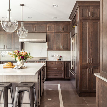
Our clients came in after thinking a long time about what to do with their kitchen – new cabinets or paint them, white kitchen or wood, custom or is semi-custom? All good questions to ask! They were committed to making this home for a while, they decided to do a full remodel. The kitchen was not living up to its potential both visually and functionally. The dark cabinets and countertop made the room feel dull. And the major drawback, a large corner pantry that was eating into the room, make it appear smaller than it was.
We started by ditching the corner pantry. It created a perfectly centered spot for the new professional range and made room for a much larger island that now houses a beverage center, microwave drawer, seating for three and tons of storage. The multi-generational family does a ton of cooking, so this kitchen gets used! We spent lots of time fine tuning the storage devices and planning where critical items would be stored. This included the new pantry area across from the refrigerator that houses small appliances and food staples.
Designed by: Susan Klimala, CKBD
Photography by: LOMA Studios
For more information on kitchen and bath design ideas go to: www.kitchenstudio-ge.com
 Advance Design Studio, Ltd.
Jackie and Sean loved the Algonquin neighborhood they lived in with the peaceful neighborhood and the close proximity to work and school. What they didn’t love was how outdated their home had become. With a cramped kitchen and an unused dining room, they decided a remodel was the perfect solution to their problem. They would be able to continue to live in the area they loved, while at the same time they could have the dream home they envisioned.
After a thorough search, Jackie came across Advance Design Studio. She was impressed by all of the positive reviews she saw on the internet and saw herself identifying with all of the project stories she saw on the website. Once they met with designer Scott Christensen and owner Todd Jurs, they knew Advance Design was the right company to make their dreams a reality.
The project consisted of four main areas: the kitchen/dining/powder room, the laundry room, the master bathroom, and the kid’s bathroom. They wanted to expand the kitchen into the seldom used dining room and add a large island for hosting parties and family gatherings. They also wanted new hardwood flooring throughout the first level. The laundry room needed to be more functional, and all three bathrooms were in dire need of updating.
The closed off kitchen was opened up to create a sweeping space between the new eating area and the much larger kitchen. A handsome dry bar complete with a beverage refrigerator and lighted glass door cabinetry makes an elegant transition across from a peninsula area filled with storage. An additional decorative cabinet lighting up elegant dishware through the mullioned glass sits directly across from the drybar.
An expansive island was critical to the kitchen plans. Jackie, Sean and Scott worked closely together to create just the right details for their design. They wanted the island to be functional in addition to being the centerpiece of the room. Added storage for the kid’s school supplies was hidden behind cabinet doors so the children could do their schoolwork right at the island, and a microwave drawer glides open with the touch of a finger hidden inconspicuously within the island space. The easy to care for Cambria Britannica Quartz island top with its sweeping grey and white marble look perched atop hand-carved Craftsman corbels was absolutely what they were hoping for, blending both beauty and function perfectly.
Adding a nice contrast to the brightness of the quartz and the white cabinetry, Kodiak - Leather granite countertops were used to balance the light and dark tones of the space. Dura Supreme Classic White painted cabinets grace the perimeter, while Maple Poppy Seed stained cabinets with a beautiful soft grey woodgrain were used in the beverage center and island. The two tones compliment the large space balancing it out nicely creating interest and elegance with the simple Craftsman style full overlay doors.
A deep warm Barnwood White Oak flooring was added throughout the lower level. The new floor brings additional contrast to the bright kitchen and provides unity with the now open floorplan as it rolls in to the foyer and family room. Final details like the show-stopping lunar like duo light fixtures complete the space and intermix expertly with crisscross details of the glass door mullions, the island bar seating and even accessories in the space.
The small cluttered laundry room needed more space and more storage. With a busy family it seemed to overflow daily and did not have anywhere to hide the families “in and out stuff.” Scott designed the new space with a stackable washer and dryer and much more efficiently organized cabinetry. Doing laundry is now (almost!) a pleasure and keeping everyone’s “stuff” hidden, but readily accessible is now a snap.
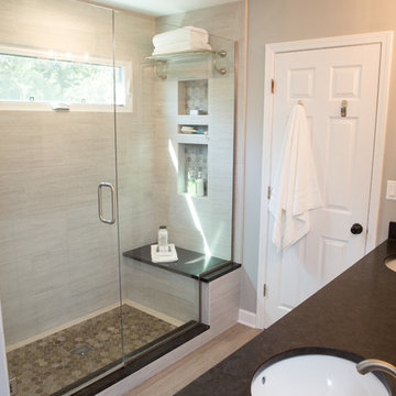
The master bath was not a place where the couple enjoyed spending time getting ready for their day. The tub almost never was used, so removing it made it possible to build an extra-large shower, replacing the small cramped cube of the previous shower they hated. Clean, horizontal lines softly draw your eye around the space with porcelain tile called Driftwood Sea spray. Full overlay cabinetry in a soft white vanity with double sinks makes getting ready for the day much more convenient for the busy couple.
Long floor planks made of porcelain tile mimic real hardwood floors in a soft grey to compliment the shower, but with the ease and care of a tile surface. Cambrian Black Granite counters with a matte finish and under mount porcelain sinks with handsome brushed chrome hardware complete the handsome space. A real bonus in any master bath; a custom built in storage nook was tucked in the corner of the space for linens and heavenly storage.
The kid’s bath was in sad shape because it was original to the house. To keep the budget in control, the tub which was in great condition was retained, but focus was on the new large brick style porcelain charcoal tile on the floor, crisp white new Craftsman style cabinetry with pretty furniture details on the corner base, a striking granite top with white under mount porcelain sinks and fresh hardware and faucets. Some beautiful soft grey wood mirrors to match mom and dads were custom sized and placed under new lighting, and 4 hooks were smartly arranged down the wall for kids’ towels.
This couple was determined not to move, and made their house their dream home. Not only does their home function greatly now, but Jackie says, “When the neighbors come to visit, they’re asking if they can “steal” the design”! The added functionality, elegance, and open floor plan were exactly what this family needed in order to stay.
Advance Design Studio, Joe Nowak
 Corynne Pless
Photo: Corynne Pless Photography © 2014 Houzz
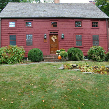
Example of a country exterior home design in New York
Example of a country exterior home design in New York
 DISC Interiors
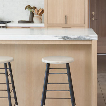
Minimalist concrete floor open concept kitchen photo in Los Angeles with flat-panel cabinets, light wood cabinets, marble countertops and white backsplash
 Court Tile Discounters
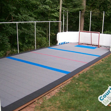
The customer built a wooden platform because the yard sloped downhill, and was able to create a small hockey area for his kids! Polypropylene plastic sports tile give a safe, suspended sports surface great for deck hockey, roller hockey, and lots of other sports.
 Princeton Design Collaborative
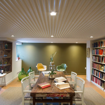
Family room library - mid-sized 1960s open concept brown floor family room library idea in New York with green walls, a standard fireplace and a brick fireplace
 Wright Jenkins Home Design
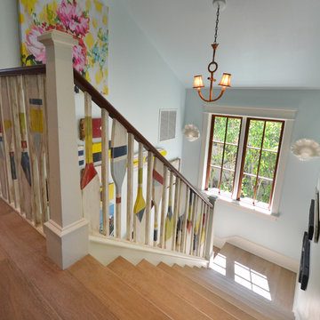
This second-story addition to an already 'picture perfect' Naples home presented many challenges. The main tension between adding the many 'must haves' the client wanted on their second floor, but at the same time not overwhelming the first floor. Working with David Benner of Safety Harbor Builders was key in the design and construction process – keeping the critical aesthetic elements in check. The owners were very 'detail oriented' and actively involved throughout the process. The result was adding 924 sq ft to the 1,600 sq ft home, with the addition of a large Bonus/Game Room, Guest Suite, 1-1/2 Baths and Laundry. But most importantly — the second floor is in complete harmony with the first, it looks as it was always meant to be that way.
©Energy Smart Home Plans, Safety Harbor Builders, Glenn Hettinger Photography
29