
Search results for "Decide sheet s" in Home Design Ideas

 Corynne Pless
Photo: Corynne Pless Photography © 2017 Houzz
Example of an eclectic bedroom design in Los Angeles
Example of an eclectic bedroom design in Los Angeles

 Wood Anchor
Part of Prairie Architecture’s new space was this large staff kitchen and eating area.
The firm wanted to have an inviting community table and matching benches for their staff seating area.
We chose Douglas Fir as the species to match the heritage beams that were part of the previous space. The Douglas Fir used in the tabletop and bench were reclaimed from a dismantled wood grain elevator in Western Manitoba.
We came up with a brand new design for a table base incorporating sheet steel to make up the angular form.
Details:
165″ long x 36″ wide reclaimed Fir tabletop with OSMO Hardwax Polyx clear coat. Leg base is a Wood Anchor custom design built with sheet steel with powder coat clear coat finish.
82″ long x 18″ wide reclaimed Fir bench top with OSMO Hardwax Polyx clear coat with 3/8″ sheet steel leg with powder coat clear coat finish.
Photo credits: 2017 © Ray Chan Photo, All Rights Reserved

 Moxie Interiors, LLC
Client request: Design a space that is modern and masculine for a teen boy entering high school. Special requests: a bed that has color-changing LED lighting, desk and chair that can double for homework and gaming.
Find the right local pro for your project
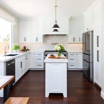
 Simply Stunning Spaces
We're calling this project our "Love It Or List It" project because our clients were debating whether or not they wanted to renovate or put their home on the market while the market was hot. They opted for the renovation & with the help of the Simply Stunning Spaces team, it's safe to say, they're loving their new space & aren't planning on leaving anytime soon!


 Dream Home Construction
Excited to share with you a new bathroom project we’ve completed for a client in Kirkland featuring brand new shower glass, Carrara marble wall, patterned tile floor, new bathroom fixtures, new tub, and vanity. This is definitely a trend continuing into 2020, an emphasis on minimalism yet sophisticated design.

 Triangle Residential Designs
Views of living room and loft of Barn Renovation.
The client was living on a farm that had been in his family since the late 1800’s. He was considering either building a new home on the property or renovating a barn that had been built by his grandfather in the 1940s. The lower level housed a milking parlor, cow stalls, mangers and a garage for tractors and equipment. The upper level was a 25’-30’ high hay loft. The barn had been used as an active dairy until 1951. We decided that while a new home would be easier, it would be a unique opportunity to restore a classic structure and maintain family history by reworking the barn.
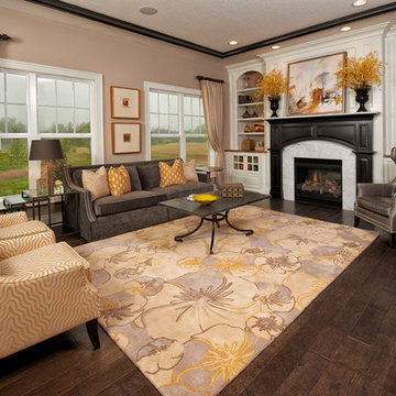


 BAUFORMAT
concrete looking luxury tile which looks like wallpapers. Perfect for urban style condo or loft or luxury house.
Bathroom - modern bathroom idea in Los Angeles
Bathroom - modern bathroom idea in Los Angeles

 Cantoni Irvine
Designed By: Sarah Buehlman
Marc and Mandy Maister were clients and fans of Cantoni before they purchased this harbor home on Balboa Island. The South African natives originally met designer Sarah Buehlman and Cantoni’s Founder and CEO Michael Wilkov at a storewide sale, and quickly established a relationship as they bought furnishings for their primary residence in Newport Beach.
So, when the couple decided to invest in this gorgeous second home, in one of the ritziest enclaves in North America, they sought Sarah’s help in transforming the outdated 1960’s residence into a modern marvel. “It’s now the ultimate beach house,” says Sarah, “and finished in Cantoni from top to bottom—including new custom cabinetry installed throughout.”
But let’s back up. This project began when Mandy contacted Sarah in the midst of the remodel process (in December 2010), asking if she could come take a look and help with the overall design.
“The plans were being drawn up with an architect, and they opted not to move anything major. Instead, they updated everything—as in the small carpeted staircase that became a gorgeous glass and metal sculpture,” Sarah explains. She took photographs and measurements, and then set to work creating the scaled renderings. “Marc and Mandy were drawn to the One and Only Collection. It features a high-gloss brown and white color scheme which served as inspiration for the project,” says Sarah.
Primary pieces in the expansive living area include the Mondrian leather sectional, the Involution sculpture, and a pair of Vladimir Kagan Corkscrew swivel chairs. The Maisters needed a place to house all their electronics but didn’t want a typical entertainment center. The One and Only buffet was actually modified by our skilled shop technicians, in our distribution center, so it could accommodate all the couple’s media equipment. “These artisans are another one of our hidden strengths—in addition to the design tools, inventory and extensive resources we have to get a job done,” adds Sarah. Marc and Mandy also fell in love with the exotic Makassar ebony wood in the Ritz Collection, which Sarah combined in the master bedroom with the Ravenna double chaise to provide an extra place to sit and enjoy the beautiful harbor views.
Beyond new furnishings, the Maisters also decided to completely redo their kitchen. And though Marc and Mandy did not have a chance to actually see our kitchen displays, having worked with Sarah over the years, they had immense trust in our commitment to craftsmanship and quality. In fact, they opted for new cabinetry in four bathrooms as well as the laundry room based on our 3D renderings and lacquer samples alone—without ever opening a drawer. “Their trust in my expertise and Cantoni’s reputation were a major deciding factor,” says Sarah.
This plush second home, complete with a private boat dock right out back, counts as one of Sarah’s proudest accomplishments. “These long-time clients are great. They love Cantoni and appreciate high quality Italian furnishings in particular. The home is so gorgeous that once you are inside and open the Nano doors, you simply don’t want to leave.” The job took almost two years to complete, but everyone seems quite happy with the results, proving that large or small—and in cases necessitating a quick turnaround or execution of a long-term vision—Cantoni has the resources to come through for all clients.

 Spring Creek Design
This project represents an increasingly popular type of project - combining 2 bedrooms into a single master suite. The house is a 1910 craftsman, with 4 bedrooms on the second floor. Typical of older homes, the master bedroom had a very small bathroom, and very little closet space. The owners decided to sacrifice an adjacent guest bedroom to create a spacious master suite. The new rooms include a large bathroom, with hers and his vanities, separate toilet room, custom tile shower and soaking tub. The extra space also allowed us to install a luxurious custom walk-in closet.
Design Criteria:
- Increase size and utility of closet space.
- Create a large, luxury bathroom with distinctly separate hers/his spaces.
Special Features:
- Custom tile shower, with frameless glass door
- Platform soaking tub w/ custom tile deck
- His/Hers vanities with quartz countertops.
- Separate toilet room.
- Room-sized walk-in closet with custom cabinet system.
- Custom 5-Panel doors and built-up mouldings to match the original woodwork.
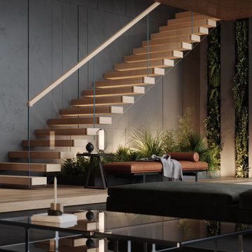


 Kitchen Design Concepts
When we initially met with our clients, they expressed the need for modernization and updating. The original kitchen had good quality cabinetry but had standard finishes and lacked a little bit of design. With utilizing this kitchen already good bones, and a “few” updates, it’s almost as if it’s a brand new kitchen! This included a fresh new finish for the cabinetry, new countertops, backsplash, and fixtures. Want to learn more about how we transformed this kitchen? Continue reading below!
Cabinetry
As mentioned above, the kitchen already had great bones. Refinishing cabinetry is not only a great way to save money but a wonderful way to recycle and revamping what you already have. All, we needed to do was remove the door and drawer fronts, paint the cabinet boxes and paint the fronts. Voila! We have a two-tone white and grey kitchen! Already the space was looking fresh and brand new. However, no stopping there. While we were at it, we updated some other stuff as well. Keep reading below!
Countertops
Having lived with laminate tops for a while, our clients were starting to notice the wear and tear from its daily use. So, they wanted something that would not only last but also is easy to maintain. There’s no better choice than quartz! They decided on a 3cm Caesarstone in Nougat – a great pairing with newly finished cabinetry!
Backsplash
Having had 12×12 standard tiles as the backsplash, there were lots left to be desired. With tons of options of tile out there, we decided on utilizing two different tile styles as the backsplash. For the main field tile, we have a 3×6 H-line in Pumice, and an accent tile in Daltile Frost Snow marble. Simple, classic, and clean!
Fixtures
Lastly, the finishing touches of the kitchen, are not just finishing touches. They provide functionality to the space! The sink and faucet are not only beautiful pieces but something you use every single day, so they must be something that works for our client’s space. Our clients decided on a Blanco Quattrus super single bowl in stainless steel, and a Blanco faucet and soap dispenser.
 User
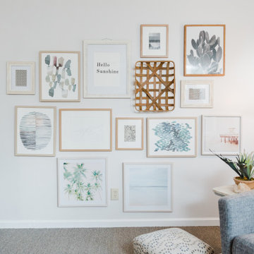
Meghan’s office presented a lot of opportunities for artwork, and a variety of it! It was an exciting challenge; one that we took in stride, as searched high and low for the perfect pieces. The hardest part about our search was finding large enough pieces of art to fill each wall. The gallery wall came about admist this struggle. Inspired by the water color prints from Meghan’s previous office, we decided to combine those with a variety of graphic prints in wood frames mixed in with photographs and sculptural pieces here and there.
Sponsored
Sunbury, OH

J.Holderby - Renovations
Franklin County's Leading General Contractors - 2X Best of Houzz!

 Design Fixation [Faith Provencher]
Photo: Design Fixation © 2017 Houzz
Bedroom - transitional bedroom idea in Boston
Bedroom - transitional bedroom idea in Boston
 TKS Design Group
Download our free ebook, Creating the Ideal Kitchen. DOWNLOAD NOW
Lakefront property in the northwest suburbs of Chicago is hard to come by, so when we were hired by this young family with exactly that, we were immediately inspired by not just the unusually large footprint of this 1950’s colonial revival but also the lovely views of the manmade lake it was sited on. The large 5-bedroom home was solidly stuck in the 1980’s, but we saw tons of potential. We started out by updating the existing staircase with a fresh coat of paint and adding new herringbone slate to the entry hall.
The powder room off the entryway also got a refresh - new flooring, new cabinets and fixtures. We ran the new slate right through into this space for some consistency. A fun wallpaper and shiplap trim add a welcoming feel and set the tone for the home.
Next, we tackled the kitchen. Located away from the rest of the first floor, the kitchen felt a little isolated, so we immediately began planning for how to better connect it to the rest of the first floor. We landed on removing the wall between the kitchen and dining room and designed a modified galley style space with separate cooking and clean up zones. The cooking zone consists of the refrigerator, prep sink and cooktop, along with a nice long run of prep space at the island. The cleanup side of the kitchen consists of the main sink and dishwasher. Both areas are situated so that the user can view the lake during prep work and cleanup!
One of the home’s main puzzles was how to incorporate the mudroom and area in front of the patio doors at the back of the house. We already had a breakfast table area, so the space by the patio doors was a bit of a no man’s land. We decided to separate the kitchen proper from what became the new mudroom with a large set of barn doors. That way you can quickly hide any mudroom messes but have easy access to the light coming in through the patio doors as well as the outdoor grilling station. We also love the impact the barn doors add to the overall space.
The homeowners’ first words to us were “it’s time to ditch the brown,” so we did! We chose a lovely blue pallet that reflects the home’s location on the lake which is also vibrant yet easy on the eye. Countertops are white quartz, and the natural oak floor works well with the other honey accents. The breakfast table was given a refresh with new chairs, chandelier and window treatments that frame the gorgeous views of the lake out the back.
We coordinated the slate mudroom flooring with that used in the home’s main entrance for a consistent feel. The storage area consists of open and closed storage to allow for some clutter control as needed.
Next on our “to do” list was revamping the dated brown bar area in the neighboring dining room. We eliminated the clutter by adding some closed cabinets and did some easy updates to help the space feel more current. One snag we ran into here was the discovery of a beam above the existing open shelving that had to be modified with a smaller structural beam to allow for our new design to work. This was an unexpected surprise, but in the end we think it was well worth it!
We kept the colors here a bit more muted to blend with the homeowner’s existing furnishings. Open shelving and polished nickel hardware add some simple detail to the new entertainment zone which also looks out onto the lake!
Next we tackled the upstairs starting with the homeowner’s son’s bath. The bath originally had both a tub shower and a separate shower, so we decided to swap out the shower for a new laundry area. This freed up some space downstairs in what used to be the mudroom/laundry room and is much more convenient for daily laundry needs.
We continued the blue palette here with navy cabinetry and the navy tile in the shower. Porcelain floor tile and chrome fixtures keep maintenance to a minimum while matte black mirrors and lighting add some depth the design. A low maintenance runner adds some warmth underfoot and ties the whole space together.
We added a pocket door to the bathroom to minimize interference with the door swings. The left door of the laundry closet is on a 180 degree hinge to allow for easy full access to the machines. Next we tackled the master bath which is an en suite arrangement. The original was typical of the 1980’s with the vanity outside of the bathroom, situated near the master closet. And the brown theme continued here with multiple shades of brown.
Our first move was to segment off the bath and the closet from the master bedroom. We created a short hall from the bedroom to the bathroom with his and hers walk-in closets on the left and right as well as a separate toilet closet outside of the main bathroom for privacy and flexibility.
The original bathroom had a giant soaking tub with steps (dangerous!) as well as a small shower that did not work well for our homeowner who is 6’3”. With other bathtubs in the home, they decided to eliminate the tub and create an oversized shower which takes up the space where the old tub was located. The double vanity is on the opposite wall and a bench is located under the window for morning conversations and a place to set a couple of towels.
The pallet in here is light and airy with a mix of blond wood, creamy porcelain and marble tile, and brass accents. A simple roman shade adds some texture and it’s top-down mechanism allows for light and privacy.
This large whole house remodel gave our homeowners not only the ability to maximize the potential of their home but also created a lovely new frame from which to view their fabulous lake views.
Designed by: Susan Klimala, CKD, CBD
Photography by: Michael Kaskel
For more information on kitchen and bath design ideas go to: www.kitchenstudio-ge.com

 Duet Design Group
Transitional Mountain Retreat
Eric Lucero Photography
Dining room - transitional dark wood floor dining room idea in Denver with beige walls
Dining room - transitional dark wood floor dining room idea in Denver with beige walls

 Imagine Living
Bedroom and large minimalist boy carpeted kids' bedroom photo in London with brown walls


 ROAM Architecture
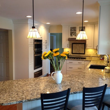
After working with these clients to renovate their previous home, these homeowners got the renovation bug. They decided to buy another home in the town that they love, and renovate it just to their liking. This house was originally constructed in the 1850's, and was filled with beautiful period details which we all wanted to retain as much as possible. In the kitchen, we removed walls between the kitchen and dining room to create a completely open and modern-day kitchen. We worked with the homeowners to come up with schemes that worked around an existing structural post in the middle of the space, but ultimately decided that it wasn't worth keeping. After some structural rework, the kitchen is open and beautiful, and ready for the next 150 years of this building's life.

 King's Court Builders, Inc.
You can’t help but notice the expansive wall of arched top windows in the family room. A two-sided fireplace brings warmth to the breakfast area and family room

 Milwaukee/NARI Home Improvement Council, Inc.
S.J. Janis Company: Master Suite and Family Room Addition
Having outgrown this 1930’s Cream City brick Colonial, the homeowners decided on a two-story master suite and family room addition to meet their expanding needs, remain near good neighbors, and stay in the same school system. The new addition enhanced the family’s lifestyle with an efficient mudroom entry and covered porch, an enlarged family room off the kitchen with natural light and entertainment opportunities, and a second-story master suite. This phase of the renovation also included a new front entry with a stamped walkway, second story bathroom remodel, additional storage, and refinished hardwood flooring.
224