
Search results for "Deciding locations" in Home Design Ideas

 Drewett Works
The genesis of design for this desert retreat was the informal dining area in which the clients, along with family and friends, would gather.
Located in north Scottsdale’s prestigious Silverleaf, this ranch hacienda offers 6,500 square feet of gracious hospitality for family and friends. Focused around the informal dining area, the home’s living spaces, both indoor and outdoor, offer warmth of materials and proximity for expansion of the casual dining space that the owners envisioned for hosting gatherings to include their two grown children, parents, and many friends.
The kitchen, adjacent to the informal dining, serves as the functioning heart of the home and is open to the great room, informal dining room, and office, and is mere steps away from the outdoor patio lounge and poolside guest casita. Additionally, the main house master suite enjoys spectacular vistas of the adjacent McDowell mountains and distant Phoenix city lights.
The clients, who desired ample guest quarters for their visiting adult children, decided on a detached guest casita featuring two bedroom suites, a living area, and a small kitchen. The guest casita’s spectacular bedroom mountain views are surpassed only by the living area views of distant mountains seen beyond the spectacular pool and outdoor living spaces.
Project Details | Desert Retreat, Silverleaf – Scottsdale, AZ
Architect: C.P. Drewett, AIA, NCARB; Drewett Works, Scottsdale, AZ
Builder: Sonora West Development, Scottsdale, AZ
Photographer: Dino Tonn
Featured in Phoenix Home and Garden, May 2015, “Sporting Style: Golf Enthusiast Christie Austin Earns Top Scores on the Home Front”
See more of this project here: http://drewettworks.com/desert-retreat-at-silverleaf/

 Bianchi Design
These clients decided to make this home their Catalina Mountain homestead, after living abroad for many years. The prior yard enclosed only a small portion of their available property, and a wall obstructed their city lights view of northern Tucson. We expanded the yard outward to take advantage of the space and to also integrate the topography change into a 360 vanishing edge pool.
The home previously had log columns in keeping with a territorial motif. To bring it up to date, concrete cylindrical columns were put in their place, which allowed us to expand the shaded locations throughout the yard in an updated way, as seen by the new retractable canvas shade structures.
Constructed by Mike Rowland, you can see how well he pulled off the projects precise detailing of Bianchi's Design. Note the cantilevered concrete steps, the slot of fire in the midst of the spa, the stair treads that don't quite touch the adjacent walls, and the columns that float just above the pool water.

 Signature Kitchen & Bath Design Inc.
This home was in the perfect neighborhood for this busy young family but the layout was all wrong! With a large formal dining room located in the front of the home and a small galley kitchen facing a narrow side yard, we quickly decided a shuffling was in order. Combining the small kitchen and family room with the large formal dining room allowed us to expand the kitchen and create a common area that every member of the family could enjoy. We selected a rich hardware floor to run throughout the space and contrasted that with crisp white cabinetry and a cool gray quartz countertop. A navy accent wall adds a pop of color in the kitchen area while a calm neutral unifies the rest of the common areas. A rustic dining table, pendant light fixtures, and farm style sink add a rustic element making the space feel relaxed and comfy for this casual family.
Photo by Brad Bidnick
Interior Design by Bennett Design Co.
Find the right local pro for your project
 O'Brien Harris LLC
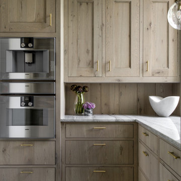
This project is new construction located in Hinsdale, Illinois. The scope included the kitchen, butler’s pantry, and mudroom. The clients are on the verge of being empty nesters and so they decided to right size. They came from a far more traditional home, and they were open to things outside of their comfort zone. O’Brien Harris Cabinetry in Chicago (OBH) collaborated on the project with the design team but especially with the builder from J. Jordan Homes. The architecture of this home is interesting and defined by large floor to ceiling windows. This created a challenge in the kitchen finding wall space for large appliances.
“In essence we only had one wall and so we chose to orient the cooking on that wall. That single wall is defined on the left by a window and on the right by the mudroom. That left us with another challenge – where to place the ovens and refrigerator. We then created a vertically clad wall disguising appliances which floats in between the kitchen and dining room”, says Laura O’Brien.
The room is defined by interior transom windows and a peninsula was created between the kitchen and the casual dining for separation but also for added storage. To keep it light and open a transparent brass and glass shelving was designed for dishes and glassware located above the peninsula.
The butler’s pantry is located behind the kitchen and between the dining room and a lg exterior window to front of the home. Its main function is to house additional appliances. The wall at the butler’s pantry portal was thickened to accommodate additional shelving for open storage. obrienharris.com

 Advance Design Studio, Ltd.
When this suburban family decided to renovate their kitchen, they knew that they wanted a little more space. Advance Design worked together with the homeowner to design a kitchen that would work for a large family who loved to gather regularly and always ended up in the kitchen! So the project began with extending out an exterior wall to accommodate a larger island and more moving-around space between the island and the perimeter cabinetry.
Style was important to the cook, who began collecting accessories and photos of the look she loved for months prior to the project design. She was drawn to the brightness of whites and grays, and the design accentuated this color palette brilliantly with the incorporation of a warm shade of brown woods that originated from a dining room table that was a family favorite. Classic gray and white cabinetry from Dura Supreme hits the mark creating a perfect balance between bright and subdued. Hints of gray appear in the bead board detail peeking just behind glass doors, and in the application of the handsome floating wood shelves between cabinets. White subway tile is made extra interesting with the application of dark gray grout lines causing it to be a subtle but noticeable detail worthy of attention.
Suede quartz Silestone graces the countertops with a soft matte hint of color that contrasts nicely with the presence of white painted cabinetry finished smartly with the brightness of a milky white farm sink. Old melds nicely with new, as antique bronze accents are sprinkled throughout hardware and fixtures, and work together unassumingly with the sleekness of stainless steel appliances.
The grace and timelessness of this sparkling new kitchen maintains the charm and character of a space that has seen generations past. And now this family will enjoy this new space for many more generations to come in the future with the help of the team at Advance Design Studio.
Dura Supreme Cabinetry
Photographer: Joe Nowak

 TKS Design Group
Download our free ebook, Creating the Ideal Kitchen. DOWNLOAD NOW
This homeowner’s daughter originally contacted us on behalf of her parents who were reluctant to begin the remodeling process in their home due to the inconvenience and dust. Once we met and they dipped their toes into the process, we were off to the races. The existing bathroom in this beautiful historical 1920’s home, had not been updated since the 70’/80’s as evidenced by the blue carpeting, mirrored walls and dropped ceilings. In addition, there was very little storage, and some health setbacks had made the bathroom difficult to maneuver with its tub shower.
Once we demoed, we discovered everything we expected to find in a home that had not been updated for many years. We got to work bringing all the electrical and plumbing up to code, and it was just as dusty and dirty as the homeowner’s anticipated! Once the space was demoed, we got to work building our new plan. We eliminated the existing tub and created a large walk-in curb-less shower.
An existing closet was eliminated and in its place, we planned a custom built in with spots for linens, jewelry and general storage. Because of the small space, we had to be very creative with the shower footprint, so we clipped one of the walls for more clearance behind the sink. The bathroom features a beautiful custom mosaic floor tile as well as tiled walls throughout the space. This required lots of coordination between the carpenter and tile setter to make sure that the framing and tile design were all properly aligned. We worked around an existing radiator and a unique original leaded window that was architecturally significant to the façade of the home. We had a lot of extra depth behind the original toilet location, so we built the wall out a bit, moved the toilet forward and then created some extra storage space behind the commode. We settled on mirrored mullioned doors to bounce lots of light around the smaller space.
We also went back and forth on deciding between a single and double vanity, and in the end decided the single vanity allowed for more counter space, more storage below and for the design to breath a bit in the smaller space. I’m so happy with this decision! To build on the luxurious feel of the space, we added a heated towel bar and heated flooring.
One of the concerns the homeowners had was having a comfortable floor to walk on. They realized that carpet was not a very practical solution but liked the comfort it had provided. Heated floors are the perfect solution. The room is decidedly traditional from its intricate mosaic marble floor to the calacutta marble clad walls. Elegant gold chandelier style fixtures, marble countertops and Morris & Co. beaded wallpaper provide an opulent feel to the space.
The gray monochromatic pallet keeps it feeling fresh and up-to-date. The beautiful leaded glass window is an important architectural feature at the front of the house. In the summertime, the homeowners love having the window open for fresh air and ventilation. We love it too!
The curb-less shower features a small fold down bench that can be used if needed and folded up when not. The shower also features a custom niche for storing shampoo and other hair products. The linear drain is built into the tilework and is barely visible. A frameless glass door that swings both in and out completes the luxurious feel.
Designed by: Susan Klimala, CKD, CBD
Photography by: Michael Kaskel
For more information on kitchen and bath design ideas go to: www.kitchenstudio-ge.com
 BlueStar
 Grand Prize Winner Jaclyn Christensen, IDF Studio
Location: San Francisco, CA
Project Name: Pierce Street
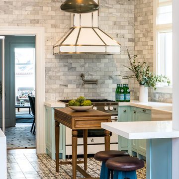
The client was just starting a new chapter in her life and moving from the East Bay to a railroad flat in San Francisco’s Cow Hollow neighborhood. She wanted a home that reflects her fun, youthful personality. This client loves the color pink and all things related to animals and the color palette is decidedly feminine throughout the home. For the kitchen we gave it a pop of her favorite teal color and paired it with walls full of Carrara marble. My goal was to have the kitchen not only reflect her personality but also give it a fresh, bright and high-style look that will look good for years to come.
Sponsored
Columbus, OH
Free consultation for landscape design!

Peabody Landscape Group
Columbus' Reliable Landscape Design & Contracting

 Aeris Home
My client decided to sell his house. Fantastic location, best schools in the area, minutes away from the ocean... All that was missing were signs of life and updated finishes. We instantly agreed on whites & greys; a free standing tub, double vanity, and long-lasting / easy-maintenance tile. We now have a clean white space that can be molded into anyone's perfect bath. White canvas gives opportunity to add color and drama. I call this "Baltic White" because sky reflections and tint in the shower glass cast just enough blue to remind me of snowy winters in Scandinavia. To demonstrate character, I staged with black accessories, a tribal rug and added warmth via walnut tub shelf. Candles and salt rock ground the airy feel and leave us with a balanced space that is as welcoming as it is elegant.
Photos - Hale Production Studios
 Aeris Home
My client decided to sell his house. Fantastic location, best schools in the area, minutes away from the ocean... All that was missing were signs of life and updated finishes. We instantly agreed on whites & greys; a free standing tub, double vanity, and long-lasting / easy-maintenance tile. We now have a clean white space that can be molded into anyone's perfect bath. White canvas gives opportunity to add color and drama. I call this "Baltic White" because sky reflections and tint in the shower glass cast just enough blue to remind me of snowy winters in Scandinavia. To demonstrate character, I staged with black accessories, a tribal rug and added warmth via walnut tub shelf. Candles and salt rock ground the airy feel and leave us with a balanced space that is as welcoming as it is elegant.
Photos - Hale Production Studios
 Signature Kitchen & Bath Design Inc.
This home was in the perfect neighborhood for this busy young family but the layout was all wrong! With a large formal dining room located in the front of the home and a small galley kitchen facing a narrow side yard, we quickly decided a shuffling was in order. Combining the small kitchen and family room with the large formal dining room allowed us to expand the kitchen and create a common area that every member of the family could enjoy. We selected a rich hardware floor to run throughout the space and contrasted that with crisp white cabinetry and a cool gray quartz countertop. A navy accent wall adds a pop of color in the kitchen area while a calm neutral unifies the rest of the common areas. A rustic dining table, pendant light fixtures, and farm style sink add a rustic element making the space feel relaxed and comfy for this casual family.
Photo by Brad Bidnick
Interior Design by Bennett Design Co.
 Aeris Home
My client decided to sell his house. Fantastic location, best schools in the area, minutes away from the ocean... All that was missing were signs of life and updated finishes. We instantly agreed on whites & greys; a free standing tub, double vanity, and long-lasting / easy-maintenance tile. We now have a clean white space that can be molded into anyone's perfect bath. White canvas gives opportunity to add color and drama. I call this "Baltic White" because sky reflections and tint in the shower glass cast just enough blue to remind me of snowy winters in Scandinavia. To demonstrate character, I staged with black accessories, a tribal rug and added warmth via walnut tub shelf. Candles and salt rock ground the airy feel and leave us with a balanced space that is as welcoming as it is elegant.
Photos - Hale Production Studios
 Aeris Home
My client decided to sell his house. Fantastic location, best schools in the area, minutes away from the ocean... All that was missing were signs of life and updated finishes. We instantly agreed on whites & greys; a free standing tub, double vanity, and long-lasting / easy-maintenance tile. We now have a clean white space that can be molded into anyone's perfect bath. White canvas gives opportunity to add color and drama. I call this "Baltic White" because sky reflections and tint in the shower glass cast just enough blue to remind me of snowy winters in Scandinavia. To demonstrate character, I staged with black accessories, a tribal rug and added warmth via walnut tub shelf. Candles and salt rock ground the airy feel and leave us with a balanced space that is as welcoming as it is elegant.
Photos - Hale Production Studios
 Drury Design
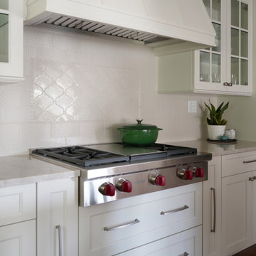
This house was 45 years old and the most recent kitchen update was past its due date.The idea was to refresh the space with a transitional design that leaned classic – something that would be elegant and comfortable. Something that would welcome and enhance natural light.
The objectives were:
-Keep things simple – classic, comfortable and easy to keep clean
-Cohesive design between the kitchen, family room, eating area and bar
-Comfortable walkways, especially between the island and sofa
-Get rid of the kitchen’s dated 3D vegetable tile and island top shaped like a painters pallet
Design challenges:
-Incorporate a structural beam so that it flows with the entire space
-Proper ventilation for the hood
-Update the floor finish to get rid of the ’90s red oak
Design solutions:
-After reviewing multiple design options we decided on keeping appliances in their existing locations
-Made the cabinet on the back wall deeper than standard to fit and conceal the exhaust vent within the crown molding space and provide proper ventilation for the rangetop
-Omitted the sink on the island because it was not being used
-Squared off the island to provide more seating and functionality
-Relocated the microwave from the wall to the island and fitted a warming drawer directly below
-Added a tray partition over the oven so that cookie sheets and cutting boards are easily accessible and neatly stored
-Omitted all the decorative fillers to make the kitchen feel current
-Detailed yet simple tile backsplash design to add interest
Refinished the already functional entertainment cabinetry to match new cabinets – good flow throughout area
Even though the appliances all stayed in the same locations, the cabinet finish created a dramatic change. This is a very large kitchen and the client embraces minimalist design so we decided to omit quite a few wall cabinets.


 Hawthorn Builders
Michael Patrick Lefebvre Photography
Transitional l-shaped medium tone wood floor kitchen photo in Boston with shaker cabinets, white cabinets, white backsplash, subway tile backsplash, paneled appliances, an island and gray countertops
Transitional l-shaped medium tone wood floor kitchen photo in Boston with shaker cabinets, white cabinets, white backsplash, subway tile backsplash, paneled appliances, an island and gray countertops
 BlueStar
 Grand Prize Winner Jaclyn Christensen, IDF Studio
Location: San Francisco, CA
Project Name: Pierce Street
The client was just starting a new chapter in her life and moving from the East Bay to a railroad flat in San Francisco’s Cow Hollow neighborhood. She wanted a home that reflects her fun, youthful personality. This client loves the color pink and all things related to animals and the color palette is decidedly feminine throughout the home. For the kitchen we gave it a pop of her favorite teal color and paired it with walls full of Carrara marble. My goal was to have the kitchen not only reflect her personality but also give it a fresh, bright and high-style look that will look good for years to come.
 The Design Gallery
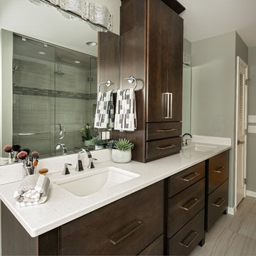
Not only was this a very long narrow room, the ceilings were low and the room felt dark and dreary even though there was a full wall of windows at one end of the room. We decided to eliminate the unnecessary tub and enlarge and move the shower to the original tub location. This allowed us to add additional storage by creating separate his and hers linen closets near the entrance of the room.
Deborah Scannell Photography, Interior Design - Dawn Driskill ASID
 Signature Kitchen & Bath Design Inc.
This home was in the perfect neighborhood for this busy young family but the layout was all wrong! With a large formal dining room located in the front of the home and a small galley kitchen facing a narrow side yard, we quickly decided a shuffling was in order. Combining the small kitchen and family room with the large formal dining room allowed us to expand the kitchen and create a common area that every member of the family could enjoy. We selected a rich hardware floor to run throughout the space and contrasted that with crisp white cabinetry and a cool gray quartz countertop. A navy accent wall adds a pop of color in the kitchen area while a calm neutral unifies the rest of the common areas. A rustic dining table, pendant light fixtures, and farm style sink add a rustic element making the space feel relaxed and comfy for this casual family.
Photo by Brad Bidnick
Interior Design by Bennett Design Co.
Sponsored
Columbus, OH
Free consultation for landscape design!
Peabody Landscape Group
Columbus' Reliable Landscape Design & Contracting
 Aeris Home
My client decided to sell his house. Fantastic location, best schools in the area, minutes away from the ocean... All that was missing were signs of life and updated finishes. We instantly agreed on whites & greys; a free standing tub, double vanity, and long-lasting / easy-maintenance tile. We now have a clean white space that can be molded into anyone's perfect bath. White canvas gives opportunity to add color and drama. I call this "Baltic White" because sky reflections and tint in the shower glass cast just enough blue to remind me of snowy winters in Scandinavia. To demonstrate character, I staged with black accessories, a tribal rug and added warmth via walnut tub shelf. Candles and salt rock ground the airy feel and leave us with a balanced space that is as welcoming as it is elegant.
Photos - Hale Production Studios
 Bianchi Design
These clients decided to make this home their Catalina Mountain homestead, after living abroad for many years. The prior yard enclosed only a small portion of their available property, and a wall obstructed their city lights view of northern Tucson. We expanded the yard outward to take advantage of the space and to also integrate the topography change into a 360 vanishing edge pool.
The home previously had log columns in keeping with a territorial motif. To bring it up to date, concrete cylindrical columns were put in their place, which allowed us to expand the shaded locations throughout the yard in an updated way, as seen by the new retractable canvas shade structures.
Constructed by Mike Rowland, you can see how well he pulled off the projects precise detailing of Bianchi's Design. Note the cantilevered concrete steps, the slot of fire in the midst of the spa, the stair treads that don't quite touch the adjacent walls, and the columns that float just above the pool water.
 Breathe Design Studio
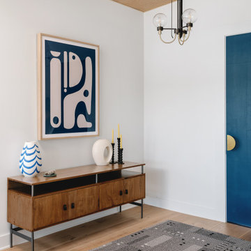
Our Austin studio decided to go bold with this project by ensuring that each space had a unique identity in the Mid-Century Modern style bathroom, butler's pantry, and mudroom. We covered the bathroom walls and flooring with stylish beige and yellow tile that was cleverly installed to look like two different patterns. The mint cabinet and pink vanity reflect the mid-century color palette. The stylish knobs and fittings add an extra splash of fun to the bathroom.
The butler's pantry is located right behind the kitchen and serves multiple functions like storage, a study area, and a bar. We went with a moody blue color for the cabinets and included a raw wood open shelf to give depth and warmth to the space. We went with some gorgeous artistic tiles that create a bold, intriguing look in the space.
In the mudroom, we used siding materials to create a shiplap effect to create warmth and texture – a homage to the classic Mid-Century Modern design. We used the same blue from the butler's pantry to create a cohesive effect. The large mint cabinets add a lighter touch to the space.
50