
Search results for "Deciding locations" in Home Design Ideas

 Aeris Home
My client decided to sell his house. Fantastic location, best schools in the area, minutes away from the ocean... All that was missing were signs of life and updated finishes. We instantly agreed on whites & greys; a free standing tub, double vanity, and long-lasting / easy-maintenance tile. We now have a clean white space that can be molded into anyone's perfect bath. White canvas gives opportunity to add color and drama. I call this "Baltic White" because sky reflections and tint in the shower glass cast just enough blue to remind me of snowy winters in Scandinavia. To demonstrate character, I staged with black accessories, a tribal rug and added warmth via walnut tub shelf. Candles and salt rock ground the airy feel and leave us with a balanced space that is as welcoming as it is elegant.
Photos - Hale Production Studios

 User
These clients wanted to update their older bungalow home as they had decided to stay in the beautiful location and renovate instead of moving. New furniture and a new layout for this design was the first step to take advantage of as much space as we could. Adding textures and colors, plus a wood-paneling look alike wallpaper was just the ticket to feel right at home. Drapery accented this large bay window and a new round dining table created a cozy atmosphere this family was looking for.
Photo Credit - Don Molyneaux

 Balboa Design Group
Our client's original kitchen lacked adequate storage and counter space. To create a more open flow from the living room to the kitchen, we decided to remove some walls and cabinets over the island, replacing with a ceiling-mount vent hood. We also incorporated an L-shaped counter along the north facing wall to maximize counter space and increase the amount of storage. The combination of custom gray distressed wood cabinetry and sparkling white quartzite countertops create a stunning atmosphere in this previously lackluster kitchen.
Find the right local pro for your project
 Ourso Designs
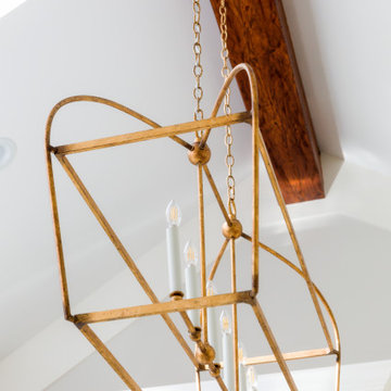
This client’s house had great bones to work with, but also had a few things that made their kitchen less functional. Their main issue with the space was that their cooktop was located on the island, and since the island wasn’t very big, it limited the amount of usable counterspace. Also, they had a microwave oven stack that was housed in a massive brick enclosure that also took up a lot of valuable space. In our design, we decided to replace the cooktop and oven with a gas range and relocated it to the back wall on the L. We also move the refrigerator to the wall opposite of the sink to create the perfect working triangle. All of the cabinetry to the right of the range serves as a dry bar with lots of storage including nice display storage for wine. Originally the house had a butler’s pass between the dining room and kitchen. We decided to transform this space by closing it in on both sides and creating a nice walk-in pantry, something the kitchen did not have before! We extended their island and added space for seating on one side. The kitchen has a beautiful vaulted ceiling that we added a beam to across the center. For materials, we chose a white and grey palette with some blue and wood tones. The backsplash is a beautiful marble mosaic with blue and grey. The countertops are luna plena quartzite, and we incorporated a custom wood wrap around the hood to match the beams. We are thrilled with how we were able to help transform this kitchen into a beautiful functional space.
 Ourso Designs
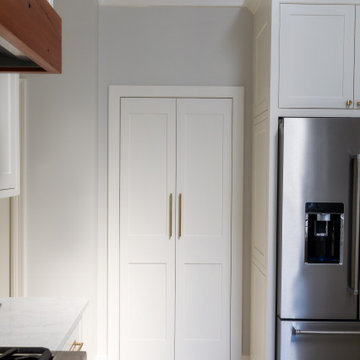
This client’s house had great bones to work with, but also had a few things that made their kitchen less functional. Their main issue with the space was that their cooktop was located on the island, and since the island wasn’t very big, it limited the amount of usable counterspace. Also, they had a microwave oven stack that was housed in a massive brick enclosure that also took up a lot of valuable space. In our design, we decided to replace the cooktop and oven with a gas range and relocated it to the back wall on the L. We also move the refrigerator to the wall opposite of the sink to create the perfect working triangle. All of the cabinetry to the right of the range serves as a dry bar with lots of storage including nice display storage for wine. Originally the house had a butler’s pass between the dining room and kitchen. We decided to transform this space by closing it in on both sides and creating a nice walk-in pantry, something the kitchen did not have before! We extended their island and added space for seating on one side. The kitchen has a beautiful vaulted ceiling that we added a beam to across the center. For materials, we chose a white and grey palette with some blue and wood tones. The backsplash is a beautiful marble mosaic with blue and grey. The countertops are luna plena quartzite, and we incorporated a custom wood wrap around the hood to match the beams. We are thrilled with how we were able to help transform this kitchen into a beautiful functional space.
 Ourso Designs
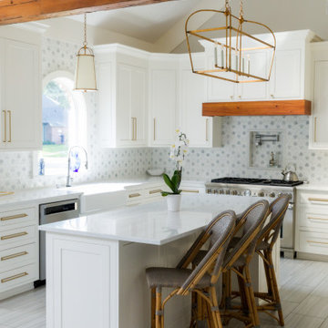
This client’s house had great bones to work with, but also had a few things that made their kitchen less functional. Their main issue with the space was that their cooktop was located on the island, and since the island wasn’t very big, it limited the amount of usable counterspace. Also, they had a microwave oven stack that was housed in a massive brick enclosure that also took up a lot of valuable space. In our design, we decided to replace the cooktop and oven with a gas range and relocated it to the back wall on the L. We also move the refrigerator to the wall opposite of the sink to create the perfect working triangle. All of the cabinetry to the right of the range serves as a dry bar with lots of storage including nice display storage for wine. Originally the house had a butler’s pass between the dining room and kitchen. We decided to transform this space by closing it in on both sides and creating a nice walk-in pantry, something the kitchen did not have before! We extended their island and added space for seating on one side. The kitchen has a beautiful vaulted ceiling that we added a beam to across the center. For materials, we chose a white and grey palette with some blue and wood tones. The backsplash is a beautiful marble mosaic with blue and grey. The countertops are luna plena quartzite, and we incorporated a custom wood wrap around the hood to match the beams. We are thrilled with how we were able to help transform this kitchen into a beautiful functional space.
 Ourso Designs
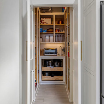
This client’s house had great bones to work with, but also had a few things that made their kitchen less functional. Their main issue with the space was that their cooktop was located on the island, and since the island wasn’t very big, it limited the amount of usable counterspace. Also, they had a microwave oven stack that was housed in a massive brick enclosure that also took up a lot of valuable space. In our design, we decided to replace the cooktop and oven with a gas range and relocated it to the back wall on the L. We also move the refrigerator to the wall opposite of the sink to create the perfect working triangle. All of the cabinetry to the right of the range serves as a dry bar with lots of storage including nice display storage for wine. Originally the house had a butler’s pass between the dining room and kitchen. We decided to transform this space by closing it in on both sides and creating a nice walk-in pantry, something the kitchen did not have before! We extended their island and added space for seating on one side. The kitchen has a beautiful vaulted ceiling that we added a beam to across the center. For materials, we chose a white and grey palette with some blue and wood tones. The backsplash is a beautiful marble mosaic with blue and grey. The countertops are luna plena quartzite, and we incorporated a custom wood wrap around the hood to match the beams. We are thrilled with how we were able to help transform this kitchen into a beautiful functional space.
Sponsored
Columbus, OH
Free consultation for landscape design!

Peabody Landscape Group
Franklin County's Reliable Landscape Design & Contracting
 O'Brien Harris LLC
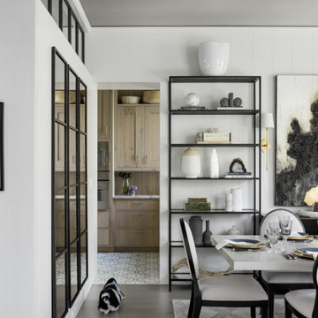
This project is new construction located in Hinsdale, Illinois. The scope included the kitchen, butler’s pantry, and mudroom. The clients are on the verge of being empty nesters and so they decided to right size. They came from a far more traditional home, and they were open to things outside of their comfort zone. O’Brien Harris Cabinetry in Chicago (OBH) collaborated on the project with the design team but especially with the builder from J. Jordan Homes. The architecture of this home is interesting and defined by large floor to ceiling windows. This created a challenge in the kitchen finding wall space for large appliances.
“In essence we only had one wall and so we chose to orient the cooking on that wall. That single wall is defined on the left by a window and on the right by the mudroom. That left us with another challenge – where to place the ovens and refrigerator. We then created a vertically clad wall disguising appliances which floats in between the kitchen and dining room”, says Laura O’Brien.
The room is defined by interior transom windows and a peninsula was created between the kitchen and the casual dining for separation but also for added storage. To keep it light and open a transparent brass and glass shelving was designed for dishes and glassware located above the peninsula.
The butler’s pantry is located behind the kitchen and between the dining room and a lg exterior window to front of the home. Its main function is to house additional appliances. The wall at the butler’s pantry portal was thickened to accommodate additional shelving for open storage. obrienharris.com

 San Luis Kitchen Co.
The owners of a charming home in the hills west of Paso Robles recently decided to remodel their not-so-charming kitchen. Referred to San Luis Kitchen by several of their friends, the homeowners visited our showroom and soon decided we were the best people to design a kitchen fitting the style of their home. We were delighted to get to work on the project right away.
When we arrived at the house, we found a small, cramped and out-dated kitchen. The ceiling was low, the cabinets old fashioned and painted a stark dead white, and the best view in the house was neglected in a seldom-used breakfast nook (sequestered behind the kitchen peninsula). This kitchen was also handicapped by white tile counters with dark grout, odd-sized and cluttered cabinets, and small ‘desk’ tacked on to the side of the oven cabinet. Due to a marked lack of counter space & inadequate storage the homeowner had resorted to keeping her small appliances on a little cart parked in the corner and the garbage was just sitting by the wall in full view of everything! On the plus side, the kitchen opened into a nice dining room and had beautiful saltillo tile floors.
Mrs. Homeowner loves to entertain and often hosts dinner parties for her friends. She enjoys visiting with her guests in the kitchen while putting the finishing touches on the evening’s meal. Sadly, her small kitchen really limited her interactions with her guests – she often felt left out of the mix at her own parties! This savvy homeowner dreamed big – a new kitchen that would accommodate multiple workstations, have space for guests to gather but not be in the way, and maybe a prettier transition from the kitchen to the dining (wine service area or hutch?) – while managing the remodel budget by reusing some of her major appliances and keeping (patching as needed) her existing floors.
Responding to the homeowner’s stated wish list and the opportunities presented by the home's setting and existing architecture, the designers at San Luis Kitchen decided to expand the kitchen into the breakfast nook. This change allowed the work area to be reoriented to take advantage of the great view – we replaced the existing window and added another while moving the door to gain space. A second sink and set of refrigerator drawers (housing fresh fruits & veggies) were included for the convenience of this mainly vegetarian cook – her prep station. The clean-up area now boasts a farmhouse style single bowl sink – adding to the ‘cottage’ charm. We located a new gas cook-top between the two workstations for easy access from each. Also tucked in here is a pullout trash/recycle cabinet for convenience and additional drawers for storage.
Running parallel to the work counter we added a long butcher-block island with easy-to-access open shelves for the avid cook and seating for friendly guests placed just right to take in the view. A counter-top garage is used to hide excess small appliances. Glass door cabinets and open shelves are now available to display the owners beautiful dishware. The microwave was placed inconspicuously on the end of the island facing the refrigerator – easy access for guests (and extraneous family members) to help themselves to drinks and snacks while staying out of the cook’s way.
We also moved the pantry storage away from the dining room (putting it on the far wall and closer to the work triangle) and added a furniture-like hutch in its place allowing the more formal dining area to flow seamlessly into the up-beat work area of the kitchen. This space is now also home (opposite wall) to an under counter wine refrigerator, a liquor cabinet and pretty glass door wall cabinet for stemware storage – meeting Mr. Homeowner’s desire for a bar service area.
And then the aesthetic: an old-world style country cottage theme. The homeowners wanted the kitchen to have a warm feel while still loving the look of white cabinetry. San Luis Kitchen melded country-casual knotty pine base cabinets with vintage hand-brushed creamy white wall cabinets to create the desired cottage look. We also added bead board and mullioned glass doors for charm, used an inset doorstyle on the cabinets for authenticity, and mixed stone and wood counters to create an eclectic nuance in the space. All in all, the happy homeowners now boast a charming county cottage kitchen with plenty of space for entertaining their guests while creating gourmet meals to feed them.
Credits:
Custom cabinetry by Wood-Mode Fine Custom Cabinetry
Contracting by Michael Pezzato of Lost Coast Construction
Stone counters by Pyramid M.T.M.
 TKS Design Group
Download our free ebook, Creating the Ideal Kitchen. DOWNLOAD NOW
Lakefront property in the northwest suburbs of Chicago is hard to come by, so when we were hired by this young family with exactly that, we were immediately inspired by not just the unusually large footprint of this 1950’s colonial revival but also the lovely views of the manmade lake it was sited on. The large 5-bedroom home was solidly stuck in the 1980’s, but we saw tons of potential. We started out by updating the existing staircase with a fresh coat of paint and adding new herringbone slate to the entry hall.
The powder room off the entryway also got a refresh - new flooring, new cabinets and fixtures. We ran the new slate right through into this space for some consistency. A fun wallpaper and shiplap trim add a welcoming feel and set the tone for the home.
Next, we tackled the kitchen. Located away from the rest of the first floor, the kitchen felt a little isolated, so we immediately began planning for how to better connect it to the rest of the first floor. We landed on removing the wall between the kitchen and dining room and designed a modified galley style space with separate cooking and clean up zones. The cooking zone consists of the refrigerator, prep sink and cooktop, along with a nice long run of prep space at the island. The cleanup side of the kitchen consists of the main sink and dishwasher. Both areas are situated so that the user can view the lake during prep work and cleanup!
One of the home’s main puzzles was how to incorporate the mudroom and area in front of the patio doors at the back of the house. We already had a breakfast table area, so the space by the patio doors was a bit of a no man’s land. We decided to separate the kitchen proper from what became the new mudroom with a large set of barn doors. That way you can quickly hide any mudroom messes but have easy access to the light coming in through the patio doors as well as the outdoor grilling station. We also love the impact the barn doors add to the overall space.
The homeowners’ first words to us were “it’s time to ditch the brown,” so we did! We chose a lovely blue pallet that reflects the home’s location on the lake which is also vibrant yet easy on the eye. Countertops are white quartz, and the natural oak floor works well with the other honey accents. The breakfast table was given a refresh with new chairs, chandelier and window treatments that frame the gorgeous views of the lake out the back.
We coordinated the slate mudroom flooring with that used in the home’s main entrance for a consistent feel. The storage area consists of open and closed storage to allow for some clutter control as needed.
Next on our “to do” list was revamping the dated brown bar area in the neighboring dining room. We eliminated the clutter by adding some closed cabinets and did some easy updates to help the space feel more current. One snag we ran into here was the discovery of a beam above the existing open shelving that had to be modified with a smaller structural beam to allow for our new design to work. This was an unexpected surprise, but in the end we think it was well worth it!
We kept the colors here a bit more muted to blend with the homeowner’s existing furnishings. Open shelving and polished nickel hardware add some simple detail to the new entertainment zone which also looks out onto the lake!
Next we tackled the upstairs starting with the homeowner’s son’s bath. The bath originally had both a tub shower and a separate shower, so we decided to swap out the shower for a new laundry area. This freed up some space downstairs in what used to be the mudroom/laundry room and is much more convenient for daily laundry needs.
We continued the blue palette here with navy cabinetry and the navy tile in the shower. Porcelain floor tile and chrome fixtures keep maintenance to a minimum while matte black mirrors and lighting add some depth the design. A low maintenance runner adds some warmth underfoot and ties the whole space together.
We added a pocket door to the bathroom to minimize interference with the door swings. The left door of the laundry closet is on a 180 degree hinge to allow for easy full access to the machines. Next we tackled the master bath which is an en suite arrangement. The original was typical of the 1980’s with the vanity outside of the bathroom, situated near the master closet. And the brown theme continued here with multiple shades of brown.
Our first move was to segment off the bath and the closet from the master bedroom. We created a short hall from the bedroom to the bathroom with his and hers walk-in closets on the left and right as well as a separate toilet closet outside of the main bathroom for privacy and flexibility.
The original bathroom had a giant soaking tub with steps (dangerous!) as well as a small shower that did not work well for our homeowner who is 6’3”. With other bathtubs in the home, they decided to eliminate the tub and create an oversized shower which takes up the space where the old tub was located. The double vanity is on the opposite wall and a bench is located under the window for morning conversations and a place to set a couple of towels.
The pallet in here is light and airy with a mix of blond wood, creamy porcelain and marble tile, and brass accents. A simple roman shade adds some texture and it’s top-down mechanism allows for light and privacy.
This large whole house remodel gave our homeowners not only the ability to maximize the potential of their home but also created a lovely new frame from which to view their fabulous lake views.
Designed by: Susan Klimala, CKD, CBD
Photography by: Michael Kaskel
For more information on kitchen and bath design ideas go to: www.kitchenstudio-ge.com
 Nicole Arnold Interiors
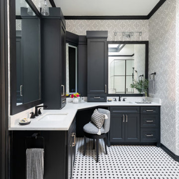
This quaint home, located in Plano’s prestigious Willow Bend Polo Club, underwent some super fun updates during our renovation and refurnishing project! The clients’ love for bright colors, mid-century modern elements, and bold looks led us to designing a black and white bathroom with black paned glass, colorful hues in the game room and bedrooms, and a sleek new “work from home” space for working in style. The clients love using their new spaces and have decided to let us continue designing these looks throughout additional areas in the home!

 Bianchi Design
These clients decided to make this home their Catalina Mountain homestead, after living abroad for many years. The prior yard enclosed only a small portion of their available property, and a wall obstructed their city lights view of northern Tucson. We expanded the yard outward to take advantage of the space and to also integrate the topography change into a 360 vanishing edge pool.
The home previously had log columns in keeping with a territorial motif. To bring it up to date, concrete cylindrical columns were put in their place, which allowed us to expand the shaded locations throughout the yard in an updated way, as seen by the new retractable canvas shade structures.
Constructed by Mike Rowland, you can see how well he pulled off the projects precise detailing of Bianchi's Design. Note the cantilevered concrete steps, the slot of fire in the midst of the spa, the stair treads that don't quite touch the adjacent walls, and the columns that float just above the pool water.
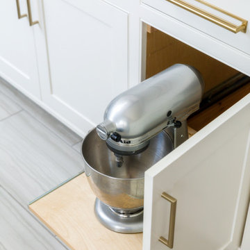 Ourso Designs
This client’s house had great bones to work with, but also had a few things that made their kitchen less functional. Their main issue with the space was that their cooktop was located on the island, and since the island wasn’t very big, it limited the amount of usable counterspace. Also, they had a microwave oven stack that was housed in a massive brick enclosure that also took up a lot of valuable space. In our design, we decided to replace the cooktop and oven with a gas range and relocated it to the back wall on the L. We also move the refrigerator to the wall opposite of the sink to create the perfect working triangle. All of the cabinetry to the right of the range serves as a dry bar with lots of storage including nice display storage for wine. Originally the house had a butler’s pass between the dining room and kitchen. We decided to transform this space by closing it in on both sides and creating a nice walk-in pantry, something the kitchen did not have before! We extended their island and added space for seating on one side. The kitchen has a beautiful vaulted ceiling that we added a beam to across the center. For materials, we chose a white and grey palette with some blue and wood tones. The backsplash is a beautiful marble mosaic with blue and grey. The countertops are luna plena quartzite, and we incorporated a custom wood wrap around the hood to match the beams. We are thrilled with how we were able to help transform this kitchen into a beautiful functional space.
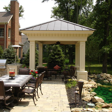
Sponsored
Columbus, OH
Free consultation for landscape design!
Peabody Landscape Group
Franklin County's Reliable Landscape Design & Contracting
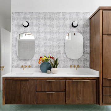
 Breathe Design Studio: San Francisco
Our Austin studio decided to go bold with this project by ensuring that each space had a unique identity in the Mid-Century Modern style bathroom, butler's pantry, and mudroom. We covered the bathroom walls and flooring with stylish beige and yellow tile that was cleverly installed to look like two different patterns. The mint cabinet and pink vanity reflect the mid-century color palette. The stylish knobs and fittings add an extra splash of fun to the bathroom.
The butler's pantry is located right behind the kitchen and serves multiple functions like storage, a study area, and a bar. We went with a moody blue color for the cabinets and included a raw wood open shelf to give depth and warmth to the space. We went with some gorgeous artistic tiles that create a bold, intriguing look in the space.
In the mudroom, we used siding materials to create a shiplap effect to create warmth and texture – a homage to the classic Mid-Century Modern design. We used the same blue from the butler's pantry to create a cohesive effect. The large mint cabinets add a lighter touch to the space.
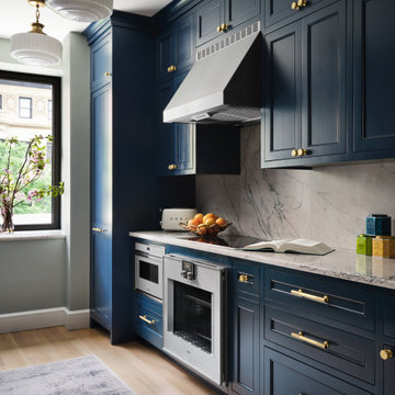
 Michele Bitter Designs
Late in the process, we decided the kitchen needed a refresh to match the rest of this gorgeous home! Custom cabinets in a deep blue complete the look!
 Ourso Designs
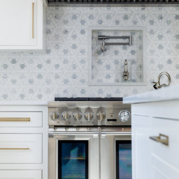
This client’s house had great bones to work with, but also had a few things that made their kitchen less functional. Their main issue with the space was that their cooktop was located on the island, and since the island wasn’t very big, it limited the amount of usable counterspace. Also, they had a microwave oven stack that was housed in a massive brick enclosure that also took up a lot of valuable space. In our design, we decided to replace the cooktop and oven with a gas range and relocated it to the back wall on the L. We also move the refrigerator to the wall opposite of the sink to create the perfect working triangle. All of the cabinetry to the right of the range serves as a dry bar with lots of storage including nice display storage for wine. Originally the house had a butler’s pass between the dining room and kitchen. We decided to transform this space by closing it in on both sides and creating a nice walk-in pantry, something the kitchen did not have before! We extended their island and added space for seating on one side. The kitchen has a beautiful vaulted ceiling that we added a beam to across the center. For materials, we chose a white and grey palette with some blue and wood tones. The backsplash is a beautiful marble mosaic with blue and grey. The countertops are luna plena quartzite, and we incorporated a custom wood wrap around the hood to match the beams. We are thrilled with how we were able to help transform this kitchen into a beautiful functional space.

 Custom Concepts Construction Inc.
This exterior transformation is located in Arlington, VA. The existing siding was Cedar. The home owner decided to replace their siding with James Hardie Fiber Cement Siding products. This modern/contemporary design is complimented by the Hardie panels in the Light Mist Color. The horizontal lap siding areas are in a 4",4",7" pattern in Hardie's Deep Ocean color. The lower level has the Hardie Sierra 8 panel installed in Boothbay Blue. All trim is Hardie Arctic White fiber cement trim.
Sponsored
Columbus, OH

Hope Restoration & General Contracting
Columbus Design-Build, Kitchen & Bath Remodeling, Historic Renovations

 Studio Design Elements
Take It Digital
Mid-sized elegant master beige tile and stone tile porcelain tile freestanding bathtub photo in Atlanta with beige walls and an undermount sink
Mid-sized elegant master beige tile and stone tile porcelain tile freestanding bathtub photo in Atlanta with beige walls and an undermount sink
 Breathe Design Studio
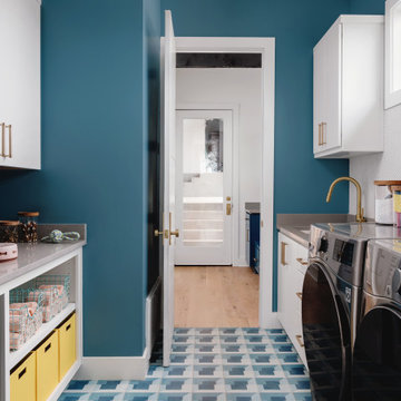
Our Austin studio decided to go bold with this project by ensuring that each space had a unique identity in the Mid-Century Modern style bathroom, butler's pantry, and mudroom. We covered the bathroom walls and flooring with stylish beige and yellow tile that was cleverly installed to look like two different patterns. The mint cabinet and pink vanity reflect the mid-century color palette. The stylish knobs and fittings add an extra splash of fun to the bathroom.
The butler's pantry is located right behind the kitchen and serves multiple functions like storage, a study area, and a bar. We went with a moody blue color for the cabinets and included a raw wood open shelf to give depth and warmth to the space. We went with some gorgeous artistic tiles that create a bold, intriguing look in the space.
In the mudroom, we used siding materials to create a shiplap effect to create warmth and texture – a homage to the classic Mid-Century Modern design. We used the same blue from the butler's pantry to create a cohesive effect. The large mint cabinets add a lighter touch to the space.

 Carolyn Reyes
Photo: Carolyn Reyes © 2016 Houzz
Design: Kelly Mack Home
Example of an eclectic living room design in Los Angeles
Example of an eclectic living room design in Los Angeles
53