
Search results for "Deciding" in Home Design Ideas

 Leicht Toronto
Astounding LEICHT open concept kitchen that displays the benefit of a high contrast space. Our matte Bondi-C cabinetry is paired up with Orlando stone oak to bring in texture and balance the contrast. This design utilizes the space by it’s U-shaped layout and a small island at the center for extra counter space. In addition, to the stainless steal appliances that are seamlessly integrated into the design.

 Rikki Snyder
Photo: Rikki Snyder © 2013 Houzz
Example of an eclectic medium tone wood floor family room design in New York with green walls
Example of an eclectic medium tone wood floor family room design in New York with green walls

 cityhomeCOLLECTIVE
Kids room. 100% designed around these Herman Miller yearly picnic posters. The client already had one, so we decided to get a bunch more and go big with those. It's a basement - so dark walls would have felt too heavy. We decided to break the paint 1/3 of the way up the wall. This is 100% a kids space - bright, cozy, and welcoming.
Find the right local pro for your project

 Interiors For Modern Living
Photography by: Bob Jansons H&H Productions
Home office - contemporary built-in desk bamboo floor home office idea in San Francisco with beige walls
Home office - contemporary built-in desk bamboo floor home office idea in San Francisco with beige walls

 Advance Design Studio, Ltd.
When this suburban family decided to renovate their kitchen, they knew that they wanted a little more space. Advance Design worked together with the homeowner to design a kitchen that would work for a large family who loved to gather regularly and always ended up in the kitchen! So the project began with extending out an exterior wall to accommodate a larger island and more moving-around space between the island and the perimeter cabinetry.
Style was important to the cook, who began collecting accessories and photos of the look she loved for months prior to the project design. She was drawn to the brightness of whites and grays, and the design accentuated this color palette brilliantly with the incorporation of a warm shade of brown woods that originated from a dining room table that was a family favorite. Classic gray and white cabinetry from Dura Supreme hits the mark creating a perfect balance between bright and subdued. Hints of gray appear in the bead board detail peeking just behind glass doors, and in the application of the handsome floating wood shelves between cabinets. White subway tile is made extra interesting with the application of dark gray grout lines causing it to be a subtle but noticeable detail worthy of attention.
Suede quartz Silestone graces the countertops with a soft matte hint of color that contrasts nicely with the presence of white painted cabinetry finished smartly with the brightness of a milky white farm sink. Old melds nicely with new, as antique bronze accents are sprinkled throughout hardware and fixtures, and work together unassumingly with the sleekness of stainless steel appliances.
The grace and timelessness of this sparkling new kitchen maintains the charm and character of a space that has seen generations past. And now this family will enjoy this new space for many more generations to come in the future with the help of the team at Advance Design Studio.
Dura Supreme Cabinetry
Photographer: Joe Nowak

 Court Atkins Group
Inspiration for a mid-sized timeless single-wall dark wood floor dedicated laundry room remodel in Charleston with open cabinets, medium tone wood cabinets, wood countertops, white walls and a side-by-side washer/dryer
 Flooret
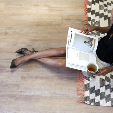
Discerning, intelligent, European. A staff favorite, Noret captures the depth of color and texture that is expected with premium European Oak. A slight tan with a whitewash brush, Noret provides a luxurious template for any refined space.
The most important specification for determining the durability of vinyl flooring is the thickness of the wear-layer. The best wear-layers are made of thick, clear virgin PVC, which covers the paper print-film that gives the floor its unique appearance. Once the wear-layer wears through, the paper is damaged and the floor will need replacement.
Most vinyl floors come with a 8-12 mil wear-layer (0.2-3 mm). The top commercial specs in the industry are higher, at 20-22 mil (0.5 mm). A select few manufacturers offer a “super” commercial spec of 28 mil (0.7 mm).
For Modin, we decided to set a new standard: 40 mil (1.0 mm) of premium virgin PVC. This allows us to offer an industry-leading 20 year Commercial Warranty (Lifetime Residential), compared to nearly all other commercial vinyl floors’ 10 year Commercial Warranty.
Beyond our superior wear-layer, we also use a patented click mechanism for superior hold, and a ceramic-bead coating.
SIZE MATTERS
Wider and longer planks create a sense of space and luxury. Most vinyl floors come in 6” or 7” widths, and 36” or 48” lengths.
For Modin, we designed our planks to be 9” wide, and 60” long. This extra large size allows our gorgeous designs to be fully expressed.
DETAILS THAT COUNT
We made sure to get all the details right. Real texture, to create the feel of wire-brushed wood. Low sheen level, to ensure a natural look that wears well over time. 4-sided bevels, to more accurately emulate the look of real planks. When added together they help create the unique look that is Modin.
DESIGNS THAT INSPIRE
We spent nearly a year just focusing on our designs, to ensure they provide the right mix of color and depth. Focusing on timeless wire-brush and European Oak styles, as well as more contemporary modern washes, our collection offers truly beautiful design that is both functional and inspiring.
Sponsored
Columbus, OH

Hope Restoration & General Contracting
Columbus Design-Build, Kitchen & Bath Remodeling, Historic Renovations


 Reno Advisors
Photographer: Ken Brown
Mid-sized craftsman green two-story mixed siding exterior home idea in Calgary
Mid-sized craftsman green two-story mixed siding exterior home idea in Calgary

 Wow Great Place
This area had been previously unused, and was a bare wall on the way through to the bedroom. We decided to make it a dedicated dressing table for the homeowner, as the bathroom did not have enough room for all her hair and make-up and jewellery requirements!

 Asher Seaton Homes
INTERIOR
---
-Two-zone heating and cooling system results in higher energy efficiency and quicker warming/cooling times
-Fiberglass and 3.5” spray foam insulation that exceeds industry standards
-Sophisticated hardwood flooring, engineered for an elevated design aesthetic, greater sustainability, and the highest green-build rating, with a 25-year warranty
-Custom cabinetry made from solid wood and plywood for sustainable, quality cabinets in the kitchen and bathroom vanities
-Fisher & Paykel DCS Professional Grade home appliances offer a chef-quality cooking experience everyday
-Designer's choice quartz countertops offer both a luxurious look and excellent durability
-Danze plumbing fixtures throughout the home provide unparalleled quality
-DXV luxury single-piece toilets with significantly higher ratings than typical builder-grade toilets
-Lighting fixtures by Matteo Lighting, a premier lighting company known for its sophisticated and contemporary designs
-All interior paint is designer grade by Benjamin Moore
-Locally sourced and produced, custom-made interior wooden doors with glass inserts
-Spa-style mater bath featuring Italian designer tile and heated flooring
-Lower level flex room plumbed and wired for a secondary kitchen - au pair quarters, expanded generational family space, entertainment floor - you decide!
-Electric car charging


 ODS Architecture
Atherton has many large substantial homes - our clients purchased an existing home on a one acre flag-shaped lot and asked us to design a new dream home for them. The result is a new 7,000 square foot four-building complex consisting of the main house, six-car garage with two car lifts, pool house with a full one bedroom residence inside, and a separate home office /work out gym studio building. A fifty-foot swimming pool was also created with fully landscaped yards.
Given the rectangular shape of the lot, it was decided to angle the house to incoming visitors slightly so as to more dramatically present itself. The house became a classic u-shaped home but Feng Shui design principals were employed directing the placement of the pool house to better contain the energy flow on the site. The main house entry door is then aligned with a special Japanese red maple at the end of a long visual axis at the rear of the site. These angles and alignments set up everything else about the house design and layout, and views from various rooms allow you to see into virtually every space tracking movements of others in the home.
The residence is simply divided into two wings of public use, kitchen and family room, and the other wing of bedrooms, connected by the living and dining great room. Function drove the exterior form of windows and solid walls with a line of clerestory windows which bring light into the middle of the large home. Extensive sun shadow studies with 3D tree modeling led to the unorthodox placement of the pool to the north of the home, but tree shadow tracking showed this to be the sunniest area during the entire year.
Sustainable measures included a full 7.1kW solar photovoltaic array technically making the house off the grid, and arranged so that no panels are visible from the property. A large 16,000 gallon rainwater catchment system consisting of tanks buried below grade was installed. The home is California GreenPoint rated and also features sealed roof soffits and a sealed crawlspace without the usual venting. A whole house computer automation system with server room was installed as well. Heating and cooling utilize hot water radiant heated concrete and wood floors supplemented by heat pump generated heating and cooling.
A compound of buildings created to form balanced relationships between each other, this home is about circulation, light and a balance of form and function. Photo by Philip Liang Photography.
Sponsored
Columbus, OH
Hope Restoration & General Contracting
Columbus Design-Build, Kitchen & Bath Remodeling, Historic Renovations

 Sport Court Central FL & Tampa Bay
This is the ultimate backyard!
Customer first purchased a putting green. He liked it so much that decided to purchase a Sport Court as well!
Sport Court 60'x32' Putting Green 25'x12' + Fringe/Chipping
James Kach


 Caroline Sharpnack
Photo: Caroline Sharpnack © 2019 Houzz
Cottage chic freestanding desk dark wood floor home studio photo in Nashville with white walls and no fireplace
Cottage chic freestanding desk dark wood floor home studio photo in Nashville with white walls and no fireplace


 TKS Design Group
Free ebook, Creating the Ideal Kitchen. DOWNLOAD NOW
Our clients had been in their home since the early 1980’s and decided it was time for some updates. We took on the kitchen, two bathrooms and a powder room.
The layout in the kitchen was functional for them, so we kept that pretty much as is. Our client wanted a contemporary-leaning transitional look — nice clean lines with a gray and white palette. Light gray cabinets with a slightly darker gray subway tile keep the northern exposure light and airy. They also purchased some new furniture for their breakfast room and adjoining family room, so the whole space looks completely styled and new. The light fixtures are staggered and give a nice rhythm to the otherwise serene feel.
The homeowners were not 100% sold on the flooring choice for little powder room off the kitchen when I first showed it, but now they think it is one of the most interesting features of the design. I always try to “push” my clients a little bit because that’s when things can get really fun and this is what you are paying for after all, ideas that you may not come up with on your own.
We also worked on the two upstairs bathrooms. We started first on the hall bath which was basically just in need of a face lift. The floor is porcelain tile made to look like carrera marble. The vanity is white Shaker doors fitted with a white quartz top. We re-glazed the cast iron tub.
The master bath was a tub to shower conversion. We used a wood look porcelain plank on the main floor along with a Kohler Tailored vanity. The custom shower has a barn door shower door, and vinyl wallpaper in the sink area gives a rich textured look to the space. Overall, it’s a pretty sophisticated look for its smaller fooprint.
Designed by: Susan Klimala, CKD, CBD
Photography by: Michael Alan Kaskel
For more information on kitchen and bath design ideas go to: www.kitchenstudio-ge.com

 Interiors by Natasha
I was hired by the parents of a soon-to-be teenage girl turning 13 years-old. They wanted to remodel her bedroom from a young girls room to a teenage room. This project was a joy and a dream to work on! I got the opportunity to channel my inner child. I wanted to design a space that she would love to sleep in, entertain, hangout, do homework, and lounge in.
The first step was to interview her so that she would feel like she was a part of the process and the decision making. I asked her what was her favorite color, what was her favorite print, her favorite hobbies, if there was anything in her room she wanted to keep, and her style.
The second step was to go shopping with her and once that process started she was thrilled. One of the challenges for me was making sure I was able to give her everything she wanted. The other challenge was incorporating her favorite pattern-- zebra print. I decided to bring it into the room in small accent pieces where it was previously the dominant pattern throughout her room. The color palette went from light pink to her favorite color teal with pops of fuchsia. I wanted to make the ceiling a part of the design so I painted it a deep teal and added a beautiful teal glass and crystal chandelier to highlight it. Her room became a private oasis away from her parents where she could escape to. In the end we gave her everything she wanted.
Photography by Haigwood Studios
125