
Search results for "Decision focused creative" in Home Design Ideas
 Dynamic Garage Door
Getting your homeowner's association board to approve your new custom garage doors can seem daunting. Dynamic Garage Door as a custom design and manufacturing firm has come across this situation quite frequently with a phenomenal success approval rate!
In order to get approval for your custom garage door approval there are a few basic points you must understand. First off, your HOA is committed to preserving the neighborhood's curb appeal integrity by focusing on the impact your new custom garage doors might have on your house and the houses of your neighbors. It is important to understand that your curb appeal decisions will impact your home and neighborhood alike. Too many companies offer semi-custom wood doors without the true understanding of the client's need and the essence of their home's architectural style. The garage door design you choose needs to comply with neighborhood regulations while complement your home's architecture. At Dynamic Garage Door, our designers are well-rounded in the garage door industry and so we can suggest or develop designs that will reinforce the natural appearance of your home's style. If you can prove to your HOA that you've done your homework and that the garage door design you chose will complement not only your home but the neighborhood you'll be surprised when your proposal is marked with the approval stamp!
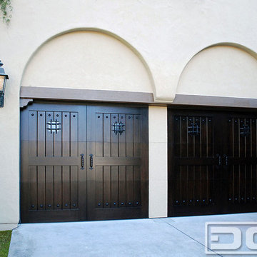
This garage door is actually a single double-car door not two as it appears. The reason is that this garage used to have two separate doors with a post in the middle. The post in the middle made it difficult to use the garage on a daily basis so the post was removed to facilitate the use of the garage. The HOA wasn't too happy about the removal of the post as it was an essential part of the arches located right above the garage doors. You can clearly see how that would have been disruptive if the homeowner went with a regular wood door and not one custom designed and manufactured by Dynamic Garage Door.
This garage door was specifically designed to address the HOA's concern about the center post removal and the effect it would have on the curb appeal of the home with the incomplete double arch look. So we addressed this by crafting the door with a false center post in the middle that was textured and painted the same color of the house to give off that illusion that the post is still there. Overall, it gives the home a complete finished appearance with two independent-looking doors and original post. The homeowner got the entire width of the opening to use at the push of a button so having a larger car won't be a problem anymore. The neighbors are all happy and no one seems to notice the center post is actually fake!
Got an interesting garage door project you want our designers to review and price out for you? Give us a call at (855) 343-DOOR
 Rivington Marx Interiors
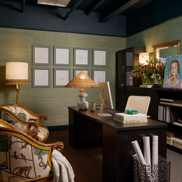
This thoughtfully designed office by Rivington Marx Interiors blends creative warmth with everyday functionality. Soft green grasscloth walls provide a textured, calming backdrop for a curated grid of framed artwork, while dark wood furnishings ground the space with a sense of purpose and polish. Character-rich lamps and warm accent lighting soften the industrial ceiling elements above, striking a balance between tailored and inviting. Vintage-inspired and custom upholstered seating, meaningful art, and carefully chosen accessories give the room a collected, lived-in feel. Designed to support focus, creativity, and conversation, this workspace reflect the Denver interior design studio’s signature approach to intelligent, character-driven design.
 4GK Construction Inc.
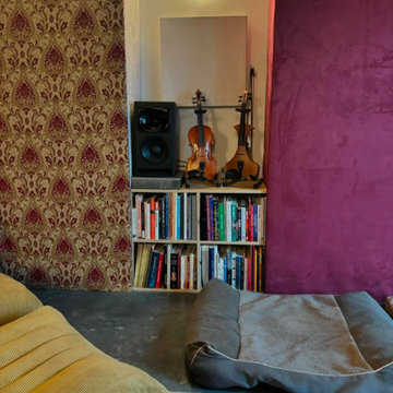
This studio is more than a recording room — it's a highly functional, artist-forward space built for deep focus, creative energy, and full-spectrum sound.
Find the right local pro for your project

 apartmentjeanie
creative & cheap jewelry displays can be found at the art or hardware store.
photo: Rikki Snyder
Bedroom - eclectic bedroom idea in New York
Bedroom - eclectic bedroom idea in New York
 Jennifer Gardner Design
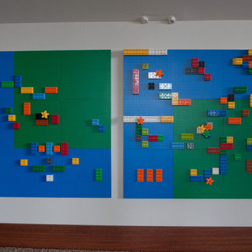
The goal for this light filled finished attic was to create a play space where two young boys could nurture and develop their creative and imaginative selves. A neutral tone was selected for the walls as a foundation for the bright pops of color added in furnishings, area rug and accessories throughout the room. We took advantage of the room’s interesting angles and created a custom chalk board that followed the lines of the ceiling. Magnetic circles from Land of Nod add a playful pop of color and perfect spot for magnetic wall play. A ‘Space Room’ behind the bike print fabric curtain is a favorite hideaway with a glow in the dark star filled ceiling and a custom litebrite wall. Custom Lego baseplate removable wall boards were designed and built to create a Flexible Lego Wall. The family was interested in the concept of a Lego wall but wanted to keep the space flexible for the future. The boards (designed by Jennifer Gardner Design) can be moved to the floor for Lego play and then easily hung back on the wall with a cleat system to display their 3-dimensional Lego creations! This room was great fun to design and we hope it will provide creative and imaginative play inspiration in the years to come!
Designed by: Jennifer Gardner Design
Photography by: Marcella Winspear
 Fluidesign Studio
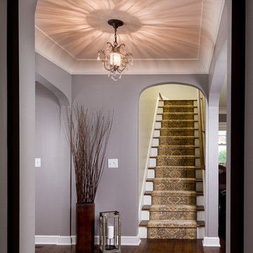
Building Design, Plans (in collaboration with Orfield Drafting), and Interior Finishes by: Fluidesign Studio I Builder & Creative Collaborator : Anchor Builders I Photographer: sethbennphoto.com
 ZeroEnergy Design
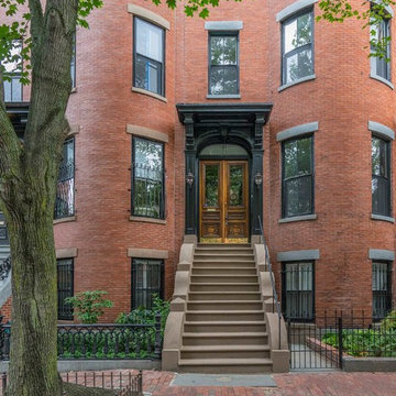
This renovated brick rowhome in Boston’s South End offers a modern aesthetic within a historic structure, creative use of space, exceptional thermal comfort, a reduced carbon footprint, and a passive stream of income.
DESIGN PRIORITIES. The goals for the project were clear - design the primary unit to accommodate the family’s modern lifestyle, rework the layout to create a desirable rental unit, improve thermal comfort and introduce a modern aesthetic. We designed the street-level entry as a shared entrance for both the primary and rental unit. The family uses it as their everyday entrance - we planned for bike storage and an open mudroom with bench and shoe storage to facilitate the change from shoes to slippers or bare feet as they enter their home. On the main level, we expanded the kitchen into the dining room to create an eat-in space with generous counter space and storage, as well as a comfortable connection to the living space. The second floor serves as master suite for the couple - a bedroom with a walk-in-closet and ensuite bathroom, and an adjacent study, with refinished original pumpkin pine floors. The upper floor, aside from a guest bedroom, is the child's domain with interconnected spaces for sleeping, work and play. In the play space, which can be separated from the work space with new translucent sliding doors, we incorporated recreational features inspired by adventurous and competitive television shows, at their son’s request.
MODERN MEETS TRADITIONAL. We left the historic front facade of the building largely unchanged - the security bars were removed from the windows and the single pane windows were replaced with higher performing historic replicas. We designed the interior and rear facade with a vision of warm modernism, weaving in the notable period features. Each element was either restored or reinterpreted to blend with the modern aesthetic. The detailed ceiling in the living space, for example, has a new matte monochromatic finish, and the wood stairs are covered in a dark grey floor paint, whereas the mahogany doors were simply refinished. New wide plank wood flooring with a neutral finish, floor-to-ceiling casework, and bold splashes of color in wall paint and tile, and oversized high-performance windows (on the rear facade) round out the modern aesthetic.
RENTAL INCOME. The existing rowhome was zoned for a 2-family dwelling but included an undesirable, single-floor studio apartment at the garden level with low ceiling heights and questionable emergency egress. In order to increase the quality and quantity of space in the rental unit, we reimagined it as a two-floor, 1 or 2 bedroom, 2 bathroom apartment with a modern aesthetic, increased ceiling height on the lowest level and provided an in-unit washer/dryer. The apartment was listed with Jackie O'Connor Real Estate and rented immediately, providing the owners with a source of passive income.
ENCLOSURE WITH BENEFITS. The homeowners sought a minimal carbon footprint, enabled by their urban location and lifestyle decisions, paired with the benefits of a high-performance home. The extent of the renovation allowed us to implement a deep energy retrofit (DER) to address air tightness, insulation, and high-performance windows. The historic front facade is insulated from the interior, while the rear facade is insulated on the exterior. Together with these building enclosure improvements, we designed an HVAC system comprised of continuous fresh air ventilation, and an efficient, all-electric heating and cooling system to decouple the house from natural gas. This strategy provides optimal thermal comfort and indoor air quality, improved acoustic isolation from street noise and neighbors, as well as a further reduced carbon footprint. We also took measures to prepare the roof for future solar panels, for when the South End neighborhood’s aging electrical infrastructure is upgraded to allow them.
URBAN LIVING. The desirable neighborhood location allows the both the homeowners and tenant to walk, bike, and use public transportation to access the city, while each charging their respective plug-in electric cars behind the building to travel greater distances.
OVERALL. The understated rowhouse is now ready for another century of urban living, offering the owners comfort and convenience as they live life as an expression of their values.
 Creative Surfaces Countertops & Tile
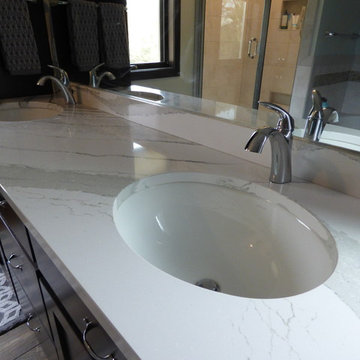
This new home near Crofton, NE was essentially designed by the homeowner herself. She wanted white to be the focus of her new kitchen and after a little bit of research she knew Cambria carried the best selection of white countertop designs. Her home features Cambria Ella in the large galley style kitchen on her island and perimeter which is accented with her slate appliances. The white farmhouse sink gives her kitchen a little bit of that country charm. So that the home was not white throughout she incorporated dark cabinetry in the bathrooms. A small powder bath on the main level features a Cambria Minera countertop; the master bath vanity countertops are Cambria Brittanicca and the children's bathroom showcases Cambria Berwyn. The home office brings some masculinity into the home with dark wood cabinets and Cambria Laneshaw.
 TVL Creative Ltd.
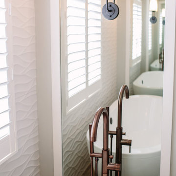
This master bathroom renovation transforms a builder-grade standard into a personalized retreat for our lovely Stapleton clients. Recognizing a need for change, our clients called on us to help develop a space that would capture their aesthetic loves and foster relaxation. Our design focused on establishing an airy and grounded feel by pairing various shades of white, natural wood, and dynamic textures. We replaced the existing ceramic floor tile with wood-look porcelain tile for a warm and inviting look throughout the space. We then paired this with a reclaimed apothecary vanity from Restoration Hardware. This vanity is coupled with a bright Caesarstone countertop and warm bronze faucets from Delta to create a strikingly handsome balance. The vanity mirrors are custom-sized and trimmed with a coordinating bronze frame. Elegant wall sconces dance between the dark vanity mirrors and bright white full height mirrors flanking the bathtub. The tub itself is an oversized freestanding bathtub paired with a tall bronze tub filler. We've created a feature wall with Tile Bar's Billowy Clouds ceramic tile floor to ceiling behind the tub. The wave-like movement of the tiles offers a dramatic texture in a pure white field. We removed the existing shower and extended its depth to create a large new shower. The walls are tiled with a large format high gloss white tile. The shower floor is tiled with marble circles in varying sizes that offer a playful aesthetic in an otherwise minimalist space. We love this pure, airy retreat and are thrilled that our clients get to enjoy it for many years to come!
 Amazing Spaces
We started with a blank slate on this basement project where our only obstacles were exposed steel support columns, existing plumbing risers from the concrete slab, and dropped soffits concealing ductwork on the ceiling. It had the advantage of tall ceilings, an existing egress window, and a sliding door leading to a newly constructed patio.
This family of five loves the beach and frequents summer beach resorts in the Northeast. Bringing that aesthetic home to enjoy all year long was the inspiration for the décor, as well as creating a family-friendly space for entertaining.
Wish list items included room for a billiard table, wet bar, game table, family room, guest bedroom, full bathroom, space for a treadmill and closed storage. The existing structural elements helped to define how best to organize the basement. For instance, we knew we wanted to connect the bar area and billiards table with the patio in order to create an indoor/outdoor entertaining space. It made sense to use the egress window for the guest bedroom for both safety and natural light. The bedroom also would be adjacent to the plumbing risers for easy access to the new bathroom. Since the primary focus of the family room would be for TV viewing, natural light did not need to filter into that space. We made sure to hide the columns inside of newly constructed walls and dropped additional soffits where needed to make the ceiling mechanicals feel less random.
In addition to the beach vibe, the homeowner has valuable sports memorabilia that was to be prominently displayed including two seats from the original Yankee stadium.
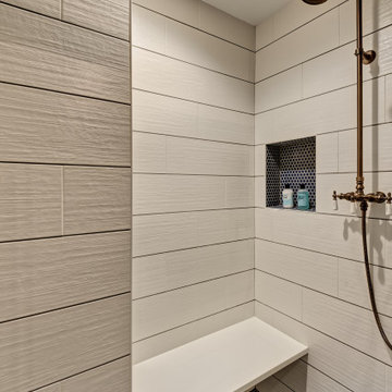
For a coastal feel, shiplap is used on two walls of the family room area. In the bathroom shiplap is used again in a more creative way using wood grain white porcelain tile as the horizontal shiplap “wood”. We connected the tile horizontally with vertical white grout joints and mimicked the horizontal shadow line with dark grey grout. At first glance it looks like we wrapped the shower with real wood shiplap. Materials including a blue and white patterned floor, blue penny tiles and a natural wood vanity checked the list for that seaside feel.
A large reclaimed wood door on an exposed sliding barn track separates the family room from the game room where reclaimed beams are punctuated with cable lighting. Cabinetry and a beverage refrigerator are tucked behind the rolling bar cabinet (that doubles as a Blackjack table!). A TV and upright video arcade machine round-out the entertainment in the room. Bar stools, two rotating club chairs, and large square poufs along with the Yankee Stadium seats provide fun places to sit while having a drink, watching billiards or a game on the TV.
Signed baseballs can be found behind the bar, adjacent to the billiard table, and on specially designed display shelves next to the poker table in the family room.
Thoughtful touches like the surfboards, signage, photographs and accessories make a visitor feel like they are on vacation at a well-appointed beach resort without being cliché.
 ZeroEnergy Design
This renovated brick rowhome in Boston’s South End offers a modern aesthetic within a historic structure, creative use of space, exceptional thermal comfort, a reduced carbon footprint, and a passive stream of income.
DESIGN PRIORITIES. The goals for the project were clear - design the primary unit to accommodate the family’s modern lifestyle, rework the layout to create a desirable rental unit, improve thermal comfort and introduce a modern aesthetic. We designed the street-level entry as a shared entrance for both the primary and rental unit. The family uses it as their everyday entrance - we planned for bike storage and an open mudroom with bench and shoe storage to facilitate the change from shoes to slippers or bare feet as they enter their home. On the main level, we expanded the kitchen into the dining room to create an eat-in space with generous counter space and storage, as well as a comfortable connection to the living space. The second floor serves as master suite for the couple - a bedroom with a walk-in-closet and ensuite bathroom, and an adjacent study, with refinished original pumpkin pine floors. The upper floor, aside from a guest bedroom, is the child's domain with interconnected spaces for sleeping, work and play. In the play space, which can be separated from the work space with new translucent sliding doors, we incorporated recreational features inspired by adventurous and competitive television shows, at their son’s request.
MODERN MEETS TRADITIONAL. We left the historic front facade of the building largely unchanged - the security bars were removed from the windows and the single pane windows were replaced with higher performing historic replicas. We designed the interior and rear facade with a vision of warm modernism, weaving in the notable period features. Each element was either restored or reinterpreted to blend with the modern aesthetic. The detailed ceiling in the living space, for example, has a new matte monochromatic finish, and the wood stairs are covered in a dark grey floor paint, whereas the mahogany doors were simply refinished. New wide plank wood flooring with a neutral finish, floor-to-ceiling casework, and bold splashes of color in wall paint and tile, and oversized high-performance windows (on the rear facade) round out the modern aesthetic.
RENTAL INCOME. The existing rowhome was zoned for a 2-family dwelling but included an undesirable, single-floor studio apartment at the garden level with low ceiling heights and questionable emergency egress. In order to increase the quality and quantity of space in the rental unit, we reimagined it as a two-floor, 1 or 2 bedroom, 2 bathroom apartment with a modern aesthetic, increased ceiling height on the lowest level and provided an in-unit washer/dryer. The apartment was listed with Jackie O'Connor Real Estate and rented immediately, providing the owners with a source of passive income.
ENCLOSURE WITH BENEFITS. The homeowners sought a minimal carbon footprint, enabled by their urban location and lifestyle decisions, paired with the benefits of a high-performance home. The extent of the renovation allowed us to implement a deep energy retrofit (DER) to address air tightness, insulation, and high-performance windows. The historic front facade is insulated from the interior, while the rear facade is insulated on the exterior. Together with these building enclosure improvements, we designed an HVAC system comprised of continuous fresh air ventilation, and an efficient, all-electric heating and cooling system to decouple the house from natural gas. This strategy provides optimal thermal comfort and indoor air quality, improved acoustic isolation from street noise and neighbors, as well as a further reduced carbon footprint. We also took measures to prepare the roof for future solar panels, for when the South End neighborhood’s aging electrical infrastructure is upgraded to allow them.
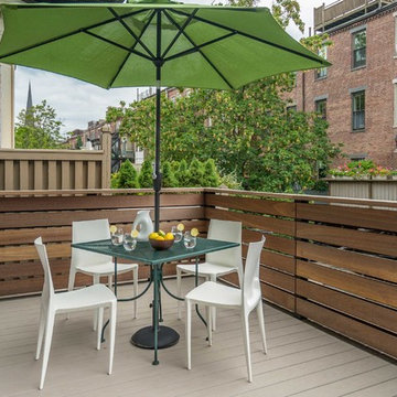
URBAN LIVING. The desirable neighborhood location allows the both the homeowners and tenant to walk, bike, and use public transportation to access the city, while each charging their respective plug-in electric cars behind the building to travel greater distances.
OVERALL. The understated rowhouse is now ready for another century of urban living, offering the owners comfort and convenience as they live life as an expression of their values.
Photography: Eric Roth Photo
 Kathleen Jennison
An Arts & Crafts Bungalow is one of my favorite styles of homes. We have quite a few of them in our Stockton Mid-Town area. And when C&L called us to help them remodel their 1923 American Bungalow, I was beyond thrilled.
As per usual, when we get a new inquiry, we quickly Google the project location while we are talking to you on the phone. My excitement escalated when I saw the Google Earth Image of the sweet Sage Green bungalow in Mid-Town Stockton. "Yes, we would be interested in working with you," I said trying to keep my cool.
But what made it even better was meeting C&L and touring their home, because they are the nicest young couple, eager to make their home period perfect. Unfortunately, it had been slightly molested by some bad house-flippers, and we needed to bring the bathroom back to it "roots."
We knew we had to banish the hideous brown tile and cheap vanity quickly. But C&L complained about the condensation problems and the constant fight with mold. This immediately told me that improper remodeling had occurred and we needed to remedy that right away.
The Before: Frustrations with a Botched Remodel
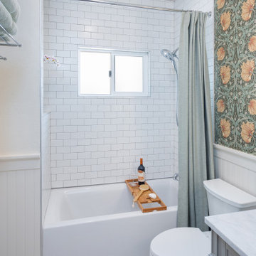
The bathroom needed to be brought back to period appropriate design with all the functionality of a modern bathroom. We thought of things like marble countertop, white mosaic floor tiles, white subway tile, board and batten molding, and of course a fabulous wallpaper.
This small (and only) bathroom on a tight budget required a little bit of design sleuthing to figure out how we could get the proper look and feel. Our goal was to determine where to splurge and where to economize and how to complete the remodel as quickly as possible because C&L would have to move out while construction was going on.
The Process: Hard Work to Remedy Design and Function
During our initial design study, (which included 2 hours in the owners’ home), we noticed framed images of William Morris Arts and Crafts textile patterns and knew this would be our design inspiration. We presented C&L with three options and they quickly selected the Pimpernel Design Concept.
We had originally selected the Black and Olive colors with a black vanity, mirror, and black and white floor tile. C&L liked it but weren’t quite sure about the black, We went back to the drawing board and decided the William & Co Pimpernel Wallpaper in Bayleaf and Manilla color with a softer gray painted vanity and mirror and white floor tile was more to their liking.
After the Design Concept was approved, we went to work securing the building permit, procuring all the elements, and scheduling our trusted tradesmen to perform the work.
We did uncover some shoddy work by the flippers such as live electrical wires hidden behind the wall, plumbing venting cut-off and buried in the walls (hence the constant dampness), the tub barely balancing on two fence boards across the floor joist, and no insulation on the exterior wall.
All of the previous blunders were fixed and the bathroom put back to its previous glory. We could feel the house thanking us for making it pretty again.
The After Reveal: Cohesive Design Decisions
We selected a simple white subway tile for the tub/shower. This is always classic and in keeping with the style of the house.
We selected a pre-fab vanity and mirror, but they look rich with the quartz countertop. There is much more storage in this small vanity than you would think.
The Transformation: A Period Perfect Refresh
We began the remodel just as the pandemic reared and stay-in-place orders went into effect. As C&L were already moved out and living with relatives, we got the go-ahead from city officials to get the work done (after all, how can you shelter in place without a bathroom?).
All our tradesmen were scheduled to work so that only one crew was on the job site at a time. We stayed on the original schedule with only a one week delay.
The end result is the sweetest little bathroom I've ever seen (and I can't wait to start work on C&L's kitchen next).
Thank you for joining me in this project transformation. I hope this inspired you to think about being creative with your design projects, determining what works best in keeping with the architecture of your space, and carefully assessing how you can have the best life in your home.
 Creatively Yours Custom Inc.
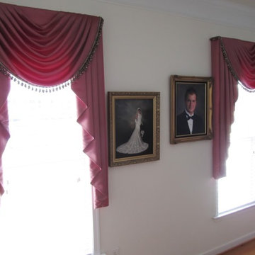
In this living room I designed custom swags with asymmetrical cascades to create interest and focus in on the family portraits in the room. The fabric has a soft sheen in a rose tone that complemented the room. Rose flower fringe accents the curve of the sways and is repeated in the custom pillows on the sofa.
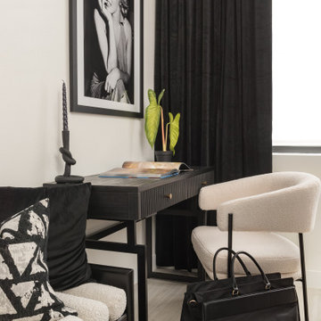
 Sixth Sense Studio
This black-and-white image portrays a streamlined home office, perfect for those seeking a minimalist workspace. A sleek black desk dominates the center, offering ample surface area for laptops, paperwork, or creative endeavors. A simple white chair stands opposite, providing a clean and comfortable contrast. The overall composition conveys a sense of order and efficiency, ideal for maximizing focus and productivity.
To further personalize this space, consider hanging artwork that complements your style and reflects your work. If you crave a calming atmosphere, serene landscapes or nature photography could be ideal. Perhaps motivational quotes or diagrams related to your field would spark inspiration. When choosing artwork, keep in mind the size of the space. A small piece might feel lost on a larger wall, while a massive canvas could overwhelm a compact area. Aim for pieces that create a balanced and visually pleasing effect.
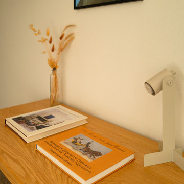
 Le Nid, The French Chic, LLC
A simple, elegant workspace designed to inspire.
Whether to write, draw, or compose, this corner offers calm and focus, a quiet place where creativity flows naturally.
Balanced lines, soft light, and thoughtful details make it the perfect spot to let ideas unfold.
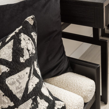 Sixth Sense Studio
This black-and-white image portrays a streamlined home office, perfect for those seeking a minimalist workspace. A sleek black desk dominates the center, offering ample surface area for laptops, paperwork, or creative endeavors. A simple white chair stands opposite, providing a clean and comfortable contrast. The overall composition conveys a sense of order and efficiency, ideal for maximizing focus and productivity.
To further personalize this space, consider hanging artwork that complements your style and reflects your work. If you crave a calming atmosphere, serene landscapes or nature photography could be ideal. Perhaps motivational quotes or diagrams related to your field would spark inspiration. When choosing artwork, keep in mind the size of the space. A small piece might feel lost on a larger wall, while a massive canvas could overwhelm a compact area. Aim for pieces that create a balanced and visually pleasing effect.
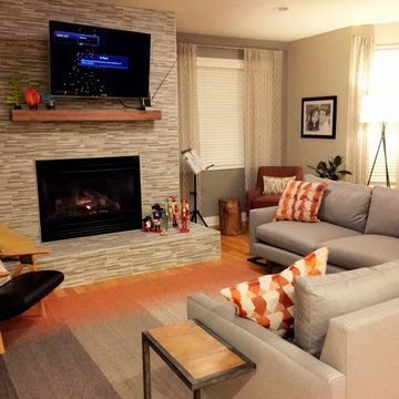 TVL Creative Ltd.
This project focuses on the transformation of a living room in the Observatory Park neighborhood of Denver. Our client for this project is a young, design-appreciating mom who wants a functional space that also addresses her love for good design. With a heavy Mid-Century Modern influence, we've developed a design that provides warmth, texture, and an entirely new orientation for her modern lifestyle.
 Lita Dirks & Co.
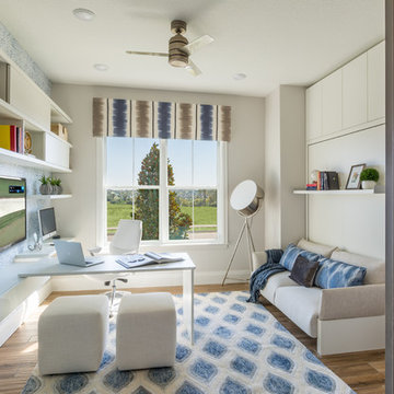
A desk with mobility allows for a quiet, function focused flex space to transform from a home office to a a guest room.
Example of a transitional home office design in Orlando
Example of a transitional home office design in Orlando
 Renovisions
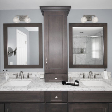
This master bath ‘Renovision’ came with three main requests from the homeowner: more storage, a larger shower and a luxurious look that feels like being at an upscale hotel. The Renovisions team accomplished these wishes and exceeded the clients expectations.
Request number 1: more storage. The existing closet was reconfigured to accommodate better storage for towels and bath supplies making it both functional and attractive. The custom built pull-out hamper was perfect. The long vanity and center tower offers much more cabinet space and drawer storage compared to what they had, especially with the increased vanity height.
Request number 2: A larger shower. Working within the existing footprint we were able to build a shower that is nearly a foot deeper as space was available. Creating a large rectangular cubby provides plenty of space for shampoos and soaps. The frameless sliding glass shower enclosure keeps the space open and airy while allowing the beautiful Carrera-look porcelain wall tiles to be the focus of this master bath.
Request number 3: a luxurious look. Turning their once boring, builder grade bathroom into an upscale hotel-like space was challenging, however, not a problem for the Renovisions team and their creative ways of resolving design snags along the way. Re-locating the doorway to the bathroom was one way to create a more spacious flow in and out of the space. Having the right design to start was half the battle – installing the beautiful products right the first time to ensure a proper fit and finish worthy of the upscale feel is the other half. The delicate tile detail in the shower cubby is the ‘jewelry’ in the room – the soft curves of this 2-tone wave design tile adds a dramatic feel and enlightened mood this client loves.
Overall, the homeowner was happy with every solution-based approach to all requests – their once dated builders bath is now bright, open and airy with a soft grey wall color adding to the soothing feel of this master bath.
 Thinkterior LLC
THEME This room is dedicated to supporting and encouraging the young artist in art and music. From the hand-painted instruments decorating the music corner to
the dedicated foldaway art table, every space is tailored to the creative spirit, offering a place to be inspired, a nook to relax or a corner to practice. This environment
radiates energy from the ground up, showering the room in natural, vibrant color.
FOCUS A majestic, floor-to-ceiling tree anchors the space, boldly transporting the beauty of nature into the house--along with the fun of swinging from a tree branch,
pitching a tent or reading under the beautiful canopy. The tree shares pride of place with a unique, retroinspired
room divider housing a colorful padded nook perfect for
reading, watching television or just relaxing.
STORAGE Multiple storage options are integrated to accommodate the family’s eclectic interests and
varied needs. From hidden cabinets in the floor to movable shelves and storage bins, there is room
for everything. The two wardrobes provide generous storage capacity without taking up valuable floor
space, and readily open up to sweep toys out of sight. The myWall® panels accommodate various shelving options and bins that can all be repositioned as needed. Additional storage and display options are strategically
provided around the room to store sheet music or display art projects on any of three magnetic panels.
GROWTH While the young artist experiments with media or music, he can also adapt this space to complement his experiences. The myWall® panels promote easy transformation and expansion, offer unlimited options, and keep shelving at an optimum height as he grows. All the furniture rolls on casters so the room can sustain the
action during a play date or be completely re-imagined if the family wants a makeover.
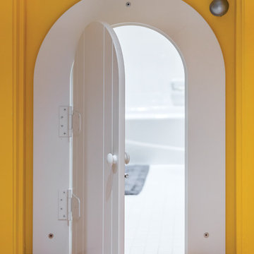
SAFETY The elements in this large open space are all designed to enfold a young boy in a playful, creative and safe place. The modular components on the myWall® panels are all locked securely in place no matter what they store. The custom drop-down table includes two safety latches to prevent unintentional opening. The floor drop doors are all equipped with slow glide closing hinges so no fingers will be trapped.
34