
Search results for "Decision focused creative" in Home Design Ideas
 Transitional Designs
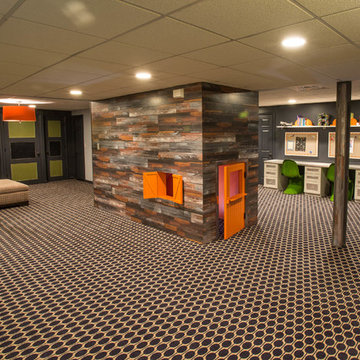
My client wanted bold colors and a room that fueled her children’s creativity. We transformed the old storage space underneath the staircase into a playhouse by simply adding a door and tiny windows. On one side of the staircase I added a blackboard and on the other side the wall was covered in a laminate wood flooring to add texture completing the look of the playhouse. A custom designed writing desk with seating to accommodate both children for their art and homework assignments. The entire area is designed for playing, imagining and creating.
Javier Fernandez Transitional Designs, Interior Designer
Greg Pallante Photographer
 Kaplan Thompson Architects
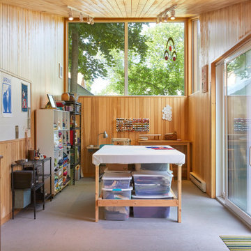
Designed to maximize function with minimal impact, the studio serves up adaptable square footage in a wrapping almost healthy enough to eat.
The open interior space organically transitions from personal to communal with the guidance of an angled roof plane. Beneath the tallest elevation, a sunny workspace awaits creative endeavors. The high ceiling provides room for big ideas in a small space, while a cluster of windows offers a glimpse of the structure’s soaring eave. Solid walls hugging the workspace add both privacy and anchors for wall-mounted storage. Towards the studio’s southern end, the ceiling plane slopes downward into a more intimate gathering space with playfully angled lines.
The building is as sustainable as it is versatile. Its all-wood construction includes interior paneling sourced locally from the Wood Mill of Maine. Lengths of eastern white pine span up to 16 feet to reach from floor to ceiling, creating visual warmth from a material that doubles as a natural insulator. Non-toxic wood fiber insulation, made from sawdust and wax, partners with triple-glazed windows to further insulate against extreme weather. During the winter, the interior temperature is able to reach 70 degrees without any heat on.
As it neared completion, the studio became a family project with Jesse, Betsy, and their kids working together to add the finishing touches. “Our whole life is a bit of an architectural experiment”, says Jesse, “but this has become an incredibly useful space.”
 TKS Design Group
Download our free ebook, Creating the Ideal Kitchen. DOWNLOAD NOW
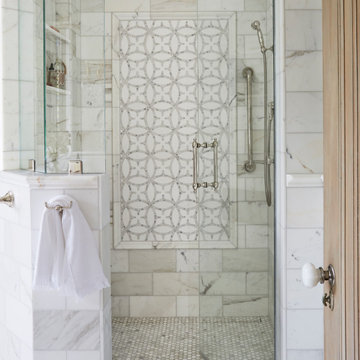
This homeowner’s daughter originally contacted us on behalf of her parents who were reluctant to begin the remodeling process in their home due to the inconvenience and dust. Once we met and they dipped their toes into the process, we were off to the races. The existing bathroom in this beautiful historical 1920’s home, had not been updated since the 70’/80’s as evidenced by the blue carpeting, mirrored walls and dropped ceilings. In addition, there was very little storage, and some health setbacks had made the bathroom difficult to maneuver with its tub shower.
Once we demoed, we discovered everything we expected to find in a home that had not been updated for many years. We got to work bringing all the electrical and plumbing up to code, and it was just as dusty and dirty as the homeowner’s anticipated! Once the space was demoed, we got to work building our new plan. We eliminated the existing tub and created a large walk-in curb-less shower.
An existing closet was eliminated and in its place, we planned a custom built in with spots for linens, jewelry and general storage. Because of the small space, we had to be very creative with the shower footprint, so we clipped one of the walls for more clearance behind the sink. The bathroom features a beautiful custom mosaic floor tile as well as tiled walls throughout the space. This required lots of coordination between the carpenter and tile setter to make sure that the framing and tile design were all properly aligned. We worked around an existing radiator and a unique original leaded window that was architecturally significant to the façade of the home. We had a lot of extra depth behind the original toilet location, so we built the wall out a bit, moved the toilet forward and then created some extra storage space behind the commode. We settled on mirrored mullioned doors to bounce lots of light around the smaller space.
We also went back and forth on deciding between a single and double vanity, and in the end decided the single vanity allowed for more counter space, more storage below and for the design to breath a bit in the smaller space. I’m so happy with this decision! To build on the luxurious feel of the space, we added a heated towel bar and heated flooring.
One of the concerns the homeowners had was having a comfortable floor to walk on. They realized that carpet was not a very practical solution but liked the comfort it had provided. Heated floors are the perfect solution. The room is decidedly traditional from its intricate mosaic marble floor to the calacutta marble clad walls. Elegant gold chandelier style fixtures, marble countertops and Morris & Co. beaded wallpaper provide an opulent feel to the space.
The gray monochromatic pallet keeps it feeling fresh and up-to-date. The beautiful leaded glass window is an important architectural feature at the front of the house. In the summertime, the homeowners love having the window open for fresh air and ventilation. We love it too!
The curb-less shower features a small fold down bench that can be used if needed and folded up when not. The shower also features a custom niche for storing shampoo and other hair products. The linear drain is built into the tilework and is barely visible. A frameless glass door that swings both in and out completes the luxurious feel.
Designed by: Susan Klimala, CKD, CBD
Photography by: Michael Kaskel
For more information on kitchen and bath design ideas go to: www.kitchenstudio-ge.com
Find the right local pro for your project
 Naturally Creative, inc.
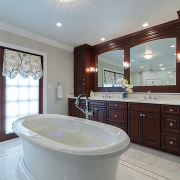
Featuring Dynasty Omega Cabinets,
Brizo Plumbing Fixtures,
Neptune Freestanding Tub With Air Bath and Chroma-therapy, Photo by
Dream Focus Photography
Dark wood stain on Cherry cabinets. Traditional Bathroom.
 CHIP-N-DALE'S CUSTOM LANDSCAPING
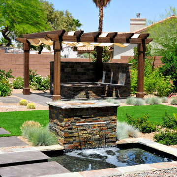
Since 1994 Chip-N-Dale’s Custom Landscaping has been serving the Las Vegas Valley and Henderson as a full service design build landscape firm, specializing in creating custom and unique landscape designs. We provide our clients with excellence in custom residential landscaping through our creative landscape designs, exceptional customer service and our commitment to quality. Our services include: custom landscaping, concrete pavers, low voltage lighting systems, custom barbeques, outdoor living environments with waterfalls and custom water features, synthetic turf, putting greens, masonry walls and custom stone work. Chip-N-Dale’s employs a full service maintenance division dedicated to keeping your landscaping looking beautiful year round. Our commitment to quality is showcased on each and every project and backed by a One Year Guarantee on all materials and labor. Our professionalism along with our constant dedication to fulfilling our client’s vision has made us the premier custom landscape contractor in Las Vegas. We understand the importance of the decision in choosing the right landscape contractor. The company you choose must possess a strong management team with leadership and a commitment to excellence. The company must employ dedicated and skilled personnel who take pride and a sense of accomplishment in their work, Chip-N-Dale’s Custom Landscaping takes immense pride in being that company. The difference between an ordinary landscape and an extraordinary landscape lies in the details. Quality, service, pride and commitment to excellence are why Chip-N-Dale’s Custom Landscaping is the right choice for your next landscape project.
Regards,
Greg Struhl
President
 Jane Perfect Interiors Ltd
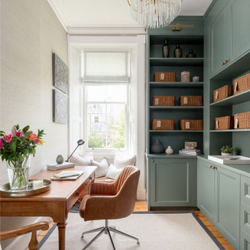
A calm and elegant home office designed to inspire focus and comfort. Featuring bespoke green cabinetry, natural woven baskets, a soft window seat, and a classic wooden desk, this space blends traditional charm with practical storage. The leather chair and delicate chandelier add a sophisticated touch, while the soft textures and serene color palette create a peaceful atmosphere for working or reading.

 CHIP-N-DALE'S CUSTOM LANDSCAPING
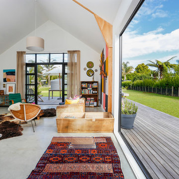
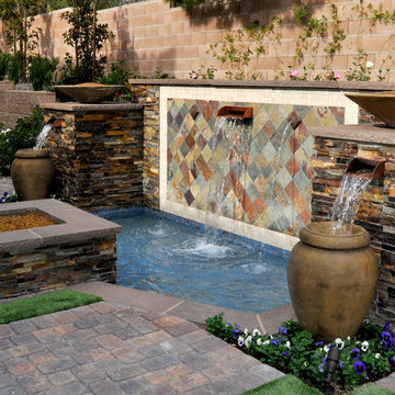
Since 1994 Chip-N-Dale’s Custom Landscaping has been serving the Las Vegas Valley and Henderson as a full service design build landscape firm, specializing in creating custom and unique landscape designs. We provide our clients with excellence in custom residential landscaping through our creative landscape designs, exceptional customer service and our commitment to quality. Our services include: custom landscaping, concrete pavers, low voltage lighting systems, custom barbeques, outdoor living environments with waterfalls and custom water features, synthetic turf, putting greens, masonry walls and custom stone work. Chip-N-Dale’s employs a full service maintenance division dedicated to keeping your landscaping looking beautiful year round. Our commitment to quality is showcased on each and every project and backed by a One Year Guarantee on all materials and labor. Our professionalism along with our constant dedication to fulfilling our client’s vision has made us the premier custom landscape contractor in Las Vegas. We understand the importance of the decision in choosing the right landscape contractor. The company you choose must possess a strong management team with leadership and a commitment to excellence. The company must employ dedicated and skilled personnel who take pride and a sense of accomplishment in their work, Chip-N-Dale’s Custom Landscaping takes immense pride in being that company. The difference between an ordinary landscape and an extraordinary landscape lies in the details. Quality, service, pride and commitment to excellence are why Chip-N-Dale’s Custom Landscaping is the right choice for your next landscape project.
Regards,
Greg Struhl
President
 OMZ architects
As a Flagstaff custom home architect, our approach to every project is to balance innovative solutions with bold design aesthetics. The Micro Mini, a compact and modern accessory dwelling unit (ADU) nestled in the heart of Flagstaff, is the perfect example of how thoughtful design can solve space constraints while offering a stylish, functional, and delightful living environment.
Our client came to us with a unique challenge: to create an additional living space on their property that was efficient, visually striking, and flexible in its function. They wanted to maximize a small footprint while incorporating pops of vibrant, monochrome color throughout the ADU to give it personality and make it feel like an extension of their larger home. The solution we provided, as your trusted Flagstaff custom home architect, was Micro Mini—a design that offers both efficiency and fun while making a big impact in a small space.
The first challenge we tackled was how to make the most of the limited square footage. Our approach, rooted in the principles of modern architecture, was to keep the floor plan as open and flexible as possible. By eliminating unnecessary walls and creating multifunctional spaces, we were able to design an interior that feels spacious and airy, despite the small footprint.
The living area, kitchen, and bedroom all flow seamlessly into each other, using strategic cabinetry, sliding doors, and built-in storage to keep the space uncluttered. The use of glass for windows and doors amplifies the sense of space, bringing in abundant natural light and connecting the interior to the outdoor landscape—a key consideration in any Flagstaff custom home architect project.
One of the most striking elements of the Micro Mini is its creative use of color. The client wanted each space to feel distinct, while still maintaining a cohesive design language. To achieve this, we incorporated monochrome color schemes in various sections of the ADU, starting with the kitchen.
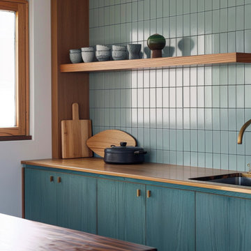
The kitchen is a bold statement in shades of blue, with blue-stained cabinets, blue backsplash tile, and even blue fixtures. This color immersion gives the kitchen a distinctive identity while still blending harmoniously with the rest of the space. In other areas of the ADU, we played with pops of other fun colors—each carefully chosen to complement the modern aesthetic of the home while adding a personalized touch.
As your Flagstaff custom home architect, we believe that color is an integral part of design, and Micro Mini is a testament to how thoughtful color application can elevate a space. The bold monochrome interiors are a fun, creative twist that make this ADU stand out while ensuring it remains functional and inviting.
Beyond the bold use of color, the interior of Micro Mini is designed with simplicity and function in mind. We utilized clean lines, minimal ornamentation, and carefully selected materials to keep the overall look sleek and modern. Light wood floors contrast with the bold color accents and add warmth to the otherwise minimalistic design.
Attention to detail is paramount in all of our projects, and as a Flagstaff custom home architect, we take pride in the craftsmanship and quality materials used throughout the Micro Mini. From the custom-built cabinetry to the thoughtfully designed storage solutions, every inch of the ADU was considered for both aesthetics and practicality.
A key problem we solved for the client was how to make the ADU feel spacious and functional despite its small footprint. As your trusted Flagstaff custom home architect, we used a range of design solutions to achieve this.
First, we incorporated high ceilings to enhance the sense of volume and space, creating an airy feel throughout the ADU. The placement of windows and the strategic use of sliding glass doors allow light to flood in, further opening up the interior and blurring the lines between inside and out. These elements not only make the ADU feel larger but also create a strong connection to the surrounding landscape.
Another key element was the use of built-in furniture and storage solutions to keep the space clutter-free. From hidden storage under the bed to custom cabinetry in the kitchen, every corner of the Micro Mini was designed with functionality in mind. This approach ensured that the ADU met the client’s needs for both comfort and practicality, while still adhering to the modern design aesthetic they desired.
Being based in Northern Arizona, we are acutely aware of how important it is for our designs to harmonize with the surrounding landscape. As a Flagstaff custom home architect, we carefully consider the site’s natural beauty and how our projects can integrate with it.
With Micro Mini, we focused on making sure that the ADU feels like a natural extension of the client’s existing property. The large windows and sliding glass doors bring in views of the surrounding landscape, while the outdoor deck extends the living space, creating a seamless indoor-outdoor experience. Whether you’re standing in the living room or on the deck, you are always connected to the beautiful Flagstaff setting.
In line with our commitment to responsible design, sustainability was a key consideration for Micro Mini. As your Flagstaff custom home architect, we prioritize energy-efficient building methods and materials. The ADU was designed to be energy-efficient, with high-performance windows and insulation that keep it cool in the summer and warm in the winter.
Additionally, the color choices and materials used in the interior were chosen not just for their aesthetic appeal, but also for their durability and sustainability. Low-VOC paints and finishes were used throughout the ADU to ensure good indoor air quality, while the energy-efficient lighting and appliances help minimize the ADU’s overall environmental impact.
At HEY! designs, we believe in a collaborative approach to architecture that puts the client’s needs and vision at the forefront. Whether designing a large custom home or a compact ADU like Micro Mini, we bring the same level of dedication, creativity, and attention to detail to every project.
Our work is rooted in modern design principles but always infused with personality and a sense of fun. Micro Mini exemplifies this approach—a bold, colorful, and efficient ADU that meets the client’s needs while also reflecting their unique style.
If you’re considering a custom home or ADU in Flagstaff, HEY! designs is here to help bring your vision to life. As a Flagstaff custom home architect, we specialize in creating spaces that are not only beautiful and functional but also responsive to the unique qualities of the site and the needs of the client.
Micro Mini is a testament to how small spaces can still be big on style and function. By incorporating bold color schemes, maximizing space efficiency, and maintaining a strong connection to the outdoors, this ADU achieves everything the client wanted—a modern, fun, and functional space.
As your Flagstaff custom home architect, we would be thrilled to help you create a unique and personalized space that meets your needs, no matter the size or scope of your project. Contact us today to learn more about how we can bring your vision to life.
 TKS Design Group
Download our free ebook, Creating the Ideal Kitchen. DOWNLOAD NOW
This client was referred to us from a past client. They are a busy 2-career household with young children and enjoy entertaining friends and family in their home. They have a beautiful open concept home but unfortunately the kitchen was not fitting for the rest of the home. They were not quite sure what to do with the space. We talked about trying to refresh it or do more of a minor remodel, but in the end they decided a full gut would get them to where they wanted to be.
One problem was there was no place for guests to hang out other than the large and awkward banquette area. The brick wall and tiled hood area were feeling a bit dated and tired. The space was just not functional for their lifestyle. There was no prep space near the cooktop and no landing area for items coming out of the ovens or refrigerator, plus a big dead zone in the center of the room.
Banquettes, like the one they previously had in the space, are great for small spaces, but when they get really large like this one, it makes getting in and out of the seating area awkward and uncomfortable. Plus, there was room for a large table, so we eliminated the awkward built in.
We started by removing the faux brick wall between the kitchen and back entry. We relocated the entry to the garage over a couple feet in order to get every last inch out of the new kitchen. We also made the decision to close up the primary window that faced the pretty ho hum brick wall of the neighbor’s house. There was plenty of light coming in from the seating area, so we just didn’t feel the window was adding much to the room.
Construction went smoothy. There was a bit of rework with electrical, flooring and HVAC, but in the end, we think it was well worth it.
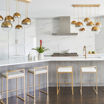
The clients really wanted a sleek contemporary look, and we originally had planned for a full height slab backsplash, but due to it’s size, it was a budget buster. Instead, we got creative and settled on large format porcelain tiles that have a similar feel but were a fraction of the cost. We made sure the wall was plumb and level so that the fit and finish would mimic that of slab material.
The final space was quite a change. A large prep sink sits directly across from the new pro-style range with plenty additional prep space on the large island. The refrigerator and ovens now have miles of landing space, and a nice tight work triangle makes cooking a breeze.
Since we wanted a more contemporary feel, not many wall cabinets were included. Instead, we outfitted some of the drawers for dish storage with a peg system. Two large pantries flanking the refrigerator hold baking supplies and small appliances. Large drawers by the cooktop hold pots and pans, and an appliance garage tucked away to the left of the range hides away miscellaneous items. The large island also houses a microwave drawer and tons of storage, most of which is drawers offering maximum convenience.
The island now seats 5-6 people comfortably along with the new table in the seating area which can seat up to 8. Entertaining will be a breeze in this space. With such a clean backdrop, we knew we would need some drama with the lighting, so we chose two sets of staggered pendants, which we adjusted for the right visual balance above the island.
We also included a small coffee station to the right of the main kitchen, which helps keep the coffee clutter out of the kitchen proper. Two tones of complimentary gray are featured in this kitchen. The perimeter is a light gray that reads almost white. The island is a gray stain that adds some depth and interest with the visible wood texture. The countertops are clean white quartz, and the hardware, barstools and light fixtures add warm brass tones. I see lots of cooking and entertaining with family and friends in the near future in this bright and airy new space.
Designed by: Susan Klimala, CKD, CBD
Photography by: Michael Kaskel
For more information on kitchen and bath design ideas go to: www.kitchenstudio-ge.com
 Advance Design Studio, Ltd.
The couple who embarked on this Lake Zurich Illinois home renovation spent years planning a move from Virginia to the rolling hills of Northern Illinois when their first grandchild was born. Wanting to be closer to their grown children so they could enjoy their new role, they first embarked upon finding the right realtor and the right home. They settled on the “perfect” home; perfect that is to transform.
The seriously outdated 1,800 square foot ranch had a closed outdated kitchen, 3 bedrooms, a living room with a fireplace, a full basement and 2 baths. Although it had “good bones”, it was straight out of a builder’s catalog with wall to wall carpet, standard tile and honey oak everywhere you looked. But this couple had big plans for this home.
In tandem with their home purchase, they began the search for the just the right renovation company. The team they chose needed to be cohesive, as the whole house renovation would be designed hundreds of miles from their home several states away. She found Advance Design Studio, Ltd. online, and was quickly enamored by the team and by Common Sense Remodeling, simply by studying the website. Her decision to choose Advance Design to partner on this complete ranch renovation was confirmed quickly upon her first face to face meeting with owner Todd Jurs, and later by Advance’s designer, Nicole Ryan.
Three bedrooms were converted into a one master suite with ample bath and walk in closet, laundry, and a 2nd multi-purpose room designed for movies and entertainment, a home office, and a guest room all in one. A doorway leading to the garage was reconfigured to create a foyer area, and allowed for a better flow to an open modern kitchen complete with a large island for cooking and entertaining, which included a wide bench seat overlooking the back yard and opening onto an eating area flanked with a fireplace and TV.
The piece de resistance culminated with 3 walls of full glass anchored by a striking fireplace in the new four season’s room where the homeowners enjoy coffee every morning while gazing at the current day’s mid-western landscape. The open floorplan encourages living in “one space” throughout the day.
Ryan worked with the couple remotely, exchanging 3D color renderings and floorplans with detailed budget updates until the project took on the very image they had envisioned. “Working with them was a change from our normal meeting process since they were literally in a different state. We conducted meetings by phone, while reviewing materials and drawings via computer. It was a fun process that necessitated lots of detail and careful coordination, but we made it happen and the process was as smooth as if they were right here like normal”, says Nicole. During a stressful time planning their move, the constant interaction with Nicole assured the couple that all was being addressed by the Advance team and they could relax and focus on other important things (like moving cross country).
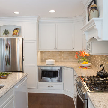
The new master bath incorporated heated flooring, a walk in shower with seating and custom shower niches, and an elegant double sink vanity with ample space for two. “The layout of each of the rooms is exactly what I envisioned,” the client said. “Advance’s attention to details such as light switch placement, electrical outlets, and many other minute details you wouldn’t even think of was the icing on the cake. If I didn’t think of it first, they certainly did,” said the happy homeowner. Small details like the crown molding, the custom designed fireplace mantle, the under-cabinet lighting and etched door glass, and even subtle rhinestones shimmering like delicate jewelry in the tile backsplash brought the whole project together. The clients were extremely happy with the way the Advance team made sure these small things were executed perfectly.
“It’s just gorgeous,” they said at a celebratory event in their home hosted shortly after completion for the entire Advance Design team that made it happen. “The entire crew at Advance Design was a pleasure to work with. We couldn’t have done this with a lesser team,” they concluded.
 Jennifer Gardner Design
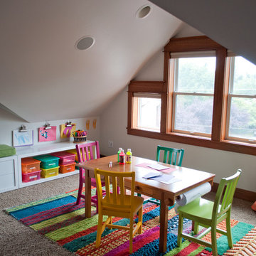
The goal for this light filled finished attic was to create a play space where two young boys could nurture and develop their creative and imaginative selves. A neutral tone was selected for the walls as a foundation for the bright pops of color added in furnishings, area rug and accessories throughout the room. We took advantage of the room’s interesting angles and created a custom chalk board that followed the lines of the ceiling. Magnetic circles from Land of Nod add a playful pop of color and perfect spot for magnetic wall play. A ‘Space Room’ behind the bike print fabric curtain is a favorite hideaway with a glow in the dark star filled ceiling and a custom litebrite wall. Custom Lego baseplate removable wall boards were designed and built to create a Flexible Lego Wall. The family was interested in the concept of a Lego wall but wanted to keep the space flexible for the future. The boards (designed by Jennifer Gardner Design) can be moved to the floor for Lego play and then easily hung back on the wall with a cleat system to display their 3-dimensional Lego creations! This room was great fun to design and we hope it will provide creative and imaginative play inspiration in the years to come!
Designed by: Jennifer Gardner Design
Photography by: Marcella Winspear
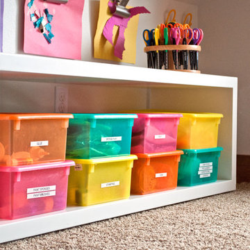 Jennifer Gardner Design
The goal for this light filled finished attic was to create a play space where two young boys could nurture and develop their creative and imaginative selves. A neutral tone was selected for the walls as a foundation for the bright pops of color added in furnishings, area rug and accessories throughout the room. We took advantage of the room’s interesting angles and created a custom chalk board that followed the lines of the ceiling. Magnetic circles from Land of Nod add a playful pop of color and perfect spot for magnetic wall play. A ‘Space Room’ behind the bike print fabric curtain is a favorite hideaway with a glow in the dark star filled ceiling and a custom litebrite wall. Custom Lego baseplate removable wall boards were designed and built to create a Flexible Lego Wall. The family was interested in the concept of a Lego wall but wanted to keep the space flexible for the future. The boards (designed by Jennifer Gardner Design) can be moved to the floor for Lego play and then easily hung back on the wall with a cleat system to display their 3-dimensional Lego creations! This room was great fun to design and we hope it will provide creative and imaginative play inspiration in the years to come!
Designed by: Jennifer Gardner Design
Photography by: Marcella Winspear
 Creative Surfaces Countertops & Tile
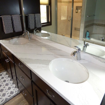
This new home near Crofton, NE was essentially designed by the homeowner herself. She wanted white to be the focus of her new kitchen and after a little bit of research she knew Cambria carried the best selection of white countertop designs. Her home features Cambria Ella in the large galley style kitchen on her island and perimeter which is accented with her slate appliances. The white farmhouse sink gives her kitchen a little bit of that country charm. So that the home was not white throughout she incorporated dark cabinetry in the bathrooms. A small powder bath on the main level features a Cambria Minera countertop; the master bath vanity countertops are Cambria Brittanicca and the children's bathroom showcases Cambria Berwyn. The home office brings some masculinity into the home with dark wood cabinets and Cambria Laneshaw.
 TVL Creative Ltd.
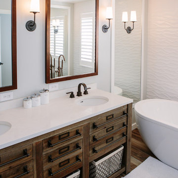
This master bathroom renovation transforms a builder-grade standard into a personalized retreat for our lovely Stapleton clients. Recognizing a need for change, our clients called on us to help develop a space that would capture their aesthetic loves and foster relaxation. Our design focused on establishing an airy and grounded feel by pairing various shades of white, natural wood, and dynamic textures. We replaced the existing ceramic floor tile with wood-look porcelain tile for a warm and inviting look throughout the space. We then paired this with a reclaimed apothecary vanity from Restoration Hardware. This vanity is coupled with a bright Caesarstone countertop and warm bronze faucets from Delta to create a strikingly handsome balance. The vanity mirrors are custom-sized and trimmed with a coordinating bronze frame. Elegant wall sconces dance between the dark vanity mirrors and bright white full height mirrors flanking the bathtub. The tub itself is an oversized freestanding bathtub paired with a tall bronze tub filler. We've created a feature wall with Tile Bar's Billowy Clouds ceramic tile floor to ceiling behind the tub. The wave-like movement of the tiles offers a dramatic texture in a pure white field. We removed the existing shower and extended its depth to create a large new shower. The walls are tiled with a large format high gloss white tile. The shower floor is tiled with marble circles in varying sizes that offer a playful aesthetic in an otherwise minimalist space. We love this pure, airy retreat and are thrilled that our clients get to enjoy it for many years to come!
 TVL Creative Ltd.
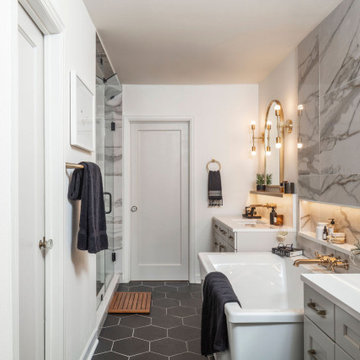
This project was not only full of many bathrooms but also many different aesthetics. The goals were fourfold, create a new master suite, update the basement bath, add a new powder bath and my favorite, make them all completely different aesthetics.
Primary Bath-This was originally a small 60SF full bath sandwiched in between closets and walls of built-in cabinetry that blossomed into a 130SF, five-piece primary suite. This room was to be focused on a transitional aesthetic that would be adorned with Calcutta gold marble, gold fixtures and matte black geometric tile arrangements.
Powder Bath-A new addition to the home leans more on the traditional side of the transitional movement using moody blues and greens accented with brass. A fun play was the asymmetry of the 3-light sconce brings the aesthetic more to the modern side of transitional. My favorite element in the space, however, is the green, pink black and white deco tile on the floor whose colors are reflected in the details of the Australian wallpaper.
Hall Bath-Looking to touch on the home's 70's roots, we went for a mid-mod fresh update. Black Calcutta floors, linear-stacked porcelain tile, mixed woods and strong black and white accents. The green tile may be the star but the matte white ribbed tiles in the shower and behind the vanity are the true unsung heroes.
 TKS Design Group
Download our free ebook, Creating the Ideal Kitchen. DOWNLOAD NOW
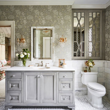
This homeowner’s daughter originally contacted us on behalf of her parents who were reluctant to begin the remodeling process in their home due to the inconvenience and dust. Once we met and they dipped their toes into the process, we were off to the races. The existing bathroom in this beautiful historical 1920’s home, had not been updated since the 70’/80’s as evidenced by the blue carpeting, mirrored walls and dropped ceilings. In addition, there was very little storage, and some health setbacks had made the bathroom difficult to maneuver with its tub shower.
Once we demoed, we discovered everything we expected to find in a home that had not been updated for many years. We got to work bringing all the electrical and plumbing up to code, and it was just as dusty and dirty as the homeowner’s anticipated! Once the space was demoed, we got to work building our new plan. We eliminated the existing tub and created a large walk-in curb-less shower.
An existing closet was eliminated and in its place, we planned a custom built in with spots for linens, jewelry and general storage. Because of the small space, we had to be very creative with the shower footprint, so we clipped one of the walls for more clearance behind the sink. The bathroom features a beautiful custom mosaic floor tile as well as tiled walls throughout the space. This required lots of coordination between the carpenter and tile setter to make sure that the framing and tile design were all properly aligned. We worked around an existing radiator and a unique original leaded window that was architecturally significant to the façade of the home. We had a lot of extra depth behind the original toilet location, so we built the wall out a bit, moved the toilet forward and then created some extra storage space behind the commode. We settled on mirrored mullioned doors to bounce lots of light around the smaller space.
We also went back and forth on deciding between a single and double vanity, and in the end decided the single vanity allowed for more counter space, more storage below and for the design to breath a bit in the smaller space. I’m so happy with this decision! To build on the luxurious feel of the space, we added a heated towel bar and heated flooring.
One of the concerns the homeowners had was having a comfortable floor to walk on. They realized that carpet was not a very practical solution but liked the comfort it had provided. Heated floors are the perfect solution. The room is decidedly traditional from its intricate mosaic marble floor to the calacutta marble clad walls. Elegant gold chandelier style fixtures, marble countertops and Morris & Co. beaded wallpaper provide an opulent feel to the space.
The gray monochromatic pallet keeps it feeling fresh and up-to-date. The beautiful leaded glass window is an important architectural feature at the front of the house. In the summertime, the homeowners love having the window open for fresh air and ventilation. We love it too!
The curb-less shower features a small fold down bench that can be used if needed and folded up when not. The shower also features a custom niche for storing shampoo and other hair products. The linear drain is built into the tilework and is barely visible. A frameless glass door that swings both in and out completes the luxurious feel.
Designed by: Susan Klimala, CKD, CBD
Photography by: Michael Kaskel
For more information on kitchen and bath design ideas go to: www.kitchenstudio-ge.com
 Dynamic Garage Door
Getting your homeowner's association board to approve your new custom garage doors can seem daunting. Dynamic Garage Door as a custom design and manufacturing firm has come across this situation quite frequently with a phenomenal success approval rate!
In order to get approval for your custom garage door approval there are a few basic points you must understand. First off, your HOA is committed to preserving the neighborhood's curb appeal integrity by focusing on the impact your new custom garage doors might have on your house and the houses of your neighbors. It is important to understand that your curb appeal decisions will impact your home and neighborhood alike. Too many companies offer semi-custom wood doors without the true understanding of the client's need and the essence of their home's architectural style. The garage door design you choose needs to comply with neighborhood regulations while complement your home's architecture. At Dynamic Garage Door, our designers are well-rounded in the garage door industry and so we can suggest or develop designs that will reinforce the natural appearance of your home's style. If you can prove to your HOA that you've done your homework and that the garage door design you chose will complement not only your home but the neighborhood you'll be surprised when your proposal is marked with the approval stamp!
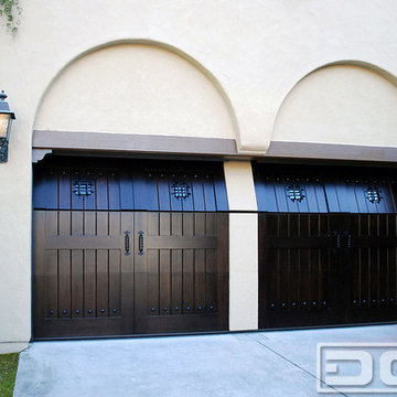
This garage door is actually a single double-car door not two as it appears. The reason is that this garage used to have two separate doors with a post in the middle. The post in the middle made it difficult to use the garage on a daily basis so the post was removed to facilitate the use of the garage. The HOA wasn't too happy about the removal of the post as it was an essential part of the arches located right above the garage doors. You can clearly see how that would have been disruptive if the homeowner went with a regular wood door and not one custom designed and manufactured by Dynamic Garage Door.
This garage door was specifically designed to address the HOA's concern about the center post removal and the effect it would have on the curb appeal of the home with the incomplete double arch look. So we addressed this by crafting the door with a false center post in the middle that was textured and painted the same color of the house to give off that illusion that the post is still there. Overall, it gives the home a complete finished appearance with two independent-looking doors and original post. The homeowner got the entire width of the opening to use at the push of a button so having a larger car won't be a problem anymore. The neighbors are all happy and no one seems to notice the center post is actually fake!
Got an interesting garage door project you want our designers to review and price out for you? Give us a call at (855) 343-DOOR
 SGDI - Sarah Gallop Design Inc.
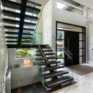
The objective was to create a warm neutral space to later customize to a specific colour palate/preference of the end user for this new construction home being built to sell. A high-end contemporary feel was requested to attract buyers in the area. An impressive kitchen that exuded high class and made an impact on guests as they entered the home, without being overbearing. The space offers an appealing open floorplan conducive to entertaining with indoor-outdoor flow.
Due to the spec nature of this house, the home had to remain appealing to the builder, while keeping a broad audience of potential buyers in mind. The challenge lay in creating a unique look, with visually interesting materials and finishes, while not being so unique that potential owners couldn’t envision making it their own. The focus on key elements elevates the look, while other features blend and offer support to these striking components. As the home was built for sale, profitability was important; materials were sourced at best value, while retaining high-end appeal. Adaptations to the home’s original design plan improve flow and usability within the kitchen-greatroom. The client desired a rich dark finish. The chosen colours tie the kitchen to the rest of the home (creating unity as combination, colours and materials, is repeated throughout).
Photos- Paul Grdina
 ZeroEnergy Design
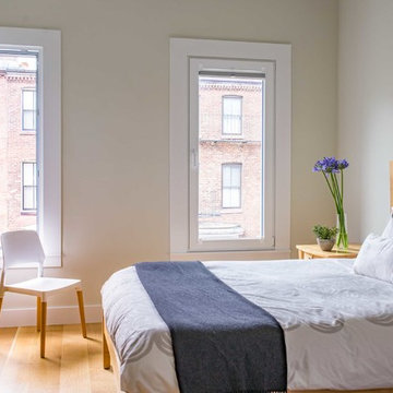
This renovated brick rowhome in Boston’s South End offers a modern aesthetic within a historic structure, creative use of space, exceptional thermal comfort, a reduced carbon footprint, and a passive stream of income.
DESIGN PRIORITIES. The goals for the project were clear - design the primary unit to accommodate the family’s modern lifestyle, rework the layout to create a desirable rental unit, improve thermal comfort and introduce a modern aesthetic. We designed the street-level entry as a shared entrance for both the primary and rental unit. The family uses it as their everyday entrance - we planned for bike storage and an open mudroom with bench and shoe storage to facilitate the change from shoes to slippers or bare feet as they enter their home. On the main level, we expanded the kitchen into the dining room to create an eat-in space with generous counter space and storage, as well as a comfortable connection to the living space. The second floor serves as master suite for the couple - a bedroom with a walk-in-closet and ensuite bathroom, and an adjacent study, with refinished original pumpkin pine floors. The upper floor, aside from a guest bedroom, is the child's domain with interconnected spaces for sleeping, work and play. In the play space, which can be separated from the work space with new translucent sliding doors, we incorporated recreational features inspired by adventurous and competitive television shows, at their son’s request.
MODERN MEETS TRADITIONAL. We left the historic front facade of the building largely unchanged - the security bars were removed from the windows and the single pane windows were replaced with higher performing historic replicas. We designed the interior and rear facade with a vision of warm modernism, weaving in the notable period features. Each element was either restored or reinterpreted to blend with the modern aesthetic. The detailed ceiling in the living space, for example, has a new matte monochromatic finish, and the wood stairs are covered in a dark grey floor paint, whereas the mahogany doors were simply refinished. New wide plank wood flooring with a neutral finish, floor-to-ceiling casework, and bold splashes of color in wall paint and tile, and oversized high-performance windows (on the rear facade) round out the modern aesthetic.
RENTAL INCOME. The existing rowhome was zoned for a 2-family dwelling but included an undesirable, single-floor studio apartment at the garden level with low ceiling heights and questionable emergency egress. In order to increase the quality and quantity of space in the rental unit, we reimagined it as a two-floor, 1 or 2 bedroom, 2 bathroom apartment with a modern aesthetic, increased ceiling height on the lowest level and provided an in-unit washer/dryer. The apartment was listed with Jackie O'Connor Real Estate and rented immediately, providing the owners with a source of passive income.
ENCLOSURE WITH BENEFITS. The homeowners sought a minimal carbon footprint, enabled by their urban location and lifestyle decisions, paired with the benefits of a high-performance home. The extent of the renovation allowed us to implement a deep energy retrofit (DER) to address air tightness, insulation, and high-performance windows. The historic front facade is insulated from the interior, while the rear facade is insulated on the exterior. Together with these building enclosure improvements, we designed an HVAC system comprised of continuous fresh air ventilation, and an efficient, all-electric heating and cooling system to decouple the house from natural gas. This strategy provides optimal thermal comfort and indoor air quality, improved acoustic isolation from street noise and neighbors, as well as a further reduced carbon footprint. We also took measures to prepare the roof for future solar panels, for when the South End neighborhood’s aging electrical infrastructure is upgraded to allow them.
URBAN LIVING. The desirable neighborhood location allows the both the homeowners and tenant to walk, bike, and use public transportation to access the city, while each charging their respective plug-in electric cars behind the building to travel greater distances.
OVERALL. The understated rowhouse is now ready for another century of urban living, offering the owners comfort and convenience as they live life as an expression of their values.
Eric Roth Photo
36