
Search results for "Decision focused creative" in Home Design Ideas
 Thinkterior LLC
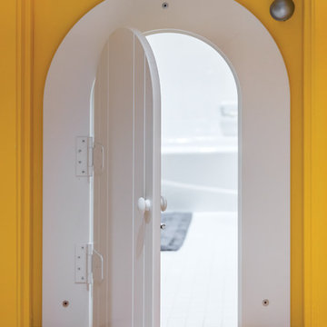
THEME This room is dedicated to supporting and encouraging the young artist in art and music. From the hand-painted instruments decorating the music corner to
the dedicated foldaway art table, every space is tailored to the creative spirit, offering a place to be inspired, a nook to relax or a corner to practice. This environment
radiates energy from the ground up, showering the room in natural, vibrant color.
FOCUS A majestic, floor-to-ceiling tree anchors the space, boldly transporting the beauty of nature into the house--along with the fun of swinging from a tree branch,
pitching a tent or reading under the beautiful canopy. The tree shares pride of place with a unique, retroinspired
room divider housing a colorful padded nook perfect for
reading, watching television or just relaxing.
STORAGE Multiple storage options are integrated to accommodate the family’s eclectic interests and
varied needs. From hidden cabinets in the floor to movable shelves and storage bins, there is room
for everything. The two wardrobes provide generous storage capacity without taking up valuable floor
space, and readily open up to sweep toys out of sight. The myWall® panels accommodate various shelving options and bins that can all be repositioned as needed. Additional storage and display options are strategically
provided around the room to store sheet music or display art projects on any of three magnetic panels.
GROWTH While the young artist experiments with media or music, he can also adapt this space to complement his experiences. The myWall® panels promote easy transformation and expansion, offer unlimited options, and keep shelving at an optimum height as he grows. All the furniture rolls on casters so the room can sustain the
action during a play date or be completely re-imagined if the family wants a makeover.
SAFETY The elements in this large open space are all designed to enfold a young boy in a playful, creative and safe place. The modular components on the myWall® panels are all locked securely in place no matter what they store. The custom drop-down table includes two safety latches to prevent unintentional opening. The floor drop doors are all equipped with slow glide closing hinges so no fingers will be trapped.
 TVL Creative Ltd.
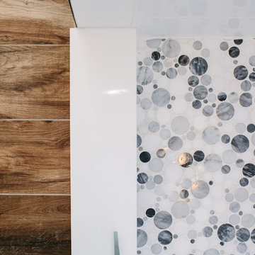
This master bathroom renovation transforms a builder-grade standard into a personalized retreat for our lovely Stapleton clients. Recognizing a need for change, our clients called on us to help develop a space that would capture their aesthetic loves and foster relaxation. Our design focused on establishing an airy and grounded feel by pairing various shades of white, natural wood, and dynamic textures. We replaced the existing ceramic floor tile with wood-look porcelain tile for a warm and inviting look throughout the space. We then paired this with a reclaimed apothecary vanity from Restoration Hardware. This vanity is coupled with a bright Caesarstone countertop and warm bronze faucets from Delta to create a strikingly handsome balance. The vanity mirrors are custom-sized and trimmed with a coordinating bronze frame. Elegant wall sconces dance between the dark vanity mirrors and bright white full height mirrors flanking the bathtub. The tub itself is an oversized freestanding bathtub paired with a tall bronze tub filler. We've created a feature wall with Tile Bar's Billowy Clouds ceramic tile floor to ceiling behind the tub. The wave-like movement of the tiles offers a dramatic texture in a pure white field. We removed the existing shower and extended its depth to create a large new shower. The walls are tiled with a large format high gloss white tile. The shower floor is tiled with marble circles in varying sizes that offer a playful aesthetic in an otherwise minimalist space. We love this pure, airy retreat and are thrilled that our clients get to enjoy it for many years to come!
 TKS Design Group
Download our free ebook, Creating the Ideal Kitchen. DOWNLOAD NOW
For many, extra time at home during COVID left them wanting more from their homes. Whether you realized the shortcomings of your space or simply wanted to combat boredom, a well-designed and functional home was no longer a want, it became a need. Tina found herself wanting more from her Old Irving Park home and reached out to The Kitchen Studio about adding function to her kitchen to make the most of the available real estate.
At the end of the day, there is nothing better than returning home to a bright and happy space you love. And this kitchen wasn’t that for Tina. Dark and dated, with a palette from the past and features that didn’t make the most of the available square footage, this remodel required vision and a fresh approach to the space. Lead designer, Stephanie Cole’s main design goal was better flow, while adding greater functionality with organized storage, accessible open shelving, and an overall sense of cohesion with the adjoining family room.
The original kitchen featured a large pizza oven, which was rarely used, yet its footprint limited storage space. The nearby pantry had become a catch-all, lacking the organization needed in the home. The initial plan was to keep the pizza oven, but eventually Tina realized she preferred the design possibilities that came from removing this cumbersome feature, with the goal of adding function throughout the upgraded and elevated space. Eliminating the pantry added square footage and length to the kitchen for greater function and more storage. This redesigned space reflects how she lives and uses her home, as well as her love for entertaining.
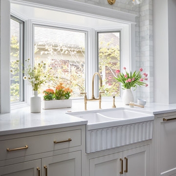
The kitchen features a classic, clean, and timeless palette. White cabinetry, with brass and bronze finishes, contrasts with rich wood flooring, and lets the large, deep blue island in Woodland’s custom color Harbor – a neutral, yet statement color – draw your eye.
The kitchen was the main priority. In addition to updating and elevating this space, Tina wanted to maximize what her home had to offer. From moving the location of the patio door and eliminating a window to removing an existing closet in the mudroom and the cluttered pantry, the kitchen footprint grew. Once the floorplan was set, it was time to bring cohesion to her home, creating connection between the kitchen and surrounding spaces.
The color palette carries into the mudroom, where we added beautiful new cabinetry, practical bench seating, and accessible hooks, perfect for guests and everyday living. The nearby bar continues the aesthetic, with stunning Carrara marble subway tile, hints of brass and bronze, and a design that further captures the vibe of the kitchen.
Every home has its unique design challenges. But with a fresh perspective and a bit of creativity, there is always a way to give the client exactly what they want [and need]. In this particular kitchen, the existing soffits and high slanted ceilings added a layer of complexity to the lighting layout and upper perimeter cabinets.
While a space needs to look good, it also needs to function well. This meant making the most of the height of the room and accounting for the varied ceiling features, while also giving Tina everything she wanted and more. Pendants and task lighting paired with an abundance of natural light amplify the bright aesthetic. The cabinetry layout and design compliments the soffits with subtle profile details that bring everything together. The tile selections add visual interest, drawing the eye to the focal area above the range. Glass-doored cabinets further customize the space and give the illusion of even more height within the room.
While her family may be grown and out of the house, Tina was focused on adding function without sacrificing a stunning aesthetic and dreamy finishes that make the kitchen the gathering place of any home. It was time to love her kitchen again, and if you’re wondering what she loves most, it’s the niche with glass door cabinetry and open shelving for display paired with the marble mosaic backsplash over the range and complimenting hood. Each of these features is a stunning point of interest within the kitchen – both brag-worthy additions to a perimeter layout that previously felt limited and lacking.
Whether your remodel is the result of special needs in your home or simply the excitement of focusing your energy on creating a fun new aesthetic, we are here for it. We love a good challenge because there is always a way to make a space better – adding function and beauty simultaneously.
Find the right local pro for your project
 Creative Concepts Construction
West Coast Craftsmanship with a Modern Edge
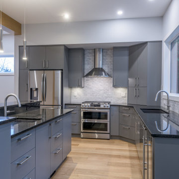
Craftsmen meets Modern is a stunning West Coast craftsman-style home with a modern twist,
thoughtfully designed in team collaboration with the client and Creative Concepts Construction.
The exterior blends Hardi Plank horizontal siding along with cement panels, accented by fir
posts and beams, and blended with cedar soffits. Hand-built rock walls and custom landscaping
tie the design seamlessly into its natural surroundings.
Inside, fir posts, beams, and tongue-and-groove ceiling create a warm, cohesive connection
between indoors and out. A handcrafted timber-frame staircase, built by CCC’s skilled
carpenters, serves as a striking centerpiece. Custom cabinetry, designed in partnership with the
homeowner, pairs beautifully with granite countertops sourced from a local Vancouver Island
supplier. Bathrooms feature extensive tile work, including curb-less showers and floor-to-ceiling
wall tiles with large niches.
This home is a true reflection of Creative Concepts Construction’s dedication to craftsmanship,
creativity, and client-focused design.
 Henne Creative LLC
Where Modern Serenity Meets Sculptural Design
Designed by HENNE CREATIVE
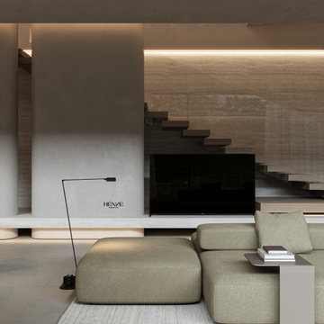
Nestled along the tranquil shoreline of Malibu, this private residence completed in 2025 is a testament to the harmony between contemporary architecture and coastal calm. Designed by HENNE CREATIVE, the space offers a deeply intentional experience that celebrates stillness, light, and form.
The open plan layout embraces clarity and cohesion, allowing natural light to flow freely throughout. Every detail is curated to reflect quiet sophistication: soft geometries, a neutral color palette, and tactile materials work in seamless concert. From floor to ceiling, natural stone textures and warm wood tones build a calm visual rhythm across the space.
The living area features a sculptural modular sofa that invites conversation while anchoring the spatial narrative. Behind it, a floating staircase highlighted by integrated linear lighting becomes an architectural statement, elegantly connecting levels without visual clutter.
The kitchen and dining space are understated yet refined. Handleless cabinetry blends into the background, while the island serves as a clean centerpiece. A custom dining chair with textured upholstery offers a subtle sculptural moment at the table one of the project’s signature design notes.
Design Language:
Minimalist, tactile, and serene with a focus on volume, light, and material honesty.
Material Palette:
Travertine inspired surfaces, natural oak, boucle and linen textiles.
Lighting:
Embedded linear LEDs and minimalist pendant lighting accentuate the architecture without overwhelming it.
This home is not merely a living space; it’s a spatial philosophy an invitation to slow down, to live intentionally, and to feel grounded in simplicity. At HENNE CREATIVE, we design spaces to be felt, not just seen and Malibu House is one of our purest expressions of that vision.
 katherine
Office Workstations and Cubicles: The Unsung Heroes of Efficient Team Environments
In today's fast-paced business world, the hum of productivity is the sweetest sound an office can produce. But what fuels this symphony of efficiency?
While leadership and strategy are crucial, the physical environment in which a team operates plays a role that is just as vital. The debate between open-plan offices and traditional cubicles has raged for years, yet the truth is that a well-designed space incorporating both office workstations cubicles can be the key to unlocking a team's full potential. This isn't just about furniture; it's about creating a habitat for success.
The Evolution of the Workspace: Beyond the Beige Box
Gone are the days of monotonous rows of identical, soul-crushing cubicles. Modern office design has embraced a more nuanced understanding of worker needs. The contemporary workstation is a far cry from its predecessors, offering flexibility, ergonomic support, and a nod to aesthetic appeal. This evolution recognizes that a one-size-fits-all approach stifles creativity and productivity.
Fostering Focus in a Sea of Collaboration
While collaboration is a cornerstone of modern business, the need for individual, focused work remains paramount. This is where the modern cubicle shines. It provides a sanctuary from the constant distractions of a completely open office, allowing employees to delve deep into tasks that require concentration. This dedicated space minimizes interruptions, leading to higher quality work and reduced stress levels.
The Power of Personalization and Ownership
Giving employees a degree of control over their immediate environment can have a profound impact on morale and engagement. Modern workstations and cubicles that allow for personalization be it through adjustable shelving, pinboards for personal items, or even the choice of chair foster a sense of ownership. This small act of empowerment can translate into a greater sense of belonging and commitment to the organization.
Ergonomics: The Foundation of Employee Well-being and Productivity
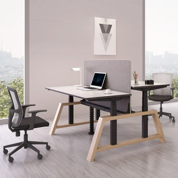
A comfortable employee is a productive employee. Ergonomics is not a luxury; it's a fundamental necessity in any office environment. Poorly designed workstations can lead to a host of musculoskeletal issues, from back pain to carpal tunnel syndrome, resulting in increased absenteeism and decreased efficiency. Investing in ergonomic chairs, adjustable-height desks, and properly positioned monitors is an investment in the long-term health and performance of your team.
Designing for Synergy: The Strategic office layout design
The arrangement of workstations and cubicles is as important as the furniture itself. A strategic office layout design can facilitate seamless communication and collaboration while still providing pockets of privacy for focused work. This involves creating "neighborhoods" for different teams, placing collaborative zones in central, easily accessible areas, and ensuring that high-traffic pathways don't cut through quiet work zones.
Breaking Down Barriers with Hybrid Designs
The most effective office environments often feature a hybrid approach. This might involve clusters of cubicles for focused work, interspersed with open, collaborative "huddle spaces" equipped with whiteboards and comfortable seating. This variety allows employees to choose the environment that best suits the task at hand, offering the best of both worlds.
The Role of Acoustics in a Thriving Workplace
Noise is one of the biggest complaints in open-plan offices. Well-designed cubicles with sound-dampening panels can significantly mitigate this issue. Furthermore, incorporating acoustic solutions throughout the office, such as sound-absorbing materials on walls and ceilings, can create a more pleasant and productive auditory environment for everyone.
Integrating Technology for a Seamless Workflow
In the digital age, technology is the lifeblood of any business. Modern office workstations are designed with this in mind, featuring integrated power and data ports, cable management systems, and ample space for multiple monitors. This seamless integration of technology ensures that employees have the tools they need to work efficiently and without frustration.
Choosing the Right Partner for Your Office Environment
The task of outfitting an office can be daunting. Partnering with a knowledgeable and reputable Meet&Co commercial furniture supplier is crucial to creating an environment that is both functional and inspiring. A good supplier will not only offer a wide range of high-quality products but will also provide expert advice on space planning and ergonomic best practices, ensuring that your investment yields the best possible return.
The Future of the Office: Flexibility and Adaptability
The world of work is constantly evolving, and office design must evolve with it. The future lies in creating flexible and adaptable spaces that can be easily reconfigured to meet the changing needs of a business. Modular furniture and movable partitions are key components of this future-proof approach, allowing organizations to scale and adapt without the need for costly and disruptive renovations.
Conclusion: A Strategic Investment in Your Greatest Asset
Ultimately, the design of your office is a direct reflection of your company's culture and values. By investing in high-quality, ergonomic, and well-designed office workstations and cubicles, you are sending a clear message to your employees: their well-being and productivity matter. This strategic investment in your physical workspace is, in fact, an investment in your most valuable asset your people. The result is a more engaged, efficient, and innovative team, ready to tackle the challenges of tomorrow.
 Henne Creative LLC
Where Modern Serenity Meets Sculptural Design
Designed by HENNE CREATIVE
Nestled along the tranquil shoreline of Malibu, this private residence completed in 2025 is a testament to the harmony between contemporary architecture and coastal calm. Designed by HENNE CREATIVE, the space offers a deeply intentional experience that celebrates stillness, light, and form.
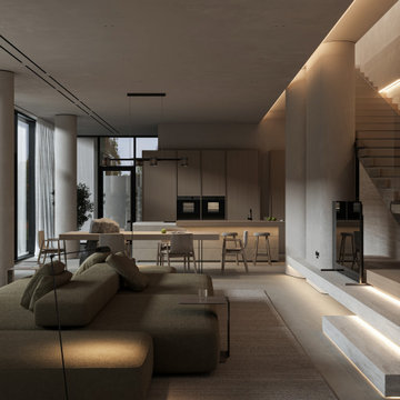
The open plan layout embraces clarity and cohesion, allowing natural light to flow freely throughout. Every detail is curated to reflect quiet sophistication: soft geometries, a neutral color palette, and tactile materials work in seamless concert. From floor to ceiling, natural stone textures and warm wood tones build a calm visual rhythm across the space.
The living area features a sculptural modular sofa that invites conversation while anchoring the spatial narrative. Behind it, a floating staircase highlighted by integrated linear lighting becomes an architectural statement, elegantly connecting levels without visual clutter.
The kitchen and dining space are understated yet refined. Handleless cabinetry blends into the background, while the island serves as a clean centerpiece. A custom dining chair with textured upholstery offers a subtle sculptural moment at the table one of the project’s signature design notes.
Design Language:
Minimalist, tactile, and serene with a focus on volume, light, and material honesty.
Material Palette:
Travertine inspired surfaces, natural oak, boucle and linen textiles.
Lighting:
Embedded linear LEDs and minimalist pendant lighting accentuate the architecture without overwhelming it.
This home is not merely a living space; it’s a spatial philosophy an invitation to slow down, to live intentionally, and to feel grounded in simplicity. At HENNE CREATIVE, we design spaces to be felt, not just seen and Malibu House is one of our purest expressions of that vision.
 Henne Creative LLC
Where Modern Serenity Meets Sculptural Design
Designed by HENNE CREATIVE
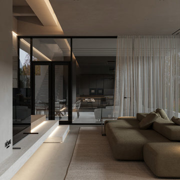
Nestled along the tranquil shoreline of Malibu, this private residence completed in 2025 is a testament to the harmony between contemporary architecture and coastal calm. Designed by HENNE CREATIVE, the space offers a deeply intentional experience that celebrates stillness, light, and form.
The open plan layout embraces clarity and cohesion, allowing natural light to flow freely throughout. Every detail is curated to reflect quiet sophistication: soft geometries, a neutral color palette, and tactile materials work in seamless concert. From floor to ceiling, natural stone textures and warm wood tones build a calm visual rhythm across the space.
The living area features a sculptural modular sofa that invites conversation while anchoring the spatial narrative. Behind it, a floating staircase highlighted by integrated linear lighting becomes an architectural statement, elegantly connecting levels without visual clutter.
The kitchen and dining space are understated yet refined. Handleless cabinetry blends into the background, while the island serves as a clean centerpiece. A custom dining chair with textured upholstery offers a subtle sculptural moment at the table one of the project’s signature design notes.
Design Language:
Minimalist, tactile, and serene with a focus on volume, light, and material honesty.
Material Palette:
Travertine inspired surfaces, natural oak, boucle and linen textiles.
Lighting:
Embedded linear LEDs and minimalist pendant lighting accentuate the architecture without overwhelming it.
This home is not merely a living space; it’s a spatial philosophy an invitation to slow down, to live intentionally, and to feel grounded in simplicity. At HENNE CREATIVE, we design spaces to be felt, not just seen and Malibu House is one of our purest expressions of that vision.
 Ciarcelluti Mathers Architecture
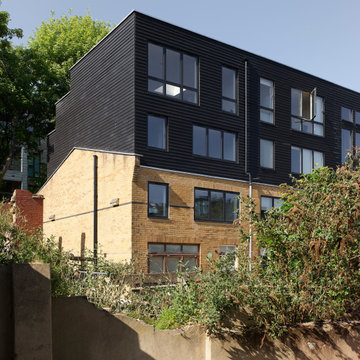
This unique project, in the heart of London Fields' creative sector, involved adjacent live-work units owned individually by a furniture maker and a group of video makers. Although experts in their respective fields, neither had experience with multi-unit development. The project presented several challenges and concerns from our clients, which we addressed with creative solutions, expertise, flexibility and collaboration.
The pair of property owners had become accidental developers by virtue of opportunity. We guided them through a complex process by helping them plan effectively, overcoming several obstacles, and ultimately leading them towards a successful outcome.
Our client's primary challenge was maximising the development potential. The two properties are part of a terrace of four. The other two owners had already added an extra storey. The new volume established a precedent for a volume the planners wanted to complete. Maximising the development potential would require carefully considering the limitations of the established volume to ensure a design that would captivate the target market of young and creative professionals.
To overcome these challenges, we took a comprehensive approach that integrated functional and aesthetic considerations. We first focused on reimagining the interior layout, utilising our expertise to optimise space and create a seamless flow within the units. This involved carefully addressing the planning limitations at the front, resulting in a stepped profile, which had initially posed limits to potential uses.
 highland
Creating the perfect fall home design, Pedrovazpaulo Real Estate and floorplan is one of the best ways to make your living space warm, functional, and visually attractive during the cozy autumn season. Fall is the time when families spend more time indoors, enjoy warm colors, and focus on comfort. A well-planned home layout not only improves beauty but also increases convenience for everyday living. A smart fall home design and floorplan should include open spaces, natural lighting, warm textures, and practical room arrangements. Whether you are building a new home or renovating your current one, choosing the right layout is essential. Modern homeowners also look for stylish house design plan options that combine beauty with efficiency. In this article, we will explore how to create the perfect fall home design and floorplan, discuss modern layout trends, and explain how house plan design, home architecture design, home design plans, and home plan design work together to build a dream home.
Why Fall Home Design Matters
A good fall home design and floorplan helps your house feel welcoming and peaceful. During autumn, people prefer warm interiors, comfortable seating areas, and rooms that allow better natural light. A thoughtful layout supports these needs while improving the overall value of the property. Fall-inspired homes often include earthy tones like brown, beige, orange, and cream. Large windows are also common because they allow sunlight to brighten indoor spaces. Open kitchens connected to dining and living rooms are another popular feature in modern house design plan ideas. When your fall home design and floorplan is properly planned, every room serves a purpose while maintaining visual harmony.
Key Features of a Perfect Floorplan
1. Open Living Spaces
One major part of a strong fall home design and floorplan is an open-concept living area. Combining the kitchen, dining room, and living room creates a spacious feeling and improves family interaction. Modern house plan design focuses on flexibility. Open spaces make entertaining guests easier and allow better furniture arrangement for seasonal decorations.
2. Functional Entryway
Your entrance should feel warm and organized. A good mudroom or foyer is essential in any fall home design and floorplan because it helps manage shoes, coats, and seasonal accessories. This practical idea is often included in professional home design plans for families who want both beauty and convenience.
3. Cozy Bedrooms
Bedrooms should provide comfort and privacy. Soft lighting, warm colors, and smart furniture placement improve relaxation. A strong home plan design ensures bedrooms are away from noisy areas for better peace.
4. Outdoor Connection
Fall is perfect for enjoying patios, balconies, and garden views. Many experts in home architecture design recommend adding sliding glass doors or covered patios to connect indoor and outdoor spaces. This improves both beauty and property value.
Importance of House Design Planning
A successful fall home design and floorplan starts with a detailed house design plan. Without proper planning, homes may look attractive but fail in functionality. A professional house design plan includes room sizes, traffic flow, ventilation, and furniture placement. It also ensures your budget is used wisely. Many homeowners regret skipping this step because poor layouts create long-term inconvenience. Good planning also supports future needs such as children, guests, or work-from-home spaces.
Role of Home Architecture Design
Strong home architecture design gives personality to your house. It combines exterior beauty with interior efficiency. The roof style, wall structure, windows, and natural light all affect the success of your fall home design and floorplan. For example, homes with high ceilings and large windows feel brighter and more open during fall. Natural materials like wood and stone also add warmth and seasonal charm. Professional home architecture design creates a balance between modern trends and personal lifestyle needs.
Choosing the Right Home Design Plans
Selecting the right home design plans helps avoid expensive mistakes. Your plan should match your land size, family size, and future goals. Single-story homes are ideal for small families and elderly residents, while double-story layouts work better for growing families. Your fall home design and floorplan should also include storage spaces, laundry areas, and practical bathroom locations. Customized home design plans are often better than copied layouts because they reflect your exact needs.
Modern Trends in Home Plan Design
Today’s home plan design focuses on simplicity, energy efficiency, and natural comfort. Some popular trends include:
- Minimalist kitchens with hidden storage
- Multi-purpose rooms for office and guest use
- Energy-saving windows and insulation
- Smart lighting systems
- Indoor plants and natural decoration
Conclusion
A well-planned fall home design and floorplan creates a home that feels warm, beautiful, and highly functional. From open living spaces to cozy bedrooms and outdoor connections, every detail matters when designing a seasonal home. Using a smart house design plan, strong house plan design, creative home architecture design, detailed home design plans, and practical home plan design helps you achieve the perfect balance of style and comfort. Whether you are building from scratch or improving your current house, investing in the right fall home design and floorplan will bring long-term satisfaction and better living quality. A thoughtful home is not just a place to live—it becomes a place to truly enjoy every season. Also you can read in homemaxe website for Pedrovazpaulo Real Estate
FAQs
1. What is a fall home design and floorplan?
A fall home design and floorplan is a home layout designed to create warmth, comfort, and functionality during the autumn season using cozy interiors and smart room arrangements.
2. Why is a house design plan important?
A house design plan helps organize room sizes, movement flow, lighting, and budget management before construction begins.
3. How does home architecture design improve a house?
Home architecture design improves both exterior appearance and interior comfort by balancing beauty, structure, and natural lighting.
4. What should be included in home design plans?
Good home design plans should include bedrooms, bathrooms, kitchen layout, storage spaces, outdoor areas, and future family needs.
5. What makes a modern home plan design successful?
A successful home plan design focuses on comfort, energy efficiency
 Art of Kitchens Pty Ltd
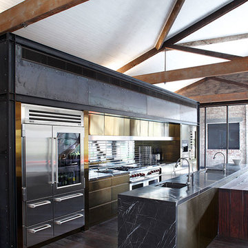
Our client wanted a unique, modern space that would pay tribute to the industrial history of the original factory building, yet remain an inviting space for entertaining, socialising and cooking.
This project focused on designing an aesthetically pleasing, functional kitchen that complemented the industrial style of the building. The kitchen space needed to be impressive in its own right, without taking away from the main features of the open-plan living area.
Every facet of the kitchen, from the smallest tile to the largest appliance was carefully considered. A combination of creative design and flawless joinery made it possible to use diverse materials such as stainless steel, reclaimed timbers, marble and reflective surfaces alongside integrated state-of-the-art appliances created an urbane, inner-city space suitable for large-scale entertaining or relaxing.
 TKS Design Group
Free ebook, Creating the Ideal Kitchen. DOWNLOAD NOW
Collaborations with builders on new construction is a favorite part of my job. I love seeing a house go up from the blueprints to the end of the build. It is always a journey filled with a thousand decisions, some creative on-the-spot thinking and yes, usually a few stressful moments. This Naperville project was a collaboration with a local builder and architect. The Kitchen Studio collaborated by completing the cabinetry design and final layout for the entire home.
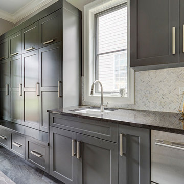
Access to the back of the house is through the mudroom which is outfitted with just about every possible storage feature you can think of for a mudroom. For starters, the basics – a locker for each family member. In addition to that, there is an entire cabinet with roll outs devoted just to shoes, one for cleaning supplies and one for extra coats. The room also features a small clean up sink as well as a set of refrigerator drawers making grabbing a Gatorade on the way to soccer practice a piece of cake.
If you are building a new home, The Kitchen Studio can offer expert help to make the most of your new construction home. We provide the expertise needed to ensure that you are getting the most of your investment when it comes to cabinetry, design and storage solutions. Give us a call if you would like to find out more!
Designed by: Susan Klimala, CKBD
Builder: Hampton Homes
Photography by: Michael Alan Kaskel
For more information on kitchen and bath design ideas go to: www.kitchenstudio-ge.com
 Amazing Spaces
We started with a blank slate on this basement project where our only obstacles were exposed steel support columns, existing plumbing risers from the concrete slab, and dropped soffits concealing ductwork on the ceiling. It had the advantage of tall ceilings, an existing egress window, and a sliding door leading to a newly constructed patio.
This family of five loves the beach and frequents summer beach resorts in the Northeast. Bringing that aesthetic home to enjoy all year long was the inspiration for the décor, as well as creating a family-friendly space for entertaining.
Wish list items included room for a billiard table, wet bar, game table, family room, guest bedroom, full bathroom, space for a treadmill and closed storage. The existing structural elements helped to define how best to organize the basement. For instance, we knew we wanted to connect the bar area and billiards table with the patio in order to create an indoor/outdoor entertaining space. It made sense to use the egress window for the guest bedroom for both safety and natural light. The bedroom also would be adjacent to the plumbing risers for easy access to the new bathroom. Since the primary focus of the family room would be for TV viewing, natural light did not need to filter into that space. We made sure to hide the columns inside of newly constructed walls and dropped additional soffits where needed to make the ceiling mechanicals feel less random.
In addition to the beach vibe, the homeowner has valuable sports memorabilia that was to be prominently displayed including two seats from the original Yankee stadium.
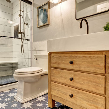
For a coastal feel, shiplap is used on two walls of the family room area. In the bathroom shiplap is used again in a more creative way using wood grain white porcelain tile as the horizontal shiplap “wood”. We connected the tile horizontally with vertical white grout joints and mimicked the horizontal shadow line with dark grey grout. At first glance it looks like we wrapped the shower with real wood shiplap. Materials including a blue and white patterned floor, blue penny tiles and a natural wood vanity checked the list for that seaside feel.
A large reclaimed wood door on an exposed sliding barn track separates the family room from the game room where reclaimed beams are punctuated with cable lighting. Cabinetry and a beverage refrigerator are tucked behind the rolling bar cabinet (that doubles as a Blackjack table!). A TV and upright video arcade machine round-out the entertainment in the room. Bar stools, two rotating club chairs, and large square poufs along with the Yankee Stadium seats provide fun places to sit while having a drink, watching billiards or a game on the TV.
Signed baseballs can be found behind the bar, adjacent to the billiard table, and on specially designed display shelves next to the poker table in the family room.
Thoughtful touches like the surfboards, signage, photographs and accessories make a visitor feel like they are on vacation at a well-appointed beach resort without being cliché.
 Creative Surfaces Countertops & Tile
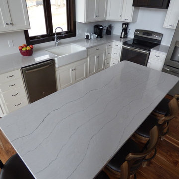
This new home near Crofton, NE was essentially designed by the homeowner herself. She wanted white to be the focus of her new kitchen and after a little bit of research she knew Cambria carried the best selection of white countertop designs. Her home features Cambria Ella in the large galley style kitchen on her island and perimeter which is accented with her slate appliances. The white farmhouse sink gives her kitchen a little bit of that country charm. So that the home was not white throughout she incorporated dark cabinetry in the bathrooms. A small powder bath on the main level features a Cambria Minera countertop; the master bath vanity countertops are Cambria Brittanicca and the children's bathroom showcases Cambria Berwyn. The home office brings some masculinity into the home with dark wood cabinets and Cambria Laneshaw.
 Advance Design Studio, Ltd.
Our clients in Tower Lakes, IL, needed more storage and functionality from their kitchen. They were primarily focused on finding the right combination of cabinets, shelves, and drawers that fit all their cookware, flatware, and appliances. They wanted a brighter, bigger space with a natural cooking flow and plenty of storage. Soffits and crown molding needed to be removed to make the kitchen feel larger. Redesign elements included: relocating the fridge, adding a baking station and coffee bar, and placing the microwave in the kitchen island.
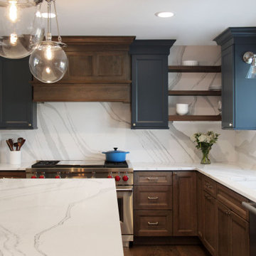
Advance Design Studio’s Claudia Pop offered functional, creative, and unique solutions to the homeowners’ problems. Our clients wanted a unique kitchen that was not completely white, a balance of design and function. Claudia offered functional, creative, and unique solutions to Chad and Karen’s kitchen design challenges. The first thing to go was soffits. Today, most kitchens can benefit from the added height and space; removing soffits is nearly always step one. Steely gray-blue was the color of choice for a freshly unique look bringing a sophisticated-looking space to wrap around the fresh new kitchen. Cherry cabinetry in a true brown stain compliments the stormy accents with sharp contrasting white Cambria quartz top balancing out the space with a dramatic flair.
“We wanted something unique and special in this space, something none of the neighbors would have,” said Claudia.
The dramatic veined Cambria countertops continue upward into a backsplash behind three complimentary open shelves. These countertops provide visual texture and movement in the kitchen. The kitchen includes two larder cabinets for both the coffee bar and baking station. The kitchen is now functional and unique in design.
“When we design a new kitchen space, as designers, we are always looking for ways to balance interesting design elements with practical functionality,” Claudia said. “This kitchen’s new design is not only way more functional but is stunning in a way a piece of art can catch one’s attention.”
Decorative mullions with mirrored inserts sit atop dual sentinel pantries flanking the new refrigerator, while a 48″ dual fuel Wolf range replaced the island cooktop and double oven. The new microwave is cleverly hidden within the island, eliminating the cluttered counter and attention-grabbing wall of stainless steel from the previous space.
The family room was completely renovated, including a beautifully functional entertainment bar with the same combination of woods and stone as the kitchen and coffee bar. Mesh inserts instead of plain glass add visual texture while revealing pristine glassware. Handcrafted built-ins surround the fireplace.
The beautiful and efficient design created by designer Claudia transitioned directly to the installation team seamlessly, much like the basement project experience Chad and Karen enjoyed previously.
“We definitely will and have recommended Advance Design Studio to friends who are looking to embark on a project small or large,” Karen said.
“Everything that was designed and built exactly how we envisioned it, and we are really enjoying it to its full potential,” Karen said.
Our award-winning design team would love to create a beautiful, functional, and spacious place for you and your family. With our “Common Sense Remodeling” approach, the process of renovating your home has never been easier. Contact us today at 847-665-1711 or schedule an appointment.
 Kathleen Jennison
An Arts & Crafts Bungalow is one of my favorite styles of homes. We have quite a few of them in our Stockton Mid-Town area. And when C&L called us to help them remodel their 1923 American Bungalow, I was beyond thrilled.
As per usual, when we get a new inquiry, we quickly Google the project location while we are talking to you on the phone. My excitement escalated when I saw the Google Earth Image of the sweet Sage Green bungalow in Mid-Town Stockton. "Yes, we would be interested in working with you," I said trying to keep my cool.
But what made it even better was meeting C&L and touring their home, because they are the nicest young couple, eager to make their home period perfect. Unfortunately, it had been slightly molested by some bad house-flippers, and we needed to bring the bathroom back to it "roots."
We knew we had to banish the hideous brown tile and cheap vanity quickly. But C&L complained about the condensation problems and the constant fight with mold. This immediately told me that improper remodeling had occurred and we needed to remedy that right away.
The Before: Frustrations with a Botched Remodel
The bathroom needed to be brought back to period appropriate design with all the functionality of a modern bathroom. We thought of things like marble countertop, white mosaic floor tiles, white subway tile, board and batten molding, and of course a fabulous wallpaper.
This small (and only) bathroom on a tight budget required a little bit of design sleuthing to figure out how we could get the proper look and feel. Our goal was to determine where to splurge and where to economize and how to complete the remodel as quickly as possible because C&L would have to move out while construction was going on.
The Process: Hard Work to Remedy Design and Function
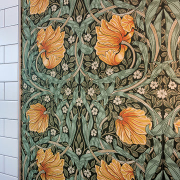
During our initial design study, (which included 2 hours in the owners’ home), we noticed framed images of William Morris Arts and Crafts textile patterns and knew this would be our design inspiration. We presented C&L with three options and they quickly selected the Pimpernel Design Concept.
We had originally selected the Black and Olive colors with a black vanity, mirror, and black and white floor tile. C&L liked it but weren’t quite sure about the black, We went back to the drawing board and decided the William & Co Pimpernel Wallpaper in Bayleaf and Manilla color with a softer gray painted vanity and mirror and white floor tile was more to their liking.
After the Design Concept was approved, we went to work securing the building permit, procuring all the elements, and scheduling our trusted tradesmen to perform the work.
We did uncover some shoddy work by the flippers such as live electrical wires hidden behind the wall, plumbing venting cut-off and buried in the walls (hence the constant dampness), the tub barely balancing on two fence boards across the floor joist, and no insulation on the exterior wall.
All of the previous blunders were fixed and the bathroom put back to its previous glory. We could feel the house thanking us for making it pretty again.
The After Reveal: Cohesive Design Decisions
We selected a simple white subway tile for the tub/shower. This is always classic and in keeping with the style of the house.
We selected a pre-fab vanity and mirror, but they look rich with the quartz countertop. There is much more storage in this small vanity than you would think.
The Transformation: A Period Perfect Refresh
We began the remodel just as the pandemic reared and stay-in-place orders went into effect. As C&L were already moved out and living with relatives, we got the go-ahead from city officials to get the work done (after all, how can you shelter in place without a bathroom?).
All our tradesmen were scheduled to work so that only one crew was on the job site at a time. We stayed on the original schedule with only a one week delay.
The end result is the sweetest little bathroom I've ever seen (and I can't wait to start work on C&L's kitchen next).
Thank you for joining me in this project transformation. I hope this inspired you to think about being creative with your design projects, determining what works best in keeping with the architecture of your space, and carefully assessing how you can have the best life in your home.
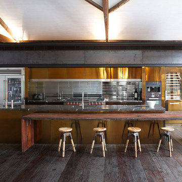 Art of Kitchens Pty Ltd
Our client wanted a unique, modern space that would pay tribute to the industrial history of the original factory building, yet remain an inviting space for entertaining, socialising and cooking.
This project focused on designing an aesthetically pleasing, functional kitchen that complemented the industrial style of the building. The kitchen space needed to be impressive in its own right, without taking away from the main features of the open-plan living area.
Every facet of the kitchen, from the smallest tile to the largest appliance was carefully considered. A combination of creative design and flawless joinery made it possible to use diverse materials such as stainless steel, reclaimed timbers, marble and reflective surfaces alongside integrated state-of-the-art appliances created an urbane, inner-city space suitable for large-scale entertaining or relaxing.
 Judy Mozen
Gregg Willett
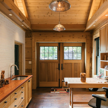
Inspiration for a small farmhouse freestanding desk dark wood floor and brown floor home studio remodel in Atlanta with brown walls
Inspiration for a small farmhouse freestanding desk dark wood floor and brown floor home studio remodel in Atlanta with brown walls
 TKS Design Group
Download our free ebook, Creating the Ideal Kitchen. DOWNLOAD NOW
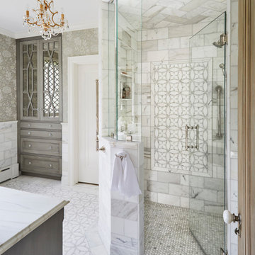
This homeowner’s daughter originally contacted us on behalf of her parents who were reluctant to begin the remodeling process in their home due to the inconvenience and dust. Once we met and they dipped their toes into the process, we were off to the races. The existing bathroom in this beautiful historical 1920’s home, had not been updated since the 70’/80’s as evidenced by the blue carpeting, mirrored walls and dropped ceilings. In addition, there was very little storage, and some health setbacks had made the bathroom difficult to maneuver with its tub shower.
Once we demoed, we discovered everything we expected to find in a home that had not been updated for many years. We got to work bringing all the electrical and plumbing up to code, and it was just as dusty and dirty as the homeowner’s anticipated! Once the space was demoed, we got to work building our new plan. We eliminated the existing tub and created a large walk-in curb-less shower.
An existing closet was eliminated and in its place, we planned a custom built in with spots for linens, jewelry and general storage. Because of the small space, we had to be very creative with the shower footprint, so we clipped one of the walls for more clearance behind the sink. The bathroom features a beautiful custom mosaic floor tile as well as tiled walls throughout the space. This required lots of coordination between the carpenter and tile setter to make sure that the framing and tile design were all properly aligned. We worked around an existing radiator and a unique original leaded window that was architecturally significant to the façade of the home. We had a lot of extra depth behind the original toilet location, so we built the wall out a bit, moved the toilet forward and then created some extra storage space behind the commode. We settled on mirrored mullioned doors to bounce lots of light around the smaller space.
We also went back and forth on deciding between a single and double vanity, and in the end decided the single vanity allowed for more counter space, more storage below and for the design to breath a bit in the smaller space. I’m so happy with this decision! To build on the luxurious feel of the space, we added a heated towel bar and heated flooring.
One of the concerns the homeowners had was having a comfortable floor to walk on. They realized that carpet was not a very practical solution but liked the comfort it had provided. Heated floors are the perfect solution. The room is decidedly traditional from its intricate mosaic marble floor to the calacutta marble clad walls. Elegant gold chandelier style fixtures, marble countertops and Morris & Co. beaded wallpaper provide an opulent feel to the space.
The gray monochromatic pallet keeps it feeling fresh and up-to-date. The beautiful leaded glass window is an important architectural feature at the front of the house. In the summertime, the homeowners love having the window open for fresh air and ventilation. We love it too!
The curb-less shower features a small fold down bench that can be used if needed and folded up when not. The shower also features a custom niche for storing shampoo and other hair products. The linear drain is built into the tilework and is barely visible. A frameless glass door that swings both in and out completes the luxurious feel.
Designed by: Susan Klimala, CKD, CBD
Photography by: Michael Kaskel
For more information on kitchen and bath design ideas go to: www.kitchenstudio-ge.com
 Transitional Designs
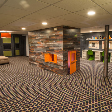
My client wanted bold colors and a room that fueled her children’s creativity. We transformed the old storage space underneath the staircase into a playhouse by simply adding a door and tiny windows. On one side of the staircase I added a blackboard and on the other side the wall was covered in a laminate wood flooring to add texture completing the look of the playhouse. A custom designed writing desk with seating to accommodate both children for their art and homework assignments. The entire area is designed for playing, imagining and creating.
Javier Fernandez Transitional Designs, Interior Designer
Greg Pallante Photographer
35