
Search results for "Decisions plan" in Home Design Ideas
 Jaffa Group Design Build
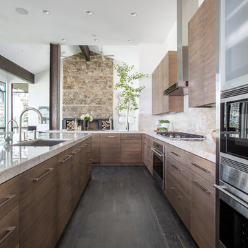
This beautiful kitchen built by Peppertree Kitchen and Bath with cabinets of architectural-grade, rift-sawn white oak veneer. It has a wire-brushed texture with a custom satin and glaze.
 Bergeron Custom Homes, LLC
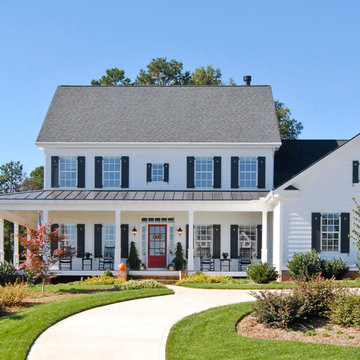
Farmhouse white two-story exterior home idea in Charleston with a mixed material roof
 Board & Vellum
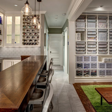
A custom built room for LEGO storage also provides a backdrop for a Media Room and a nearby bar. John Wilbanks Photography
Basement - transitional underground basement idea in Seattle with gray walls and a bar
Basement - transitional underground basement idea in Seattle with gray walls and a bar
Find the right local pro for your project
 O’Hara Interiors
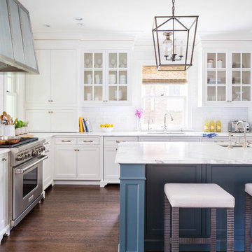
Martha O'Hara Interiors, Interior Design & Photo Styling | John Kraemer & Sons, Remodel | Troy Thies, Photography
Please Note: All “related,” “similar,” and “sponsored” products tagged or listed by Houzz are not actual products pictured. They have not been approved by Martha O’Hara Interiors nor any of the professionals credited. For information about our work, please contact design@oharainteriors.com.
 Maison Maya
Tim Williams Photography
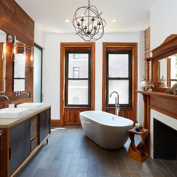
Bathroom - large transitional master ceramic tile bathroom idea in New York with white walls, a vessel sink, concrete countertops, flat-panel cabinets and black cabinets
Bathroom - large transitional master ceramic tile bathroom idea in New York with white walls, a vessel sink, concrete countertops, flat-panel cabinets and black cabinets
 Yerigan Construction Company
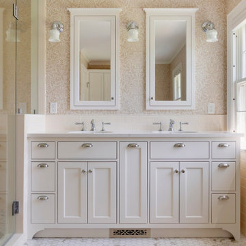
Inspiration for a timeless master beige tile and ceramic tile marble floor, white floor, double-sink and wallpaper bathroom remodel in Minneapolis with beaded inset cabinets, white cabinets, a one-piece toilet, multicolored walls, an undermount sink, quartz countertops, a hinged shower door, white countertops and a built-in vanity
 Ashley Kiely Living
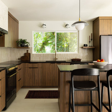
Mid-century modern kitchen remodel in Portland, Oregon, featuring walnut cabinetry, black countertops, a fluted tile backsplash and an island with seating.
Sponsored
Sunbury, OH

J.Holderby - Renovations
Franklin County's Leading General Contractors - 2X Best of Houzz!
 Surfside Home Co.
Photo Credit: Pura Soul Photography
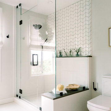
Bathroom - mid-sized scandinavian bathroom idea in San Diego
Bathroom - mid-sized scandinavian bathroom idea in San Diego
 Studio Dearborn
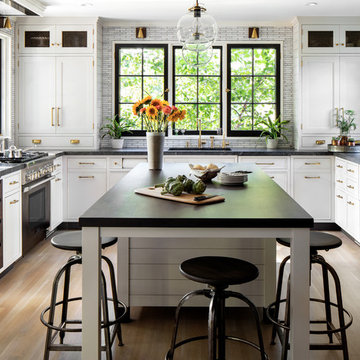
INTERNATIONAL AWARD WINNER. 2018 NKBA Design Competition Best Overall Kitchen. 2018 TIDA International USA Kitchen of the Year. 2018 Best Traditional Kitchen - Westchester Home Magazine design awards.
The designer's own kitchen was gutted and renovated in 2017, with a focus on classic materials and thoughtful storage. The 1920s craftsman home has been in the family since 1940, and every effort was made to keep finishes and details true to the original construction. For sources, please see the website at www.studiodearborn.com. Photography, Adam Kane Macchia and Timothy Lenz

 Gast Architects
Mariko Reed Architectural Photography
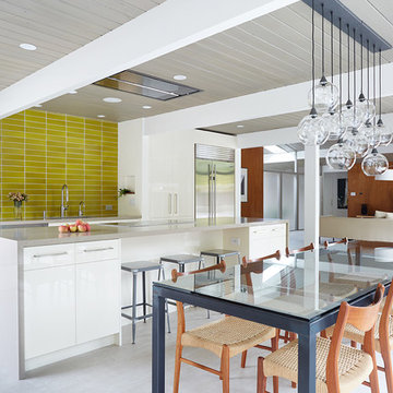
Open concept kitchen - 1950s galley open concept kitchen idea in San Francisco with white cabinets, yellow backsplash and an island
Open concept kitchen - 1950s galley open concept kitchen idea in San Francisco with white cabinets, yellow backsplash and an island
 Polycor
Ryan Struck Photography
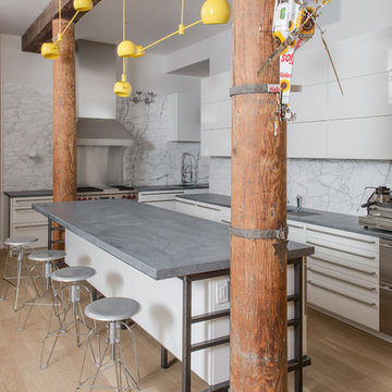
Urban l-shaped light wood floor kitchen photo in New York with flat-panel cabinets, white cabinets, white backsplash, stainless steel appliances and an island
Urban l-shaped light wood floor kitchen photo in New York with flat-panel cabinets, white cabinets, white backsplash, stainless steel appliances and an island
 Manhattan Home Design
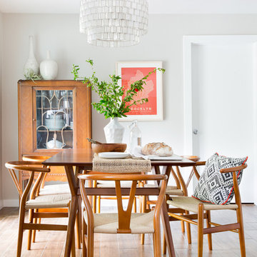
As the kitchen is in the center of the house, we finished it with wish bone chairs they perfectly complement industrial wooden table they have. We kept the old chandelier and vase.

Sponsored
Columbus, OH

Hope Restoration & General Contracting
Columbus Design-Build, Kitchen & Bath Remodeling, Historic Renovations
 O’Hara Interiors
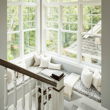
Martha O'Hara Interiors, Interior Design | L. Cramer Builders + Remodelers, Builder | Troy Thies, Photography | Shannon Gale, Photo Styling
Please Note: All “related,” “similar,” and “sponsored” products tagged or listed by Houzz are not actual products pictured. They have not been approved by Martha O’Hara Interiors nor any of the professionals credited. For information about our work, please contact design@oharainteriors.com.
 Prentiss Balance Wickline Architects
Photography: Eirik Johnson
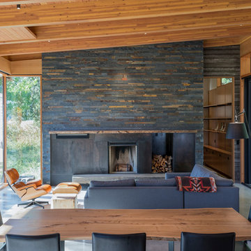
Inspiration for a mid-sized rustic concrete floor and gray floor dining room remodel in Seattle with a standard fireplace
Inspiration for a mid-sized rustic concrete floor and gray floor dining room remodel in Seattle with a standard fireplace
 Wolf & Wing Interior Design
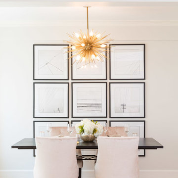
Inspiration for a mid-sized transitional light wood floor dining room remodel in New York with beige walls and no fireplace
 Klopf Architecture
Nestled in the hills of Orinda, California, this 1951 residence is one of only seven extant homes, now known as “The Magnificent Seven”, designed by architect Olof Dahlstrand, a protégé of Frank Lloyd Wright. With its low-slung rooflines, natural materials, and deep integration with the sloping landscape, the home is a pristine example of mid-century modern design inspired by Wright’s organic principles. Over the years, prior homeowners have emphasized preservation, ensuring that the house remained relatively untouched. Each owner has respected the original architecture and stayed true to Dahlstrand’s intent. When a family of five—two college-aged sons and a middle school-aged daughter—acquired the property, they were captivated by its history, legacy of care, and architectural significance. While they appreciated Dahlstrand’s original vision, they also recognized the need to adapt the home for contemporary living while preserving its design integrity.
The remodel was conceived as a thoughtful response to the past—an effort to bring the house into the 21st century without compromising its soul. The primary mandate was to maintain architectural continuity while improving the functionality, comfort, and livability for a modern family. The design team—architects and contractor alike—worked with a shared reverence for the original architecture, allowing that mindset to guide even the most technical or pragmatic decisions.
A key objective was to increase natural light in the kitchen—a departure from Wrightian principles of enclosed, intimate cooking spaces—while maintaining the home’s architectural language. The kitchen was reconfigured to foster a stronger connection to adjacent living spaces while retaining the underlying concept of spatial separation. One of the most transformative architectural changes was the removal of a ridge beam that was originally planned to remain visible through the kitchen. During construction, the team collaborated on a better solution: a wide-flanged steel beam concealed within the roof envelope. This subtle move preserved the clean lines and ceiling continuity, a modern update carried out with utmost respect for the existing framework.
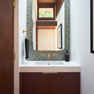
The home’s original powder room, previously accessible only through the kitchen, was relocated for better flow and privacy. A new powder room was carved out of former kitchen cabinetry—a narrow, interior space that could have felt dark and enclosed. To avoid this, the design extended the line of original transom windows into the new powder room and added a skylight above the vanity. The result is a bright and airy space that feels consistent with the rest of the home. Other updates included the installation of new solid-core interior doors with veneers carefully matched to the original mahogany, enhancing the continuity of the interiors. Even smaller decisions, such as placing the door knobs at 42 inches high, mirrored the original proportions. Every choice reflected a shared belief between the architect, contractor, and client: that new work should serve the integrity of the old.
The home’s extensive interior redwood millwork and paneling was meticulously restored. Where new materials were introduced—such as the replacement redwood soffit paneling—the contractor took pains to find finish nails that matched the original, rather than using modern equivalents. This level of craftsmanship and collaboration defined the project. It extended even to the detailing of a blind door to the new powder room, which had to disappear into the existing redwood board-and-batten wall. It was a team effort: the owner found a suitable handle, the architects devised the custom in-swing mechanism, and the contractor executed it so the door aligned precisely with the battens. Throughout, the homeowners were deeply engaged in the design process. One, a meticulous design enthusiast, focused on aesthetic integrity and historic detail. The other brought a practical and function-driven perspective, ensuring that new fixtures and materials would be durable and require minimal maintenance.
While the home’s location posed no major site challenges, sustainability was a key concern. The team upgraded the roof insulation, installed solar panels with battery storage, and added ductless mini-split cooling systems. Lighting was another area where modern technology was woven into a historic framework: new square LED fixtures echo the original custom perimeter soffit lights, maintaining the design language while offering advanced performance.
A planned expansion of a bedroom into suite with a bathroom had to be shelved due to budget constraints and the high cost of below-grade foundation work. Still, the team focused their efforts on making the most of the existing footprint, resolving constraints through design ingenuity rather than adding square footage. This renovation represents a collaborative achievement in preserving and evolving a historically significant home. Every decision was shaped by a shared ethos among clients, architects, and contractor: to maintain the home’s architectural soul while updating it for contemporary life. The result is a timeless modernist residence that continues Olof Dahlstrand’s legacy, remaining grounded in nature, craftsmanship, and human-scale design.
Klopf Architecture Team: John Klopf, AIA, Klara Kevane, Fernanda Bernardes
Interior Architectural Design: Klopf Architecture
Structural Engineer: Daniel Bastiao
Contractor: Don Larwood, Larwood Construction
Photography: Mariko Reed
Year Completed: 2022

Sponsored
Sunbury, OH
J.Holderby - Renovations
Franklin County's Leading General Contractors - 2X Best of Houzz!

 Advance Design Studio, Ltd.
After six years of living in their Huntley IL home, Chris and Meghan were tired of their dark, dingy, outdated kitchen and it was finally time for a long-anticipated change. “The kitchen is the place where we live, it’s where we do everything,” Meghan said. “It was important that it be a space where we wanted to be.” Meghan loves cooking and enjoys including their girls in healthy meal prepping, this led them to want a brighter, more enjoyable kitchen with increased functionality and improved storage.
For Chris especially, the laundry room was an entirely dysfunctional eyesore. “We had a washer and a dryer, but it was all kind-of cobbled together!” Chris said. “There were always laundry piles everywhere, we weren’t really sure what we wanted to do in there, but it was time for us to make a change.” The mess of the space was stressful every time they walked in the door from the garage each day. Kids’ backpacks and shoes piled up haphazardly in the makeshift boot-bench closet left the family feeling disorganized and stressed. They needed space for folding clothes and locker cubbies to help keep the family organized.
Having known Christine and Todd in the Huntley community for years, Chris and Meghan were familiar with their work. “We already trusted them personally and having seen their projects for years we knew they did top notch work. After we reviewed the initial round of designs, we knew that hiring them was definitely the right choice,” Meghan and Chris said. Although Chris had done a lot of work in their home himself, the kitchen and laundry room renovation was such a large undertaking that he didn’t want to steal time away from his family to spend what would surely be many long weekends doing the job himself. “That would not have been a wise choice for us,” Chris laughed.
“Our designer, Michelle was very, very, easy to work with; anything we wanted to see or weren’t sure about, she went above and beyond to make this easy for us. She was easy to get hold of and always quick to respond,” the couple said. Michelle pulled ideas that mirrored the couple’s taste and style and was adept at directing the couple to limited choices that didn’t overwhelm them and kept the process moving. “I have a hard time making decisions. Michelle made the decision-making process so easy. I loved how she listened to what I liked and then presented three great options for me to choose from,” Meghan said.
The main objectives for the kitchen were better storage solutions, they wanted the space to reflect their lifestyle and taste, and they wanted it to last for years with low maintenance. One of the first steps in creating a more functional kitchen was relocating the refrigerator, creating an improved workflow for the busy family.
“We didn’t know that we could even move the refrigerator to a new location where it is now, that was something that we never would have thought of,” Chris said. “The new refrigerator location makes the kitchen feel so much bigger. We didn’t add any space, but our whole kitchen with the new design just seems like it’s so much larger than before!” Meghan said.
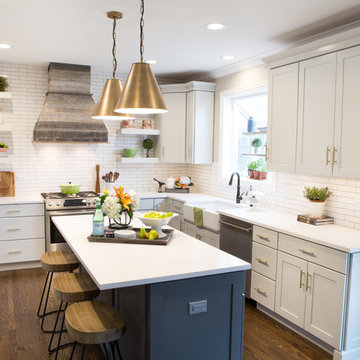
The perimeter mist colored cabinets helped warm and brighten the entire room, while the graphite colored cabinets on the island added contrast. Using this fresh, clean color palette satisfied the couple’s desire for a bright space that was the exact opposite of what they had before. Organization accessories were also added to the cabinets such as a spice drawer tray and roll outs to create hidden convenience.
“I absolutely love the hidden spices – it makes cooking so much more enjoyable!” Chris said. “And all the pull outs, and the double trash bin, who would think you could get so excited about organization!” the couple said in unison.
One thing they hated in their original kitchen was how dark the space felt. Added lighting on the ceiling with the new light fixtures combined with the lighter cabinetry colors throughout solved this problem. “Our new kitchen has this warm, almost cozy feeling that our old kitchen never had, it’s just a space that I love spending my time in now,” Meghan said. The light airy feeling was accentuated with the use of floating white shelves on either side of the decorative range hood. “We have so much cabinetry space, the new design is amazing we actually have more storage space than we will ever need,” Meghan said.
The island was extended to create more work surface and added space for stool seating. “The new island changes how we live. Now the kids can be in the kitchen with us, doing homework, eating breakfast, and the three of us have special dinners there when Chris is working late,” Meghan said.
The Carrara Marmi Quartz countertops were chosen because they are, not only beautiful, but are made from hard-working material that doesn’t require maintenance. The white subway tile backsplash that wraps to the ceiling behind the focal point cooktop range/hood compliments the crisp white countertops perfectly, while brushed brass hardware and light fixtures keep the design fresh and new.
The couple had a few fears at the beginning of the project, as most homeowners do. Their biggest fear was being out of their kitchen and laundry room for an extended time. The crew made it very easy for the family to work in a limited space keeping the washer and dryer hooked up the majority of the time, and also getting appliances working with minimal downtime.
“They above and beyond accommodated us to get us through the process,” Meghan said. “They did a great job making sure we were as comfortable as possible throughout the process,” Chris added.
“Our project manager DJ did a great job. He was very good at updating us on schedule changes, getting guys in as quickly as possible. Everyone that stepped in the house was nice and did great work,” said Chris. They thought Advance’s carpenter was phenomenal and were impressed when he took a conceptual idea from a photograph and worked with designer Michelle to create a one of a kind range/hood that has become the topic of conversation with friends and family who visit the new kitchen. “He was in our house literally every day for several weeks. He was easy to work with and good at what he did,” Meghan and Chris said.
The focal point of the kitchen; a hand-crafted, custom-built ventilation hood was clad with handpicked reclaimed barnwood. Advance Design’s carpenter built the framework and the cladding to create a one-of-a-kind design element that the couple loves.
“I think it was especially fun for him to create something unique from scratch, showcasing his talent in this area,” Meghan said. “I love that my kitchen is not like everyone else’s. I got to pick out the wood on my hood and watch it being built and was able to choose what pieces of wood went where on it. It’s totally unique.”
Red Oak flooring was toothed-in throughout the kitchen and the rest of the first floor anywhere changes were made. Then the whole floor was refinished to tone down the orange undertones in the existing floor stain, ultimately changing the color complexion of the entire first floor. The result is a completely new feeling to the entire home.
Renovating the laundry room was extremely important to Meghan and Chris, but they had trouble visualizing what the possibilities were for the seemingly small space. Michelle produced beautiful 3D illustrations that helped them envision the space in a whole new way.
“I must have told Michelle 100 times that I am a visual person, seeing the designs in 3D made it so easy to make decisions and see what we could really do with our space,” Meghan said.
A dividing wall and doorway were removed between the existing laundry room and hallway formerly containing a coat closet, providing space to design specialized graphite colored cabinetry matching the kitchen island to house custom storage cubbies for each family member. Adding the tall utility cabinetry in the new laundry area helped solve the storage issue, tucking away cleaning supplies, household items, and even the cat got its own cubby.
“I love how everything is now hidden in its own space. I can’t tell you how much I hated coming home and seeing everything sitting around on counters,” Chris said.
Electrical outlets were planned for the inside of utility cabinets, so devices could charge in hidden locations. Stacking the washer and dryer allowed for wider countertop space to provide a folding area and a special space for clothes to hang. “The way I do laundry has been completely transformed! I can actually fold clothes and hang them now right out of the washer and dryer,” Meghan said.
“The end result in the kitchen and the laundry/mud room was an updated light and bright space, with a smarter work flow that better meets the needs of this family,” Michelle said.
“I would totally recommend Advance Design,” Meghan said. “Sometimes I sit and just look at my kitchen and laundry room and think ‘Wow, I can’t believe I get to live here!’ It’s an understatement to say we love our new space.”
 Sarah Dane-Brown Designs
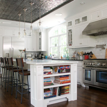
Inspiration for a large transitional l-shaped medium tone wood floor and brown floor kitchen remodel in San Luis Obispo with an undermount sink, recessed-panel cabinets, white cabinets, gray backsplash, stainless steel appliances, an island and black countertops
3