
Search results for "Deliberation" in Home Design Ideas
 Wendel Klein Builders, Inc.
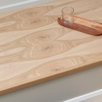
This expansive Cambridge residence was ready for a new chapter, and Wendel Klein Design Build was honored to lead the transformation. By meticulously remodeling both the interior and exterior, we struck a deliberate balance between modern functionality and historic charm. The result is a home that feels entirely current while honoring its original soul.
 Infinite Possibilities Landscape & Design
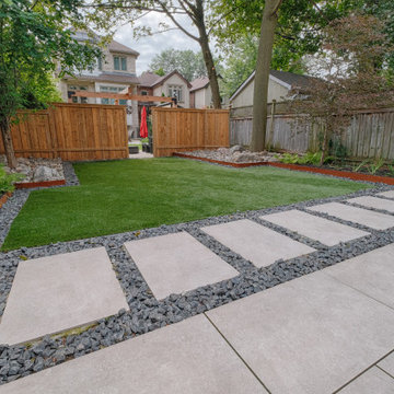
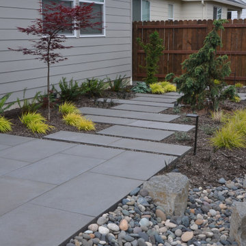
Stepping stone placement and spacing is important within a contemporary backyard design plan. Spacing depends on the size of your stones and the desired aesthetic. For a contemporary look, we chose wider gaps between stones, creating a deliberate and eye-catching pattern.
As for layout, we created a clear and intentional path with the stepping stones. You can opt for a straight path, a gently curving one, or even a geometric design, such as a grid or zigzag pattern, to achieve a contemporary feel.
Placing the stepping stones and gravel strategically provides easy access to your garden beds and other areas of interest in your backyard. This path is both functional and visually appealing.
 DEANE Inc | Distinctive Design & Cabinetry
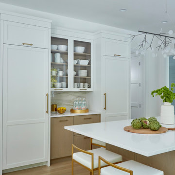
Located in the highly sought-after Allwood neighborhood of Darien, this spec house is the fourth collaboration with a client who first began with a renovation of her own home. While architecturally it is a traditional home from the exterior, the interiors are more transitional in style. In order to compete in the speculative market, our client’s directive was clear – ‘differentiation the kitchen design from every other spec house’. So we incorporated painted cabinetry but highlighted with rift-cut white oak base cabinets. This contrast between these finishes influenced our decision to select a subtle white quartzite countertop to deliberately highlight the striking porcelain backsplash.
The steel and glass partition frames the space – drawing the eye to the focal point of the kitchen, the custom stainless steel hood. Gold hardware adds a pop of flair to the space and warms the room. Walnut drawer inserts, stainless steel appliance garage, pull out trash drawers with compost bins and a stylish desk make this the Gold Standard of spec houses.
Find the right local pro for your project
 SM Design
Bridle Path Residence — Formal Dining Room
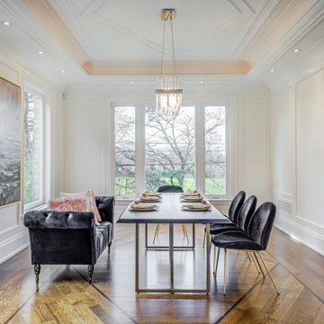
This Bridle Path Residence dining room is designed as a refined architectural setting where classic detailing provides the foundation for a more contemporary interpretation of formal entertaining. The room feels intentionally composed rather than overly decorated, allowing proportion, natural light, material contrast, and carefully selected furnishings to create its character.
The architecture is the quiet luxury of the space. Floor-to-ceiling wall panelling frames the room with a strong sense of rhythm and proportion, while the elaborately detailed coffered ceiling draws the eye upward and gives the dining area a greater sense of volume. Warm concealed illumination within the ceiling detail adds a subtle layer of glow, particularly in the evening, and reinforces the architectural geometry without making the lighting feel theatrical.
Large surrounding windows are central to the design. Rather than treating the dining room as an enclosed formal space, the expansive glazing opens the room toward the mature landscape outside, allowing natural light and views of the greenery to become part of the interior composition. This connection to the landscape softens the formality of the architecture and gives the room a relaxed residential quality.
The furniture introduces a deliberate contemporary counterpoint. A sleek dining table with a refined metal base sits comfortably within the traditional architectural envelope, while the sculptural black dining chairs bring a stronger graphic element. Their curved silhouettes soften the linear wall panelling and create an elegant contrast against the predominantly light interior.
The deep charcoal lounge chairs at the end of the table add another layer of intimacy, transforming the dining room into more than a space for formal meals. They create a secondary seating moment and introduce tactile upholstery, making the room feel comfortable and lived-in.
The dark-toned area rug visually anchors the dining arrangement against the warm hardwood flooring, while the large-scale artwork introduces an expressive, painterly element. Its muted palette complements the room without competing with the architectural detailing.
A suspended crystal chandelier provides the final layer of refinement, positioned centrally within the coffered ceiling to emphasize symmetry and create a luminous focal point over the dining table. The combination of crystal, dark upholstery, warm wood flooring, polished metal, and crisp white millwork creates a sophisticated material dialogue.
The overall design is rooted in modern elegance within a classic architectural framework. Traditional millwork and proportion establish permanence, while contemporary furnishings, sculptural forms, artwork, and restrained colour create a fresher interpretation of formal dining. The result is an elegant entertaining space that feels sophisticated, welcoming, and distinctly tailored to the character of the Bridle Path Residence.
 Harmony Design Northwest
Transforming the blank canvas of a basic builder’s backyard into a captivating retreat, we turned a grass-dominated space into an effortlessly elegant low-maintenance haven with a distinct Asian flair. At the heart of this metamorphosis is the expanded patio and walkway, featuring offset architectural pavers that not only captivate the eye but also contribute to a dynamic sense of flow throughout the elongated backyard.
A key focal point is the thoughtfully designed rain garden, adorned with strategically placed boulders that manages stormwater runoff in an aesthetically pleasing way.
The carefully curated plant palette plays a pivotal role in achieving the desired aesthetic. The deliberate choice of low grasses and foliage-forward perennials, coupled with the inclusion of small evergreen plants and vibrant Japanese maples, creates a harmonious blend of colors, shapes, and sizes. This contrasting arrangement not only ensures visual interest year-round but also infuses the space with a timeless allure inspired by Asian design principles.
The result is a backyard oasis that transcends the ordinary, offering a serene escape with minimal upkeep requirements. The strategic combination of hardscape elements, lush greenery, and carefully selected plants transforms this space into a sanctuary where the beauty of nature meets the sophistication of thoughtful design.
 Eugene Pintail LLC
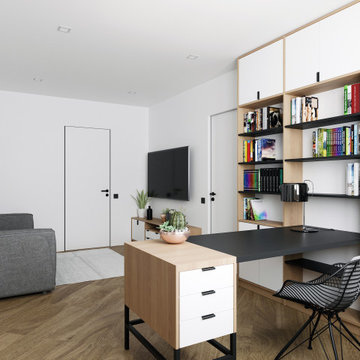
Gylden æra embraces the timeless elegance of Scandinavian minimalism in a compact apartment. By streamlining layout and materials, it creates a serene, deliberate environment where simplicity speaks volumes.
Every detail is intentionally crafted—from the seamless integration of functional areas to the uncluttered circulation paths. The design presents a visual calm that enhances both daily living and quiet reflection.
Soft woods, matte surfaces, and warm neutrals anchor the scheme. Subtle use of light tones amplifies natural light and expands spatial perception. Textural variations—like woven textiles, fine-grain wood, and matte finishes—add depth without compromising simplicity.
Minimalist lighting design—wall-mounted fixtures, linear pendants—complements the space's architectural rhythm without drawing attention away. Strategic layering of natural and ambient light enhances mood while maintaining visual clarity.
Gylden æra feels both peaceful and poised—moderated yet expressive. It captures a balance of restrained luxury and everyday comfort, honoring Scandinavian roots.
 Metropolis Drafting and Construction Inc
Today’s investment landscape in California features a surge in transforming single-family lots into vibrant multi-family residences, facilitated by recent SB9 and ADU laws. This project exemplifies how a modest 6,750-square-foot lot can accommodate a 1,500-square-foot primary home alongside a 2,500-square-foot duplex, seamlessly integrating design, functionality, and neighborhood aesthetics.
The primary residence underwent a meticulous interior transformation, evolving from a 3-bedroom, 1.5-bath layout into a spacious 4-bedroom, 2-bath home. Strategic reconfigurations centered around creating an expansive great room—an open-concept space adorned with vaulted ceilings—where the kitchen, dining, and living areas converge into a magnificent communal zone.
Exterior updates further distinguish the property. The front and side yards are enclosed with fencing and privacy hedges, linked by concrete pathways that enhance outdoor functionality while compensating for backyard space lost during renovations. The exterior façade was refreshed with darker tones, deliberately contrasting with the duplex to emphasize architectural separation.
Designed to preserve the suburban charm, the duplex visually mimics a single-family home from the street. Its facade creates an illusion of a two-story residence, maintaining harmony within the neighborhood fabric. The main unit, developed under SB9 guidelines, features three bedrooms and two bathrooms, with a luxurious parents’ suite situated upstairs. Downstairs, two bedrooms share a full bath, creating a balanced family-oriented layout.
The duplex’s interior boasts 9-foot ceilings throughout, elevating the sense of space and openness. The design thoughtfully places the kitchen at the front, inviting guests into the home, while stairs on the right lead to the private upstairs bedroom suite.
The ADU offers a two bedroom and two & half baths. the unit is accessible via a private side entrance with a dedicated walkway. Its layout includes a ground-floor living room, a galley kitchen, and a discreet powder room beneath the stairs, designed to contain guest traffic and maintain privacy upstairs. The upstairs bedrooms each feature luxurious bathrooms with expansive showers, adding an element of modern elegance.
Both units enjoy thoughtfully landscaped outdoor spaces—private patios, backyard areas, and gated front yards—creating welcoming environments for residents and visitors alike.
This project exemplifies innovative urban infill solutions, blending architectural elegance with legal compliance and community harmony—an inspiring blueprint for the future of residential development in California.
 Georgia Zikas Design
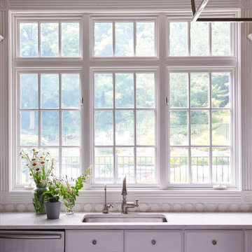
Youthful tradition for a bustling young family. Refined and elegant, deliberate and thoughtful — with outdoor living fun.
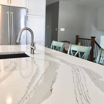
Transitional l-shaped medium tone wood floor and brown floor eat-in kitchen photo in Other with an undermount sink, raised-panel cabinets, white cabinets, marble countertops, white backsplash, marble backsplash, stainless steel appliances, an island and white countertops
Transitional l-shaped medium tone wood floor and brown floor eat-in kitchen photo in Other with an undermount sink, raised-panel cabinets, white cabinets, marble countertops, white backsplash, marble backsplash, stainless steel appliances, an island and white countertops
 Gallery KBNY
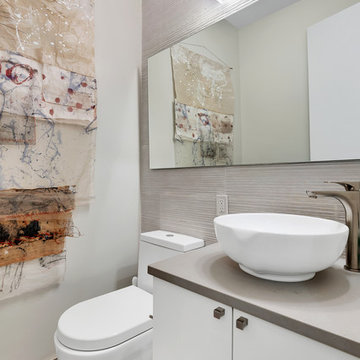
In this Manhattan pied-à-terre renovation, Gallery tackled the entire apartment. A true full renovation, we updated the kitchen, master bathroom, and powder room, installed new flooring throughout the entire space, and built the entertainment center in the living room.
DESIGN DETAILS
The clients wanted their pied-à-terre to have some modern touches, but not too sleek or contemporary. Since it combines a number of styles and elements, transitional turned out to be their ideal aesthetic. Whites, grays, and earthy tones carried this color theme throughout the apartment.
One of the clients is an artist and wanted wall space to display their original work, visible in the dining area and powder room in the photos below. The entertainment center is another highlight, with its white mosaic brick tile accent wall and glass open shelves to display family photos on both sides.
Instead of tiles, the new powder room walls received a textured concrete application, resulting in an almost industrial vibe. In the master bathroom renovation, glass mosaic tile accent walls bring a touch of personality to both the shower and a storage nook opposite the vanity.
UNIQUELY-SHAPED ROOMS
We specialize in adapting to every potential challenge, including uniquely-shaped rooms like the nearly-triangular kitchen in this Manhattan pied-à-terre renovation.
It’s important to design an uncommonly-shaped space as practically as possible, including specs seemingly as small as sink positioning. Every little detail counts tenfold in a room that’s not rectangular!
Other design details in the kitchen renovation include the classic combination of Shaker-style cabinets and quartz countertops, with a glass mosaic backsplash that matches the one used in the bathroom.
VISIBILITY = TRUST
Communication is always a core value at Gallery, but it’s even more vital when working with bi-coastal clients who were in another state throughout almost the entire process. We met with them once; everything else was done virtually thanks to JobTracker, our project management system.
The client had complete visibility into the renovation, including all design renderings, scheduled installations, and daily progress videos and photos. Even though they were 3000 miles away, they had a direct line to everyone on the team at all times.
SOME HIGHLIGHTS
- Entertainment center designed and built to serve as focal point, with white brick mosaic accent wall and open shelves made of glass
- Track lighting for ease of displaying art and to preserve ceiling height instead of the dropped ceiling that recessed lighting would necessitate
- Deliberate consideration of space in the unusually-shaped, nearly triangular kitchen
- Glass mosaic tile accent walls in the master bathroom with matching tile for the backsplash in the kitchen
Thinking about renovating your bathroom? Contact us today to find out how you can benefit from our expertise in remodeling New York City bathrooms. As a design-and-build firm with a full-scale approach, we handle every single aspect of your home renovation from start to finish.
 Ridgewood Home Construction
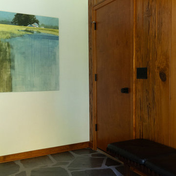
This mid-century modern Rockford home was updated in stages, and the kitchen needed a complete remodel. The homeowners desired a kitchen that felt current without breaking from the character that defined the rest of the house. That meant we needed to choose materials that fit the home and highlighted the home’s character.
Our team sourced pecky cypress and natural slate tile from non-traditional suppliers to get the exact look the home called for. The wood cabinetry was paired with a granite island, providing a gathering space in the kitchen without overpowering it. Because both materials required careful handling during installation, the crew worked more slowly and deliberately through this phase than a standard remodel. The result connected the kitchen directly to the living area, so the two spaces feel like one continuous room built in the same style as the rest of the home.
 Madley Fine Cabinetry
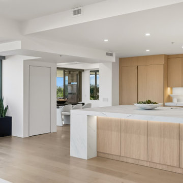
This is the largest luxury penthouse in Old Town Scottsdale, and the cabinetry was designed to match that distinction.
The kitchen anchors an expansive open-plan living space with flat-front white oak cabinetry running wall to wall, clean and uninterrupted against crisp white walls. A dramatic oversized island in white marble with bold veining commands the center of the room, its waterfall edge dropping cleanly to the floor on two sides. The scale of the island is deliberate: it holds its own against the floor-to-ceiling windows and the sweeping Scottsdale skyline beyond.
Black fixtures ground the design without adding weight. Integrated appliances maintain the clean line of the cabinetry wall. Under-cabinet lighting warms the stone backsplash at the perimeter, balancing the brightness of the natural light flooding the space.
Every decision in this kitchen was made at the scale of the property. The result is a space that leads the room rather than serving it.
Scope: Full kitchen cabinetry, oversized waterfall island
Material: White oak, white marble, black fixtures
Style: Contemporary luxury, minimalist modern
Location: Old Town Scottsdale, AZ
luxury kitchen cabinetry Scottsdale, white oak kitchen cabinets Scottsdale, marble waterfall island kitchen, custom penthouse cabinetry Scottsdale AZ, minimalist kitchen design Phoenix, floor to ceiling cabinetry, custom cabinet maker Scottsdale, luxury condo kitchen remodel Phoenix metro, frameless white oak cabinets, contemporary kitchen design Scottsdale, high end kitchen cabinetry Arizona
 Fiorito Interior Design
It’s rare when a client comes to me with a brief for a complete home from scratch, but that is exactly what happened here. My client, a professional musician and singer, was having a luxury three-story condo built and wanted help choosing not only all the hardscape materials like tile, flooring, carpet, and cabinetry, but also all furniture and furnishings. I even outfitted his new home with plates, flatware, pots and pans, towels, sheets, and window coverings. Like I said, this was from scratch!
We defined his style direction for the new home including dark colors, minimalistic furniture, and a modern industrial sensibility, and I set about creating a fluid expression of that style. The tone is set at the entry where a custom laser-cut industrial steel sign requests visitors be shoeless. We deliberately limited the color palette for the entire house to black, grey, and deep blue, with grey-washed or dark stained neutral woods.
The navy zellige tiles on the backsplash in the kitchen add depth between the cement-textured quartz counters and cerused cabinetry. The island is painted in a coordinating navy and features hand-forged iron stools. In the dining room, horizontal and vertical lines play with each other in the form of an angular linear chandelier, lighted acrylic light columns, and a dining table with a special faceted wave edge. Chair backs echo the shape of the art maps on the wall.
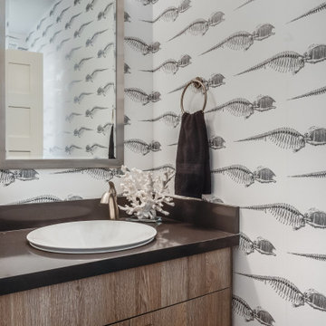
We chose a unique, three dimensional wall treatment for the living room where a plush sectional and LED tunable lights set the stage for comfy movie nights. Walls with a repeating whimsical black and white whale skeleton named Bruce adorn the walls of the powder room. The adjacent patio boasts a resort-like feeling with a cozy fire table, a wall of up-lit boxwoods, and a black sofa and chairs for star gazing.
A gallery wall featuring a roster of some of my client’s favorite rock, punk, and jazz musicians adorns the stairwell. On the third floor, the primary and guest bathrooms continue with the cement-textured quartz counters and same cerused cabinetry.
We completed this well-appointed home with a serene guest room in the established limited color palette and a lounge/office/recording room.
All photos by Bernardo Grijalva
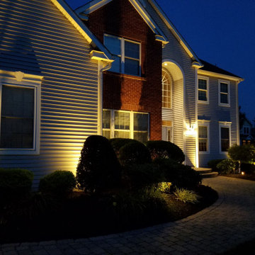
 Outdoor Lighting Design by Preferred Properties
Towering Zelkova Trees with their inherit Vase like Shape and delicate leaves light up like a perfect 10 everytime. The results of this landscape lighting stems back to when our team did the landscaping and the ability to earmark the location of these trees to row up on each side of the driveway really contributes to proper orientation of the home on the plot especially deliberate at night to reach out and welcome guests to bring them into this sideways rear flag lot. The House and grounds are immaculate and show up well at night. Properly placed well and uplights on the trees surrounding the home really make it a welcome sight. The Lighting here is cohesive in dominance and controls the direction of the viewers point of view.
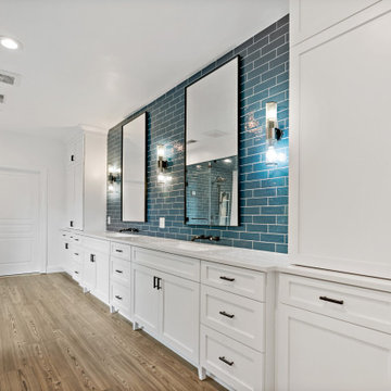
 Moss Building & Design
This Centreville, Virginia primary bath remodel completely transformed the space. The customers' goals were to update the bathroom to a more contemporary design from its traditional look and feel (original to the home). Their vision was to remove the large, walk up bathtub completely and replace it with a massive walk-in shower with steam shower capabilities and a completely tiled bench at one end. The choice of a bright blue tile for (almsot all the) walls, ceiling, bench and backsplash was done deliberately to complement the bright white cabinetry and the warm brown tiled floor. Previous to the remodel, the bathroom had a variety of somewhat ornate columns and heavy cabinetry which dominated the room. Now, the space is clean, bright, and spacious with just as much storage as before.
 My Kitchen And Bath
A complete kitchen and powder room remodel in Herndon, Virginia, designed around two clear priorities: open up the kitchen to the rest of the main level, and create an experience that felt warm and timeless rather than trendy.
The original layout had a wall separating the kitchen from the dining room and an awkward fridge wall that limited both storage and traffic flow. Our solution involved removing the dividing wall (confirmed non-load-bearing), tightening the new dining room opening to 66 inches, and extending the fridge wall 25 inches into the kitchen to create a proper full-height pantry run. The result is a kitchen that breathes — open to the dining and living areas, with clear sight lines from the island to the bay windows at the far end.
Design Approach
The clients came in knowing they didn't want white. They didn't want navy. They wanted something with real wood character — the kind of finish that ages well and looks more like furniture than stock kitchen cabinetry. Cherry was the answer to that question.
We anchored the room around contrast: warm cherry cabinetry against clean white walls and white quartz, black hardware grounding the cherry's warmth, and a single waterfall island acting as the architectural focal point. Stainless appliances, brushed gold pendant accents, and the herringbone hardwood floor pull the room together without any one element shouting for attention.
The Cabinetry
Medallion Gold Line Sonoma Cappuccino — a stained cherry finish that catches light differently throughout the day. All-plywood box construction, solid wood doors and drawer fronts, soft close everywhere, US-made with a lifetime warranty. Four pull-out drawers built into the pantry bottoms keep the deep storage actually usable rather than a black hole.
Cabinet hardware is Top Knobs Riverside Pulls in flat black — 40 pulls across drawers and doors, plus three longer pulls on the 36-inch base drawers. The black was a deliberate decision: with cherry and stainless already providing warm and cool tones, brass or gold would have been one warm tone too many. Black grounds the cabinetry and gives the kitchen its architectural definition.
The Island and Countertops
MSI Calacatta Miraggio Gold quartz throughout — perimeter counters, island, waterfall ends, and the powder room. The Gold variant has subtle warm veining that pairs with cherry where cooler whites would have fought the wood tone.
The island gets a full waterfall edge — slabs book-matched, miters precise, the finished edge essentially seamless. Treating the island as architectural sculpture rather than just functional storage. The black undermount farmhouse-style sink ties back to the hardware throughout the rest of the kitchen.
The Backsplash
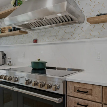
MSI Metro Gold tile — small format white and gold tiles in a herringbone-adjacent pattern with intermittent gold accents. Full height, continuous behind the floating shelves and behind the hood.
Four custom floating shelves are spaced above a 3-inch countertop ledge: first shelf 18 inches above the ledge, second shelf 9 inches above that, third 18 inches above the second. The shelves are stained to match the cabinetry. The backsplash continues behind the shelves and behind the hood, so the wall reads as a continuous textured surface that the shelves and hood float in front of.
The Appliances
This is a serious cooking kitchen. The clients chose a 48-inch Wolf gas range, a Sub-Zero built-in refrigerator integrated into the cherry cabinet wall, a Wolf microwave drawer in the island base, and a Bosch dishwasher. For ventilation, we installed a 1200 CFM hood paired with a make-up air system to balance the negative pressure that hood pulls. New ducting was routed through the exterior siding on the side of the house.
The Flooring
MSI engineered hardwood throughout the entire main level — approximately 800 square feet — installed in a Bramlett herringbone pattern. Herringbone adds roughly 15-20 percent to material and labor costs because of the angled cuts and waste factor, but the result is a floor that reads as more considered and luxurious than standard plank flooring. Finished with 4.5-inch white wood baseboards throughout.
The Powder Room
A small room with a big personality. The clients chose a deep blue and teal scallop pattern wallpaper (client-supplied, we installed) and paired it with the same Sonoma Cappuccino cherry vanity used in the kitchen — material continuity between the spaces.
Powder room countertop is the same MSI Calacatta Miraggio Gold quartz from the kitchen with a rectangular white undermount sink. Hardware on the powder room vanity is Top Knobs Riverside in honey bronze rather than the kitchen's flat black — the warm bronze pulls the brass tones from the faucet into the millwork and complements the wallpaper. New sconce, kept the existing toilet (refinishing or replacing a working toilet is wasted money in a powder room remodel), and a Panasonic Whisper Green exhaust fan.
Project Specs
Location: Herndon, Virginia
Project type: Combined kitchen and powder room remodel
Project duration: Approximately 4 to 6 weeks
Style: Transitional, Modern Farmhouse, Warm Wood Contemporary
Color palette: Cherry, white, black, brushed gold, deep blue (powder room)
Materials
Cabinetry (kitchen and powder room): Medallion Gold Line Sonoma Cappuccino cherry, Shaker-style, all-plywood box construction, lifetime warranty
Kitchen hardware: Top Knobs Riverside Pulls in flat black (TK1014BLK and TK1017BLK)
Powder room hardware: Top Knobs Riverside Pulls in honey bronze (TK1012HB)
Counter tops: MSI Calacatta Miraggio Gold Quartz, pencil edge, waterfall island
Backsplash: MSI Metro Gold tile, full height
Floating shelves: 4 custom shelves at 48" by 9", stained to match cabinets
Range: 48-inch Wolf gas range
Refrigerator: Sub-Zero built-in
Microwave: Wolf microwave drawer (island base)
Hood: 1200 CFM with make-up air system
Kitchen sink: Kohler farmhouse-style, 36-inch base, black
Kitchen faucet: Brizo (homeowner-supplied)
Flooring: MSI engineered hardwood in Bramlett herringbone pattern, approximately 800 sq ft
Baseboards: 4.5-inch white wood throughout
Powder room wallpaper: Client-supplied scallop pattern in blues and teals
Powder room exhaust fan: Panasonic Whisper Green
Paint: Benjamin Moore
Designed and built by My Kitchen and Bath out of our Herndon showroom at 285 Sunset Park Drive. We've been designing and building kitchens, bathrooms, and full home renovations across Northern Virginia and the DMV since 1994.
 My Kitchen And Bath
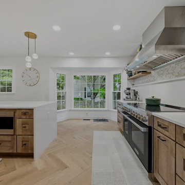
A complete kitchen and powder room remodel in Herndon, Virginia, designed around two clear priorities: open up the kitchen to the rest of the main level, and create an experience that felt warm and timeless rather than trendy.
The original layout had a wall separating the kitchen from the dining room and an awkward fridge wall that limited both storage and traffic flow. Our solution involved removing the dividing wall (confirmed non-load-bearing), tightening the new dining room opening to 66 inches, and extending the fridge wall 25 inches into the kitchen to create a proper full-height pantry run. The result is a kitchen that breathes — open to the dining and living areas, with clear sight lines from the island to the bay windows at the far end.
Design Approach
The clients came in knowing they didn't want white. They didn't want navy. They wanted something with real wood character — the kind of finish that ages well and looks more like furniture than stock kitchen cabinetry. Cherry was the answer to that question.
We anchored the room around contrast: warm cherry cabinetry against clean white walls and white quartz, black hardware grounding the cherry's warmth, and a single waterfall island acting as the architectural focal point. Stainless appliances, brushed gold pendant accents, and the herringbone hardwood floor pull the room together without any one element shouting for attention.
The Cabinetry
Medallion Gold Line Sonoma Cappuccino — a stained cherry finish that catches light differently throughout the day. All-plywood box construction, solid wood doors and drawer fronts, soft close everywhere, US-made with a lifetime warranty. Four pull-out drawers built into the pantry bottoms keep the deep storage actually usable rather than a black hole.
Cabinet hardware is Top Knobs Riverside Pulls in flat black — 40 pulls across drawers and doors, plus three longer pulls on the 36-inch base drawers. The black was a deliberate decision: with cherry and stainless already providing warm and cool tones, brass or gold would have been one warm tone too many. Black grounds the cabinetry and gives the kitchen its architectural definition.
The Island and Countertops
MSI Calacatta Miraggio Gold quartz throughout — perimeter counters, island, waterfall ends, and the powder room. The Gold variant has subtle warm veining that pairs with cherry where cooler whites would have fought the wood tone.
The island gets a full waterfall edge — slabs book-matched, miters precise, the finished edge essentially seamless. Treating the island as architectural sculpture rather than just functional storage. The black undermount farmhouse-style sink ties back to the hardware throughout the rest of the kitchen.
The Backsplash
MSI Metro Gold tile — small format white and gold tiles in a herringbone-adjacent pattern with intermittent gold accents. Full height, continuous behind the floating shelves and behind the hood.
Four custom floating shelves are spaced above a 3-inch countertop ledge: first shelf 18 inches above the ledge, second shelf 9 inches above that, third 18 inches above the second. The shelves are stained to match the cabinetry. The backsplash continues behind the shelves and behind the hood, so the wall reads as a continuous textured surface that the shelves and hood float in front of.
The Appliances
This is a serious cooking kitchen. The clients chose a 48-inch Wolf gas range, a Sub-Zero built-in refrigerator integrated into the cherry cabinet wall, a Wolf microwave drawer in the island base, and a Bosch dishwasher. For ventilation, we installed a 1200 CFM hood paired with a make-up air system to balance the negative pressure that hood pulls. New ducting was routed through the exterior siding on the side of the house.
The Flooring
MSI engineered hardwood throughout the entire main level — approximately 800 square feet — installed in a Bramlett herringbone pattern. Herringbone adds roughly 15-20 percent to material and labor costs because of the angled cuts and waste factor, but the result is a floor that reads as more considered and luxurious than standard plank flooring. Finished with 4.5-inch white wood baseboards throughout.
The Powder Room
A small room with a big personality. The clients chose a deep blue and teal scallop pattern wallpaper (client-supplied, we installed) and paired it with the same Sonoma Cappuccino cherry vanity used in the kitchen — material continuity between the spaces.
Powder room countertop is the same MSI Calacatta Miraggio Gold quartz from the kitchen with a rectangular white undermount sink. Hardware on the powder room vanity is Top Knobs Riverside in honey bronze rather than the kitchen's flat black — the warm bronze pulls the brass tones from the faucet into the millwork and complements the wallpaper. New sconce, kept the existing toilet (refinishing or replacing a working toilet is wasted money in a powder room remodel), and a Panasonic Whisper Green exhaust fan.
Project Specs
Location: Herndon, Virginia
Project type: Combined kitchen and powder room remodel
Project duration: Approximately 4 to 6 weeks
Style: Transitional, Modern Farmhouse, Warm Wood Contemporary
Color palette: Cherry, white, black, brushed gold, deep blue (powder room)
Materials
Cabinetry (kitchen and powder room): Medallion Gold Line Sonoma Cappuccino cherry, Shaker-style, all-plywood box construction, lifetime warranty
Kitchen hardware: Top Knobs Riverside Pulls in flat black (TK1014BLK and TK1017BLK)
Powder room hardware: Top Knobs Riverside Pulls in honey bronze (TK1012HB)
Counter tops: MSI Calacatta Miraggio Gold Quartz, pencil edge, waterfall island
Backsplash: MSI Metro Gold tile, full height
Floating shelves: 4 custom shelves at 48" by 9", stained to match cabinets
Range: 48-inch Wolf gas range
Refrigerator: Sub-Zero built-in
Microwave: Wolf microwave drawer (island base)
Hood: 1200 CFM with make-up air system
Kitchen sink: Kohler farmhouse-style, 36-inch base, black
Kitchen faucet: Brizo (homeowner-supplied)
Flooring: MSI engineered hardwood in Bramlett herringbone pattern, approximately 800 sq ft
Baseboards: 4.5-inch white wood throughout
Powder room wallpaper: Client-supplied scallop pattern in blues and teals
Powder room exhaust fan: Panasonic Whisper Green
Paint: Benjamin Moore
Designed and built by My Kitchen and Bath out of our Herndon showroom at 285 Sunset Park Drive. We've been designing and building kitchens, bathrooms, and full home renovations across Northern Virginia and the DMV since 1994.
 fine art of design
fine art of design is a full service design and construction company. fine art of design is founded on the principle that achieving timeless design is a deliberate process. Through concept, design and meticulous craftsmanship, the art of placement is where every design begins and ends. We work towards creating beautiful and unique spaces that meet our clients’ lifestyles and brings our clients dreams to reality.
 FA Legacy Rugs
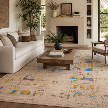
Inspired by antique Persian "garden" and panel rugs, this design organizes a soft, sandy-beige field into a grid of compartments, each holding faded pictorial motifs — cypress trees, blossoms, birds, and small figural forms — rendered in a scattered, semi-erased palette of cornflower blue, mustard gold, sage green, and dusty maroon. The deliberately faded, weathered treatment gives it the look of a beloved antique rug that's lived a long life, with color emerging unevenly across the surface for a soft, painterly effect.
This distressed pictorial style is especially popular in transitional and modern-eclectic spaces that want traditional storytelling motifs without the visual weight of a fully saturated traditional rug.
 Century Stair Company
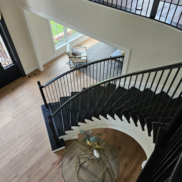
A single curve does a lot of work here. Rising from the main level to a wraparound balcony above, this staircase earns its place at the center of the home — not just structurally, but visually. Black iron balusters and handrails push against crisp white risers in a contrast that feels deliberate rather than decorative. The open floor plan gives it room to breathe, letting the curve read as architecture rather than furniture. The result is a staircase that creates movement even when no one is on it.
1976-2026 © Century Stair Company
 Holly Alexander Signature Design
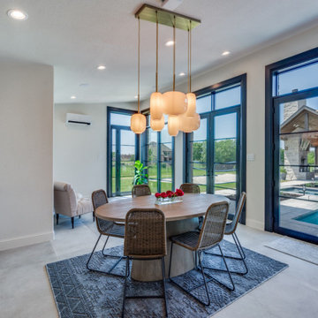
An #organicmodern escape perched on The Edge of a deep blue pool - inviting you to experience the cool weightlessness of the water while simultaneously being pulled into the cozy comfort of the quiet indoor space. The casita was designed to feel like a retreat, the kind of space that slows you down the moment you step into it.
Warm materials, deliberate lines, and an indoor-outdoor flow that blurs the boundary between built and natural.
Designed by Holly Alexander Signature Design, a division of 708 Studios.
16