
Search results for "Deliberation" in Home Design Ideas
 The Stone Studio
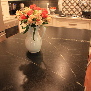
The interesting veining pattern of the black soapstone creates movement in the entire design of this kitchen, encouraging the eye to move diagonally across the room. After extensive deliberation, a Brazilian soapstone from The Stone Studio's soapstone inventory was selected by the homeowner.
 Leicht Westchester-Greenwich
Grounded Aesthetic
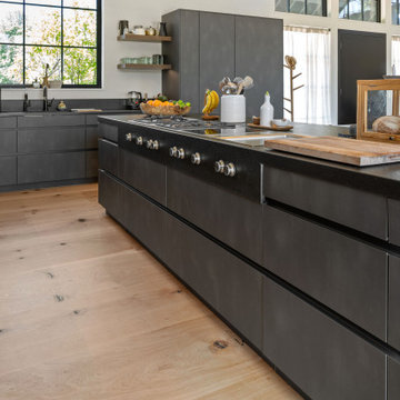
Modern clean lines juxtaposed with natural texture and materials, create a warm and inviting kitchen that feels casual and luxurious at the same time.
Leicht Minera Kiruna cabinets with natural wood and woven elements define the kitchen in this vast open space. Floating wood shelves highlight the functional items that add character and personality to the space.
The distinctive large island includes the prestigious Gaggenau gas & induction combination cooktops for the homeowners’ culinary and entertainment lifestyle.
Bold Neutrals
The deliberate kitchen palette of natural neutral colors is a nod to the Modern Rustic high style. Textured deep grays and black hues combined with an organic natural wood palette, evokes sophistication and warmth.
Neolith Nero Zimbabwe Riverwashed countertop and low backsplash with its deep rich color and rough texture adds to the curated mix. Minera Kiruna panels complete the backsplash composition with its natural metal vibe.
 Adam Gibson Design
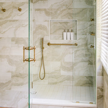
These bathrooms are composed with clean architectural clarity, balancing crisp geometry and warm materiality. Large-format stone tile wraps the walls and sloped ceilings to create a continuous, monolithic envelope, while custom millwork and floating vanities reinforce strong horizontal lines and visual order. The freestanding tub reads as a sculptural element within the space, and warm wood flooring softens the palette and grounds the composition. Brushed brass fixtures provide subtle contrast and refinement, resulting in a calm, well-proportioned interior where detailing and material transitions are deliberately restrained.
Find the right local pro for your project
 Klopf Architecture
Built for the Bluff, A Sea Ranch Home is Remade from the Inside Out
The house had always been grounded, on an ocean bluff at The Sea Ranch. It sits unencumbered, adjacent to one of the most dramatic stretches of the Sonoma coast with protected commons meadow to the east, uninterrupted Pacific views to the west, and a bluff trail running alongside. What it lacked was the feeling of home, one that could hold up its own against the natural landscape.
The owners are entrepreneurs with deep involvement across tech, real estate, and development and they know how things are built. The Sea Ranch house had been in their lives for years, a second residence and a place for family to gather. Built for a different time, it felt more compromising than comfortable. Sitting in a closed off nook, the kitchen fit one cook at a time and turned its back on the rest of the house. The entry was dim and compressed, divided by a structural column that presented itself at exactly the wrong moment. The primary suite was small relative to the view outside it. A large rear bedroom sat behind a lowered ceiling with a bathroom that had never been added. The house was certainly worth the trouble of doing it right.
What followed was not one project but four, each with its own design challenge, each addressed over a period of time.
Where the House Meets the Ocean
The most complex piece of the project, in both structural and spatial terms, was the kitchen expansion. The existing room was a single-person galley squeezed in as an afterthought with no meaningful connection to the dining room, the living space, or the deck outside. To make it useful for a family that cooks and gathers, it needed to grow outward into an existing patio and flow into the rooms around it.
A big challenge was the roofline. Several planes at different pitches and angles converged directly where additional volume was needed. A new form had to join that geometry without reading as a correction. The solution found the simplest possible connection between the existing angles, a roofline that from outside the structure, appears entirely original. From the bluff trail where the addition is visible, there is no discernible seam.
Inside, the kitchen is now open to the living and dining rooms without interruption. A large sliding glass door connects the space onto the rear deck. The deck itself was expanded and oriented so that the body of the house shields it from the coastal wind which is a common consideration that determines whether outdoor space at The Sea Ranch actually gets used. The result is a room that works for large family gatherings where no one feels cutoff, and one that makes the boundary between being inside and outside easy to ignore.
Welcoming Light
A structural column stood at the convergence of eight distinct roof planes in the entry. It was load-bearing, but it was also the reason the entry had always felt like a hallway rather than a welcoming arrival.
With the structural engineer, a custom steel connector was designed to receive beams from six separate directions, redistributing the load through a single new continuous beam. The column was surgically removed. Three triangular skylights were then cut into the roof above, their shapes drawn from the
existing geometry of the planes around them. The entry is now bright and open. The skylights feel native to the structure because they follow the logic already present in the roof.
Two Suites, Two Views
At opposite ends of the house, the two bedroom suites were each reconfigured, and each found a different way to introduce more of the landscape into the room.
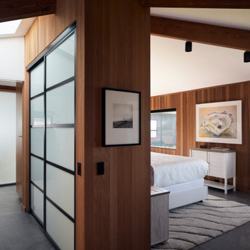
An addition to the primary suite extended the structure outward to create a wraparound plan with a loop from the bedroom through bath and closet that had not been possible before. The expansion opened a slot view from the tub and shower toward the ocean. The view is precise and private. The ocean view is present and deliberate.
The rear bedroom absorbed an adjacent storage room to transform it into a full second suite with a vaulted ceiling, a large bathroom with a tub, a shower, and a sauna. A private fenced garden courtyard sits just beyond the glass bringing the outdoors inside. The tub was placed so that, looking past the courtyard and through the bedroom beyond, the ocean is visible at the far end. It is a long view and it makes the room feel larger and more settled than its footprint would suggest.
Glass on Four Sides, Fire at the Center
The main living and gathering room had always been caught between two competing facts: glass on four sides meant exceptional views but at The Sea Ranch, it also meant a cold room. A 360-degree cylindrical fireplace was added at the center on a raised stone base, providing radiant heat in every direction and giving the room a focal point around which a group naturally orients itself, whether that means two people at the end of the day or the whole family after dinner.
Owners Who Picked Up the Tools
The owner was not a passive client. they came with construction knowledge, specific ideas, and the desire to be an active part of the process, a dynamic that other architects may had found difficult, which Klopf Architecture accepted as an asset. They took it upon themselves to complete some of the work during construction, including the installation of a new radiant heating system beneath the floors.
The radiant system added to the older and less-desirable forced-air setup. At The Sea Ranch, that change matters as the house sits close enough to the ocean and moving air competes with the sound of it, where radiant heat does not. Solar panels were added to the roof as part of the new system. Insulation was upgraded throughout the walls, roof, and crawl space. The house that had always had the right setting now holds warmth the way a house on the bluff should.
They were also deeply involved in the design and selections throughout, and the finished house reflects both of them in ways that are specific rather than generic. The process took longer and moved through more iterations than a more arms-length relationship might have allowed. The result is more defined and personal because of it.
The Landscape Holds Priority
Every exterior decision was shaped by The Sea Ranch Design Standards, which require that buildings defer to the landscape around them rather than compete with it. Because this house sits on the bluff and is visible from the public trail, the additions faced a close review. Existing materials were matched. Geometries were resolved. The additions had to become indistinguishable from the original building.
From the trail, the house reads exactly as it always has — low, cedar-clad, secondary to the meadow and the water. The setting holds priority. Inside, the house has been remade.
Klopf Architecture Project Team: Geoff Campen and Trenton Jewett
Contractor: Shawn Bettega Construction
Photography: ©2025 Mariko Reed
Year Completed: 2023
Location: The Sea Ranch, CA
 Unique Landscapes Ltd
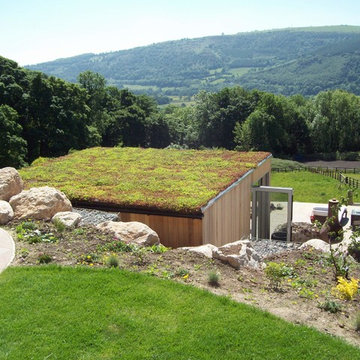
A green roof is a layer of vegetation (living plants) deliberately put on top of a conventional roof surface and bringing a whole host of benefits to the building and the environment. On a sedum roof, the majority of the plants are low growing succulents from the sedum, or stonecrop, family.
 Metropolis Drafting and Construction Inc
Today’s investment landscape in California features a surge in transforming single-family lots into vibrant multi-family residences, facilitated by recent SB9 and ADU laws. This project exemplifies how a modest 6,750-square-foot lot can accommodate a 1,500-square-foot primary home alongside a 2,500-square-foot duplex, seamlessly integrating design, functionality, and neighborhood aesthetics.
The primary residence underwent a meticulous interior transformation, evolving from a 3-bedroom, 1.5-bath layout into a spacious 4-bedroom, 2-bath home. Strategic reconfigurations centered around creating an expansive great room—an open-concept space adorned with vaulted ceilings—where the kitchen, dining, and living areas converge into a magnificent communal zone.
Exterior updates further distinguish the property. The front and side yards are enclosed with fencing and privacy hedges, linked by concrete pathways that enhance outdoor functionality while compensating for backyard space lost during renovations. The exterior façade was refreshed with darker tones, deliberately contrasting with the duplex to emphasize architectural separation.
Designed to preserve the suburban charm, the duplex visually mimics a single-family home from the street. Its facade creates an illusion of a two-story residence, maintaining harmony within the neighborhood fabric. The main unit, developed under SB9 guidelines, features three bedrooms and two bathrooms, with a luxurious parents’ suite situated upstairs. Downstairs, two bedrooms share a full bath, creating a balanced family-oriented layout.
The duplex’s interior boasts 9-foot ceilings throughout, elevating the sense of space and openness. The design thoughtfully places the kitchen at the front, inviting guests into the home, while stairs on the right lead to the private upstairs bedroom suite.
The ADU offers a two bedroom and two & half baths. the unit is accessible via a private side entrance with a dedicated walkway. Its layout includes a ground-floor living room, a galley kitchen, and a discreet powder room beneath the stairs, designed to contain guest traffic and maintain privacy upstairs. The upstairs bedrooms each feature luxurious bathrooms with expansive showers, adding an element of modern elegance.
Both units enjoy thoughtfully landscaped outdoor spaces—private patios, backyard areas, and gated front yards—creating welcoming environments for residents and visitors alike.
This project exemplifies innovative urban infill solutions, blending architectural elegance with legal compliance and community harmony—an inspiring blueprint for the future of residential development in California.
 lavish
This Raleigh, NC home was reimagined from the ground up — not room by room, but as a single, cohesive expression of how a family lives, gathers, and rests.
The architecture drove every decision. Custom millwork and panel molding were carried through every space, creating a visual language that connects the entry to the living room, the dining room to the primary suite. It's what makes the home feel complete — not like a collection of individually finished rooms.
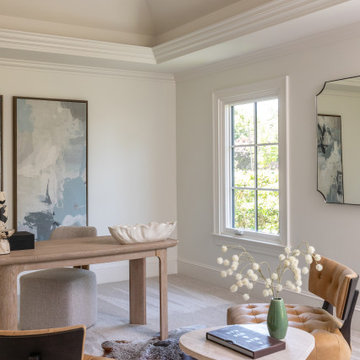
In the kitchen, a full marble slab backsplash reads as one uninterrupted surface — giving the room its presence without competing with the custom white inset cabinetry and brushed nickel hardware. The dining room lives in deliberate contrast: deep-toned oak table, delicate botanical wallpaper, antique mirror. Light and organic, yet entirely considered.
The living room was designed around its connection to the outside — French doors that open directly to a substantial outdoor kitchen and entertaining space, anchored on the interior by a cast stone fireplace with an arched surround that commands the room.
The entry sets the expectation for everything that follows: a double-height foyer, geometric pendants cascading from above, large-scale original artwork, and a carved console that makes the first impression without overstating it.
Designed and executed by Lavish — Raleigh, NC's full-service interior design and remodeling firm.
 Arte Cuisine Kitchen
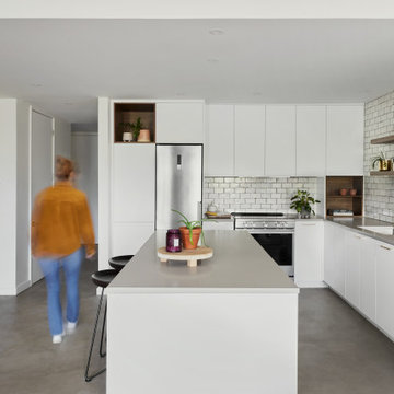
An elegant, airy kitchen
The Louis-Alphonse-Venne Project kitchen is distinguished by its minimalist yet sophisticated elegance.
White polymer cabinets and a quartz countertop with a matte concrete effect add a contemporary touch to the space. The waxed concrete floor, meanwhile, creates a harmonious link between these different elements.
Optimizing storage space is one of the kitchen's main assets. Shelves have been cleverly installed on the wall, while the sink area has been deliberately left free to create an airy, flowing space.
To add warmth to the space, antique metro tiles were used for the backsplash.
Finally, a Mitzi wall light adds to the room's luminosity.
A bold staircase
 George Ocampo
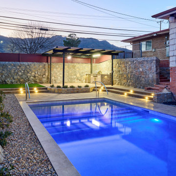
Central El Paso Backyard Renovation:
Fifteen years is a long time for a backyard to quietly wait.
At first, it was full of intention—a pool that promised summers, laughter, and long evenings. But time has a way of settling in. The water turned still, then green. Edges cracked. The space became less of a destination and more of something you looked past. Life moved forward, but the backyard stayed behind.
Then came the decision: it was time.
Not a patch job. Not a quick fix. A complete reset.
The transformation didn’t begin beautifully—it began with demolition. The old pool was drained, exposing years of neglect etched into its surface. Crews stepped in, breaking, clearing, reshaping. What once held stagnant water became an open cavity of possibility. Steel rebar formed a new skeleton, precise and intentional. Every line measured. Every elevation reconsidered.
This wasn’t just construction—it was rethinking how the space should live.
The shell was rebuilt. Surfaces were refined. Plumbing, structure, and flow were corrected at their core. What had once been outdated and failing was now engineered to last.
Then the shift happened.
Hardscape came in—clean, warm-toned concrete replacing worn decking. Stone walls, once just boundaries, were elevated into features. Subtle textures, intentional lines. A visual language that matched the architecture of the home instead of competing with it.
The pool returned—but not as it was.
Now it was sharp, modern, and inviting. A long, clean body of water with a shallow tanning ledge that catches the sun just right. Stainless steel scuppers arc water into the pool—movement, sound, life. Steps are crisp, geometry is balanced, and the water reflects clarity instead of neglect.
Around it, the yard found purpose.
Artificial turf introduced contrast—green, controlled, low-maintenance. A pergola structure rose in the corner, creating a destination within the destination. Beneath it, a built-in outdoor kitchen turned the backyard into a place to gather, not just pass through. Lighting stitched everything together, making the space just as alive at dusk as it is under the midday sun.
By the end, nothing felt accidental.
What was once forgotten is now deliberate. What was once avoided is now the center of attention.
Fifteen years later, the backyard didn’t just come back—it finally became what it was always supposed to be.
 Eugene Pintail LLC
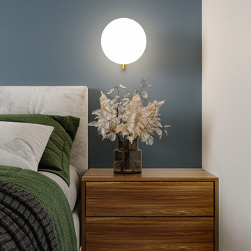
Minimalism isn’t supposed to be vanilla—this one actually earns the label. Clean, modern simplicity is the core, but it’s rich in intention. Every line, surface, and texture is deliberate; emptiness feels calculated, not lazy. The subdued palette and essentialist layout speak to refined restraint, yet the space still communicates a quiet, confident presence. Real minimalism with character—not stripped, but sharpened.
 My Kitchen And Bath
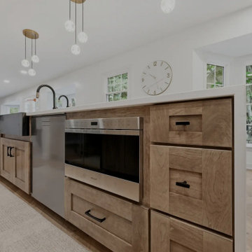
A complete kitchen and powder room remodel in Herndon, Virginia, designed around two clear priorities: open up the kitchen to the rest of the main level, and create an experience that felt warm and timeless rather than trendy.
The original layout had a wall separating the kitchen from the dining room and an awkward fridge wall that limited both storage and traffic flow. Our solution involved removing the dividing wall (confirmed non-load-bearing), tightening the new dining room opening to 66 inches, and extending the fridge wall 25 inches into the kitchen to create a proper full-height pantry run. The result is a kitchen that breathes — open to the dining and living areas, with clear sight lines from the island to the bay windows at the far end.
Design Approach
The clients came in knowing they didn't want white. They didn't want navy. They wanted something with real wood character — the kind of finish that ages well and looks more like furniture than stock kitchen cabinetry. Cherry was the answer to that question.
We anchored the room around contrast: warm cherry cabinetry against clean white walls and white quartz, black hardware grounding the cherry's warmth, and a single waterfall island acting as the architectural focal point. Stainless appliances, brushed gold pendant accents, and the herringbone hardwood floor pull the room together without any one element shouting for attention.
The Cabinetry
Medallion Gold Line Sonoma Cappuccino — a stained cherry finish that catches light differently throughout the day. All-plywood box construction, solid wood doors and drawer fronts, soft close everywhere, US-made with a lifetime warranty. Four pull-out drawers built into the pantry bottoms keep the deep storage actually usable rather than a black hole.
Cabinet hardware is Top Knobs Riverside Pulls in flat black — 40 pulls across drawers and doors, plus three longer pulls on the 36-inch base drawers. The black was a deliberate decision: with cherry and stainless already providing warm and cool tones, brass or gold would have been one warm tone too many. Black grounds the cabinetry and gives the kitchen its architectural definition.
The Island and Countertops
MSI Calacatta Miraggio Gold quartz throughout — perimeter counters, island, waterfall ends, and the powder room. The Gold variant has subtle warm veining that pairs with cherry where cooler whites would have fought the wood tone.
The island gets a full waterfall edge — slabs book-matched, miters precise, the finished edge essentially seamless. Treating the island as architectural sculpture rather than just functional storage. The black undermount farmhouse-style sink ties back to the hardware throughout the rest of the kitchen.
The Backsplash
MSI Metro Gold tile — small format white and gold tiles in a herringbone-adjacent pattern with intermittent gold accents. Full height, continuous behind the floating shelves and behind the hood.
Four custom floating shelves are spaced above a 3-inch countertop ledge: first shelf 18 inches above the ledge, second shelf 9 inches above that, third 18 inches above the second. The shelves are stained to match the cabinetry. The backsplash continues behind the shelves and behind the hood, so the wall reads as a continuous textured surface that the shelves and hood float in front of.
The Appliances
This is a serious cooking kitchen. The clients chose a 48-inch Wolf gas range, a Sub-Zero built-in refrigerator integrated into the cherry cabinet wall, a Wolf microwave drawer in the island base, and a Bosch dishwasher. For ventilation, we installed a 1200 CFM hood paired with a make-up air system to balance the negative pressure that hood pulls. New ducting was routed through the exterior siding on the side of the house.
The Flooring
MSI engineered hardwood throughout the entire main level — approximately 800 square feet — installed in a Bramlett herringbone pattern. Herringbone adds roughly 15-20 percent to material and labor costs because of the angled cuts and waste factor, but the result is a floor that reads as more considered and luxurious than standard plank flooring. Finished with 4.5-inch white wood baseboards throughout.
The Powder Room
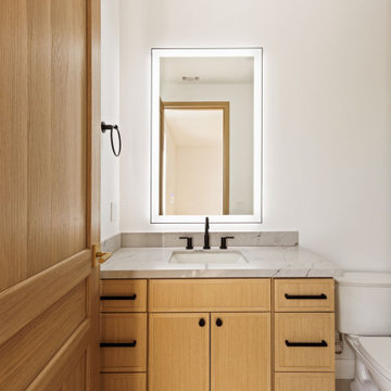
A small room with a big personality. The clients chose a deep blue and teal scallop pattern wallpaper (client-supplied, we installed) and paired it with the same Sonoma Cappuccino cherry vanity used in the kitchen — material continuity between the spaces.
Powder room countertop is the same MSI Calacatta Miraggio Gold quartz from the kitchen with a rectangular white undermount sink. Hardware on the powder room vanity is Top Knobs Riverside in honey bronze rather than the kitchen's flat black — the warm bronze pulls the brass tones from the faucet into the millwork and complements the wallpaper. New sconce, kept the existing toilet (refinishing or replacing a working toilet is wasted money in a powder room remodel), and a Panasonic Whisper Green exhaust fan.
Project Specs
Location: Herndon, Virginia
Project type: Combined kitchen and powder room remodel
Project duration: Approximately 4 to 6 weeks
Style: Transitional, Modern Farmhouse, Warm Wood Contemporary
Color palette: Cherry, white, black, brushed gold, deep blue (powder room)
Materials
Cabinetry (kitchen and powder room): Medallion Gold Line Sonoma Cappuccino cherry, Shaker-style, all-plywood box construction, lifetime warranty
Kitchen hardware: Top Knobs Riverside Pulls in flat black (TK1014BLK and TK1017BLK)
Powder room hardware: Top Knobs Riverside Pulls in honey bronze (TK1012HB)
Counter tops: MSI Calacatta Miraggio Gold Quartz, pencil edge, waterfall island
Backsplash: MSI Metro Gold tile, full height
Floating shelves: 4 custom shelves at 48" by 9", stained to match cabinets
Range: 48-inch Wolf gas range
Refrigerator: Sub-Zero built-in
Microwave: Wolf microwave drawer (island base)
Hood: 1200 CFM with make-up air system
Kitchen sink: Kohler farmhouse-style, 36-inch base, black
Kitchen faucet: Brizo (homeowner-supplied)
Flooring: MSI engineered hardwood in Bramlett herringbone pattern, approximately 800 sq ft
Baseboards: 4.5-inch white wood throughout
Powder room wallpaper: Client-supplied scallop pattern in blues and teals
Powder room exhaust fan: Panasonic Whisper Green
Paint: Benjamin Moore
Designed and built by My Kitchen and Bath out of our Herndon showroom at 285 Sunset Park Drive. We've been designing and building kitchens, bathrooms, and full home renovations across Northern Virginia and the DMV since 1994.
 First Impression Designs Inc.
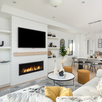
Modernist Enclave is designed as a sophisticated, minimalist sanctuary that melds clean architectural lines with warm, contemporary finishes—anchoring its aesthetic in modern form while elevating everyday living into a refined experience. Set in Vancouver and shaped by developer KFA Homes, the space invites light to sculpt volume and materials to speak the language of leisure and elegance. As a residence that both grounds and lifts, it seamlessly integrates functional living, thoughtful proportions, and a curated material palette—delivering a home that feels inherently timeless, deliberately bold, and uniquely tailored to the modern occupant.
 Century Stair Company
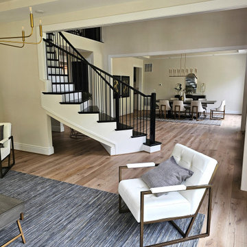
A single curve does a lot of work here. Rising from the main level to a wraparound balcony above, this staircase earns its place at the center of the home — not just structurally, but visually. Black iron balusters and handrails push against crisp white risers in a contrast that feels deliberate rather than decorative. The open floor plan gives it room to breathe, letting the curve read as architecture rather than furniture. The result is a staircase that creates movement even when no one is on it.
1976-2026 © Century Stair Company
 Metropolis Drafting and Construction Inc
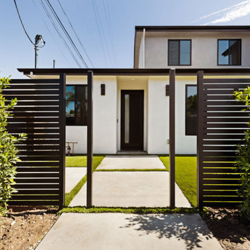
Today’s investment landscape in California features a surge in transforming single-family lots into vibrant multi-family residences, facilitated by recent SB9 and ADU laws. This project exemplifies how a modest 6,750-square-foot lot can accommodate a 1,500-square-foot primary home alongside a 2,500-square-foot duplex, seamlessly integrating design, functionality, and neighborhood aesthetics.
The primary residence underwent a meticulous interior transformation, evolving from a 3-bedroom, 1.5-bath layout into a spacious 4-bedroom, 2-bath home. Strategic reconfigurations centered around creating an expansive great room—an open-concept space adorned with vaulted ceilings—where the kitchen, dining, and living areas converge into a magnificent communal zone.
Exterior updates further distinguish the property. The front and side yards are enclosed with fencing and privacy hedges, linked by concrete pathways that enhance outdoor functionality while compensating for backyard space lost during renovations. The exterior façade was refreshed with darker tones, deliberately contrasting with the duplex to emphasize architectural separation.
Designed to preserve the suburban charm, the duplex visually mimics a single-family home from the street. Its facade creates an illusion of a two-story residence, maintaining harmony within the neighborhood fabric. The main unit, developed under SB9 guidelines, features three bedrooms and two bathrooms, with a luxurious parents’ suite situated upstairs. Downstairs, two bedrooms share a full bath, creating a balanced family-oriented layout.
The duplex’s interior boasts 9-foot ceilings throughout, elevating the sense of space and openness. The design thoughtfully places the kitchen at the front, inviting guests into the home, while stairs on the right lead to the private upstairs bedroom suite.
The ADU offers a two bedroom and two & half baths. the unit is accessible via a private side entrance with a dedicated walkway. Its layout includes a ground-floor living room, a galley kitchen, and a discreet powder room beneath the stairs, designed to contain guest traffic and maintain privacy upstairs. The upstairs bedrooms each feature luxurious bathrooms with expansive showers, adding an element of modern elegance.
Both units enjoy thoughtfully landscaped outdoor spaces—private patios, backyard areas, and gated front yards—creating welcoming environments for residents and visitors alike.
This project exemplifies innovative urban infill solutions, blending architectural elegance with legal compliance and community harmony—an inspiring blueprint for the future of residential development in California.
 Eugene Pintail LLC
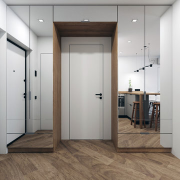
Gylden æra embraces the timeless elegance of Scandinavian minimalism in a compact apartment. By streamlining layout and materials, it creates a serene, deliberate environment where simplicity speaks volumes.
Every detail is intentionally crafted—from the seamless integration of functional areas to the uncluttered circulation paths. The design presents a visual calm that enhances both daily living and quiet reflection.
Soft woods, matte surfaces, and warm neutrals anchor the scheme. Subtle use of light tones amplifies natural light and expands spatial perception. Textural variations—like woven textiles, fine-grain wood, and matte finishes—add depth without compromising simplicity.
Minimalist lighting design—wall-mounted fixtures, linear pendants—complements the space's architectural rhythm without drawing attention away. Strategic layering of natural and ambient light enhances mood while maintaining visual clarity.
Gylden æra feels both peaceful and poised—moderated yet expressive. It captures a balance of restrained luxury and everyday comfort, honoring Scandinavian roots.
 Beachside Building Company
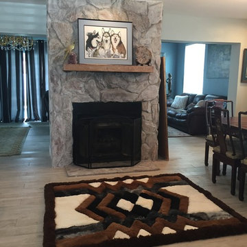
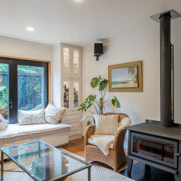
After photo of the fireplace. The natural stone was whitewashed to blend into the color scheme of the house. The whitewash was deliberately thinned so that that some of the color of the stone can peek through.
 Lola Cwikowski Studio
An Ohio family in search of a place to enjoy the Portuguese coast acquired a four-bedroom apartment just outside the center of Cascais. Our studio was engaged to turn a compartmented interior into a holiday residence for a household that gathers in numbers: one that could seat everyone at once and still hold the ease and lightness of a home by the beach.
The original plan included a kitchen and laundry room sealed off from the living room, floor finishes and levels that changed from threshold to threshold, and bathrooms in varying styles. Work began by redefining the alignments and circulation. The principal transformation was the opening of the kitchen, creating a more generous social setting centered on a bespoke island fitted with storage and seating.
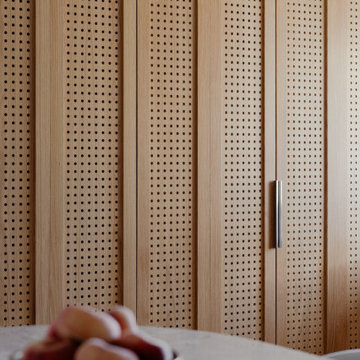
The interior takes its cues from the building’s geometric façade, which projects and recedes in volumes and voids. Bespoke joinery in oak and lacquer carries continuity and order through the apartment. Concealed storage runs throughout: at the entrance, in the dining area, along the living area, and beneath built-in benches. The laundry is merged into the kitchen behind perforated doors for ventilation while keeping the service area discreet. Behind the sofa, a console slips a workspace into the living area without conceding its openness.
Curved elements answer the rectilinear architecture; artisanal glazed vertical tiles repeat from the backsplashes onto custom side tables. The palette stays deliberately narrow; the muted oak and lacquer are joined by a softened timber floor, Portuguese Lioz stone, and walls painted to the color of bare plaster. Existing doors and baseboards were repainted in a warm light gray that draws the original elements into the language of the new interior. Upholstery and decorative accents hint at the terracotta, sky blue, and yellow of the façade.
The bedrooms are set with upholstered headboards on oak frames, bedside tables that extend those outlines, and wardrobes fit for a long stay. Locally made rugs, bedcovers, and throw pillows soften the composition. In the bathrooms, the plans were reorganized and the showers enlarged. Lioz was used for the counters and sinks, shelves, shower bases, and bathtub surround, with microcement bringing a soothing warmth to the walls, and storage in floating cabinets. Deeper in tone than the rest of the apartment yet never dim, they are quietly elegant rooms made for lingering — taking one’s time getting ready, or unwinding at the end of a day.
PHOTOGRAPHY: © ALEXANDER BOGORODSKIY
 Amanda Martocchio Architecture
Photo credit Jane Beiles
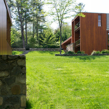
Located on a beautiful property with a legacy of architectural and landscape innovation, this guest house was originally designed by the offices of Eliot Noyes and Alan Goldberg. Due to its age and expanded use as an in-law dwelling for extended stays, the 1200 sf structure required a renovation and small addition. While one objective was to make the structure function independently of the main house with its own access road, garage, and entrance, another objective was to knit the guest house into the architectural fabric of the property. New window openings deliberately frame landscape and architectural elements on the site, while exterior finishes borrow from that of the main house (cedar, zinc, field stone) bringing unity to the family compound. Inside, the use of lighter materials gives the simple, efficient spaces airiness.
A challenge was to find an interior design vocabulary which is both simple and clean, but not cold or uninteresting. A combination of rough slate, white washed oak, and high gloss lacquer cabinets provide interest and texture, but with their minimal detailing create a sense of calm.
 My Kitchen And Bath
A complete kitchen and powder room remodel in Herndon, Virginia, designed around two clear priorities: open up the kitchen to the rest of the main level, and create an experience that felt warm and timeless rather than trendy.
The original layout had a wall separating the kitchen from the dining room and an awkward fridge wall that limited both storage and traffic flow. Our solution involved removing the dividing wall (confirmed non-load-bearing), tightening the new dining room opening to 66 inches, and extending the fridge wall 25 inches into the kitchen to create a proper full-height pantry run. The result is a kitchen that breathes — open to the dining and living areas, with clear sight lines from the island to the bay windows at the far end.
Design Approach
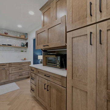
The clients came in knowing they didn't want white. They didn't want navy. They wanted something with real wood character — the kind of finish that ages well and looks more like furniture than stock kitchen cabinetry. Cherry was the answer to that question.
We anchored the room around contrast: warm cherry cabinetry against clean white walls and white quartz, black hardware grounding the cherry's warmth, and a single waterfall island acting as the architectural focal point. Stainless appliances, brushed gold pendant accents, and the herringbone hardwood floor pull the room together without any one element shouting for attention.
The Cabinetry
Medallion Gold Line Sonoma Cappuccino — a stained cherry finish that catches light differently throughout the day. All-plywood box construction, solid wood doors and drawer fronts, soft close everywhere, US-made with a lifetime warranty. Four pull-out drawers built into the pantry bottoms keep the deep storage actually usable rather than a black hole.
Cabinet hardware is Top Knobs Riverside Pulls in flat black — 40 pulls across drawers and doors, plus three longer pulls on the 36-inch base drawers. The black was a deliberate decision: with cherry and stainless already providing warm and cool tones, brass or gold would have been one warm tone too many. Black grounds the cabinetry and gives the kitchen its architectural definition.
The Island and Countertops
MSI Calacatta Miraggio Gold quartz throughout — perimeter counters, island, waterfall ends, and the powder room. The Gold variant has subtle warm veining that pairs with cherry where cooler whites would have fought the wood tone.
The island gets a full waterfall edge — slabs book-matched, miters precise, the finished edge essentially seamless. Treating the island as architectural sculpture rather than just functional storage. The black undermount farmhouse-style sink ties back to the hardware throughout the rest of the kitchen.
The Backsplash
MSI Metro Gold tile — small format white and gold tiles in a herringbone-adjacent pattern with intermittent gold accents. Full height, continuous behind the floating shelves and behind the hood.
Four custom floating shelves are spaced above a 3-inch countertop ledge: first shelf 18 inches above the ledge, second shelf 9 inches above that, third 18 inches above the second. The shelves are stained to match the cabinetry. The backsplash continues behind the shelves and behind the hood, so the wall reads as a continuous textured surface that the shelves and hood float in front of.
The Appliances
This is a serious cooking kitchen. The clients chose a 48-inch Wolf gas range, a Sub-Zero built-in refrigerator integrated into the cherry cabinet wall, a Wolf microwave drawer in the island base, and a Bosch dishwasher. For ventilation, we installed a 1200 CFM hood paired with a make-up air system to balance the negative pressure that hood pulls. New ducting was routed through the exterior siding on the side of the house.
The Flooring
MSI engineered hardwood throughout the entire main level — approximately 800 square feet — installed in a Bramlett herringbone pattern. Herringbone adds roughly 15-20 percent to material and labor costs because of the angled cuts and waste factor, but the result is a floor that reads as more considered and luxurious than standard plank flooring. Finished with 4.5-inch white wood baseboards throughout.
The Powder Room
A small room with a big personality. The clients chose a deep blue and teal scallop pattern wallpaper (client-supplied, we installed) and paired it with the same Sonoma Cappuccino cherry vanity used in the kitchen — material continuity between the spaces.
Powder room countertop is the same MSI Calacatta Miraggio Gold quartz from the kitchen with a rectangular white undermount sink. Hardware on the powder room vanity is Top Knobs Riverside in honey bronze rather than the kitchen's flat black — the warm bronze pulls the brass tones from the faucet into the millwork and complements the wallpaper. New sconce, kept the existing toilet (refinishing or replacing a working toilet is wasted money in a powder room remodel), and a Panasonic Whisper Green exhaust fan.
Project Specs
Location: Herndon, Virginia
Project type: Combined kitchen and powder room remodel
Project duration: Approximately 4 to 6 weeks
Style: Transitional, Modern Farmhouse, Warm Wood Contemporary
Color palette: Cherry, white, black, brushed gold, deep blue (powder room)
Materials
Cabinetry (kitchen and powder room): Medallion Gold Line Sonoma Cappuccino cherry, Shaker-style, all-plywood box construction, lifetime warranty
Kitchen hardware: Top Knobs Riverside Pulls in flat black (TK1014BLK and TK1017BLK)
Powder room hardware: Top Knobs Riverside Pulls in honey bronze (TK1012HB)
Counter tops: MSI Calacatta Miraggio Gold Quartz, pencil edge, waterfall island
Backsplash: MSI Metro Gold tile, full height
Floating shelves: 4 custom shelves at 48" by 9", stained to match cabinets
Range: 48-inch Wolf gas range
Refrigerator: Sub-Zero built-in
Microwave: Wolf microwave drawer (island base)
Hood: 1200 CFM with make-up air system
Kitchen sink: Kohler farmhouse-style, 36-inch base, black
Kitchen faucet: Brizo (homeowner-supplied)
Flooring: MSI engineered hardwood in Bramlett herringbone pattern, approximately 800 sq ft
Baseboards: 4.5-inch white wood throughout
Powder room wallpaper: Client-supplied scallop pattern in blues and teals
Powder room exhaust fan: Panasonic Whisper Green
Paint: Benjamin Moore
Designed and built by My Kitchen and Bath out of our Herndon showroom at 285 Sunset Park Drive. We've been designing and building kitchens, bathrooms, and full home renovations across Northern Virginia and the DMV since 1994.
 Refresh Renovations Auckland West
It takes a special kind of client to embrace the eclectic design style. Eclecticism is an approach to design that combines elements from various periods, styles, and sources. It involves the deliberate mixing and matching of different aesthetics to create a unique and visually interesting space. Eclectic design celebrates the diversity of influences and allows for the expression of personal taste and creativity.
The client a window dresser in her former life her own bold ideas right from the start, like the wallpaper for the kitchen splashback.
The kitchen used to be in what is now the sitting area and was moved into the former dining space. Creating a large Kitchen with a large bench style table coming off it combines the spaces and allowed for steel tube elements in combination with stainless and timber benchtops. Combining materials adds depth and visual interest. The playful and unexpected elements like the elephant wallpaper in the kitchen create a lively and engaging environment.
The swapping of the spaces created an open layout with seamless integration to the adjacent living area. The prominent focal point of this kitchen is the island.
All the spaces allowed the client the freedom to experiment and showcase her personal style.
15