
Search results for "Deliberation" in Home Design Ideas
 Cornerstone Engineering and Contracting
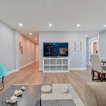
Open-concept living and dining area in a fully renovated Jersey Shore luxury beachfront apartment. Wide-plank LVP flooring runs throughout the entire unit creating a seamless flow from the living room through the dining area and into the hallway. Recessed lighting throughout, fresh paint, tall clean baseboards, and an open layout designed to maximize the space for short-term rental guests. The light flooring tone was chosen deliberately for the coastal setting. Full gut renovation by Cornerstone Engineering and Construction
 First Impression Designs Inc.
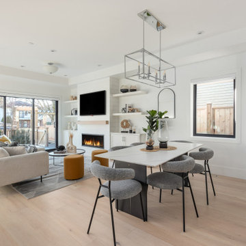
Modernist Enclave is designed as a sophisticated, minimalist sanctuary that melds clean architectural lines with warm, contemporary finishes—anchoring its aesthetic in modern form while elevating everyday living into a refined experience. Set in Vancouver and shaped by developer KFA Homes, the space invites light to sculpt volume and materials to speak the language of leisure and elegance. As a residence that both grounds and lifts, it seamlessly integrates functional living, thoughtful proportions, and a curated material palette—delivering a home that feels inherently timeless, deliberately bold, and uniquely tailored to the modern occupant.
 Metropolis Drafting and Construction Inc
Today’s investment landscape in California features a surge in transforming single-family lots into vibrant multi-family residences, facilitated by recent SB9 and ADU laws. This project exemplifies how a modest 6,750-square-foot lot can accommodate a 1,500-square-foot primary home alongside a 2,500-square-foot duplex, seamlessly integrating design, functionality, and neighborhood aesthetics.
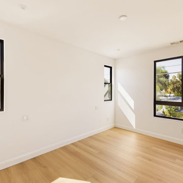
The primary residence underwent a meticulous interior transformation, evolving from a 3-bedroom, 1.5-bath layout into a spacious 4-bedroom, 2-bath home. Strategic reconfigurations centered around creating an expansive great room—an open-concept space adorned with vaulted ceilings—where the kitchen, dining, and living areas converge into a magnificent communal zone.
Exterior updates further distinguish the property. The front and side yards are enclosed with fencing and privacy hedges, linked by concrete pathways that enhance outdoor functionality while compensating for backyard space lost during renovations. The exterior façade was refreshed with darker tones, deliberately contrasting with the duplex to emphasize architectural separation.
Designed to preserve the suburban charm, the duplex visually mimics a single-family home from the street. Its facade creates an illusion of a two-story residence, maintaining harmony within the neighborhood fabric. The main unit, developed under SB9 guidelines, features three bedrooms and two bathrooms, with a luxurious parents’ suite situated upstairs. Downstairs, two bedrooms share a full bath, creating a balanced family-oriented layout.
The duplex’s interior boasts 9-foot ceilings throughout, elevating the sense of space and openness. The design thoughtfully places the kitchen at the front, inviting guests into the home, while stairs on the right lead to the private upstairs bedroom suite.
The ADU offers a two bedroom and two & half baths. the unit is accessible via a private side entrance with a dedicated walkway. Its layout includes a ground-floor living room, a galley kitchen, and a discreet powder room beneath the stairs, designed to contain guest traffic and maintain privacy upstairs. The upstairs bedrooms each feature luxurious bathrooms with expansive showers, adding an element of modern elegance.
Both units enjoy thoughtfully landscaped outdoor spaces—private patios, backyard areas, and gated front yards—creating welcoming environments for residents and visitors alike.
This project exemplifies innovative urban infill solutions, blending architectural elegance with legal compliance and community harmony—an inspiring blueprint for the future of residential development in California.
Find the right local pro for your project
 B.R.G. interior design limited
灣仔廈門街(286呎)
‘麻雀雖小,但五臟俱全’
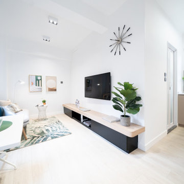
今次設計是為一個超過40年樓齡的唐樓單位進行翻新,按照業主的要求,將原來的廚房及廁所擴大。由於地方有限,設計師將單位拆掉大部分的牆身,並用人體工學去計算每個空間。
利用電視櫃連接主人房升高地台,大幅提升儲物量。此外利用全高衣櫃代替磚牆區分睡房及客廳,節省空間和成本同時也有具有一定隔音的效果 (櫃內的被鋪及衣服作吸音)。
為了令細單位視覺上感覺更寬敞,中心點是客飯廳與電視之間的通道。同時設計師刻意在用色及物料上加強其連貫性。白色,米色水磨石,兩種楓木色及黏土色作基礎,並用深灰及黑色突顯大自然色的鮮明度。
緊記在安排空間時,除每個空間的燈光佈局外,窗也是主要考量之一。善用自然光,除了節省能源外,用家也能夠在享受每個早上的晨光
更多設計細節照片已在官網:
https://www.brginterior.com/amoystreet
Amoy St., WanChai (286 sq feet)
‘small but complete in every detail’
The design is to renovate a tenement building unit over 40 years old. Expanding the original kitchen and toilet in accordance with the owner's requirements. In order to make good use of 286 square feet, our designer had locked down most of walls in unit and calculated each space in ergonomic way.
The TV cabinet is connected to the raising platform in master room, which greatly increases the storage capacity. Meanwhile, a full-height wardrobe is used instead of a brick wall to distinguish bedrooms and living rooms. It is not only saving space and cost but also providing a certain sound insulation effect (Don’t forget the bedding and clothes in wardrobe are sound-absorbing too!).
In order to make small units visually more spacious, the focal point is the passage between dining area and TV. Meanwhile, our design deliberately strengthens their coherence in color and material. Using white, terrazzo in beige, two types of maple and clay color as the foundation (natural color), and highlighting its vividness by using color or material in dark gray, chrome and black.
And keep in mind that when arranging lighting layout of each space, windows are also one of the main considerations. Making good balance in use of natural light is not only helping to save energy and most importantly users also enjoy sunlight coming every morning.
More details photos have been on the official website:
https://www.brginterior.com/amoystreet
 Lola Cwikowski Studio
An Ohio family in search of a place to enjoy the Portuguese coast acquired a four-bedroom apartment just outside the center of Cascais. Our studio was engaged to turn a compartmented interior into a holiday residence for a household that gathers in numbers: one that could seat everyone at once and still hold the ease and lightness of a home by the beach.
The original plan included a kitchen and laundry room sealed off from the living room, floor finishes and levels that changed from threshold to threshold, and bathrooms in varying styles. Work began by redefining the alignments and circulation. The principal transformation was the opening of the kitchen, creating a more generous social setting centered on a bespoke island fitted with storage and seating.
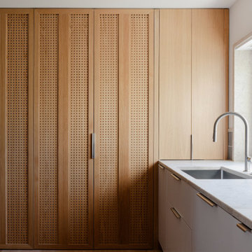
The interior takes its cues from the building’s geometric façade, which projects and recedes in volumes and voids. Bespoke joinery in oak and lacquer carries continuity and order through the apartment. Concealed storage runs throughout: at the entrance, in the dining area, along the living area, and beneath built-in benches. The laundry is merged into the kitchen behind perforated doors for ventilation while keeping the service area discreet. Behind the sofa, a console slips a workspace into the living area without conceding its openness.
Curved elements answer the rectilinear architecture; artisanal glazed vertical tiles repeat from the backsplashes onto custom side tables. The palette stays deliberately narrow; the muted oak and lacquer are joined by a softened timber floor, Portuguese Lioz stone, and walls painted to the color of bare plaster. Existing doors and baseboards were repainted in a warm light gray that draws the original elements into the language of the new interior. Upholstery and decorative accents hint at the terracotta, sky blue, and yellow of the façade.
The bedrooms are set with upholstered headboards on oak frames, bedside tables that extend those outlines, and wardrobes fit for a long stay. Locally made rugs, bedcovers, and throw pillows soften the composition. In the bathrooms, the plans were reorganized and the showers enlarged. Lioz was used for the counters and sinks, shelves, shower bases, and bathtub surround, with microcement bringing a soothing warmth to the walls, and storage in floating cabinets. Deeper in tone than the rest of the apartment yet never dim, they are quietly elegant rooms made for lingering — taking one’s time getting ready, or unwinding at the end of a day.
PHOTOGRAPHY: © ALEXANDER BOGORODSKIY
 Moss Building & Design
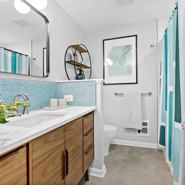
Our Herndon customers returned to MOSS (after a successful kitchen addition project) to update several areas of their home. Included in the remodel were the conversion of the home's carport to a full garage with plenty of storage, the transformation of an attached sunroom into a more deliberately designed space (especially for hanging out as a family versus serving as a storage catch all), and the full update of the home's hallway bathroom to once again showcase the family's love of color.
 Mount Construction
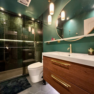
Two full bathroom remodels completed back to back in the same home — sequenced deliberately so the homeowner could stay comfortable and keep living in the house throughout the entire project. No displacement, no hotels, just smart scheduling and clean jobsite management.
Both bathrooms were taken down to the studs and rebuilt with a modern look and fully upgraded features — walk-in showers, heated floors, heated towel bars, and all new fixtures, tile, and finishes throughout. The kind of transformation where nothing from before carries over except the walls.
 lavish
This Raleigh, NC home was reimagined from the ground up — not room by room, but as a single, cohesive expression of how a family lives, gathers, and rests.
The architecture drove every decision. Custom millwork and panel molding were carried through every space, creating a visual language that connects the entry to the living room, the dining room to the primary suite. It's what makes the home feel complete — not like a collection of individually finished rooms.
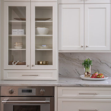
In the kitchen, a full marble slab backsplash reads as one uninterrupted surface — giving the room its presence without competing with the custom white inset cabinetry and brushed nickel hardware. The dining room lives in deliberate contrast: deep-toned oak table, delicate botanical wallpaper, antique mirror. Light and organic, yet entirely considered.
The living room was designed around its connection to the outside — French doors that open directly to a substantial outdoor kitchen and entertaining space, anchored on the interior by a cast stone fireplace with an arched surround that commands the room.
The entry sets the expectation for everything that follows: a double-height foyer, geometric pendants cascading from above, large-scale original artwork, and a carved console that makes the first impression without overstating it.
Designed and executed by Lavish — Raleigh, NC's full-service interior design and remodeling firm.
 Century Stair Company
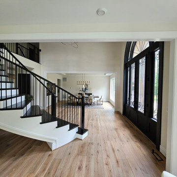
A single curve does a lot of work here. Rising from the main level to a wraparound balcony above, this staircase earns its place at the center of the home — not just structurally, but visually. Black iron balusters and handrails push against crisp white risers in a contrast that feels deliberate rather than decorative. The open floor plan gives it room to breathe, letting the curve read as architecture rather than furniture. The result is a staircase that creates movement even when no one is on it.
1976-2026 © Century Stair Company
 HOME&DESIGN Portfolio of 100 Top Designers
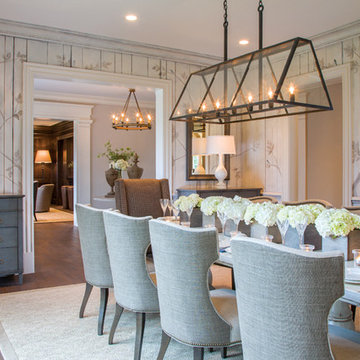
Kristin Peake Interiors, LLC -- Kristin Peake -- The walls of this dining room are finished with a hand-painted tree-branch motif. Birds are deliberately placed in specific areas. “The tranquility and atmosphere that you feel upon entering this room is one of calm and comfort,” says the designer. -- INTERIOR DESIGN: Kristin Peake Interiors, LLC -- See more at http://www.handd.com/kristinpeake
 Ridgewood Home Construction
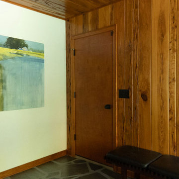
This mid-century modern Rockford home was updated in stages, and the kitchen needed a complete remodel. The homeowners desired a kitchen that felt current without breaking from the character that defined the rest of the house. That meant we needed to choose materials that fit the home and highlighted the home’s character.
Our team sourced pecky cypress and natural slate tile from non-traditional suppliers to get the exact look the home called for. The wood cabinetry was paired with a granite island, providing a gathering space in the kitchen without overpowering it. Because both materials required careful handling during installation, the crew worked more slowly and deliberately through this phase than a standard remodel. The result connected the kitchen directly to the living area, so the two spaces feel like one continuous room built in the same style as the rest of the home.
 Cabinets by Trivonna
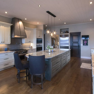
Photo by Ross Irwin --- The door style used for the island is the handsome Providence, while the door style for the perimeter is the Springfield. The choice of a recessed panel door for the perimeter and a raised panel door for the island is absolutely deliberate.
 Wanda Ely Architect Inc.
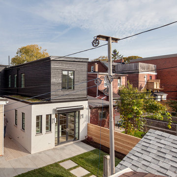
Seen against a hodgepodge of rear additions typical of many Toronto streets, the addition deliberately stands out from its neighbours.
Photo by Scott Norsworthy
 Usable Space Interiors, LLC
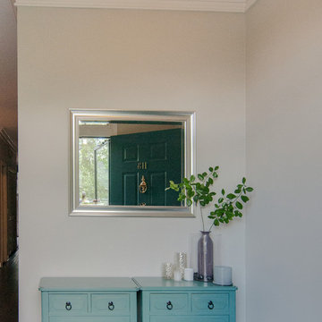
This clients foyer is very much a part of the living room. USI repurposed decor around the home while changing the flush mount to create a more independent and deliberate space.
 Century Stair Company
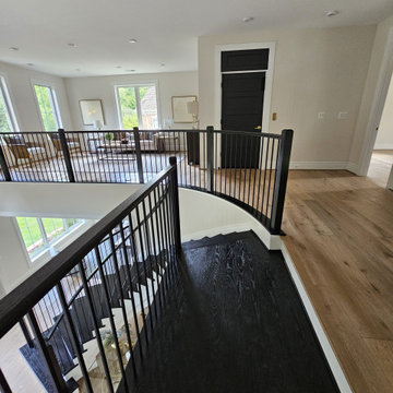
A single curve does a lot of work here. Rising from the main level to a wraparound balcony above, this staircase earns its place at the center of the home — not just structurally, but visually. Black iron balusters and handrails push against crisp white risers in a contrast that feels deliberate rather than decorative. The open floor plan gives it room to breathe, letting the curve read as architecture rather than furniture. The result is a staircase that creates movement even when no one is on it.
1976-2026 © Century Stair Company
 George Ocampo
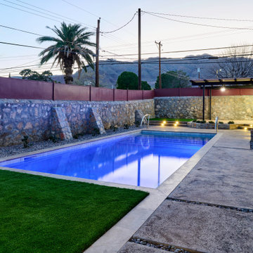
Central El Paso Backyard Renovation:
Fifteen years is a long time for a backyard to quietly wait.
At first, it was full of intention—a pool that promised summers, laughter, and long evenings. But time has a way of settling in. The water turned still, then green. Edges cracked. The space became less of a destination and more of something you looked past. Life moved forward, but the backyard stayed behind.
Then came the decision: it was time.
Not a patch job. Not a quick fix. A complete reset.
The transformation didn’t begin beautifully—it began with demolition. The old pool was drained, exposing years of neglect etched into its surface. Crews stepped in, breaking, clearing, reshaping. What once held stagnant water became an open cavity of possibility. Steel rebar formed a new skeleton, precise and intentional. Every line measured. Every elevation reconsidered.
This wasn’t just construction—it was rethinking how the space should live.
The shell was rebuilt. Surfaces were refined. Plumbing, structure, and flow were corrected at their core. What had once been outdated and failing was now engineered to last.
Then the shift happened.
Hardscape came in—clean, warm-toned concrete replacing worn decking. Stone walls, once just boundaries, were elevated into features. Subtle textures, intentional lines. A visual language that matched the architecture of the home instead of competing with it.
The pool returned—but not as it was.
Now it was sharp, modern, and inviting. A long, clean body of water with a shallow tanning ledge that catches the sun just right. Stainless steel scuppers arc water into the pool—movement, sound, life. Steps are crisp, geometry is balanced, and the water reflects clarity instead of neglect.
Around it, the yard found purpose.
Artificial turf introduced contrast—green, controlled, low-maintenance. A pergola structure rose in the corner, creating a destination within the destination. Beneath it, a built-in outdoor kitchen turned the backyard into a place to gather, not just pass through. Lighting stitched everything together, making the space just as alive at dusk as it is under the midday sun.
By the end, nothing felt accidental.
What was once forgotten is now deliberate. What was once avoided is now the center of attention.
Fifteen years later, the backyard didn’t just come back—it finally became what it was always supposed to be.
 Metropolis Drafting and Construction Inc
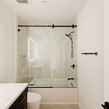
Today’s investment landscape in California features a surge in transforming single-family lots into vibrant multi-family residences, facilitated by recent SB9 and ADU laws. This project exemplifies how a modest 6,750-square-foot lot can accommodate a 1,500-square-foot primary home alongside a 2,500-square-foot duplex, seamlessly integrating design, functionality, and neighborhood aesthetics.
The primary residence underwent a meticulous interior transformation, evolving from a 3-bedroom, 1.5-bath layout into a spacious 4-bedroom, 2-bath home. Strategic reconfigurations centered around creating an expansive great room—an open-concept space adorned with vaulted ceilings—where the kitchen, dining, and living areas converge into a magnificent communal zone.
Exterior updates further distinguish the property. The front and side yards are enclosed with fencing and privacy hedges, linked by concrete pathways that enhance outdoor functionality while compensating for backyard space lost during renovations. The exterior façade was refreshed with darker tones, deliberately contrasting with the duplex to emphasize architectural separation.
Designed to preserve the suburban charm, the duplex visually mimics a single-family home from the street. Its facade creates an illusion of a two-story residence, maintaining harmony within the neighborhood fabric. The main unit, developed under SB9 guidelines, features three bedrooms and two bathrooms, with a luxurious parents’ suite situated upstairs. Downstairs, two bedrooms share a full bath, creating a balanced family-oriented layout.
The duplex’s interior boasts 9-foot ceilings throughout, elevating the sense of space and openness. The design thoughtfully places the kitchen at the front, inviting guests into the home, while stairs on the right lead to the private upstairs bedroom suite.
The ADU offers a two bedroom and two & half baths. the unit is accessible via a private side entrance with a dedicated walkway. Its layout includes a ground-floor living room, a galley kitchen, and a discreet powder room beneath the stairs, designed to contain guest traffic and maintain privacy upstairs. The upstairs bedrooms each feature luxurious bathrooms with expansive showers, adding an element of modern elegance.
Both units enjoy thoughtfully landscaped outdoor spaces—private patios, backyard areas, and gated front yards—creating welcoming environments for residents and visitors alike.
This project exemplifies innovative urban infill solutions, blending architectural elegance with legal compliance and community harmony—an inspiring blueprint for the future of residential development in California.
 AOME Architects
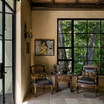
The contrast is deliberate: old oak overhead, stone underfoot, soft plaster around the perimeter, and slender black steel at the openings.
Credit: Miranda Estes
 Gregory Hitchcock Design
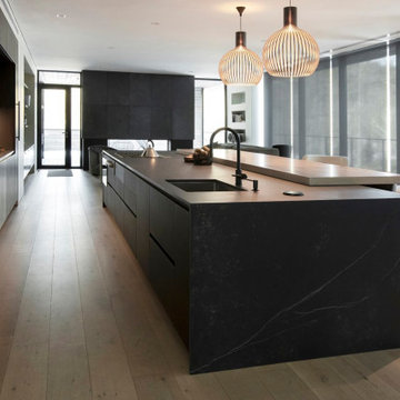
Kosher modern kitchen with Italian cabinetry.
We deliberately designed a lighter oak breakfast bar with invisible bracing for that clean contrast.
Seamlessly built-in with custom recessed handles in the island are wine fridges on both ends.
The waterfall-style island counter conveniently houses pop-up outlets, which allowed for a clean look all around.
 Avid Interior Design Inc.
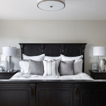
Here we achieved a unified and balanced sense of sophistication throughout this clients home by carefully curating the finishes, fixtures and custom cabinet details. We deliberately carried the colour scheme between each bathroom to showcase consistency throughout.
It’s amazing what a few upgrades in selections can do for your space!
19