
Search results for "Deposit" in Home Design Ideas

 safe ZOnea
Ask a kitchen designer in Chicago which countertop question comes up most and you will hear the same answer: white or off-white quartz, and which shade. Homeowners walk into showrooms with a photo saved on their phone, usually a bright, veined slab from a magazine spread, and leave an hour later realizing there are a dozen versions of that same look. The confusion is not about taste. It is about the fact that "white quartz" covers a huge range of patterns, undertones, and price points, and nobody explains the differences before the sale.
Older bungalows and newer builds alike are getting stripped of their dated laminate and butcher block in favor of quartz, and the reasons are practical rather than trendy. Quartz does not need sealing, resists the kind of staining that granite can suffer over decades, and holds up to the freeze-thaw humidity swings that Chicago basements and kitchens go through every year. Once a homeowner commits to quartz, though, the real decision starts: which white, and does the pattern justify the difference in cost.
This piece walks through three specific slabs that keep showing up in Chicago renovation projects, why designers reach for them in different rooms, and what actually separates a flat white surface from one with real depth. None of this requires a design background to follow. It is mostly about paying attention to how a slab behaves under kitchen lighting, how busy the vending gets, and how it photographs versus how it looks in person.
Why White Quartz Took Over Chicago Kitchens
Ten years ago, granite dominated Chicago kitchen remodels almost by default. It was durable, it looked expensive, and every fabricator in the metro area carried a wide range of colors. Quartz has since taken over that position, and the shift happened faster than most contractors expected. Engineered stone gave homeowners a more predictable surface, since natural granite varies slab to slab while quartz is manufactured to a consistent pattern batch after batch.
The other driver is light. Chicago winters are long and gray, and a lot of kitchens, especially in older two-flats and courtyard buildings, do not get much direct sun. A dark granite countertop in a dim kitchen can make the whole room feel smaller. White and light-toned quartz reflects what little natural light comes through the windows, and it makes a galley kitchen or a north-facing space feel noticeably brighter without touching the cabinetry or the layout.
There is also a resale argument that local real estate agents bring up constantly. White quartz photographs well for listings, reads as updated and low-maintenance to buyers touring in person, and does not compete visually with whatever cabinet color the next owner might prefer. It is a safer bet than a bold veined marble look or a colored quartz that might feel dated in five years.
Arctic White and the Cost Question
Among the flatter, more uniform whites, arctic white quartz price comes up constantly in budget conversations because the slab sits at a more approachable point than the heavily veined Italian-marble-inspired patterns. It reads as clean and bright without the busy movement that some homeowners find overwhelming in a small kitchen. Fabricators in the Chicago area tend to keep it in stock precisely because demand stays steady across both new construction and remodel projects.
Part of what keeps this slab affordable relative to its heavily patterned cousins comes down to manufacturing complexity. A quartz surface with minimal veining and a consistent white base is simpler to produce at scale than one that mimics the irregular, high-contrast movement of natural Calacatta marble. That production difference shows up directly in what a homeowner pays per square foot, and it is worth asking a fabricator to walk through that pricing before assuming every white quartz costs the same.
Homeowners planning a full kitchen, including an island, backsplash, and perimeter counters, often use a flatter white like this specifically because it lets other elements carry the visual interest. A patterned tile backsplash or a bold cabinet color reads more clearly against a calm countertop than against one already fighting for attention with heavy veining. Designers frequently pair simpler whites with statement lighting fixtures for exactly this reason.
What Makes Calacatta Patterns Different
Calacatta refers to a family of marble originally quarried in Italy, known for a bright white background broken up by bold, often gold-toned veining that moves in thick, dramatic streaks rather than thin gray lines. Natural Calacatta marble is soft, porous, and expensive to maintain, which is exactly why quartz manufacturers spent years developing engineered versions that replicate the look without the upkeep headaches.
The challenge with any Calacatta-style quartz is getting the veining to look organic instead of printed. Early generations of engineered stone struggled with repetitive patterns that gave away the fact the slab was manufactured rather than cut from actual marble. Modern digital printing and layering techniques have closed that gap considerably, and the better Calacatta-inspired quartz lines now vary the veining across each slab batch so two counters in the same kitchen do not look identical.
Chicago designers gravitate toward Calacatta patterns for kitchens that function as the visual centerpiece of an open floor plan, which describes a large share of the gut renovations happening in neighborhoods like Lincoln Park, Roscoe Village, and the North Shore suburbs. When the kitchen island is visible from the living room and dining area, a dramatic veined surface becomes part of the home's overall design language rather than a purely functional work surface.
Calacatta Arno Under Kitchen Lighting
One of the more popular options in this category, calacatta arno quartz, balances a warm white base with soft gray and gold veining that avoids looking too stark under the cooler LED lighting common in newer Chicago builds. Homeowners touring showrooms sometimes make the mistake of judging a slab entirely under warm incandescent lighting, then get surprised when the same surface looks slightly different once installed under their kitchen's actual fixtures.
What separates this particular pattern from flatter competitors is how the veining clusters rather than spreading evenly across the slab. That clustering mimics the way real quarried marble forms, with denser mineral deposits in some sections and cleaner stretches in others. Fabricators cutting a large island slab from a single piece will often orient the pattern intentionally so the busiest veining lands somewhere visually interesting rather than getting cut off at an edge.
Because the background reads warmer than a stark white, this pattern tends to pair well with brass or matte gold hardware, a combination that has been showing up repeatedly in Chicago kitchen remodels over the past few renovation seasons. Cabinet painters report a similar trend, with more clients requesting warm white or greige cabinet colors specifically because they complement this kind of veined quartz better than a cooler, blue-toned white would.
Silestone's Version of the Calacatta Look
Manufacturers compete directly in this Calacatta-inspired category, and silestone eternal calacatta gold represents one brand's specific take on the pattern, distinguished by richer gold veining set against a brighter white base than some competing slabs in the same family. Silestone has built a reputation around anti-bacterial surface treatments in addition to the standard quartz durability, a detail some homeowners specifically ask about for kitchens used heavily by families with young children.
The veining in this particular slab tends to run in longer, more continuous lines compared to the clustered pattern found in some other Calacatta-style options, which gives large island surfaces a sense of visual flow from one end to the other. Fabricators working with bigger islands, the kind increasingly common in open-concept Chicago remodels, often favor patterns like this because there is less need to worry about seams interrupting a busy, disconnected pattern.
Price positioning for this slab tends to sit toward the upper end of the engineered quartz category, reflecting both the brand's manufacturing process and the complexity of replicating that continuous gold veining consistently across production batches. Homeowners weighing this option against other Calacatta-style quartz should ask their fabricator directly about batch availability, since premium patterns sometimes have longer lead times than standard stock colors.
Living With Quartz Day to Day
Beyond how a slab looks in a showroom or a listing photo, the daily experience of owning quartz countertops matters more once the renovation dust settles. Quartz resists scratching far better than laminate and holds up to the acidic spills, hot pans, and general abuse of an active kitchen without the sealing maintenance that natural stone requires every year or two. That low-maintenance reputation is a large part of why quartz overtook granite in the first place.
Heat resistance is a detail that gets less attention than it should. While quartz handles moderate heat well, manufacturers generally recommend using a trivet or pad for very hot pots straight off the stove, since sudden temperature shock can occasionally cause stress marks in the resin binder that holds the engineered stone together. This is a minor precaution rather than a major limitation, but it is worth mentioning to anyone assuming quartz is entirely indestructible.
Cleaning routines stay simple across almost every pattern in this category. A damp cloth and mild soap handle daily messes, and the nonporous surface means wine, coffee, and tomato-based sauces do not soak in the way they can with unsealed granite or marble. Homeowners moving from an older stone counter often mention how much less they worry about everyday spills once quartz is installed, which is a quality-of-life change that rarely makes it into the initial design conversation.
Choosing Between the Three
There is no single correct answer among these three slabs, and that is exactly why they keep coming up together in the same design conversations across Chicago renovation projects. A flatter white with minimal veining suits kitchens where other elements need to carry the visual interest, while a bolder Calacatta-inspired pattern makes sense when the countertop itself is meant to be the centerpiece of an open floor plan.
Budget matters too, and it is worth having a direct conversation with a fabricator about where each option lands before falling in love with a specific slab in a showroom. Lighting, cabinet color, and how the kitchen connects to the rest of the home all play into which pattern will actually look right once installation is finished rather than just in a photo.
Whatever direction a homeowner leans, seeing a full slab in person under actual kitchen lighting remains the single most useful step before signing off. Photos only go so far once the countertop is sitting in the room it will live in for years.
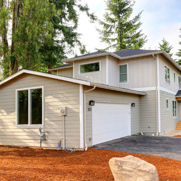
 Shuler Architecture
Completed in 2015, this 4 BR, 2 1/2 bath was designed for a developer with a intolerably tight budget. Our simple solution employs a straightforward mix of flowing spaces borrowed from California great room houses with design elements found in more traditional residential design.
The house is entered through a generous entry hall flanked by a formal Dining Room on one side and a Home Office/Den on the other. The far end of this Entry Hall deposits into a large Great Room and open kitchen that is this home's gathering and entertainment hub. A small alcove at the end of the kitchen allows for everyday meals while the island functions as this entire space's focal point. Completing the entertainment concept of this level is a covered porch accessed through a sliding door in the Family Room.
The upper level is accessed via a stair at one end of the plan and is organized around a wide hallway that terminates in a tech space for kids. 3 generous children's bedrooms and an ample Master Suite with a view toward the Olympic Mountains complete this level. Finish selections throughout the house were purposely kept clean, light and simple. The exterior form of the house, while simple, allows for a variety of roof schemes that appeal to different price points in the marketplace. We also designed a bonus room option that can be accessed via the stair and resides over the garage.
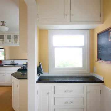
 Domistyle Design
The back porch became part of the house with a countertop for charging cell phones and depositing a briefcase or work bag on the way in.
Example of a small transitional u-shaped linoleum floor eat-in kitchen design in Seattle with an undermount sink, shaker cabinets, white cabinets, granite countertops, white backsplash, subway tile backsplash, stainless steel appliances and a peninsula
Example of a small transitional u-shaped linoleum floor eat-in kitchen design in Seattle with an undermount sink, shaker cabinets, white cabinets, granite countertops, white backsplash, subway tile backsplash, stainless steel appliances and a peninsula
Find the right local pro for your project
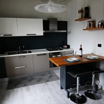
 Diletta Bordignon Designer
Trasformation of an artisanal deposit in an amazing house.
interior and exterior project, choise the materials, the interior furniture and construction site management..
All studied in detail to transform what was a workplace in a space of relaxation to share with family or friends.
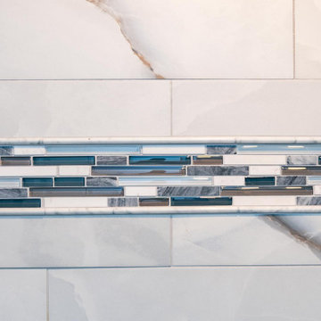
 mackmiller design+build
The clients’ 1995 primary bathroom wasn’t functional or safe. They wanted it accessible so they could age-in-place. However, to keep costs down, they wanted to stay within the current footprint and keep the same general layout. Key changes to the project included replacing a double window with a single window. This allowed for the larger double bowl vanity and a double built-in linen cabinet. A 32” wide door was installed and the tub was replaced with a barrier-free, curbless, shower. A white painted Shaker style flat panel double vanity with rarely seen Lemurian Blue granite and two white undermount sinks were added. The granite is quarried in Madagascar and rich in iridescent, labradorite deposits is the room’s focal point. A curbless shower with a hinged glass door was installed. The colors of the shower deco strip reflect the vanity top color palette. Large format marble look white and taupe porcelain shower wall and floor tile with hints of blue were installed in the shower and bathroom floor. Taupe 2 x 2 tiles were laid on the shower floor. A granite shaving bench and two corner shelves for products were added. Delta Lahara polished chrome shower head and hand shower system, vanity faucets and a robe hook were installed. Polished chrome is repeated in the Schlage Accent privacy lever door handles and Top Knobs cabinet hardware. A large custom beveled vanity framed mirror and two polished chrome three-light vanity fixtures with white glass globes were also installed.


 Marker Girl Home
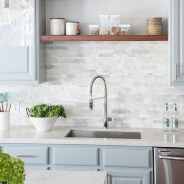
The Cabinetry is all painted in a soft blue/grey (Sherwin Williams Mineral Deposit 7652 ) and the walls are painted in (Sherwin Williams Frosty White 6196) The island was custom made to function for them. They requested lots of storage so we designed storage in the front of the island as well and the left side was open shelved for cookbooks. Counters are quartz from LG. I love using Quartz for a more durable option keeping it family-friendly. We opted for a nice stone mosaic from Daltile – Sublimity Namaste.
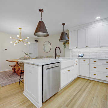
 Main Line Kitchen Design
Main Line Kitchen Design has a different business model than other kitchen showrooms, designers, and cabinetry dealers. The difference helps us to do five important things better than our competitors.
The kitchens we sell are better designed and our designers are more experienced. This is because we insist on showing customers designs we recommend, BEFORE, we do a design they request. This way, final designs tend to be more collaborative and professional. Our designers are more experienced because they are better paid and design with more cabinet brands than at other dealers.
Our pricing for cabinets is less than other cabinet dealers. This is because we do not have a showroom open to the public, and we require a small deposit and a screening before we accept customers. This helps our designers spend their time more effectively. And, it eliminates 80% of the overhead kitchen showrooms spend on staffing, larger displays, and on a curbside location.
We carry more brands of cabinetry than other dealers. This is possible because we display one cabinet for each brand we sell. Through glass countertops clients can examine a brands construction quality, and we display the door styles and finishes of our brands. Instead of the larger displays customers see in traditional showrooms, our customers can view 5 million kitchens on Houzz.com, or the hundreds of our kitchen renovations we show on Houzz, our web site, and in framed photos on the walls of our office building.
Kitchen construction is often better organized and generally costs less. This is because we recommend general contractors free of charge. They supervise construction from scheduling to completion. This eliminates a middleman, reduces delays, and eliminates the fees that almost all showrooms and home centers charge their customers. We are also happy to work with any contractor a customer finds on their own. If we haven’t worked with that contractor before they may need more of our direction, but both companies can benefit from working together and possibly referring each other in the future.
Less problems arise, and if they do, they are handled more quickly. This is because every kitchen we sell is reviewed by at least 3 kitchen designers during the ordering process. Our Operations Manager Ed Sossich checks orders and schedules all warehouse and home deliveries. Our delivery manager Mark Mitten supervises every delivery and checks in each cabinet and part. And our CRM system, Monday, prompts each person responsible for each phase of a customer’s kitchen with automated alerts. This keeps things moving, even during supply chain disruptions, and ensures no step is overlooked.
Main Line Kitchen Design’s company slogan is “The world of kitchen design is changing . . . “. We pride ourselves on being innovative in everything we do. From our web site and how we advertise, to the gift we send each customer upon the completion of their kitchen.
Our business model helps us receive 100’s of 5-star reviews, and makes our kitchen projects more enjoyable for everyone.
We look forward to working with you.
 Neolithic Materials
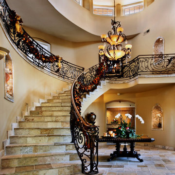
Reclaimed Biblical Stone – 2nd Cut is a richly varied reclaimed stone with deep amber, burnt ochre, slate grey, and weathered sand tones. Its undulating surface, tumbled edges, and mineral deposits create a rugged, aged character suited to motor courts, garden patios, farmhouse kitchens, and spa-style bathrooms. For inquiries, contact us at (310) 289-0414 or info@neolithicmaterials.com
 Tile Doctor Ltd
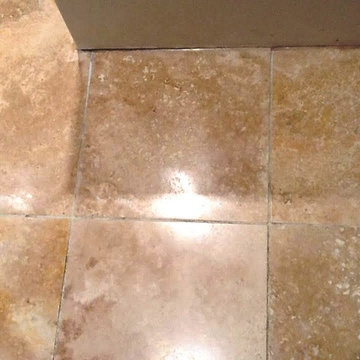
Earlier this month I was in the town of Northampton, to see a client who had reported a problem with her Travertine kitchen tiles. Basically the grout between the tiles was badly stained, to the point of appearing almost black.
The Travertine tiles were also in need of some maintenance, and so I was commissioned to provide a clean, polish and a fresh seal. Travertine is a popular choice for kitchen flooring due to its relatively high durability and distinct features. My task was to get this floor back to looking its best.
My priority was to address the badly stained grout so I cleaned the grout lines by hand using a combination of hand brushes and Tile Doctor Grout Clean-Up. The surface was pre-wet with water, before a solution of Grout-Clean Up and clean water was applied to the surface. The brushes were then used to agitate the solution. Grout Clean-Up contains a mix of concentrated phosphoric acid and cleaner designed to penetrate below the surface of the grout to remove grout stains, smears and mineral deposits.
As you can see from the photos, Grout Clean-Up made an immediate difference to the appearance of the tiles. This product is suitable for use on masonry and acid resistant surfaces. After completing the clean, I gave the floor a thorough rinse to neutralise the floor after cleaning and removed as much of the water as possible using a wet vacuum.
Following this, I paid attention to the tiles themselves, cleaning them to achieve a polished effect by using a system of burnishing pads. Tile Doctor burnishing pads comprise a set of four pads varying in grit type, from Coarse and Medium to Fine and Very Fine. I applied all four pads in turn to the floor, stopping to rinse the floor in between each. The result was a high quality polished finish.
I then left the floor to dry completely overnight, before commencing the seal the next day. My choice of sealing product was Tile Doctor Colour Grow which is a colour intensifying sealer that both enhances the natural appearance of the stone and provides a durable surface seal.
My client was very pleased with the finished product, and left the following comment on the Tile Doctor feedback system: “efficiently done”, yielding “good results”.
Phil Vissian
Northamptonshire Tile Doctor
 The Safety Letterbox Company
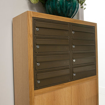
Floral Court is a mixed-use development featuring a high-quality residential, retail and restaurant space located in London’s Covent Garden. The project has created a new public walkway between Floral Street and King Street, providing increased footfall levels that provide a vital link to the retail and restaurant units in the development.
The mailboxes used in the Floral Court project are situated in internal lobby areas that residents pass through to access their apartment. Each bank of mailboxes is fitted into a bespoke timber frame with an internal steel frame support that ensures multiple mailboxes are securely installed in their respective locations.
The chosen mailbox model for this development is the NW2 product, an item that is particularly popular with clients looking for a mailbox that has a minimalist design finish and where mail is to be both delivered and retrieved through the front face. This project uses a lateral variation of the NW2 mailbox, which allows for A4 sized flexible mail to be deposited and securely stored in the post box. The lateral type of post box typically features a shorter depth and larger width, which is ideal for installation areas that are relatively narrow.
To reflect the number of residences that they service, the mailboxes are in a variety of different configurations across the site.
Each post box has been engraved with corresponding residence numbers during the manufacturing process. To allow for a clean finish on the mailbox, the client opted for the engraving to be the same colour as the mailboxes themselves. Being used with the NW2 product, which has been specifically designed to have minimal features, this is the ideal mailbox and engraving combination for a sleek designer look.
The mailbox is engraved with the front family ‘Calisto MT’, which is used in other locations on the site. This ensures a consistent mirroring of fonts used throughout the Floral Court development.
 mackmiller design+build
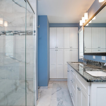
The clients’ 1995 primary bathroom wasn’t functional or safe. They wanted it accessible so they could age-in-place. However, to keep costs down, they wanted to stay within the current footprint and keep the same general layout. Key changes to the project included replacing a double window with a single window. This allowed for the larger double bowl vanity and a double built-in linen cabinet. A 32” wide door was installed and the tub was replaced with a barrier-free, curbless, shower. A white painted Shaker style flat panel double vanity with rarely seen Lemurian Blue granite and two white undermount sinks were added. The granite is quarried in Madagascar and rich in iridescent, labradorite deposits is the room’s focal point. A curbless shower with a hinged glass door was installed. The colors of the shower deco strip reflect the vanity top color palette. Large format marble look white and taupe porcelain shower wall and floor tile with hints of blue were installed in the shower and bathroom floor. Taupe 2 x 2 tiles were laid on the shower floor. A granite shaving bench and two corner shelves for products were added. Delta Lahara polished chrome shower head and hand shower system, vanity faucets and a robe hook were installed. Polished chrome is repeated in the Schlage Accent privacy lever door handles and Top Knobs cabinet hardware. A large custom beveled vanity framed mirror and two polished chrome three-light vanity fixtures with white glass globes were also installed.
 User
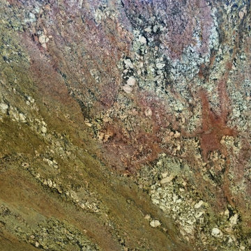
UserCrema Bordeaux Granite is a multi-colored granite that redefines the artistry of any surface. It has a mixture of ivory, blue green, light green and coral red. (Bundle#2)

 Rossana Kelton Fine Art Gallery
The story of the three flamingos in Atacama Salt Lake is a story of inspiration. I am from South America and wanted to bring to the attention the images of the Atacama Salt flats in the country of Chile. These flats are considered the largest salt deposits in Chile and the largest source of lithium in the world. The Atacama mountains seemed like dormant volcanos. I thought that it was very fascinating that the biggest salt reserves had flamingos living in that area. I always associated flamingos with tropical areas and did not realized that they exist in the Andes and in Argentina, Peru and Bolivia. There are species of flamingos that live in Africa and Europe. I just thought that the flamingos where an intriguing subject. The three flamingos also represent harmony, wisdom and understanding.
 Shuler Architecture
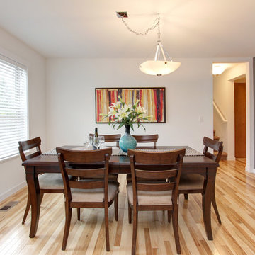
Completed in 2015, this 4 BR, 2 1/2 bath was designed for a developer with a intolerably tight budget. Our simple solution employs a straightforward mix of flowing spaces borrowed from California great room houses with design elements found in more traditional residential design.
The house is entered through a generous entry hall flanked by a formal Dining Room on one side and a Home Office/Den on the other. The far end of this Entry Hall deposits into a large Great Room and open kitchen that is this home's gathering and entertainment hub. A small alcove at the end of the kitchen allows for everyday meals while the island functions as this entire space's focal point. Completing the entertainment concept of this level is a covered porch accessed through a sliding door in the Family Room.
The upper level is accessed via a stair at one end of the plan and is organized around a wide hallway that terminates in a tech space for kids. 3 generous children's bedrooms and an ample Master Suite with a view toward the Olympic Mountains complete this level. Finish selections throughout the house were purposely kept clean, light and simple. The exterior form of the house, while simple, allows for a variety of roof schemes that appeal to different price points in the marketplace. We also designed a bonus room option that can be accessed via the stair and resides over the garage.

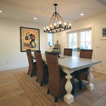
 ExceptionalHome
Example of a large cottage light wood floor and brown floor great room design in Orange County with white walls
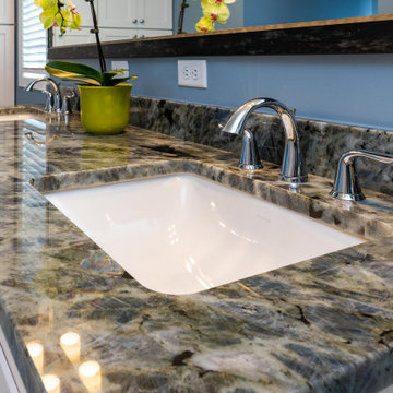 mackmiller design+build
The clients’ 1995 primary bathroom wasn’t functional or safe. They wanted it accessible so they could age-in-place. However, to keep costs down, they wanted to stay within the current footprint and keep the same general layout. Key changes to the project included replacing a double window with a single window. This allowed for the larger double bowl vanity and a double built-in linen cabinet. A 32” wide door was installed and the tub was replaced with a barrier-free, curbless, shower. A white painted Shaker style flat panel double vanity with rarely seen Lemurian Blue granite and two white undermount sinks were added. The granite is quarried in Madagascar and rich in iridescent, labradorite deposits is the room’s focal point. A curbless shower with a hinged glass door was installed. The colors of the shower deco strip reflect the vanity top color palette. Large format marble look white and taupe porcelain shower wall and floor tile with hints of blue were installed in the shower and bathroom floor. Taupe 2 x 2 tiles were laid on the shower floor. A granite shaving bench and two corner shelves for products were added. Delta Lahara polished chrome shower head and hand shower system, vanity faucets and a robe hook were installed. Polished chrome is repeated in the Schlage Accent privacy lever door handles and Top Knobs cabinet hardware. A large custom beveled vanity framed mirror and two polished chrome three-light vanity fixtures with white glass globes were also installed.
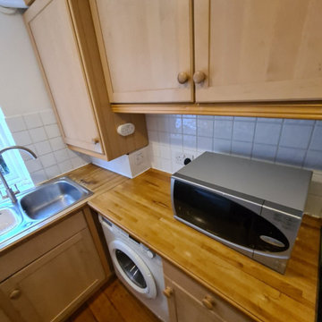
 End of Tenancy Cleaning Portsmouth
Check out one of our latest projects. Our professional team of cleaners managed to clean perfectly the entire 2 bed property for a short period of time. The customer was happy with the final result and most importantly he received his deposit back.
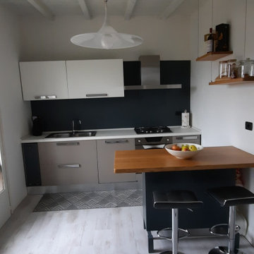 Diletta Bordignon Designer
Trasformation of an artisanal deposit in an amazing house.
interior and exterior project, choise the materials, the interior furniture and construction site management..
All studied in detail to transform what was a workplace in a space of relaxation to share with family or friends.
23