
Search results for "Depression" in Home Design Ideas
 Bluestem Remodeling
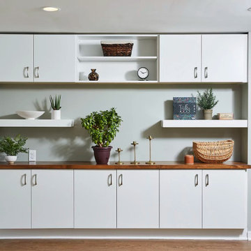
This homeowner loved her small, cozy house in St. Louis park, but after nearly 20 years, was ready to make the move and undergo a large remodeling project to finally gain the additional living spaces she craved daily.
She desperately needed more and better storage, and dreamed of having additional space to support leisure activities such as crafting, a laundry space that didn’t depress her, a guest space, an additional space to flop down at the end of the day and watch TV, and a better, secondary bathroom for daily showering.
After living in the house for so many years, a significant basement remodel would actually cost almost as much as the home itself originally was. But after years of planning, preparation and dreaming, it was finally time to take action and make her home better suit her life.
 Floors by Remo and Company
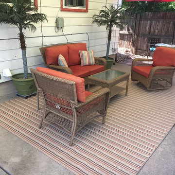
Inspiration for a small tropical concrete back porch remodel in Denver with an awning
 TVL Creative Ltd.
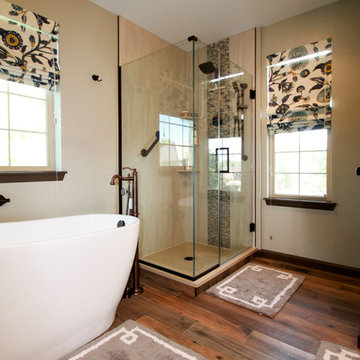
This remodel took a dated and cramped bathroom and transformed it into a classy oasis for our Lowry clients. The clients had a limited budget and wanted to leave the space as in-place as possible. However, the large drop in tub ate valuable floor space and a half wall between the shower and tub had become a holding place for random items without a home. The thick frame on the shower glass made the shower feel extremely small, and the dated lighting and fixtures further depressed the space. We proposed a traditional and elegant design that consider the client's budgetary and spatial constraints. We removed the existing drop-in tub and replaced it with a lovely free-standing soaker. The length of this tub is short, but the depth is exaggerated, making it an ideal replacement in this tiny footprint. The shower glass was swapped for framless glass that boldly expands space. We tore out the existing carpet and installed gorgeous wood-look tile that adds depth and warmth to the room. The clients opted to keep their existing vanity to save cost, so a new top was added to bring the aesthetic up to the level of the new additions. The wall paint was taken from a buttery yellow to a soft gray-green, accented by a darker version of this same color on the siding barn door and toilet room door. New vanity lights, faucets, and storage shelves were installed to help our clients organize and keep things off the counter tops. Finally, new custom up-down window shades were curated for the bathroom to add to the final touch. This space is a simple scope with a dramatic transformation that introduces a timeless look for years to come.
Find the right local pro for your project
 Classic Kitchens Design Studio
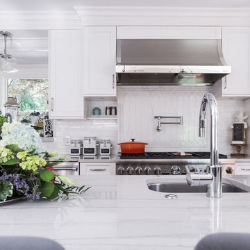
Large eclectic medium tone wood floor kitchen photo in Kansas City with recessed-panel cabinets, white cabinets, quartzite countertops, white backsplash, subway tile backsplash, stainless steel appliances and an island

 Grandin Road
Don't just decorate, put on a spine-tingling show to write home about with our Animated Haunted Typewriter. The hit of your Halloween spectacle, they'll still be talking about next year. As the unsuspecting approach, it simply appears as a forgotten writer's relic. Once the motion sensor is activated, the ghost at the keyboard repeatedly depresses the keys that spell, "H-E-L-P." Paper carriage moves side-to-side, as typewriter sound effects play, adding to the spellbinding illusion. The final frightful touch is the desperate and disordered message, typewritten on letterhead from the Transylvania Hotel. Spooky.


 TVL Creative Ltd.
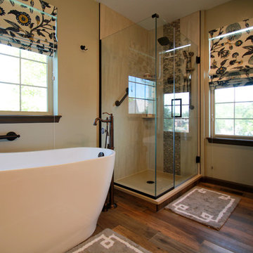
This remodel took a dated and cramped bathroom and transformed it into a classy oasis for our Lowry clients. The clients had a limited budget and wanted to leave the space as in-place as possible. However, the large drop in tub ate valuable floor space and a half wall between the shower and tub had become a holding place for random items without a home. The thick frame on the shower glass made the shower feel extremely small, and the dated lighting and fixtures further depressed the space. We proposed a traditional and elegant design that consider the client's budgetary and spatial constraints. We removed the existing drop-in tub and replaced it with a lovely free-standing soaker. The length of this tub is short, but the depth is exaggerated, making it an ideal replacement in this tiny footprint. The shower glass was swapped for framless glass that boldly expands space. We tore out the existing carpet and installed gorgeous wood-look tile that adds depth and warmth to the room. The clients opted to keep their existing vanity to save cost, so a new top was added to bring the aesthetic up to the level of the new additions. The wall paint was taken from a buttery yellow to a soft gray-green, accented by a darker version of this same color on the siding barn door and toilet room door. New vanity lights, faucets, and storage shelves were installed to help our clients organize and keep things off the counter tops. Finally, new custom up-down window shades were curated for the bathroom to add to the final touch. This space is a simple scope with a dramatic transformation that introduces a timeless look for years to come.
 Birch+Oak Construction
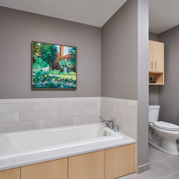
Reprioritizing & reconfiguring spaces to update master bath and create guest accommodations.
Project Details:
These homeowners loved the light, the views, and the compactness of their condo unit. The dining space could accommodate the whole family, they had private areas for quiet reading time, and they loved the location, the building and the community. They definitely did not want to leave.
However, the wasted space in the guest bath, the dark, depressing, heavy-feeling in the master bath and the lack of closet space for guests were all problems for them. They wanted a brighter, more inviting bathroom with more functionality and storage, better accommodations for guests, and the tv room to become a comfortable place to relax and actually enjoy the incredible view they had. The unit was designed specifically for the needs of the previous owner, but they needed their home to fit their own needs and lifestyle.
Our team helped this couple create the bright master bath they wanted, complete with additional functionality and storage options. The guest bath and sitting room were also both reconfigured. The guest bath was reworked to become smaller - but more functional, and the sitting room was expanded to become a fully-functioning guest room.
The reprioritization and reworking of spaces in this unit is a great example of working within an existing framework to create rooms that better fit the needs and wants of a homeowner. The new spaces are a much better fit for the lifestyle and aesthetic of this couple, while mimicking the warmth and welcoming feel of the existing spaces they already enjoyed. They are now able to fully take advantage of the views in all living areas of the unit and can easily accommodate guests in comfort whenever they desire.
 TVL Creative Ltd.
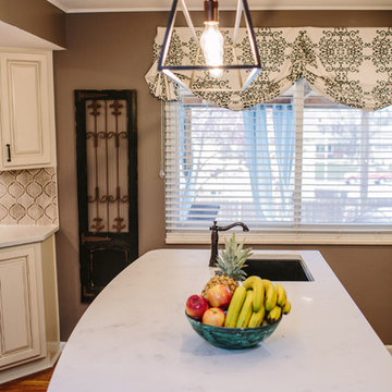
This challenging kitchen came our way at the same time as another similarly located Centennial kitchen. It was apparent that both houses had been built by the same builder: tight space, low ceilings, awkward arrangement, and poor building materials. Our client here is a single mother of three boys with an incredibly demanding work life. Once finally home at the end of a busy day, our client was virtually unable to use her kitchen. Cabinet doors were falling off, limited storage and workspace offered her little opportunity to cook and prep for her children, and the dark and low ceiling created an atmosphere that can only be described as depressing. Our client is also from Louisiana and has always dreamed of a kitchen that reminds her of home warmth and hospitality. Our goal was not only to expand functional storage and workspace, but bring in the southern NOLA appeal that reminds our client so much of home. To do this, we removed the wall between the formal dining room and kitchen to create an extended kitchen that runs the full length of both spaces. The back wall of what used to be the dining room is now the cooking zone for our client: we've relocated her range and microwave, and have created an island full of storage where her children can sit and socialize. We've also lifted up the low ceiling to create a tray ceiling that we have finished with ghostwood. The cabinetry is an off-white color with a hazelnut glaze that offers a more traditional, warm appearance. The island and mini work nook feature dramatic, handmade tin ceiling tiles for a dramatic texture and color. We've finished the space with functional quartz countertops and an arabesque two-toned marble backspalsh. The sinks, faucets and hardware are all in a matte black finish that offer a dramatic pop throughout the space. Little touches of Parisian flair add to this Cajun-French aesthetic and we are so thrilled with the final result!
 Dezinerwallz
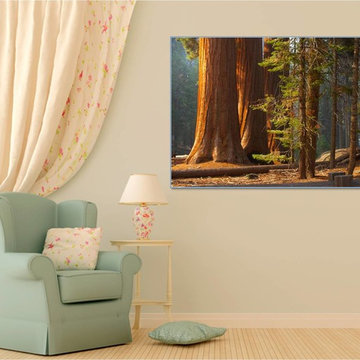
Knowing what we know about man’s innate connection with and love of nature and natural environments, if we’re not incorporating biophilic design principles into our own personal spaces, we’re depriving ourselves, and those with whom we share these spaces, of all the benefits that access to nature offers us.
Click on the next picture to continue reading………..
 Kitchen Design Services
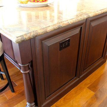
Large elegant u-shaped medium tone wood floor eat-in kitchen photo in San Francisco with an undermount sink, recessed-panel cabinets, white cabinets, granite countertops, white backsplash, stone tile backsplash, stainless steel appliances and an island
 TVL Creative Ltd.
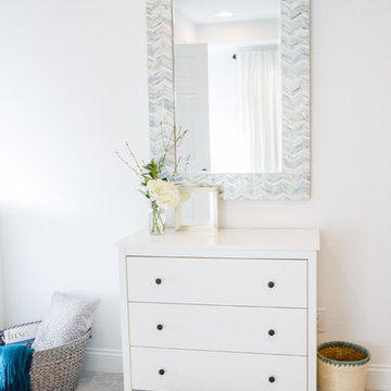
This newly purchased home was the perfect size for our client's growing family. The house, having been expanded on and renovated by the previous owners was the right size but not quite the right style. The house was full of design elements that may have been "cool" in the early 2000s but just didn't feel right for a young family. The master bathroom was in the most serious need of redo with many, many square feet of dingy and somewhat depressing deep red granite tile with diamond accents in black granite. The bathroom felt dark and dingy. Together with our clients, we set out on our mission to efficiently turn this room into an inviting and happy place for our clients. Thankfully the layout of the space was very functional, so we focused on an aesthetic overhall. At the top of the client’s list was to have a beautiful and comfortable freestanding soaker tub. Behind the Kohler tub and throughout the bathroom walls is polished Calacatta Gold marble tile. The new brushed nickel plumbing fixtures are timeless and unfussy, an important thing for busy young parents! The new bathroom is sleek but not stark. A welcoming space for our clients to feel at home.
 Narofsky Architecture + ways2design
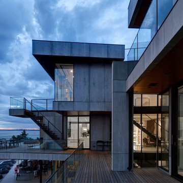
The site for this waterfront residence is located on the
Great Neck Peninsula, facing west to views of NYC and
the borough bridges. When purchased, there existed a
50-year-old house and pool structurally condemned
which required immediate removal. Once the site was
cleared, a year was devoted to stabilizing the seawall
and hill to accommodate the newly proposed home.
The lot size, shape and relationship to an easement
access road, overlaid with strict zoning regulations was
a key factor in the organization of the client’s program
elements. The arc contour of the easement road and
required setback informed the front facade shape,
which was designed as a privacy screen, as adjacent
homes are in close proximity. Due to strict height
requirements the house from the street appears to be
one story and then steps down the hill allowing for
three fully occupiable floors. The local jurisdiction also
granted special approval accepting the design of the
garage, within the front set back, as its roof is level with
the roadbed and fully landscaped. A path accesses a
hidden door to the bedroom level of the house. The
garage is accessed through a semicircular driveway
that leads to a depressed entry courtyard, offering
privacy to the main entrance.
The configuration of the home is a U-shape surrounding a
rear courtyard. This shape, along with suspended pods
assures water views to all occupants while not
compromising privacy from the adjacent homes.
The house is constructed on a steel frame, clad with fiber
cement, resin panels and an aluminum curtain wall
system. All roofs are accessible as either decks or
landscaped garden areas.
The lower level accesses decks, an outdoor kitchen, and
pool area which are perched on the edge of the upper
retaining wall.
 Sycamore Kitchens & More
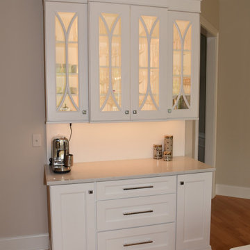
"I want light and airy!" That was our design challenge in changing a dark depressing kitchen to a vibrant space for entertaining and enjoying the everyday. This beautiful light and airy kitchen was achieved through the use of light materials including white cabinetry with lots of glass featuring sweeping curved mullions, a majestic curved chimney hood, stunning white quartzite and stainless steel Wolf and Sub-Zero appliances. Function was also a cornerstone of the design with spaces created for seating, storage and serving. An old desk was replaced with a coffee bar station which doubles as a drink area when having guests. Natural light was improved along with energy efficient LED lighting to set the mood, especially at night. "We just love our transformed kitchen, it makes the house a home!"
 TVL Creative Ltd.
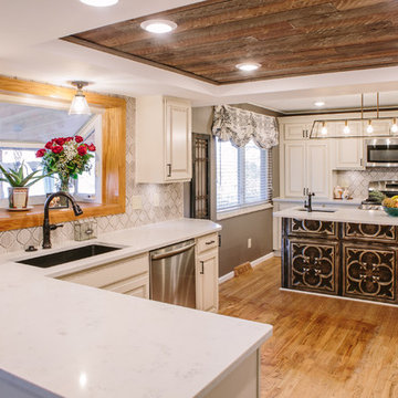
This challenging kitchen came our way at the same time as another similarly located Centennial kitchen. It was apparent that both houses had been built by the same builder: tight space, low ceilings, awkward arrangement, and poor building materials. Our client here is a single mother of three boys with an incredibly demanding work life. Once finally home at the end of a busy day, our client was virtually unable to use her kitchen. Cabinet doors were falling off, limited storage and workspace offered her little opportunity to cook and prep for her children, and the dark and low ceiling created an atmosphere that can only be described as depressing. Our client is also from Louisiana and has always dreamed of a kitchen that reminds her of home warmth and hospitality. Our goal was not only to expand functional storage and workspace, but bring in the southern NOLA appeal that reminds our client so much of home. To do this, we removed the wall between the formal dining room and kitchen to create an extended kitchen that runs the full length of both spaces. The back wall of what used to be the dining room is now the cooking zone for our client: we've relocated her range and microwave, and have created an island full of storage where her children can sit and socialize. We've also lifted up the low ceiling to create a tray ceiling that we have finished with ghostwood. The cabinetry is an off-white color with a hazelnut glaze that offers a more traditional, warm appearance. The island and mini work nook feature dramatic, handmade tin ceiling tiles for a dramatic texture and color. We've finished the space with functional quartz countertops and an arabesque two-toned marble backspalsh. The sinks, faucets and hardware are all in a matte black finish that offer a dramatic pop throughout the space. Little touches of Parisian flair add to this Cajun-French aesthetic and we are so thrilled with the final result!

 Alexandra Crafton
Photo: Alexandra Crafton © 2017 Houzz
Living room - eclectic living room idea in Boston
Living room - eclectic living room idea in Boston
 Just the Thing Decorating, Staging, and Windows
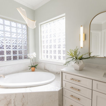
This 1980's home had a dark and depressing master bath. Now it s bursting with light and character!
Large transitional master beige tile and porcelain tile porcelain tile, beige floor and double-sink bathroom photo in Dallas with recessed-panel cabinets, beige cabinets, a one-piece toilet, green walls, an undermount sink, quartz countertops, a hinged shower door, white countertops and a built-in vanity
Large transitional master beige tile and porcelain tile porcelain tile, beige floor and double-sink bathroom photo in Dallas with recessed-panel cabinets, beige cabinets, a one-piece toilet, green walls, an undermount sink, quartz countertops, a hinged shower door, white countertops and a built-in vanity
 JLC Designs
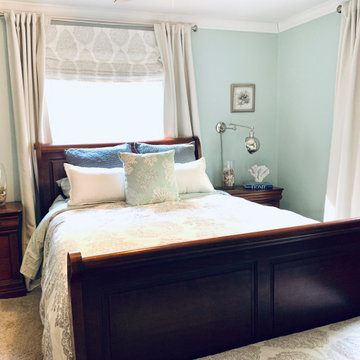
This primary bedroom was dark and depressing. The owners wanted a space that was calm and serene, like a coastal escape. We painted the walls a subtle sea glass and created custom window treatments to accentuate the room. Potterybarn linens and coastal decor finished the space.

27