
Search results for "Determination" in Home Design Ideas

 RenovationPLUS
Inspiration for a transitional beige two-story stucco exterior home remodel in Indianapolis with a hip roof
 Phoenix Home Remodeling
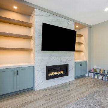
After finishing Devon & Marci’s home office, they wanted us to come back and take their standard fireplace and elevate it to the rest of their home.
After determining what they wanted a clean and modern style we got to work and created the ultimate sleek and modern feature wall.
Because their existing fireplace was in great shape and fit in the design, we designed a new façade and surrounded it in a large format tile. This tile is 24X48 laid in a horizontal stacked pattern.
The porcelain tile chosen is called Tru Marmi Extra Matte.
With the addition of a child, they needed more storage, so they asked us to install new custom cabinets on either sides of the fireplace and install quartz countertops that match their kitchen island called Calacatta Divine.
To finish the project, they needed more decorative shelving. We installed 3 natural stained shelves on each side.
And added lighting above each area to spotlight those family memories they have and will continue to create over the next years.


Find the right local pro for your project

 AGM Home Store, LLC
Many rooms need a wastebasket: kitchens, bathrooms, bedrooms, or even the office. To determine what type of basket is right for you, consider how much garbage you’ll be placing into your wastebasket daily, as well as appealing preferences, materials and features. We offer a large line of luxury, designer waste baskets and step cans in many different shapes and finishes. These finishes include: polished chrome bathroom waste baskets, polished gold waste bins, white waste baskets. We also a lot of different shapes so that you can select the best option and style you are looking for. We offer round bathroom trash cans, square bathroom trash bins, stainless steel step can waste baskets, swing cover trash can, crystal glass bathroom waste baskets, brass bathroom waste bins, corner wastebaskets, and chrome bathroom waste baskets with a lid/cover, and wastebaskets without lid as well. Buying a bathroom waste basket will keep your room looking clean and tidy.

 NJ Sunroom Additions
Family room
Sunroom - transitional sunroom idea in New York with a ribbon fireplace and a stone fireplace
Sunroom - transitional sunroom idea in New York with a ribbon fireplace and a stone fireplace

 SJ Studios, LLC
 - the customer wants a mosaic featuring sunflowers. The perspective is to be the flower and stalk, etc. The customer has selected a field tile and the size of the mosaic is to be 23" X 26" which leaves about a 3" border all the way around. It's also key to determine where in the space it will go, ensuring that it's visible from as many angles as possible.
 Packard Cabinetry of Sea Cliff
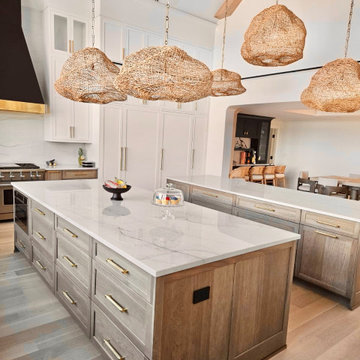
Description of Waterfront Home Design
Challenge: The task was to fill a vast space with 14-foot walls soaring to a peak of 30 feet, using cabinetry that would not appear undervalued or insubstantial. The main question was determining the appropriate height for the cabinetry, considering the scale and proportion of the space, the walk-through to adjoining rooms, window heights, and the height of the refrigerator.
Solution: By carefully analyzing these factors, we were able to create cabinetry that perfectly scaled to the grand dimensions of the room. The floor plan featured two islands that effectively filled the space. Key elements included #TheGalley workstations, drop-down televisions, #MouserCabinetry, and secret doors leading to a hidden scullery, all contributing to an extraordinary project.
 Packard Cabinetry of Sea Cliff
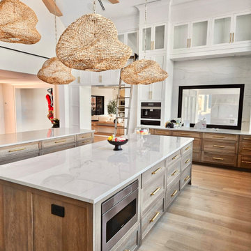
Description of Waterfront Home Design
Challenge: The task was to fill a vast space with 14-foot walls soaring to a peak of 30 feet, using cabinetry that would not appear undervalued or insubstantial. The main question was determining the appropriate height for the cabinetry, considering the scale and proportion of the space, the walk-through to adjoining rooms, window heights, and the height of the refrigerator.
Solution: By carefully analyzing these factors, we were able to create cabinetry that perfectly scaled to the grand dimensions of the room. The floor plan featured two islands that effectively filled the space. Key elements included #TheGalley workstations, drop-down televisions, #MouserCabinetry, and secret doors leading to a hidden scullery, all contributing to an extraordinary project.
 Westchester Bathroom Remodeling
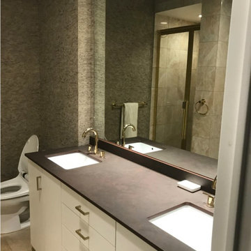
For this Manhattan, apartment space was something we did not have a lot of. But we did have a creative partner in the homeowner who was open to the suggestions of our design team and ready to get creative.
After the functional requirements were determined and our design was drafted and approved by the homeowner, we got to work.
First, a complete bathroom gut was completed, followed by; the installation of a glass shower door, new tile, plumbing and lighting.
The tile we selected a light gray was paired with white stain-resistant grout and painted with a shower base tile that brought out the wood elements of the floating vanity.
As with many of our smaller bathroom projects, we used a pre-built floating vanity to win backspace for the bathroom and eye line. Floating vanities are great for a few reasons; the main advantage of a floating vanity is the illusion of space it creates in the room. With a floating vanity, the bathroom feels bigger as light can pass freely beneath it.
 Kitchen Solvers of Fort Wayne & Toledo
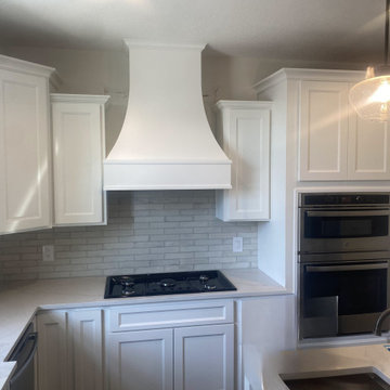
For this kitchen remodeling job, our client had just replaced their countertops and didn’t want to replace them again. After looking over their existing cabinets, we determined that cabinet refacing would be a great solution for them. They went with our Portland door in maple wood and a pure white color from our Kitchen Solvers Classic Collection line. We also changed the cabinets in the bar area with the same door style; however, these cabinets were done in a black tea color. We also extended the cabinets to the ceiling to give them more storage. Now our clients have the kitchen of their dreams!
 Nix Group Architects
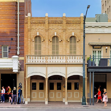
Brush-Turner-Hirshfeld Building - Tenant Space Renovation and Remodel - Jim Nix - AIA - Austin Architect - Nix Group Architects – Residential and Commercial Architecture Firm - Austin Texas – 78701.
This 1872 retail building originally had twice the street presence as it has today. In 1924, half of the building was purchased to make way for the new Stephen F. Austin Hotel. The building's facade was altered on numerous occasions, but the most dramatic change occurred when the building assumed an eclectic French Modern look in the 1970's, leaving none of the original facade. In 1999, it was decided to return the building back to its original architectural styling. By using the limited historic photographs taken of Congress Avenue at varying distances from the building as well as by studying other buildings of the same era, the buildings historic proportions and details were determined.
 Architects DCA
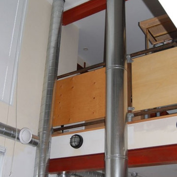
The owner of this home had purchased an early 20th Century house that had been carved up into apartments and otherwise unsympathetically modified and added on to over the years. After careful review, it was determined that there was little value in the existing structure. A new design, based on the existing foundation, was created. The existing foundation was added onto, increasing the height of the basement to create useable space. The new three storey home, building off the owner’s theatre background, incorporates a double height living room, dramatic open riser stairs and abundant natural light. The finished house includes three bedrooms, two bathrooms, open plan kitchen and dining space, walk out rear terrace and second level balcony. The third floor master retreat is tucked into the low slope roof, maintaining the character of the street; the industrial type cladding creates a contextual reinterpretation of the original community’s blue collar background. Featured in the Ottawa Citizen on several occasions including Glebe house tour.

 Advance Design Studio, Ltd.
When Bill and Jackie Fox decided it was time for a 3 Season room, they worked with Todd Jurs at Advance Design Studio to make their back yard dream come true. Situated on an acre lot in Gilberts, the Fox’s wanted to enjoy their yard year round, get away from the mosquitoes, and enhance their home’s living space with an indoor/outdoor space the whole family could enjoy.
“Todd and his team at Advance Design Studio did an outstanding job meeting my needs. Todd did an excellent job helping us determine what we needed and how to design the space”, says Bill.
The 15’ x 18’ 3 Season’s Room was designed with an open end gable roof, exposing structural open beam cedar rafters and a beautiful tongue and groove Knotty Pine ceiling. The floor is a tongue and groove Douglas Fir, and amenities include a ceiling fan, a wall mounted TV and an outdoor pergola. Adjustable plexi-glass windows can be opened and closed for ease of keeping the space clean, and use in the cooler months. “With this year’s mild seasons, we have actually used our 3 season’s room year round and have really enjoyed it”, reports Bill.
“They built us a beautiful 3-season room. Everyone involved was great. Our main builder DJ, was quite a craftsman. Josh our Project Manager was excellent. The final look of the project was outstanding. We could not be happier with the overall look and finished result. I have already recommended Advance Design Studio to my friends”, says Bill Fox.
Photographer: Joe Nowak

 KB Lueck Building Consultants, LLC.
A leaking shower was the beginning of a major bathroom renovation. When we determined the shower floor pan was leaking and the floor would need to be removed to fix the leak - the client began to think about the other features they did not really appreciate about the bathroom layout. The original master bath had very tight walk ways and a toilet area that was small. We redesigned the layout enlarging the walk ways, toilet area and added three and a half feet to the vanity length. The new layout did require a complete bathroom gut and remodel. The end results were much more functional and spacious than before while maintaining all the features of a luxury master bath.

 Factor Design Build
Many people can’t see beyond the current aesthetics when looking to buy a house, but this innovative couple recognized the good bones of their mid-century style home in Golden’s Applewood neighborhood and were determined to make the necessary updates to create the perfect space for their family.
In order to turn this older residence into a modern home that would meet the family’s current lifestyle, we replaced all the original windows with new, wood-clad black windows. The design of window is a nod to the home’s mid-century roots with modern efficiency and a polished appearance. We also wanted the interior of the home to feel connected to the awe-inspiring outside, so we opened up the main living area with a vaulted ceiling. To add a contemporary but sleek look to the fireplace, we crafted the mantle out of cold rolled steel. The texture of the cold rolled steel conveys a natural aesthetic and pairs nicely with the walnut mantle we built to cap the steel, uniting the design in the kitchen and the built-in entryway.
Everyone at Factor developed rich relationships with this beautiful family while collaborating through the design and build of their freshly renovated, contemporary home. We’re grateful to have the opportunity to work with such amazing people, creating inspired spaces that enhance the quality of their lives.


 Devine Bath & Kitchen
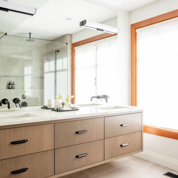
Our clients wanted to explore all their options for creating a beautiful and practical new space, even if it meant moving a couple walls. This is where it pays to hire a company that offers both design and construction services! Our designer, Stephanie, worked closely with our contractor team to create a brand new layout that suited our clients style and practical needs. We determined we could make room for a spacious new walk-in shower by stealing some space from the guest bathroom on the other side of the wall (which we also remodeled). We also saved some space by installing a pocket door and a wall-hung toilet, which takes up less space than a traditional toilet. This freed up a ton of space for a large, custom double-vanity. Throw in some new lighting, a fresh coat of paint, and a new tile floor, and the result is a gorgeous new master bathroom that is almost completely unrecognizable!
 KB Lueck Building Consultants, LLC.
A leaking shower was the beginning of a major bathroom renovation. When we determined the shower floor pan was leaking and the floor would need to be removed to fix the leak - the client began to think about the other features they did not really appreciate about the bathroom layout. The original master bath had very tight walk ways and a toilet area that was small. We redesigned the layout enlarging the walk ways, toilet area and added three and a half feet to the vanity length. The new layout did require a complete bathroom gut and remodel. The end results were much more functional and spacious than before while maintaining all the features of a luxury master bath.

 Deck and Patio Company "Outdoor Living Experts"
The four-foot multi-tiered waterfall feeding into the pond appears just like you see it in nature. To accomplish this, it is important to understand the way water moves over rock. Natural looking movement is determined by the type of rocks used, forcing water to move multiple ways when it comes down over the waterfall.
www.deckandpatio.com

 ODS Architecture
Originally a nearly three-story tall 1920’s European-styled home was turned into a modern villa for work and home. A series of low concrete retaining wall planters and steps gradually takes you up to the second level entry, grounding or anchoring the house into the site, as does a new wrap around veranda and trellis. Large eave overhangs on the upper roof were designed to give the home presence and were accented with a Mid-century orange color. The new master bedroom addition white box creates a better sense of entry and opens to the wrap around veranda at the opposite side. Inside the owners live on the lower floor and work on the upper floor with the garage basement for storage, archives and a ceramics studio. New windows and open spaces were created for the graphic designer owners; displaying their mid-century modern furnishings collection.
A lot of effort went into attempting to lower the house visually by bringing the ground plane higher with the concrete retaining wall planters, steps, wrap around veranda and trellis, and the prominent roof with exaggerated overhangs. That the eaves were painted orange is a cool reflection of the owner’s Dutch heritage. Budget was a driver for the project and it was determined that the footprint of the home should have minimal extensions and that the new windows remain in the same relative locations as the old ones. Wall removal was utilized versus moving and building new walls where possible.
Photo Credit: John Sutton Photography.
86