
Search results for "Dialogues" in Home Design Ideas
 STUDIO ENÉE architects
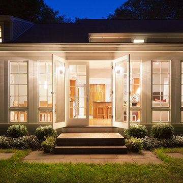
Overlooking an acre of land, this 1951 residence in Needham, Massachusetts was expanded and renovated to create a dialogue between the interior spaces and the exterior landscape. Two full height window walls look on to an expansive garden from the new kitchen and living areas. A skylight over the kitchen maximizes and brings natural daylight into the central core of the house. Access from the existing garage into the dining and kitchen areas is accomplished via a new mudroom and side entrance. The design reflects a flexible living space with framed views of the landscape and the use of natural and sustainable materials.
Photo Credit: Matthew Delphenic
 Nash Waters Architecture
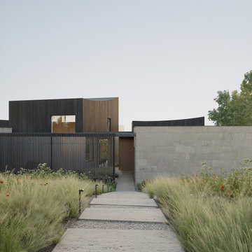
Embed within the contours of its sloping topography, Ledge & Light House is a retreat from the intensity of urban life—an Essex County home designed to embrace both serenity and openness. As a refuge from the city, it offers an immersive dialogue between architecture and landscape, where shifting light, framed views, and a careful balance of mass and transparency define the experience.
 Boyenga Team / Compass
Eichler X-100 Family Room: The Social Core of a Modernist Vision
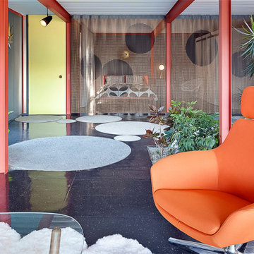
The family room in the Eichler X-100 is where the home truly comes alive—a space designed not just for gathering, but for experiencing architecture in motion. Created by A. Quincy Jones and Frederick Emmons for Joseph Eichler, it embodies the ideal balance between openness, comfort, and innovation.
A Structure That Disappears
At first glance, the room feels effortlessly open—but that freedom is the result of the X-100’s steel-frame construction, which eliminates the need for interior support walls. This allows the family room to function as a true uninterrupted volume, seamlessly connected to adjacent spaces.
The structure is still present—expressed through subtle steel elements—but it never interrupts the flow.
Light-Filled and Ever-Changing
The family room is bathed in natural light from every direction:
Floor-to-ceiling glass walls bring in expansive views and daylight
Overhead skylights soften and diffuse light across the space
Reflections from surrounding surfaces create a gentle, dynamic glow
From morning to evening, the room shifts in tone and atmosphere, making it feel alive and responsive.
Living Without Boundaries
One of the defining qualities of the family room is its ability to blur boundaries. Large sliding glass panels open directly to the outdoors, transforming the space into an indoor-outdoor pavilion.
Whether open or closed, the connection to nature is constant—air, light, and landscape are always part of the experience.
Designed for Everyday Life
Unlike more formal living spaces, the family room is grounded in functionality. It’s where:
Conversations happen naturally
Daily routines unfold
Relaxation and connection take center stage
The openness allows for flexibility—furniture arrangements, uses, and moods can evolve without constraint.
Views That Extend Through the Home
From this space, sightlines stretch across the home—often landing on interior gardens or atriums. This creates a layered visual experience where multiple zones are always in dialogue with one another.
The effect is subtle but powerful:
you are always aware of the entire home, not just the room you’re in.
The Essence of Eichler Living
The family room captures what made Eichler homes revolutionary—a focus on how people actually live. It’s not about formality or separation, but about connection, openness, and ease.
In the X-100, that idea is pushed to its highest level—creating a space that feels as relevant today as it did in 1956. image Sabrina Huang
Find the right local pro for your project
 Tapis Rouge
In dialogue with history
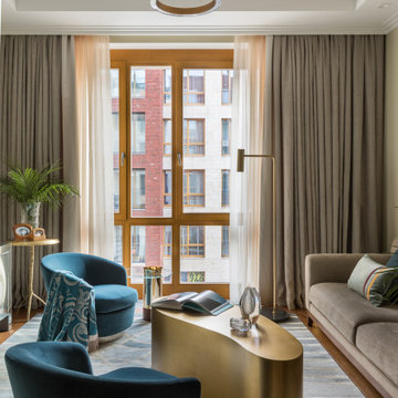
The gently curving figures create a whimsical play resembling an asymmetrical arabesque. Flirting with the traditional motif of the carpet's ornament is a meta-message addressed to cultural memory. The canvas of the rug is divided into segments by light lines, which look three-dimensional thanks to the yellow reflex. The framed spaces are colored as if isolated from the others. The color varies both through the effect of inhomogeneous coloring of the threads and weaving of two or three close colors next to each other, forming a background of a complex color gradient of shades of gray and blue.
The virtue of centuries-old traditions of hand knotting
The rug is made in the traditional hand weaving workshop of Nepal. Masters of this art have been preserving the technology for hundreds of years, and in collaboration with modern European designers create unique rugs at the junction of tradition and modernity. Natural raw materials are used in the creation of this rug, which reflects the idea of authentic aesthetics and modern requirements for ecological comfort. The density of the rug is 100 knots per inch.
 High Fashion Home
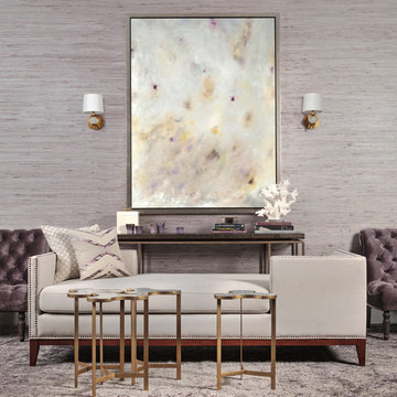
Graceful living, Featuring our Mercury double chaise, Caitlin chair, Link bunching table, Roman console, and Intellectual dialogue painting.
Transitional living room photo in Houston
Transitional living room photo in Houston
 First Impression Designs Inc.
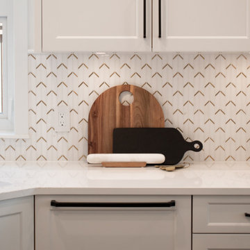
Éclat Manoir embodies refined elegance and timeless sophistication. Inspired by classic manor architecture, it balances grandeur with modern livability through light-filled spaces, rich textures, and tailored detailing. Natural light highlights the home’s sculptural forms and polished finishes, creating a harmonious dialogue between strength and softness. The result is a serene yet striking residence—where craftsmanship, comfort, and quiet luxury converge.
 EAG Studio
FOUR SEASONS RESIDENCE
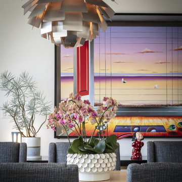
The interiors by EAG Studio at the Four Seasons Residences blend refined luxury with warmth and personality, creating spaces that feel elevated yet effortlessly lived-in. Rich colors, layered textures, and expressive art bring energy and character, balanced by warm woods and tactile finishes that ground the home in comfort.
Nature is woven throughout the design through sculptural greenery, organic forms, and abundant natural light, creating a seamless dialogue between indoors and the surrounding city. Thoughtful material pairings and inviting furniture arrangements foster a sense of ease, resulting in an atmosphere that feels optimistic, welcoming, and quietly sophisticated.
 Xavieras Inc.
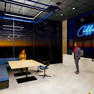
IQ Business Media Inc. wishes to expand the programming of their business brand by connecting with their audience in more dynamic ways and further enhance their position as a viable partner to national and international design markets. Bringing diverse stakeholders together to facilitate ongoing dialogue in the areas of design and architecture is a key goal of the organization.
Design Solutions:
Quality of space and brand delivery provide state-of-the-art technology in all the spaces.
Spaces can adapt to support the project and business needs. Onsite staff act as a conduit for culture, community, connecting people, companies, and industries by sharing expertise and developing meaningful relationships. Therefore, the spaces are flexible, easy to reconfigure, and adapt to diverse uses.
Software: Revit with Enscape plugin, Photoshop.
Designer Credit: www.linkedin.com/in/mahsa-taskini
 Fabco Sanctuary
The architect and designer Guy Derwent was approached by his client with a clear and compelling brief: to completely transform a grand Victorian terrace house they were planning to renovate. The client envisioned something far beyond a standard renovation – this was to be a bold and dramatic reimagining of a family home that could grow with them over time.
With the property having remained largely untouched for more than fifty years, the architects saw an opportunity to unlock its potential and deliver a contemporary design that would contrast beautifully with its Victorian heritage.
The existing layout consisted of a series of small, disconnected rooms to the rear of the house. To respond to the client’s need for openness and flexibility, the architect proposed a radical restructuring of the ground floor:
The rear rooms were completely removed
Suspended timber floors were lowered by up to two metres to align with the garden
Two bold extensions were added
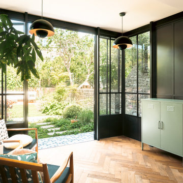
The first extension filled in the side return with a London stock brick facade and a glazed roof, while the second – a striking black steel and glass pavilion was glazed on three sides and placed along the garden elevation.
This new pavilion redefined the building’s relationship with the garden. Its steel-framed glazing created a seamless dialogue between interior and exterior, offering a sense of immersion in the surrounding landscape.
At the heart of the plan sits a dramatic, five-metre-tall dining space that acts as a transition from the original entrance hall into the new addition. A large, circular cast-glass window, framed in steel, provides a visual and spatial link between old and new, allowing light and movement to travel through the depth of the home.
Throughout the project, a series of black metal elements were introduced as sculptural interventions – each marking moments of transformation within the house. These included the bespoke steel framed circular window, a custom metal staircase, a cylindrical support column, and the striking steel and glass garden pavilion. Together, they formed a coherent architectural language that underscored the project’s bold intent.
Our steel windows and doors played a vital role in delivering the project’s vision. The architects chose steel for its refined sight lines and distinctive material character, which helped bridge the gap between the historical context of the building and the bold new additions.
The black steel frames provided a crisp contrast to the pale London stock brick and added definition to the glazed pavilion, reinforcing the sense of architectural precision. In particular, the fine steel profiles of the garden room allowed the extension to feel both lightweight and immersive, blurring the boundary between the house and its garden.
The architect drew inspiration from the Bauhaus Movement, particularly the work of Walter Gropius, whose approach to functional beauty and industrial materials informed the design of the garden pavilion.
Here, our glazing system was used not just for transparency, but as an expressive architectural element. The carefully proportioned panels help to conceal the roof thickness and reinforce the pavilion’s industrial yet abstract character – a deliberate nod to product design and modernist detailing.
Sustainability was an important factor in the selection of materials. Our steel systems, made from 99% recycled content and 100% recyclable, aligned with the project’s broader environmental goals.
The architects noted that this commitment to material longevity and circularity was central to their decision to use steel. The durability and recyclability of the windows and doors ensured the project met both aesthetic and ethical criteria.
This London terrace house now stands as a celebration of contrast – between heritage and innovation, solidity and transparency, tradition and transformation. Our steel windows and doors were not simply components; they were essential tools in crafting a home that is as bold and expressive as it is functional.
The result is a home designed for modern family life, where light, space, and materiality come together in perfect harmony.
 KZ Architecture
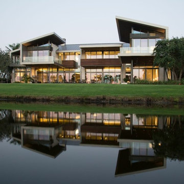
The project involved a large program that would yield a massive home on a limited and restricted site. The design strategy involved deconstructing the volume into pavilions that could generate a dialogue between built form and landscape and create intimate connections between the golf course and the living spaces.
Robin Hill
 KZ Architecture
The project involved a large program that would yield a massive home on a limited and restricted site. The design strategy involved deconstructing the volume into pavilions that could generate a dialogue between built form and landscape and create intimate connections between the golf course and the living spaces.
Robin Hill
 Rhodes Architecture + Light
A transformation inspired by the owner’s love of modern architecture, art and color (and the adjacent sand, rock, water, and the northwest landscape), the Indianola House sought to bring the soul of a home to a colorless muted box. The original house was a drab 1990’s-era box with no personality or presence sited on a beautiful secluded bay, facing water and island views, northwest of the City of Seattle. The existing mono-colored stucco-clad exterior and pyramidal glass-block openings had led the neighborhood to dub the structure, unflatteringly, “The Miami Vice House”.
Rhodes Architecture’s Residential Architects careful use of natural light, rich, collaged finishes and ability to open the house to gardens, beach, and outdoor gathering was critical to the design. The house soon became “The Gallery”.
The original home’s grey stucco exterior made the house seem both large and featureless; the introduction of no-maintenance exterior materials that collage and complement each other was a goal of the homeowner and the Seattle Architects who teamed up for this residential design. The bloated scale of the house cried out for the establishment and definition of the parts of the structure, a breaking down of the home’s form and its apparent bland size.
Living, sleeping, and bathing areas that started as staid spaces were in need of opening to the natural environment with additions of large doors, folding glass walls and useable balconies were crucial to each space having a dialogue with the outdoors.
The owner’s extensive art collection was highlighted and became the focus of interior places, well-lit naturally and through a new lighting system. Energy use and sustainable systems were a key component of the design which used high-efficacy lighting, better cladding on a rain-screen system, high-efficiency doors and windows, new insulation and weather barriers, and which added a photovoltaic-generated electrical system. The contemporary design sought to integrate all of these systems, materials, and finishes into a seamless whole that lent interest and drama to a residence which was previously lusterless.
How radically this house was transformed is evident in the exteriors, gardens and the natural spaces the house now opens to, as well as the gallery-like interiors. This home is a stunning testament to what is possible “before-and-after” when remade by Rhodes Architecture + Light.
The clients are an older couple with long professional and political careers, a love of art and a clear desire to connect with the Northwest environment and enliven their daily lives with spaces full of color and natural light.
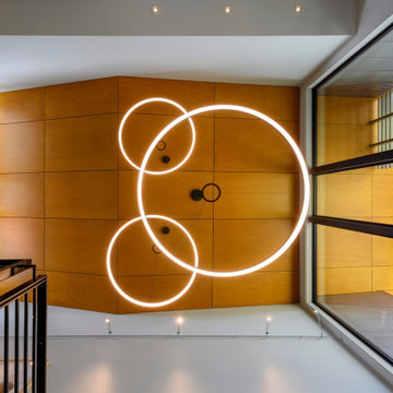
Rhodes Architecture + Light was hired in 2019 to add new exteriors and interiors, natural light, larger openings to beach and bay, seismic and foundation upgrades to the home, and to infuse life into the house through the re-use of existing space and varied materials, color, textures, and lighting. The only actual change to the exterior “shell” of the house was the introduction of a low “gull-wing” roof with wood soffits above the central atrium space, to add drama and bring natural light into the entry gallery space. Interior spaces, including bedrooms and bathrooms, were re-planned and opened to each other, to greater natural light, to roof decks, and to the incredible views and sea-side environment.
The Builder, Fairbank Construction Company of Bainbridge Island, Washington, met the challenge of the design, first completely deconstructing the finishes inside and out, then precisely interlocking new claddings, windows and doors, cabinetry, finishes and a new gull-wing central roof in a beautiful transformation. The construction was total, thorough, and very detailed, resulting a house that, far from seeming a “remodeling”, is far more present and fitting to the owner’s lives and the natural environment than the house we started with.
 nC2 architecture llc
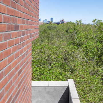
A new, ground-up attached house facing Cooper Park in Williamsburg Brooklyn. The site is in a row of small 1950s two-story, split-level brick townhouses, some of which have been modified and enlarged over the years and one of which was replaced by this building.
The exterior is intentionally subdued, reminiscent of the brick warehouse architecture that occupies much of the neighborhood. In contrast, the interior is bright, dynamic and highly-innovative. In a nod to the original house, nC2 opted to explore the idea of a new, urban version of the split-level home.
The house is organized around a stair oriented laterally at its center, which becomes a focal point for the free-flowing spaces that surround it. All of the main spaces of the house - entry hall, kitchen/dining area, living room, mezzanine and a tv room on the top floor - are open to each other and to the main stair. The split-level configuration serves to differentiate these spaces while maintaining the open quality of the house.
A four-story high mural by the artist Jerry Inscoe occupies one entire side of the building and creates a dialog with the architecture. Like the building itself, it can only be truly appreciated by moving through the spaces.
 First Impression Designs Inc.
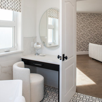
Éclat Manoir embodies refined elegance and timeless sophistication. Inspired by classic manor architecture, it balances grandeur with modern livability through light-filled spaces, rich textures, and tailored detailing. Natural light highlights the home’s sculptural forms and polished finishes, creating a harmonious dialogue between strength and softness. The result is a serene yet striking residence—where craftsmanship, comfort, and quiet luxury converge.
 Landscape Design West, LLC
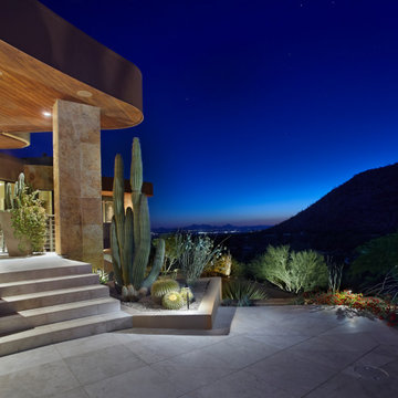
IN 2021, PETE AND BECKY MEIER HIRED LANDSCAPE DESIGN WEST, LLC, TO CREATE AN EXTRAORDINARY RENOVATION DESIGN FOR THE CANYON PASS HOUSE LOCATED IN THE GATED COMMUNITY OF CANYON PASS AT THE PINNACLE OF DOVE MOUNTAIN, IN TUCSON, ARIZONA.
EXISTING LANDSCAPE DID NOT COMPLIMENT THE OUTSTANDING ADJACENT DESERT NOR THE UNIQUE MARK SOLOWAY ARCHITECTURE. GOAL WAS TO CREATE A BEAUTIFUL DIALOGUE WITH THE ADJACENT DESERT AND RESIDENCE.
DESIRED OUTCOME:
INCREASE VISUAL APPEAL/LOWER WATER USE WITH NUMEROUS SPECIMEN SUCCULENTS AND A PLANTING DESIGN THAT IS INVITING, COLORFUL AND GRACIOUS, INCREASE YEAR AROUND COLOR AND BLOOMS TO ATTRACT NATIVE POLLINATORS SUCH AS BIRDS, BATS, HUMMINGBIRDS AND BUTTERFLIES MITIGATE DAMAGE TO PORTIONS OF THE PROPERTY PREVIOUSLY USED AS CONSTRUCTION STAGING AREAS
LOWER WATER USAGE REPLACING EXISTING FAULTY IRRIGATION
LOWER ENERGY/INCREASED NIGHTTIME LIGHTING AESTHETICS WITH A PROFESSIONAL DESIGN AND USING HUNTER/FX LED LIGHTING
CHALLENGES:
HILLSIDE/SLOPE
WILDLIFE
ROCKY SOILS
DIFFICULT ACCESS
Robin Stancliff Photography
 Misiaszek Turpin pllc
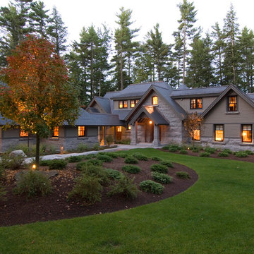
This 4,800 square-foot guesthouse is a three-story residence consisting of a main-level master suite, upper-level guest suite, and a large bunkroom. The exterior finishes were selected for their durability and low-maintenance characteristics, as well as to provide a unique, complementary element to the site. Locally quarried granite and a sleek slate roof have been united with cement fiberboard shingles, board-and-batten siding, and rustic brackets along the eaves.
The public spaces are located on the north side of the site in order to communicate with the public spaces of a future main house. With interior details picking up on the picturesque cottage style of architecture, this space becomes ideal for both large and small gatherings. Through a similar material dialogue, an exceptional boathouse is formed along the water’s edge, extending the outdoor recreational space to encompass the lake.
Photographer: Bob Manley
 Lola Cwikowski Studio
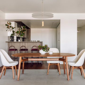
A couple relocating to Lisbon found a property in a recently upgraded building with open layouts and modernized features. Our studio was entrusted to bring elegant comfort to the interior with carefully curated, custom-designed furniture and decor. From a blank canvas, the home was enlivened with walnut furnishings by Portuguese producers, warm-hued textiles in botanical motifs, and accents of delicate brass lighting.
The entryway leads toward a spacious living room, where hand-woven rugs delineate areas for different activities. The first features a dining collection with upholstered shell chairs that comfortably envelop end-of-evening conversation. Midway, a daybed and display shelving system nestled under the lowered ceiling offer an intimate, yet versatile space. Stepping into the lounge, theatrical curtains reveal the pastel medley of Lisbon’s built landscape, the river, and hills in the distance. The dialogue of the room continues around a multi-tiered center table and featherweight pendant: a Brazilian modernist armchair faces a bespoke tufted-leather sofa, its throw cushions tailored to the palette of the media cabinet.
Outside, the balcony’s slate lacquered dining set caters to convivial meals. Private appreciation is found in a pair of leisurely chairs adjacent to the bedroom, with a side table quoting the terracotta background.
The main suite is endued with a crafted spindle bed dressed in deep blue linens and a lively made-to-measure embroidered bedspread. White Estremoz marble nightstands were designed to organize reading material and provide cable management. Circular ceramic lamps and bedside tables complement an ample upholstered bed to accommodate guests, and a floating console offers a discreet solution for remote meetings.
 Eugene Pintail LLC
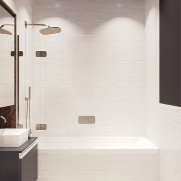
This design captures the spirit of eclectic modernity—boldly combining texture, form, and soulful detail. It embraces both clean contemporary lines and layered, curated elements, resulting in a space that feels thoughtfully collected, not predictable.
Textural richness is at the forefront—soft upholstery pairs with sleek surfaces, and mixed finishes (polished metals, matte woods, and plush textiles) create a tactile and visual dialogue. The contrast between refined and cozy elements builds warmth and sophistication.
The layout balances openness with intimacy. Thoughtfully placed furniture and visual rhythms guide movement through the space, allowing each area to feel both connected and distinct.
Lighting is composed with subtlety and intention—ambient fixtures and layered lighting gently sculpt the environment. Shadows and highlights enhance the ambiance without overpowering the architectural interplay.
This space tells a story of modern living infused with personality. It’s dynamic yet grounded—inviting curiosity, conversation, and comfort in equal measure.
 LeichtUSA
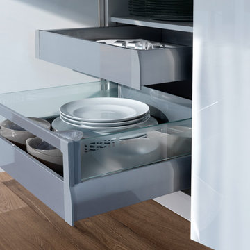
The present project, with its clear and simple forms, looks for the interaction with the rural environment and the contact with the surrounding buildings. The simplicity and architectural dialogue between form and function are the theme for inside and outside. Kitchen and dining area are facing each other. The isle leads to a made-to-measure corner bench that stretches under the wide windows along the entire length of the house and connects to the kitchen across the corner. Above the tall units with their integrated appliances, the window continues as a narrow band. The white high gloss acrylic surface of the kitchen fronts forms a decorative contrast to the wood of the floor and bench. White lacquered recessed handles provide a tranquil, two-dimensional effect.

 Klopf Architecture
Set in a quiet neighborhood and framed by mature trees, this residence presented a unique opportunity: to thoughtfully evolve a custom mid-century modern home into a space that supports the everyday rhythms of a growing family. With a deep respect for the home’s original architecture, Klopf Architecture reimagined the house to better meet the needs of its owners—introducing functional improvements while preserving the spirit and character of its mid-century roots.
The clients approached Klopf Architecture with a clear vision: refresh their home while seamlessly integrating new programmatic elements. Key goals included clarifying and enhancing the entry sequence; connecting the detached garage to the main house with a practical yet architecturally intentional intervention; adding functional spaces such as a mudroom and laundry room; expanding and remodeling the primary suite’s bathroom and closet; and creating a more engaging outdoor space that capitalized on the site’s impressive views, featuring a fire pit and outdoor kitchen.
As a couple with distinct yet complementary perspectives—one focused on modern functionality and technology, and the other dedicated to preserving the home’s architectural integrity—their collaboration with Klopf Architecture resulted in a solution that harmonized both ideals. Their shared commitment to improving the livability of their home led to a design dialogue rooted in balance. This dynamic partnership shaped the direction of the renovation, ensuring that every decision honored the spirit of the original home while aligning with the practical needs of their growing family.
Designing within the constraints of the sloped site posed one of the project’s central challenges. The detached garage sat at a higher elevation than the main house, requiring a solution that ensured architectural and geometric compatibility between the two structures. Rather than create a purely utilitarian link, Klopf Architecture introduced an intentional connection that contributes to the overall architectural language. A notable pinch point in the plan—where differing geometries converged—was treated as a hinge point, turning a potentially awkward juncture into an architectural feature. This area now functions as both a transition and a moment of design interest that unifies the overall plan.
The design also addressed the underutilized outdoor area, which was located in a shadowed portion of the site with geometrical limitations. A new connection to the rear deck was created in this same area, making the outdoor space more useful and inviting. Klopf Architecture introduced carefully positioned openings and spatial improvements that forged a strong visual and functional connection between indoor and outdoor spaces. The outdoor area now reads as a deliberate extension of the home, embracing natural light and emphasizing the dramatic views.
Working through multiple design iterations, Klopf Architecture crafted a solution that preserved the architectural language of the original home while supporting the functional needs of modern life. The garage-to-house connection became more than a passage—it evolved into an architectural moment of transition. A new mudroom and laundry space enhanced convenience without compromising the clean lines of the design. The primary suite was expanded to create a private, serene retreat. The reimagined backyard, complete with fire pit and kitchen, now plays a vital role in the family’s daily routine and social life.
Outcomes and Lasting Impact
The result is a home that balances heritage with contemporary design, technical precision with design sensibility. The redesign not only met the clients’ initial goals but also exceeded expectations in its ability to seamlessly blend past and present, function and beauty, making the outdoor kitchen a favorite gathering place.
Beyond aesthetics, the renovation has significantly improved daily life for the family. The newly integrated garage connection has streamlined routines, providing a seamless transition between arriving home, storing belongings, and entering the main living spaces. The expanded primary suite offers a retreat-like atmosphere, creating a private space to unwind at the end of the day. The redesigned outdoor areas have also become an extension of their lifestyle—whether it's casual family dinners around the fire pit, entertaining friends in the outdoor kitchen, or simply enjoying the view from the reimagined backyard.
Through a thoughtful and strategic approach, the house has been successfully evolved into a home that remains true to its mid-century modern roots while enhancing livability, functionality, and the overall quality of life for the modern-day owners.
Klopf Architecture Team: Geoffrey Campen, Fernanda Bernardes
Architectural Interior Design: Klopf Architecture
Structural Engineer: Base Design Inc.
Contractor: Golden Snail Builders
Photography: Mariko Reed
Year Completed:2022
62