
Search results for "Didn offer" in Home Design Ideas
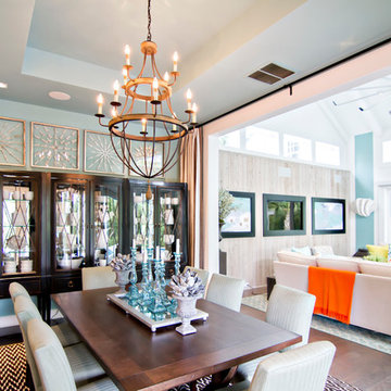
 Glenn Layton Homes
HGTV Smart Home 2013 by Glenn Layton Homes, Jacksonville Beach, Florida.
Example of a large beach style medium tone wood floor kitchen/dining room combo design in Jacksonville with blue walls
Example of a large beach style medium tone wood floor kitchen/dining room combo design in Jacksonville with blue walls
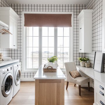
 Remedy Design
Example of a transitional galley medium tone wood floor, brown floor and wallpaper utility room design in Salt Lake City with shaker cabinets, white cabinets, gray walls, a side-by-side washer/dryer and white countertops
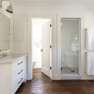
 HEYDT DESIGNS
David Duncan Livingston
Alcove shower - mid-sized farmhouse master white tile and subway tile dark wood floor alcove shower idea in San Francisco with an undermount sink, shaker cabinets, white cabinets and white walls
Alcove shower - mid-sized farmhouse master white tile and subway tile dark wood floor alcove shower idea in San Francisco with an undermount sink, shaker cabinets, white cabinets and white walls
Find the right local pro for your project
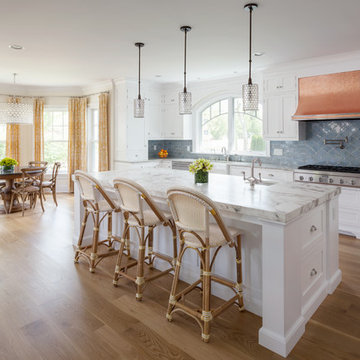
 AHR Designs
Example of a beach style galley medium tone wood floor eat-in kitchen design in Baltimore with a farmhouse sink, white cabinets, marble countertops, blue backsplash, ceramic backsplash, stainless steel appliances, an island and shaker cabinets
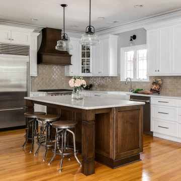
 Leslie Williams Interior Design
Love the variation in this tile from Sonoma tileworks! This client wanted a warm kitchen without any gray. The countertops have a warm veining pattern to go with the brown wood tones and we added some rustic/industrial details to make it feel like the client's mountain cabin.
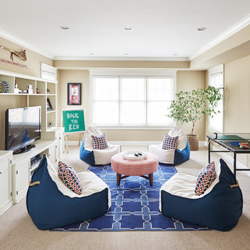
 Stuart Nordin Design
Matthew Kleinrock
Elegant gender-neutral playroom photo in DC Metro with beige walls
Elegant gender-neutral playroom photo in DC Metro with beige walls
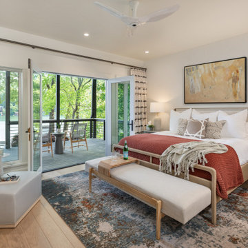
 Northside Design Collective
Guest Master Suite with French Doors to deck overlooking the lake and mountains. Light wood tones and accents of color in the rug, bedding and artwork. Swivel chair, ottoman and bench seating.

Sponsored
Columbus, OH
Free consultation for landscape design!

Peabody Landscape Group
Columbus' Reliable Landscape Design & Contracting
 CHRISTOPHER STROM ARCHITECTS
Eye-Land: Named for the expansive white oak savanna views, this beautiful 5,200-square foot family home offers seamless indoor/outdoor living with five bedrooms and three baths, and space for two more bedrooms and a bathroom.
The site posed unique design challenges. The home was ultimately nestled into the hillside, instead of placed on top of the hill, so that it didn’t dominate the dramatic landscape. The openness of the savanna exposes all sides of the house to the public, which required creative use of form and materials. The home’s one-and-a-half story form pays tribute to the site’s farming history. The simplicity of the gable roof puts a modern edge on a traditional form, and the exterior color palette is limited to black tones to strike a stunning contrast to the golden savanna.
The main public spaces have oversized south-facing windows and easy access to an outdoor terrace with views overlooking a protected wetland. The connection to the land is further strengthened by strategically placed windows that allow for views from the kitchen to the driveway and auto court to see visitors approach and children play. There is a formal living room adjacent to the front entry for entertaining and a separate family room that opens to the kitchen for immediate family to gather before and after mealtime.
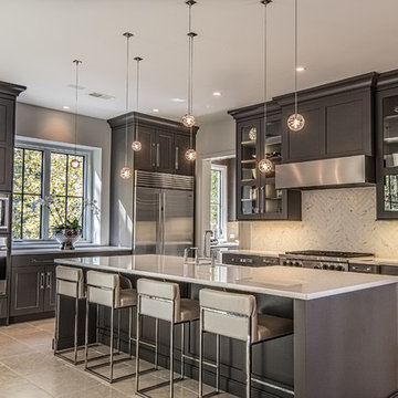

 Drury Design
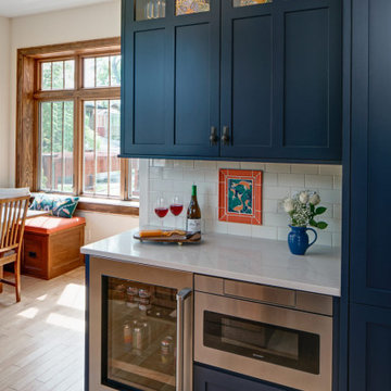
The 100-year old home’s kitchen was old and just didn’t function well. A peninsula in the middle of the main part of the kitchen blocked the path from the back door. This forced the homeowners to mostly use an odd, U-shaped corner of the kitchen.
Design objectives:
-Add an island
-Wow-factor design
-Incorporate arts and crafts with a touch of Mid-century modern style
-Allow for a better work triangle when cooking
-Create a seamless path coming into the home from the backdoor
-Make all the countertops in the space 36” high (the old kitchen had different base cabinet heights)
Design challenges to be solved:
-Island design
-Where to place the sink and dishwasher
-The family’s main entrance into the home is a back door located within the kitchen space. Samantha needed to find a way to make an unobstructed path through the kitchen to the outside
-A large eating area connected to the kitchen felt slightly misplaced – Samantha wanted to bring the kitchen and materials more into this area
-The client does not like appliance garages/cabinets to the counter. The more countertop space, the better!
Design solutions:
-Adding the right island made all the difference! Now the family has a couple of seats within the kitchen space. -Multiple walkways facilitate traffic flow.
-Multiple pantry cabinets (both shallow and deep) are placed throughout the space. A couple of pantry cabinets were even added to the back door wall and wrap around into the breakfast nook to give the kitchen a feel of extending into the adjoining eating area.
-Upper wall cabinets with clear glass offer extra lighting and the opportunity for the client to display her beautiful vases and plates. They add and an airy feel to the space.
-The kitchen had two large existing windows that were ideal for a sink placement. The window closest to the back door made the most sense due to the fact that the other window was in the corner. Now that the sink had a place, we needed to worry about the dishwasher. Samantha didn’t want the dishwasher to be in the way of people coming in the back door – it’s now in the island right across from the sink.
-The homeowners love Motawi Tile. Some fantastic pieces are placed within the backsplash throughout the kitchen. -Larger tiles with borders make for nice accent pieces over the rangetop and by the bar/beverage area.
-The adjacent area for eating is a gorgeous nook with massive windows. We added a built-in furniture-style banquette with additional lower storage cabinets in the same finish. It’s a great way to connect and blend the two areas into what now feels like one big space!
 Jordan Design Build Group
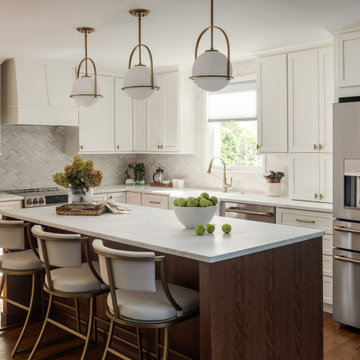
With Craftsman details throughout the rest of the home, our clients wanted their new kitchen to have transitional elements such as Shaker style doors, a farmhouse sink, warm wood tones, and other timeless features such as a custom hood and natural stone counters. The beautiful Glorious White marble counters have a soft honed finish and the stunning marble backsplash ties everything together to complete the look. The two-toned cabinets pair a rich stained cherry island with soft white perimeter cabinets. Brushed brass accents on the appliances pulls, cabinet hardware, lights and plumbing fixtures add another layer of sophistication. An induction range, dishwasher drawers, undercounter microwave, and four-door smart refrigerator amp up the functionality of this cook’s kitchen.
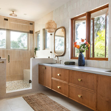
Transitional master white tile and ceramic tile porcelain tile, beige floor and double-sink bathroom photo in San Diego with shaker cabinets, brown cabinets, an integrated sink, a hinged shower door, gray countertops and a built-in vanity
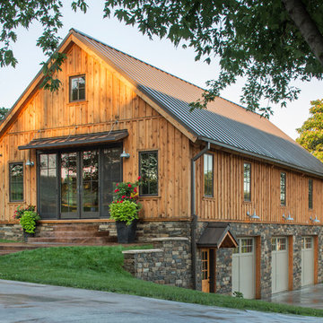
 Sand Creek Post & Beam
Sand Creek Post & Beam traditional wood barn used as a garage with a party loft / guest house. For more photos visit us at www.sandcreekpostandbeam.com or check us out on Facebook at www.facebook.com/SandCreekPostandBeam


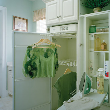
 Sater Design Collection, Inc.
Utility Room. The Sater Design Collection's luxury, Mediterranean home plan "Maxina" (Plan #6944). saterdesign.com
Dedicated laundry room - traditional single-wall ceramic tile dedicated laundry room idea in Miami with raised-panel cabinets, white cabinets and blue walls
Dedicated laundry room - traditional single-wall ceramic tile dedicated laundry room idea in Miami with raised-panel cabinets, white cabinets and blue walls
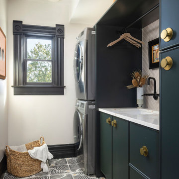
 Lindy Design Build
The laundry room may be one of the most functional spaces in the house, but that didn’t stop us from treating it like a design opportunity. In fact, we believe the most used spaces deserve the most love—and this one delivers.
A showstopping patterned tile from Haus Tile anchors the room with playful sophistication, echoing the circular motifs found throughout the home. Above, deep green Tedd Wood cabinetry offers ample storage, finished with oversized Atlas Dot knobs in brass that feel as chic as they are substantial.
We incorporated thoughtful additions like a hanging rod from Signature Hardware for air-drying clothes, a long quartz work surface in Cambria Inverness Gold for folding and sorting, and an ultra-durable Blanco Silgranit sink paired with a Kingston Brass wall-mounted faucet to keep things clean and stylish. Above, glass ribbed lights from West Elm add just the right amount of sparkle.
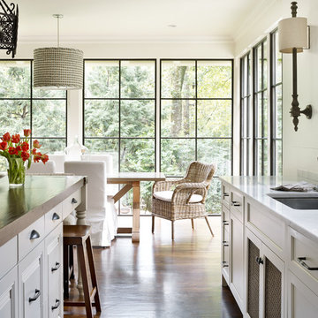 User
UserEmily Followill
Inspiration for a timeless medium tone wood floor eat-in kitchen remodel in Atlanta with an undermount sink, recessed-panel cabinets, white cabinets and an island
Inspiration for a timeless medium tone wood floor eat-in kitchen remodel in Atlanta with an undermount sink, recessed-panel cabinets, white cabinets and an island
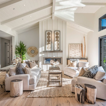
 Joseph Farrell Architecture
Interior Design by Pamala Deikel Design
Photos by Paul Rollis
Example of a large country formal and open concept light wood floor and beige floor living room design in San Francisco with white walls, a ribbon fireplace, a metal fireplace and no tv
Example of a large country formal and open concept light wood floor and beige floor living room design in San Francisco with white walls, a ribbon fireplace, a metal fireplace and no tv

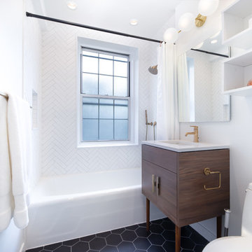
Inspiration for a contemporary white tile black floor bathroom remodel in New York with flat-panel cabinets, dark wood cabinets, white walls, an undermount sink and white countertops

 TKS Design Group
Download our free ebook, Creating the Ideal Kitchen. DOWNLOAD NOW
This client was referred to us from a past client. They are a busy 2-career household with young children and enjoy entertaining friends and family in their home. They have a beautiful open concept home but unfortunately the kitchen was not fitting for the rest of the home. They were not quite sure what to do with the space. We talked about trying to refresh it or do more of a minor remodel, but in the end they decided a full gut would get them to where they wanted to be.
One problem was there was no place for guests to hang out other than the large and awkward banquette area. The brick wall and tiled hood area were feeling a bit dated and tired. The space was just not functional for their lifestyle. There was no prep space near the cooktop and no landing area for items coming out of the ovens or refrigerator, plus a big dead zone in the center of the room.
Banquettes, like the one they previously had in the space, are great for small spaces, but when they get really large like this one, it makes getting in and out of the seating area awkward and uncomfortable. Plus, there was room for a large table, so we eliminated the awkward built in.
We started by removing the faux brick wall between the kitchen and back entry. We relocated the entry to the garage over a couple feet in order to get every last inch out of the new kitchen. We also made the decision to close up the primary window that faced the pretty ho hum brick wall of the neighbor’s house. There was plenty of light coming in from the seating area, so we just didn’t feel the window was adding much to the room.
Construction went smoothy. There was a bit of rework with electrical, flooring and HVAC, but in the end, we think it was well worth it.
The clients really wanted a sleek contemporary look, and we originally had planned for a full height slab backsplash, but due to it’s size, it was a budget buster. Instead, we got creative and settled on large format porcelain tiles that have a similar feel but were a fraction of the cost. We made sure the wall was plumb and level so that the fit and finish would mimic that of slab material.
The final space was quite a change. A large prep sink sits directly across from the new pro-style range with plenty additional prep space on the large island. The refrigerator and ovens now have miles of landing space, and a nice tight work triangle makes cooking a breeze.
Since we wanted a more contemporary feel, not many wall cabinets were included. Instead, we outfitted some of the drawers for dish storage with a peg system. Two large pantries flanking the refrigerator hold baking supplies and small appliances. Large drawers by the cooktop hold pots and pans, and an appliance garage tucked away to the left of the range hides away miscellaneous items. The large island also houses a microwave drawer and tons of storage, most of which is drawers offering maximum convenience.
The island now seats 5-6 people comfortably along with the new table in the seating area which can seat up to 8. Entertaining will be a breeze in this space. With such a clean backdrop, we knew we would need some drama with the lighting, so we chose two sets of staggered pendants, which we adjusted for the right visual balance above the island.
We also included a small coffee station to the right of the main kitchen, which helps keep the coffee clutter out of the kitchen proper. Two tones of complimentary gray are featured in this kitchen. The perimeter is a light gray that reads almost white. The island is a gray stain that adds some depth and interest with the visible wood texture. The countertops are clean white quartz, and the hardware, barstools and light fixtures add warm brass tones. I see lots of cooking and entertaining with family and friends in the near future in this bright and airy new space.
Designed by: Susan Klimala, CKD, CBD
Photography by: Michael Kaskel
For more information on kitchen and bath design ideas go to: www.kitchenstudio-ge.com

1