
Search results for "Dismiss" in Home Design Ideas
 Donald Lococo Architects
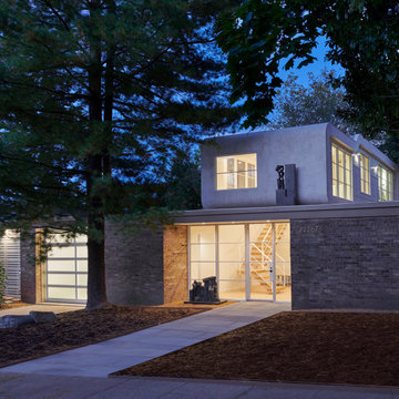
Designed in 1970 for an art collector, the existing referenced 70’s architectural principles. With its cadence of ‘70’s brick masses punctuated by a garage and a 4-foot-deep entrance recess. This recess, however, didn’t convey to the interior, which was occupied by disjointed service spaces. To solve, service spaces are moved and reorganized in open void in the garage. (See plan) This also organized the home: Service & utility on the left, reception central, and communal living spaces on the right.
To maintain clarity of the simple one-story 70’s composition, the second story add is recessive. A flex-studio/extra bedroom and office are designed ensuite creating a slender form and orienting them front to back and setting it back allows the add recede. Curves create a definite departure from the 70s home and by detailing it to "hover like a thought" above the first-floor roof and mentally removable sympathetic add.Existing unrelenting interior walls and a windowless entry, although ideal for fine art was unconducive for the young family of three. Added glass at the front recess welcomes light view and the removal of interior walls not only liberate rooms to communicate with each other but also reinform the cleared central entry space as a hub.
Even though the renovation reinforms its relationship with art, the joy and appreciation of art was not dismissed. A metal sculpture lost in the corner of the south side yard bumps the sculpture at the front entrance to the kitchen terrace over an added pedestal. (See plans) Since the roof couldn’t be railed without compromising the one-story '70s composition, the sculpture garden remains physically inaccessible however mirrors flanking the chimney allow the sculptures to be appreciated in three dimensions. The mirrors also afford privacy from the adjacent Tudor's large master bedroom addition 16-feet away.
 Cascade West Development
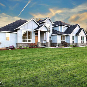
The Aerius - Modern American Craftsman on Acreage in Ridgefield Washington by Cascade West Development Inc.
Welcome to the Aerius. Don’t let the Northwest inspired appearance fool you. As you step inside; the interwoven transitional, modern and contemporary elements make personal solitude, friendly gatherings, and extended family stays simultaneously conceivable. The thoughtful division of rooms and amenities insure space for each member of the household to act independently or to come together as a whole and share in the quiet sophistication of the common areas. The family that lives here values independence as well as inclusion. Functionality and freedom are the principles of this nest; from which a family can take flight.
At first glance this home seems to disappear into it’s surroundings. The dark, natural appearance of the rock borrows hues and rough texture from the surrounding forest. A soft, powder blue paint gives no clear chromatic indication between structure and sky. With this in mind the dark shingles seem to float above a stoney foundation. Unexpected levitation isn’t the only aerial endeavor this home embarks upon. With lofty interiors and dismissible separation from the outdoors; people, air and conversation can flow freely throughout the combined space. Overall the home echoes the popular American Craftsman style, which dots the Pacific Northwest landscape. This home’s many peaks; supported by visible gables and lower exterior masonry denote common treatments found throughout Clark County. However, within the championed modern features of this home, touches of originality can still be found. From the driveway to the dining room, the design guides the viewer through the home while maintaining a comfortable and creative atmosphere.
Cascade West Facebook: https://goo.gl/MCD2U1
Cascade West Website: https://goo.gl/XHm7Un
These photos, like many of ours, were taken by the good people of ExposioHDR - Portland, Or
Exposio Facebook: https://goo.gl/SpSvyo
Exposio Website: https://goo.gl/Cbm8Ya
 Cascade West Development
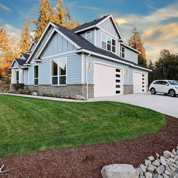
The Aerius - Modern American Craftsman on Acreage in Ridgefield Washington by Cascade West Development Inc.
Welcome to the Aerius. Don’t let the Northwest inspired appearance fool you. As you step inside; the interwoven transitional, modern and contemporary elements make personal solitude, friendly gatherings, and extended family stays simultaneously conceivable. The thoughtful division of rooms and amenities insure space for each member of the household to act independently or to come together as a whole and share in the quiet sophistication of the common areas. The family that lives here values independence as well as inclusion. Functionality and freedom are the principles of this nest; from which a family can take flight.
At first glance this home seems to disappear into it’s surroundings. The dark, natural appearance of the rock borrows hues and rough texture from the surrounding forest. A soft, powder blue paint gives no clear chromatic indication between structure and sky. With this in mind the dark shingles seem to float above a stoney foundation. Unexpected levitation isn’t the only aerial endeavor this home embarks upon. With lofty interiors and dismissible separation from the outdoors; people, air and conversation can flow freely throughout the combined space. Overall the home echoes the popular American Craftsman style, which dots the Pacific Northwest landscape. This home’s many peaks; supported by visible gables and lower exterior masonry denote common treatments found throughout Clark County. However, within the championed modern features of this home, touches of originality can still be found. From the driveway to the dining room, the design guides the viewer through the home while maintaining a comfortable and creative atmosphere.
Cascade West Facebook: https://goo.gl/MCD2U1
Cascade West Website: https://goo.gl/XHm7Un
These photos, like many of ours, were taken by the good people of ExposioHDR - Portland, Or
Exposio Facebook: https://goo.gl/SpSvyo
Exposio Website: https://goo.gl/Cbm8Ya
Find the right local pro for your project
 Imperial Tile & Stone Anaheim
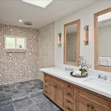
Doorless shower - mid-sized transitional 3/4 beige tile, brown tile, white tile and ceramic tile porcelain tile doorless shower idea in Los Angeles with recessed-panel cabinets, light wood cabinets, a two-piece toilet, beige walls, an undermount sink and quartz countertops
 Donald Lococo Architects
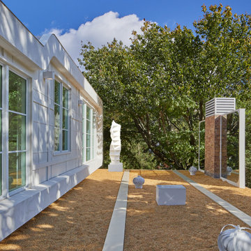
Designed in 1970 for an art collector, the existing referenced 70’s architectural principles. With its cadence of ‘70’s brick masses punctuated by a garage and a 4-foot-deep entrance recess. This recess, however, didn’t convey to the interior, which was occupied by disjointed service spaces. To solve, service spaces are moved and reorganized in open void in the garage. (See plan) This also organized the home: Service & utility on the left, reception central, and communal living spaces on the right.
To maintain clarity of the simple one-story 70’s composition, the second story add is recessive. A flex-studio/extra bedroom and office are designed ensuite creating a slender form and orienting them front to back and setting it back allows the add recede. Curves create a definite departure from the 70s home and by detailing it to "hover like a thought" above the first-floor roof and mentally removable sympathetic add.Existing unrelenting interior walls and a windowless entry, although ideal for fine art was unconducive for the young family of three. Added glass at the front recess welcomes light view and the removal of interior walls not only liberate rooms to communicate with each other but also reinform the cleared central entry space as a hub.
Even though the renovation reinforms its relationship with art, the joy and appreciation of art was not dismissed. A metal sculpture lost in the corner of the south side yard bumps the sculpture at the front entrance to the kitchen terrace over an added pedestal. (See plans) Since the roof couldn’t be railed without compromising the one-story '70s composition, the sculpture garden remains physically inaccessible however mirrors flanking the chimney allow the sculptures to be appreciated in three dimensions. The mirrors also afford privacy from the adjacent Tudor's large master bedroom addition 16-feet away.
 Cape Associates, Inc.
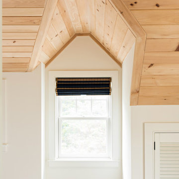
The little cottage on Turnip Field Road in Eastham had been owned by the same couple since 1940, until they built a new, adjacent house on the property. The cottage was then handed down to the next generation, who began spending more and more time at the cottage. It was then that they contacted Cape Associates to construct a more livable home in place of that little cottage. It was crucial to the owners however, that the home keep with the understated charm and Cape Cod-feel of the neighborhood.
The primary challenge was to keep it humble, while building the owners their well-deserved vacation retreat. The original cottage had no air conditioning, and renovating was quickly dismissed because of the inadequacies and the cost of modernizing. Building new allowed the team to relocate the house further back from the street, and it meant meeting the owners’ needs without compromise.
Cape Associates’ project manager Lance LaLone said the owners expressed their desire to incorporate lots of wood and the types of materials that were in the old cottage. Most of the interior is pine, which was used on the flooring, the walls, and wrapped around the ceiling’s beams, giving the owners what they desired on a grander scale – a beautiful, modern dwelling that still held the personality of that little cottage that held such cherished memories.
The front of the home has a two-car garage and breezeway entrance, while the rear reveals an entertainer’s paradise, with an enormous mahogany deck with an outdoor shower, a stunning Connecticut-fieldstone fireplace with a chimney that reaches around 30 feet in height, and multiple sliders to access the home. The finished basement opens to the ground level, and above the entrance breezeway is another small deck with a great view. It’s the best of indoor/outdoor living.
Movement patterns from beach to house to bedroom were an important consideration. The site also provided an excellent opportunity to visually connect the basement level patio visually to the main level deck and finally the master bedroom deck. The finished home provides year-round living, with a summer-getaway atmosphere.
 Donald Lococo Architects
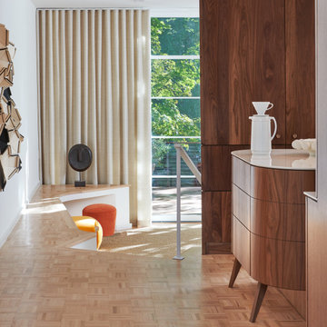
Existing unrelenting interior walls and a windowless entry, although ideal for fine art was unconducive for the young family of three. Added glass at the front recess welcomes light view and the removal of interior walls not only liberate rooms to communicate with each other but also reinform the cleared central entry space as a hub.
Even though the renovation reinforms its relationship with art, the joy and appreciation of art was not dismissed. A metal sculpture lost in the corner of the south side yard bumps the sculpture at the front entrance to the kitchen terrace over an added pedestal. (See plans) Since the roof couldn’t be railed without compromising the one-story '70s composition, the sculpture garden remains physically inaccessible however mirrors flanking the chimney allow the sculptures to be appreciated in three dimensions.
 Cascade West Development
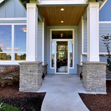
The Aerius - Modern American Craftsman on Acreage in Ridgefield Washington by Cascade West Development Inc.
Welcome to the Aerius. Don’t let the Northwest inspired appearance fool you. As you step inside; the interwoven transitional, modern and contemporary elements make personal solitude, friendly gatherings, and extended family stays simultaneously conceivable. The thoughtful division of rooms and amenities insure space for each member of the household to act independently or to come together as a whole and share in the quiet sophistication of the common areas. The family that lives here values independence as well as inclusion. Functionality and freedom are the principles of this nest; from which a family can take flight.
At first glance this home seems to disappear into it’s surroundings. The dark, natural appearance of the rock borrows hues and rough texture from the surrounding forest. A soft, powder blue paint gives no clear chromatic indication between structure and sky. With this in mind the dark shingles seem to float above a stoney foundation. Unexpected levitation isn’t the only aerial endeavor this home embarks upon. With lofty interiors and dismissible separation from the outdoors; people, air and conversation can flow freely throughout the combined space. Overall the home echoes the popular American Craftsman style, which dots the Pacific Northwest landscape. This home’s many peaks; supported by visible gables and lower exterior masonry denote common treatments found throughout Clark County. However, within the championed modern features of this home, touches of originality can still be found. From the driveway to the dining room, the design guides the viewer through the home while maintaining a comfortable and creative atmosphere.
Cascade West Facebook: https://goo.gl/MCD2U1
Cascade West Website: https://goo.gl/XHm7Un
These photos, like many of ours, were taken by the good people of ExposioHDR - Portland, Or
Exposio Facebook: https://goo.gl/SpSvyo
Exposio Website: https://goo.gl/Cbm8Ya
 Donald Lococo Architects
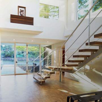
Designed in 1970 for an art collector, the existing referenced 70’s architectural principles. With its cadence of ‘70’s brick masses punctuated by a garage and a 4-foot-deep entrance recess. This recess, however, didn’t convey to the interior, which was occupied by disjointed service spaces. To solve, service spaces are moved and reorganized in open void in the garage. (See plan) This also organized the home: Service & utility on the left, reception central, and communal living spaces on the right.
To maintain clarity of the simple one-story 70’s composition, the second story add is recessive. A flex-studio/extra bedroom and office are designed ensuite creating a slender form and orienting them front to back and setting it back allows the add recede. Curves create a definite departure from the 70s home and by detailing it to "hover like a thought" above the first-floor roof and mentally removable sympathetic add.Existing unrelenting interior walls and a windowless entry, although ideal for fine art was unconducive for the young family of three. Added glass at the front recess welcomes light view and the removal of interior walls not only liberate rooms to communicate with each other but also reinform the cleared central entry space as a hub.
Even though the renovation reinforms its relationship with art, the joy and appreciation of art was not dismissed. A metal sculpture lost in the corner of the south side yard bumps the sculpture at the front entrance to the kitchen terrace over an added pedestal. (See plans) Since the roof couldn’t be railed without compromising the one-story '70s composition, the sculpture garden remains physically inaccessible however mirrors flanking the chimney allow the sculptures to be appreciated in three dimensions. The mirrors also afford privacy from the adjacent Tudor's large master bedroom addition 16-feet away.

 Donald Lococo Architects
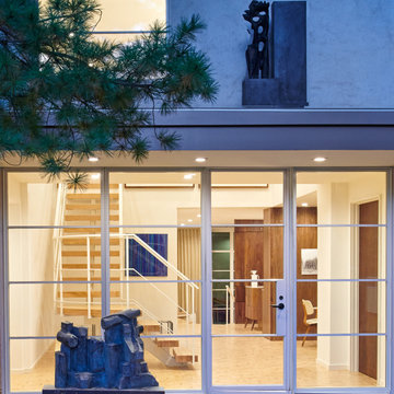
Designed in 1970 for an art collector, the existing referenced 70’s architectural principles. With its cadence of ‘70’s brick masses punctuated by a garage and a 4-foot-deep entrance recess. This recess, however, didn’t convey to the interior, which was occupied by disjointed service spaces. To solve, service spaces are moved and reorganized in open void in the garage. (See plan) This also organized the home: Service & utility on the left, reception central, and communal living spaces on the right.
To maintain clarity of the simple one-story 70’s composition, the second story add is recessive. A flex-studio/extra bedroom and office are designed ensuite creating a slender form and orienting them front to back and setting it back allows the add recede. Curves create a definite departure from the 70s home and by detailing it to "hover like a thought" above the first-floor roof and mentally removable sympathetic add.Existing unrelenting interior walls and a windowless entry, although ideal for fine art was unconducive for the young family of three. Added glass at the front recess welcomes light view and the removal of interior walls not only liberate rooms to communicate with each other but also reinform the cleared central entry space as a hub.
Even though the renovation reinforms its relationship with art, the joy and appreciation of art was not dismissed. A metal sculpture lost in the corner of the south side yard bumps the sculpture at the front entrance to the kitchen terrace over an added pedestal. (See plans) Since the roof couldn’t be railed without compromising the one-story '70s composition, the sculpture garden remains physically inaccessible however mirrors flanking the chimney allow the sculptures to be appreciated in three dimensions. The mirrors also afford privacy from the adjacent Tudor's large master bedroom addition 16-feet away.
 RNR Designs
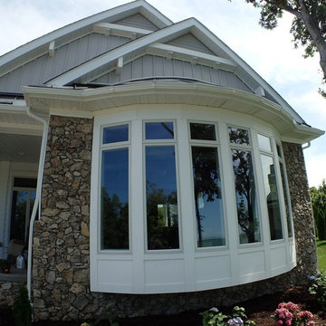
Lakeside home rendered in a simple Catawba Coastal style, takes advantage of challenging site while focusing interior views on long range lake views to west and northeast. Sited on a craggy geological outcropping of (2) different limestone types, this site was dismissed as unbuildable for years. Creating this classic from studying J.H. Bellows , a turn-of-the-century developer and architect on Catawba Island, meant use of simple elements with a touch of panache. This unique site, required out-of-the-box thinking to meld casual living with the marvelous views. Open spaces; 1st floor Owner Suite; ease of access; unique guest suites highlight the design features. Cantilever bow window configuration allows immersive view.
 Donald Lococo Architects
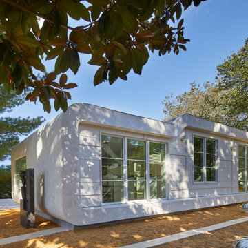
Designed in 1970 for an art collector, the existing referenced 70’s architectural principles. With its cadence of ‘70’s brick masses punctuated by a garage and a 4-foot-deep entrance recess. This recess, however, didn’t convey to the interior, which was occupied by disjointed service spaces. To solve, service spaces are moved and reorganized in open void in the garage. (See plan) This also organized the home: Service & utility on the left, reception central, and communal living spaces on the right.
To maintain clarity of the simple one-story 70’s composition, the second story add is recessive. A flex-studio/extra bedroom and office are designed ensuite creating a slender form and orienting them front to back and setting it back allows the add recede. Curves create a definite departure from the 70s home and by detailing it to "hover like a thought" above the first-floor roof and mentally removable sympathetic add.Existing unrelenting interior walls and a windowless entry, although ideal for fine art was unconducive for the young family of three. Added glass at the front recess welcomes light view and the removal of interior walls not only liberate rooms to communicate with each other but also reinform the cleared central entry space as a hub.
Even though the renovation reinforms its relationship with art, the joy and appreciation of art was not dismissed. A metal sculpture lost in the corner of the south side yard bumps the sculpture at the front entrance to the kitchen terrace over an added pedestal. (See plans) Since the roof couldn’t be railed without compromising the one-story '70s composition, the sculpture garden remains physically inaccessible however mirrors flanking the chimney allow the sculptures to be appreciated in three dimensions. The mirrors also afford privacy from the adjacent Tudor's large master bedroom addition 16-feet away.

 Emerson Grey Designs
Taylor Cole Photography
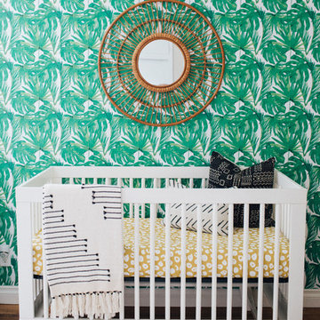
Inspiration for a mid-sized eclectic gender-neutral medium tone wood floor nursery remodel in Orange County with beige walls
Inspiration for a mid-sized eclectic gender-neutral medium tone wood floor nursery remodel in Orange County with beige walls
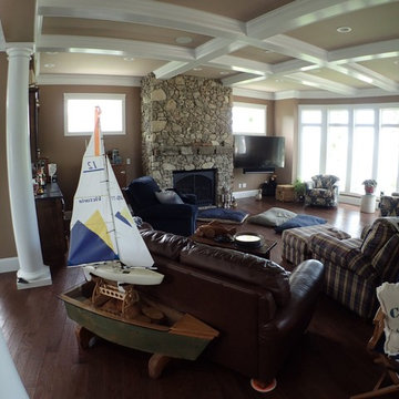 RNR Designs
Lakeside home rendered in a simple Catawba Coastal style, takes advantage of challenging site while focusing interior views on long range lake views to west and northeast. Sited on a craggy geological outcropping of (2) different limestone types, this site was dismissed as unbuildable for years. Creating this classic from studying J.H. Bellows , a turn-of-the-century developer and architect on Catawba Island, meant use of simple elements with a touch of panache. This unique site, required out-of-the-box thinking to meld casual living with the marvelous views. Open spaces; 1st floor Owner Suite; ease of access; unique guest suites highlight the design features. Tuscan columns create area definition.
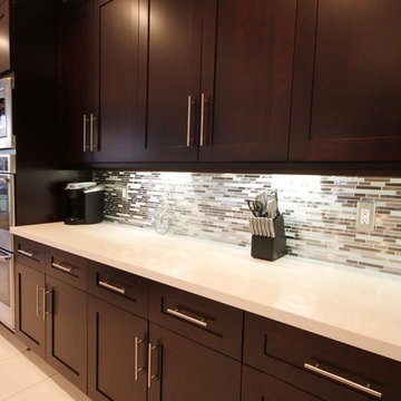
 Fresh Remodel
Trendy l-shaped eat-in kitchen photo in Miami with an undermount sink, shaker cabinets, brown cabinets, quartzite countertops, metallic backsplash and stainless steel appliances

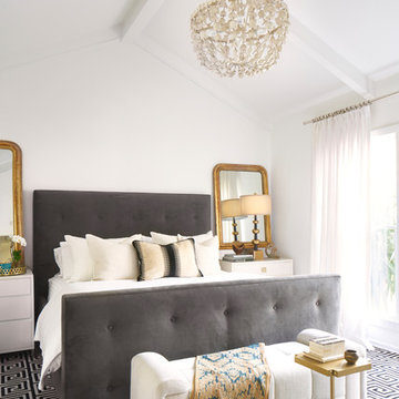
 Shabby Slips Austin
Lars Fraser
Example of a transitional master bedroom design in Austin with white walls
Example of a transitional master bedroom design in Austin with white walls
4