
Search results for "Distracted" in Home Design Ideas
 Garage Living Dallas
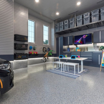
2020 has thrown a lot at us. One of the biggest challenges for parents and their kids has been adjusting to at-home learning.
Learning in high-traffic areas like the kitchen, living room, and dining room can be too distracting for kids. With families spending so much time indoors right now, the abundance of background noise from things like meal preparation, ringing phones, and conversations makes it particularly challenging for youngsters to focus on their studies.
We can turn any garage into a learning-friendly space without limiting its functionality.
Schedule a free design consultation with Garage Living by calling (817) 704-2356.
We’ll work with you to design a garage-to-classroom setup that gives you the peace of mind that your kids are getting their education in a safe space right in your own home.
#homeschooling #homelearning #studyspaces #garagelivingtexas #garage #garagelife #homedesign #homedecor
 Clothed In Majesty, LLC
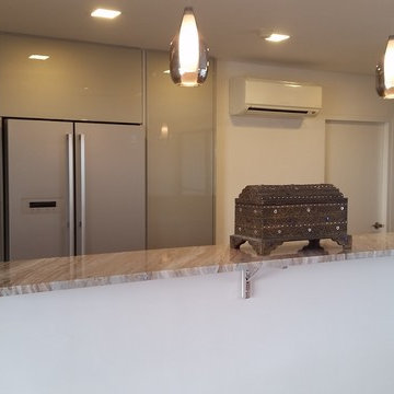
After knocking down two walls separating the kitchen from the Dining Room and Entry Hall, we have an expansive space open to fantastic views of the Bay towards the West and Mountain views towards the East. Now the Kitchen is something to behold. The custom cabinetry was designed with more storage space than before in-spite of adding a dishwasher which was not part of the original kitchen. The window behind the range was removed and replaced with a mosaic of glass and travertine. Because the owner enjoys cooking, a vent hood was a must and could not be placed within the window as the original layout. The reflective properties of both the glass and high gloss painted finish on the refrigerator wall bring natural light to the space. The granite has a rich color combination of browns and creams that are very calming and dramatic at the same time. The stone was chosen for its interest but not so powerful as to distract from the spectacular views.
Please leave a comment for information on any items seen in our photographs.
 CertaPro Painters of Carlsbad
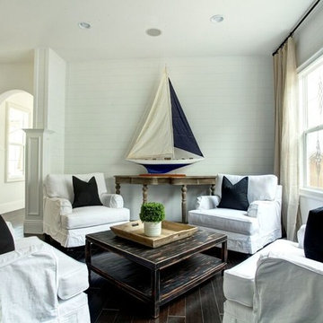
Dark floors contrast sharply against light walls, creating a great space for thoughtful conversation with minimal distractions.
Example of a beach style living room design in San Diego
Example of a beach style living room design in San Diego
Find the right local pro for your project
 Paramount Kitchen & Bath
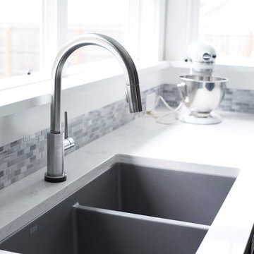
Plenty of light in this kitchen remodel by Angie! Paired with the rich, transitional cabinets the MSI Cashmere Carrarra countertops, light natural stone backsplash and white walls make this kitchen remodel feel incredibly open and airy. Large stainless pulls blend well with the appliances and don't distract from the overall beauty of the space.
The Dura Supreme stained Cherry Hazelnut finish on a wide modified shaker door and drawer front creates a transitional feel when paired with the other muted selections that really let the cabinetry shine!
Schedule a free consultation with one of our designers today:
https://paramount-kitchens.com/
 KBK - Custom Kitchens Designers based in Brisbane
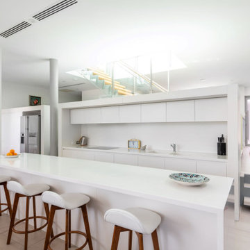
Elegant and Refined Kitchen Overlooking Brisbane River.
This stunning Bulimba home was a complete with a crisp and clean Kitchens by Kathie renovation. The design was kept streamlined and light so not to distract from the home art museum it is surrounded by. This minimalist design allows the paintings and views of Brisbane River to steal the show. The bright and monochromatic kitchen is perfectly paired with vibrant rugs and complimented by a stunning art wall.
We adore the clean lines and minimalist hand to this renovation. Designer Ebony did a fantastic job creating a functional yet streamlined layout that suited all of the clients needs.
 Great American Landscapes
Our client came to us with the objective of building an outdoor living space for his family to always come back to instead of going on separate vacations. They needed a space that felt like a retreat from the world. A space for relaxing and spending quality family time together without the day-to-day distractions.
Our team provided a rustic, industrial looking outdoor entertaining area with sports watching as the main goal to provide years of family fun through the seasons!
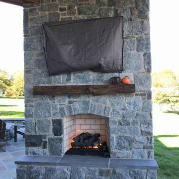
Our biggest challenge on this project was to design and build a beautiful, custom triangular floor to ceiling outdoor fireplace that was the centerpiece of this project.
The entire project included building a porch roof over a flagstone patio. All surfaces were clad in cedar with built in bluetooth speakers, ceiling fan, recessed lighting, and a gas heater. We also built an outdoor kitchen with bar height table top and gas grill. The floor to ceiling stone fireplace in the corner of the patio included a custom mantle and mounted TV.
 Cascade Outdoor Design
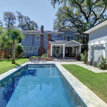
For this project the house itself and the garage are the only original features on the property. In the front yard we created massive curb appeal by adding a new brick driveway, framed by lighted brick columns, with an offset parking space. A brick retaining wall and walkway lead visitors to the front door, while a low brick wall and crisp white pergola enhance a previous underutilized patio. Landscaping, sod, and lighting frame the house without distracting from its character.
In the back yard the driveway leads to an updated garage which received a new brick floor and air conditioning. The back of the house changed drastically with the seamless addition of a covered patio framed on one side by a trellis with inset stained glass opposite a brick fireplace. The live-edge cypress mantel provides the perfect place for decor. The travertine patio steps down to a rectangular pool, which features a swim jet and linear glass waterline tile. Again, the space includes all new landscaping, sod, and lighting to extend enjoyment of the space after dusk.
Photo by Craig O'Neal
 Completely Personal Homes LLC
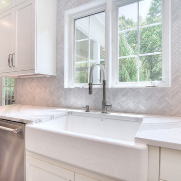
CLOSE UP OF APRON SINK, HERRINGBONE TILE AND WINDOW/TILE DETAIL. USED SCHLUTER MOULDING TO ENCAPSULATE THE WINDOW (NO CASING TO DISTRACT FROM VISUAL FLOW)
 Susan Schwend, Bassett Furniture Pittsburgh
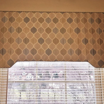
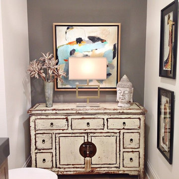
Transitional home office space with artwork in shades of blues and tans with coastal and sailing themes were the inspiration for a light tonal fabric that does not distract from the art, but makes a cohesive tailored statement.
 ELEVATIONS | Design Solutions by Myers
Visit Our Showroom
8000 Locust Mill St.
Ellicott City, MD 21043
Berenson Timeless Charm Hardware
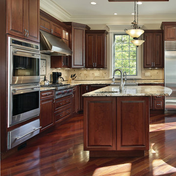
Traditional design focuses on being warm and welcoming, borrowing classic elements from European and Old World style for a feeling of familiarity. Unlike a sleek, contemporary kitchen where nothing distracts from the task at hand, a traditional kitchen is designed to be lived in, comfortable for hours at a time. Cabinetry looks and feels like “real” furniture, showing the frame around doors and, often, exposing hinges. Finishes are aged and distressed. Faucets and hardware have shape and detail. Even a crystal chandelier – one you might expect in a dining room – is at home in a traditional kitchen. The overall effect is one of beloved pieces, collected over time.
Elevations Design Solutions by Myers is the go-to inspirational, high-end showroom for the best in cabinetry, flooring, window and door design. Visit our showroom with your architect, contractor or designer to explore the brands and products that best reflects your personal style. We can assist in product selection, in-home measurements, estimating and design, as well as providing referrals to professional remodelers and designers.
 TATCOR DESIGN BUILD
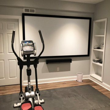
What is a modern basement without an exercise room? Enjoy your own private workout space by entering through a tasteful glass door. Need some motivation? Then you are in luck as you have a large projection screen right in front of you where you can play a how-to workout video, beautiful scenery, or watch your favorite shows to distract you from the workout.
 Bespoke By Acorn
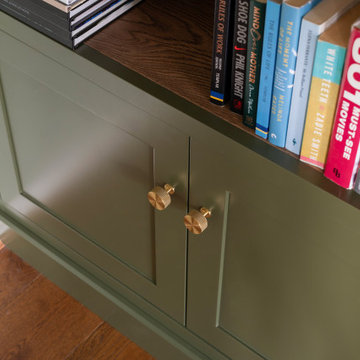
This stunning bespoke built-in media unit features shaker style doors and a break fronted design. The cabinetry mixes a stylish green painted finish with a contrasting rustic oak veneer for a unique nature-inspired look. With tailored shelving and clutter free cupboards the floor to ceiling furniture has added character and makes the perfection feature in our clients’ Surrey home.
Timeless shaker style design
This made to measure cabinetry has been handmade in solid wood in a shaker style. The understated, yet distinctive design is an enduring centuries-old classic; and the traditional construction is exceptionally strong. The breakfront gives variation to the depth of the media unit, adding interesting and drawing attention to the TV screen. With cabling concealed, nothing distracts from the beauty of this fitted wall to wall unit.
Nature-inspired green paired with oak wood
The unit has been finished in an eco-friendly, designer paint by Lick in a natural earthy tone of olive green, which is very much on trend. The dusky green with golden undertones makes the room feel restorative and uplifting. The cabinet backs and shelves are crafted from real oak veneer, protected with a dark stain in a satin finish to enhance the natural beauty and character of the wood. The oak veneer was chosen to match the room’s wooden floor and other furniture.
Shelving to showcase art and books
The open shelving has integrated LED lighting which casts a soft glow over the oak backs, adding ambience and dimension to the furniture. The combination of display shelving and closed lower cupboards achieves an attractive sense of order with only the best items on show and gadgets and other items hidden away.
A bespoke carpentry and joinery service from start to finish
Bespoke by Acorn took care of every stage of this project, from working with our clients on the original concept right through to the installation. This made the whole process an easy, stress-free, and enjoyable experience for them.
 Zobel & Co. Kitchens
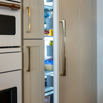
Paneled refrigerator looks like cabinetry and doesn't distract your eye from other focal points in the kitchen.
Transitional kitchen photo in Boston
Transitional kitchen photo in Boston
 Kon-strux Developments
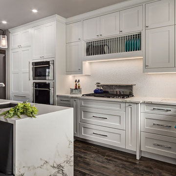
Nothing distracting: a restful backdrop to the rest of your life. A peaceful, efficient kitchen anchors the whole home. Designer: Nicole Muzechka
(Calgary Photos)
 BK Landscape Design
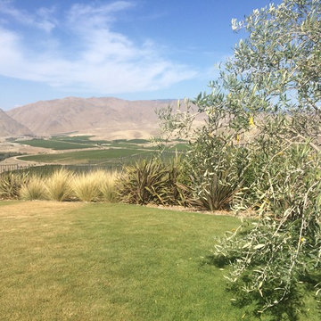
This is a new house in a new development. The owner had a completely blank canvas to work with and stunning vistas from the rear yard. BKLD created an intimate seating area to enjoy evening sunsets, terrace walls with beautiful plantings to contain the steep hillside on one side of the yard while creating a new outdoor living and entertaining space. An informal Bocce court provides for a good distraction from the hustle, bustle of a busy work week and and is also serving as a placeholder for a future pool. A large full dimension wood trellis are also coming in the near future.
 Nip Tuck Remodeling
No more orange wood...
There was so much cherry and fir throughout the main floor, the color was distracting and dated, as was the older fireplace surround and flanking shelves.
The clients wished to modernize the aesthetic, update and improve the appliances (with a fully plumbed espresso machine), and lighten the visual load in the family room.
To dramatically change the scale of an architectural element, the space still needed to feel livable. A larger fireplace profile, larger appliances, and a larger island were all key considerations for the final look and balance of the project.
 Tweak Your Space
This project earned its name 'The Herringbone House' because of the reclaimed wood accents styled in the Herringbone pattern. This project was focused heavily on pattern and texture. The wife described her style as "beachy buddha" and the husband loved industrial pieces. We married the two styles together and used wood accents and texture to tie them seamlessly. You'll notice the living room features an amazing view of the water and this design concept plays perfectly into that zen vibe. We removed the tile and replaced it with beautiful hardwood floors to balance the rooms and avoid distraction. The owners of this home love Cuban art and funky pieces, so we constructed these built-ins to showcase their amazing collection.
 Tetrachrome Design, LLC
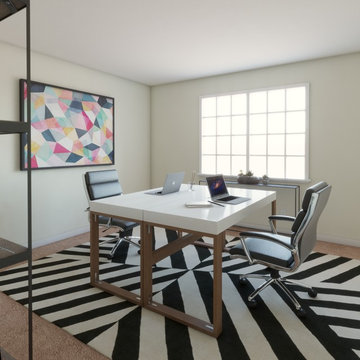
For some, working at home can be a struggle because you might not be removed from the distractions of home. But walking into this office, you feel like your stepping into ideation central where the vibrant colors and patterns will get the ideas flowing.
 Axis Mundi | SF
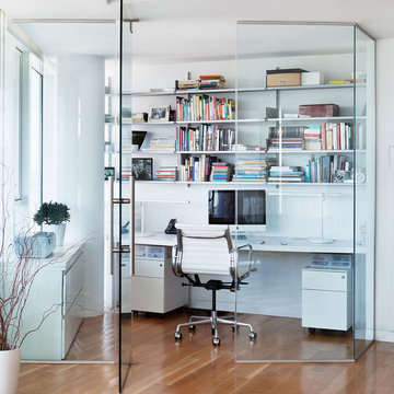
It wasn’t necessary to overthink things when Axis Mundi designed interiors for an apartment at Brooklyn’s glass-sheathed 1 Grand Army Plaza, the luxury building by Richard Meier already endowed with all the “starchitect” bells and whistles, as well as drop-dead stunning views of Brooklyn, the harbor and Prospect Park. What did require considerable aptitude was to strike the right balance between respect for these assets, particularly the panoramas, and livability. The all-white scheme doesn’t just complement Meier’s own aesthetic devotion to this purest of pure hues; it serves as a cool backdrop for the views, affording comfortable vantage points from which to enjoy them, yet not drawing attention away from the splendors of one of the world’s most distinctive boroughs. Sleek, low-lying Italian seating avoids distracting interruptions on the horizon line. But minimal color accents and pattern also sidestep what could have been a potentially antiseptic environment, making it tactile, human and luxurious.
2,200 sf
Design Team: John Beckmann, Richard Rosenbloom and Nick Messerlian
Vintage photography courtesy of the Ubu Gallery, New York
Photography: Adriana Buffi and Fran Parente
© Axis Mundi Design LLC
 Metro Interiors
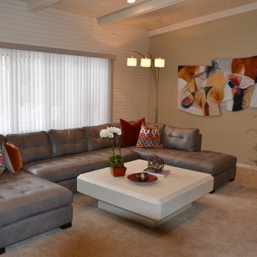
Before, this family room had a lot of “little things” distracting the eye. We simplified things and created a fresh new design that’s decluttered, cohesive, and designed with the family in mind.
The room had a lot of wood detail – on the ceiling and the wall. We had it painted an off-white, Benjamin Moore’s “Cake Batter” to lighten things up and make the room feel more spacious. The ceiling beams are seen has harsh, oppressive energy in Feng Shui, so it was especially important to minimize their impact. We did that by matching the ceiling color with the beam color. On the rest of the walls we went with another neutral, a soft earth tone to add some warmth.
For the windows we chose new treatments that are still vertical, because that function was important to the family, but with a unique texture on the blinds to add some interest.
The new carpet is nice and soft, and we found a new leather sectional to anchor the room. It’s larger, and has an updated style, with a configuration that wraps around. It was specifically chosen for its durability as well, since this is where the family spends a lot of time – it can withstand spills and regular wear and tear. A contemporary and practical floor lamp was also added alongside the sofa for additional lighting.
The cocktail table is a great piece the homeowners previously had, which we encouraged them to keep. We knew it would work well in the design, and look brand new with the finished room’s color scheme and furniture. It was in such nice shape, and also durable; plus the size worked in perfect balance paired with the sofa in the room. We changed things up on the surface with creative accents that coordinate with the design and add some new life.
With the grouping of art on the wall before, it was hard to know what to focus on. The new piece of artwork, which we found on a trip to an art gallery, is sculptural and fun. The size also helps to create balance in the room, and its contemporary look and color effortlessly complete the room.
67