
Search results for "Distracted" in Home Design Ideas
 Rayna Vogel
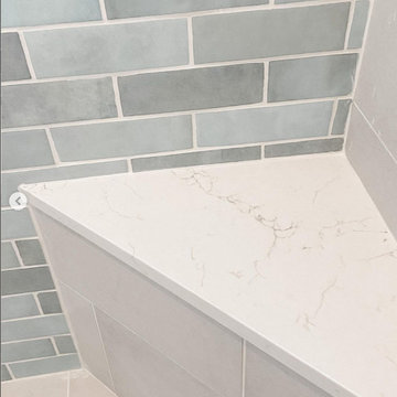
There’s more than one way to add storage in the shower besides an accent niche. This variegated tile was so stunning I didn’t want to break it up with an accent tile. But we still need a place to store soaps and shampoos, so I designed a tall ledge instead that doesn’t distract from the beautiful handmade Bedrosians Tile & Stone going floor to ceiling.
 Michael Nash Design, Build & Homes
Kitchen Over 150K
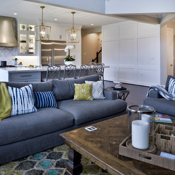
If you ever found yourself shopping for a new home, finding a model home, falling in love with this model home and immediately signing on the dotted line. Yet after a few months of moving into your new home you realize that the kitchen and the layout of main level will not work out for your lifestyle. The model home you fell in love with was furnished with beautiful furniture distracting you from concentrating on what is really important to you. This is what happened to this couple in Ashburn, VA, after purchasing their dream home.
The kitchen lacked natural light, while its location was not ideal and was disrupting their daily routine. After a careful review of the kitchen design, a plan was formed to upgrade the kitchen.
Their kitchen was moved to a location between the two-story family room and front dining room. To the left of the family room there was a breakfast eating area that was not serving any purpose.
Our design incorporated the breakfast area placed along a couple feet from an adjacent pantry space to create this new dream kitchen.
By knocking down a few bearing walls, we have placed the main sink area under large backside windows. Now the kitchen can look into their beautiful backyard. A major load bearing wall between the old breakfast room and adjacent two-story family was taken down and a big steel beam took the place of that, creating a large seamless connection between the new kitchen and the rest of the home.
A large island was implemented with a prep sink, microwave, and with lots of seating space around it. Large scale professional appliances along with stunning mosaic backsplash tiles complement this amazing kitchen design.
Double barn style door in front of the pantry area sets off this storage space tucked away from rest of the kitchen. All the old tile was removed and a matching wide plank distressed wood floor was installed to create a seamless connection to rest of the home. A matching butler pantry cabinet area just outside of dining room and a wine station/drink serving area between family room and main foyer were added to better utilize the multi-function needs of the family.
The custom inset cabinetry with double layers and exotic stone counter top, distressed ceiling beams, and other amenities are just a few standouts of this project.
 HKB Interior Design
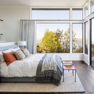
Beachfront properties call for prioritizing these sweeping seaside views and an open plan that is both modern and inviting.
While incorporating intentional pattern play and adventurous colors, we were committed to only making efforts that enhanced the postcard-worthy views rather than distract from them.
Find the right local pro for your project
 DES Home Renovations
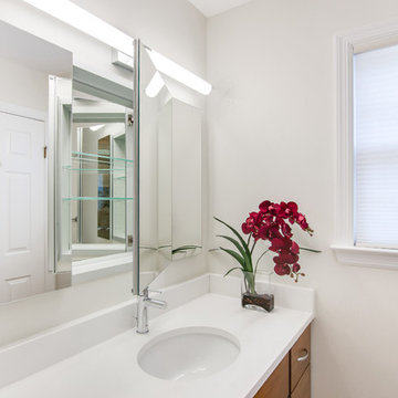
The phrase “Less is More” holds very true for this small master bathroom. With its neutral color scheme, clean lines, and linear fixtures, this bathroom is nothing short of excellent in its portrayal of modern. There is not much to distract the eye on this crisp design.
 Columbia Cabinets
Impeccable Classic
Project Details
Designer: Amy Van Wie
Cabinetry: Brookhaven Framed Cabinetry
Wood: Maple
Finishes: Nordic White
Door: Bloomfield Recessed
Countertop: Carrera Marble
Awards
2016 NKBA Tri-State Awards, Best New Kitchen Design, Over 300 Square Feet
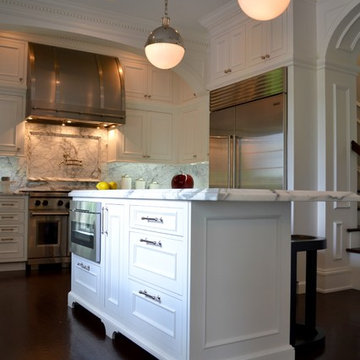
This Loudonville project was designed on a grand scale but the goal my client and I shared was to avoid grand becoming grandiose. Our strategy was relatively simple: keep it classic and let the impeccable execution and the detail of the design add the firepower. The pristine Nordic white finish set the stage, providing a light breezy backdrop for the sun-filled space. The custom arches, double-stacked cabinets and dental moulding elegantly fill the kitchen’s vertical dimension and are beautifully juxtaposed with the dark-stained wood floor. In keeping with our classic elegance theme, we avoided fussy distractions, using Carrera marble for both the countertop and backsplash and selecting hardware and lighting that complement the cabinets and architecture of the room.

 H&P Building LLC
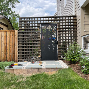
Our Privacy Screens are 100% Custom Made in the USA. We are located in Colorado but we can ship for all of the 50 states. We only use high quality American Made steel.
All of our Products are custom made. We can add frames, posts, brackets. There are also several designs available through our Etsy listings.
Or visit our website to see more options:
www.hnpbuilding.com
Benefits of our privacy screens:
1- Increased privacy – The nosy neighbors and odd passersby will have a much harder time seeing your own personal goings-on.
2- Shade – On a hot summer’s day, it is always nice to find a bit of shade, and when the sun is beating down on your patio, sometimes you have to bring the shade to you. A privacy screen can offer this much-needed respite from the heat of direct sunlight.
3- Hiding eyesores – Sometimes there are things we need to keep outside and they are not always aesthetically pleasing. Things like air conditioning units and water pumps can really distract from your yard’s scenery. Privacy screens are a good way of dividing and keeping things like this out of sight.
4- Attractive – The right screen can really accentuate your yard, making it a true sight to be seen.
What exactly do you do?
Driven by curiosity, we thrive on challenging creativity and what is expected when designing for a space.
We enhance experience through the creation and design of decorative screens. Ultimately, elevating spaces to bring people together.
 Joe McGuire Design
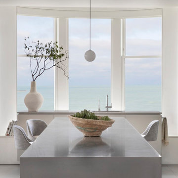
Experience urban sophistication meets artistic flair in this unique Chicago residence. Combining urban loft vibes with Beaux Arts elegance, it offers 7000 sq ft of modern luxury. Serene interiors, vibrant patterns, and panoramic views of Lake Michigan define this dreamy lakeside haven.
The minimalist modern kitchen is designed to reflect the ever-changing lakeside moods of sea and sky. The artfully aligned cabinets, dine-in island, and window-facing sink are outfitted with organic touches that bring warmth without distracting from the views.
 American Home Improvement Inc.
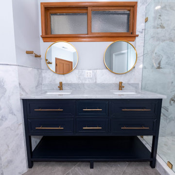
Corner shower - large modern master white tile and marble tile porcelain tile, gray floor, double-sink and tray ceiling corner shower idea in Los Angeles with furniture-like cabinets, blue cabinets, a one-piece toilet, white walls, an undermount sink, marble countertops, a hinged shower door, white countertops and a freestanding vanity
 Travis Donnelly Wallpaper
Office wallpaper installation – Avondale, PA. Eclectic doesn’t have to mean chaotic. This office in Avondale features bold abstract wallpaper with layered brushstroke patterns in muted navy, sand, and olive. Installed behind open shelving and a wall-mounted desk, the paper acts like a creative backdrop without distracting from work.
 Home Staging by Vivian LLC
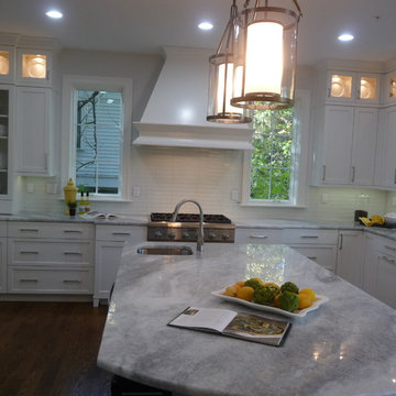
Let the finishes speak for themselves. Just add pops of color here and there, but don't over do it. You staging shouldn't be a distraction.
Trendy kitchen photo in DC Metro
Trendy kitchen photo in DC Metro
 Globe Electric
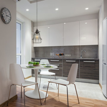
Fashioned after vintage inspired lighting Globe Electric's Elior 1-Light Pendant adds a rustic industrial feel to any space. The cage shade showcases the bulb of your choice to create a beautiful silhouette. Add a vintage Edison bulb for a perfect finishing touch. Ideal for use in kitchens, restaurants, bars, and dining rooms - the exposed bulb in this fixture delivers the perfect look. Includes all mounting hardware for quick and easy installation and requires one medium base 60W light bulb (sold separately).
 Brad Cox, Architect, Inc.
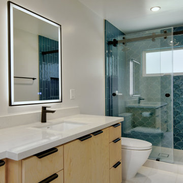
Gorgeous wall tile in the shower is the focal point of this bathroom. Farmhouse-style sliding glass doors above a curb eliminate the need for lower tracks, which are notoriously difficult to clean and visually distracting. A black-framed electric mirror and black hardware tie the elements together. No light fixture is necessary over the vanity, creating a streamlined, modern look.
 MossCreek
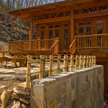
This stunning custom designed home by MossCreek features contemporary mountain styling with sleek Asian influences. Glass walls all around the home bring in light, while also giving the home a beautiful evening glow. Designed by MossCreek for a client who wanted a minimalist look that wouldn't distract from the perfect setting, this home is natural design at its very best. Photo by Joseph Hilliard
 Janvrin & Co.
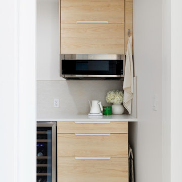
A transformation of a modest raised ranch into a modern oasis. I was the interior designer and general contractor from mechanicals to finishing. It’s also my personal home.
The interior design style is that of modern minimalist meets organic modern. I wanted a space that reduced distractions and let the eyes, head, and soul rest. Where everything inside the home has a specific use and purpose. The objects in our home are fewer but each hold a great personal value. You might expect to see this airy aesthetic, with its gallery white walls, in California or New York. Not nestled in a modest 50 year old neighborhood in Omaha, Nebraska. Creating a minimal aesthetic is one of the trickiest design styles to pull off. It is more than just less stuff and lots of white. It means sticking to these design principals:
-weaving in an abundance of textures
-incorporating natural finishes
-keenly curating art
-giving extra attention to scale
-limiting purely decorative items
-maximizing natural light
This style is not to be confused with the frugality of reductive design. I have incorporated many elevated basics that create an aesthetic of quiet luxury:
-architectural bead for trim-less doors
-first-of-its kind interior door hardware made of terrazzo
-historical marble found in landmark interiors like the NY Public Library
-premium flush air vents that disappear out of site
-luxury appliances from GE Café and Signature
-elegant and resilient terrazzo field tiles
Ours was not a simple interior remodel and addition:
-gutted and remodeled the existing 2,000 SF
-added on approximately another 1,000 SF
-moved and installed all new major mechanicals i.e. heating, plumbing and electrical.
-knocked through foundation walls to extend the space back
-dug down and built up
 California Renovation
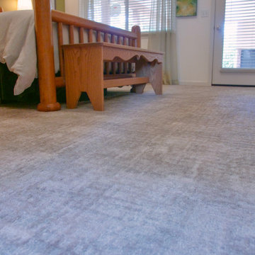
For added comfort, our client wanted fresh, soft carpet installed in their master bedroom. The beige color easily matches with the green and white walls, and it doesn't distract from the style of this room!
 Renovisions
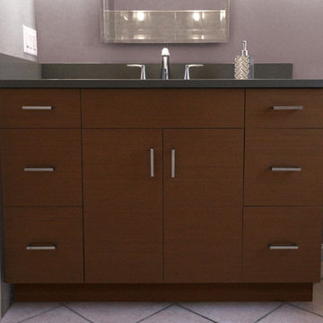
One of the hottest trends in bath design is open, clean-line spaces. This serene look is accomplished by reducing distractions caused by too many ornate details. This client approached Renovisions to remodel her outdated master bath and create a clean and uncluttered space with a contemporary flair. The bathtub and tile floor remains in the new design adding a small challenge to coordinate the right color selection for shower and tub surround tile. The existing bath’s fiberglass shower was cramped, under utilized and under styled, so Renovisions first enlarged the depth of the shower with a complete water proof system, hand-held shower and soap dish, corner shelf and safety grab bar.
A teak veneer vanity was designed to compliment the client’s master bedroom teak furniture. A beautiful combination of sleek grey quartz countertop, rectangular under-mount sink, modern plumbing fixtures, stylish hardware and a simple yet elegant tilt mirror completed the contemporary look.
This renewed master bath combines functionality and aesthetics in perfect harmony.
 Newschool Builders LLC
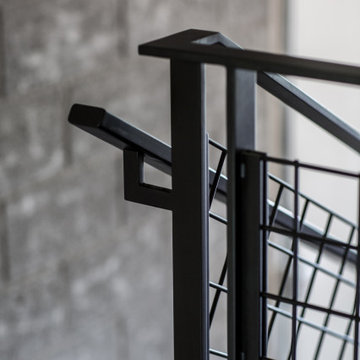
Embracing the natural elements of this circa 1960’s Condo development in Stowe Vermont was a priority for our clients. We worked closely with a great design team and our clients to create this simple, but beautiful minimalist retreat. Our clients, both authors, wanted a place to withdraw from the endless distractions and fast pace rhythms of the city. Custom made cabinets, bookshelves and built ins helped off set the sandblasted CMU block walls and ground concrete floors. A beautiful handcrafted stairwell was a center piece connecting the three floors. A handcrafted integrated concrete sink in the master is was another testament to the mixed mediums used to create this space. We embraced exposed conduit and commercial grade light fixtures throughout which helped add to the overall minimalist feel of the space. There is a beautiful rawness to this project which everyone came to admire.
 Simply Home Decorating
The kitchen may be the heart of a home, but the dining room is where the family gathers to enjoy special occasions, create and pass on traditions, and savour each other’s company free from distractions. The family behind this particular dining room enjoys doing just that.
When they are not traveling the world, Matthew and Anna (names changed) love to cook meals at home with their teenage daughter, entertain family and friends, and live amongst their cherished travel souvenirs and heirlooms. Their dining room, however, was far from the perfect backdrop for these experiences.
Before: Dining Room:
When Matthew and Anna contacted us, they imagined a space that would comfortably seat 8 to 10 people and incorporate their beautiful inherited dining table and sideboard in a fresh, modern way. Above all, they wanted a dining room that they would feel proud to share.
They worked with us to design, lightly renovate, and furnish their dining room and adjacent living space. Now, the room is nothing short of inviting and elevated.
Classic Yet Contemporary Dining Room:
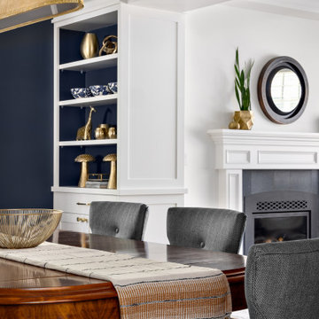
Viewed from the living area, the dining room is a hidden gem waiting to be discovered. Matthew and Anna wanted dark blue for the walls, and we couldn’t have been happier to find the perfect shade for them. By leaning darker, this rich blue creates the perception of depth, making the room feel enticing, comfortable and secluded.
The previous built-ins were underwhelming and lacked function, so we designed wider, taller, double sided cabinets that integrated the existing bulk-head, and then accessorized the shelves with the family’s travel finds, books, and decor. Topping these units with brass art lights not only blends contemporary and traditional styles, it also draws attention to the dining table’s modern show-stopping chandelier. You can’t miss it.
Inside the dining room, the effect is equally impressive: enveloping yet spacious, warm yet cool, classic yet contemporary. We incorporated their heirloom pieces seamlessly into the design thanks to the 1:2 ratio. For every traditional piece, we introduced two more modern or contemporary pieces — clean lines, subtle curves, and lustrous brass hardware. The result is a collected yet updated look.
In any room with dark walls, lighting is of the utmost importance. We placed a mirror adjacent to the window to reflect natural light throughout the room, and we kept the trim and ceiling white for brightness. To provide maximum versatility, we provided multiple light sources that can be adjusted to create different levels of light to suit any mood or occasion. These include: pot lights and a chandelier on dimmers, a sculptural trilight lamp on the sideboard, and art lights on the bookcases and above important art pieces.
The built-ins have another surprise waiting inside this special dining room:
Double-sided built-ins: dining room shelving and living room shelving.
Rather than keep them white like we did in the living room, we painted the back wall of the book cases the same dark blue as the walls in the rest of the room. This reduces the contrast with the surrounding walls and emphasizes the white outline of the cabinets. We also love the dark blue walls’ role as a beautiful backdrop for this family’s treasures. The brass accessories and hand-painted vases and bowls feel like part of the experience.
Of course, what is beauty without function? It may not look like it, but the base storage is only accessible from the dining room side. The units include deep cabinets for storing serving ware, as well as another delightful surprise: silverware drawers lined in luxurious navy velvet!
Lastly, we designed this beautiful nook for their heirloom sideboard. From afar, the wall looks as if it has texture and perhaps a touch of shine. Up close, you will notice that it is actually navy blue wallpaper with tiny golden dots. This unique touch accentuates the brass in the room touches throughout the space.. The room feels curated, contemporary, and full of character.
Words of Praise:
Anna and Matthew were thrilled with their new dining room and with the design process itself, which is always the highest compliment. They said:
“Working with Lori and her team at Simply Home Decorating was a great experience. The design they came up with was both beautiful and practical for our family. Renovations can be stressful but working with Simply Home made the process much more pleasant.
“Simply Home's project management and their longstanding relationships with reliable trades meant we could relax, knowing that everything was taken care of. If an issue arose, the entire Simply Home team was quick to address it. They were excellent at communicating with us—we never felt like we didn't know what was going on. We would highly recommend working with Simply Home Decorating.”
Thank you, Matthew and Anna! We are honoured to have been part of your journey and wish your family many happy memories in these new spaces.
Now, is it your turn? Are you ready to uncover the hidden potential in your home? If so, contact us here to start the conversation or download my guide Uncovering the Hidden Potential in Your Home below to learn more about what we can do for you.
 EDC INTERIORS INC
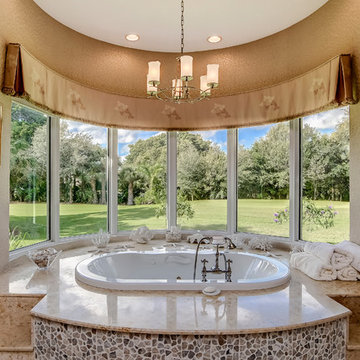
Photo by Bruce Frame. This is just one aspect of the clients' master bathroom, where the large bathtub overlooks the golf course beyond. The walls are done in a metallic-toned wall covering and the window treatment is a rich, heavy, deep gold metallic silk with a subtle floral pattern and a hint of fringe. The chandelier above is soft, graceful, and organic so as not to distract from the other elements in this part of the master bath.
71