
Search results for "Download" in Home Design Ideas
 TKS Design Group
Download our free ebook, Creating the Ideal Kitchen. DOWNLOAD NOW
Alice and Dave are on their 2nd home with TKS Design Group, having completed the remodel of a kitchen, primary bath and laundry/mudroom in their previous home. This new home is a bit different in that it is new construction. The house has beautiful space and light but they needed help making it feel like a home.
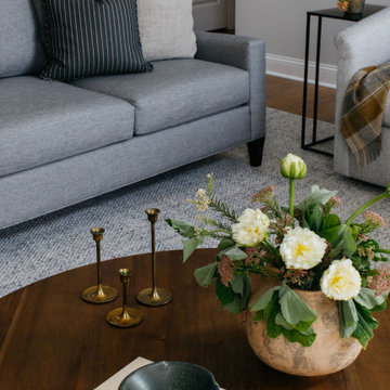
In the living room, Alice and Dave plan to host family at their home often and wanted a space that had plenty of comfy seating for conversation, but also an area to play games. So, our vision started with a search for luxurious but durable fabric along with multiple types of seating to bring the entire space together. Our light-filled living room is now warm and inviting to accommodate Alice and Dave’s weekend visitors.
The multiple types of seating chosen include a large sofa, two chairs, along with two occasional ottomans in both solids and patterns and all in easy to care for performance fabrics. Underneath, we layered a soft wool rug with cool tones that complimented both the warm tones of the wood floor and the cool tones of the fabric seating. A beautiful occasional table and a large cocktail table round out the space.
We took advantage of this room’s height by placing oversized artwork on the largest wall to create a place for your eyes to rest and to take advantage of the room’s scale. The TV was relocated to its current location over the fireplace, and a new light fixture scaled appropriately to the room’s ceiling height gives the space a more comfortable, approachable feel. Lastly, carefully chosen accessories including books, plants, and bowls complete this family’s new living space.
Photography by @MargaretRajic
Do you have a new home that has great bones but just doesn’t feel comfortable and you can’t quite figure out why? Contact us here to see how we can help!
 TKS Design Group
Download our free ebook, Creating the Ideal Kitchen. DOWNLOAD NOW
This homeowner’s daughter originally contacted us on behalf of her parents who were reluctant to begin the remodeling process in their home due to the inconvenience and dust. Once we met and they dipped their toes into the process, we were off to the races. The existing bathroom in this beautiful historical 1920’s home, had not been updated since the 70’/80’s as evidenced by the blue carpeting, mirrored walls and dropped ceilings. In addition, there was very little storage, and some health setbacks had made the bathroom difficult to maneuver with its tub shower.
Once we demoed, we discovered everything we expected to find in a home that had not been updated for many years. We got to work bringing all the electrical and plumbing up to code, and it was just as dusty and dirty as the homeowner’s anticipated! Once the space was demoed, we got to work building our new plan. We eliminated the existing tub and created a large walk-in curb-less shower.
An existing closet was eliminated and in its place, we planned a custom built in with spots for linens, jewelry and general storage. Because of the small space, we had to be very creative with the shower footprint, so we clipped one of the walls for more clearance behind the sink. The bathroom features a beautiful custom mosaic floor tile as well as tiled walls throughout the space. This required lots of coordination between the carpenter and tile setter to make sure that the framing and tile design were all properly aligned. We worked around an existing radiator and a unique original leaded window that was architecturally significant to the façade of the home. We had a lot of extra depth behind the original toilet location, so we built the wall out a bit, moved the toilet forward and then created some extra storage space behind the commode. We settled on mirrored mullioned doors to bounce lots of light around the smaller space.
We also went back and forth on deciding between a single and double vanity, and in the end decided the single vanity allowed for more counter space, more storage below and for the design to breath a bit in the smaller space. I’m so happy with this decision! To build on the luxurious feel of the space, we added a heated towel bar and heated flooring.
One of the concerns the homeowners had was having a comfortable floor to walk on. They realized that carpet was not a very practical solution but liked the comfort it had provided. Heated floors are the perfect solution. The room is decidedly traditional from its intricate mosaic marble floor to the calacutta marble clad walls. Elegant gold chandelier style fixtures, marble countertops and Morris & Co. beaded wallpaper provide an opulent feel to the space.
The gray monochromatic pallet keeps it feeling fresh and up-to-date. The beautiful leaded glass window is an important architectural feature at the front of the house. In the summertime, the homeowners love having the window open for fresh air and ventilation. We love it too!
The curb-less shower features a small fold down bench that can be used if needed and folded up when not. The shower also features a custom niche for storing shampoo and other hair products. The linear drain is built into the tilework and is barely visible. A frameless glass door that swings both in and out completes the luxurious feel.
Designed by: Susan Klimala, CKD, CBD
Photography by: Michael Kaskel
For more information on kitchen and bath design ideas go to: www.kitchenstudio-ge.com
 TKS Design Group
Free ebook, Creating the Ideal Kitchen. DOWNLOAD NOW
This client moved to the area to be near their adult daughter and grandchildren so this new construction is destined to be a place full of happy memories and family entertaining. The goal throughout the home was to incorporate their existing collection of artwork and sculpture with a more contemporary aesthetic. The kitchen, located on the first floor of the 3-story townhouse, shares the floor with a dining space, a living area and a powder room.
The kitchen is U-shaped with the sink overlooking the dining room, the cooktop along the exterior wall, with a large clerestory window above, and the bank of tall paneled appliances and storage along the back wall. The European cabinetry is made up of three separate finishes – a light gray glossy lacquer for the base cabinets, a white glossy lacquer for the tall cabinets and a white glass finish for the wall cabinets above the cooktop. The colors are subtly different but provide a bit of texture that works nicely with the finishings chosen for the space. The stainless grooves and toe kick provide additional detail.
The long peninsula provides casual seating and is topped with a custom walnut butcher block waterfall countertop that is 6” thick and has built in wine storage on the front side. This detail provides a warm spot to rest your arms and the wine storage provides a repetitive element that is heard again in the pendants and the barstool backs. The countertops are quartz, and appliances include a full size refrigerator and freezer, oven, steam oven, gas cooktop and paneled dishwasher.
Cabinetry Design by: Susan Klimala, CKD, CBD
Interior Design by: Julie Dunfee Designs
Photography by: Mike Kaskel
For more information on kitchen and bath design ideas go to: www.kitchenstudio-ge.com
Find the right local pro for your project
 TKS Design Group
Free ebook, Creating the Ideal Kitchen. DOWNLOAD NOW
Maximizing the floor plan of this family's 1950's split level ranch was priority one for the project. The kitchen and dining room were flip flopped and the space was opened up to allow for today's casual lifestyle. The new kitchen has ample storage, professional appliances and a peninsula with seating for guests. The wall was removed so that the space flows together. Floating cabinets were added in the dining area for additional storage. A new french door extends the space to outdoors.
Designed by: Susan Klimala, CKD, CBD
Photography by: Carlos Vergara
For more information on kitchen and bath design ideas go to: www.kitchenstudio-ge.com
 TKS Design Group
Download our free ebook, Creating the Ideal Kitchen. DOWNLOAD NOW
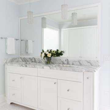
Bathrooms come in all shapes and sizes and each project has its unique challenges. This master bath remodel was no different. The room had been remodeled about 20 years ago as part of a large addition and consists of three separate zones – 1) tub zone, 2) vanity/storage zone and 3) shower and water closet zone. The room layout and zones had to remain the same, but the goal was to make each area more functional. In addition, having comfortable access to the tub and seating in the tub area was also high on the list, as the tub serves as an important part of the daily routine for the homeowners and their special needs son.
We started out in the tub room and determined that an undermount tub and flush deck would be much more functional and comfortable for entering and exiting the tub than the existing drop in tub with its protruding lip. A redundant radiator was eliminated from this room allowing room for a large comfortable chair that can be used as part of the daily bathing routine.
In the vanity and storage zone, the existing vanities size neither optimized the space nor provided much real storage. A few tweaks netted a much better storage solution that now includes cabinets, drawers, pull outs and a large custom built-in hutch that houses towels and other bathroom necessities. A framed custom mirror opens the space and bounces light around the room from the large existing bank of windows.
We transformed the shower and water closet room into a large walk in shower with a trench drain, making for both ease of access and a seamless look. Next, we added a niche for shampoo storage to the back wall, and updated shower fixtures to give the space new life.
The star of the bathroom is the custom marble mosaic floor tile. All the other materials take a simpler approach giving permission to the beautiful circular pattern of the mosaic to shine. White shaker cabinetry is topped with elegant Calacatta marble countertops, which also lines the shower walls. Polished nickel fixtures and sophisticated crystal lighting are simple yet sophisticated, allowing the beauty of the materials shines through.
Designed by: Susan Klimala, CKD, CBD
For more information on kitchen and bath design ideas go to: www.kitchenstudio-ge.com

 Control4
Striking bathroom brings the outdoors in with floor to ceiling window and an organic tile wall and features smart home automation to enhance the ambiance. In-ceiling speakers broadcast the music of your choice using a whole-home audio solution, powered by Control4. The recessed smart lighting lighting and accent lights are designed to create the perfect personalized ambiance, whether relaxing after a hard day or getting energized for a night out. Other automation options may include triggering tinted windows for privacy, ambient heating in the floor and placing a TV behind the mirror. Everything can be controlled from virtually anywhere using your Control4 app with a smart phone or tablet device.
 TKS Design Group
Download our free ebook, Creating the Ideal Kitchen. DOWNLOAD NOW
Lakefront property in the northwest suburbs of Chicago is hard to come by, so when we were hired by this young family with exactly that, we were immediately inspired by not just the unusually large footprint of this 1950’s colonial revival but also the lovely views of the manmade lake it was sited on. The large 5-bedroom home was solidly stuck in the 1980’s, but we saw tons of potential. We started out by updating the existing staircase with a fresh coat of paint and adding new herringbone slate to the entry hall.
The powder room off the entryway also got a refresh - new flooring, new cabinets and fixtures. We ran the new slate right through into this space for some consistency. A fun wallpaper and shiplap trim add a welcoming feel and set the tone for the home.
Next, we tackled the kitchen. Located away from the rest of the first floor, the kitchen felt a little isolated, so we immediately began planning for how to better connect it to the rest of the first floor. We landed on removing the wall between the kitchen and dining room and designed a modified galley style space with separate cooking and clean up zones. The cooking zone consists of the refrigerator, prep sink and cooktop, along with a nice long run of prep space at the island. The cleanup side of the kitchen consists of the main sink and dishwasher. Both areas are situated so that the user can view the lake during prep work and cleanup!
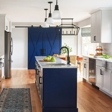
One of the home’s main puzzles was how to incorporate the mudroom and area in front of the patio doors at the back of the house. We already had a breakfast table area, so the space by the patio doors was a bit of a no man’s land. We decided to separate the kitchen proper from what became the new mudroom with a large set of barn doors. That way you can quickly hide any mudroom messes but have easy access to the light coming in through the patio doors as well as the outdoor grilling station. We also love the impact the barn doors add to the overall space.
The homeowners’ first words to us were “it’s time to ditch the brown,” so we did! We chose a lovely blue pallet that reflects the home’s location on the lake which is also vibrant yet easy on the eye. Countertops are white quartz, and the natural oak floor works well with the other honey accents. The breakfast table was given a refresh with new chairs, chandelier and window treatments that frame the gorgeous views of the lake out the back.
We coordinated the slate mudroom flooring with that used in the home’s main entrance for a consistent feel. The storage area consists of open and closed storage to allow for some clutter control as needed.
Next on our “to do” list was revamping the dated brown bar area in the neighboring dining room. We eliminated the clutter by adding some closed cabinets and did some easy updates to help the space feel more current. One snag we ran into here was the discovery of a beam above the existing open shelving that had to be modified with a smaller structural beam to allow for our new design to work. This was an unexpected surprise, but in the end we think it was well worth it!
We kept the colors here a bit more muted to blend with the homeowner’s existing furnishings. Open shelving and polished nickel hardware add some simple detail to the new entertainment zone which also looks out onto the lake!
Next we tackled the upstairs starting with the homeowner’s son’s bath. The bath originally had both a tub shower and a separate shower, so we decided to swap out the shower for a new laundry area. This freed up some space downstairs in what used to be the mudroom/laundry room and is much more convenient for daily laundry needs.
We continued the blue palette here with navy cabinetry and the navy tile in the shower. Porcelain floor tile and chrome fixtures keep maintenance to a minimum while matte black mirrors and lighting add some depth the design. A low maintenance runner adds some warmth underfoot and ties the whole space together.
We added a pocket door to the bathroom to minimize interference with the door swings. The left door of the laundry closet is on a 180 degree hinge to allow for easy full access to the machines. Next we tackled the master bath which is an en suite arrangement. The original was typical of the 1980’s with the vanity outside of the bathroom, situated near the master closet. And the brown theme continued here with multiple shades of brown.
Our first move was to segment off the bath and the closet from the master bedroom. We created a short hall from the bedroom to the bathroom with his and hers walk-in closets on the left and right as well as a separate toilet closet outside of the main bathroom for privacy and flexibility.
The original bathroom had a giant soaking tub with steps (dangerous!) as well as a small shower that did not work well for our homeowner who is 6’3”. With other bathtubs in the home, they decided to eliminate the tub and create an oversized shower which takes up the space where the old tub was located. The double vanity is on the opposite wall and a bench is located under the window for morning conversations and a place to set a couple of towels.
The pallet in here is light and airy with a mix of blond wood, creamy porcelain and marble tile, and brass accents. A simple roman shade adds some texture and it’s top-down mechanism allows for light and privacy.
This large whole house remodel gave our homeowners not only the ability to maximize the potential of their home but also created a lovely new frame from which to view their fabulous lake views.
Designed by: Susan Klimala, CKD, CBD
Photography by: Michael Kaskel
For more information on kitchen and bath design ideas go to: www.kitchenstudio-ge.com
 TKS Design Group
Free ebook, Creating the Ideal Kitchen. DOWNLOAD NOW
A small cramped and dated kitchen featuring an apple wallpaper border & wood paneling was transformed into a bright open concept space featuring a large island and custom cherry wood hood. The white cabinetry is accented by crisp calacutta backsplash tile and glass feature tile at the range. Blue pendant lights punctuate the room. A remodel of the fireplace in the neighboring family room anchors that space visually to the kitchen. The new space provides a comfortable gathering spot for family and friends.
Designed by: Susan Klimala, CKD, CBD
For more information on kitchen and bath design ideas go to: www.kitchenstudio-ge.com
 TKS Design Group
Download our free ebook, Creating the Ideal Kitchen. DOWNLOAD NOW
Alice and Dave are on their 2nd home with TKS Design Group, having completed the remodel of a kitchen, primary bath and laundry/mudroom in their previous home. This new home is a bit different in that it is new construction. The house has beautiful space and light but they needed help making it feel like a home.
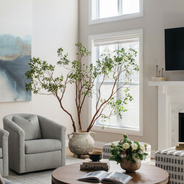
In the living room, Alice and Dave plan to host family at their home often and wanted a space that had plenty of comfy seating for conversation, but also an area to play games. So, our vision started with a search for luxurious but durable fabric along with multiple types of seating to bring the entire space together. Our light-filled living room is now warm and inviting to accommodate Alice and Dave’s weekend visitors.
The multiple types of seating chosen include a large sofa, two chairs, along with two occasional ottomans in both solids and patterns and all in easy to care for performance fabrics. Underneath, we layered a soft wool rug with cool tones that complimented both the warm tones of the wood floor and the cool tones of the fabric seating. A beautiful occasional table and a large cocktail table round out the space.
We took advantage of this room’s height by placing oversized artwork on the largest wall to create a place for your eyes to rest and to take advantage of the room’s scale. The TV was relocated to its current location over the fireplace, and a new light fixture scaled appropriately to the room’s ceiling height gives the space a more comfortable, approachable feel. Lastly, carefully chosen accessories including books, plants, and bowls complete this family’s new living space.
Photography by @MargaretRajic
Do you have a new home that has great bones but just doesn’t feel comfortable and you can’t quite figure out why? Contact us here to see how we can help!
 TKS Design Group
Free ebook, Creating the Ideal Kitchen. DOWNLOAD NOW
The Klimala’s and their three kids are no strangers to moving, this being their fifth house in the same town over the 20-year period they have lived there. “It must be the 7-year itch, because every seven years, we seem to find ourselves antsy for a new project or a new environment. I think part of it is being a designer, I see my own taste evolve and I want my environment to reflect that. Having easy access to wonderful tradesmen and a knowledge of the process makes it that much easier”.
This time, Klimala’s fell in love with a somewhat unlikely candidate. The 1950’s ranch turned cape cod was a bit of a mutt, but it’s location 5 minutes from their design studio and backing up to the high school where their kids can roll out of bed and walk to school, coupled with the charm of its location on a private road and lush landscaping made it an appealing choice for them.
“The bones of the house were really charming. It was typical 1,500 square foot ranch that at some point someone added a second floor to. Its sloped roofline and dormered bedrooms gave it some charm.” With the help of architect Maureen McHugh, Klimala’s gutted and reworked the layout to make the house work for them. An open concept kitchen and dining room allows for more frequent casual family dinners and dinner parties that linger. A dingy 3-season room off the back of the original house was insulated, given a vaulted ceiling with skylights and now opens up to the kitchen. This room now houses an 8’ raw edge white oak dining table and functions as an informal dining room. “One of the challenges with these mid-century homes is the 8’ ceilings. I had to have at least one room that had a higher ceiling so that’s how we did it” states Klimala.
The kitchen features a 10’ island which houses a 5’0” Galley Sink. The Galley features two faucets, and double tiered rail system to which accessories such as cutting boards and stainless steel bowls can be added for ease of cooking. Across from the large sink is an induction cooktop. “My two teen daughters and I enjoy cooking, and the Galley and induction cooktop make it so easy.” A wall of tall cabinets features a full size refrigerator, freezer, double oven and built in coffeemaker. The area on the opposite end of the kitchen features a pantry with mirrored glass doors and a beverage center below.
The rest of the first floor features an entry way, a living room with views to the front yard’s lush landscaping, a family room where the family hangs out to watch TV, a back entry from the garage with a laundry room and mudroom area, one of the home’s four bedrooms and a full bath. There is a double sided fireplace between the family room and living room. The home features pops of color from the living room’s peach grass cloth to purple painted wall in the family room. “I’m definitely a traditionalist at heart but because of the home’s Midcentury roots, I wanted to incorporate some of those elements into the furniture, lighting and accessories which also ended up being really fun. We are not formal people so I wanted a house that my kids would enjoy, have their friends over and feel comfortable.”
The second floor houses the master bedroom suite, two of the kids’ bedrooms and a back room nicknamed “the library” because it has turned into a quiet get away area where the girls can study or take a break from the rest of the family. The area was originally unfinished attic, and because the home was short on closet space, this Jack and Jill area off the girls’ bedrooms houses two large walk-in closets and a small sitting area with a makeup vanity. “The girls really wanted to keep the exposed brick of the fireplace that runs up the through the space, so that’s what we did, and I think they feel like they are in their own little loft space in the city when they are up there” says Klimala.
Designed by: Susan Klimala, CKD, CBD
Photography by: Carlos Vergara
For more information on kitchen and bath design ideas go to: www.kitchenstudio-ge.com
 TKS Design Group
Download our free ebook, Creating the Ideal Kitchen. DOWNLOAD NOW
This family from Wheaton was ready to remodel their kitchen, dining room and powder room. The project didn’t call for any structural or space planning changes but the makeover still had a massive impact on their home. The homeowners wanted to change their dated 1990’s brown speckled granite and light maple kitchen. They liked the welcoming feeling they got from the wood and warm tones in their current kitchen, but this style clashed with their vision of a deVOL type kitchen, a London-based furniture company. Their inspiration came from the country homes of the UK that mix the warmth of traditional detail with clean lines and modern updates.
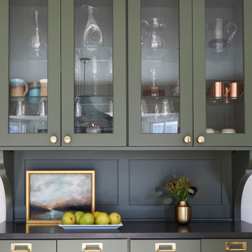
To create their vision, we started with all new framed cabinets with a modified overlay painted in beautiful, understated colors. Our clients were adamant about “no white cabinets.” Instead we used an oyster color for the perimeter and a custom color match to a specific shade of green chosen by the homeowner. The use of a simple color pallet reduces the visual noise and allows the space to feel open and welcoming. We also painted the trim above the cabinets the same color to make the cabinets look taller. The room trim was painted a bright clean white to match the ceiling.
In true English fashion our clients are not coffee drinkers, but they LOVE tea. We created a tea station for them where they can prepare and serve tea. We added plenty of glass to showcase their tea mugs and adapted the cabinetry below to accommodate storage for their tea items. Function is also key for the English kitchen and the homeowners. They requested a deep farmhouse sink and a cabinet devoted to their heavy mixer because they bake a lot. We then got rid of the stovetop on the island and wall oven and replaced both of them with a range located against the far wall. This gives them plenty of space on the island to roll out dough and prepare any number of baked goods. We then removed the bifold pantry doors and created custom built-ins with plenty of usable storage for all their cooking and baking needs.
The client wanted a big change to the dining room but still wanted to use their own furniture and rug. We installed a toile-like wallpaper on the top half of the room and supported it with white wainscot paneling. We also changed out the light fixture, showing us once again that small changes can have a big impact.
As the final touch, we also re-did the powder room to be in line with the rest of the first floor. We had the new vanity painted in the same oyster color as the kitchen cabinets and then covered the walls in a whimsical patterned wallpaper. Although the homeowners like subtle neutral colors they were willing to go a bit bold in the powder room for something unexpected. For more design inspiration go to: www.kitchenstudio-ge.com
 TKS Design Group
Download our free ebook, Creating the Ideal Kitchen. DOWNLOAD NOW
This unit, located in a 4-flat owned by TKS Owners Jeff and Susan Klimala, was remodeled as their personal pied-à-terre, and doubles as an Airbnb property when they are not using it. Jeff and Susan were drawn to the location of the building, a vibrant Chicago neighborhood, 4 blocks from Wrigley Field, as well as to the vintage charm of the 1890’s building. The entire 2 bed, 2 bath unit was renovated and furnished, including the kitchen, with a specific Parisian vibe in mind.
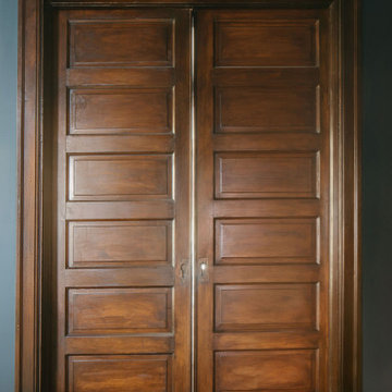
Although the location and vintage charm were all there, the building was not in ideal shape -- the mechanicals -- from HVAC, to electrical, plumbing, to needed structural updates, peeling plaster, out of level floors, the list was long. Susan and Jeff drew on their expertise to update the issues behind the walls while also preserving much of the original charm that attracted them to the building in the first place -- heart pine floors, vintage mouldings, pocket doors and transoms.
Because this unit was going to be primarily used as an Airbnb, the Klimalas wanted to make it beautiful, maintain the character of the building, while also specifying materials that would last and wouldn’t break the budget. Susan enjoyed the hunt of specifying these items and still coming up with a cohesive creative space that feels a bit French in flavor.
Parisian style décor is all about casual elegance and an eclectic mix of old and new. Susan had fun sourcing some more personal pieces of artwork for the space, creating a dramatic black, white and moody green color scheme for the kitchen and highlighting the living room with pieces to showcase the vintage fireplace and pocket doors.
Photographer: @MargaretRajic
Photo stylist: @Brandidevers
Do you have a new home that has great bones but just doesn’t feel comfortable and you can’t quite figure out why? Contact us here to see how we can help!

 Waypoint Living Spaces
Waypoint® 740 Painted Linen Mullion door frames with clear glass inserts creates a beautiful separation between kitchen and living room. Our built-in pass through china cabinet provides natural light and a means for storing and displaying serving pieces and collectibles.
Downloads featuring build and install details, along with 2020 designs for built-ins for this home and others, are available through Waypoint Living Spaces® dealers.

 Flavin Architects
This new house is perched on a bluff overlooking Long Pond. The compact dwelling is carefully sited to preserve the property's natural features of surrounding trees and stone outcroppings. The great room doubles as a recording studio with high clerestory windows to capture views of the surrounding forest.
Photo by: Nat Rea Photography
 TKS Design Group
Download our free ebook, Creating the Ideal Kitchen. DOWNLOAD NOW
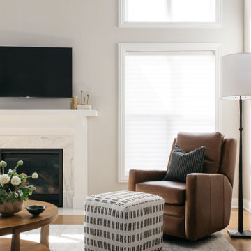
Alice and Dave are on their 2nd home with TKS Design Group, having completed the remodel of a kitchen, primary bath and laundry/mudroom in their previous home. This new home is a bit different in that it is new construction. The house has beautiful space and light but they needed help making it feel like a home.
In the living room, Alice and Dave plan to host family at their home often and wanted a space that had plenty of comfy seating for conversation, but also an area to play games. So, our vision started with a search for luxurious but durable fabric along with multiple types of seating to bring the entire space together. Our light-filled living room is now warm and inviting to accommodate Alice and Dave’s weekend visitors.
The multiple types of seating chosen include a large sofa, two chairs, along with two occasional ottomans in both solids and patterns and all in easy to care for performance fabrics. Underneath, we layered a soft wool rug with cool tones that complimented both the warm tones of the wood floor and the cool tones of the fabric seating. A beautiful occasional table and a large cocktail table round out the space.
We took advantage of this room’s height by placing oversized artwork on the largest wall to create a place for your eyes to rest and to take advantage of the room’s scale. The TV was relocated to its current location over the fireplace, and a new light fixture scaled appropriately to the room’s ceiling height gives the space a more comfortable, approachable feel. Lastly, carefully chosen accessories including books, plants, and bowls complete this family’s new living space.
Photography by @MargaretRajic
Do you have a new home that has great bones but just doesn’t feel comfortable and you can’t quite figure out why? Contact us here to see how we can help!
 TKS Design Group
Download our free ebook, Creating the Ideal Kitchen. DOWNLOAD NOW
This family from Wheaton was ready to remodel their kitchen, dining room and powder room. The project didn’t call for any structural or space planning changes but the makeover still had a massive impact on their home. The homeowners wanted to change their dated 1990’s brown speckled granite and light maple kitchen. They liked the welcoming feeling they got from the wood and warm tones in their current kitchen, but this style clashed with their vision of a deVOL type kitchen, a London-based furniture company. Their inspiration came from the country homes of the UK that mix the warmth of traditional detail with clean lines and modern updates.
To create their vision, we started with all new framed cabinets with a modified overlay painted in beautiful, understated colors. Our clients were adamant about “no white cabinets.” Instead we used an oyster color for the perimeter and a custom color match to a specific shade of green chosen by the homeowner. The use of a simple color pallet reduces the visual noise and allows the space to feel open and welcoming. We also painted the trim above the cabinets the same color to make the cabinets look taller. The room trim was painted a bright clean white to match the ceiling.
In true English fashion our clients are not coffee drinkers, but they LOVE tea. We created a tea station for them where they can prepare and serve tea. We added plenty of glass to showcase their tea mugs and adapted the cabinetry below to accommodate storage for their tea items. Function is also key for the English kitchen and the homeowners. They requested a deep farmhouse sink and a cabinet devoted to their heavy mixer because they bake a lot. We then got rid of the stovetop on the island and wall oven and replaced both of them with a range located against the far wall. This gives them plenty of space on the island to roll out dough and prepare any number of baked goods. We then removed the bifold pantry doors and created custom built-ins with plenty of usable storage for all their cooking and baking needs.
The client wanted a big change to the dining room but still wanted to use their own furniture and rug. We installed a toile-like wallpaper on the top half of the room and supported it with white wainscot paneling. We also changed out the light fixture, showing us once again that small changes can have a big impact.
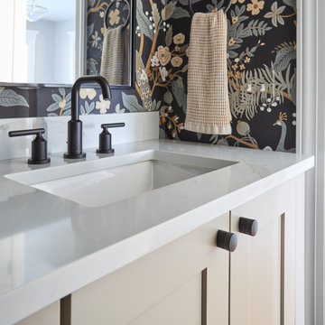
As the final touch, we also re-did the powder room to be in line with the rest of the first floor. We had the new vanity painted in the same oyster color as the kitchen cabinets and then covered the walls in a whimsical patterned wallpaper. Although the homeowners like subtle neutral colors they were willing to go a bit bold in the powder room for something unexpected. For more design inspiration go to: www.kitchenstudio-ge.com
 TKS Design Group
Free ebook, Creating the Ideal Kitchen. DOWNLOAD NOW
Maximizing the floor plan of this family's 1950's split level ranch was priority one for the project. The kitchen and dining room were flip flopped and the space was opened up to allow for today's casual lifestyle. The new kitchen has ample storage, professional appliances and a peninsula with seating for guests. The wall was removed so that the space flows together. Floating cabinets were added in the dining area for additional storage. A new french door extends the space to outdoors.
Designed by: Susan Klimala, CKD, CBD
Photography by: Carlos Vergara
For more information on kitchen and bath design ideas go to: www.kitchenstudio-ge.com
 TKS Design Group
Download our free ebook, Creating the Ideal Kitchen. DOWNLOAD NOW
This family from Wheaton was ready to remodel their kitchen, dining room and powder room. The project didn’t call for any structural or space planning changes but the makeover still had a massive impact on their home. The homeowners wanted to change their dated 1990’s brown speckled granite and light maple kitchen. They liked the welcoming feeling they got from the wood and warm tones in their current kitchen, but this style clashed with their vision of a deVOL type kitchen, a London-based furniture company. Their inspiration came from the country homes of the UK that mix the warmth of traditional detail with clean lines and modern updates.
To create their vision, we started with all new framed cabinets with a modified overlay painted in beautiful, understated colors. Our clients were adamant about “no white cabinets.” Instead we used an oyster color for the perimeter and a custom color match to a specific shade of green chosen by the homeowner. The use of a simple color pallet reduces the visual noise and allows the space to feel open and welcoming. We also painted the trim above the cabinets the same color to make the cabinets look taller. The room trim was painted a bright clean white to match the ceiling.
In true English fashion our clients are not coffee drinkers, but they LOVE tea. We created a tea station for them where they can prepare and serve tea. We added plenty of glass to showcase their tea mugs and adapted the cabinetry below to accommodate storage for their tea items. Function is also key for the English kitchen and the homeowners. They requested a deep farmhouse sink and a cabinet devoted to their heavy mixer because they bake a lot. We then got rid of the stovetop on the island and wall oven and replaced both of them with a range located against the far wall. This gives them plenty of space on the island to roll out dough and prepare any number of baked goods. We then removed the bifold pantry doors and created custom built-ins with plenty of usable storage for all their cooking and baking needs.
The client wanted a big change to the dining room but still wanted to use their own furniture and rug. We installed a toile-like wallpaper on the top half of the room and supported it with white wainscot paneling. We also changed out the light fixture, showing us once again that small changes can have a big impact.
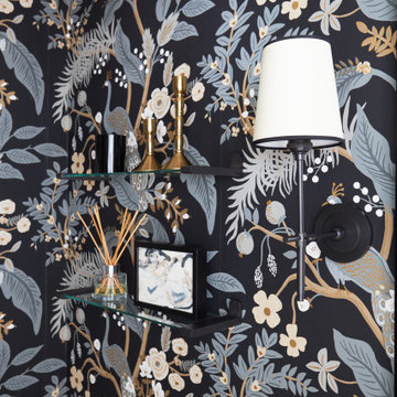
As the final touch, we also re-did the powder room to be in line with the rest of the first floor. We had the new vanity painted in the same oyster color as the kitchen cabinets and then covered the walls in a whimsical patterned wallpaper. Although the homeowners like subtle neutral colors they were willing to go a bit bold in the powder room for something unexpected. For more design inspiration go to: www.kitchenstudio-ge.com
 TKS Design Group
Free ebook, Creating the Ideal Kitchen. DOWNLOAD NOW
A small cramped and dated kitchen featuring an apple wallpaper border & wood paneling was transformed into a bright open concept space featuring a large island and custom cherry wood hood. The white cabinetry is accented by crisp calacutta backsplash tile and glass feature tile at the range. Blue pendant lights punctuate the room. A remodel of the fireplace in the neighboring family room anchors that space visually to the kitchen. The new space provides a comfortable gathering spot for family and friends.
Designed by: Susan Klimala, CKD, CBD
For more information on kitchen and bath design ideas go to: www.kitchenstudio-ge.com
 TKS Design Group
Download our free ebook, Creating the Ideal Kitchen. DOWNLOAD NOW
This client was referred to us from a past client. They are a busy 2-career household with young children and enjoy entertaining friends and family in their home. They have a beautiful open concept home but unfortunately the kitchen was not fitting for the rest of the home. They were not quite sure what to do with the space. We talked about trying to refresh it or do more of a minor remodel, but in the end they decided a full gut would get them to where they wanted to be.
One problem was there was no place for guests to hang out other than the large and awkward banquette area. The brick wall and tiled hood area were feeling a bit dated and tired. The space was just not functional for their lifestyle. There was no prep space near the cooktop and no landing area for items coming out of the ovens or refrigerator, plus a big dead zone in the center of the room.
Banquettes, like the one they previously had in the space, are great for small spaces, but when they get really large like this one, it makes getting in and out of the seating area awkward and uncomfortable. Plus, there was room for a large table, so we eliminated the awkward built in.
We started by removing the faux brick wall between the kitchen and back entry. We relocated the entry to the garage over a couple feet in order to get every last inch out of the new kitchen. We also made the decision to close up the primary window that faced the pretty ho hum brick wall of the neighbor’s house. There was plenty of light coming in from the seating area, so we just didn’t feel the window was adding much to the room.
Construction went smoothy. There was a bit of rework with electrical, flooring and HVAC, but in the end, we think it was well worth it.
The clients really wanted a sleek contemporary look, and we originally had planned for a full height slab backsplash, but due to it’s size, it was a budget buster. Instead, we got creative and settled on large format porcelain tiles that have a similar feel but were a fraction of the cost. We made sure the wall was plumb and level so that the fit and finish would mimic that of slab material.
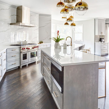
The final space was quite a change. A large prep sink sits directly across from the new pro-style range with plenty additional prep space on the large island. The refrigerator and ovens now have miles of landing space, and a nice tight work triangle makes cooking a breeze.
Since we wanted a more contemporary feel, not many wall cabinets were included. Instead, we outfitted some of the drawers for dish storage with a peg system. Two large pantries flanking the refrigerator hold baking supplies and small appliances. Large drawers by the cooktop hold pots and pans, and an appliance garage tucked away to the left of the range hides away miscellaneous items. The large island also houses a microwave drawer and tons of storage, most of which is drawers offering maximum convenience.
The island now seats 5-6 people comfortably along with the new table in the seating area which can seat up to 8. Entertaining will be a breeze in this space. With such a clean backdrop, we knew we would need some drama with the lighting, so we chose two sets of staggered pendants, which we adjusted for the right visual balance above the island.
We also included a small coffee station to the right of the main kitchen, which helps keep the coffee clutter out of the kitchen proper. Two tones of complimentary gray are featured in this kitchen. The perimeter is a light gray that reads almost white. The island is a gray stain that adds some depth and interest with the visible wood texture. The countertops are clean white quartz, and the hardware, barstools and light fixtures add warm brass tones. I see lots of cooking and entertaining with family and friends in the near future in this bright and airy new space.
Designed by: Susan Klimala, CKD, CBD
Photography by: Michael Kaskel
For more information on kitchen and bath design ideas go to: www.kitchenstudio-ge.com
41