
Search results for "Downward" in Home Design Ideas
 Ann Lowengart Interiors
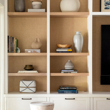
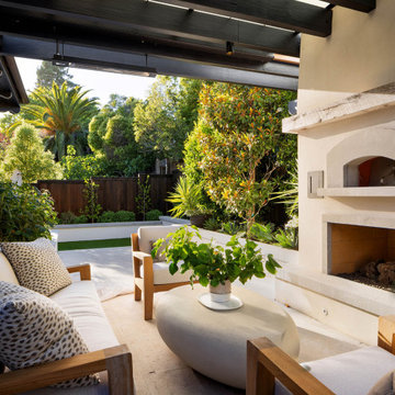
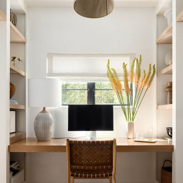
The three-level Mediterranean revival home started as a 1930s summer cottage that expanded downward and upward over time. We used a clean, crisp white wall plaster with bronze hardware throughout the interiors to give the house continuity. A neutral color palette and minimalist furnishings create a sense of calm restraint. Subtle and nuanced textures and variations in tints add visual interest. The stair risers from the living room to the primary suite are hand-painted terra cotta tile in gray and off-white. We used the same tile resource in the kitchen for the island's toe kick.

 Create Good Sinks
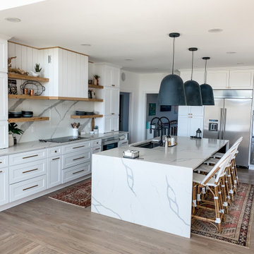
This beautiful Scandi-Boho kitchen has the perfect marriage of simplicity, texture, and curiosity. The gorgeous and oversized matte black bell light fixtures compliment the matte black dual faucets perfectly. As your eyes melt their focus downward, you are curiously drawn to the oversized and super-functional 46" ledge workstation sink.
Find the right local pro for your project

 Ann Lowengart Interiors
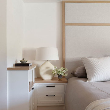
The three-level Mediterranean revival home started as a 1930s summer cottage that expanded downward and upward over time. We used a clean, crisp white wall plaster with bronze hardware throughout the interiors to give the house continuity. A neutral color palette and minimalist furnishings create a sense of calm restraint. Subtle and nuanced textures and variations in tints add visual interest. The stair risers from the living room to the primary suite are hand-painted terra cotta tile in gray and off-white. We used the same tile resource in the kitchen for the island's toe kick.

 Ann Lowengart Interiors
The three-level Mediterranean revival home started as a 1930s summer cottage that expanded downward and upward over time. We used a clean, crisp white wall plaster with bronze hardware throughout the interiors to give the house continuity. A neutral color palette and minimalist furnishings create a sense of calm restraint. Subtle and nuanced textures and variations in tints add visual interest. The stair risers from the living room to the primary suite are hand-painted terra cotta tile in gray and off-white. We used the same tile resource in the kitchen for the island's toe kick.
 Essence Design Studio
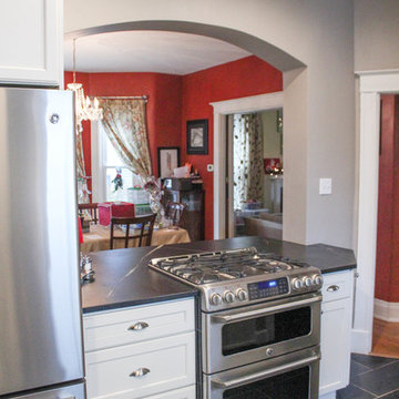
Eat-in kitchen - country u-shaped eat-in kitchen idea in Cincinnati with a farmhouse sink, recessed-panel cabinets, white cabinets, soapstone countertops, white backsplash, subway tile backsplash and stainless steel appliances

 Ann Lowengart Interiors
The three-level Mediterranean revival home started as a 1930s summer cottage that expanded downward and upward over time. We used a clean, crisp white wall plaster with bronze hardware throughout the interiors to give the house continuity. A neutral color palette and minimalist furnishings create a sense of calm restraint. Subtle and nuanced textures and variations in tints add visual interest. The stair risers from the living room to the primary suite are hand-painted terra cotta tile in gray and off-white. We used the same tile resource in the kitchen for the island's toe kick.
 Richard Best Architect, Inc.
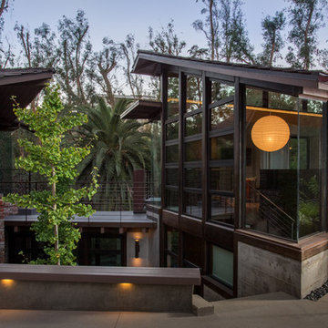
Hillside Modernism In Context.
The owners of this modern hillside home sought to have a home in a nice Los Angeles neighborhood wherein they could raise their burgeoning family. The owners purchased a 1948 2000sf, single story, 2 bedroom English Cottage styled home (believed to have been originally owned by Yul Brynner) on a ½ acre hillside site in the exclusive Brentwood area of Los Angeles. The property slopes downward away from the street and overlooks a mini eucalyptus arroyo. The owners love their new location but are now faced-with having to raise their new and growing family on a hillside with extremely limited yard spaces for children to play and in a location where nature is very close – deer as well as coyotes wander the arroyo.
In 2000 the owners commissioned architect Richard Best to add 2500sf to the cottage and transform it into a home more fitting to their growing family’s needs. Subsequently, in 2014/15, the owners again commissioned Richard to create a 2-story master suite addition. Living in or visiting the completed project - the original 1948 home remodeled + the 2000 addition + the 2014/15 addition, one goes through an unexpected and delightful experience as the spaces of the home “unfold” to reveal intimacy and environmental immersion.
It was important to Richard and to the owners that their remodels and additions be appropriately designed to fit into the neighborhood and have the feel, scale, and soul of the original cottage. With this in-mind, Richard has interpreted the design intentions of the original cottage - “modernizing” the architectural vocabulary and creating open-plan, 2-story additions which promote site “engagement” at various floor levels and openness to the outdoors in a manner clearly inspired by the original cottage, yet modern.
At the front door of the original (still remains as it was) 1948 structure, one is presented with a quaint a low-slung entry which establishes a very comfortable sense of scale. Inside, the remodeled spaces of the original cottage exude comfort and a cozy sensibility evoked by the reuse of the original home’s exposed timber framing structure, open-plan circulation, and an inventive two-sided steel fireplace which acts as a room divider between the living room and a home office. Accordion wood doors connect these rooms to a newly formed outdoor rear patio. At this point one also gets ones first hint that something very interesting is happening just beyond – a glimpse of the 2000 & 2014/15 additions.
Moving from the original 1948 structure into the 2-story 2000 addition, one is greeted by a modern and open linear floor plan arrangement – a kitchen, casual dining and family room extend perpendicularly from the 1948 structure into the rear yard and down the hillside. The open framed cathedral ceiling and wood roof trusses establish a lofty feeling and a rhythm discretely separating the open rooms one from the other. Extensive use of windows and French doors connect the indoors to the outdoors and provide abundant natural lighting. This new appendage ends with a symmetrical family room which has no corners – it is a geometry composed of two overlapped squares - one rotated 45 degrees atop the other to create double opportunities for bay windows. The design not only connects the home to the desired exterior flat yards spaces, but it also takes full advantage of the sloping terrain by adding a floor below the original level so as to maintain a scale appropriate to the neighborhood. The exterior materials were chosen taking “hints” from the original 1948 structure – natural redwood siding, reused brick veneer and wood doors/windows all serving to aesthetically connect the addition back-to the spirit of the original structure.
By 2014/15 the owners’ family has fully blossomed - the children are now teenagers and there is a need for additional space. However, the owners are very content with their remodeled cottage and Richard’s 2000 addition – unsure how to add to a home which they feel is quite perfect as it is … wanting whatever changes are to be made to be sympathetic to it. They are also concerned about potential additions blocking-out their views of the eucalyptus arroyo. The owners approached Richard with trepidation – we love our perfect house but we need it to be a bit bigger and we don’t want to block-out the arroyo views or create a hemmed-in feeling – how can we add but still see the arroyo.
In response Richard created a private yet connected 2-story master suite, which by its positioning, dynamic geometries and extensive glazing create the fourth side of the former rear patio, making it into exterior courtyard with views around and through the new addition into the arroyo. A dynamic angularity in the new master addition (inspired by the 2000 addition) simultaneously reduces the apparent size/presence of the master suite addition on the edge of the eucalyptus arroyo while creating framed views into the arroyo from the newly formed courtyard. The new master suite - a master bathroom, master closet and a master sleeping loft each having exterior decks and/or patios, is connected back to the 2000 addition via a glazed hallway which provides a sense of connectedness and privacy. A modern rustic aesthetic of exposed board-formed concrete, natural finished Corten steel exterior cladding, frameless metal windows, and clear finished Douglas Fir planks serve to “extend” the soul of the original cottage into the master suite.
The project is a highly sustainable design as well. Energy use is reduced by employing a high efficiency heat pump heating and cooling system, dual paned/gasketed metal window/door systems, natural lighting through a Kalwall skylight and generous exterior glazing with extensive eaves for shading, rigid roof insulation, and earthen backing – the lower floor is up-against the hillside which tends to even-out the day/night temperature differential.
Credits:
Architecture & Interior Design: Richard Best Architect Inc.
Structural Engineering: Dan Echeto & David Choi Associates
Interior Decor: Noelle Schoop
Landscape: Connie Heitzman
Photos: Carmel McFayden and Adriano Sarmento / James Porschen

 TCP Custom Outdoor Living
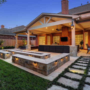
The home had a paver patio with a pergola. They wanted something simple with clean finishes as well as
a Jacuzzi. We removed the old pavers and put down 16 X 24 travertine classic ivory tiles. Tying into the
roof and incorporating the breezeway, we added a 900 SF patio cover. The center section has a vaulted
ceiling and a gable roof. We dropped the Jacuzzi into the ground 2 feet and added composite decking around it.
The fire pit adds a bit of flare to the project – it is 14’6” and has 26 feet of seating around it.
The ceiling finish is hardie that has been painted to match the home with columns and beams that are
also wrapped in hardie and painted with a complementary trim color.
We installed gas lanterns and indirect lighting on the seat wall.
TK IMAGES
 User
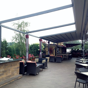
UserThis penthouse awning installation near New York City shows 2,000+ square feet of dining area that is now completely protected by a waterproof retractable enclosure.
The desire was for a penthouse awning that provided protection from the sun, but was also heavy-duty enough to handle inclement weather. The owner wanted to preserve the Al-fresco outdoor dining feel of the rooftop patio, but wanted to be able to hit a button for on-demand protection when needed. This restaurant can now book additional functions, generating more revenue from the penthouse than before the awning was installed - guaranteeing their patrons a protected space.
The Gennius is a retractable pergola awning SPECIFICALLY designed to handle inclement weather. Rainwater is routed downward with the slope of the fabric, and captured within a gutter integrated within the awning's supporting framework. Rainwater then escapes the gutter through the support posts and is diverted away from the entertaining area.
For more information on the Gennius, please visit http://www.pergola-awning.com/Gennius.html
 Garden Nest Residential Landscape
Photo By: Jude Parkinson-Morgan
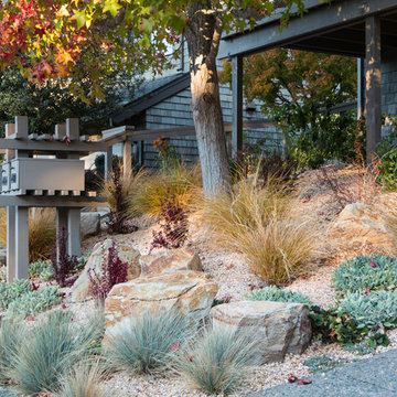
Inspiration for a mid-sized transitional drought-tolerant front yard gravel landscaping in San Francisco.
Inspiration for a mid-sized transitional drought-tolerant front yard gravel landscaping in San Francisco.
 Battle Associates, Architects
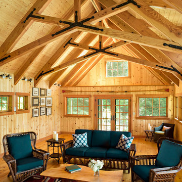
This project is a simple family gathering space next to the lake, with a small screen pavilion at waters edge. The large volume is used for music performances and family events. A seasonal (unheated) space allows us to utilize different windows--tllt in awnings, downward operating single hung windows, all with single glazing.

 Lori Dennis, ASID, LEED AP
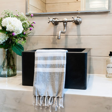
Small cottage beige tile light wood floor powder room photo in Los Angeles with open cabinets, white cabinets, beige walls, a vessel sink, marble countertops and white countertops
 Tom Meaney Architect, AIA
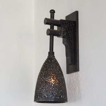
Custom made outdoor iron wall sconce.
Mediterranean white exterior home idea in Santa Barbara
Mediterranean white exterior home idea in Santa Barbara
 Rocky Mountain Homes/Rocky Mountain Log Homes
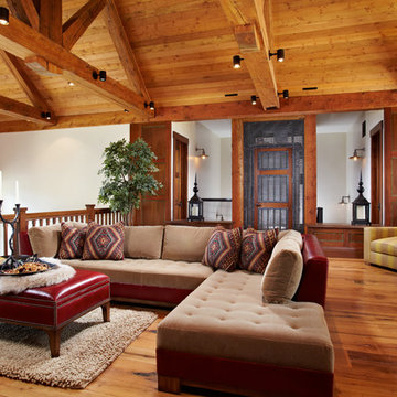
Example of a mountain style living room design in Other
12