
Search results for "Eliminating" in Home Design Ideas
 MAK Design + Build Inc.
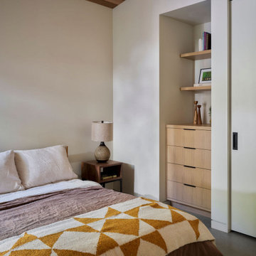
A warm, modern ADU bedroom with a western red cedar ceiling, built-in rift-cut oak drawers and shelving, a cozy bed with geometric textiles, and soft neutral walls. The integrated storage maximizes function while maintaining a clean, uncluttered look.
 Seaside Builders Of Delray Beach, Florida
Kitchen
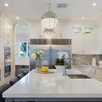
Inspiration for a mid-sized coastal u-shaped medium tone wood floor and brown floor eat-in kitchen remodel with white cabinets, marble countertops, multicolored backsplash, stainless steel appliances, an island, white countertops, a farmhouse sink, shaker cabinets and matchstick tile backsplash
Inspiration for a mid-sized coastal u-shaped medium tone wood floor and brown floor eat-in kitchen remodel with white cabinets, marble countertops, multicolored backsplash, stainless steel appliances, an island, white countertops, a farmhouse sink, shaker cabinets and matchstick tile backsplash
 User
UserDeborah Scannell - Saint Simons Island, GA
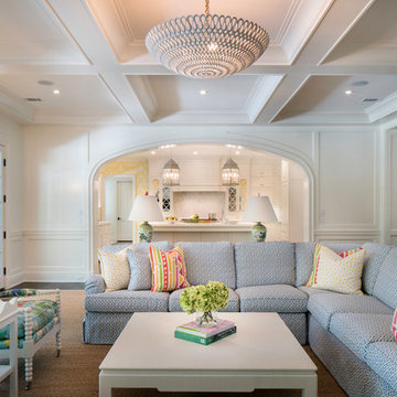
Living room - coastal dark wood floor and brown floor living room idea with white walls
Living room - coastal dark wood floor and brown floor living room idea with white walls
Find the right local pro for your project


 Mark Brand Architecture
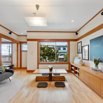
The design of this remodel of a small two-level residence in Noe Valley reflects the owner's passion for Japanese architecture. Having decided to completely gut the interior partitions, we devised a better-arranged floor plan with traditional Japanese features, including a sunken floor pit for dining and a vocabulary of natural wood trim and casework. Vertical grain Douglas Fir takes the place of Hinoki wood traditionally used in Japan. Natural wood flooring, soft green granite and green glass backsplashes in the kitchen further develop the desired Zen aesthetic. A wall to wall window above the sunken bath/shower creates a connection to the outdoors. Privacy is provided through the use of switchable glass, which goes from opaque to clear with a flick of a switch. We used in-floor heating to eliminate the noise associated with forced-air systems.
 Universal Appliance and Kitchen Center
Miele Appliances at Universal Appliance and Kitchen Center
26767 Agoura Road, Calabasas, CA 91302
Phone 818.880.0011 Fax 818.880.0411
12050 Ventura Blvd.,Studio City, CA 91604
Phone 818.755.1111 Fax 818.755.9111
www.uakc.com
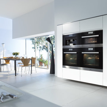
Miele Generation 6000 is bringing design and innovation that exceed expectations. It includes two distinct design styles - PureLine and ContourLine - as well as several color options including Brilliant White and Truffle Brown.
Design for Miele is not simply the exterior. Like the design principle, form follows function; the true beauty of the Generation 6000 series is highlighted by its intuitive user interface, which ensures unsurpassed performance and convenience in the kitchen. With these new color options and the uniform design of the Generation 6000 series, Miele has created a series of appliances that will seamlessly integrate into any kitchen or lifestyle. Whether appliances are installed vertically, horizontally, as a square or in a T-shape configuration, the design is fully resolved.
M Touch – Top-class technology with a special touch
Whether it’s creating a double cappuccino at the touch of a single button, finding the desired MasterChef automatic program on the Combi-Steam Oven in an instant or selecting the operating mode and temperature in just a few simple steps – Miele eliminates the guesswork. All of these operations are easier than ever because of M Touch. Reminiscent of smart phones and tablets, M Touch is an intuitive user interface that allows the user to swipe or scroll through the menu with the tip of a finger. A new high resolution control panel with white TFT (Thin Film Transistor) text brings a brilliant display. And because the interface is universal across all Gen 6000 appliances, the transition from appliance to appliance is easier than ever.
Oven Innovations: Moisture Plus, Gourmet Center and MultiSteam
Developed exclusively for Miele USA, Moisture Plus is a truly unique steam injection system featured in Miele M Touch 30” Convection Ovens. Moisture Plus automatically injects a burst of steam into the oven cavity at pre-determined points during the cooking process. The addition of moisture improves results when proofing dough, gives loaves of bread a crisp crust and glossy finish and makes cuts of meat particularly crisp on the outside and succulent inside.
Also new to the 30” Convection Oven is the addition of MasterChef Plus programs. Ideal for the consummate baker at home, this exclusive new menu system houses 14 automatic bread programs and replicates results seen in artisan bakeries. Included are programs for sourdough, whole grain, rolls and baguettes.
A pioneer in steam oven technology, Generation 6000 Steam and Combi-Steam Ovens are equipped with MultiSteam technology, a revolutionary new steam cooking generation. The addition of six steam inlets in the Steam Oven and eight steam inlets in the Combi-Steam Oven, delivers fast, even steam distribution and incredibly quick heat-up times for even cooking results through a more powerful steam generator.
Long regarded for its ingredient-driven menu, Miele MasterChef programs are now located within the Gourmet Center. Choose from more than 100 easy to use programs for grains, vegetables, meats, fish and poultry. At just the touch of a button, the program will deliver menu options that guide the user step by step - from the desired oven mode to temperature - all resulting in the perfect dish.
Generation 6000 Coffee Systems impress with comfort and innovation
There are several new highlights to the Generation 6000 Whole Bean Coffee System including a new CupSensor, EasyClick Milk System and One Touch for Two features. Exclusive to Miele, the CupSensor automatically adjusts the height of the spout to the optimum position for different cup and glass sizes. Whether a tall latté macchiato or a dainty espresso is being prepared, the central spout automatically adjusts to the cup’s rim and eliminates splashing. The CupSensor even reacts precisely to beverages made with milk by raising the spout slightly to make room for the incoming espresso.
Also new is the EasyClick milk system which is a dishwasher safe glass, milk flask that effortlessly clicks into place at the front of the machine. And for easy maintenance, the new Miele Coffee Systems now automatically rinse all milk spouts and hoses with water after each use.
The One Touch for Two feature allows the user to prepare two coffee specialties such as cappuccino and latté macchiato at the same time, thus reducing prep time when two or more drinks are being served.
Miele Generation 6000 series is distinguished by its elegant design and remarkable innovations to deliver unmatched results that can be seen, touched and tasted. German engineered and tested to last 20 years, Generation 6000 reinforces the Miele Design for Life philosophy and solidifies Miele at the forefront of residential culinary appliances.
 TKS Design Group
Free ebook, Creating the Ideal Kitchen. DOWNLOAD NOW
Having a space for their teenage kids to hang out after school, study and interact with Mom & Dad was at the top of the list for this remodel. The 1928 home, sits in a lovely Glen Ellyn neighborhood, near downtown and near all the action of the local high school and lake. It’s was a great house with great bones but the kitchen was in need of some TLC. The remodel project had been a long time coming, and since both the homeowners work from home, they had been nervous about disrupting their bustling daily schedules to get the project in motion.
Once we had a plan in place, we dug in and got to work. The first step was to remove a non-load bearing wall between the kitchen and dining room. We then reworked the space a bit, eliminating a redundant passage way to the hall, and reworking a closet to allow for a large galley style kitchen and small bar area open to the dining room. The new kitchen has a small peninsula for the family to have casual meals and for the kids to hang out after school. A window was eliminated to give more space for cabinetry and storage, and another window was made larger to allow for a grander view into the backyard.
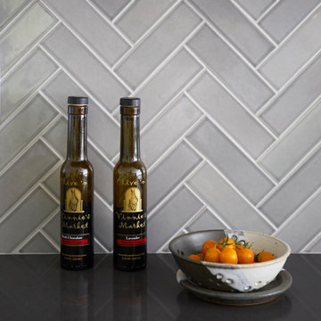
We decided upon a layered approach to this space to provide character appropriate to the older home. White painted cabinetry provides a backdrop for interesting touches such as gray herringbone tile, a reeded farmhouse sink and bronze hardware and lighting. The bar has its own unique look featuring gray cabinetry with a patterned cement tile backsplash and walnut top. A bar fridge, glass cabinets and baskets for tucking away homework give this little multi-functional area loads of character. A miniature mudroom area was also added to the dining room so that the new space can be kept neat and tidy.
The stylish result looks both appropriate to the 1928 home and provides loads of functionality for this active family that can now take advantage of every square inch their home.
Designed by: Susan Klimala, CKD, CBD
Photography by: Michael Alan Kaskel
For more information on kitchen and bath design ideas go to: www.kitchenstudio-ge.com
 Michael Nash Design, Build & Homes
2012 NARI Capital CotY, Finalist Award Winner, Residential Kitchen $50,000 to $100,000
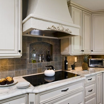
Baby boomers were getting ready to give a facelift to their home. Dragged looking run down kitchen was no match with the rest of their prominent Mclean neighbors.
A big peninsula with a huge overhead hood had blocked off kitchen from breakfast room. Doorways were narrow. A wall of brick chimney style occupied the left wall of this kitchen. “Crowded and disturbing” is how the wife described her kitchen.
Pour traffic flow pattern, lack of storage, and no rhyme or rhythm was how we saw the place.
Course of action started with regrouping all tall elements into a low visibility wall. Eliminate the peninsula, then creating a nice and inviting kitchen with wide pathway by the way of Middle Island.
Eliminate bulkheads, ducts and plumbing inside of them. Re-route the soil stack for upper bathrooms to an adjacent wall.
We relocated stove into the east wall, and build a beautiful wood mantel hood above it. This given this kitchen a practical work triangle. Then brought plumbing for prep. sink into the Island just couple steps away for multi-purpose use.
The north wall now have been occupied with tall pantry, big built in fridge and double oven cabinet .
There were two walls in the breakfast room that had not been used and now e have put them to good use for added storage and butler area and glass front cabinetry to display their valuable china.
Widening all doorways have and putting middle Island have improved the look and traffic pattern for garage into family room a lot more comfortable than it has ever been.
Use of light glazed cabinetry with a contrasting custom Mahogany wood countertop are part of highlight of this project and delivers one of customer’s wishes of bright and clean kitchen.
We have installed exotic mahogany floors to compliment center wood Island. Floors also had created a casual ambiance, especially against the soft lemon chiffon wall paint.
The ultimate French country style kitchen was completed with furnishing the old breakfast area with casual seating rather than a formal table.
This couple was inspired by this massive transformation to carry on the remodeling to other parts of their humbled home.
 TKS Design Group
Download our free ebook, Creating the Ideal Kitchen. DOWNLOAD NOW
Lakefront property in the northwest suburbs of Chicago is hard to come by, so when we were hired by this young family with exactly that, we were immediately inspired by not just the unusually large footprint of this 1950’s colonial revival but also the lovely views of the manmade lake it was sited on. The large 5-bedroom home was solidly stuck in the 1980’s, but we saw tons of potential. We started out by updating the existing staircase with a fresh coat of paint and adding new herringbone slate to the entry hall.
The powder room off the entryway also got a refresh - new flooring, new cabinets and fixtures. We ran the new slate right through into this space for some consistency. A fun wallpaper and shiplap trim add a welcoming feel and set the tone for the home.
Next, we tackled the kitchen. Located away from the rest of the first floor, the kitchen felt a little isolated, so we immediately began planning for how to better connect it to the rest of the first floor. We landed on removing the wall between the kitchen and dining room and designed a modified galley style space with separate cooking and clean up zones. The cooking zone consists of the refrigerator, prep sink and cooktop, along with a nice long run of prep space at the island. The cleanup side of the kitchen consists of the main sink and dishwasher. Both areas are situated so that the user can view the lake during prep work and cleanup!
One of the home’s main puzzles was how to incorporate the mudroom and area in front of the patio doors at the back of the house. We already had a breakfast table area, so the space by the patio doors was a bit of a no man’s land. We decided to separate the kitchen proper from what became the new mudroom with a large set of barn doors. That way you can quickly hide any mudroom messes but have easy access to the light coming in through the patio doors as well as the outdoor grilling station. We also love the impact the barn doors add to the overall space.
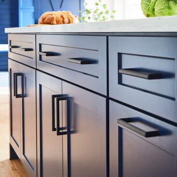
The homeowners’ first words to us were “it’s time to ditch the brown,” so we did! We chose a lovely blue pallet that reflects the home’s location on the lake which is also vibrant yet easy on the eye. Countertops are white quartz, and the natural oak floor works well with the other honey accents. The breakfast table was given a refresh with new chairs, chandelier and window treatments that frame the gorgeous views of the lake out the back.
We coordinated the slate mudroom flooring with that used in the home’s main entrance for a consistent feel. The storage area consists of open and closed storage to allow for some clutter control as needed.
Next on our “to do” list was revamping the dated brown bar area in the neighboring dining room. We eliminated the clutter by adding some closed cabinets and did some easy updates to help the space feel more current. One snag we ran into here was the discovery of a beam above the existing open shelving that had to be modified with a smaller structural beam to allow for our new design to work. This was an unexpected surprise, but in the end we think it was well worth it!
We kept the colors here a bit more muted to blend with the homeowner’s existing furnishings. Open shelving and polished nickel hardware add some simple detail to the new entertainment zone which also looks out onto the lake!
Next we tackled the upstairs starting with the homeowner’s son’s bath. The bath originally had both a tub shower and a separate shower, so we decided to swap out the shower for a new laundry area. This freed up some space downstairs in what used to be the mudroom/laundry room and is much more convenient for daily laundry needs.
We continued the blue palette here with navy cabinetry and the navy tile in the shower. Porcelain floor tile and chrome fixtures keep maintenance to a minimum while matte black mirrors and lighting add some depth the design. A low maintenance runner adds some warmth underfoot and ties the whole space together.
We added a pocket door to the bathroom to minimize interference with the door swings. The left door of the laundry closet is on a 180 degree hinge to allow for easy full access to the machines. Next we tackled the master bath which is an en suite arrangement. The original was typical of the 1980’s with the vanity outside of the bathroom, situated near the master closet. And the brown theme continued here with multiple shades of brown.
Our first move was to segment off the bath and the closet from the master bedroom. We created a short hall from the bedroom to the bathroom with his and hers walk-in closets on the left and right as well as a separate toilet closet outside of the main bathroom for privacy and flexibility.
The original bathroom had a giant soaking tub with steps (dangerous!) as well as a small shower that did not work well for our homeowner who is 6’3”. With other bathtubs in the home, they decided to eliminate the tub and create an oversized shower which takes up the space where the old tub was located. The double vanity is on the opposite wall and a bench is located under the window for morning conversations and a place to set a couple of towels.
The pallet in here is light and airy with a mix of blond wood, creamy porcelain and marble tile, and brass accents. A simple roman shade adds some texture and it’s top-down mechanism allows for light and privacy.
This large whole house remodel gave our homeowners not only the ability to maximize the potential of their home but also created a lovely new frame from which to view their fabulous lake views.
Designed by: Susan Klimala, CKD, CBD
Photography by: Michael Kaskel
For more information on kitchen and bath design ideas go to: www.kitchenstudio-ge.com
 Detailed Designs By Denise
Builder: Kemp Homes
Interior Designer: Kathleen Grim, Srote & Co
Cabinet Design: Detailed Designs by Denise
Cabinet Production: Wright Cabinet Shop
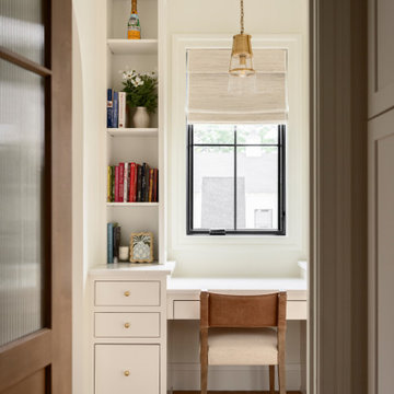
Example of a small transitional built-in desk light wood floor and brown floor home office design in St Louis with white walls
Example of a small transitional built-in desk light wood floor and brown floor home office design in St Louis with white walls
 Jarrett Design
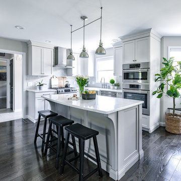
This stylish family of four came to us yearning for added functionality with flair. The couple recently updated other areas of the home on their own quite beautifully, but realized they needed the help of professionals when it came to the kitchen and mudroom. The new kitchen plan enlarged the island with additional seating, eliminated soffits for extra storage and an updated look, and swapped out the desk for a message center with a hidden charging/drop area. A cozy banquette was designed for the eat-in area of the kitchen. Drawers below the bench add storage to this gathering spot.
Aesthetic elements with a soft industrial feel to compliment the new interiors were desired. Beautiful island detailing with tall brackets, panels and base molding in a lovely grey paint in contrast to the white perimeter create a focal point for the space. The homeowner sourced a fun light fixture to top off the island. This along with a stainless chimney hood and appliances add to the overall industrial appeal.
Grey cabinetry in the mudroom flows with the kitchen while adding cubbies and a bench with lockers above. A cabinetry surround for the washer and dryer integrates the built-ins in a space that works hard while looking pretty.

 Metropolis Drafting and Construction Inc
An original 1930’s English Tudor with only 2 bedrooms and 1 bath spanning about 1730 sq.ft. was purchased by a family with 2 amazing young kids, we saw the potential of this property to become a wonderful nest for the family to grow.
The plan was to reach a 2550 sq. ft. home with 4 bedroom and 4 baths spanning over 2 stories.
With continuation of the exiting architectural style of the existing home.
A large 1000sq. ft. addition was constructed at the back portion of the house to include the expended master bedroom and a second-floor guest suite with a large observation balcony overlooking the mountains of Angeles Forest.
An L shape staircase leading to the upstairs creates a moment of modern art with an all white walls and ceilings of this vaulted space act as a picture frame for a tall window facing the northern mountains almost as a live landscape painting that changes throughout the different times of day.
Tall high sloped roof created an amazing, vaulted space in the guest suite with 4 uniquely designed windows extruding out with separate gable roof above.
The downstairs bedroom boasts 9’ ceilings, extremely tall windows to enjoy the greenery of the backyard, vertical wood paneling on the walls add a warmth that is not seen very often in today’s new build.
The master bathroom has a showcase 42sq. walk-in shower with its own private south facing window to illuminate the space with natural morning light. A larger format wood siding was using for the vanity backsplash wall and a private water closet for privacy.
In the interior reconfiguration and remodel portion of the project the area serving as a family room was transformed to an additional bedroom with a private bath, a laundry room and hallway.
The old bathroom was divided with a wall and a pocket door into a powder room the leads to a tub room.
The biggest change was the kitchen area, as befitting to the 1930’s the dining room, kitchen, utility room and laundry room were all compartmentalized and enclosed.
We eliminated all these partitions and walls to create a large open kitchen area that is completely open to the vaulted dining room. This way the natural light the washes the kitchen in the morning and the rays of sun that hit the dining room in the afternoon can be shared by the two areas.
The opening to the living room remained only at 8’ to keep a division of space.

 studio CM
1950s freestanding desk gray floor, exposed beam, vaulted ceiling and wood ceiling home office photo in San Francisco with white walls
 Azy LaBelle Design
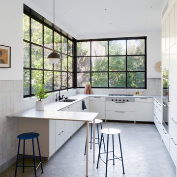
Our overall design concept for the renovation of this space was to optimize the functional space for a family of five and accentuate the existing window. In the renovation, we eliminated a huge centrally located kitchen island which acted as an obstacle to the feeling of the space and focused on creating an elegant and balanced plan promoting movement, simplicity and precisely executed details. We held strong to having the kitchen cabinets, wherever possible, float off the floor to give the subtle impression of lightness avoiding a bottom heavy look. The cabinets were painted a pale tinted green to reduce the empty effect of light flooding a white kitchen leaving a softness and complementing the gray tiles.
To integrate the existing dining room with the kitchen, we simply added some classic dining chairs and a dynamic light fixture, juxtaposing the geometry of the boxy kitchen with organic curves and triangular lights to balance the clean design with an inviting warmth.
 TKS Design Group
Download our free ebook, Creating the Ideal Kitchen. DOWNLOAD NOW
For many, extra time at home during COVID left them wanting more from their homes. Whether you realized the shortcomings of your space or simply wanted to combat boredom, a well-designed and functional home was no longer a want, it became a need. Tina found herself wanting more from her Old Irving Park home and reached out to The Kitchen Studio about adding function to her kitchen to make the most of the available real estate.
At the end of the day, there is nothing better than returning home to a bright and happy space you love. And this kitchen wasn’t that for Tina. Dark and dated, with a palette from the past and features that didn’t make the most of the available square footage, this remodel required vision and a fresh approach to the space. Lead designer, Stephanie Cole’s main design goal was better flow, while adding greater functionality with organized storage, accessible open shelving, and an overall sense of cohesion with the adjoining family room.
The original kitchen featured a large pizza oven, which was rarely used, yet its footprint limited storage space. The nearby pantry had become a catch-all, lacking the organization needed in the home. The initial plan was to keep the pizza oven, but eventually Tina realized she preferred the design possibilities that came from removing this cumbersome feature, with the goal of adding function throughout the upgraded and elevated space. Eliminating the pantry added square footage and length to the kitchen for greater function and more storage. This redesigned space reflects how she lives and uses her home, as well as her love for entertaining.
The kitchen features a classic, clean, and timeless palette. White cabinetry, with brass and bronze finishes, contrasts with rich wood flooring, and lets the large, deep blue island in Woodland’s custom color Harbor – a neutral, yet statement color – draw your eye.
The kitchen was the main priority. In addition to updating and elevating this space, Tina wanted to maximize what her home had to offer. From moving the location of the patio door and eliminating a window to removing an existing closet in the mudroom and the cluttered pantry, the kitchen footprint grew. Once the floorplan was set, it was time to bring cohesion to her home, creating connection between the kitchen and surrounding spaces.
The color palette carries into the mudroom, where we added beautiful new cabinetry, practical bench seating, and accessible hooks, perfect for guests and everyday living. The nearby bar continues the aesthetic, with stunning Carrara marble subway tile, hints of brass and bronze, and a design that further captures the vibe of the kitchen.
Every home has its unique design challenges. But with a fresh perspective and a bit of creativity, there is always a way to give the client exactly what they want [and need]. In this particular kitchen, the existing soffits and high slanted ceilings added a layer of complexity to the lighting layout and upper perimeter cabinets.
While a space needs to look good, it also needs to function well. This meant making the most of the height of the room and accounting for the varied ceiling features, while also giving Tina everything she wanted and more. Pendants and task lighting paired with an abundance of natural light amplify the bright aesthetic. The cabinetry layout and design compliments the soffits with subtle profile details that bring everything together. The tile selections add visual interest, drawing the eye to the focal area above the range. Glass-doored cabinets further customize the space and give the illusion of even more height within the room.
While her family may be grown and out of the house, Tina was focused on adding function without sacrificing a stunning aesthetic and dreamy finishes that make the kitchen the gathering place of any home. It was time to love her kitchen again, and if you’re wondering what she loves most, it’s the niche with glass door cabinetry and open shelving for display paired with the marble mosaic backsplash over the range and complimenting hood. Each of these features is a stunning point of interest within the kitchen – both brag-worthy additions to a perimeter layout that previously felt limited and lacking.
Whether your remodel is the result of special needs in your home or simply the excitement of focusing your energy on creating a fun new aesthetic, we are here for it. We love a good challenge because there is always a way to make a space better – adding function and beauty simultaneously.
 Harwood Design Builders Ltd.
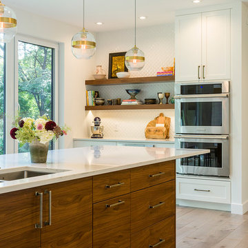
A riverfront property is a desirable piece of property duet to its proximity to a waterway and parklike setting. The value in this renovation to the customer was creating a home that allowed for maximum appreciation of the outside environment and integrating the outside with the inside, and this design achieved this goal completely.
To eliminate the fishbowl effect and sight-lines from the street the kitchen was strategically designed with a higher counter top space, wall areas were added and sinks and appliances were intentional placement. Open shelving in the kitchen and wine display area in the dining room was incorporated to display customer's pottery. Seating on two sides of the island maximize river views and conversation potential. Overall kitchen/dining/great room layout designed for parties, etc. - lots of gathering spots for people to hang out without cluttering the work triangle.
Eliminating walls in the ensuite provided a larger footprint for the area allowing for the freestanding tub and larger walk-in closet. Hardwoods, wood cabinets and the light grey colour pallet were carried through the entire home to integrate the space.
 Harwood Design Builders Ltd.
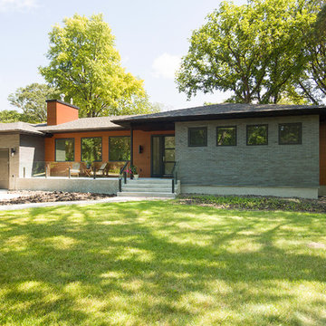
A riverfront property is a desirable piece of property duet to its proximity to a waterway and parklike setting. The value in this renovation to the customer was creating a home that allowed for maximum appreciation of the outside environment and integrating the outside with the inside, and this design achieved this goal completely.
To eliminate the fishbowl effect and sight-lines from the street the kitchen was strategically designed with a higher counter top space, wall areas were added and sinks and appliances were intentional placement. Open shelving in the kitchen and wine display area in the dining room was incorporated to display customer's pottery. Seating on two sides of the island maximize river views and conversation potential. Overall kitchen/dining/great room layout designed for parties, etc. - lots of gathering spots for people to hang out without cluttering the work triangle.
Eliminating walls in the ensuite provided a larger footprint for the area allowing for the freestanding tub and larger walk-in closet. Hardwoods, wood cabinets and the light grey colour pallet were carried through the entire home to integrate the space.
 Harwood Design Builders Ltd.
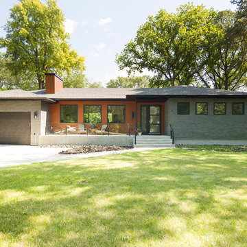
A riverfront property is a desirable piece of property duet to its proximity to a waterway and parklike setting. The value in this renovation to the customer was creating a home that allowed for maximum appreciation of the outside environment and integrating the outside with the inside, and this design achieved this goal completely.
To eliminate the fishbowl effect and sight-lines from the street the kitchen was strategically designed with a higher counter top space, wall areas were added and sinks and appliances were intentional placement. Open shelving in the kitchen and wine display area in the dining room was incorporated to display customer's pottery. Seating on two sides of the island maximize river views and conversation potential. Overall kitchen/dining/great room layout designed for parties, etc. - lots of gathering spots for people to hang out without cluttering the work triangle.
Eliminating walls in the ensuite provided a larger footprint for the area allowing for the freestanding tub and larger walk-in closet. Hardwoods, wood cabinets and the light grey colour pallet were carried through the entire home to integrate the space.
35