
Search results for "Eliminating" in Home Design Ideas
 User
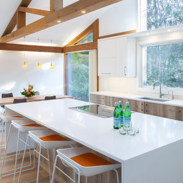
UserThe team at TruKitchens managed this main-level remodel from start to finish. The family always loved the bones and interesting details of this home, but the finishes and functionality in the kitchen were begging for an update. The new layout of the space eliminates the refrigerator wall, moving the appliance to a new location nearer the sink, and opens the space into the dining area. The large hood is removed from the middle of the space and replaced by a BEST downdraft ventilator to accompany the new Thermador induction cooktop. The oven is now relocated on the wall between the living room and kitchen. This same wall now features pass-through shelving that creates a bar space accessible from the living room and kitchen.
Finish selections center around creating a clean, modern look and lightening up the space. The Mode slab door style from Grabill Cabinets in their Lioher Zenit Supermatte Blanco finish and Nature Plus Nadir finish is used throughout the space. Crisp white quartz countertops and backsplash keep the space light and bright. Paneled appliances help streamline the entire design.
 329 Design
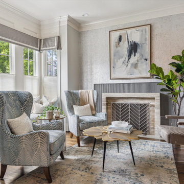
Living room - small transitional formal medium tone wood floor, brown floor and wallpaper living room idea in Houston with gray walls, a standard fireplace, a stone fireplace and no tv

Find the right local pro for your project
 BRENT SILVER CONSTRUCTION
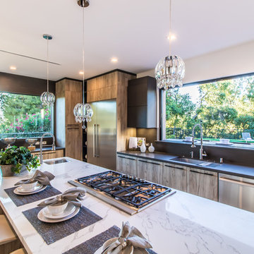
Trendy l-shaped kitchen photo in Los Angeles with an undermount sink, flat-panel cabinets, medium tone wood cabinets, stainless steel appliances, an island and white countertops
 42 North | DESIGN…at your doorstep®
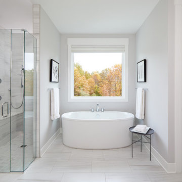
Freestanding bathtub - transitional master gray tile and porcelain tile porcelain tile and white floor freestanding bathtub idea in Grand Rapids with white walls and a hinged shower door
 TKS Design Group
Free ebook, Creating the Ideal Kitchen. DOWNLOAD NOW
Having a space for their teenage kids to hang out after school, study and interact with Mom & Dad was at the top of the list for this remodel. The 1928 home, sits in a lovely Glen Ellyn neighborhood, near downtown and near all the action of the local high school and lake. It’s was a great house with great bones but the kitchen was in need of some TLC. The remodel project had been a long time coming, and since both the homeowners work from home, they had been nervous about disrupting their bustling daily schedules to get the project in motion.
Once we had a plan in place, we dug in and got to work. The first step was to remove a non-load bearing wall between the kitchen and dining room. We then reworked the space a bit, eliminating a redundant passage way to the hall, and reworking a closet to allow for a large galley style kitchen and small bar area open to the dining room. The new kitchen has a small peninsula for the family to have casual meals and for the kids to hang out after school. A window was eliminated to give more space for cabinetry and storage, and another window was made larger to allow for a grander view into the backyard.
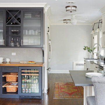
We decided upon a layered approach to this space to provide character appropriate to the older home. White painted cabinetry provides a backdrop for interesting touches such as gray herringbone tile, a reeded farmhouse sink and bronze hardware and lighting. The bar has its own unique look featuring gray cabinetry with a patterned cement tile backsplash and walnut top. A bar fridge, glass cabinets and baskets for tucking away homework give this little multi-functional area loads of character. A miniature mudroom area was also added to the dining room so that the new space can be kept neat and tidy.
The stylish result looks both appropriate to the 1928 home and provides loads of functionality for this active family that can now take advantage of every square inch their home.
Designed by: Susan Klimala, CKD, CBD
Photography by: Michael Alan Kaskel
For more information on kitchen and bath design ideas go to: www.kitchenstudio-ge.com
 Charter Custom Homes
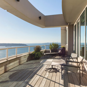
This deck was completely transformed by eliminating the built-in planter boxes. A new waterproof deck coating was applied followed by wood sleepers with 1x6 ipe deck boards topping the deck off. Boards were left to gray naturally.
Evan Parker
 Choeff Levy Fischman, P.A.
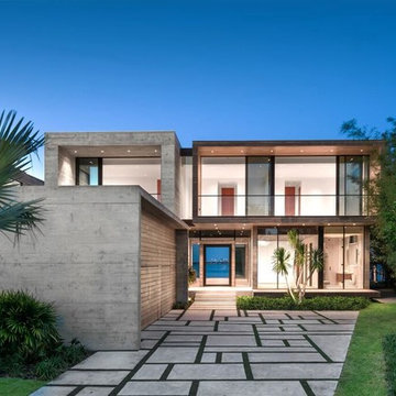
The architects incorporated a rare post-tension structural system into the residence, which eliminated the use of structural beams, and allowed for maximized ceiling heights on both floors and unobstructed views of the water.
 MAD Architecture
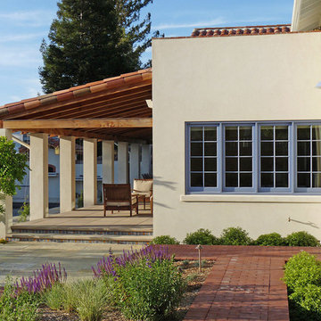
Great outdoor space surrounds this mission style residential design with stone hardscapes and a large pool.
Tuscan beige two-story exterior home photo in San Francisco
Tuscan beige two-story exterior home photo in San Francisco
 TKS Design Group
Free ebook, Creating the Ideal Kitchen. DOWNLOAD NOW
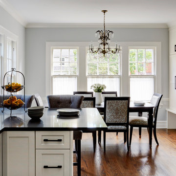
Having a space for their teenage kids to hang out after school, study and interact with Mom & Dad was at the top of the list for this remodel. The 1928 home, sits in a lovely Glen Ellyn neighborhood, near downtown and near all the action of the local high school and lake. It’s was a great house with great bones but the kitchen was in need of some TLC. The remodel project had been a long time coming, and since both the homeowners work from home, they had been nervous about disrupting their bustling daily schedules to get the project in motion.
Once we had a plan in place, we dug in and got to work. The first step was to remove a non-load bearing wall between the kitchen and dining room. We then reworked the space a bit, eliminating a redundant passage way to the hall, and reworking a closet to allow for a large galley style kitchen and small bar area open to the dining room. The new kitchen has a small peninsula for the family to have casual meals and for the kids to hang out after school. A window was eliminated to give more space for cabinetry and storage, and another window was made larger to allow for a grander view into the backyard.
We decided upon a layered approach to this space to provide character appropriate to the older home. White painted cabinetry provides a backdrop for interesting touches such as gray herringbone tile, a reeded farmhouse sink and bronze hardware and lighting. The bar has its own unique look featuring gray cabinetry with a patterned cement tile backsplash and walnut top. A bar fridge, glass cabinets and baskets for tucking away homework give this little multi-functional area loads of character. A miniature mudroom area was also added to the dining room so that the new space can be kept neat and tidy.
The stylish result looks both appropriate to the 1928 home and provides loads of functionality for this active family that can now take advantage of every square inch their home.
Designed by: Susan Klimala, CKD, CBD
Photography by: Michael Alan Kaskel
For more information on kitchen and bath design ideas go to: www.kitchenstudio-ge.com
 TKS Design Group
Download our free ebook, Creating the Ideal Kitchen. DOWNLOAD NOW
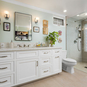
This homeowner’s daughter originally contacted us on behalf of her parents who were reluctant to begin the remodeling process in their home due to the inconvenience and dust. Once we met and they dipped their toes into the process, we were off to the races. The existing bathroom in this beautiful historical 1920’s home, had not been updated since the 70’/80’s as evidenced by the blue carpeting, mirrored walls and dropped ceilings. In addition, there was very little storage, and some health setbacks had made the bathroom difficult to maneuver with its tub shower.
Once we demoed, we discovered everything we expected to find in a home that had not been updated for many years. We got to work bringing all the electrical and plumbing up to code, and it was just as dusty and dirty as the homeowner’s anticipated! Once the space was demoed, we got to work building our new plan. We eliminated the existing tub and created a large walk-in curb-less shower.
An existing closet was eliminated and in its place, we planned a custom built in with spots for linens, jewelry and general storage. Because of the small space, we had to be very creative with the shower footprint, so we clipped one of the walls for more clearance behind the sink. The bathroom features a beautiful custom mosaic floor tile as well as tiled walls throughout the space. This required lots of coordination between the carpenter and tile setter to make sure that the framing and tile design were all properly aligned. We worked around an existing radiator and a unique original leaded window that was architecturally significant to the façade of the home. We had a lot of extra depth behind the original toilet location, so we built the wall out a bit, moved the toilet forward and then created some extra storage space behind the commode. We settled on mirrored mullioned doors to bounce lots of light around the smaller space.
We also went back and forth on deciding between a single and double vanity, and in the end decided the single vanity allowed for more counter space, more storage below and for the design to breath a bit in the smaller space. I’m so happy with this decision! To build on the luxurious feel of the space, we added a heated towel bar and heated flooring.
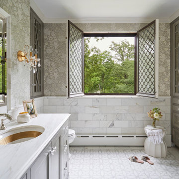
One of the concerns the homeowners had was having a comfortable floor to walk on. They realized that carpet was not a very practical solution but liked the comfort it had provided. Heated floors are the perfect solution. The room is decidedly traditional from its intricate mosaic marble floor to the calacutta marble clad walls. Elegant gold chandelier style fixtures, marble countertops and Morris & Co. beaded wallpaper provide an opulent feel to the space.
The gray monochromatic pallet keeps it feeling fresh and up-to-date. The beautiful leaded glass window is an important architectural feature at the front of the house. In the summertime, the homeowners love having the window open for fresh air and ventilation. We love it too!
The curb-less shower features a small fold down bench that can be used if needed and folded up when not. The shower also features a custom niche for storing shampoo and other hair products. The linear drain is built into the tilework and is barely visible. A frameless glass door that swings both in and out completes the luxurious feel.
Designed by: Susan Klimala, CKD, CBD
Photography by: Michael Kaskel
For more information on kitchen and bath design ideas go to: www.kitchenstudio-ge.com
 Everything Home
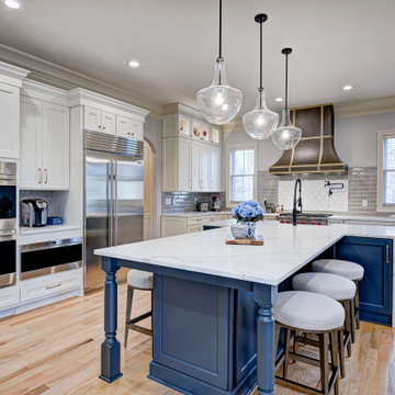
In this gorgeous Carmel residence, the primary objective for the great room was to achieve a more luminous and airy ambiance by eliminating the prevalent brown tones and refinishing the floors to a natural shade.
The kitchen underwent a stunning transformation, featuring white cabinets with stylish navy accents. The overly intricate hood was replaced with a striking two-tone metal hood, complemented by a marble backsplash that created an enchanting focal point. The two islands were redesigned to incorporate a new shape, offering ample seating to accommodate their large family.
In the butler's pantry, floating wood shelves were installed to add visual interest, along with a beverage refrigerator. The kitchen nook was transformed into a cozy booth-like atmosphere, with an upholstered bench set against beautiful wainscoting as a backdrop. An oval table was introduced to add a touch of softness.
To maintain a cohesive design throughout the home, the living room carried the blue and wood accents, incorporating them into the choice of fabrics, tiles, and shelving. The hall bath, foyer, and dining room were all refreshed to create a seamless flow and harmonious transition between each space.
---Project completed by Wendy Langston's Everything Home interior design firm, which serves Carmel, Zionsville, Fishers, Westfield, Noblesville, and Indianapolis.
For more about Everything Home, see here: https://everythinghomedesigns.com/
To learn more about this project, see here:
https://everythinghomedesigns.com/portfolio/carmel-indiana-home-redesign-remodeling
 TKS Design Group
Download our free ebook, Creating the Ideal Kitchen. DOWNLOAD NOW
This homeowner’s daughter originally contacted us on behalf of her parents who were reluctant to begin the remodeling process in their home due to the inconvenience and dust. Once we met and they dipped their toes into the process, we were off to the races. The existing bathroom in this beautiful historical 1920’s home, had not been updated since the 70’/80’s as evidenced by the blue carpeting, mirrored walls and dropped ceilings. In addition, there was very little storage, and some health setbacks had made the bathroom difficult to maneuver with its tub shower.
Once we demoed, we discovered everything we expected to find in a home that had not been updated for many years. We got to work bringing all the electrical and plumbing up to code, and it was just as dusty and dirty as the homeowner’s anticipated! Once the space was demoed, we got to work building our new plan. We eliminated the existing tub and created a large walk-in curb-less shower.
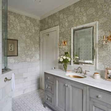
An existing closet was eliminated and in its place, we planned a custom built in with spots for linens, jewelry and general storage. Because of the small space, we had to be very creative with the shower footprint, so we clipped one of the walls for more clearance behind the sink. The bathroom features a beautiful custom mosaic floor tile as well as tiled walls throughout the space. This required lots of coordination between the carpenter and tile setter to make sure that the framing and tile design were all properly aligned. We worked around an existing radiator and a unique original leaded window that was architecturally significant to the façade of the home. We had a lot of extra depth behind the original toilet location, so we built the wall out a bit, moved the toilet forward and then created some extra storage space behind the commode. We settled on mirrored mullioned doors to bounce lots of light around the smaller space.
We also went back and forth on deciding between a single and double vanity, and in the end decided the single vanity allowed for more counter space, more storage below and for the design to breath a bit in the smaller space. I’m so happy with this decision! To build on the luxurious feel of the space, we added a heated towel bar and heated flooring.
One of the concerns the homeowners had was having a comfortable floor to walk on. They realized that carpet was not a very practical solution but liked the comfort it had provided. Heated floors are the perfect solution. The room is decidedly traditional from its intricate mosaic marble floor to the calacutta marble clad walls. Elegant gold chandelier style fixtures, marble countertops and Morris & Co. beaded wallpaper provide an opulent feel to the space.
The gray monochromatic pallet keeps it feeling fresh and up-to-date. The beautiful leaded glass window is an important architectural feature at the front of the house. In the summertime, the homeowners love having the window open for fresh air and ventilation. We love it too!
The curb-less shower features a small fold down bench that can be used if needed and folded up when not. The shower also features a custom niche for storing shampoo and other hair products. The linear drain is built into the tilework and is barely visible. A frameless glass door that swings both in and out completes the luxurious feel.
Designed by: Susan Klimala, CKD, CBD
Photography by: Michael Kaskel
For more information on kitchen and bath design ideas go to: www.kitchenstudio-ge.com

 TKS Design Group
Download our free ebook, Creating the Ideal Kitchen. DOWNLOAD NOW
The homeowners built their traditional Colonial style home 17 years’ ago. It was in great shape but needed some updating. Over the years, their taste had drifted into a more contemporary realm, and they wanted our help to bridge the gap between traditional and modern.
We decided the layout of the kitchen worked well in the space and the cabinets were in good shape, so we opted to do a refresh with the kitchen. The original kitchen had blond maple cabinets and granite countertops. This was also a great opportunity to make some updates to the functionality that they were hoping to accomplish.
After re-finishing all the first floor wood floors with a gray stain, which helped to remove some of the red tones from the red oak, we painted the cabinetry Benjamin Moore “Repose Gray” a very soft light gray. The new countertops are hardworking quartz, and the waterfall countertop to the left of the sink gives a bit of the contemporary flavor.
We reworked the refrigerator wall to create more pantry storage and eliminated the double oven in favor of a single oven and a steam oven. The existing cooktop was replaced with a new range paired with a Venetian plaster hood above. The glossy finish from the hood is echoed in the pendant lights. A touch of gold in the lighting and hardware adds some contrast to the gray and white. A theme we repeated down to the smallest detail illustrated by the Jason Wu faucet by Brizo with its similar touches of white and gold (the arrival of which we eagerly awaited for months due to ripples in the supply chain – but worth it!).
The original breakfast room was pleasant enough with its windows looking into the backyard. Now with its colorful window treatments, new blue chairs and sculptural light fixture, this space flows seamlessly into the kitchen and gives more of a punch to the space.
The original butler’s pantry was functional but was also starting to show its age. The new space was inspired by a wallpaper selection that our client had set aside as a possibility for a future project. It worked perfectly with our pallet and gave a fun eclectic vibe to this functional space. We eliminated some upper cabinets in favor of open shelving and painted the cabinetry in a high gloss finish, added a beautiful quartzite countertop and some statement lighting. The new room is anything but cookie cutter.
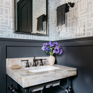
Next the mudroom. You can see a peek of the mudroom across the way from the butler’s pantry which got a facelift with new paint, tile floor, lighting and hardware. Simple updates but a dramatic change! The first floor powder room got the glam treatment with its own update of wainscoting, wallpaper, console sink, fixtures and artwork. A great little introduction to what’s to come in the rest of the home.
The whole first floor now flows together in a cohesive pallet of green and blue, reflects the homeowner’s desire for a more modern aesthetic, and feels like a thoughtful and intentional evolution. Our clients were wonderful to work with! Their style meshed perfectly with our brand aesthetic which created the opportunity for wonderful things to happen. We know they will enjoy their remodel for many years to come!
Photography by Margaret Rajic Photography
 Polhemus Savery DaSilva
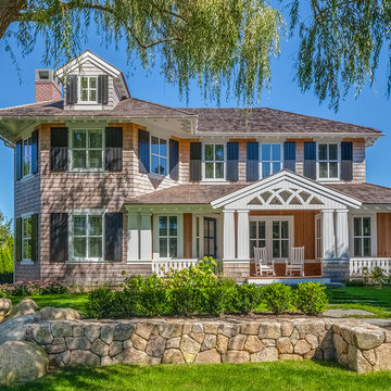
Custom coastal home on Cape Cod by Polhemus Savery DaSilva Architects Builders.
Scope Of Work: Architecture, Construction //
Photography: Brian Vanden Brink // exterior shingle style, landscape & rock wall.
 Amanda Martocchio Architecture
When a world class sailing champion approached us to design a Newport home for his family, with lodging for his sailing crew, we set out to create a clean, light-filled modern home that would integrate with the natural surroundings of the waterfront property, and respect the character of the historic district.
Our approach was to make the marine landscape an integral feature throughout the home. One hundred eighty degree views of the ocean from the top floors are the result of the pinwheel massing. The home is designed as an extension of the curvilinear approach to the property through the woods and reflects the gentle undulating waterline of the adjacent saltwater marsh. Floodplain regulations dictated that the primary occupied spaces be located significantly above grade; accordingly, we designed the first and second floors on a stone “plinth” above a walk-out basement with ample storage for sailing equipment. The curved stone base slopes to grade and houses the shallow entry stair, while the same stone clads the interior’s vertical core to the roof, along which the wood, glass and stainless steel stair ascends to the upper level.
One critical programmatic requirement was enough sleeping space for the sailing crew, and informal party spaces for the end of race-day gatherings. The private master suite is situated on one side of the public central volume, giving the homeowners views of approaching visitors. A “bedroom bar,” designed to accommodate a full house of guests, emerges from the other side of the central volume, and serves as a backdrop for the infinity pool and the cove beyond.
Also essential to the design process was ecological sensitivity and stewardship. The wetlands of the adjacent saltwater marsh were designed to be restored; an extensive geo-thermal heating and cooling system was implemented; low carbon footprint materials and permeable surfaces were used where possible. Native and non-invasive plant species were utilized in the landscape. The abundance of windows and glass railings maximize views of the landscape, and, in deference to the adjacent bird sanctuary, bird-friendly glazing was used throughout.
Photo: Michael Moran/OTTO Photography
 JRP Design & Remodel
Our client had been living in her beautiful lakeside retreat for about 3 years. All around were stunning views of the lake and mountains, but the view from inside was minimal. It felt dark and closed off from the gorgeous waterfront mere feet away. She desired a bigger kitchen, natural light, and a contemporary look. Referred to JRP by a subcontractor our client walked into the showroom one day, took one look at the modern kitchen in our design center, and was inspired!
After talking about the frustrations of dark spaces and limitations when entertaining groups of friends, the homeowner and the JRP design team emerged with a new vision. Two walls between the living room and kitchen would be eliminated and structural revisions were needed for a common wall shared a wall with a neighbor. With the wall removals and the addition of multiple slider doors, the main level now has an open layout.
Everything in the home went from dark to luminous as sunlight could now bounce off white walls to illuminate both spaces. Our aim was to create a beautiful modern kitchen which fused the necessities of a functional space with the elegant form of the contemporary aesthetic. The kitchen playfully mixes frameless white upper with horizontal grain oak lower cabinets and a fun diagonal white tile backsplash. Gorgeous grey Cambria quartz with white veining meets them both in the middle. The large island with integrated barstool area makes it functional and a great entertaining space.
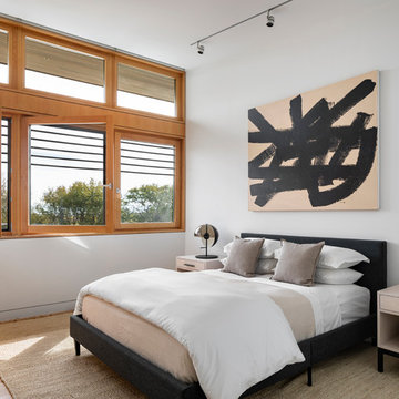
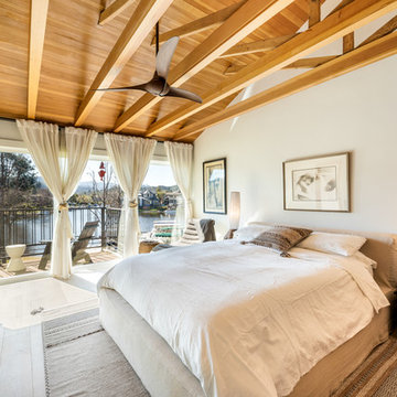
The master bedroom received a mini facelift as well. White never fails to give your bedroom a timeless look. The beautiful, bright marble shower shows what's possible when mixing tile shape, size, and color. The marble mosaic tiles in the shower pan are especially bold paired with black matte plumbing fixtures and gives the shower a striking visual.
Layers, light, consistent intention, and fun! - paired with beautiful, unique designs and a personal touch created this beautiful home that does not go unnoticed.
PROJECT DETAILS:
• Style: Contemporary
• Colors: Neutrals
• Countertops: Cambria Quartz, Luxury Series, Queen Anne
• Kitchen Cabinets: Slab, Overlay Frameless
Uppers: Blanco
Base: Horizontal Grain Oak
• Hardware/Plumbing Fixture Finish: Kitchen – Stainless Steel
• Lighting Fixtures:
• Flooring:
Hardwood: Siberian Oak with Fossil Stone finish
• Tile/Backsplash:
Kitchen Backsplash: White/Clear Glass
Master Bath Floor: Ann Sacks Benton Mosaics Marble
Master Bath Surround: Ann Sacks White Thassos Marble
Photographer: Andrew – Open House VC
 Stone Standard
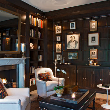
 The client provided a unique collection of framed images of Napoleon Bonaparte which were collected over several decades. The images are hung on a custom gallery rail system designed. Holes were drilled through the stems of Visual Comfort picture lights to allow the gallery rods to pass through the lights. This allowed centering of the picture lights to each rod. The bookcase lights are from the same series but they were modified to accept a one inch diameter custom rosette. The cabinet hardware, as with all of the metal finishes in the room, is polished nickel and includes Baldwin flush ring pulls, Von Morris mortise butt hinges and Brusso ball catches.
The beveled mirror and frame above the hearth is actually a Seura television mirror with Premier Glass. The television is completely undetectable when it is off and, when it is on, the picture is clear and bright. Undetectable behind the mirror is a Russound IR receiver that transfers IR signals to a cable box, DVD player, and Apple TV receiver located in the lower cabinets. The source components are connected to the television with HDMI cables. Bose wall-mounted speakers, positioned in the lower alcoves of the bookcase, are supplemented with a Sonos subwoofer placed under the sofa.
Surrounding the mantle and mirror is a three inch wide frame, identical to the frame around the gallery wall, that allows the Chesney's Edinburgh Carrara marble mantle and the steel Andover register grate to be set back from the bookcases. The mantle rests securely on a hearth stone of honed black granite which was recessed into the concrete floor. Suspended within the grate is an EcoSmart Bioethonal burner specifically designed for historic register grates. Volcanic stone was placed between the burner and the grate to conceal the front of the burner.
The bookcases, cabinets and wall paneling are fabricated from a combination of solid mahogany and mahogany plywood. Crown and base molding were eliminated from the design to minimize the impact of the library in an otherwise contemporary house. The fascia above the bookcases and mantle, as well as the fascia above the gallery wall, are single pieces of solid mahogany carefully shaved to follow the irregular contours of the drywall ceiling and eliminate the need for caulk or fillers. The same method was employed at the bottom rail of the face frame to allow it to follow the slight undulations of the concrete floor. Eloy Estrada built the wood components and installed them along with all of the other components in the room.
The two adjustable height Galerie des Lamps floor lamps on either side of the mantle are from the Grasshopper series. The Visual Comfort Dorchester Pharmacy floor lamps, on either side of the sofa, plug into a recessed Lew electrical floor box that was recessd into the floor under the sofa. The room originally had a chandelier and recessed lights all of which were all removed. The Lutron light switches, in matte Midnight, allow for independent dimming of the bookcase and picture lights. Within three of the bookcase alcoves are Littlight gooseneck lamps used to highlight various artifacts. The outlets for these lamps, and their transformers, are concealed under a removable wood panel at the back of the alcove. The cords for the display lamps cleanly pass through a Mockett grommet.
The layout of the room and gallery rail system were designed by Leland Stone.
 Distinctive Design + Build + Remodel
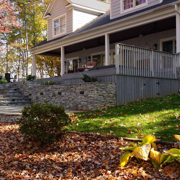
An expansive deck with built-in hot tub overlooks Lake Norman. Fiberon deck boards are a low-maintenance answer for people who want to spend more time relaxing on their deck than scraping and painting or staining it.
36