
Search results for "Eliminating" in Home Design Ideas
 TKS Design Group
Free ebook, Creating the Ideal Kitchen. DOWNLOAD NOW
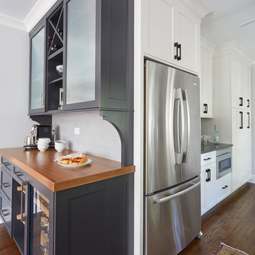
Having a space for their teenage kids to hang out after school, study and interact with Mom & Dad was at the top of the list for this remodel. The 1928 home, sits in a lovely Glen Ellyn neighborhood, near downtown and near all the action of the local high school and lake. It’s was a great house with great bones but the kitchen was in need of some TLC. The remodel project had been a long time coming, and since both the homeowners work from home, they had been nervous about disrupting their bustling daily schedules to get the project in motion.
Once we had a plan in place, we dug in and got to work. The first step was to remove a non-load bearing wall between the kitchen and dining room. We then reworked the space a bit, eliminating a redundant passage way to the hall, and reworking a closet to allow for a large galley style kitchen and small bar area open to the dining room. The new kitchen has a small peninsula for the family to have casual meals and for the kids to hang out after school. A window was eliminated to give more space for cabinetry and storage, and another window was made larger to allow for a grander view into the backyard.
We decided upon a layered approach to this space to provide character appropriate to the older home. White painted cabinetry provides a backdrop for interesting touches such as gray herringbone tile, a reeded farmhouse sink and bronze hardware and lighting. The bar has its own unique look featuring gray cabinetry with a patterned cement tile backsplash and walnut top. A bar fridge, glass cabinets and baskets for tucking away homework give this little multi-functional area loads of character. A miniature mudroom area was also added to the dining room so that the new space can be kept neat and tidy.
The stylish result looks both appropriate to the 1928 home and provides loads of functionality for this active family that can now take advantage of every square inch their home.
Designed by: Susan Klimala, CKD, CBD
Photography by: Michael Alan Kaskel
For more information on kitchen and bath design ideas go to: www.kitchenstudio-ge.com
 Echo Systems
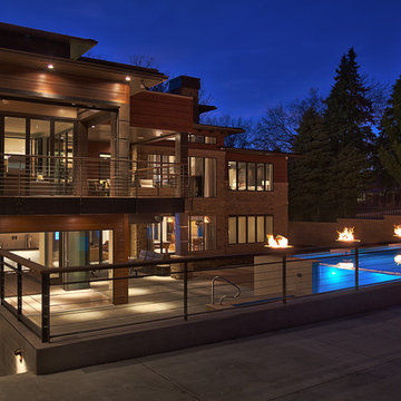
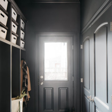
Outdoor lighting that automatically rises slowly at dusk and lighting that illuminates your way through the mud hall and into the kitchen when the garage door opens eliminates driving or walking into dark areas.
Lighting controls can easily duplicate the appearance of occupancy in your home while you are away or eliminate a large bank of light switches with a single lighting keypad that controls a large area . . . we are experts in this field.
 TVL Creative Ltd.
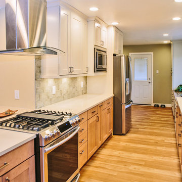
This remodel took an extremely dark & dated kitchen and transformed it into a bright and airy happy place for our client. The existing conditions created a dark, hall-like kitchen that greatly lacked in function and did little to optimize storage. Realizing the potential of this truly massive space, we created a design that utilizes every inch of the kitchen and creates functional cooking and prep space as well as pantry storage and work nooks. Our first order of business was to demo out the blocky corner that separated the kitchen from the living room. This involved removing an existing fireplace, re-structuring a wall, and having an entirely new furnace installed in the basement to eliminate a duct running right through the corner we hoped to eliminate. After opening up the space, we focused on highlighting and brightening the room. New NuCore flooring was installed to give the kitchen a fresh look while offering optimal function and cleanability. Two-toned cabinets in a honey maple and painted silk were used to create a warm and comfortable balance throughout the space. New quartz countertops in MSI's canvas were installed, and butcher block was installed on the two desk areas to offer a warm visual relief and casual work surface. The color palette for the kitchen is reminiscent of a cozy apothecary; we utilized fresh greens with Sherwin Williams paint on the walls and Treviso Gray Sage glazed subway tiles on the backsplash. Over the sink, we designed a playful highlight with counter-to-ceiling mini brick mosaic in a dark crackle green. We introduced additional lighting throughout including new recessed lights, over-sink light, and under-cabinet lights. New appliances were introduced to the space as well, and we complimented the stainless steel of these fixtures to the transitional nickel hardware on the cabinets. This space now feels open and inviting, and is visible from the second you enter the front door! We are so proud of this result and so happy that our clients can enjoy this gorgeous kitchen for years to come.
Find the right local pro for your project
 DreamMaker Bath & Kitchen Springfield
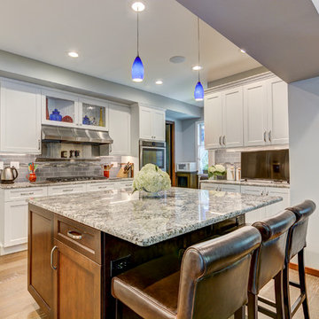
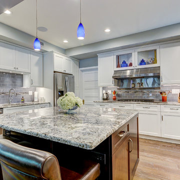
As the third generation to own and live in this beautiful home, these homeowners were ready to not only brighten up this kitchen with white cabinets and fresh materials, they were ready to create an open concept kitchen opening up to the large family room addition that had been added years ago.
The existing floor plan boasted 5 walkthrough doorways (one of which was to a bathroom) plus a pantry closet door all in about a 222 square foot kitchen. Taking out the center wall eliminates two doorways and altering the entrance to a half bath to now open to back foyer to home eliminates another (and just makes a whole lot more sense!).
Natural light now flows into the hub of the home and many can gather around the large island, 64” x 68”. The beautiful hood was cleaned and reused as it truly is a focal point. Aesthetically, the white cabinetry, gray subway tile backsplash, and washed hickory wood flooring create a classic and functional kitchen that accentuates the beauty of this 90 year old home.
Existing doors in the home are re-purposed with barn style hardware to stylishly create the new entrance to the half bathroom.
 TKS Design Group
Download our free ebook, Creating the Ideal Kitchen. DOWNLOAD NOW
The homeowners built their traditional Colonial style home 17 years’ ago. It was in great shape but needed some updating. Over the years, their taste had drifted into a more contemporary realm, and they wanted our help to bridge the gap between traditional and modern.
We decided the layout of the kitchen worked well in the space and the cabinets were in good shape, so we opted to do a refresh with the kitchen. The original kitchen had blond maple cabinets and granite countertops. This was also a great opportunity to make some updates to the functionality that they were hoping to accomplish.
After re-finishing all the first floor wood floors with a gray stain, which helped to remove some of the red tones from the red oak, we painted the cabinetry Benjamin Moore “Repose Gray” a very soft light gray. The new countertops are hardworking quartz, and the waterfall countertop to the left of the sink gives a bit of the contemporary flavor.
We reworked the refrigerator wall to create more pantry storage and eliminated the double oven in favor of a single oven and a steam oven. The existing cooktop was replaced with a new range paired with a Venetian plaster hood above. The glossy finish from the hood is echoed in the pendant lights. A touch of gold in the lighting and hardware adds some contrast to the gray and white. A theme we repeated down to the smallest detail illustrated by the Jason Wu faucet by Brizo with its similar touches of white and gold (the arrival of which we eagerly awaited for months due to ripples in the supply chain – but worth it!).
The original breakfast room was pleasant enough with its windows looking into the backyard. Now with its colorful window treatments, new blue chairs and sculptural light fixture, this space flows seamlessly into the kitchen and gives more of a punch to the space.
The original butler’s pantry was functional but was also starting to show its age. The new space was inspired by a wallpaper selection that our client had set aside as a possibility for a future project. It worked perfectly with our pallet and gave a fun eclectic vibe to this functional space. We eliminated some upper cabinets in favor of open shelving and painted the cabinetry in a high gloss finish, added a beautiful quartzite countertop and some statement lighting. The new room is anything but cookie cutter.
Next the mudroom. You can see a peek of the mudroom across the way from the butler’s pantry which got a facelift with new paint, tile floor, lighting and hardware. Simple updates but a dramatic change! The first floor powder room got the glam treatment with its own update of wainscoting, wallpaper, console sink, fixtures and artwork. A great little introduction to what’s to come in the rest of the home.
The whole first floor now flows together in a cohesive pallet of green and blue, reflects the homeowner’s desire for a more modern aesthetic, and feels like a thoughtful and intentional evolution. Our clients were wonderful to work with! Their style meshed perfectly with our brand aesthetic which created the opportunity for wonderful things to happen. We know they will enjoy their remodel for many years to come!
Photography by Margaret Rajic Photography
 DreamMaker Bath & Kitchen Springfield
As the third generation to own and live in this beautiful home, these homeowners were ready to not only brighten up this kitchen with white cabinets and fresh materials, they were ready to create an open concept kitchen opening up to the large family room addition that had been added years ago.
The existing floor plan boasted 5 walkthrough doorways (one of which was to a bathroom) plus a pantry closet door all in about a 222 square foot kitchen. Taking out the center wall eliminates two doorways and altering the entrance to a half bath to now open to back foyer to home eliminates another (and just makes a whole lot more sense!).
Natural light now flows into the hub of the home and many can gather around the large island, 64” x 68”. The beautiful hood was cleaned and reused as it truly is a focal point. Aesthetically, the white cabinetry, gray subway tile backsplash, and washed hickory wood flooring create a classic and functional kitchen that accentuates the beauty of this 90 year old home.
Existing doors in the home are re-purposed with barn style hardware to stylishly create the new entrance to the half bathroom.
 Alair Homes - Salt Lake
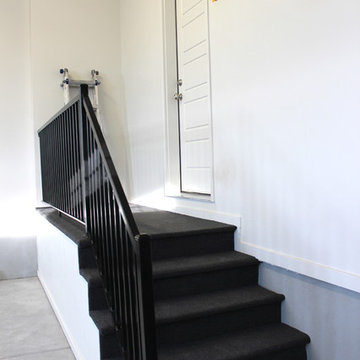
Inspiration for a large timeless attached three-car staircase remodel in Salt Lake City
 Gallery KBNY
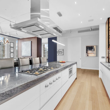
Located in the Sky Lofts building in Tribeca (once home to the most expensive apartment sale in NYC), our clients were ready to renovate and modernize their centerpiece kitchen. Due to the unique nature of loft renovations (high ceilings, columns, creative and skillful lighting applications, among other factors), Gallery’s expertise in loft spaces was vital to our clients. In addition to the loft particularities, it’s important in a kitchen of this size to ensure that all the elements have been laid out with purpose from a functional perspective and a design perspective.
CENTERPIECE KITCHEN
Color was an important design element in this kitchen. This is evident in the striking blues and grays of the marble countertops and backsplash, as well as the dark navy hue of the built-in cabinets. White lower cabinets create two-tone contrast, while glass cabinets and a long wood open shelf make the most of the available height.
The built-in cabinets also include built-in appliances: an espresso maker, coffee machine, two side-by-side wine fridges, and even an integrated refrigerator paneled to match the cabinetry for an essentially seamless look. The cabinets are all push-to-open, eliminating knobs to complete the overall sleek, contemporary style.
The marble backsplash is also book-matched, meaning the slabs of stone have been cut and polished to match each other, creating a mirroring effect that further contributes to the cohesive, contemporary aesthetic of this apartment.
BUILDING CONSIDERATIONS
Functional factors are another vital component to New York City apartment building renovations. In this particular project, we had to consider how to get large slabs of stone into the loft without having to cut them up. When working with slabs, and especially when the design is as sleek and contemporary as this one, it’s vital to eliminate seams as much as possible. Elevators and stairs are often not large enough to handle large slabs of stone, which means there are only two other options: cutting the stone and putting it back together on site (but this will create a seam, so it’s not always an option) or using a crane to bring it in through a window.
Higher-end buildings tend to have more restrictions and management companies with stricter renovation guidelines – with good reason. A good relationship with the super and staff of the building is absolutely essential; effective communication with everyone involved will result in an ideal outcome for all parties.
ARTFUL LOGISTICS
Seemingly minor elements such as apartment protections are also just as crucial. While every renovation will require protections in hallways, common spaces, zip walls, and perhaps the floors, those protections are doubled when renovating in an apartment that’s currently occupied. In the case of this particular client, who owned a great deal of valuable artwork in addition to their furniture and other belongings, Gallery exacted their own form of art when putting the protections in place and maneuvering around them with skill.
SOME HIGHLIGHTS
- Unique marble slabs (Azul Macauba quartzite and Calacatta Diamond quartzite) for the countertops and backsplash
- Book-matched backsplash
- Gaggenau appliances
- Glass cabinets with built-in lighting
- Custom millwork for the cabinets
 Sketches, An Interior View LLC
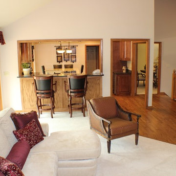
This mature home needed updating so we opened the wall allowing for a pass through and eliminated the dinette area.
The footprint was reworked putting the sink in the corner to view out the window as well as the great room. The kitchen table was eliminated and eating was incorporated into the island.
 EA Home Design
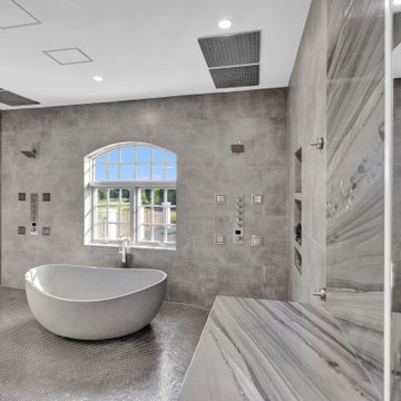
We are thrilled to unveil our latest bathroom remodeling project, a seamless blend of modern design and functional elegance. Here's a glimpse into the transformation:
1. Contemporary Palette: The choice of a grey color tile sets a sophisticated and neutral backdrop, allowing the features of the bathroom to shine. This hue not only exudes a sense of calm but also complements the contemporary design elements we've incorporated.
2. Warmth Underfoot: One of the standout features of this remodel is the heated flooring that runs under all the tiled areas. This luxurious addition ensures that even on the coldest mornings, your feet are greeted with a warm embrace, elevating the comfort level of the bathroom.
3. Enhanced Layout: Recognizing the need for more convenience, we repositioned the shower and introduced a second toilet room. This not only maximizes the use of space but also ensures that the bathroom can cater to multiple users without any hassle.
4. Dual Shower Spaces: By eliminating two angles in the bathroom's corner, we've carved out space for two distinct shower areas. This design choice not only adds a touch of luxury but also offers a versatile bathing experience tailored to individual preferences.
5. Wet Room Wonder: The shower and tub area now reside within a waterproof wet room. This innovative design ensures that water stays where it's supposed to, eliminating the need for a curb and offering a sleek, uninterrupted flow to the space.
6. Floating Vanities: Our floating vanities are more than just a design statement. They create an illusion of space, making the bathroom appear larger and more open. Paired with a stunning stone backsplash, they offer a perfect blend of style and functionality.
7. Illuminated Elegance: The mirrors, with their integrated lights, are the pièce de résistance. They not only enhance the aesthetic appeal of the bathroom but also ensure optimal lighting, making daily grooming tasks a breeze.
This bathroom remodel is a testament to our commitment to marrying design with functionality. Every element, from the choice of tiles to the heated floors, has been thoughtfully chosen to create a space that is not just visually appealing but also supremely functional and comfortable. We invite you to step in and experience this modern oasis for yourself.
 Schweitzer Design & Build, Inc.
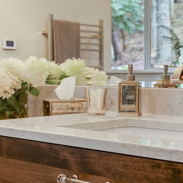
Our clients came to us seeking our design expertise to help them re-work their bathroom and create a spa-like oasis. By removing a wall with vanity in the middle of the room, the fiberglass shower and walls, and eliminating the oversize tub deck we were able to work with a large open space and create the bathroom of our clients’ dreams.
Originally, there was a wall with a single vanity behind it when you first walked into the bathroom which really closed off the space and made it feel quite small. By eliminating the wall and single vanity, fiberglass shower, and built-in bathtub, we were able to enlarge the water closet 2 ½’ and create an open, airy bathroom.
We designed a curbless shower so our clients can age-in-place and always have accessibility into their shower. A long shower bench was added to provide a comfortable spot to sit and enjoy the shower. At the end of the open shower space was the perfect spot to put the freestanding bathtub with easy access from either end of the bathtub. Large windows allow the shower or bath user to enjoy the gorgeous views of nature right outside the window.
A double vanity was installed with a seating area for doing make-up and hair. Toe kick lighting was added to provide soft lighting for the nighttime trips to the bathroom with a built-in motion sensor so no need to try and find light switches in the dark. This toe kick lighting can also be used during relaxing, bubbly soaks in the tub to provide a nice soft light to relax in. Gorgeous pendant fixtures over the vanity provide lovely light and have dimmer switches for times when you do not need full lighting.
Heated tile flooring throughout the bathroom, along with a heat lamp with fan, and towel warmer will leave the clients feeling so warm and cozy after a relaxing shower or long soak they may never want to leave their bathroom.
 Elite Kitchen & Bath/Express Contracting
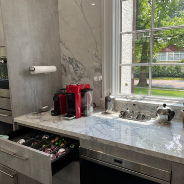
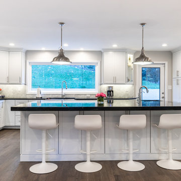
In an older home in Great Neck, we opened up a wall between the small kitchen and a storage room and eliminated a powder room to enlarge the kitchen/dining concept. To enlarge the kitchen and allow backyard views, we flipped the kitchen to the back of the house, found a space to move the powder room and eliminated the small room.
The client chose an Italian industrial look cement textured door style. We brightened the look with high gloss white upper cabinets. Two new attractive large windows let in natural light and gave them views of their yard. They wanted a quartz counter that looked like marble. Since quartz doesn’t offer this style, we chose a marble look porcelain which is stunning!
Additional cabinetry, pantry and island increased their storage. Two sinks and additional counter space made it functional for two. The work flow of the kitchen was easy and open. All materials are easy to clean.
The eat-in kitchen maximized the dining away ambiance. To satisfy their culinary desires, we added a spice drawer and cabinet. The coffee bar has a drawer for easy access. The island faucet includes sparkling water. Since they love grilled food all year round, we recommended a range top with a grill and high-powered vented hood. The full-size wine fridge makes it easy to store wine conveniently. The built-in steam oven allowed them to cook small meals with high efficiency.
 Michael Nash Design, Build & Homes
This 1980’s colonial home in the heart of McLean, VA is home to a busy family of four who had been searching for ideas in Houzz for a long time.
The previous kitchen was a dungeon-like maze, small and dark, front dining room was outdated, the powder room and pantry wrapped around a stack of duct pipes.
After meeting with our design staff, we came up with plenty of recommendations which they loved.
Our expert team set out to, eliminate the powder room from the middle of the kitchen and relocate to far end of a dead space in family room, eliminate closet and stack of second floor ducts, widen doorway to foyer with structural beam, widen window above sink to allow more daylight, relocate the back door to allow more cabinet space to the right of the sink, take down a major cinder block and brick wall separating family room from kitchen, inserting steel beam and steel post opening the entire kitchen to family room and adding floor space to kitchen.
We implemented a large Island with dark black contrasting stain in the middle of kitchen space. Island includes a bar, sink, microwave and beverage center built in.
Our designers suggested a polished marble backsplash with a chevron pattern behind the stove to make the kitchen stand taller.
Clever use of various lighting sources and contrasting cabinet colors off set the unique three-inch thick soapstone island countertop.
Complete with large-scale appliances, such as 48-inch steam oven, 48-inch tower fridge/freezer and others, we completely updated this 1980’s kitchen.
 Covermade Bedding
Covermade Easy Bed Making Comforters
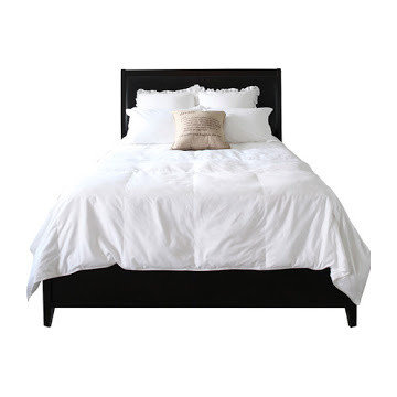
Easily keep your bed made single everyday, and eliminate cover-stealing at night! Covermade down and down alternative comforters are designed to be the perfect all-season weight, you’ll sleep in ultimate comfort with this breathable, silky smooth and 100% cotton fabric.
Comforter Description
• Luxury Down or Down Alternative Fill
• Patented COVERMADE® Ultra-Stretch Elastic System Keeps Comforter in Place
• Silky 300 Thread Count
• 100% Cotton Fabric with Sateen Finish
• Finished & Filled in the USA
• Baffle Box construction helps keep fill from shifting and eliminates cold spots
• Machine washable
See "Easy Bed Making" in action in this short demo video! Copy and paste the link below into your browser:
https://www.youtube.com/watch?v=yGkbfdqUJ04
 EA Home Design
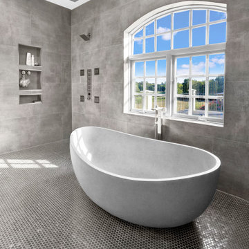
We are thrilled to unveil our latest bathroom remodeling project, a seamless blend of modern design and functional elegance. Here's a glimpse into the transformation:
1. Contemporary Palette: The choice of a grey color tile sets a sophisticated and neutral backdrop, allowing the features of the bathroom to shine. This hue not only exudes a sense of calm but also complements the contemporary design elements we've incorporated.
2. Warmth Underfoot: One of the standout features of this remodel is the heated flooring that runs under all the tiled areas. This luxurious addition ensures that even on the coldest mornings, your feet are greeted with a warm embrace, elevating the comfort level of the bathroom.
3. Enhanced Layout: Recognizing the need for more convenience, we repositioned the shower and introduced a second toilet room. This not only maximizes the use of space but also ensures that the bathroom can cater to multiple users without any hassle.
4. Dual Shower Spaces: By eliminating two angles in the bathroom's corner, we've carved out space for two distinct shower areas. This design choice not only adds a touch of luxury but also offers a versatile bathing experience tailored to individual preferences.
5. Wet Room Wonder: The shower and tub area now reside within a waterproof wet room. This innovative design ensures that water stays where it's supposed to, eliminating the need for a curb and offering a sleek, uninterrupted flow to the space.
6. Floating Vanities: Our floating vanities are more than just a design statement. They create an illusion of space, making the bathroom appear larger and more open. Paired with a stunning stone backsplash, they offer a perfect blend of style and functionality.
7. Illuminated Elegance: The mirrors, with their integrated lights, are the pièce de résistance. They not only enhance the aesthetic appeal of the bathroom but also ensure optimal lighting, making daily grooming tasks a breeze.
This bathroom remodel is a testament to our commitment to marrying design with functionality. Every element, from the choice of tiles to the heated floors, has been thoughtfully chosen to create a space that is not just visually appealing but also supremely functional and comfortable. We invite you to step in and experience this modern oasis for yourself.
 TVL Creative Ltd.
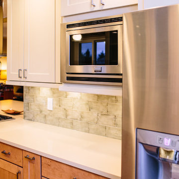
This remodel took an extremely dark & dated kitchen and transformed it into a bright and airy happy place for our client. The existing conditions created a dark, hall-like kitchen that greatly lacked in function and did little to optimize storage. Realizing the potential of this truly massive space, we created a design that utilizes every inch of the kitchen and creates functional cooking and prep space as well as pantry storage and work nooks. Our first order of business was to demo out the blocky corner that separated the kitchen from the living room. This involved removing an existing fireplace, re-structuring a wall, and having an entirely new furnace installed in the basement to eliminate a duct running right through the corner we hoped to eliminate. After opening up the space, we focused on highlighting and brightening the room. New NuCore flooring was installed to give the kitchen a fresh look while offering optimal function and cleanability. Two-toned cabinets in a honey maple and painted silk were used to create a warm and comfortable balance throughout the space. New quartz countertops in MSI's canvas were installed, and butcher block was installed on the two desk areas to offer a warm visual relief and casual work surface. The color palette for the kitchen is reminiscent of a cozy apothecary; we utilized fresh greens with Sherwin Williams paint on the walls and Treviso Gray Sage glazed subway tiles on the backsplash. Over the sink, we designed a playful highlight with counter-to-ceiling mini brick mosaic in a dark crackle green. We introduced additional lighting throughout including new recessed lights, over-sink light, and under-cabinet lights. New appliances were introduced to the space as well, and we complimented the stainless steel of these fixtures to the transitional nickel hardware on the cabinets. This space now feels open and inviting, and is visible from the second you enter the front door! We are so proud of this result and so happy that our clients can enjoy this gorgeous kitchen for years to come.
 User
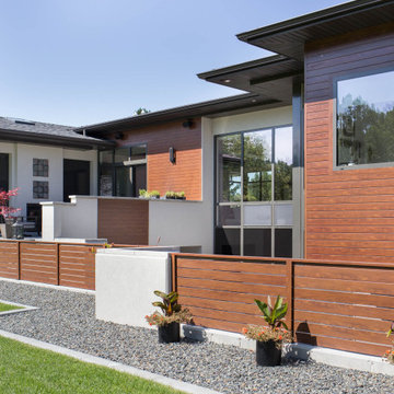
UserThe open space plan on the main level of the Prairie Style home is deceiving of the actual separation of spaces. This home packs a punch with a private hot tub, craft room, library, and even a theater. The interior of the home features the same attention to place, as the natural world is evident in the use of granite, basalt, walnut, poplar, and natural river rock throughout. Floor to ceiling windows in strategic locations eliminates the sense of compression on the interior, while the overall window design promotes natural daylighting and cross-ventilation in nearly every space of the home.
Glo’s A5 Series in double pane was selected for the high performance values and clean, minimal frame profiles. High performance spacers, double pane glass, multiple air seals, and a larger continuous thermal break combine to reduce convection and eliminate condensation, ultimately providing energy efficiency and thermal performance unheard of in traditional aluminum windows. The A5 Series provides smooth operation and long-lasting durability without sacrificing style for this Prairie Style home.
 The Vrindavan Project
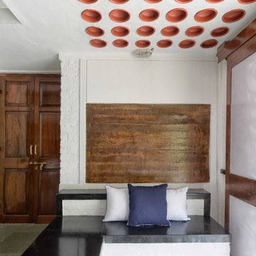
Inspiration for a large farmhouse open concept marble floor living room remodel in Mumbai with multicolored walls
 Harwood Design Builders Ltd.
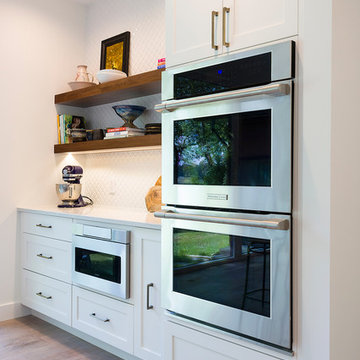
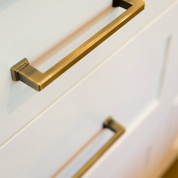
A riverfront property is a desirable piece of property duet to its proximity to a waterway and parklike setting. The value in this renovation to the customer was creating a home that allowed for maximum appreciation of the outside environment and integrating the outside with the inside, and this design achieved this goal completely.
To eliminate the fishbowl effect and sight-lines from the street the kitchen was strategically designed with a higher counter top space, wall areas were added and sinks and appliances were intentional placement. Open shelving in the kitchen and wine display area in the dining room was incorporated to display customer's pottery. Seating on two sides of the island maximize river views and conversation potential. Overall kitchen/dining/great room layout designed for parties, etc. - lots of gathering spots for people to hang out without cluttering the work triangle.
Eliminating walls in the ensuite provided a larger footprint for the area allowing for the freestanding tub and larger walk-in closet. Hardwoods, wood cabinets and the light grey colour pallet were carried through the entire home to integrate the space.
 Harwood Design Builders Ltd.
A riverfront property is a desirable piece of property duet to its proximity to a waterway and parklike setting. The value in this renovation to the customer was creating a home that allowed for maximum appreciation of the outside environment and integrating the outside with the inside, and this design achieved this goal completely.
To eliminate the fishbowl effect and sight-lines from the street the kitchen was strategically designed with a higher counter top space, wall areas were added and sinks and appliances were intentional placement. Open shelving in the kitchen and wine display area in the dining room was incorporated to display customer's pottery. Seating on two sides of the island maximize river views and conversation potential. Overall kitchen/dining/great room layout designed for parties, etc. - lots of gathering spots for people to hang out without cluttering the work triangle.
Eliminating walls in the ensuite provided a larger footprint for the area allowing for the freestanding tub and larger walk-in closet. Hardwoods, wood cabinets and the light grey colour pallet were carried through the entire home to integrate the space.
44