
Search results for "Enhances problem solving" in Home Design Ideas
 Drury Design
The Setup
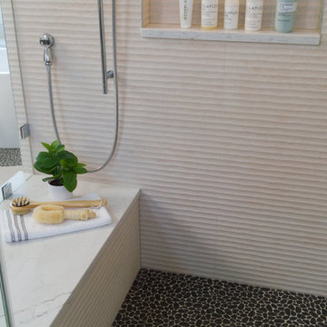
For this primary bathroom project, the homeowners wanted to transform their large, T-shaped bathroom into a functional, multi-purpose sanctuary. The existing layout was inefficient, with a bulky built-in tub, a closed-off shower, and an awkward footprint that limited practical use.
This remodel also presented a unique challenge – the homeowners wanted to use the space for workouts as well. The design needed to maximize the large open area in the middle of the T, providing enough room for yoga and light free-weight exercises while maintaining the bathroom’s aesthetic and functionality.
Design objectives:
Expand and brighten the shower area without major layout changes
Replace the oversized built-in tub with a sleek freestanding alternative
Create a flexible space for workouts while maintaining the bathroom’s design integrity
Address cold flooring with added comfort solutions
Enhance lighting for both beauty and functionality
Incorporate storage for workout equipment and everyday essentials
Integrate natural elements to accommodate the homeowners’ love of plants
The Remodel
Design challenges to be solved:
Shower Expansion – The homeowners want a more open, spa-like shower but don’t want to dramatically alter the footprint.
Workout Integration – Balancing fitness functionality with a serene bathroom design will require creative layout adjustments.
Storage Solutions – With workout gear to stow away, the space needs discrete and versatile storage options.
Lighting – Enhancing both natural and artificial lighting to brighten the large space.
Cold Floors – Positioned above the garage, the bathroom tends to feel colder than the adjacent primary bedroom. A solution is needed to add warmth and comfort during use, without the need to reconfigure the home’s overall heating system.
The Renewed Space
Design solutions:
Spa-Like Shower Expansion – Removing a wall and replacing it with glass transformed the shower into an open, airy retreat, allowing natural light to flow freely through the space. A curved black river rock floor and neutral linear wall tiles add warmth and texture, while carefully placed niche lighting enhances the tranquil, luxurious atmosphere.
Workout-Friendly Layout – A custom full-length mirror was strategically placed to accommodate multiple uses, creating a fitness studio-like experience for yoga or light weight training. The mirror’s size and positioning allow for clear visibility during workouts, while also enhancing the room by adding light and a greater sense of depth.
Custom Storage Solutions – A custom cabinet with a wood top was crafted to discreetly store workout equipment, preserving the clean, open feel of the space. Its design not only enhances functionality but also creates a sense of symmetry, bringing visual balance and cohesion to the overall layout.
Enhanced Lighting – Replacing the shower wall with glass, installing a full-length mirror, and incorporating vanity mirrors with built-in lighting dramatically brighten the space. LED strip lighting under the cabinets, along the tub half wall, and in both the side and shower niches adds layered illumination, enhancing both function and ambiance.
Heated Floors – Installing heated flooring provides consistent warmth and comfort year-round, enhancing the space for both workouts and daily routines. A European-style towel warmer brings additional warmth and a touch of luxury, elevating the overall experience.
Final Thoughts:
This transformed bathroom blends luxury with intentional design. By addressing the homeowners’ needs – from workout flexibility to spa-inspired details – the space now serves multiple purposes without compromise. The warm cabinetry, black accents and thoughtful lighting tie the design together, while the curved textures and plant-friendly ledge add a personalized touch. This bathroom is now a bright, welcoming sanctuary for daily routines and mindful moments.
 Dynamic Garage Door
Not all garage doors are created equal. Dynamic Garage Doors are custom designed for each individual project. Our full custom design and manufacturing abilities allow us to create unique custom garage doors that naturally blend into each home's authentic architectural style.
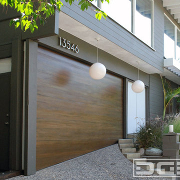
This Mid Century style carport was converted into a fully functional garage but presented a problem when it came time to retrofit it with a custom wood garage door. Since the ground was pitched at a sloping angle it required the need of a custom designed asymmetrical garage door that would compensate for the huge gap at the bottom of the garage door opening. Taking careful measurements was of essence to handcraft a garage door that would fit perfectly into the awkwardly shaped garage opening. Once everything was calculated to perfection our designers came up with a minimalistic Mid Century style garage door design that would complement the home's architectural elements. The answer was a fine-lined garage door design with horizontal tongue and groove slats in solid mahogany that were carefully stained to simulate and match the home's existing ipe wood accents. We opted for ipe-stained mahogany in lieu of real ipe to save the client on the custom garage door cost while still delivering a garage door that will last a lifetime and look like a naturally blended architectural element of the home.
Enclosing the carport and adding a Dynamic Garage Door re-purposed and graduated a simple carport to a fully functional garage with a working automatic garage door. Investing in a custom garage door for this sloping carport will prove to return the investment at time of resale. Not to mention, of course, the curb appeal enhancement it gave the home.
 Baron's Major Brands
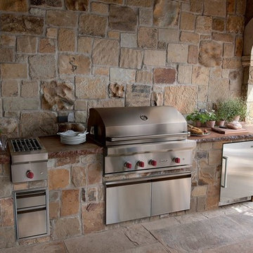
Wolf outdoor grills solve the problem of imprecise heat control that can make grilling such a hit-or-miss proposition. Sear steaks and chops, grill fruit, even smoke trout or bacon – you can do it all with confidence.
Sculpted in double-wall stainless steel and heli-arc welded for seamless strength, Wolf outdoor grills are engineered and tested to perform beautifully for decades.
Find the right local pro for your project
 Studio Dearborn
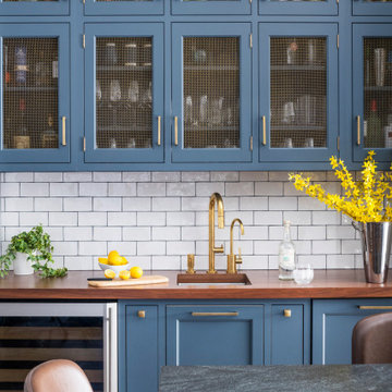
Designer Sarah Robertson of Studio Dearborn helped a neighbor and friend to update a “builder grade” kitchen into a personal, family space that feels luxurious and inviting.
The homeowner wanted to solve a number of storage and flow problems in the kitchen, including a wasted area dedicated to a desk, too-little pantry storage, and her wish for a kitchen bar. The all white builder kitchen lacked character, and the client wanted to inject color, texture and personality into the kitchen while keeping it classic.
 Dream Home Construction
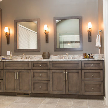
Our client contacted us regarding their outdated bathroom. They could not handle
taking a shower in their “TOMB” shower anymore. They wanted to update their
bathroom giving it a streamlined look with a traditional touch.
Our client’s desires were:
• Wanted a large open shower
• Wanted a larger master closet
• Wanted a better way of excising the wall cabinet by the vanity
• They wanted to remove their Jacuzzi tub
After coming up with a design that satisfied the customer’s needs, we started the demo
process and ran into the first obstacle. Because of the construction of the original
closed shower, there was no moisture barrier used which caused the existing framing
and exterior sheathing to decay. We were also startled by what look like an expanding
black cloud of carpenter ants, when we opened up the wall.
After making the necessary repairs, we continued with the remodel which consisted of a
dramatic large shower, the large subway design, granite shelving along with the bronze
accent tile that enhances the over all look of the show er. It also gave it a larger
appearance with the custom glass enclose. Another concern we had after relocating the
shower to its new location, was that it was under an existing skylight. We felt that there
maybe a moisture concern especially during the winter months. To over come this
obstacle we installed an exhaust fan near the ceiling in the w all above the shower. We
painted the exhaust fan grill the same color of the walls, so the fan would not stand out.
To make sure that there would not be any problem with condensation around the
skylight , we trimmed the skylight with azek material.
We installed custom cabinets that reflected the look the client was trying to achieve.
During this process we over came our last obstacle by installing bi-fold style doors on
the wall cabinet next to the vanity, which would swing completely out of the way so the
customer could have full access to the slide drawers. The handles were placed on the
doors to make it look like a regular two door wall cabinet. The bi-fold action also
allowanced it to clear a wall sconce.
 SV Design
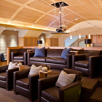
A desire for a more modern and zen-like environment in a historical, turn of the century stone and stucco house was the drive and challenge for this sophisticated Siemasko + Verbridge Interiors project. Along with a fresh color palette, new furniture is woven with antiques, books, and artwork to enliven the space. Carefully selected finishes enhance the openness of the glass pool structure, without competing with the grand ocean views. Thoughtfully designed cabinetry and family friendly furnishings, including a kitchenette, billiard area, and home theater, were designed for both kids and adults.
 Gelotte Architecture
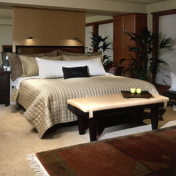
• Before - 2,300 square feet
• After – 3,800 square feet
• Remodel of a 1930’s vacation cabin on a steep, lakeside lot
• Asian-influenced Arts and Crafts style architecture compliments the owner’s art and furniture collection
• A harmonious design blending stained wood, rich stone and natural fibers
• The creation of an upper floor solved access problems while adding space for a grand entry, office and media room
• The new staircase, with its Japanese tansu-style cabinet and widened lower sculpture display steps, forms a partitioning wall for the two-story library
 Advance Design Studio, Ltd.
After six years of living in their Huntley IL home, Chris and Meghan were tired of their dark, dingy, outdated kitchen and it was finally time for a long-anticipated change. “The kitchen is the place where we live, it’s where we do everything,” Meghan said. “It was important that it be a space where we wanted to be.” Meghan loves cooking and enjoys including their girls in healthy meal prepping, this led them to want a brighter, more enjoyable kitchen with increased functionality and improved storage.
For Chris especially, the laundry room was an entirely dysfunctional eyesore. “We had a washer and a dryer, but it was all kind-of cobbled together!” Chris said. “There were always laundry piles everywhere, we weren’t really sure what we wanted to do in there, but it was time for us to make a change.” The mess of the space was stressful every time they walked in the door from the garage each day. Kids’ backpacks and shoes piled up haphazardly in the makeshift boot-bench closet left the family feeling disorganized and stressed. They needed space for folding clothes and locker cubbies to help keep the family organized.
Having known Christine and Todd in the Huntley community for years, Chris and Meghan were familiar with their work. “We already trusted them personally and having seen their projects for years we knew they did top notch work. After we reviewed the initial round of designs, we knew that hiring them was definitely the right choice,” Meghan and Chris said. Although Chris had done a lot of work in their home himself, the kitchen and laundry room renovation was such a large undertaking that he didn’t want to steal time away from his family to spend what would surely be many long weekends doing the job himself. “That would not have been a wise choice for us,” Chris laughed.
“Our designer, Michelle was very, very, easy to work with; anything we wanted to see or weren’t sure about, she went above and beyond to make this easy for us. She was easy to get hold of and always quick to respond,” the couple said. Michelle pulled ideas that mirrored the couple’s taste and style and was adept at directing the couple to limited choices that didn’t overwhelm them and kept the process moving. “I have a hard time making decisions. Michelle made the decision-making process so easy. I loved how she listened to what I liked and then presented three great options for me to choose from,” Meghan said.
The main objectives for the kitchen were better storage solutions, they wanted the space to reflect their lifestyle and taste, and they wanted it to last for years with low maintenance. One of the first steps in creating a more functional kitchen was relocating the refrigerator, creating an improved workflow for the busy family.
“We didn’t know that we could even move the refrigerator to a new location where it is now, that was something that we never would have thought of,” Chris said. “The new refrigerator location makes the kitchen feel so much bigger. We didn’t add any space, but our whole kitchen with the new design just seems like it’s so much larger than before!” Meghan said.
The perimeter mist colored cabinets helped warm and brighten the entire room, while the graphite colored cabinets on the island added contrast. Using this fresh, clean color palette satisfied the couple’s desire for a bright space that was the exact opposite of what they had before. Organization accessories were also added to the cabinets such as a spice drawer tray and roll outs to create hidden convenience.
“I absolutely love the hidden spices – it makes cooking so much more enjoyable!” Chris said. “And all the pull outs, and the double trash bin, who would think you could get so excited about organization!” the couple said in unison.
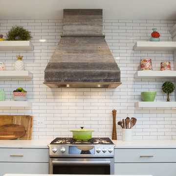
One thing they hated in their original kitchen was how dark the space felt. Added lighting on the ceiling with the new light fixtures combined with the lighter cabinetry colors throughout solved this problem. “Our new kitchen has this warm, almost cozy feeling that our old kitchen never had, it’s just a space that I love spending my time in now,” Meghan said. The light airy feeling was accentuated with the use of floating white shelves on either side of the decorative range hood. “We have so much cabinetry space, the new design is amazing we actually have more storage space than we will ever need,” Meghan said.
The island was extended to create more work surface and added space for stool seating. “The new island changes how we live. Now the kids can be in the kitchen with us, doing homework, eating breakfast, and the three of us have special dinners there when Chris is working late,” Meghan said.
The Carrara Marmi Quartz countertops were chosen because they are, not only beautiful, but are made from hard-working material that doesn’t require maintenance. The white subway tile backsplash that wraps to the ceiling behind the focal point cooktop range/hood compliments the crisp white countertops perfectly, while brushed brass hardware and light fixtures keep the design fresh and new.
The couple had a few fears at the beginning of the project, as most homeowners do. Their biggest fear was being out of their kitchen and laundry room for an extended time. The crew made it very easy for the family to work in a limited space keeping the washer and dryer hooked up the majority of the time, and also getting appliances working with minimal downtime.
“They above and beyond accommodated us to get us through the process,” Meghan said. “They did a great job making sure we were as comfortable as possible throughout the process,” Chris added.
“Our project manager DJ did a great job. He was very good at updating us on schedule changes, getting guys in as quickly as possible. Everyone that stepped in the house was nice and did great work,” said Chris. They thought Advance’s carpenter was phenomenal and were impressed when he took a conceptual idea from a photograph and worked with designer Michelle to create a one of a kind range/hood that has become the topic of conversation with friends and family who visit the new kitchen. “He was in our house literally every day for several weeks. He was easy to work with and good at what he did,” Meghan and Chris said.
The focal point of the kitchen; a hand-crafted, custom-built ventilation hood was clad with handpicked reclaimed barnwood. Advance Design’s carpenter built the framework and the cladding to create a one-of-a-kind design element that the couple loves.
“I think it was especially fun for him to create something unique from scratch, showcasing his talent in this area,” Meghan said. “I love that my kitchen is not like everyone else’s. I got to pick out the wood on my hood and watch it being built and was able to choose what pieces of wood went where on it. It’s totally unique.”
Red Oak flooring was toothed-in throughout the kitchen and the rest of the first floor anywhere changes were made. Then the whole floor was refinished to tone down the orange undertones in the existing floor stain, ultimately changing the color complexion of the entire first floor. The result is a completely new feeling to the entire home.
Renovating the laundry room was extremely important to Meghan and Chris, but they had trouble visualizing what the possibilities were for the seemingly small space. Michelle produced beautiful 3D illustrations that helped them envision the space in a whole new way.
“I must have told Michelle 100 times that I am a visual person, seeing the designs in 3D made it so easy to make decisions and see what we could really do with our space,” Meghan said.
A dividing wall and doorway were removed between the existing laundry room and hallway formerly containing a coat closet, providing space to design specialized graphite colored cabinetry matching the kitchen island to house custom storage cubbies for each family member. Adding the tall utility cabinetry in the new laundry area helped solve the storage issue, tucking away cleaning supplies, household items, and even the cat got its own cubby.
“I love how everything is now hidden in its own space. I can’t tell you how much I hated coming home and seeing everything sitting around on counters,” Chris said.
Electrical outlets were planned for the inside of utility cabinets, so devices could charge in hidden locations. Stacking the washer and dryer allowed for wider countertop space to provide a folding area and a special space for clothes to hang. “The way I do laundry has been completely transformed! I can actually fold clothes and hang them now right out of the washer and dryer,” Meghan said.
“The end result in the kitchen and the laundry/mud room was an updated light and bright space, with a smarter work flow that better meets the needs of this family,” Michelle said.
“I would totally recommend Advance Design,” Meghan said. “Sometimes I sit and just look at my kitchen and laundry room and think ‘Wow, I can’t believe I get to live here!’ It’s an understatement to say we love our new space.”
 Megan Reiley
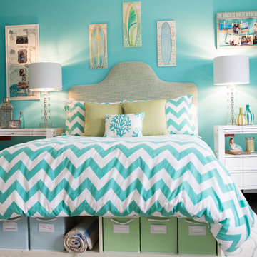
This custom made headboard, inspired by the clients love to surf, has great texture and sits nicely up against the bright teal wall. The custom pillows also help bring in some color and texture. The wavy rug enhances the "beach-like" theme.
Cat and the Fiddle Photography

 Pennsylvania Landscape & Nursery Association
Terran Landscapes http://www.terranlandscapes.com
Project Entry: Fishers Woodland Garden
2014 PLNA Awards for Landscape Excellence Winner
Category: Theme Garden $15,000-$30,000
Award Level: Bronze
Photo Description:
We were contracted by the client to design a calming space for their staff to relax, take a walk, and enjoy a leisurely lunch as well as to provide their grandchildren a place to run and pick flowers. The space was originally dominated by large trees and had been overgrown with ivy, sumac and aggressive vines, providing an unwelcome, dark space with little color or visual appeal. The client requested a colorful blend of shrubs and perennials that would provide interest throughout the seasons, as well as provide privacy by screening the street traffic along Carisbrooke Road.
Our goal was to create the privacy screen along the road by layering plants from the ground to the tree canopy. The theme was to let nature inspire the landscape, allowing a space that was originally woodland to become an enhanced version of itself, creating a beautiful habitat for birds and butterflies to excite the senses and satisfy all who enjoy the beauty of nature.
We began by clearing the brush and removing all aggressive vines and ivy that jeopardized the health of the trees. We kept and transplanted all non- invasive or native plant material in the area to various locations throughout the property. Several yards of compost were then tilled into the soil and the existing trees fertilized to provide a rich growing environment.
A few challenges occurred during the design process. It was decided that a new generator was to be installed in the woodland and due to a future addition to the house, we were forced to eliminate planned additional impervious pathway surfaces. We provided screening to hide the generator and buffer the noise, and created a meandering path and sitting area out of natural woodchips instead of the proposed bluestone to solve the impervious space issue. The woodchips add a sense of informality and invite the viewer to walk slowly through the space. The reduced noise from the additional screening of the generator allows for quiet reflection as chipmunks scurry and hummingbirds dart about between the flowers.
Our plant palette consists of shady understory plants that thrive and flower vigorously from spring through fall. A tall, lush, evergreen backdrop of Ilex opaca and Prunus laurocerasus ‘Schipkaensis’ provides the screening and blends into a middle layer of ‘Ivory Halo’ dogwood, hydrangeas and winterberry hollies. Beautiful perennials and groundcovers bloom along the woodland path, providing a low visual layer of color and texture. Movement throughout the garden is provided by the graceful Calamagrostis brachytricha and Hakenchloa that soften the nearby hardscaping. The woodland floor is full of shade-loving Solomon’s seal, hosta, astilbe, ferns, bleeding heart, Tiarella and Aconitum.
The street side of this woodland required plants with a preference for a little more sun and drought tolerance. A palette of oakleaf hydrangea, Agastache, Liatris and Rudbeckia softens the fence line and provides the desired color.
As designed and installed, the woodland garden successfully provides the client’s family and office staff a quiet space where they can take a peaceful moment and enjoy nature.
Photo Credit: Lisa C. Falls
 Studio Dearborn
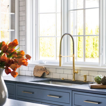
Designer Sarah Robertson of Studio Dearborn helped a neighbor and friend to update a “builder grade” kitchen into a personal, family space that feels luxurious and inviting.
The homeowner wanted to solve a number of storage and flow problems in the kitchen, including a wasted area dedicated to a desk, too-little pantry storage, and her wish for a kitchen bar. The all white builder kitchen lacked character, and the client wanted to inject color, texture and personality into the kitchen while keeping it classic.
 TaskRabbit
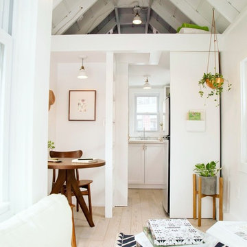
Recently, TaskRabbit challenged a group of 10 Taskers to build a Tiny House in the middle of Manhattan in just 72 hours – all for a good cause.
Building a fully outfitted tiny house in 3 days was a tall order – a build like this often takes months – but we set out to prove the power of collaboration, showing the kind of progress that can be made when people come together, bringing their best insights, skills and creativity to achieve something that seems impossible.
It was quite a week. New York was wonderful (and quite lovely, despite a bit of rain), our Taskers were incredible, and TaskRabbit’s Tiny House came together in record time, due to the planning, dedication and hard work of all involved.
A Symbol for Change
The TaskRabbit Tiny House was auctioned off with 100% of the proceeds going to our partner, Community Solutions, a national nonprofit helping communities take on complex social challenges – issues like homelessness, unemployment and health inequity – through collaboration and creative problem solving. This Tiny House was envisioned as a small symbol of the change that is possible when people have the right tools and opportunities to work together. Through our three-day build, our Taskers proved that amazing things can happen when we put our hearts into creating substantive change in our communities.
The Winning Bid
We’re proud to report that we were able to raise $26,600 to support Community Solutions’ work. Sarah, a lovely woman from New Hampshire, placed the winning bid – and it’s nice to know our tiny home is in good hands.
#ATinyTask: Behind the Scenes
The Plans
A lot of time and effort went into making sure this Tiny Home was as efficient, cozy and welcoming as possible. Our master planners, designer Lesley Morphy and TaskRabbit Creative Director Scott Smith, maximized every square inch in the little house with comfort and style in mind, utilizing a lofted bed, lofted storage, a floor-to-ceiling tiled shower, a compost toilet, and custom details throughout. There’s a surprising amount of built-in storage in the kitchen, while a conscious decision was made to keep the living space open so you could actually exist comfortably without feeling cramped.
The Build
Our Taskers worked long, hard shifts while our team made sure they were well fed, hydrated and in good spirits. The team brought amazing energy and we couldn’t be prouder of the way they worked together. Stay tuned, as we’ll be highlighting more of our Tiny House Taskers’ stories in coming days – they were so great that we want to make sure all of you get to know them better.
The Final Product
Behold, the completed Tiny House! For more photos, be sure to check out our Facebook page.
This was an incredibly inspiring project, and we really enjoyed watching the Tiny House come to life right in the middle of Manhattan. It was amazing to see what our Taskers are capable of, and we’re so glad we were able to support Community Solutions and help fight homelessness, unemployment and health inequity with #ATinyTask.
 Elizabeth Beach Hacking, ShelfGenie Designer
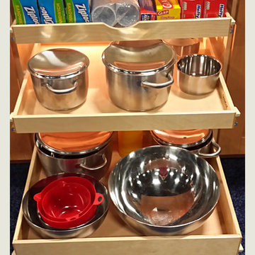
ShelfGenie Glide-Outs improve organization, decrease clutter, and help you solve your most challenging kitchen problems. Full extension rails enable you to fill your cabinets all the way to the back, and simply slide them out to reach even the deepest items. Hi! I'm Elizabeth Beach Hacking of ShelfGenie MA (S. Shore, N. Shore, Metro West & Cape Cod). Call me at:646-944-8599 to find out how we can retrofit your pantry and cabinets with space saving Glide-Outs. Receive $100 off your custom order, just by mentioning Houzz.
 JandB Kitchen Designs
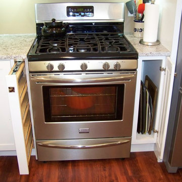
3" FILLER SHOULD ALWAYS HAVE SPICE PULL-OUT ACCESSORY.....NORMALLY MUST BE INSTALLED BETWEEN 2 CABS. BUT USE OF 3/4" END PANEL (BY STOVE) SOLVES PROBLEM.....9" TRAY-DIVIDER CABINET IS ALWAYS VERY USEFUL BUT SO OFTEN FORGOTTEN.....REFR. END PANEL NOT ONLY HIDES UNATTRACTIVE SIDE OF FRIDGE BUT PROVIDES SURFACE FOR GRANITE TO BUTT UP TO.....ELIMINATES OPEN SPACE FOR FOOD TO DROP THROUGH.
 Edgewater Design Group
As written in Northern Home & Cottage by Elizabeth Edwards
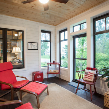
For years, Jeff and Ellen Miller spent their vacations sailing in Northern Michigan—so they had plenty of time to check out which small harbor town they might like to retire to someday. When that time arrived several years ago, they looked at properties up and down the coast and along inland lakes. When they discovered a sweet piece on the outskirts of Boyne City that included waterfront and a buildable lot, with a garage on it, across the street, they knew they’d found home. The couple figured they could find plans for their dream lake cottage online. After all, they weren’t looking to build anything grandiose. Just a small-to-medium sized contemporary Craftsman. But after an unfruitful online search they gave up, frustrated. Every plan they found had the back of the house facing the water—they needed a blueprint for a home that fronted on the water. The Millers first met the woman, Stephanie Baldwin, Owner & President of Edgewater Design Group, who solved that issue and a number of others on the 2015
Northern Home & Cottage Petoskey Area Home Tour. Baldwin’s home that year was a smart, 2000-square cottage on Crooked Lake with simple lines and a Craftsman sensibility. That home proved to the couple that Edgewater Design Group is as proficient at small homes as the larger ones they are often known for. Edgewater Design Group did indeed come up with the perfect plan for the Millers. At 2400 square feet, the simple Craftsman with its 3 bedrooms, vaulted ceiling in the great room and upstairs deck is everything the Millers wanted—including the fact that construction stayed within their budget. An extra courtesy of working with the talented design team is a screened in porch facing the lake (“She told us, of course you have to have a screened in porch,” Ellen says. “And we love it!’) Edgewater’s other touches are more subtle. The Millers wanted to keep the garage, but the home needed to be sited on a small knoll some feet away in order to capture the views of Lake Charlevoix across the street. The solution is a covered walkway and steps that are so artful they enhance the home. Another favor Baldwin did for them was to connect them with Legacy Construction, a firm known for its craftsmanship and attention to detail. The Miller home, outfitted with touches including custom molding, cherry cabinetry, a stunning custom range hood, built in shelving and custom vanities. A warm hickory floor and lovely earth-toned Craftsman-style color palette pull it all together, while a fireplace mantel hewn from a tree taken on the property rounds out this gracious lake cottage.
 Tile Doctor Ltd
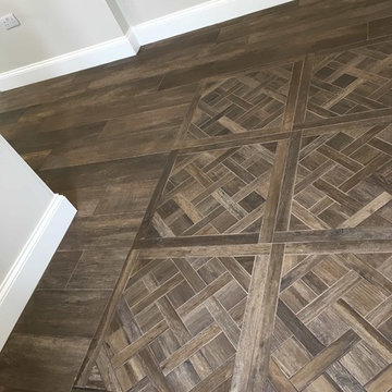
Grout haze or grout smears as it is often called can be a huge problem when laying tiles. Grout haze is basically grout that has been left to dry on the surface of the tile after installation. It’s a common problem which is exacerbated by the use of quick drying products. Take for example this interesting Wood Effect Ceramic Tile installation at a house in Guildford following installation by a builder.
I was a bit slow in following up on the initial enquiry as we had been very busy so by the time, I got in touch I was told they had employed someone else to carry out the work. I apologised for my late response and said to call me if he needed help in the future. Three days later I got a call so we arranged a visit so that I could carry out a test and quote a price.
As it turns out the builder had returned and failed to remove the grout haze and so had a rival firm that seemed more interested in selling unnecessary sealer than fixing the problem. I was astonished to see what a state the builder had left his floor. Grout was all over the floor with footprints walked across thresholds and more. I could understand it if there was some grout was missed after installation but not to this level!
I carried out a successful test and confirmed to the customer that there was absolutely no need to rip and replace his £2k floor. We agreed a date to resolve the problem and to say he was relieved was an understatement!
The builders had used Mapei grout which contains polymers. Polymers offer better flexibility and adhesion, however in order to remove the grout haze we would first need to break down the polymers in the grout first and this is why the rival firm failed.
With that in mind, my first action was to apply Tile Doctor Remove and Go to the floor and leave it to dwell for five to ten minutes. I then worked it into the tile using a scrubbing pad fitted to a rotary machine.
After washing the soil away with warm water and extracting with a wet vacuum I applied Tile Doctor Grout Clean-up to treat the grout. Grout Clean-up is an acid-based product that breaks down the grout so it can be rinsed away and extracted as before. Afterwards I rinsed the floor with warm water and extracted again to remove any trace of product and neutralise the floor. After removing as much moisture as possible with the wet vacuum I speed dried the tiles with a blower.
Ceramic tiles won’t accept a sealer so once the floor had dried the job was finished and it took less than a day.
The customer was over the moon with the difference. While his floor was in such a state, he has been unable to bring in new furniture as the serious possibility of removing the tiles was hanging over him.
Relieved that the problem was now resolved he kindly left the following review:
“I had a floor that had just been laid with very heavy grout haze. I had already had advice from two other professional floor cleaners who had advised me that the floor was irreparable and would need to be pulled up. As soon as I spoke with Rupert, it was clear he was extremely knowledgeable. He asked questions none of the other companies had. By understanding the specific nature of the problem, he was able to solve it by first removing the grout polymers and then applying an acid wash. The floor came up brilliantly. Rupert was the only person I spoke to that could fix this, everyone else told me I needed to replace my floor! Superbly knowledgeable, professional and did an excellent job. Don’t bother speaking to anyone else, just call Rupert! “
Rupert Mcleod
West Surrey Tile Doctor
 Sloan Polish Design
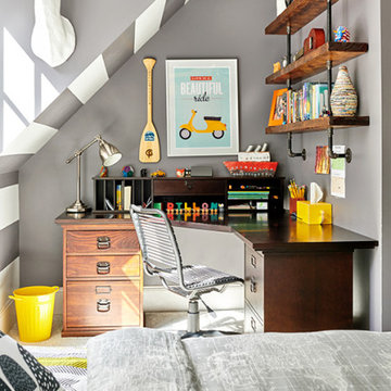
Working in small or awkward spaces is often the most rewarding because the problem solving required calls on one’s creativity. The slanted ceiling nook in this tween bedroom is a great example of how to turn a demerit into an asset. Instead of trying to ignore it, the feature is played up here with the bold stripe treatment. The nook’s utility is maximized by using a corner desk and creating custom wood shelves affixed to the wall using plumbing piping.
Storage space remained a challenge in the room, and if we added a tall storage unit to the wall where one could fit, we would be blocking the light and views of the windows. The solution was to create a long, built-in bench with drawer storage below and two long wooden shelves, higher up the wall, for books and personal items. To bring in an industrial vibe and complement the iron bed, we distressed the wood and used plumbing pipes and fixtures for shelf support.
Pops of yellow as a repeating element bring energy and personality to the space. Custom bedding, pillows, and window seat fabric from Spoonflower.
Images ©Spoonflower and ©Sloan Polish Design.
 Twelve Stones Designs, LLC
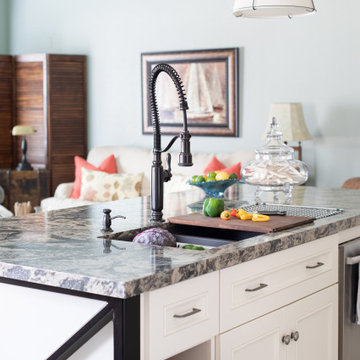
The owners of this kitchen had spent the money to upgrade the finishes in their kitchen upon building the home 12 years ago, but after living in the space for several years they realized how nonfunctional the layout really was. The (then) two preschool aged children had grown into busy, hungry teenagers with many friends who also liked to hang out at the house. So the family needed a more functional kitchen with better traffic flow, space for daily activities revolving around the kitchen at different times of day, and a kitchen that could accommodate cooking for and serving large groups. Furthermore, the dark, traditional finishes no longer reflected the homeowners’ style. They requested a brighter, more relaxed, coastal style that reflected their love of the seaside cities they like to visit.
Originally, the kitchen was U-shaped with a narrow island in the middle. The island created narrow aisles that bottle-necked at the dishwasher, refrigerator, and cooktop areas. There was a pass-through from the foyer into the kitchen, but the owners never liked that the pass-through was also located so close to the powder room. The awkward proximity was unappealing and made guests feel uncomfortable.
The kitchen’s storage was made up of lots of narrow cabinets, apothecary drawers, clipped corner units, and very few drawers. It lacked useful storage for the larger items the family used on a daily basis. And the kitchen’s only pantry was small closet that had only builder-grade, narrow shelving with no illumination to be able to see the contents inside.
Overall, the kitchen’s lighting plan was poorly executed. Only six recessed cans illuminated the entire kitchen and nook areas. The under cabinet lighting was not evenly distributed either. In fact, the builder had mis-placed the under cabinet lighting around the decorative pilasters which made for choppy, dark cubbies. Further, the builder didn’t include any lighting over the sink or the bar area, which meant whoever was doing the dishes was always in their own shadow. That, coupled with the steep overhang of the game room above made the bar area feel like a dim, cavernous space that wasn’t inviting or task oriented. The kitchen looked out into the main living space, but the raised bar and a narrow wall (which held the only large cabinet in the kitchen) created more of a barrier than a relationship to the living room or breakfast nook. In fact, one couldn’t even see the breakfast nook from the cooktop or sink areas due to its orientation. The raised bar top was too narrow to comfortably sit to either dine at or chat from due to the lack of knee space. The the homeowners confided that the kitchen felt more like a dark, dirty prison than place where the family, or their guests, wanted to gather and commune.
The clients' needs and desires were:
➢ to create a kitchen that would be a space the family loved to be in; to relate to the adjacent spaces all around, and to have better flow for entertaining large groups
➢ to remove the walls between the breakfast nook and living area and to be able to utilize the natural light from the windows in both those areas
➢ to incorporate a functional chopping block for prepping fresh food for home cooked meals, an island with a large sink and drain board, 2 pull out trash cans, and seating for at least the 2 teens to eat or do homework
➢ to design a kitchen and breakfast nook with an airy, coastal, relaxed vibe that blended with the rest of the house's coastal theme
➢ to integrate a layered lighting plan which would include ample general illumination, specific task lighting, decorative lighting, and lots of illuminated storage
➢ to design a kitchen with not only more storage for all the husband’s kitchen gadgets and collection of oils and spices, but smart storage, including a coffee/breakfast bar and a place to store and conceal the toaster oven and microwave
➢ to find a way to utilize the large open space between the kitchen, pantry area, and breakfast nook
Twelve Stones Designs achieved the owner's goals by:
➢ removing the walls between the kitchen and living room to allow the natural light to filter in from the adjacent rooms and to create a connection between the kitchen, nook, and living spaces for a sense of unity and communion
➢ removing the existing pantry and designing 3 large pantry style cabinets with LED tape lights and rollout drawers to house lots of kitchen appliances, gadgets, and tons of groceries. We also took the cabinets all the way up to the 9’ ceiling for additional storage for seasonal items and bulk storage.
➢ designing 2 islands - 1 with a gorgeous black walnut chopping block that houses a drawer for chopping and carving knives and a custom double pull out trash unit for point of use utilization - and 1 that houses the dishwasher, a large Blanco Gourmet sink with integrated drain board, woven baskets for fresh root vegetables and kitchen towels, plenty of drawer storage for kitchen items, and bar seating for up to 4 diners.
➢ closing off the space between the kitchen and the powder room to create a beautiful new private alcove for the powder room as well as adding some decorative storage. This also gave us space to include more tall storage near the new range for precision placement of the husband’s extensive oil and spice collection as well as a location for a combo-steam oven the wife wanted for baking and cooking healthy meals.
The project is enhanced functionally by:
➢ incorporated USB and standard receptacles for the kids’ laptops and phone charging in the large island
➢ designing the small island to include additional open shelving for items used on a daily basis such as a variety of bowls, plates, and colanders. This set up also works well for the husband who prefers to “plate” his dinners in restaurant-style fashion before presenting them to the table.
➢ the integration of specific storage units, such as double stacked cutlery drawers, a custom spice pull-out, a Kuerig coffee and tea pod drawer, and custom double stacked utensil drawers
➢ moving the refrigerator to the old oven location - this eliminated the bottle neck as well as created a better relationship to the eating table. It also utilizes the floor space between the pantry, nook, and kitchen
➢ creating a banquet style breakfast nook - this banquette seating not only doubles the amount of seating for large gatherings but it better utilizes the odd space between the kitchen and the previous nook area. It also helps to create a distinct pathway from the mudroom room through the pantry area, kitchen, nook, and living room.
➢ the coffee/breakfast bar area which includes the perfect location for the concealed microwave and toaster oven, convenient storage for the coffee pods and tea accoutrements. Roll-out drawers below also house the smoothie maker, hot water kettle, and a plethora of smoothie-making ingredients such as protein powders, smoothie additives, etc. Furthermore, the drawers below the Keurig house measuring utensil, cutlery, baking supplies and tupperware storage.
➢ incorporating lots of wide drawers and pullouts to accommodate large cookware.
➢ utilizing as much vertical space as possible by building storage to the ceiling which accommodates the family’s abundant amount of serving platters, baking sheets, bakeware, casserole dishes, and additional cutting boards.
The project is enhanced aesthetically by:
➢ new 5-piece Versailles pattern porcelain tile that now seamlessly joins the entire down stairs area together creating a bright, cohesiveness feeling instead of choppy separated spaces - it also adds a coastal feeling
➢ designing a cabinet to conceal the microwave and toaster oven
➢ the coastal influenced light fixtures over the nook table and island
➢ the sandy colors of the Langdon Cambria countertops. The swirling pattern and sparkling quartz pieces remind the homeowner of black-and-tan sandy beaches
➢ the striped banquet seating whose creamy white background and blue-green stripes were the inspiration for the cabinet and wall colors.
➢ All the interior doors were painted black to coordinate with the blacks and grays in the backsplash tile and countertop. This also adds a hint of tailored formality to an otherwise casual space.
➢ the use of WAC's Oculux small aperture LED units for the overhead lighting complimented with Diode LED strips for task lighting under the cabinets and inside the pantry and glass wall cabinets. All of the lighting applications are on separate dimmer switches.
Innovative uses of materials or construction methods by Realty Restoration LLC:
➢ Each 1-1/2” x 3” block of reclaimed end-grain black walnut that makes up the center island chopping block was hand milled and built in the shop. It was designed to look substantial and proportional to the surrounding elements, executed by creating the 4 inch tall top with a solid wood chamfered edge band.
➢ The metal doors on either side of the vent hood were also custom designed for this project and built in the Realty Restoration LLC shop. They are made 1x2, 11-gauge mild steel with ribbed glass. Weighing 60 lbs a piece, heavy duty cabinet hinges were added to support the weight of the door and keep them from sagging.
➢ Under-cabinet receptacles were added along the range wall in order to have a clean, uninterrupted backsplash.
Design obstacles to overcome:
➢ Because we were removing the demising walls between the kitchen and living room, we had to find a way to plumb and vent the new island. We did this by tunneling through the slab (the slab had post tension cables which prevented us from just trenching) to run a new wet vent through a nearby structural wall. We pulled the existing hot and cold lines between upper floor joists and ran them down the structural wall as well and up through a conduit in the tunnel.
➢ Since we were converting from wall overs to a gas range it allowed us to utilize the 220 feed for the wall ovens to provide a new sub panel for all the new kitchen circuits
➢ Due to framing deficiencies inherited from the original build there was a 1-1/2” differential in the floor-to-ceiling height over a 20 foot span; by utilizing the process of cutting and furring coupled with the crown moulding details on the cabinet elevations we were able to mask the problem and provide seamless transitions between the cabinet components.
Evidence of superior craftsmanship:
➢ uniquely designed, one-of-a-kind metal “X” end panels on the large island. The end panels were custom made in the Realty Restoration LLC shop and fitted to the exact dimensions of the island. The welding seams are completely indistinguishable - the posts look like they are cut from a single sheet of metal
➢ square metal posts on the small island were also custom made and designed to compliment and carry through the metal element s throughout the kitchen
➢ the beautiful, oversized end panels on the pantry cabinets which give the breakfast nook a tailored look
➢ integrating a large format 5 piece Versailles tile pattern to seamlessly flow from the existing spaces into the new kitchen space
➢ By constructing a custom cabinet that jogged around a corner we could not remodel (housing the entry way coat closet) we were able to camouflage the adjacent wall offset within the upper and lower cabinets. By designing around the existing jog in the structural walls we accomplished a few things: we were able to find the space to house, and hide, the microwave and toaster oven yet still have a clean cohesive appearance from the kitchen side. Additionally, the owners were able to keep their much needed coat closet and we didn’t have to increase the budget with unnecessary structural work.
 EasyTurf Florida
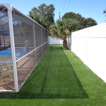
Sometimes the lawn beyond the pool cage can be a challenge to keep looking its best. That's why an EasyTurf artificial grass solution is the best way to solve lawn problems in these areas once and for all. AlternaScapes can provide this solution for as low as $99 a month and you can start enjoying these yards areas again. Call 1-800-445-2944 or visit us at www.JustLikeGrass.com to get your free estimate.
 Advance Design Studio, Ltd.
After six years of living in their Huntley IL home, Chris and Meghan were tired of their dark, dingy, outdated kitchen and it was finally time for a long-anticipated change. “The kitchen is the place where we live, it’s where we do everything,” Meghan said. “It was important that it be a space where we wanted to be.” Meghan loves cooking and enjoys including their girls in healthy meal prepping, this led them to want a brighter, more enjoyable kitchen with increased functionality and improved storage.
For Chris especially, the laundry room was an entirely dysfunctional eyesore. “We had a washer and a dryer, but it was all kind-of cobbled together!” Chris said. “There were always laundry piles everywhere, we weren’t really sure what we wanted to do in there, but it was time for us to make a change.” The mess of the space was stressful every time they walked in the door from the garage each day. Kids’ backpacks and shoes piled up haphazardly in the makeshift boot-bench closet left the family feeling disorganized and stressed. They needed space for folding clothes and locker cubbies to help keep the family organized.
Having known Christine and Todd in the Huntley community for years, Chris and Meghan were familiar with their work. “We already trusted them personally and having seen their projects for years we knew they did top notch work. After we reviewed the initial round of designs, we knew that hiring them was definitely the right choice,” Meghan and Chris said. Although Chris had done a lot of work in their home himself, the kitchen and laundry room renovation was such a large undertaking that he didn’t want to steal time away from his family to spend what would surely be many long weekends doing the job himself. “That would not have been a wise choice for us,” Chris laughed.
“Our designer, Michelle was very, very, easy to work with; anything we wanted to see or weren’t sure about, she went above and beyond to make this easy for us. She was easy to get hold of and always quick to respond,” the couple said. Michelle pulled ideas that mirrored the couple’s taste and style and was adept at directing the couple to limited choices that didn’t overwhelm them and kept the process moving. “I have a hard time making decisions. Michelle made the decision-making process so easy. I loved how she listened to what I liked and then presented three great options for me to choose from,” Meghan said.
The main objectives for the kitchen were better storage solutions, they wanted the space to reflect their lifestyle and taste, and they wanted it to last for years with low maintenance. One of the first steps in creating a more functional kitchen was relocating the refrigerator, creating an improved workflow for the busy family.
“We didn’t know that we could even move the refrigerator to a new location where it is now, that was something that we never would have thought of,” Chris said. “The new refrigerator location makes the kitchen feel so much bigger. We didn’t add any space, but our whole kitchen with the new design just seems like it’s so much larger than before!” Meghan said.
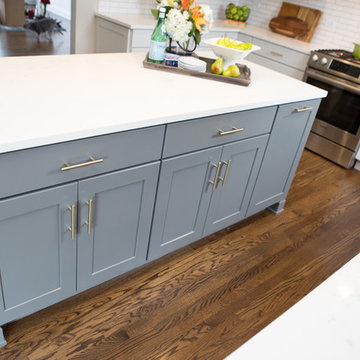
The perimeter mist colored cabinets helped warm and brighten the entire room, while the graphite colored cabinets on the island added contrast. Using this fresh, clean color palette satisfied the couple’s desire for a bright space that was the exact opposite of what they had before. Organization accessories were also added to the cabinets such as a spice drawer tray and roll outs to create hidden convenience.
“I absolutely love the hidden spices – it makes cooking so much more enjoyable!” Chris said. “And all the pull outs, and the double trash bin, who would think you could get so excited about organization!” the couple said in unison.
One thing they hated in their original kitchen was how dark the space felt. Added lighting on the ceiling with the new light fixtures combined with the lighter cabinetry colors throughout solved this problem. “Our new kitchen has this warm, almost cozy feeling that our old kitchen never had, it’s just a space that I love spending my time in now,” Meghan said. The light airy feeling was accentuated with the use of floating white shelves on either side of the decorative range hood. “We have so much cabinetry space, the new design is amazing we actually have more storage space than we will ever need,” Meghan said.
The island was extended to create more work surface and added space for stool seating. “The new island changes how we live. Now the kids can be in the kitchen with us, doing homework, eating breakfast, and the three of us have special dinners there when Chris is working late,” Meghan said.
The Carrara Marmi Quartz countertops were chosen because they are, not only beautiful, but are made from hard-working material that doesn’t require maintenance. The white subway tile backsplash that wraps to the ceiling behind the focal point cooktop range/hood compliments the crisp white countertops perfectly, while brushed brass hardware and light fixtures keep the design fresh and new.
The couple had a few fears at the beginning of the project, as most homeowners do. Their biggest fear was being out of their kitchen and laundry room for an extended time. The crew made it very easy for the family to work in a limited space keeping the washer and dryer hooked up the majority of the time, and also getting appliances working with minimal downtime.
“They above and beyond accommodated us to get us through the process,” Meghan said. “They did a great job making sure we were as comfortable as possible throughout the process,” Chris added.
“Our project manager DJ did a great job. He was very good at updating us on schedule changes, getting guys in as quickly as possible. Everyone that stepped in the house was nice and did great work,” said Chris. They thought Advance’s carpenter was phenomenal and were impressed when he took a conceptual idea from a photograph and worked with designer Michelle to create a one of a kind range/hood that has become the topic of conversation with friends and family who visit the new kitchen. “He was in our house literally every day for several weeks. He was easy to work with and good at what he did,” Meghan and Chris said.
The focal point of the kitchen; a hand-crafted, custom-built ventilation hood was clad with handpicked reclaimed barnwood. Advance Design’s carpenter built the framework and the cladding to create a one-of-a-kind design element that the couple loves.
“I think it was especially fun for him to create something unique from scratch, showcasing his talent in this area,” Meghan said. “I love that my kitchen is not like everyone else’s. I got to pick out the wood on my hood and watch it being built and was able to choose what pieces of wood went where on it. It’s totally unique.”
Red Oak flooring was toothed-in throughout the kitchen and the rest of the first floor anywhere changes were made. Then the whole floor was refinished to tone down the orange undertones in the existing floor stain, ultimately changing the color complexion of the entire first floor. The result is a completely new feeling to the entire home.
Renovating the laundry room was extremely important to Meghan and Chris, but they had trouble visualizing what the possibilities were for the seemingly small space. Michelle produced beautiful 3D illustrations that helped them envision the space in a whole new way.
“I must have told Michelle 100 times that I am a visual person, seeing the designs in 3D made it so easy to make decisions and see what we could really do with our space,” Meghan said.
A dividing wall and doorway were removed between the existing laundry room and hallway formerly containing a coat closet, providing space to design specialized graphite colored cabinetry matching the kitchen island to house custom storage cubbies for each family member. Adding the tall utility cabinetry in the new laundry area helped solve the storage issue, tucking away cleaning supplies, household items, and even the cat got its own cubby.
“I love how everything is now hidden in its own space. I can’t tell you how much I hated coming home and seeing everything sitting around on counters,” Chris said.
Electrical outlets were planned for the inside of utility cabinets, so devices could charge in hidden locations. Stacking the washer and dryer allowed for wider countertop space to provide a folding area and a special space for clothes to hang. “The way I do laundry has been completely transformed! I can actually fold clothes and hang them now right out of the washer and dryer,” Meghan said.
“The end result in the kitchen and the laundry/mud room was an updated light and bright space, with a smarter work flow that better meets the needs of this family,” Michelle said.
“I would totally recommend Advance Design,” Meghan said. “Sometimes I sit and just look at my kitchen and laundry room and think ‘Wow, I can’t believe I get to live here!’ It’s an understatement to say we love our new space.”
14